10.3 Basic Aesthetics
In R, the aes() function is often used within other graphing elements to specify the desired aesthetics. The aes() function can be used in a global manner (applying to all of the graph’s elements) by nesting within ggplot(). It can also be used for specific graph elements by nesting aes() in those specific geom functions (geom_point(), geom_line(), geom_errorbar(), etc.,); more on this later.
10.3.1 The aes vignette
Execute ??aes to view the options for graphing aesthetics and select the “Aesthetic specifications” vignette.
This help page will go over how to alter the appearance of:
Color and fill of various objects
Lines size/type
Point shape, color, and fill
Text size, font, font face, justification
There is an abundance of resources to help you graph using the ggplot2 package. This guide will go over a select few that are frequently used.
10.3.2 Color
Let’s change the graph so that each cut is differentiated by color:
diamonds %>%
  group_by(clarity, cut) %>%
  summarize(m = mean(price),
            se = sem(price)) %>%
  ggplot(aes(x = clarity, y = m, group = cut, color = cut)) +
  geom_point() +
  geom_errorbar(aes(ymin = m - se, ymax = m + se)) +
  geom_line()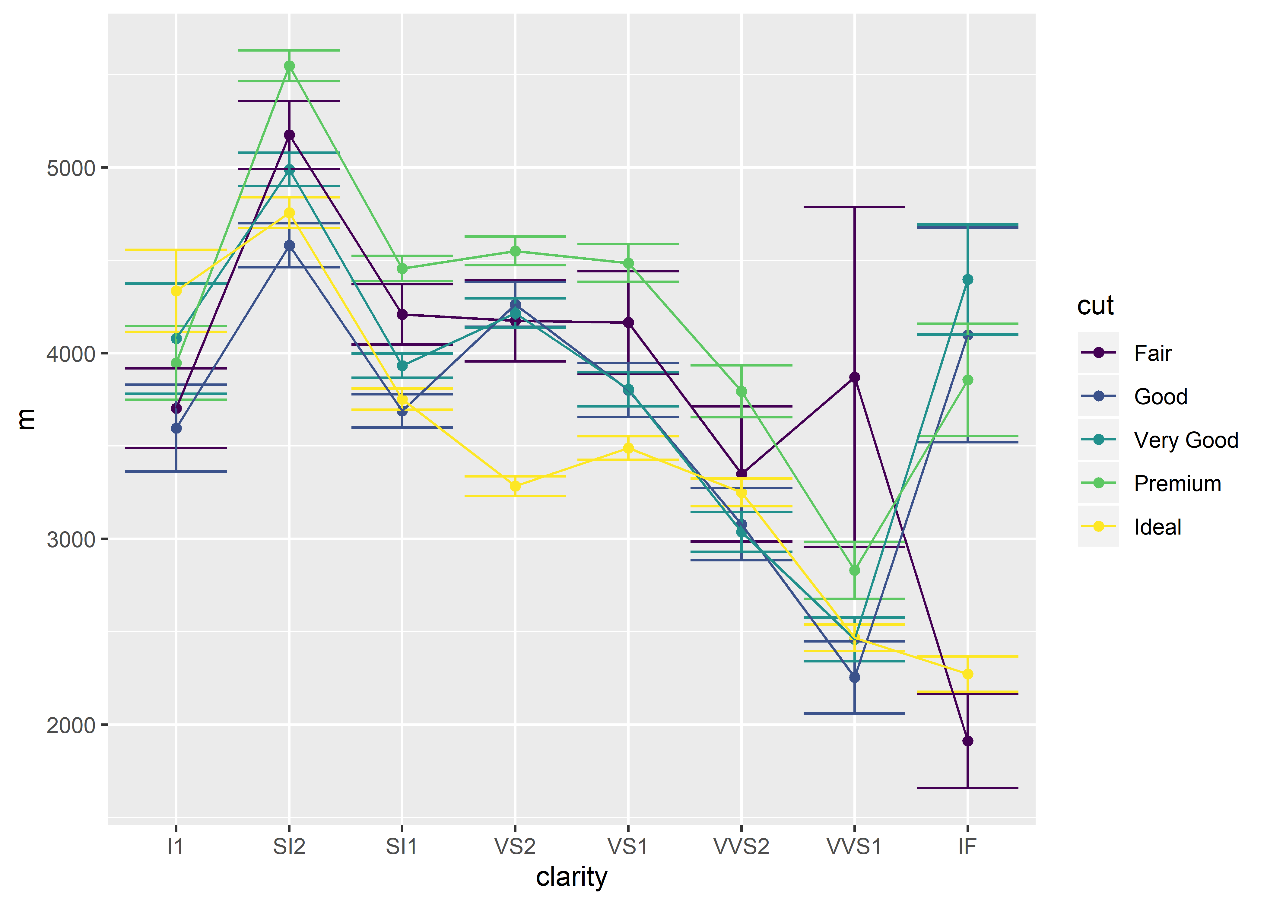
10.3.3 Coloring Structural Elements
There is a more specific method of changing the color aesthetics of the graph. Rather than changing the entire color scheme of the graph (points, error bars, connecting lines), you can elect to change one part. This allows for some customization.
Don’t forget to make sure the sem function is defined in your environment before following along the examples in this section!
sem <- function(x, na.rm = FALSE) {
  out <- sd(x, na.rm = na.rm)/sqrt(length(x))
  return(out)}
Global Color Changes
diamonds %>%
  group_by(clarity, cut) %>%
  summarize(m = mean(price),
            se = sem(price)) %>%
  ggplot(aes(x = clarity,
             y = m,
             group = cut,
             color = cut)) +
  geom_point() +
  geom_errorbar(aes(ymin = m - se,
                    ymax = m + se)) +
  geom_line()
Changing the Color of Data Points Only
diamonds %>%
  group_by(clarity, cut) %>%
  summarize(m = mean(price),
            se = sem(price)) %>%
  ggplot(aes(x = clarity,
             y = m,
             group = cut)) +
  geom_point(aes(color = cut)) +
  geom_errorbar(aes(ymin = m - se,
                    ymax = m + se)) +
  geom_line()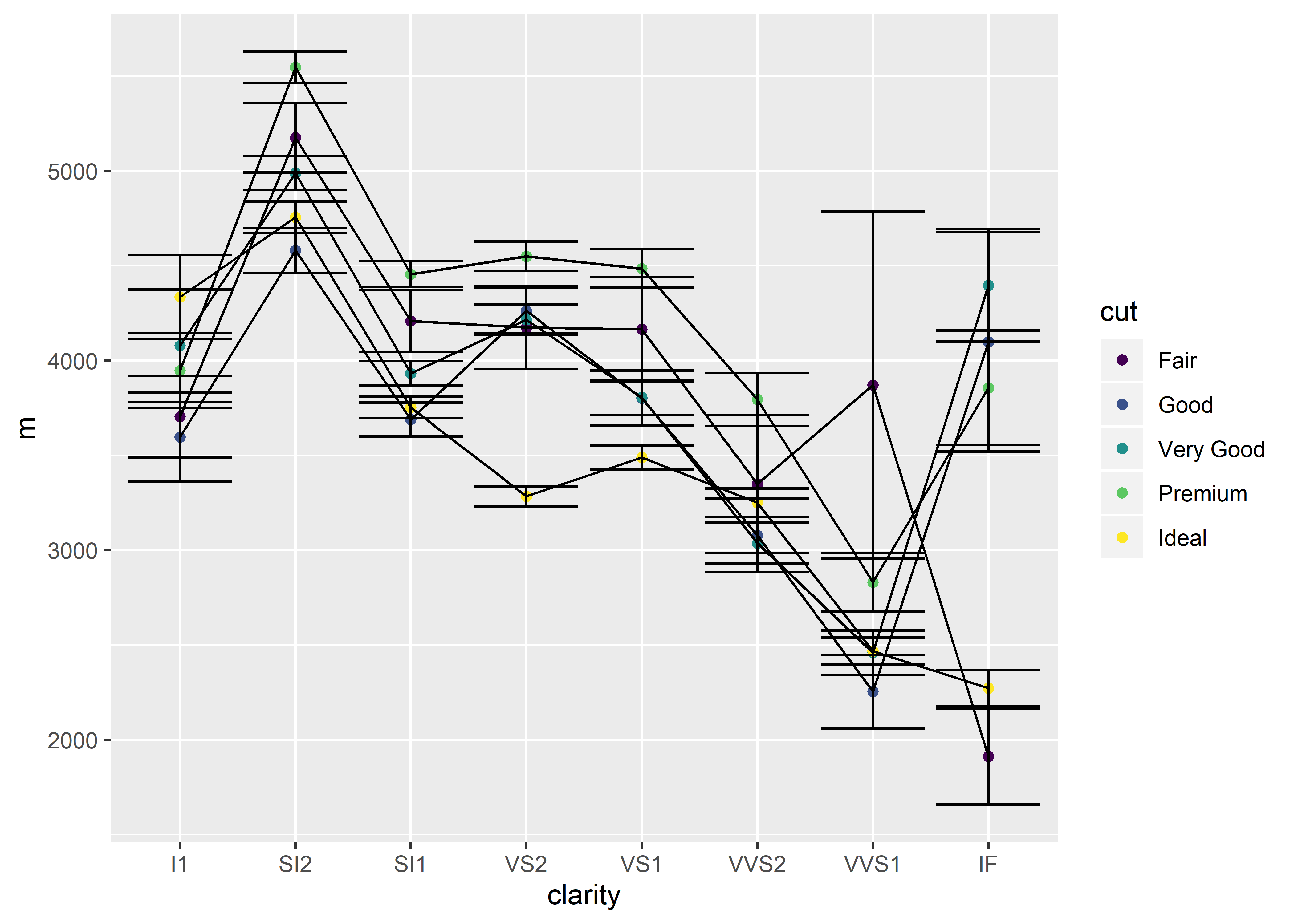
Changing the Color of Error Bars Only
diamonds %>%
  group_by(clarity, cut) %>%
  summarize(m = mean(price),
            se = sem(price)) %>%
  ggplot(aes(x = clarity,
             y = m,
             group = cut)) +
  geom_point() +
  geom_errorbar(aes(ymin = m - se,
                    ymax = m + se,
                    color = cut)) +
  geom_line()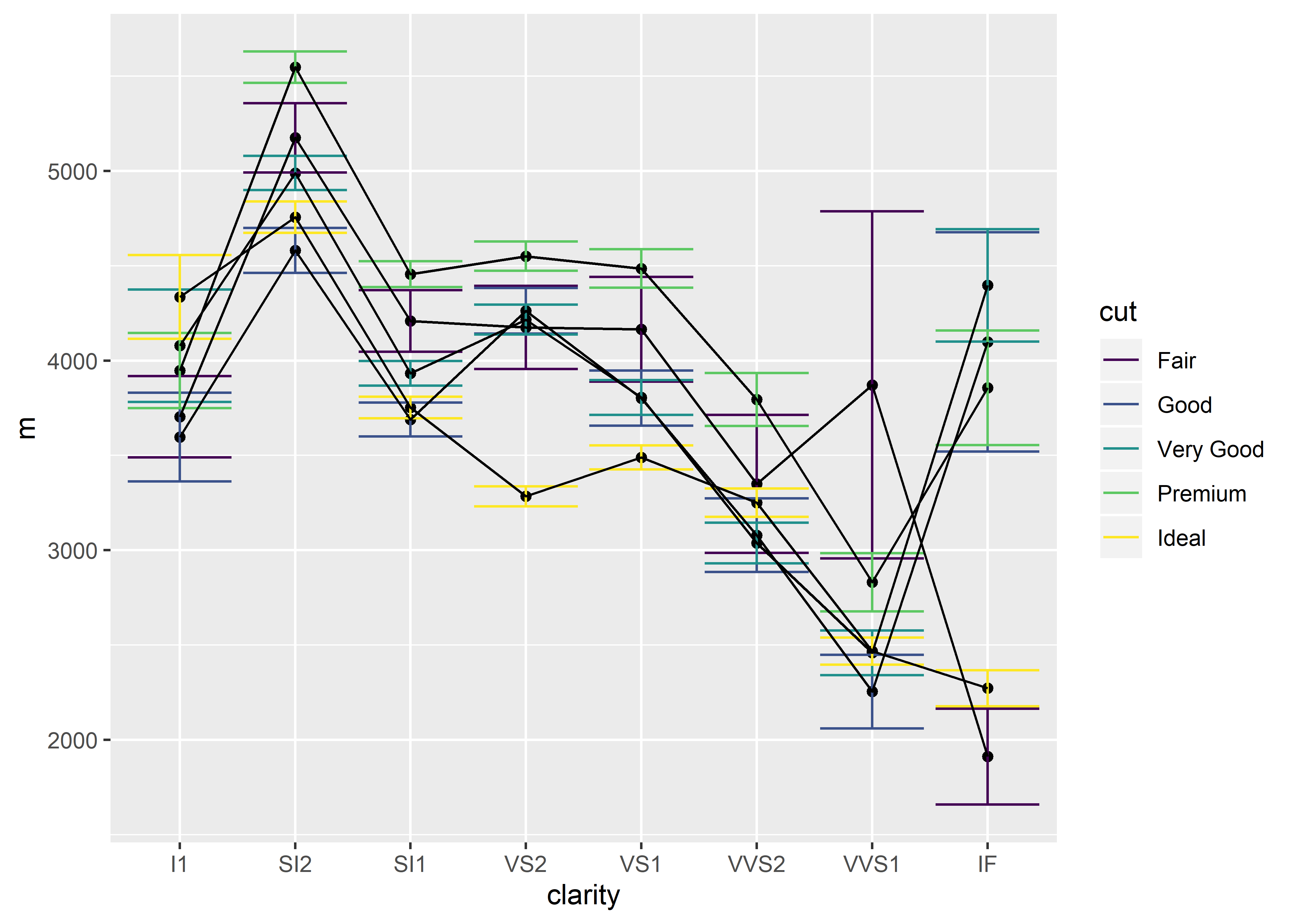
Changing the Color of Connecting Lines Only
diamonds %>%
  group_by(clarity, cut) %>%
  summarize(m = mean(price),
            se = sem(price)) %>%
  ggplot(aes(x = clarity,
             y = m,
             group = cut)) +
  geom_point() +
  geom_errorbar(aes(ymin = m - se,
                    ymax = m + se)) +
  geom_line(aes(color = cut))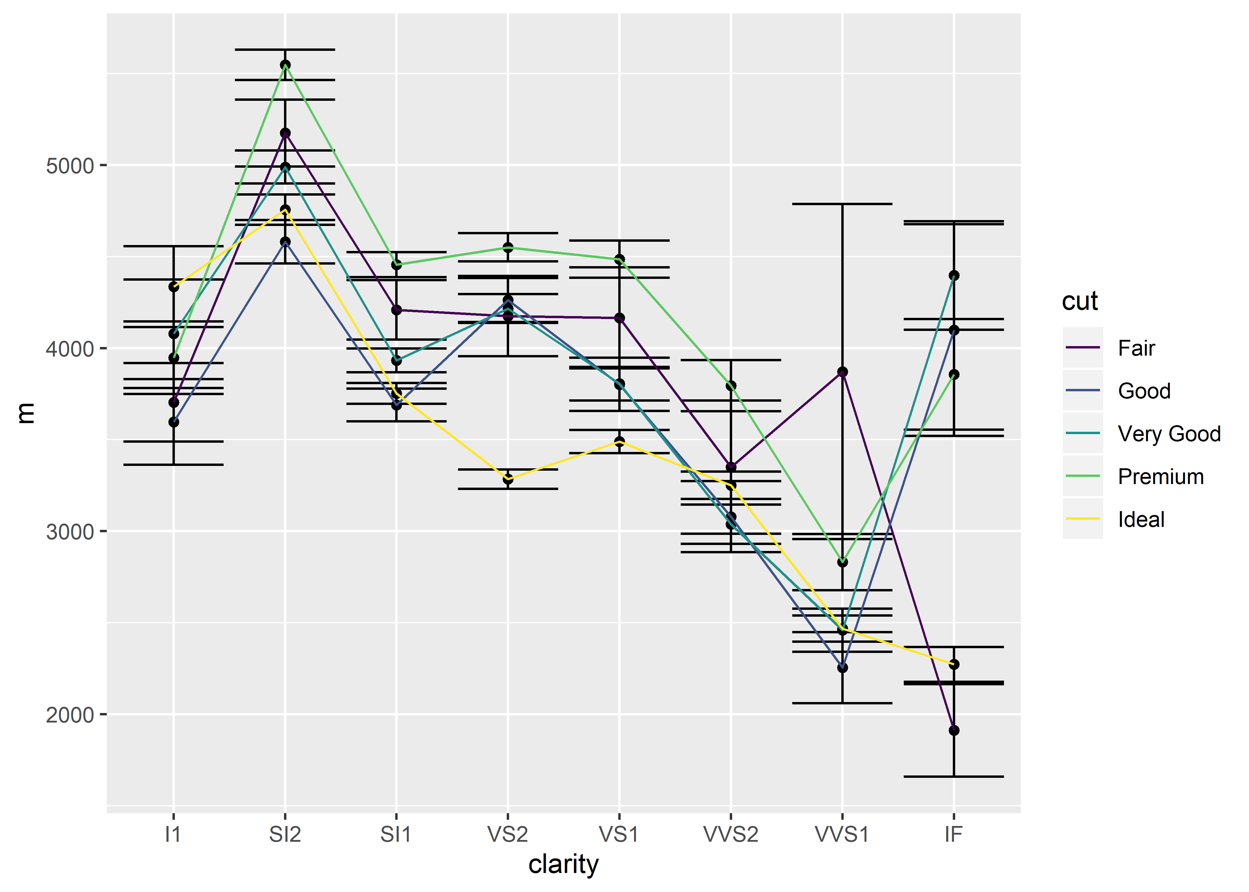
10.3.4 Shape
We could also opt to change the shape of each cut category for further distinction. Notice how each cut category is now represented by a different symbol:
diamonds %>%
  group_by(clarity, cut) %>%
  summarize(m = mean(price),
            se = sem(price)) %>%
  ggplot(aes(x = clarity, y = m, group = cut, color = cut, shape = cut)) +
  geom_point() +
  geom_errorbar(aes(ymin = m - se, ymax = m + se)) +
  geom_line()
## Warning: Using shapes for an ordinal variable is not advised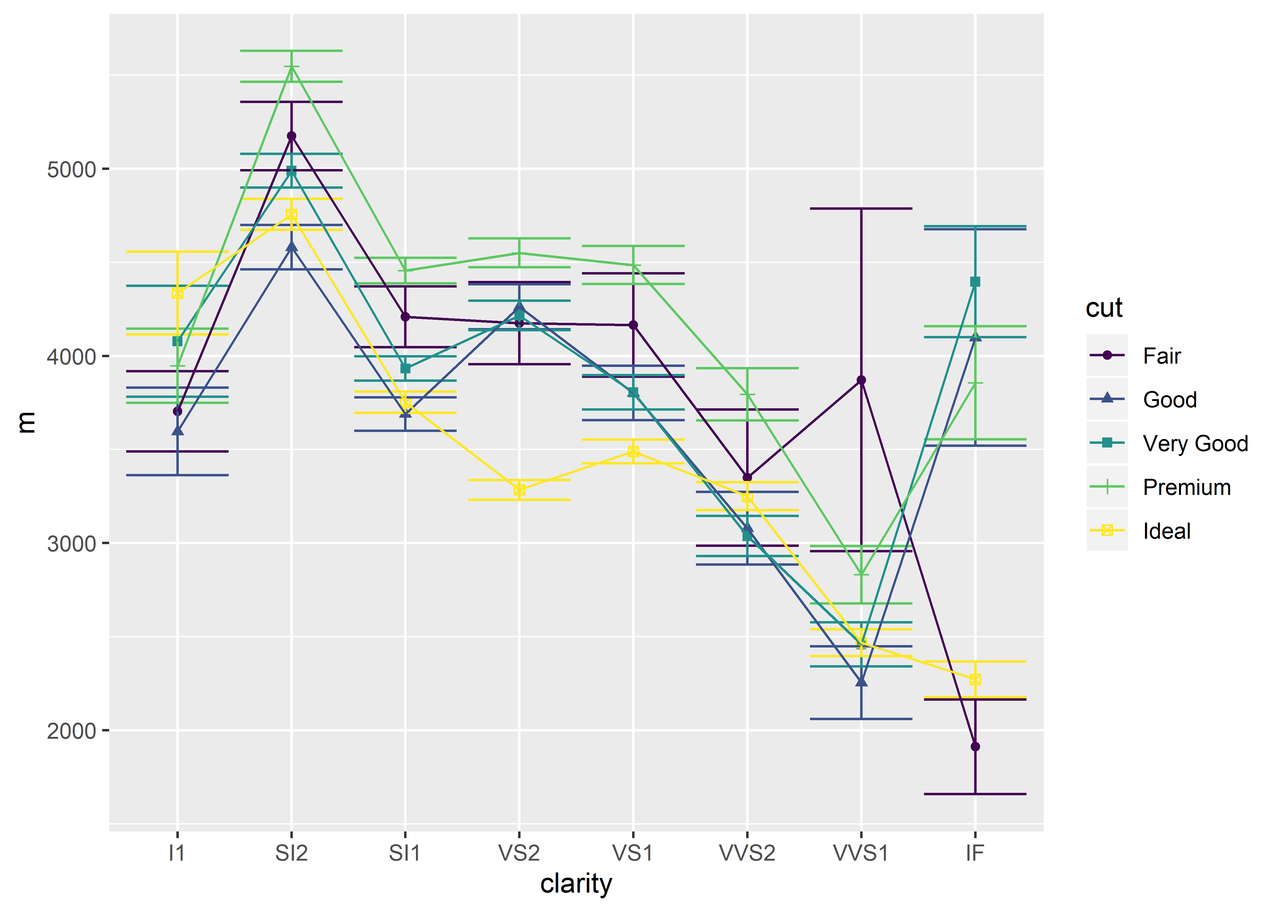
There will be a warning message stating that using shapes for an ordinal variable is not advised. R will occasionally advise you on your code. In some cases, these are error messages that prevent your code from working. In other cases (such as this), there are warning messages that don’t prevent your code execution but does provide suggestions.
10.3.5 Line Type
You can differentiate the cut categories by different line types, though this may not be very useful in this particular situation:
diamonds %>%
  group_by(clarity, cut) %>%
  summarize(m = mean(price),
            se = sem(price)) %>%
  ggplot(aes(x = clarity, y = m, group = cut, color = cut, linetype = cut)) +
  geom_point() +
  geom_errorbar(aes(ymin = m - se, ymax = m + se)) +
  geom_line()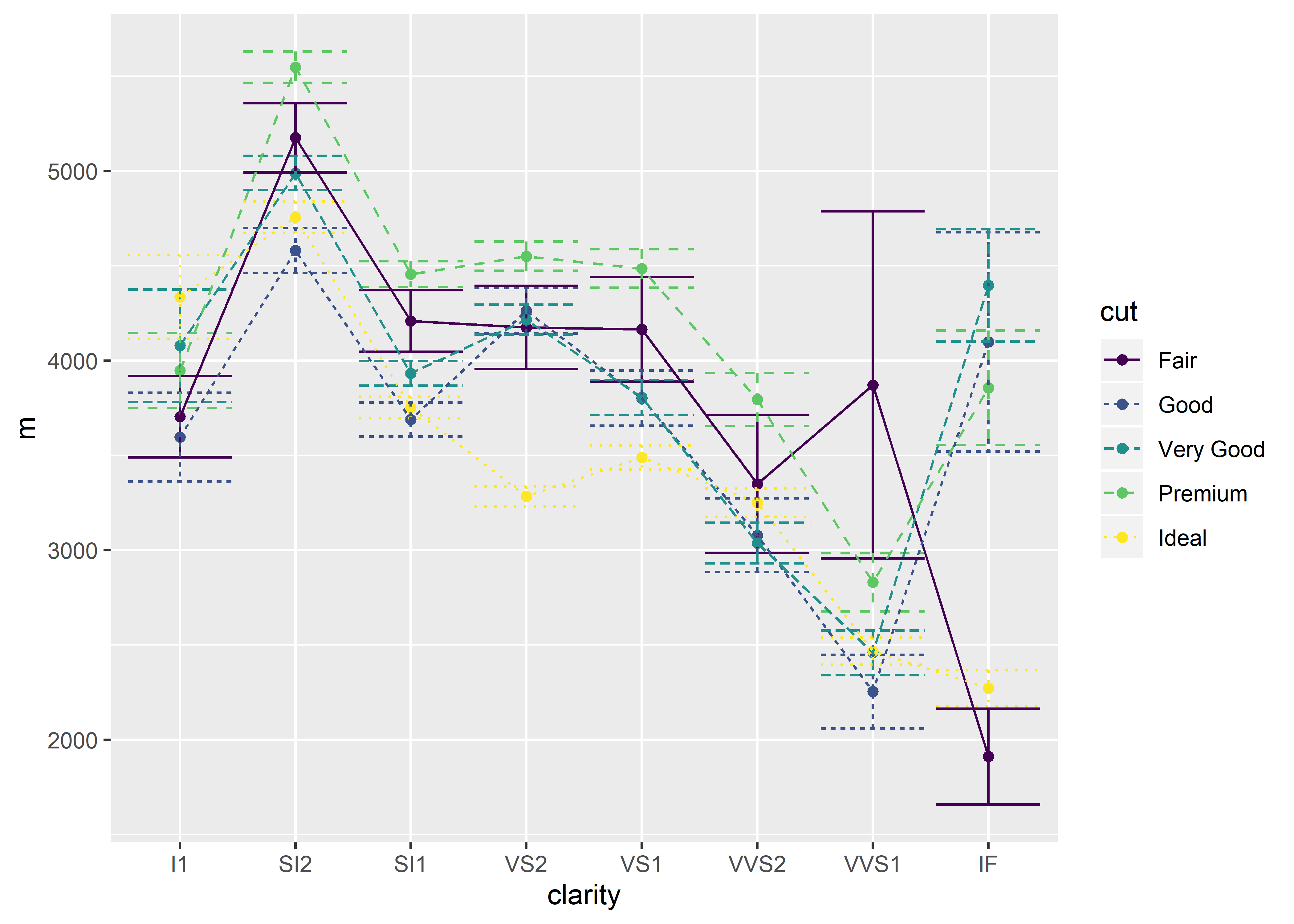
Remember that in order to use the sem() function in the example above, it must be defined in the environment using:
sem <- function(x, na.rm = FALSE) {
  out <- sd(x, na.rm = na.rm)/sqrt(length(x))
  return(out)}
10.3.6 Inside vs. Outside aes()
Some aesthetics need to be nested within aes() and some do not. How do we know when to place them outside versus inside?
Aesthetics for a specific variable of your data go inside
aes().An aesthetic that will remain a constant value – irrespective of the values of your data – should be placed outside of
aes()and within the geom element.
As an example, let’s focus on the color argument in ggplot().
If you were to place the color argument inside of aes() as such:
diamonds %>%
  group_by(clarity, cut) %>%
  summarize(m = mean(price)) %>%
  ggplot(aes(x = clarity, y = m, group = cut, color = cut)) +
geom_point() 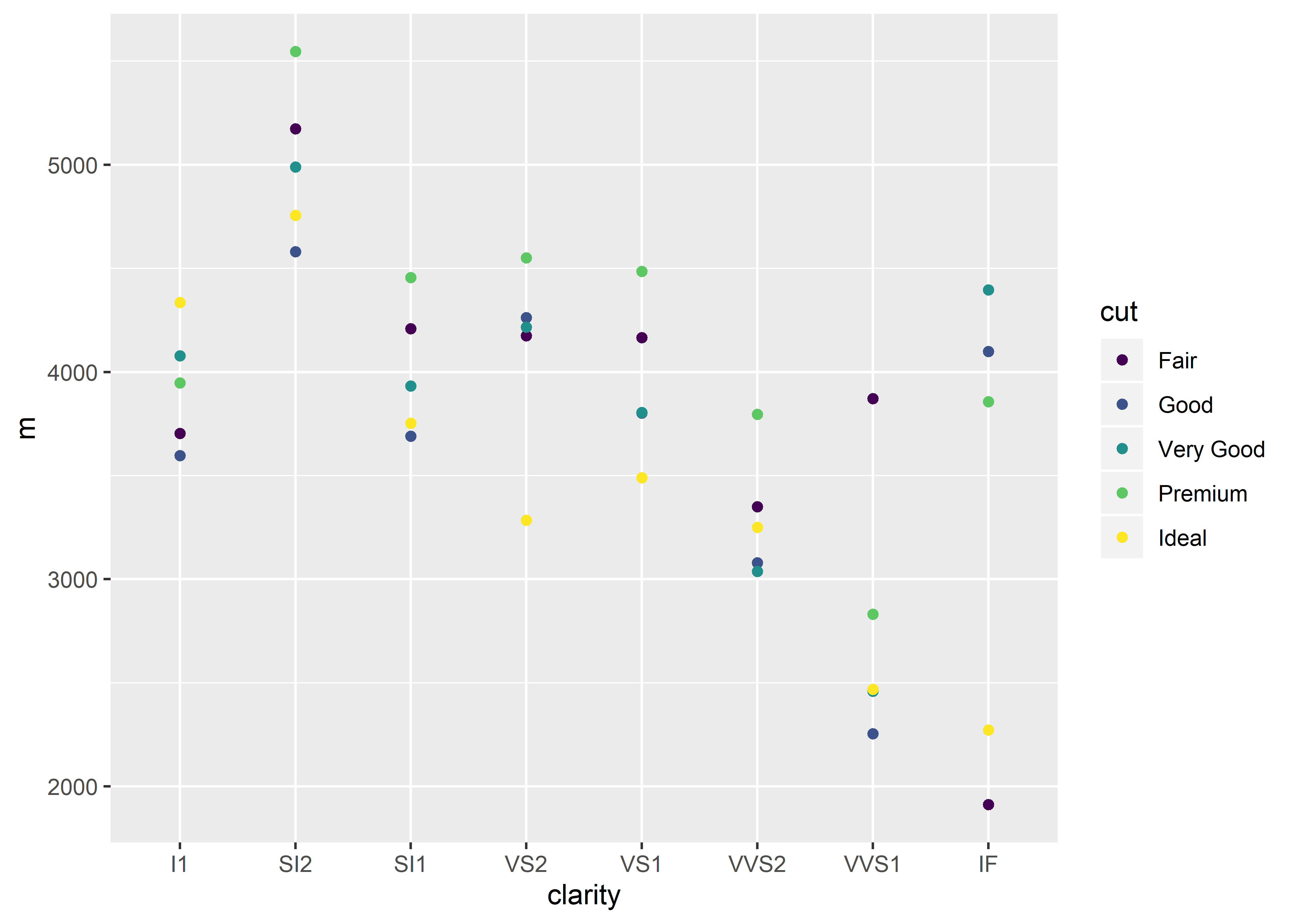
If you were to place the color argument outside of aes(), such as:
diamonds %>%
  group_by(clarity, cut) %>%
  summarize(m = mean(price)) %>%
  ggplot(aes(x = clarity, y = m, group = cut), color = cut) +
  geom_point()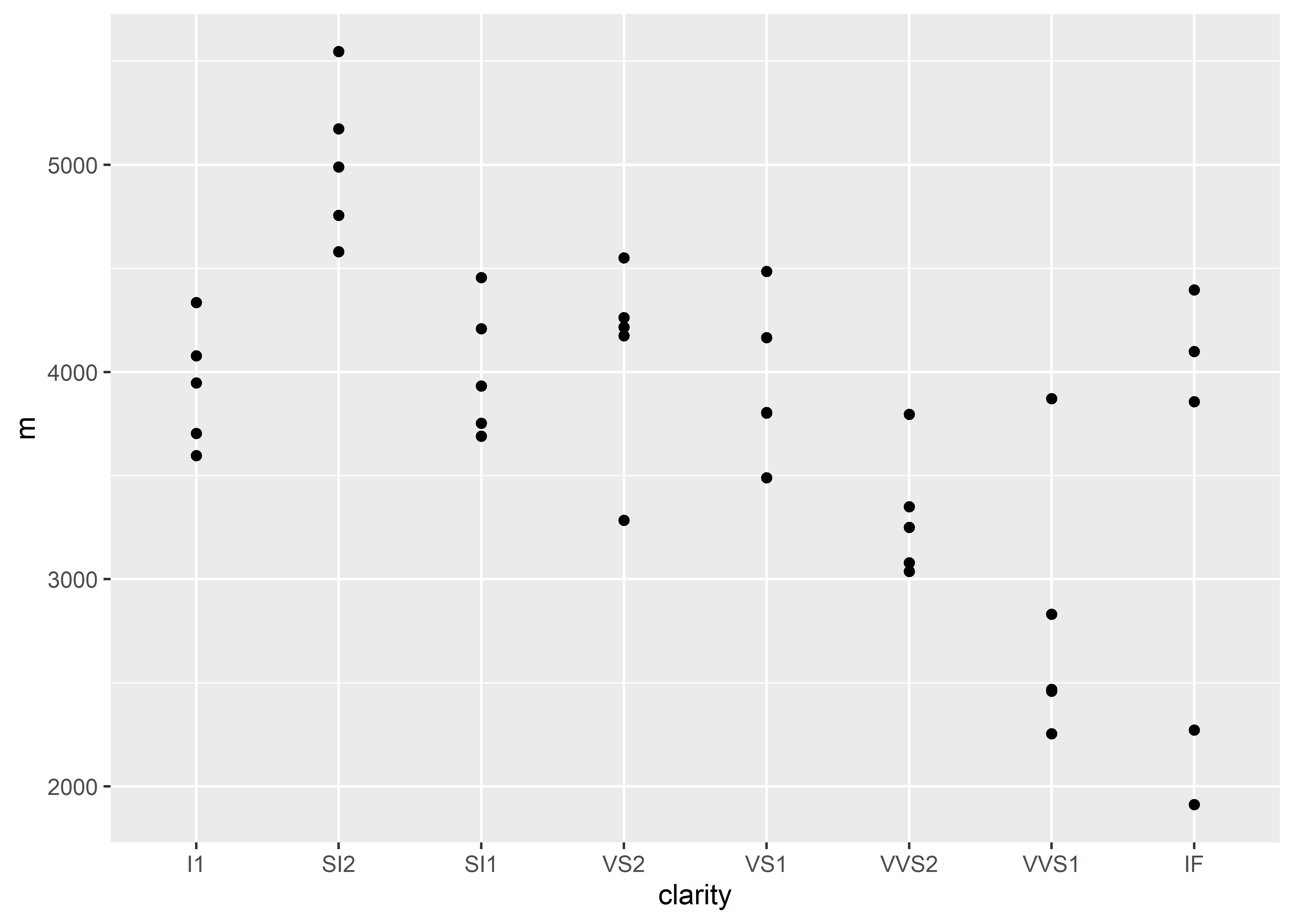
In this example, setting the color argument to a variable, cut, requires that the color argument be nested inside aes(). This is because the color argument in ggplot() is referring to coloring a particular variable, not just the data points (geom_point()) overall.
In order to specify that we want all data points displayed in a single color, we could execute:
diamonds %>%
  group_by(clarity, cut) %>%
  summarize(m = mean(price)) %>%
  ggplot(aes(x = clarity, y = m, group = cut)) +
  geom_point(color = "purple")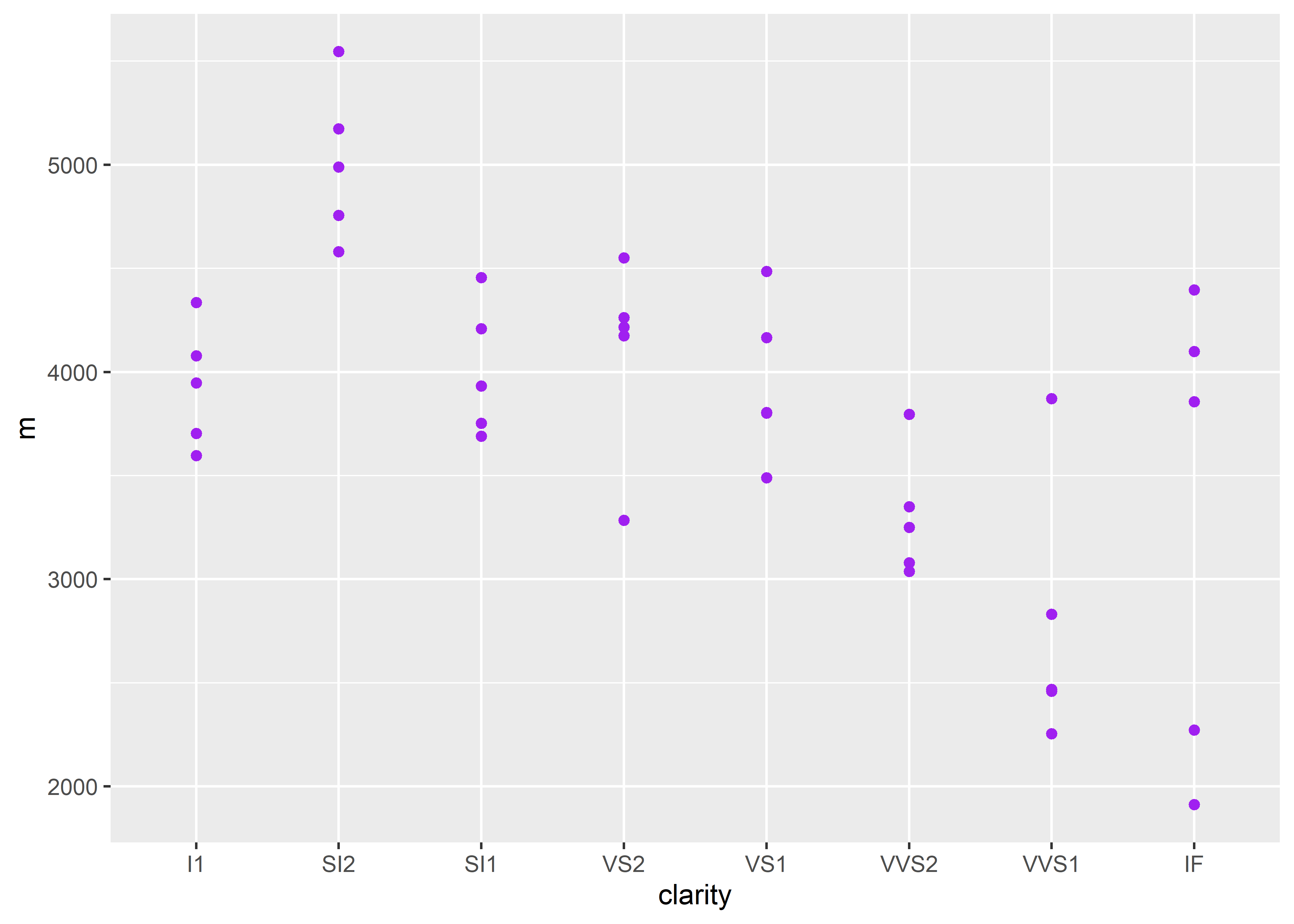
Notice that in order to specify a single color for all points, you must place the color argument outside of aes() under the specific geom element. Here, the color of the data points does not consider each cut category – the color is the same across all cuts (Fair, Good, Very Good, etc.).
When you place a color argument inside aes(), R recognizes the argument’s value as a variable.
diamonds %>%
  group_by(clarity, cut) %>%
  summarize(m = mean(price)) %>%
  ggplot(aes(x = clarity, y = m, group = cut)) +
geom_point(aes(color = "purple")) 
OR
diamonds %>%
  group_by(clarity, cut) %>%
  summarize(m = mean(price)) %>%
  ggplot(aes(x = clarity, y = m, group = cut, color = "purple")) +
geom_point() 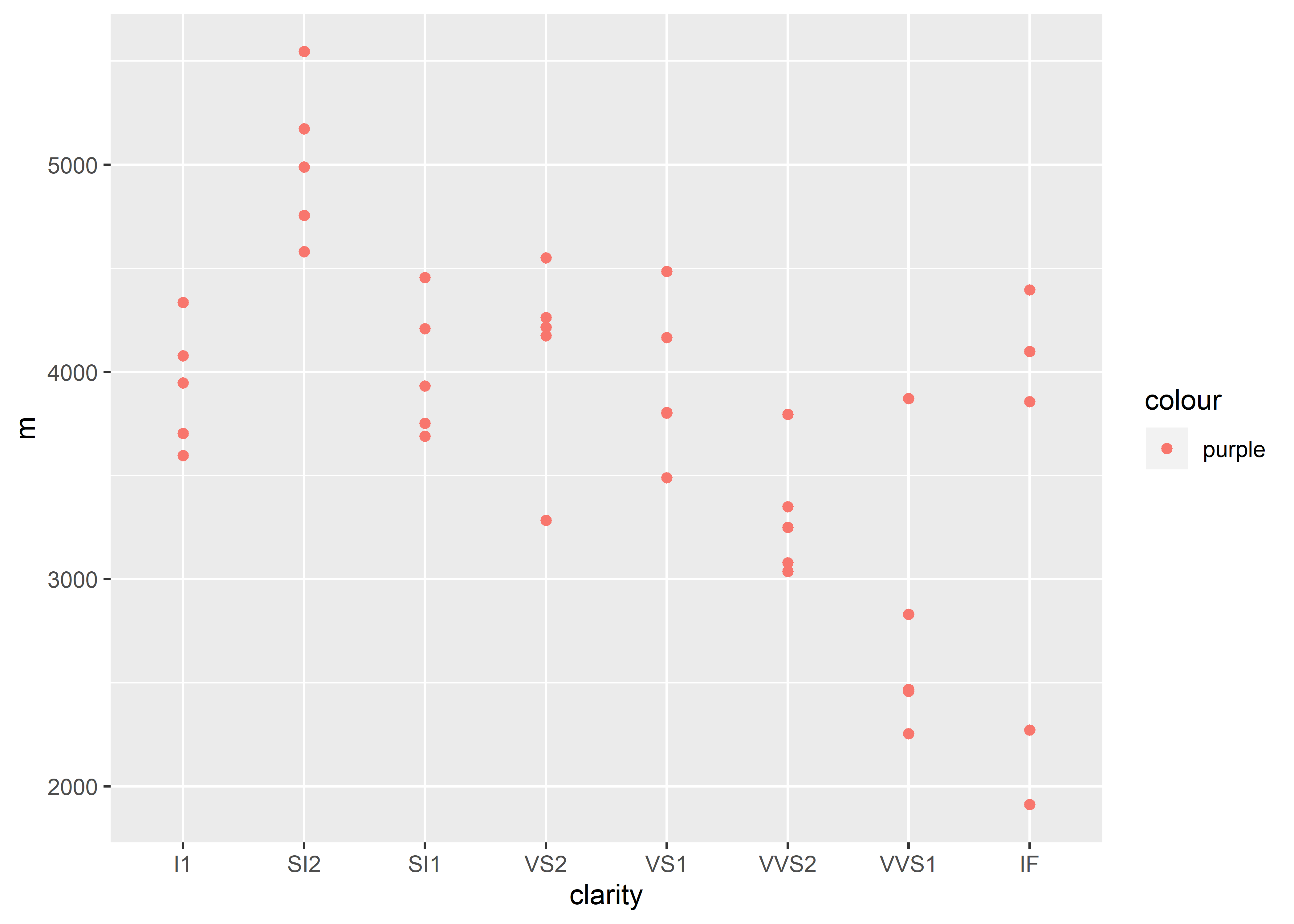
In the above examples, R thinks that “purple”" represents a variable name (notice the legend). We know that the user is attempting to color the data points purple, but R does not logically evaluate the code as such. R has a predetermined method in which it determines how code is read and will not “fill in the blanks” and assume the user intended actions.
Though “purple”" is not an existing variable name in the diamonds dataset, R still recognizes that the code is attempting to change the color. As a result, R will default to the color red.