10.9 Themes
In this section, we are going to focus on beautifying your graph. Although some find the grey gridlines aesthetically pleasing, they are often not considered “publication quality”" graphs by many. Thankfully, the ggplot2 package has some built-in theme functions that all beginning with theme_.
10.9.1 Pre-made Themes
theme_classic() is one of my favorite themes to use when I want to create a quick, pretty graph. You’ll notice that this theme’s default does not contain grid lines:
diamonds %>%
  group_by(clarity, cut) %>%
  summarize(m = mean(price)) %>%
  ggplot(aes(x = clarity, y = m, group = cut, color = cut)) +
  geom_point() +
  geom_line() +
  facet_wrap(~cut, ncol = 2) +
  labs(x= "my x-axis label here",
       y = "my y-axis label here",
       title = "The title of my Graph here") +
  theme_classic()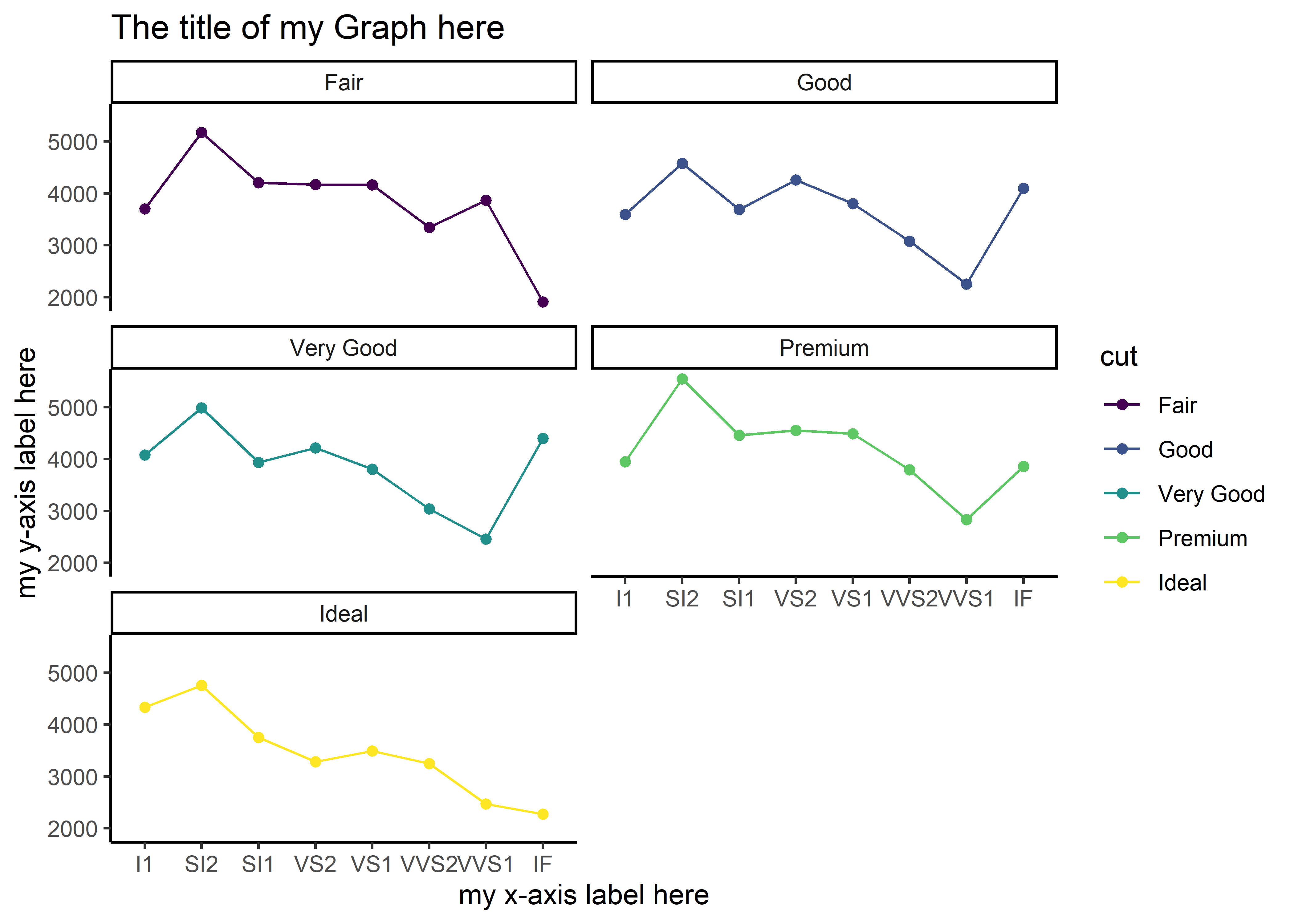
Built-in themes have varying default fonts, font sizes, color palettes, and other styling attributes. Another simple theme is theme_bw(), which is a black and white theme. There are many other theme options for R out there that others have created. The ggthemes package (installation is required for use of this package), for example, contains additional themes that work with the ggplot2 graphs; remember that you must install this package and load the library in order to utilize the themes. All of these pre-made themes make it easy and relatively painless to beautify your graph. The alternative is to change aspects of your graph manually.
10.9.2 Customizing the Theme
Sometimes, you may not like all of the design choices of a pre-made theme. In cases like these, you can choose to alter certain aspects under the theme() function. In the help page (?theme), you’ll find a list of the different graphing components that can be altered. To alter these components, you will often have to specify which element (the text, lines, etc.,) of the component you want altered. In this section, we will explore some of the customization options.
10.9.3 Theme Components and Elements
The components of a ggplot theme can be manually altered. For the many different theme components, we can specifically target an element of the component. For more information on theme components, execute ?theme. For more information on theme elements, execute ?margin.
| Examples of Theme Components | Example of Theme Elements |
|---|---|
| axis.title | element_blank |
| axis.ticks | element_rect |
| axis.line | element_line |
| legend.background | element_text |
| legend.position | |
| legend.text | |
| legend.title | |
| panel.border | |
| strip.text |
The basic structure for making manual changes to the theme:
- The
theme()function is added to the existingggplot()code:
data %>% ggplot(aes(x, y)) + geom_point() + geom_line() + theme()
- Components are nested within
theme()and must be defined (=, one equal sign) with an element....is shorthand for “the same code as before” (i.e.,data %>% ggplot() + geom_point() + geom_line():
... theme(axis.title = element_blank())
or
... theme(axis.title = element_text(color = "blue", face = "italic"))
- Defining a component with a pre-set value (see the help pages for details on the available pre-set values):
... + theme(legend.position = "left")
*Remember that one equal sign (=) represents the phrase “is defined as” and two equal signs represents the phrase “is equal to”. They cannot be used interchangeably! Double equal signs (==) are usually used to specify a value within a variable that already exists whereas single equal signs add new definitions.
Not all components require element specification (see above example) and not all elements are available for each component. For example, the legend.position component does not accept element_text, because the position of a legend requires a location (left, right, etc.)! Defining the legend.position with an element will result in an error message!
In the upcoming sections, we will learn a few different theme manipulations. As always, refer to the internet (e.g., Stacked Overflow) for additional guidance.
10.9.3.1 Removing the Legend Title
The element_blank() function, used within the graph component legend.title, will achieve this:
diamonds %>%
  group_by(clarity, cut) %>%
  summarize(m = mean(price)) %>%
  ggplot(aes(x = clarity, y = m, group = cut, color = cut)) +
  geom_point() +
  geom_line() +
  facet_wrap(~cut, ncol = 2) +
  labs(x= "my x-axis label here",
       y = "my y-axis label here",
       title = "The title of my Graph here") +
  theme(legend.title = element_blank()) # removes legend title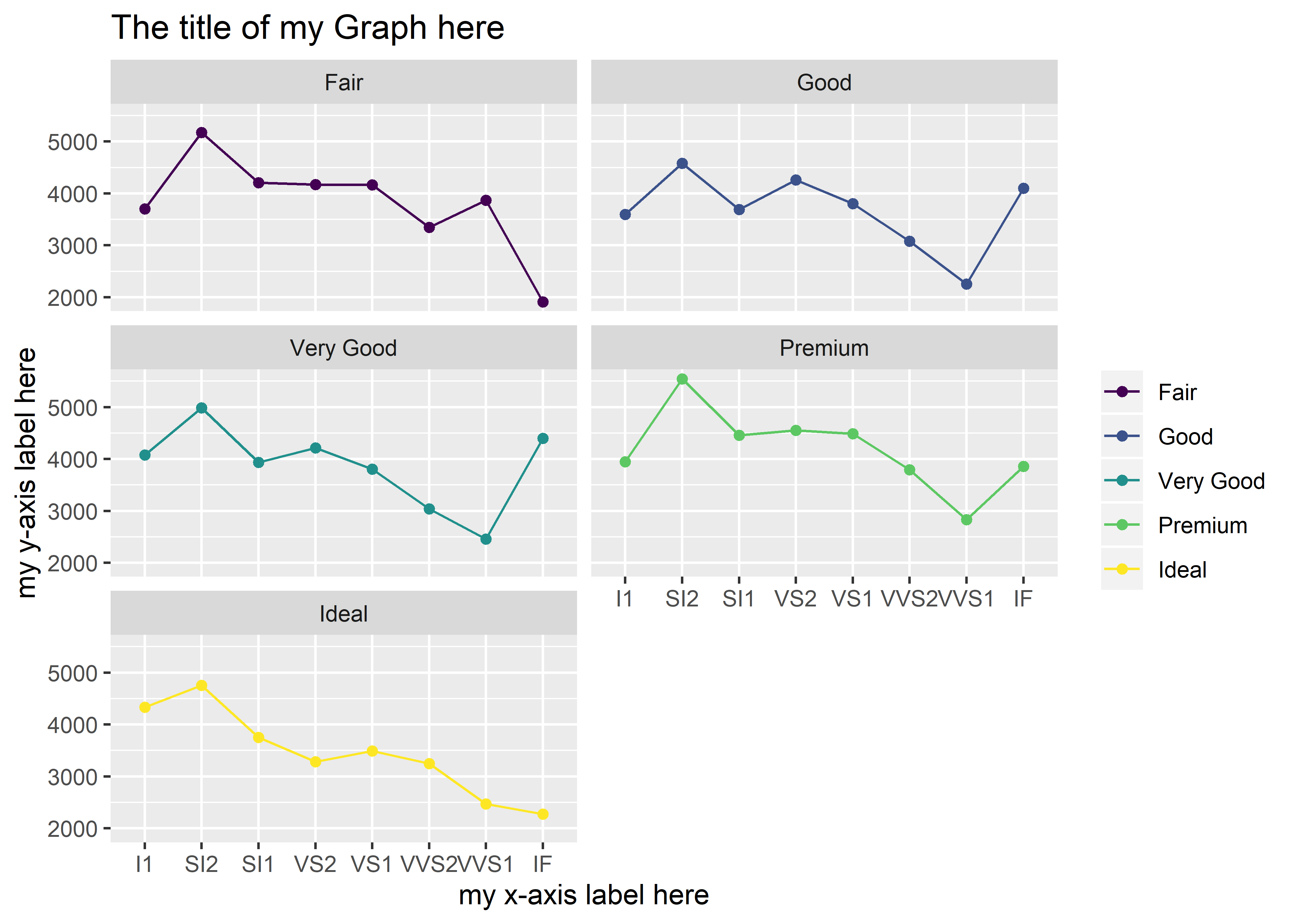
Notice that the cut label is no longer above the legend.
10.9.4 Centering and Bolding the Plot Title
Because these changes involve the text of the plot title, the element_text() function is more appropriate here.
diamonds %>%
  group_by(clarity, cut) %>%
  summarize(m = mean(price)) %>%
  ggplot(aes(x = clarity, y = m, group = cut, color = cut)) +
  geom_point() +
  geom_line() +
  facet_wrap(~cut, ncol = 2) +
  labs(x = "my x-axis label here",
       y = "my y-axis label here",
       title = "The title of my Graph here") +
  theme(legend.title = element_blank(),
        plot.title = element_text(hjust = 0.5, face = "bold")) # alters the plot.title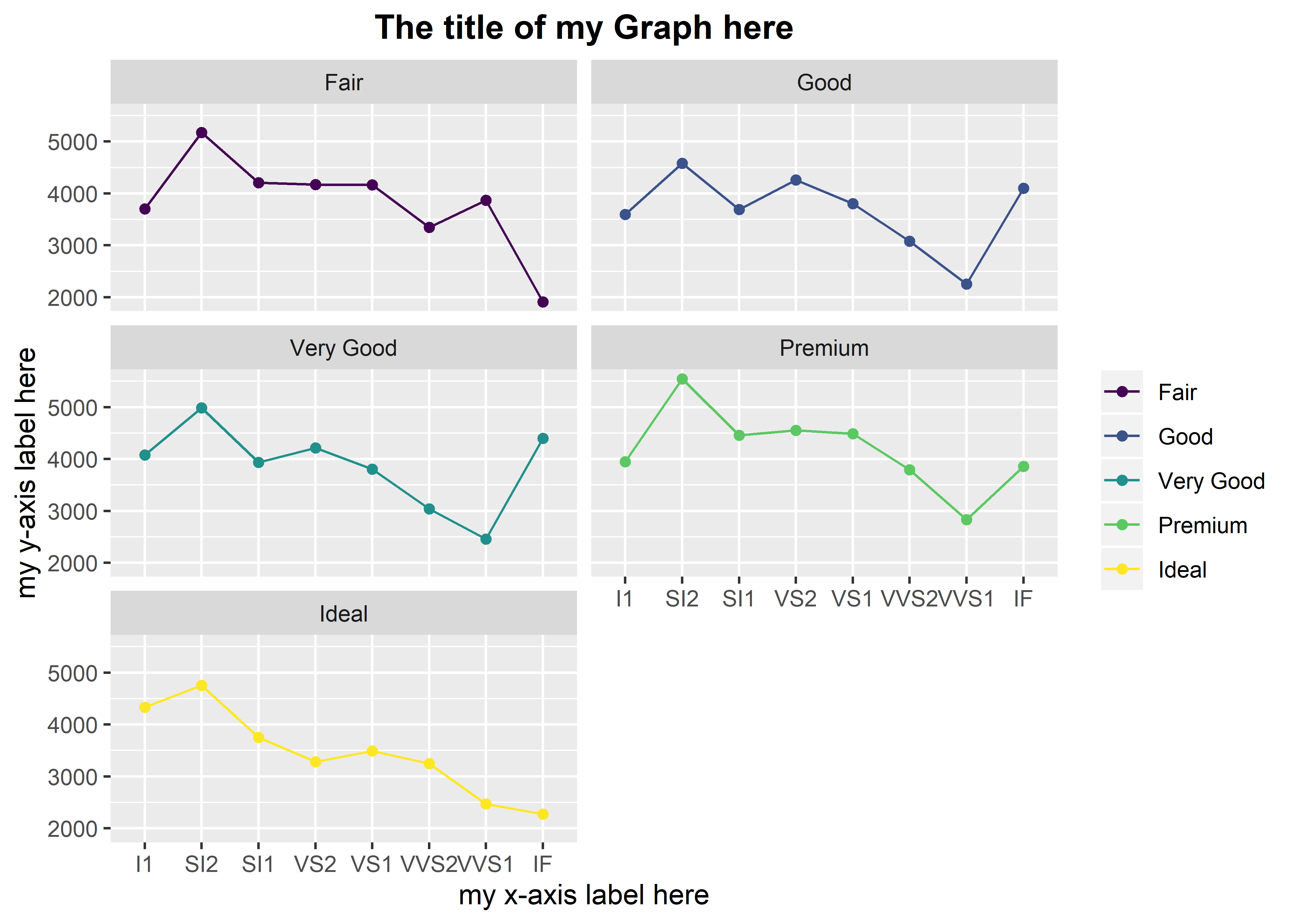
Notice that multiple changes can be added, separating each change with a comma. In plot.title = element_text(hjust = 0.5, face = "bold"), hjust refers to the horizontal justification. That is, along the horizontal plane, the text should sit halfway across the graph (hence, 0.5). The default value for hjust is 0, which aligns the text to the left. To align the text to the right, the value of hjust needs to equal 1. There is also the option to align the text somewhere in between 0 and 1 other than 0.5. The face argument refers to the font face, which can be bold, italic, bold.italic, or the default plain.
e.x. hjust = 0.24 face = “bold.italic”
There are many different options for customizing graph elements. Just as you can change the size, color, and line type of the data points and lines, you can change the aesthetic of just about any other graph element.
10.9.5 Exercises
Using the following foundation, manually adjust the theme accordingly. Each exercise is separate from the others, so make sure to only change components listed within an exercise (i.e., each exercise must start with the base graph below):
diamonds %>%
  group_by(clarity, cut) %>%
  summarize(m = mean(price)) %>%
  ggplot(aes(x = clarity, y = m, group = cut, color = cut)) +
  geom_point() +
  geom_line() +
  facet_wrap(~cut, ncol = 2) +
  labs(x = "my x-axis label here",
       y = "my y-axis label here",
       title = "The title of my Graph here")
Change the plot title to an italic face. Did you remember to add the
theme()argument?Change the plot title to a bold and italic face (hint: check out the
?marginhelp page).Change the legend title to a bold face (hint: you will need to replace
element_blank()withelement_text()).Align the legend title to a horizontal justification of 0.5.
Align the legend title to a horizontal justification of 0.75.
For the legend title, set the value of the “face” argument equal to 2 (
face = 2). What do you see here? What happens when face = 3? face = 4?Change the size of the plot title to 5 (hint: within
element_text(), entersize = 5).Change the font family of the plot title to “Times New Roman” (hint:
family = "Times New Roman").Remove the legend entirely (hint: legend.position = “none” directly within
theme()). Do you still have the legend.title argument under theme() as well? Does it make sense to keep this argument for this specific example (why not)?Under
theme(), execute legend.position = c(0.90, 0.55). What happened? Change it toc(0.90, 0.20). Change it toc(0.9, 1). Change it toc(0.2, 1)and bold the legend title.Color the plot title blue (hint: color = “blue”).
Remove the plot title using
element_blank(). What’s a simpler way of doing this?Change the angle of the x-axis labels to 45 degrees (hint: use
axis.text.x.bottom()andelement_text())Fill the
plot.background()with the color blue (hint: useplot.backgroundandelement_rect())Remove the major panel grids (hint: use
panel.grid.majorandelement_blank())Remove the minor panel grids
Remove the panel background
Change the axis line to a dotted black line (hint: use
axis.line(),element_line(),linetype = "dotted", color = "black")Perform exercises 15-18 in a single graph
Add a size 5 panel border (hint: use
panel.border(),element_rect,size = 5,fill = NA). What happens when you don’t specifyfill = NA?
10.9.6 Customizing Pre-made Themes
You can also opt to use a pre-made theme in addition to manual modifications. This can save time, especially if you like some style components from the pre-made theme. For example, I do like how theme_classic() removes the ugly gridlines and formats the facet titles, so I’m going to keep theme_classic() but manually remove the legend title:
diamonds %>%
  group_by(clarity, cut) %>%
  summarize(m = mean(price)) %>%
  ggplot(aes(x = clarity, y = m, group = cut, color = cut)) +
  geom_point() +
  geom_line() +
  facet_wrap(~cut, ncol = 2) +
  labs(x= "my x-axis label here",
       y = "my y-axis label here",
       title = "The title of my Graph here") +
  theme_classic() + # adding a built-in theme
  theme(legend.title = element_blank()) # adding custom theme edits
There is an endless plethora of design choices one can make with a graph – more than this guide can cover. Luckily, there is also an abundance of resources that can help you modify your graph.