10.5 Grouped Aesthetics
The ggplot2 has a lot of built-in aesthetics for color, point shapes, line types, etc. The easiest ways to know your options is to complete an internet search for phrases such as:
ggplot2 colors
ggplot2 point shapes
ggplot2 line types
Here is a quick list of built-in aesthetic options:
10.5.1 Colors
Colors values can be entered in as string/word form. Both British and American spellings are accepted (i.e., grey and gray; color and colour). There is a list of over 600 colors to choose from by their explicit name – execute colors() for a full list:
ex.
"purple","pink","grey","steelblue2"
Colors can also be specified by a hexadecimal code. This is a six digit code that defines a color by various levels of red, blue, and green (#RRGGBB)
ex.
"#FF0000","#FFD700","#FF6347"
There are also color palette packages that allow you to change the color themes (e.g., RColorBrewer and wesanderson are examples of such packages)
10.5.2 Point Shapes
Shapes of data points are specified with a designated integer label. The shape argument is typically placed within the geom_point() element. A list of options can be found in the ??aes vignette. The number labels range from 0-25 for standard shapes, where 21-25 are shapes that can use a fill argument (more on fill later).
10.5.3 Line Types
The linetype argument can be used to change the aesthetic of lines. There are six various line types that can be specified by an integer label or a character/string:
1or"solid"2or"dashed"3or"dotted"4or"dotdash"5or"longdash"6or"twodash"
or

Again, I recommend referring back to the ??aes vignette to view the various aesthetic options. This help page will list the names and integer codes for each aesthetic option.
10.5.4 Examples
For the upcoming example, the sem function must be loaded to the environment:
sem <- function(x, na.rm = FALSE) {
out <-sd(x, na.rm = na.rm)/sqrt(length(x))
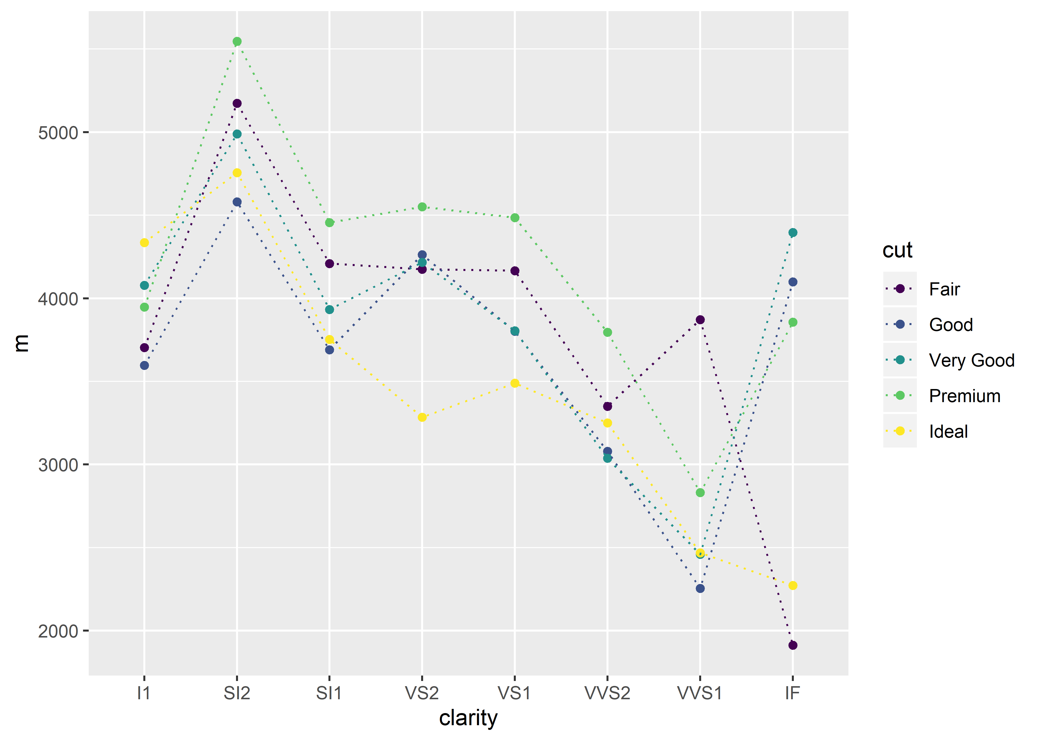
return(out)}Suppose that you want to set the line type for all cut categories in the diamonds dataset to the built-in linetype option called “dashed” or 2. Remember that line types can be referred to by their name or by their unique integer. In this example, we will use the integer.
diamonds %>%
  group_by(clarity, cut) %>%
  summarize(m = mean(price),
            se = sem(price)) %>%
  ggplot(aes(x = clarity, y = m, group = cut, color = cut)) +
  geom_point() +
  geom_errorbar(aes(ymin = m - se, ymax = m + se)) +
  geom_line(linetype = 2)
Notice that in this above case, the line type was placed outside of the aes() function. Since we want all line types in the graph to have dashed connecting lines, this information will not be enclosed in aes().
In a similar manner, the data points can be collectively changed in shape. Here, the shape of each data point was changed to an asterisk (i.e., shape number 8):
diamonds %>%
  group_by(clarity, cut) %>%
  summarize(m = mean(price),
            se = sem(price)) %>%
  ggplot(aes(x = clarity, y = m, group = cut, color = cut)) +
  geom_point(shape = 8) +
  geom_errorbar(aes(ymin = m - se, ymax = m + se)) +
  geom_line()
You can also choose a shape in which a separate fill argument is required. These shapes are listed in the aes vignette (??aes).
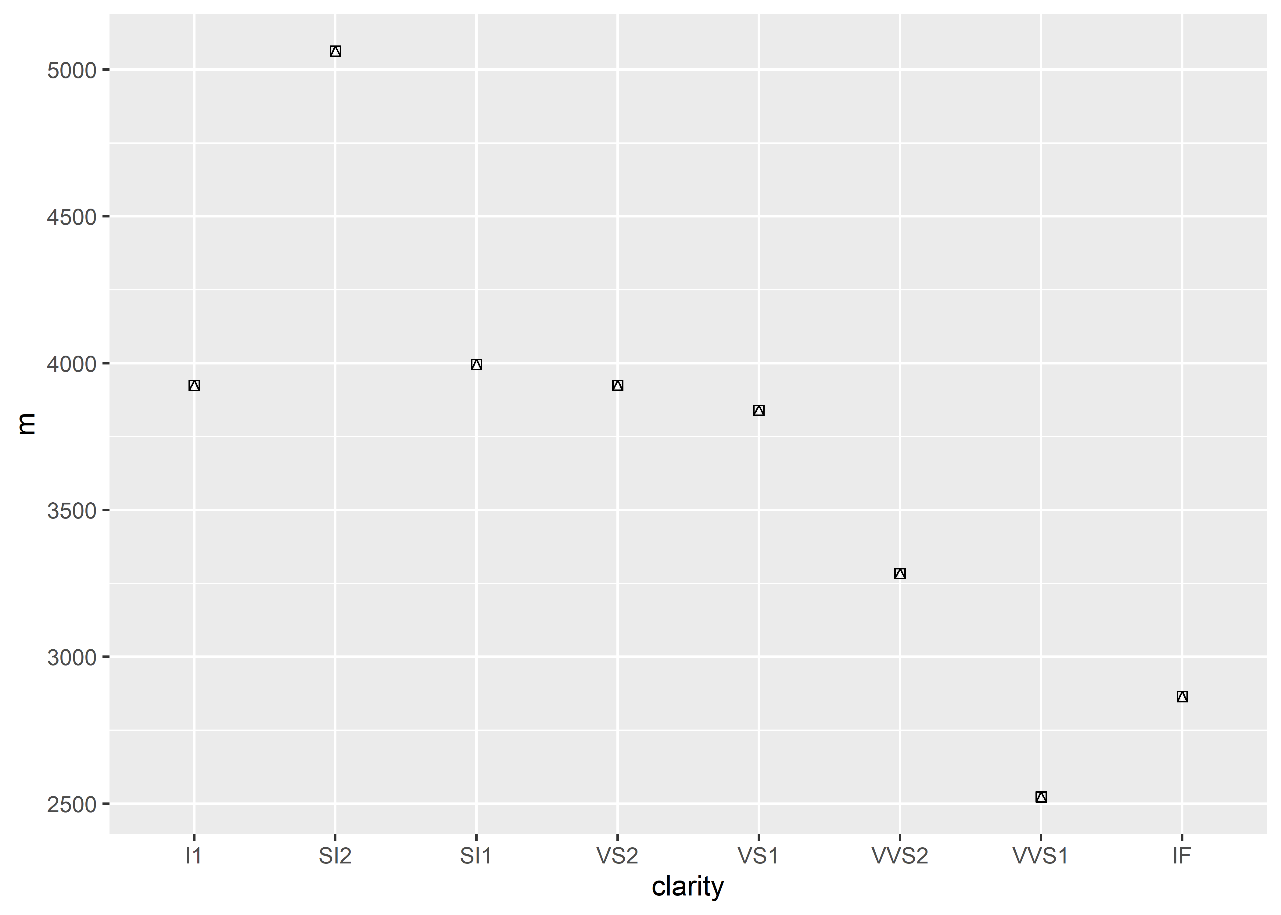
Changing the shape to 22 will produce empty square data points:
diamonds %>%
  group_by(clarity, cut) %>%
  summarize(m = mean(price),
            se = sem(price)) %>%
  ggplot(aes(x = clarity, y = m, group = cut, color = cut)) +
  geom_point(shape = 22) +
  geom_errorbar(aes(ymin = m - se, ymax = m + se)) +
  geom_line()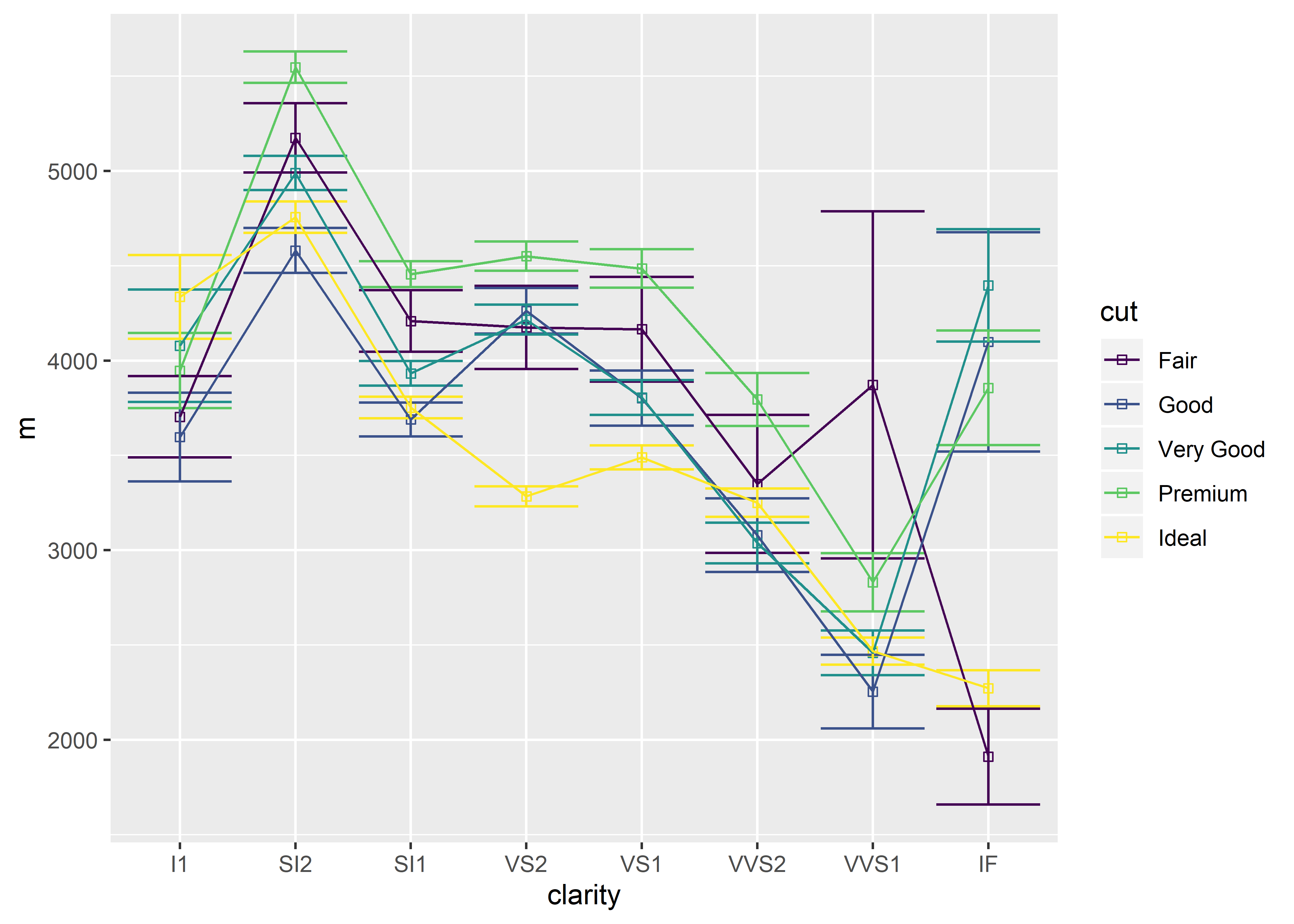
By adding a fill argument, these data points can be filled with a specific color:
diamonds %>%
  group_by(clarity, cut) %>%
  summarize(m = mean(price),
            se = sem(price)) %>%
  ggplot(aes(x = clarity, y = m, group = cut, color = cut)) +
  geom_point(shape = 22, fill = "purple") +
  geom_errorbar(aes(ymin = m - se, ymax = m + se)) +
  geom_line()
It can be a little hard to see that the data points are filled because they lay underneath the other geom elements. In this case, it is wise to overlay the data points by shifting geom_point() down to the bottom of your code (see previous section about Layering Order).
diamonds %>%
  group_by(clarity, cut) %>%
  summarize(m = mean(price),
            se = sem(price)) %>%
  ggplot(aes(x = clarity, y = m, group = cut, color = cut)) +
  geom_errorbar(aes(ymin = m - se, ymax = m + se)) +
  geom_line() +
  geom_point(shape = 22, fill = "purple")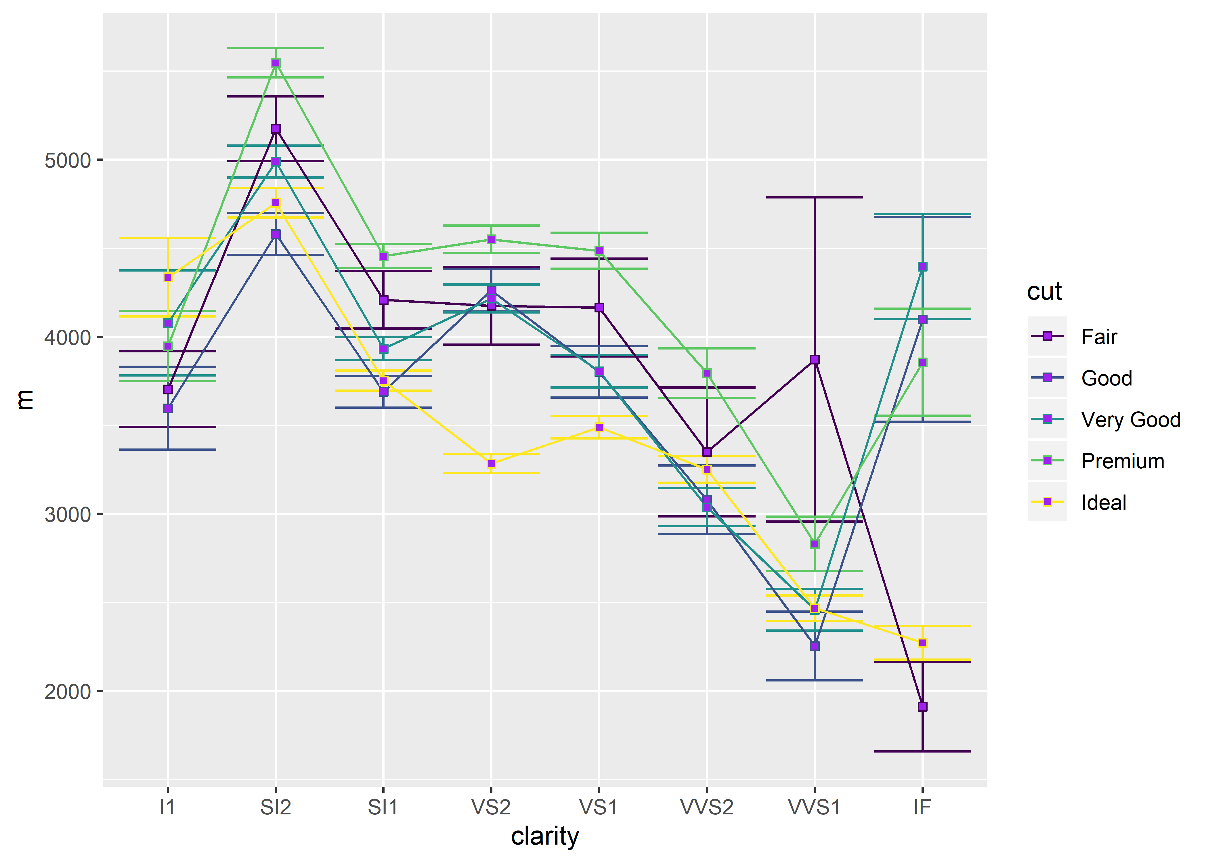
We can also adjust the size of each data point to further improve visuals:
diamonds %>%
  group_by(clarity, cut) %>%
  summarize(m = mean(price),
            se = sem(price)) %>%
  ggplot(aes(x = clarity, y = m, group = cut, color = cut)) +
  geom_errorbar(aes(ymin = m - se, ymax = m + se)) +
  geom_line() +
geom_point(shape = 22, fill = "purple", size = 4) 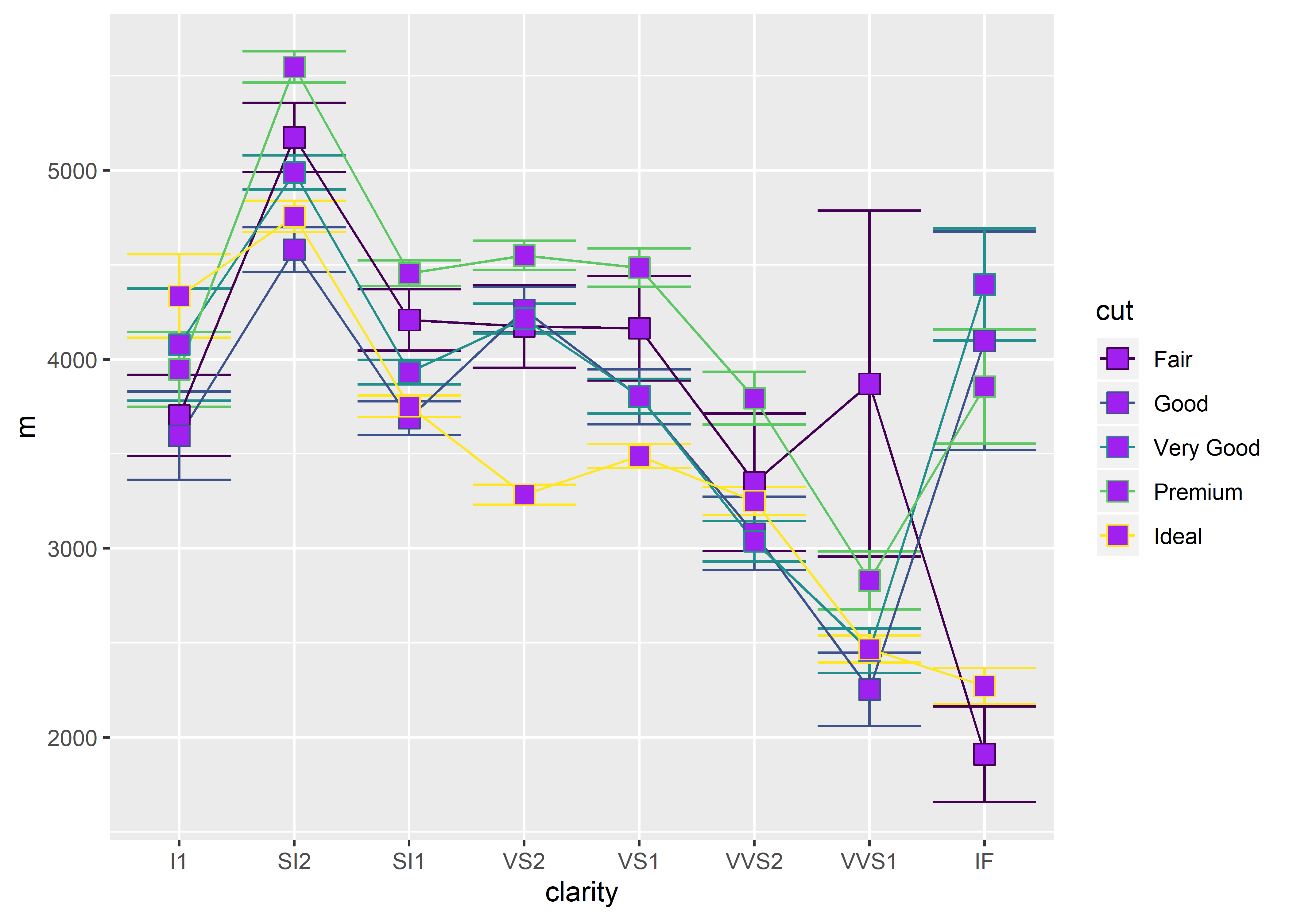
The size can be adjusted to any numeric value (including decimals).