11.1 Bar Graph
Let’s continue to use our graph from diamonds but replace geom_point() with geom_bar(). Here, we are graphing the average (mean) price of the diamonds by cut category.
diamonds %>%
  group_by(clarity, cut) %>%
  summarize(m = mean(price)) %>%
  ggplot(aes(x = clarity, y = m, group = cut, fill = cut)) +
geom_bar(stat = "identity") 
In geom_bar(), the default dependent measure is the count (i.e., stat = "count" by default). In the above example, we’ve overridden the default count value by specifying stat = "identity". This indicates that R should use the y-value given in the ggplot() function. Notice that bar graphs use the fill argument instead of the color argument to color-code each cut category.
If we execute this same code without stat = "identity", this will result in an error:
# produces error due to unnecessary y variable
diamonds %>%
  group_by(clarity, cut) %>%
  summarize(m = mean(price)) %>%
  ggplot(aes(x = clarity, y = m, group = cut, fill = cut)) +
  geom_bar() # removed stat = "identity" from geom_bar()
By default, R will assume that the stat argument of geom_bar() is set to "count". If we set stat to equal count, R will count how many observations (read: rows of data) there are has for each clarity (x-variable) in the diamonds dataset. Since R is counting how many diamonds there are for each clarity with stat = "count", we do not need to include a y-variable (dependent variable) in ggplot():
# graphing the frequency/count of the clarity categories
diamonds %>%
  group_by(clarity, cut) %>%
  ggplot(aes(x = clarity, group = cut, fill = cut)) + # removed y argument and value
  geom_bar()
# is the same as this:
diamonds %>%
  group_by(clarity, cut) %>%
  ggplot(aes(x = clarity, group = cut, fill = cut)) +
  geom_bar(stat = "count") # stat = "count" is implied in the first example
In summary: we need to be mindful of the value we assign to the stat argument within the geom_bar() function. If it is stat = "identity", we are asking R to use the y-value we provide for the dependent variable. If we specify stat = "count" or leave geom_bar() blank, R will count the number of observations based on the x-variable groupings.
11.1.1 Exercises
- In the above code, replace
fill = cutwithcolor = cut. What happened?
diamonds %>%
  group_by(clarity, cut) %>%
  summarize(m = mean(price)) %>%
  ggplot(aes(x = clarity, y = m, group = cut, color = cut)) + # changed fill = cut tp color = cut
geom_bar(stat = "identity") - Set
geom_bar()’spositionargument equal to"dodge"using the code below. What do you see?
diamonds %>%
  group_by(clarity, cut) %>%
  ggplot(aes(x = clarity, group = cut, fill = cut)) +
geom_bar(position = "dodge")- You can also choose to specify how far the bars dodge each other with
position = position_dodge():
# Try editing the number within the position_dodge() function:
# notice how the bars overlap at a 0.5 value
diamonds %>%
  group_by(clarity, cut) %>%
  ggplot(aes(x = clarity, group = cut, fill = cut)) +
geom_bar(position = position_dodge(0.5)) # manually determining the dodge distance- Plot cut (x-axis) vs. price (y-axis)
# this calculates the total cost of all diamonds within each clarity category
# for example: "the cumulative cost of all diamonds with an I1 clarity is $2,907,809"
diamonds %>%
  ggplot(aes(x = clarity, y = price)) +
  geom_bar(stat = "identity")

# to calculate the average price of diamonds per each clarity:
diamonds %>%
  group_by(clarity) %>%
  summarize(m = mean(price)) %>% # defined m as the mean price of the diamonds dataset
  ggplot(aes(x = clarity, y = m)) +
  geom_bar(stat = "identity") +
  labs(y = "Mean Price of Diamonds",
       x = "Clarity Category")
Adding Error bars and facet wraps
- Notice how the error bars (standard deviation) overlay the bars themselves. Recall back to the line graph chapter that the order of graphing elements matters!
- Try repositioning
geom_errobar()abovegeom_bar()to see what happens!
diamonds %>%
  group_by(clarity, cut) %>%
  summarize(m = mean(price),
            s = sd(price)) %>% # standard deviation
  ggplot(aes(x = clarity, y = m, group = cut, color = cut, fill = cut)) + # what happens when you add both color and fill arguments? (hint: remove one argument at a time to see the difference)
  geom_bar(stat = "identity")+
  geom_errorbar(aes(ymin = m-s, ymax = m+s)) +
  facet_wrap(~cut)
Using the code from the previous example, rename the x and y-axes using
lab()Execute
?geom_bar()to check out some of the arguments that can be used for thisgeomelement.
diamonds %>%
  group_by(clarity) %>%
  summarize(m = mean(price)) %>% # defined m as the mean price of the diamonds dataset
  ggplot(aes(x = clarity, y = m)) +
  geom_bar(stat = "identity",
           show.legend = FALSE, # altering the show.legend argument
           color = "red",
           size = 1, # when we change the size, what are we really changing? (size of what?)
           alpha = .5) # what does changing the value of alpha do?
Using techniques we’ve learned from the line graph chapter, recreate the graph below:
- Use
group_by()forclarityandcut - Re-order the x-axis values of
clarityusingmutate()andfactor() - Calculate the mean and standard error (using the standard error function) for
pricewithinsummarize - Set the independent variable to clarity and dependent variable to mean price
- Set the
group,color, andfillto equalcut - Change the
sizeof the error bars to 0.2 and thewidthto 0.5 insidegeom_errorbar() - Change the y-axis tick intervals using
limits()andbreaks()withinscale_y_continuousto match the graph below (hint: values for those functions should include c(-numbers in here-)) - Change the x, y, and title labels using
labs() - Set the theme to
theme_classic() - Remove the legend title from the graph using
theme()andelement_blank()(note that this line must go aftertheme_classic()) - Center the plot title using
theme(),element_text, andhjust - Set the
position_dodge()to 0.9 for bothgeom_errorbar()andgeom_bar()
- Use
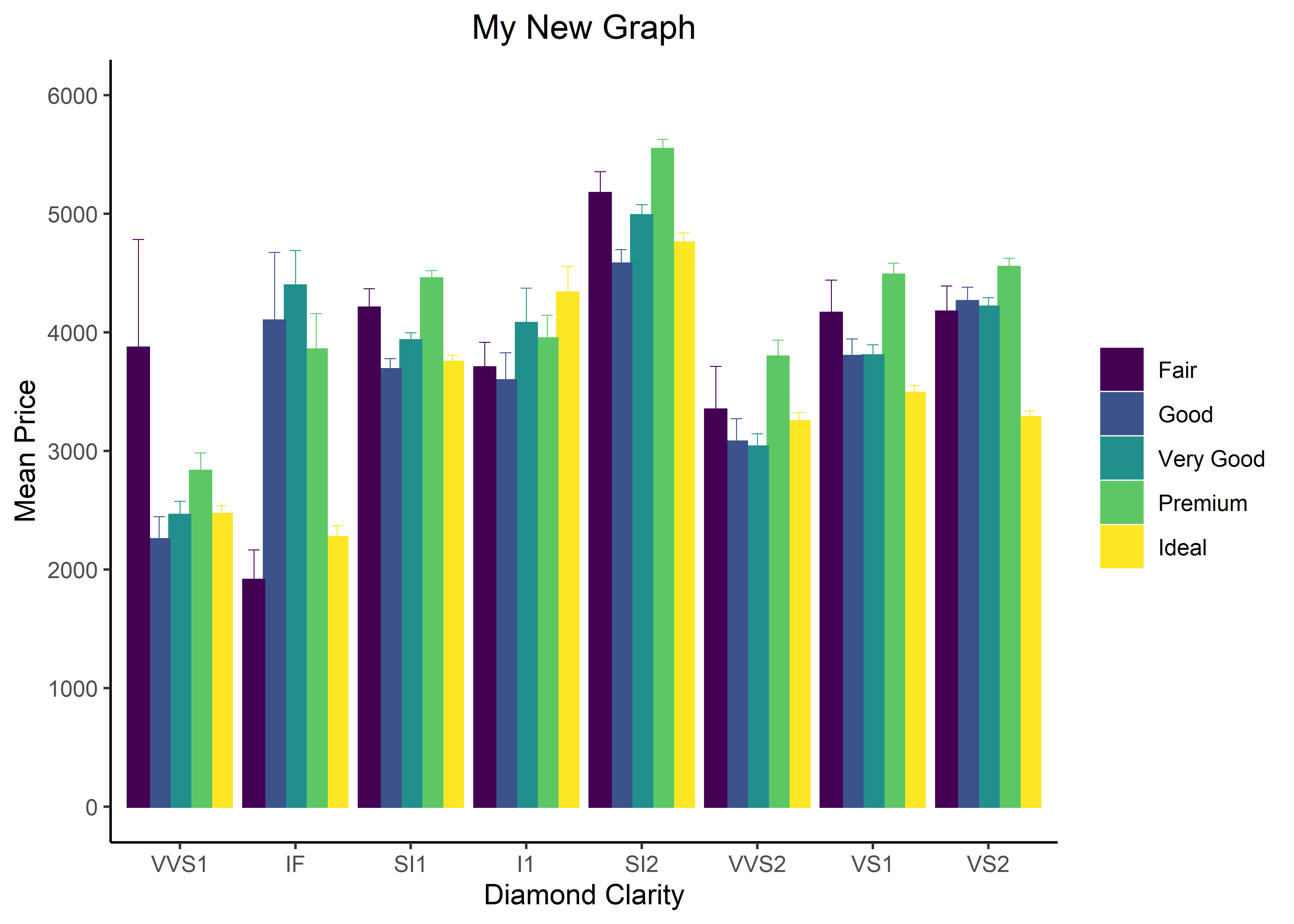
Figure 11.1: Product of the changes listed above.