8.4 Important Tidyverse Functions
Nearly all of the relevant examples of graphing in this guide requires a bit of tidyverse knowledge. Let’s start by creating a sample dataset:
## Creating an object named Subject
Subject <- c("Wendy", "Wendy", "Wendy", # you can press ENTER to auto-indent
             "John", "John", "John",    # the code. This produces better
             "Helen", "Helen", "Helen") # formatting for the user.

## Creating an object named Date
Date <- c("2019-08-08", "2019-09-05", "2019-12-07", "2019-08-08",
          "2019-09-05", "2019-12-07", "2019-08-08", "2019-09-05", "2019-12-07")

## Creating an object named Score
Score <- c(2, 15, 34,
           5, 10, 27,
           16, 8, 40)

## Creating an object
mydata <- tibble(Subject, Date, Score) | Subject | Date | Score |
|---|---|---|
| Wendy | 2019-08-08 | 2 |
| Wendy | 2019-09-05 | 15 |
| Wendy | 2019-12-07 | 34 |
| John | 2019-08-08 | 5 |
| John | 2019-09-05 | 10 |
| John | 2019-12-07 | 27 |
| Helen | 2019-08-08 | 16 |
| Helen | 2019-09-05 | 8 |
| Helen | 2019-12-07 | 40 |
Let’s pick two variables (Subject and Score) to graph the mydata dataset.
ggplot(mydata, aes(x = Subject, y = Score)) +
  geom_point()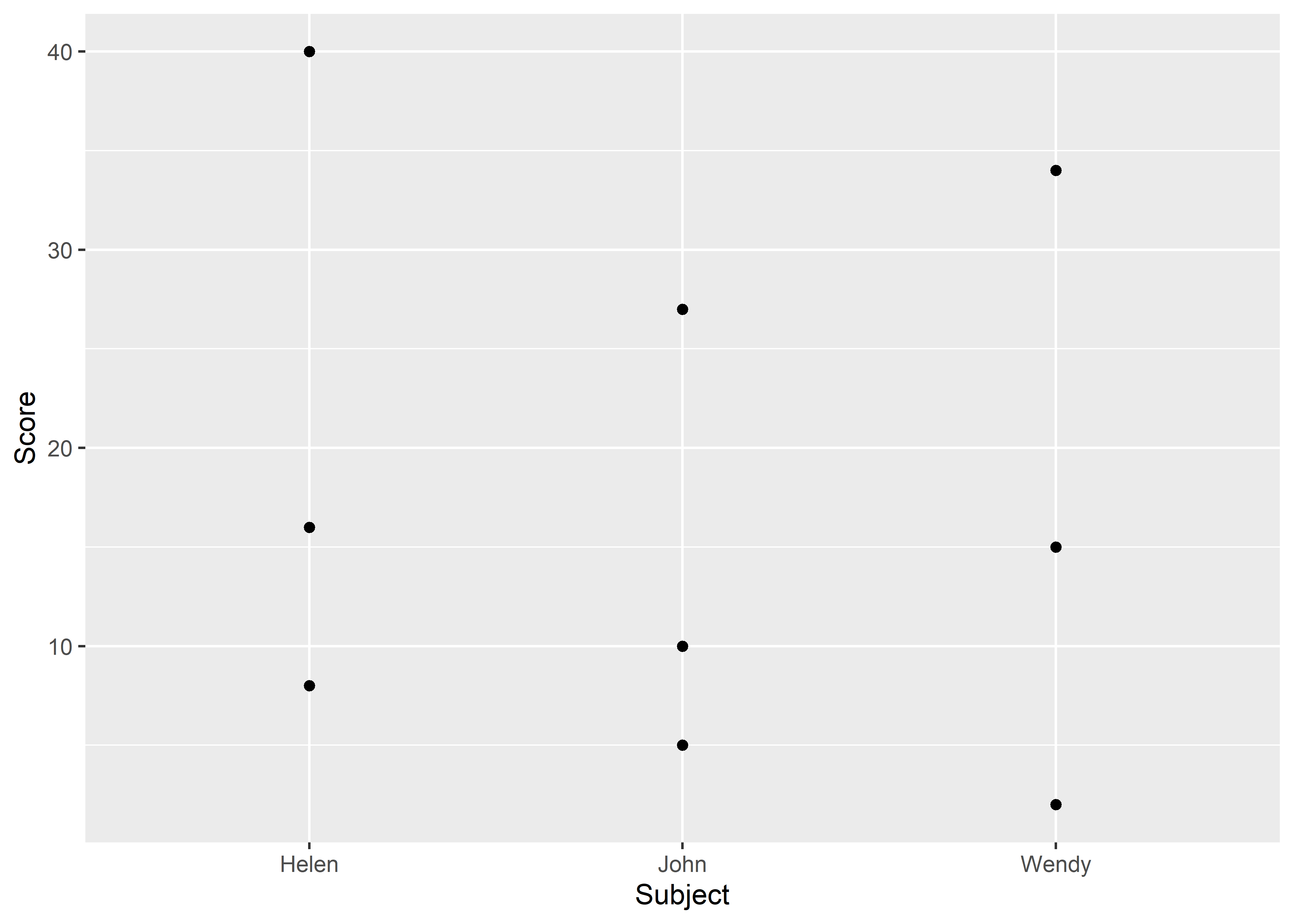
Figure 8.1: Graphing long data.
While it might be interesting to graph all of Helen, John, and Wendy’s scores, another useful graph might be to see the average scores for each person. There are at least two ways of setting up your graph:
Using the
stat_summarymethodUsing the
tidyversemethod
8.4.1 Using the stat_summary Method
One of the classic methods to graph is by using the stat_summary() function. We begin by using the ggplot() function, which requires the name of the dataset, we’ll use mydata from our previous example, followed by the aes() function that encompasses the x and y variable specifications. Next, we add on the stat_summary() function. For this function, we specify that we want to calculate the mean of the y axis in the first argument (fun.y asks what function to use for the y variable). Then, we specify what graphing/geom element to plot. Here, we specified that we want points (other options could be bar, line, etc.).
ggplot(mydata, aes(x = Subject, y = Score)) +
  stat_summary(fun.y = "mean", geom = "point")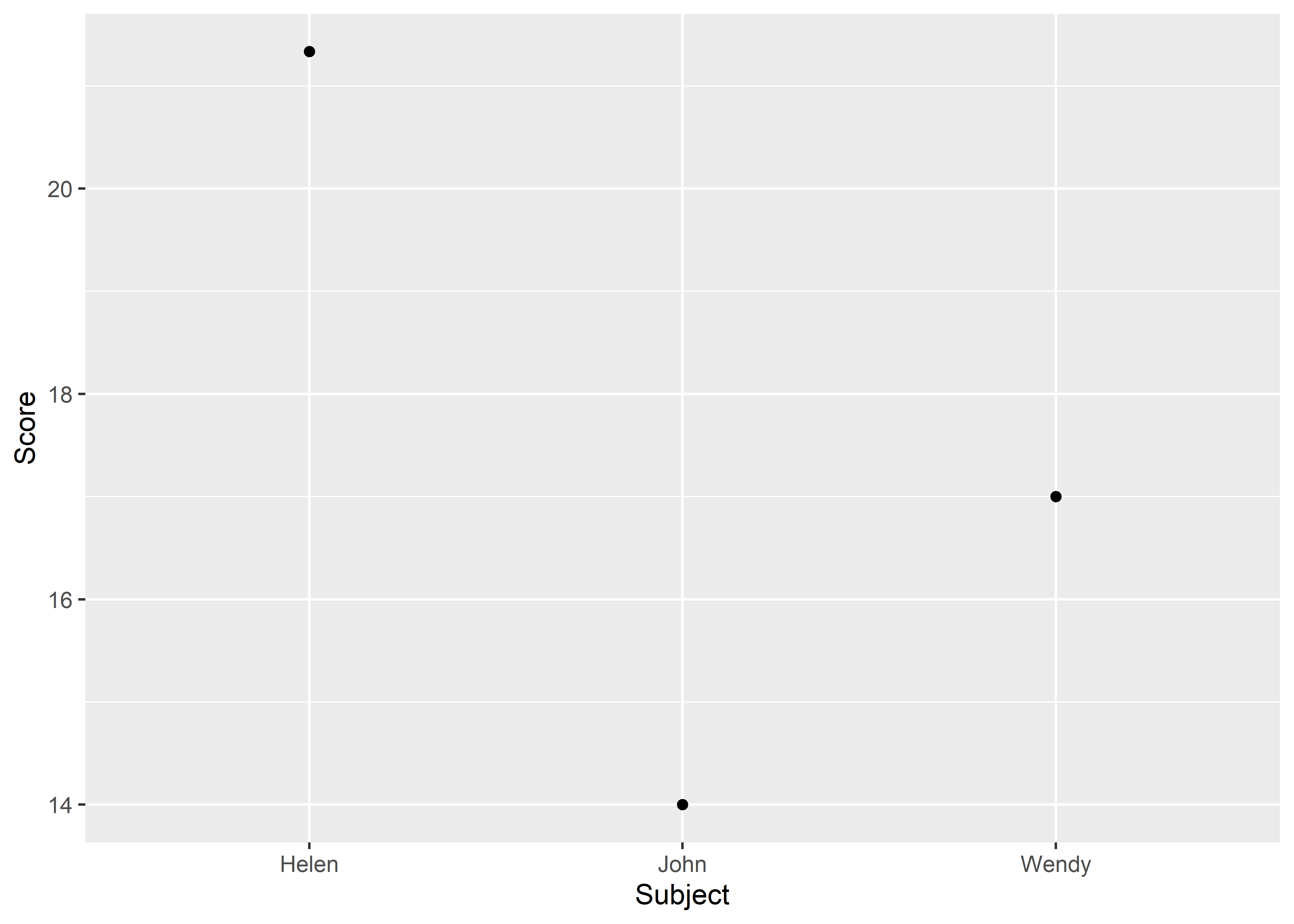
8.4.2 Using the tidyverse Method
The tidyverse method requires a bit more planning and preparation than the stat_summary method, but the end result is the same. However, the tidyverse method is my preferred method of coding for all other tasks (not just for graphing) because it is more user friendly (in my humble opinion). Let’s look at how the tidyverse code is set up.
mydata %>%                            # name of the dataset
  group_by(Subject) %>%               # grouping the data
  summarize(m = mean(Score)) %>%      # calculating the mean
  ungroup() %>%                       # ungroup the data
  ggplot(aes(x = Subject, y = m)) +   # set up the graph
  geom_point()                        # add data points on graph
For this example, the mean of Score was renamed to m. This was done in order to differentiate this set of values from the original values from Scores. That is, m represents averaged Score values whereas Score simply represents raw values. Additionally, we can always change the axes labels later to whatever we want using the labs() function; labs() will be introduced later in the chapter.
Let’s break down each line of the tidyverse code:
mydata %>%represents the name of the dataset. The pipe (%>%) represents the phrase “and then”, indicating that we want R to do more with the dataset.group_by(Subject) %>%indicates that we want to group the data by theSubjectvariable. We will learn more about thegroup_by()function in later chapters, but for the purposes of graphing, all we need to know is that we must group all variables that are considered our independent variables.Note that all of these grouping variables must be characters or factors. They should not be numeric or integers!
We can determine what variables need to be included in
group_by()for our graph by asking ourselves one question: Do I care about this variable’s values? If wegroup_by(Sex), as in biological sex, we are saying that we do want to see male and female data separately. Otherwise, R will graph the “average” person/organism, not accounting for males separately from females. If wegroup_by(Sex, Age), that means we care about females of eachAgevalue separately from males of eachAgevalue.In a typical graph, we may group up to 3 variables within the dataset. We will see examples of variable grouping in the upcoming sections.
8.4.3 Additional Practice
Recall that the diamonds dataset (explained in 5) has variables that measure the diamond’s clarity and the diamond’s cut. These variables both contain categorical values. That is, clarity values can only be: I1, SI2, SI1, VS2, VS1, VVS2, VVS1, and IF. Diamonds in the clarity category called “IF” are deemed as having flawless clarity. Similarly, cut values can only be in one of 5 categories (Fair, Good, Very Good, Premium, or Ideal). Notice that no single diamond in this dataset can be in two cut categories or two clarity categories at the same time!
The code below shows how to graph the clarity, cut, and price of every diamond using both graphing methods:
## stats_summary method
ggplot(diamonds,                                        # name of dataset
       aes(x = clarity,                                 # x-axis variable
           y = price,                                   # y-axis variable
           group = cut,                                 # grouping variable (legend)
           color = cut)) +                              # coloring the grouping variable
  stat_summary(fun.y = "mean", geom = "point") +        # adding data points
  stat_summary(fun.y = "mean", geom = "line") +         # adding connecting lines
  stat_summary(fun.data = "mean_se", geom = "errorbar") # adding error bars (standard error)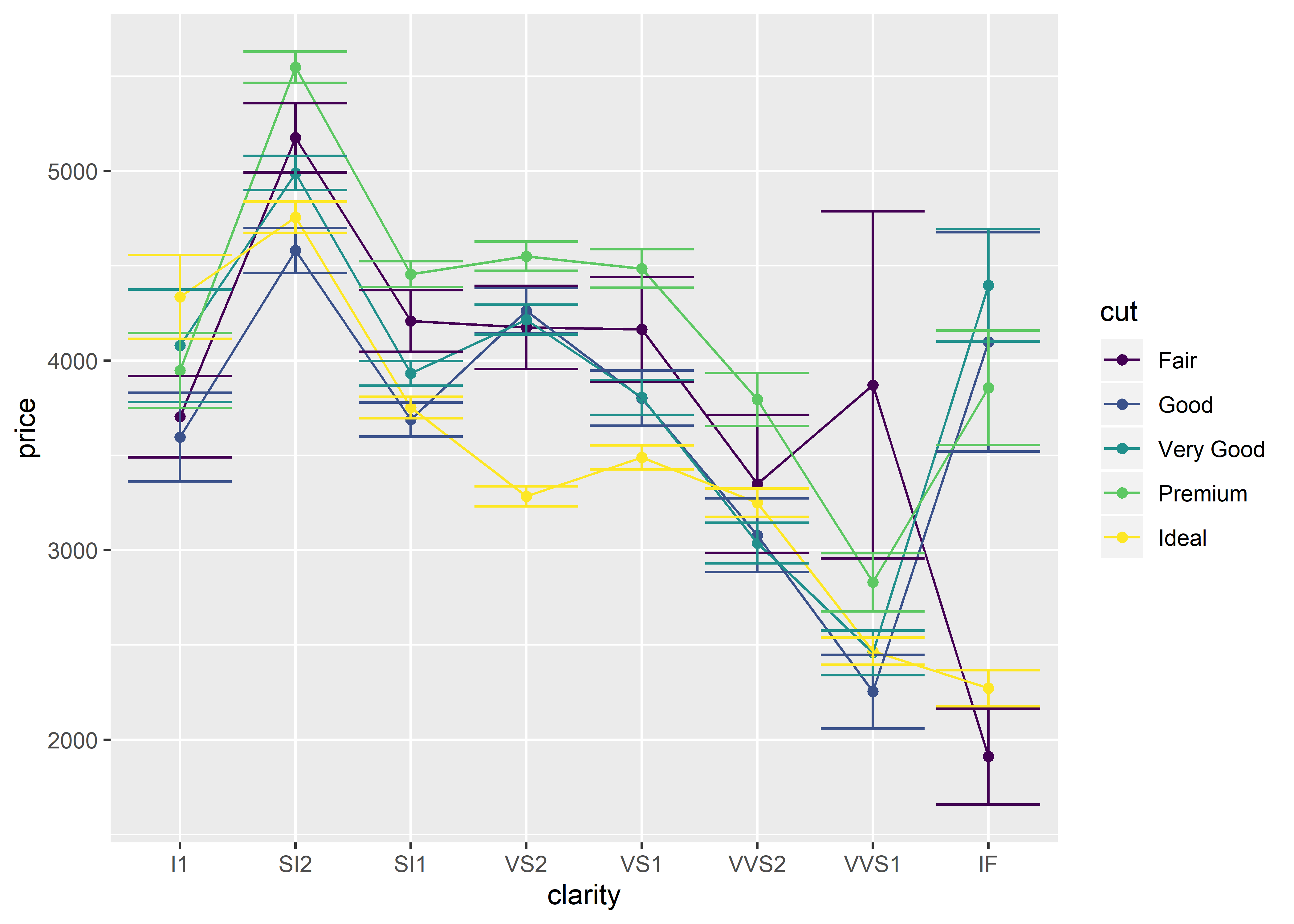
## tidyverse method
### first requires the 'sem' function to be loaded:
sem <- function(x, na.rm = FALSE) {
  out <-sd(x, na.rm = na.rm)/sqrt(length(x))
  return(out)
}

## graphing code
diamonds %>%                          # name of dataset
  group_by(clarity, cut) %>%          # grouping variables
  summarize(m = mean(price),          # calculating mean price
            s = sem(price)) %>%       # calculating standard error
  ggplot(aes(x = clarity,             # x-axis variable
             y = m,                   # y-axis variable
             group = cut,             # grouping variable
             color = cut)) +          # color the grouping variable
  geom_point() +                      # adding data points
  geom_line() +                       # adding connecting lines
  geom_errorbar(aes(ymin = m - s,     # adding lower error bars
                    ymax = m + s))    # adding upper error bars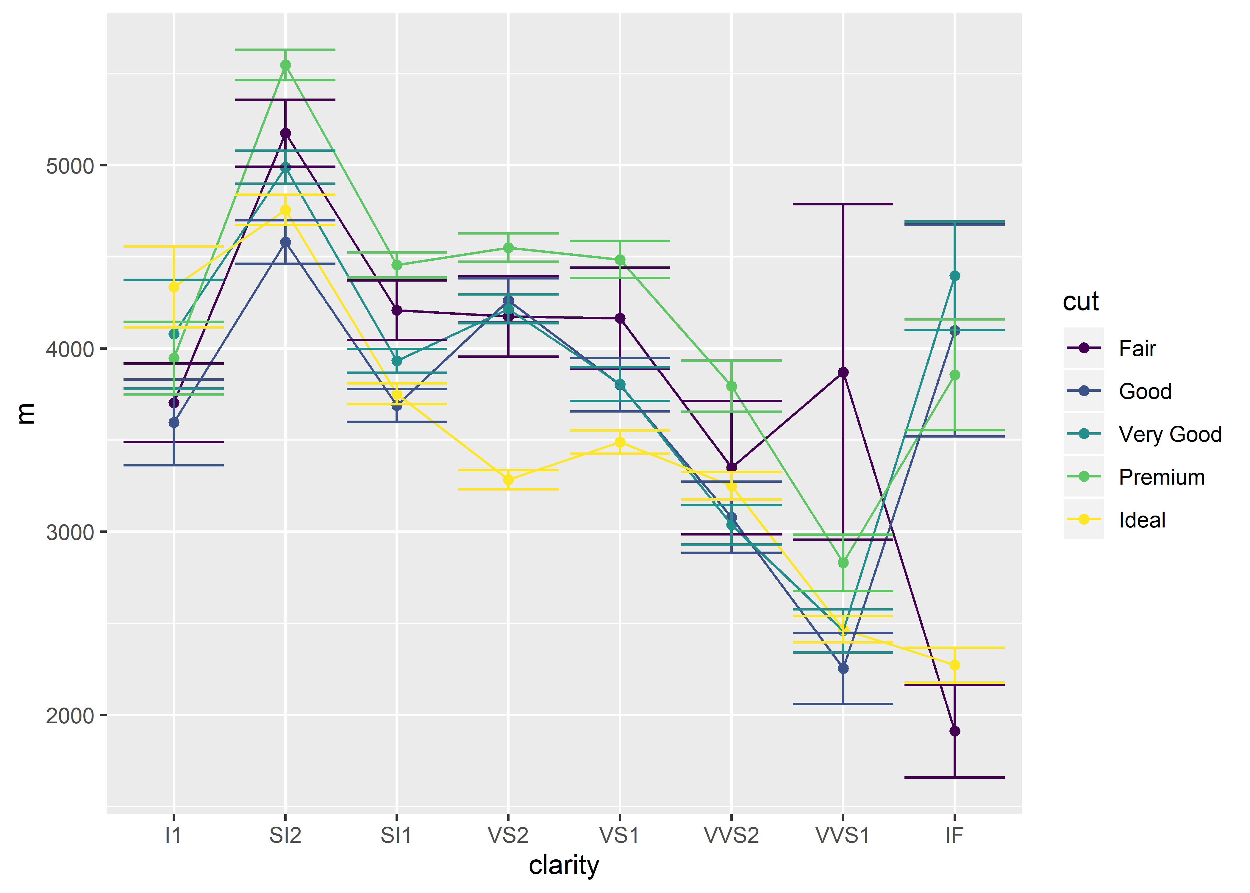
I want to emphasize a few things:
Notice that the tidyverse method uses a mix of both pipes (
%>%) and pluses (+) to graph. Be sure to use these punctuation marks at the appropriate time!In order to calculate the standard error of the mean using the tidyverse method, you must create the
semfunction and execute thesemcode before creating the graph. This is because thesem()function is not loaded in base R by default. However, thestat_summary()function does have a built-in standard error function ready for use!In this case, the tidyverse method is slightly more work to type out compared to the stat_summary method. However, you’ll find that the tidy method can be easily read from top to bottom in a user-friendly way. Remember that the pipe can be read aloud as “and then”.
Notice that the above code is styled in a particular manner. My preference is to add spaces between certain characters (using the shortcut hotkey for the
%>%, CTRL/CMD + SHIFT + M, will automatically add spaces before and after each pipe). I also prefer to use the auto-indentation styling so that it is easier to read my code. If you wanted to, you could technically write all of your code in one line, but this wouldn’t be very user-friendly code. See the example below to see what zero spacing and auto-indentation looks like):
# using the tidy method (same code as above)
diamonds %>% group_by(clarity,cut) %>% summarize(m=mean(price),s=sem(price)) %>% ggplot(aes(x=clarity,y=m,group=cut,color=cut))+geom_point()+geom_line()+geom_errorbar(aes(ymin=m-s,ymax=m+s)) # don't do this
Here is an example for when the tidyverse method is slightly superior or even: calculating standard deviation (sd). In this case, calculating standard deviation with the stat_summary method requires more typing than with the tidy method. The sd() function can be used in the tidy method since it is a built-in function.
## stat_summary method
ggplot(diamonds,
       aes(x = clarity,
           y = price,
           group = cut,
           color = cut)) +
  stat_summary(fun.y = "mean", geom = "point") +
  stat_summary(fun.y = "mean", geom = "line") +
  stat_summary(fun.y = "mean",
               fun.ymax = function(x) mean(x) + sd(x), # calculating sd
               fun.ymin = function(x) mean(x) - sd(x), # calculating sd
geom = "errorbar") 
## tidyverse method
diamonds %>%
  group_by(cut, clarity) %>%
  summarize(m = mean(price),
            s = sd(price)) %>% # calculating sd
  ggplot(aes(x = clarity,
           y = m,
           group = cut,
           color = cut)) +
  geom_line() +
  geom_point() +
geom_errorbar(aes(ymin = m - s, ymax = m + s)) 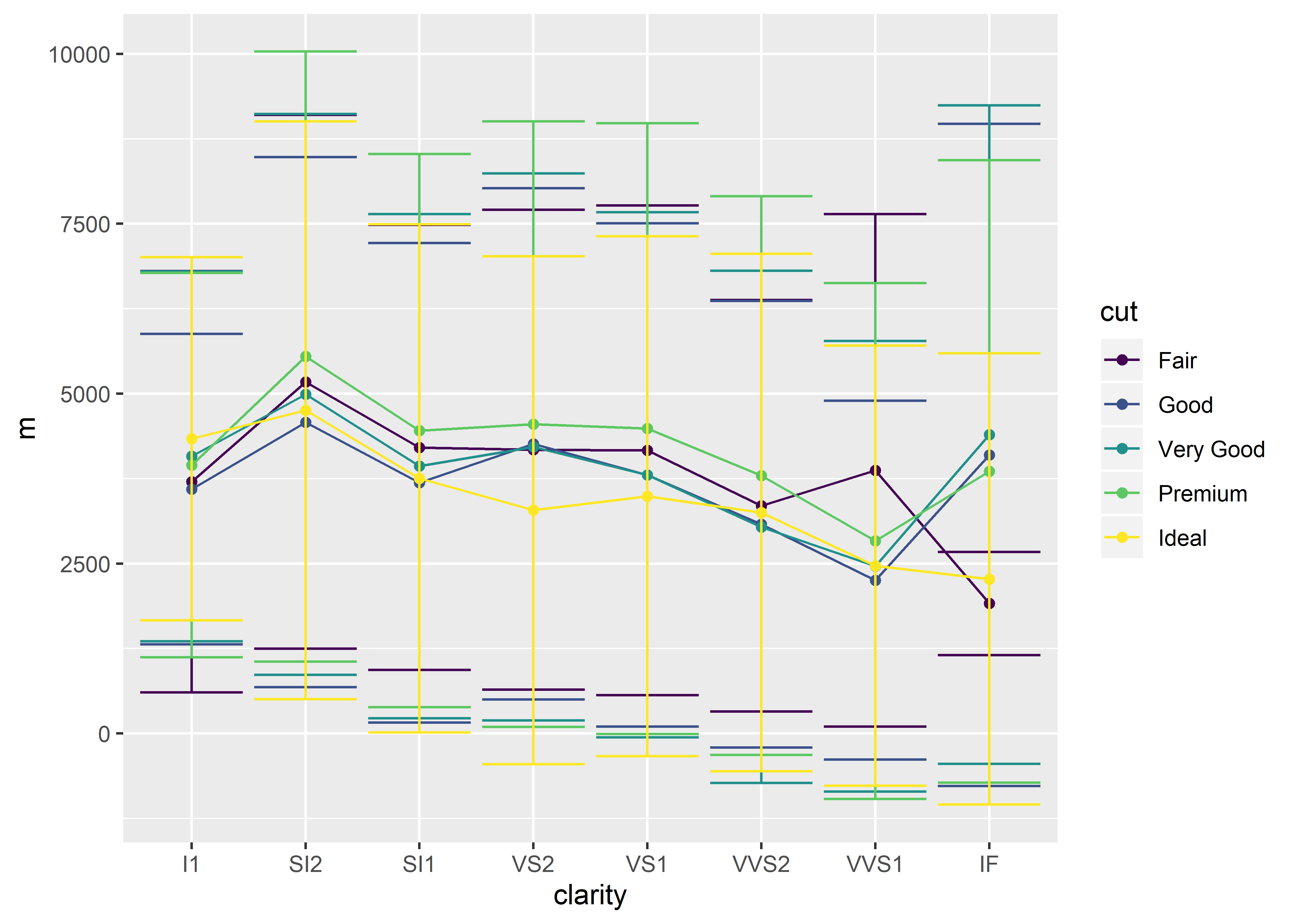
By now, you’ve noticed that I lean toward using the tidyverse method. So why bother introducing the stat_summary method at all? The answer is really simple: you should be aware of the available options out there. Tidyverse is still relatively new-ish at the time of writing this guide. Many experienced R users are still using “base-R” and will only know how to explain things using base R. Plus it’s never a bad idea to know more than one way of completing a task. My philosphy is that you can’t ask questions if you don’t know what to even ask!
8.4.4 The Third Method
In a related caveat, I do want to talk about a “third” method. This method can only be used if the data is prepared exactly as you want it. That is, your dataset should only contain the summary statistics or raw data you want to plot. In the tidyverse method, we first had to calculate the summary statistics (mean, standard error) before beginning to plot with ggplot(). What if we didn’t want to plot the mean price for diamonds, accounting for cut and clarity?
## no tidyverse-style code
ggplot(diamonds,
aes(x = clarity,
y = price, # raw price value
group = cut,
color = cut)) +
geom_point() +
geom_line()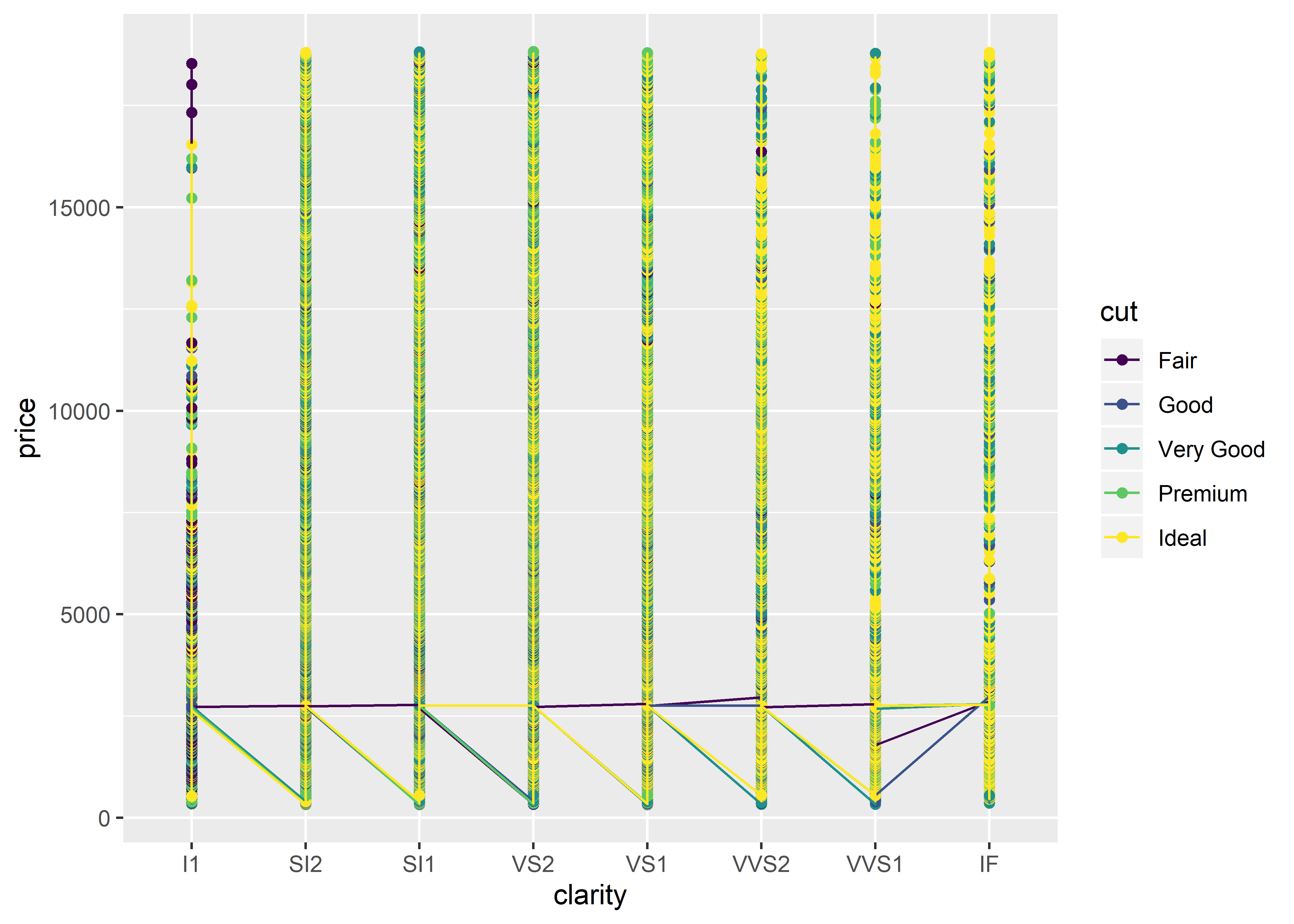 As you can see, R has plotted every single diamond in the dataset (53,940 diamonds!) according to their clarity and cut. This is because the
 diamonds dataset by default contains information about each individual diamond (for each row).
## # A tibble: 53,940 x 10
##    carat cut       color clarity depth table price     x     y     z
##    <dbl> <ord>     <ord> <ord>   <dbl> <dbl> <int> <dbl> <dbl> <dbl>
##  1 0.23  Ideal     E     SI2      61.5    55   326  3.95  3.98  2.43
##  2 0.21  Premium   E     SI1      59.8    61   326  3.89  3.84  2.31
##  3 0.23  Good      E     VS1      56.9    65   327  4.05  4.07  2.31
##  4 0.290 Premium   I     VS2      62.4    58   334  4.2   4.23  2.63
##  5 0.31  Good      J     SI2      63.3    58   335  4.34  4.35  2.75
##  6 0.24  Very Good J     VVS2     62.8    57   336  3.94  3.96  2.48
##  7 0.24  Very Good I     VVS1     62.3    57   336  3.95  3.98  2.47
##  8 0.26  Very Good H     SI1      61.9    55   337  4.07  4.11  2.53
##  9 0.22  Fair      E     VS2      65.1    61   337  3.87  3.78  2.49
## 10 0.23  Very Good H     VS1      59.4    61   338  4     4.05  2.39
## # ... with 53,930 more rows
If we wanted to use the “Third Method” to plot the mean price by clarity and cut, the dataset must look like this (note that there are only 40 combinations of cut and clarity - 5 cut options multiplied by 8 clarity options):
## # A tibble: 40 x 4
## # Groups:   clarity [8]
##    clarity cut        mean standard.err
##    <ord>   <ord>     <dbl>        <dbl>
##  1 I1      Fair      3704.        214.
##  2 I1      Good      3597.        233.
##  3 I1      Very Good 4078.        297.
##  4 I1      Premium   3947.        197.
##  5 I1      Ideal     4336.        221.
##  6 SI2     Fair      5174.        182.
##  7 SI2     Good      4580.        119.
##  8 SI2     Very Good 4989.         90.0
##  9 SI2     Premium   5546.         82.6
## 10 SI2     Ideal     4756.         83.4
## # ... with 30 more rows
This method can be useful if we wanted to graph “non-summary statistic data”. Translated: if you want to plot each row of data as-is (no calculations performed), this method can be used! This will essentially produce a scatter plot if you have many rows of data. If you have few rows of data, it can be plotted as a regular line graph.
ggplot(diamonds, aes(x = price,
                     y = carat,
                     group = cut,
                     color = cut)) +
  geom_point()
The “Third Method” is especially useful (and faster than the tidy method) when counting frequencies using a bar graph. The graph below depicts the number of diamonds that fit each clarity and cut. For example, there are about 5,000 diamonds with a VVS2 clarity and a little over half have a cut categorized as ideal (yellow bar). Notice that this code does not require a y-value; frequency count is the default dependent measure and is therefore assumed when a y-value is not specified. We’ll talk more about bar graphs later.
ggplot(diamonds, aes(x = clarity, group = cut, fill = cut)) +
         geom_bar()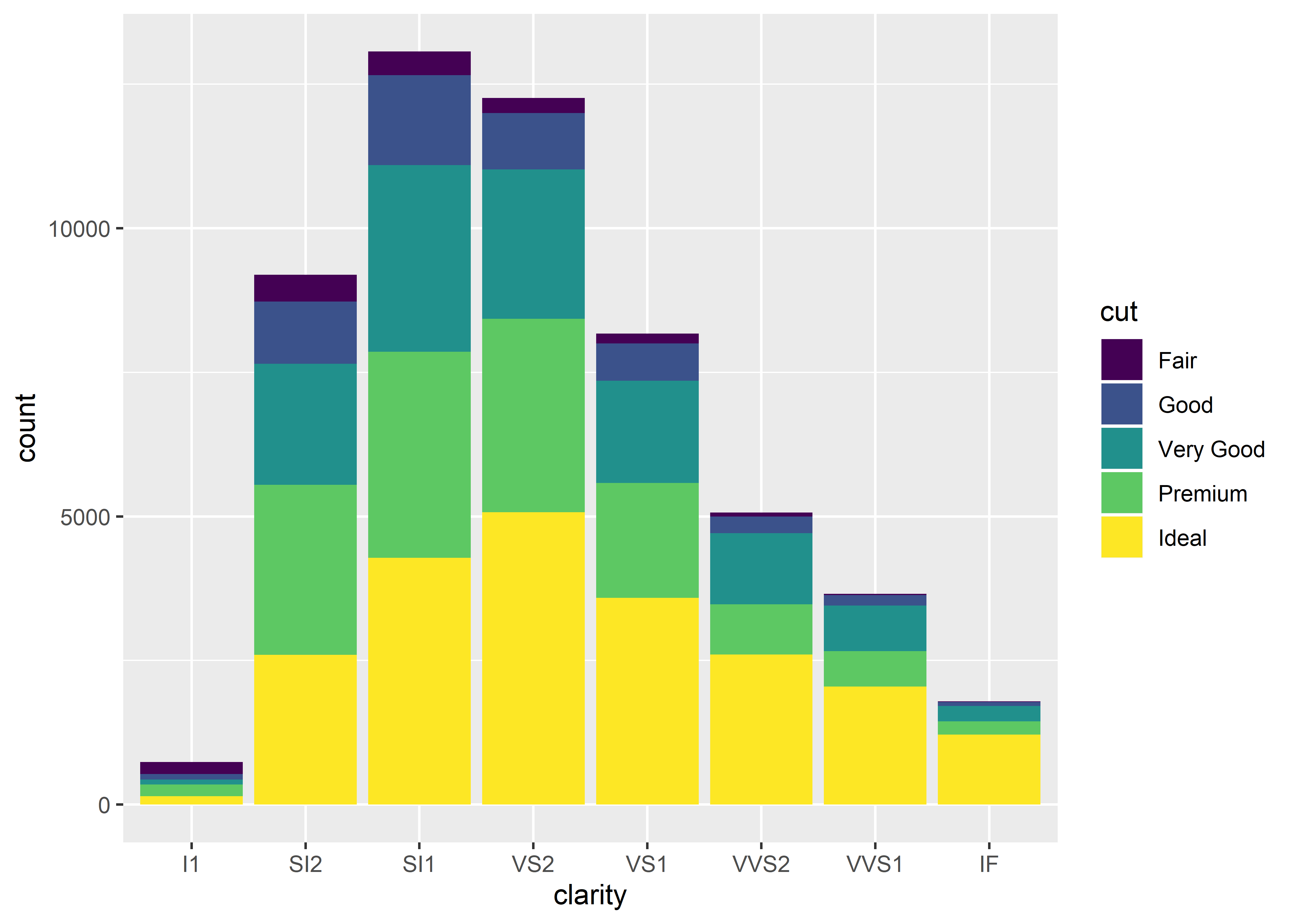
In summary, the “Third Method” can only be used when the data is exactly how you want it (i.e., when you’re fine with having all of the rows in the dataset represented). Otherwise, the tidyverse method is the way to go.