10.2 Multiple Independent Variables
Since most data is a bit more complex, let’s move on to graphing an additional variable, cut. Here, we graph each color’s price (as before) for each cut (new addition to the graph):
diamonds %>%
  group_by(clarity, cut) %>%
  summarize(m = mean(price),
            se = sem(price)) %>%
  ggplot(aes(x = clarity, y = m, group = cut)) +
  geom_point() +
  geom_errorbar(aes(ymin = m - se, ymax = m + se)) +
  geom_line()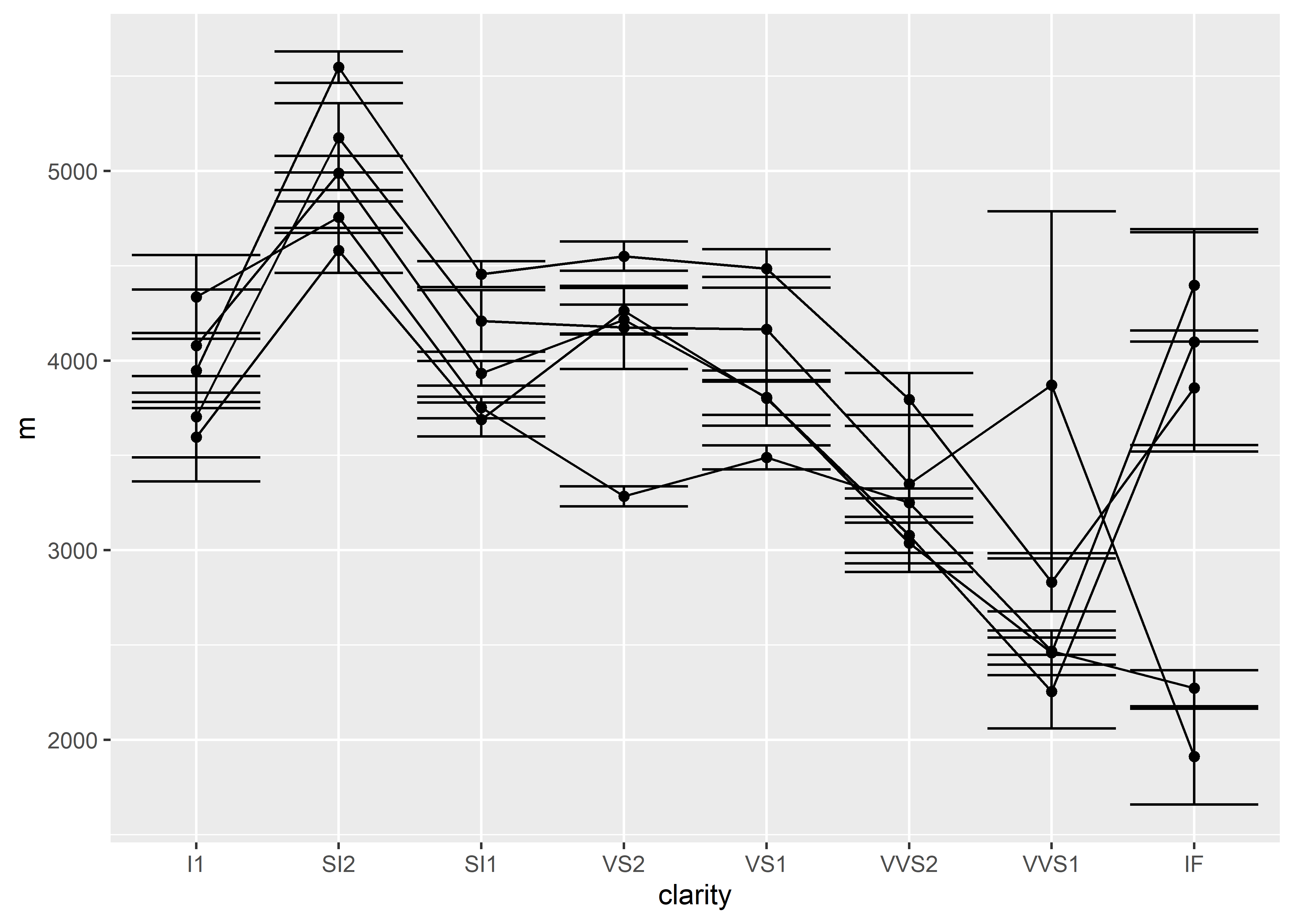
We’ve added the cut variable within group_by() and specified that the points should be connected according to their cut category. Since all of the data points look the same (black, round point), the legend is missing. However, each of those lines represents a different diamond cut and should be differentially labeled. To do this, we need to change the aesthetics so that each cut is visually distinct.