10.4 The Order of the Layers Matter
Don’t forget to make sure the sem function is defined in your environment before following along the examples in this section!
sem <- function(x, na.rm = FALSE) {
  out <- sd(x, na.rm = na.rm)/sqrt(length(x))
  return(out)}
You may have noticed that the graph with only colored data points is difficult to see. That’s because the colored are underneath the error bars and connecting lines. Remember that building a graph requires the addition of multiple layers stacked on top of each other. The data points sit beneath the error bars and lines because it is higher up in the code:
diamonds %>%
  group_by(clarity, cut) %>%
  summarize(m = mean(price),
            se = sem(price)) %>%
  ggplot(aes(x = clarity,
             y = m,
             group = cut)) +
  geom_point(aes(color = cut)) +
  geom_errorbar(aes(ymin = m - se,
                    ymax = m + se)) +
  geom_line()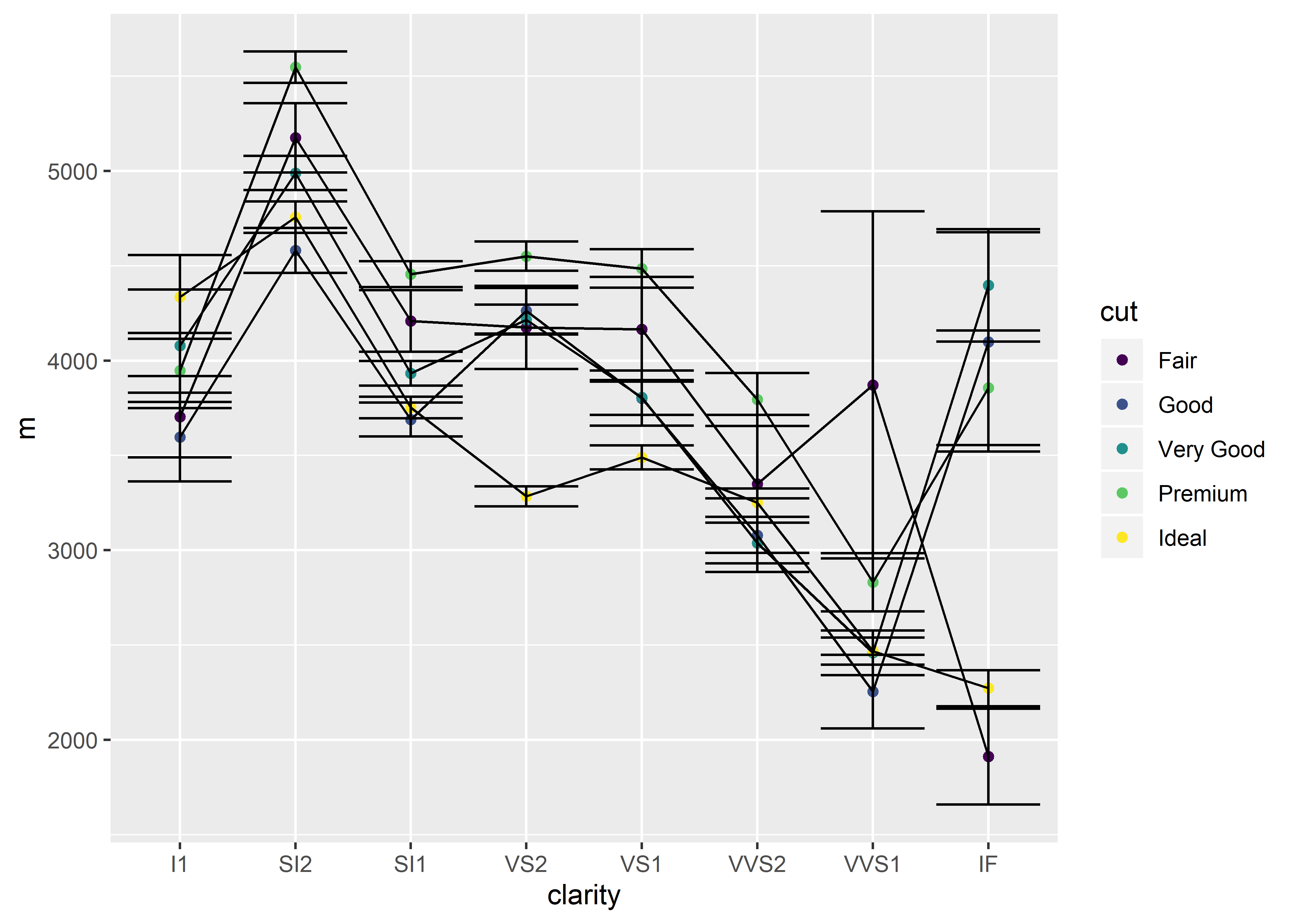
Moving the geom_point() element below geom_line() will result in the points laying over the error bars and connecting lines:
diamonds %>%
  group_by(clarity, cut) %>%
  summarize(m = mean(price),
            se = sem(price)) %>%
  ggplot(aes(x = clarity,
             y = m,
             group = cut)) +
  geom_errorbar(aes(ymin = m - se,
                    ymax = m + se)) +
  geom_line() +
geom_point(aes(color = cut)) 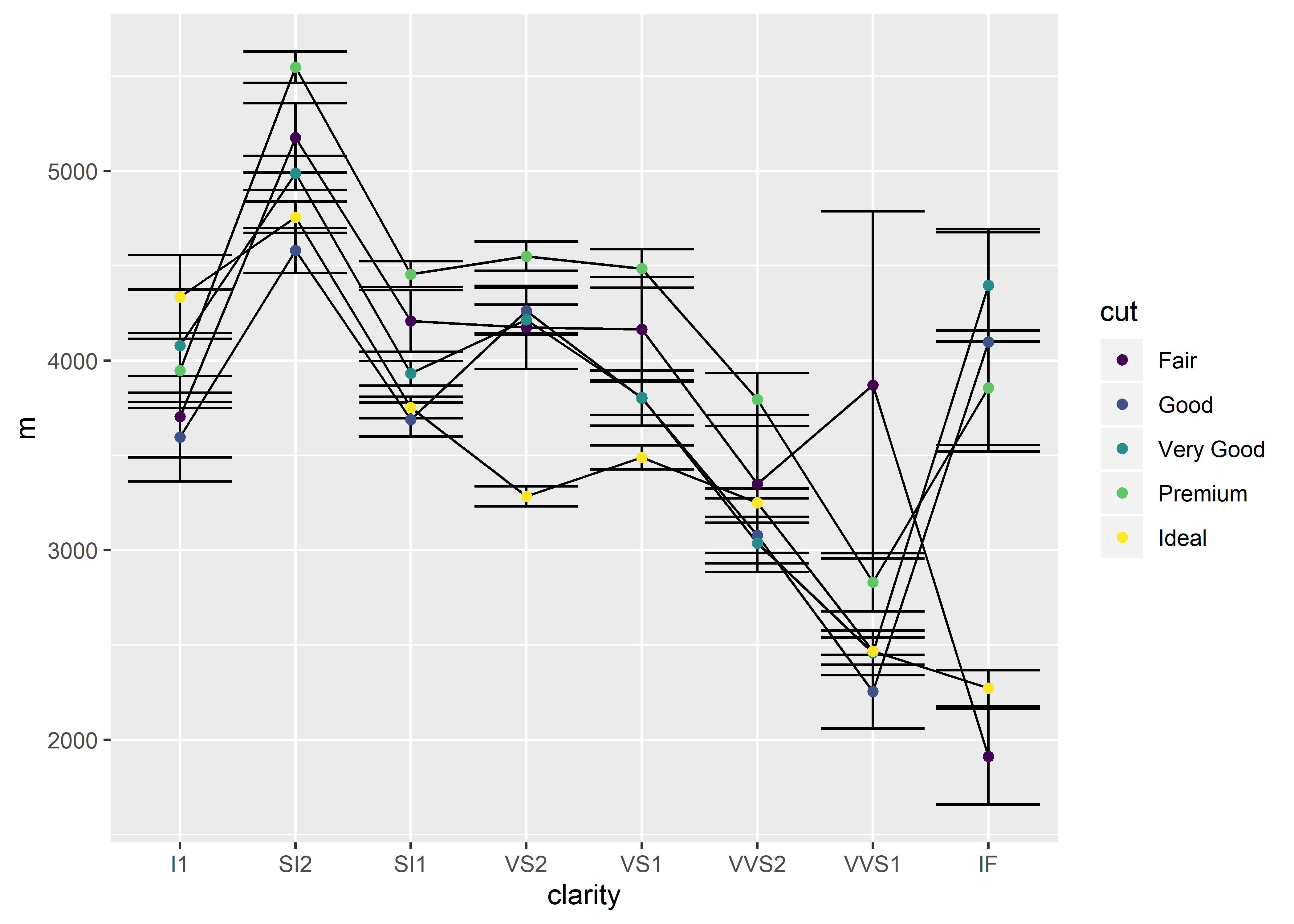
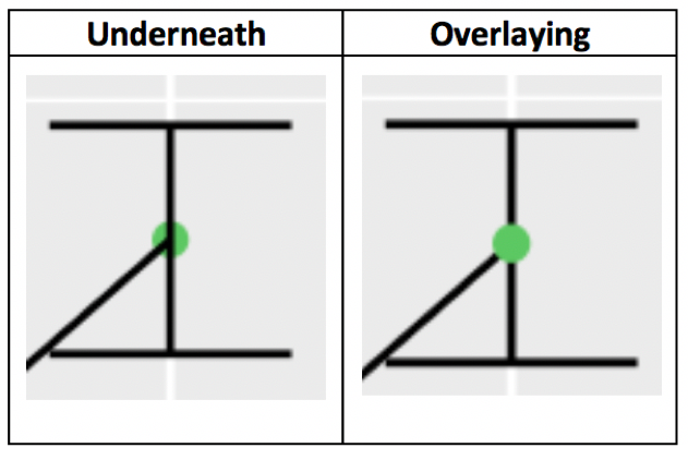
Of course, this isn’t as important when everything (error bars, lines, points) is the same color.