WE ARE BOTH SKIERS, AND WE HAVE BOTH SPENT OUR SHARE of time in the Wasatch mountains outside of Salt Lake City, Utah, enjoying some of the best snow on the planet. The perfect Utah powder even factored into the choice that one of us made about what college to attend. A number of ski resorts are situated in the Wasatch mountains, and each resort has its own personality. Snowbird rises out of Little Cottonwood Canyon, splayed out in steel and glass and concrete, its gondola soaring over sheer cliffs to a cirque from which terrifyingly steep chutes drop away. Farther up the canyon, Alta has equally challenging terrain, even better snow, and feels lost in time. Its lodges are simple wooden structures and its lifts are bare-bones; it is one of three remaining resorts in the country that won’t allow snowboarders. Start talking to a fellow skier at a party or on an airplane or in a city bar, and the odds are that she will mention one or both of these resorts as among the best in North America.
In nearby Big Cottonwood Canyon, the resorts Brighton and Solitude have a very different feel. They are beautiful and well suited for the family and great fun to ski. But few would describe them as epic, and they’re hardly destination resorts. Yet if you take a day off from Alta or Snowbird to ski at Solitude, something interesting happens. Riding the lifts with other skiers, the conversation inevitably turns to the relative merits of the local resorts. But at Solitude, unlike Alta or Snowbird—or anywhere else, really-people often mention Solitude as the best place to ski in the world. They cite the great snow, the mellow family atmosphere, the moderate runs, the absence of lift lines, the beauty of the surrounding mountains, and numerous other factors.
When Carl skied Solitude for the first time, at fifteen, he was so taken by this tendency that he mentioned it to his father as they inhaled burgers at the base lodge before taking the bus back to the city.
“I think maybe l underestimated Solitude,” Carl told him. “I had a pretty good day here. There is some good tree skiing, and if you like groomed cruising …
“And I bet I didn’t even find the best runs,” Carl continued. “There must be some amazing lines here. Probably two-thirds of the people I talked to today like this place even more than Alta or Snowbird! That’s huge praise.”
Carl’s father chuckled. “Why do you think they’re skiing at Solitude?” he asked.
This was Carl’s first exposure to the logic of selection effects. Of course when you ask people at Solitude where they like to ski, they will answer “Solitude.” If they didn’t like to ski at Solitude, they would be at Alta or Snowbird or Brighton instead. The superlatives he’d heard in praise of Solitude that day were not randomly sampled from among the community of US skiers. Skiers at Solitude are not a representative sample of US skiers; they are skiers who could just as easily be at Alta or Snowbird and choose not to be.
Obvious as that may be in this example, this basic principle is a major source of confusion and misunderstanding in the analysis of data.
In the third chapter of this book, we introduced the notion of statistical tests or data science algorithms as black boxes that can serve to conceal bullshit of various types. We argued that one can usually see this bullshit for what it is without having to delve into the fine details of how the black box itself works. In this chapter, the black boxes we will be considering are statistical analyses, and we will consider some of the common problems that can arise with the data that is fed into these black boxes.
Often we want to learn about the individuals in some group. We might want to know the incomes of families in Tucson, the strength of bolts from a particular factory in Detroit, or the health status of American high school teachers. As nice as it would be to be able to look at every single member of the group, doing so would be expensive if not outright infeasible. In statistical analysis, we deal with this problem by investigating small samples of a larger group and using that information to make broader inferences. If we want to know how many eggs are laid by nesting bluebirds, we don’t have to look in every bluebird nest in the country. We can look at a few dozen nests and make a pretty good estimate from what we find. If we want to know how people are going to vote on an upcoming ballot measure, we don’t need to ask every registered voter what they are thinking; we can survey a sample of voters and use that information to predict the outcome of the election.
The problem with this approach is that what you seed depends on where you look. To draw valid conclusions, we have to be careful to ensure that the group we look at is a random sample of the population. People who shop at organic markets are more likely to have liberal political leanings; gun show attendees are more likely to be conservative. If we conduct a survey of voters at an organic grocery store—or at a gun show-we are likely to get a misleading impression of sentiments citywide.
We also need to think about whether the results we get are influenced by the act of sampling itself. Individuals being interviewed for a psychology study may give different answers depending on whether the interviewer is a man or a woman, for example. We run into this effect if we try to use the voluminous data from the Internet to understand aspects of social life. Facebook’s autocomplete feature provides a quick, if informal, way to get a sense of what people are talking about on the social media platform. How healthy is the institution of marriage in 2019? Let’s try a Facebook search query:
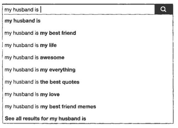
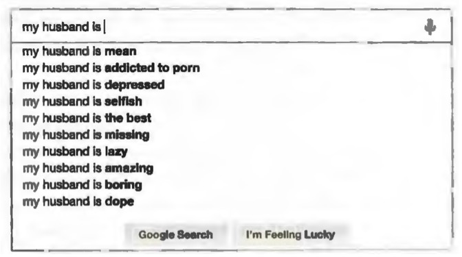
This paints a happy-if saccharine-picture. But on Facebook people generally try to portray their lives in the best possible light. The people who post about their husbands on Facebook may not be a random sample of married people; they may be the ones with happy marriages. And what people write on Facebook may not be a reliable indicator of their happiness. If we type the same query into Google and let Google’s autocomplete feature tell us about contemporary matrimony, we see something very different
We should stress that a sample does not need to be completely random in order to be useful. It just needs to be random with respect to whatever we are asking about.
Suppose we take an election poll based on only those voters whose names appear in the first ten pages of the phone book. This is a highly nonrandom sample of people. But unless having a name that begins with the letter A somehow correlates with political preference, our sample is random with respect to the question We are asking: How are you going to vote in the upcoming election?
Then there is the issue of how broadly we can expect a study’s findings to apply. When can we extrapolate what we find from one population to other populations? One aim of social psychology is to uncover universals of human cognition, yet a vast majority of studies in social psychology are conducted on what Joe Henrich and colleagues have dubbed WEIRD populations: Western, Educated, Industrialized, Rich, and Democratic. Of these studies, most are conducted on the cheapest, most convenient population available: college students who have to serve as study subjects for course credit.
How far can we generalize based on the results of such studies? If we find th.at American college students are more likely to engage in violent behavior after listening to certain kinds of music, we need to be cautious about extrapolating this result to American retirees or German college students, let alone people in developing countries or members of traditional societies.
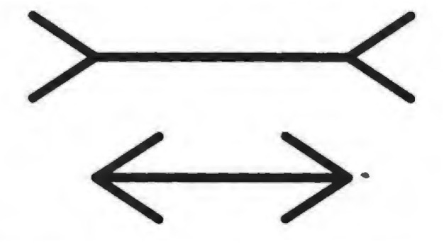
You might think that basic findings about something like visual perception should apply across demographic groups and cultures. Yet they do not. Members of different societies vary widely in their susceptibility to the famous Muller-Lyer illusion, in which the direction of arrowheads influences the apparent length of a line. The illusion has by far the strongest effect on American undergraduates.” Other groups see little or no difference in the apparent line length.
Again, where you look determines what you see.
WHAT YOU SEE DEPENDS ON WHERE YOU LOOK
If you study one group and assume that your results apply to other groups, this is extrapolation. If you think you are studying one group, but do not manage to obtain a representative sample of that group, this is a different problem. It is a problem so important in statistics that it has a special name: selection bias. Selection bias arises when the individuals that you sample for your study differ systematically from the population of individuals eligible for your study.
For example, suppose we want to know how often students miss class sessions at the University of Washington. We survey the students in our Calling Bullshit class on a sunny Friday afternoon in May. The students’ responses indicate that they miss, on average, two classes per semester. This seems implausibly low, given that our course is filled to capacity and yet only about two-thirds of the seats are occupied on any given day. So are our students lying to us? Not necessarily. The students who are answering our question are not a random sample of eligible individuals-all students in our class-with respect to the question we are asking. If they weren’t particularly diligent in their attendance, the students in our sample wouldn’t have been sitting there in the classroom while everyone else was outside soaking up the Friday afternoon sunshine.
Selection bias can create misleading impressions. Think about the ads you see for auto insurance. “New GEICO customers report average annual savings over $500” on car insurance. This sounds pretty impressive, and it would be easy to imagine that this means that you will save $500 per year by switching to GEICO.
But then if you look around, many other insurance agencies are running similar ads. Allstate advertisements proclaim that “drivers who switched to Allstate saved an average of $498 per year.” Progressive claims that customers who switched to them saved over $500. Farmers claims that their insured who purchase multiple policies save an average of $502. Other insurance companies claim savings figures upward of $300. How can this be? How can all of the different agencies claim that switching to them saves a substantial amount of money? If some companies are cheaper than the competition, surely others must be more expensive.
The problem with thinking that you can save money by switching to GEICO (or Allstate, or Progressive, or Farmers) is that the people who switched to GEICO are nowhere near a random sample of customers in the market for automobile insurance. Think about it: What would it take to get you to go through the hassle of switching to GEICO (or any other agency)? You would have to save a substantial sum of money. People don’t switch insurers in order to pay more!
Different insurance companies use different algorithms to determine your rates. Some weight your driving record more heavily; some put more emphasis on the number of miles you drive; some look at whether you store your car in a garage at night; others offer lower rates to students with good grades; some take into account the size of your engine; others offer a discount if you have antilock brakes and traction control. So, when a driver shops around for insurance, she is looking for an insurer whose algorithms would lower her rates considerably.
If she is already with the cheapest insurer for her personal situation, or if the other insurers are only a little cheaper, she is unlikely to switch. The only people who switch are those who will save big by doing so. And this is how all of the insurers can claim that those who switch to their policies save a substantial sum of money.
This is a classic example of selection bias. The people who switch to GEICO are not a random sample of insurance customers, but rather those who have the most to gain by switching. The ad copy could equivalently read, “Some people will see their insurance premiums go up if they switch to GEICO. Other people will see their premiums stay about the same. Yet others will see their premiums drop. Of these, a few people will see their premiums drop a lot. Of these who see a substantial drop, the average savings is $500.” While accurate, you’re unlikely to hear a talking reptile say something like this in a Super Bowl commercial.
In all of these cases, the insurers presumably know that selection bias is responsible for the favorable numbers they are able to report. Smart consumers realize there is something misleading about the marketing, even if it isn’t quite clear what that might be. But sometimes the insurance companies themselves can be caught unaware. An executive at a major insurance firm told us about one instance of selection bias that temporarily puzzled his team. Back in the 1990s, his employer was one of the first major agencies to sell insurance policies online. This seemed like a valuable market to enter early, but the firm’s analytics team turned up a disturbing result about selling insurance to Internet-savvy customers. They discovered that individuals with email addresses were far more likely to have filed insurance claims than individuals without.
If the difference had been minor, it might have been tempting to assume it was a real pattern. One could even come up with any number of plausible post hoc explanations, e.g., that Internet users are more likely to be young males who drive more miles, more recklessly. But in this case, the difference in claim rates was huge. Our friend applied one of the most important rules for spotting bullshit: If something seems too good or too bad to be true, it probably is. He went back to the analytics team that found this pattern, told them it couldn’t possibly be correct, and asked them to recheck their analysis. A week later, they reported back with a careful reanalysis that replicated the original result. Our friend still didn’t believe it and sent them back to look yet again for an explanation.
This time they returned a bit sheepishly. The math was correct, they explained, but there was a problem with the data. The company did not solicit email addresses when initially selling a policy. The only time they asked for an email address was when someone was in the process of filing a claim. As a result, anyone who had an email address in the company’s database had necessarily also filed a claim. People who used email were not more likely to file claims-but people who had filed claims were vastly more likely to have email addresses on file.
Selection effects appear everywhere, once you start looking for them. A psychiatrist friend of ours marveled at the asymmetry in how psychiatric disorders are manifested. “One in four Americans will suffer from excessive anxiety at some point,” he explained, “but in my entire career I have only seen one patient who suffered from too little anxiety.”
Of course! No one walks into their shrink’s office and says “Doctor, you’ve got to help me. I lie awake night after night not worrying.” Most likely there are as many people with too little anxiety as there are with too much. It’s just that they don’t go in for treatment. Instead they end up in prison, or on Wall Street.
THE MORTAL DANGER OF MUSICIANSHIP.
In a clinical trial designed to assess the severity of the side effects of a certain medication, the initial sample of patients may be random, but individuals who suffer side effects may be disproportionately likely to drop out of the trial and thus not be included in the final analysis. This is data censoring a, phenomenon closely related to selection bias. Censoring occurs when a sample may be initially selected at random, without selection bias, but a nonrandom subset of the sample doesn’t figure into the final analysis.
LET’S DIVE RIGHT INTO an example. In March 2015, a striking graph made the rounds on social media. The graph, from a popular article about death rates for musicians, looked somewhat like the figure below and seems to reveal a shocking trend. It appears that being a musician in older musical genres-blues, jazz, gospel-is a relatively safe occupation. Performing in new genres-punk, metal, and especially rap and hip-hop-looks extraordinarily dangerous. The researcher who conducted the study told The Washington Post that “it’s a cautionary tale to some degree. People who go into rap music or hip hop or punk, they’re in a much more occupational hazard [sic] profession compared to war. We don’t lose half our army in a battle.”
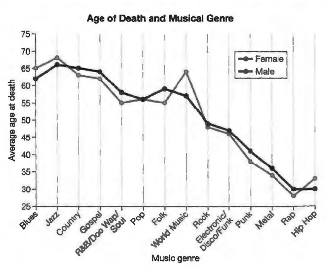
This graph became a meme, and spread widely on social media. Not only does it provide quantitative data about an interesting topic, but these data reinforce anecdotal impressions that many of us may already hold about the hard living that goes along with a life in the music business.
Looking at the graph for a moment, however, you can see something isn’t right. Again, if something seems too good or too bad to be true, it probably is. This certainly seems too bad to be true. What aroused our suspicion about this graph was the implausibly large difference in ages at death. We wouldn’t be particularly skeptical if the study found 5 to 10 percent declines for musicians in some genres. But look at the graph. Rap and hip-hop musicians purportedly die at about thirty years of age–half the age of performers in some other genres.
So what’s going on? The data are misleading because they are right censored individuals who are still alive at the end of the study period are removed from the study.
Let’s first look at an example of how right-censoring works, and then return to the musicians. Imagine that you are part of a conservation team studying the life cycle of a rare chameleon species on Madagascar. Chameleons are curiously short-lived; for them a full life is two to three years at most. In 2013, you begin banding every newly born individual in a patch of forest; you then track its survival until your funding runs out in 2017. The figure to the right illustrates the longevity of the individuals that you have banded. Each bar corresponds to one chameleon. At the bottom of the figure are the first individuals banded, back in 2013. Some die early, usually due to predation, but others live full chameleon lives. You record the date of death and indicate that in the graph. The same thing holds for the individuals born in 2014.
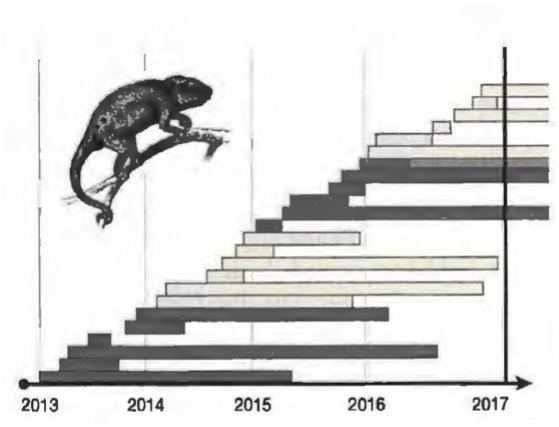
But of the individuals born in 2015 and 2016, not all are deceased when the study ends in 2017. This is indicated by the bars that overrun the vertical line representing the end of the study.
So how do you record your data? If you were to simply count those individuals as dying at the study’s end, you’d be introducing a strong bias to your data. They didn’t really die; you just went home. So you decide that maybe the safest thing to do is to throw out those individuals from your data set entirely. In doing so, you are right censoring your data: You are throwing out the data that run off the right side of the graph. The right-censored data are shown to the right.
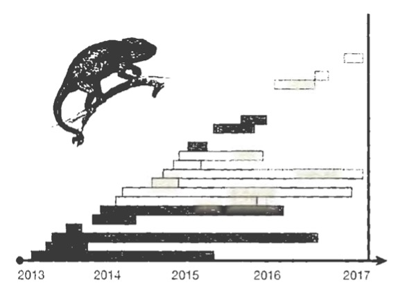
Look at what seems to be happening here. Some chameleons born in 2013 and 2014 die early, but others live two or three years. From these right-censored data, all of those born in 2015 and 2016 appear to die early. If you didn’t know that the data had been right-censored, you might conclude chat 2015 and 2016 were very dangerous years to be a chameleon and be concerned about the long-term health of this population. This is misleading. The distribution of life spans is unchanged from 2013 to 2017. By throwing out the individuals who live past the end of the study, you are looking at all individuals born in 2013 and 2014, but only the short-lived among those that are born. in 2015 and 2016. By right-censoring the data, you’ve created a misleading impression of mortality patterns.
The right-censoring problem that we see here can be viewed as a form of selection bias. The individuals in our sample from 2015 and 2016 are not a random sample of chameleons born in those years. Rather, they are precisely those individuals with the shortest life spans. The same problem arises in the graph of average age at death for musicians. Rap and hip-hop are new genres, maybe forty years old at the most, and popular musicians tend to launch their careers in their teens or twenties. As a consequence, most rap and hip-hop stars are still alive today, and thus omitted from the study. The only rap and hip-hop musicians who have died already are those who have died prematurely. Jazz, blues, country, and gospel, by comparison, have been around for a century or more. Many deceased performers of these styles lived into their eighties or longer. It’s not that rap stars will likely die young; it’s that the rap stars who have died must have died young, because rap hasn’t been around long enough for it to be otherwise.
To be fair to the study’s author, she acknowledges the right censoring issue in her article. The problem is that readers may think that the striking differences shown in the graph are due to differing mortality rates by musical genre, whereas we suspect the majority of the pattern is a result of right-censoring. We don’t like being presented with graphs in which some or even most of the pattern is due to statistical artifact, and then being told by the author, “But some of the pattern is real, trust me.”
Another problem is that there is no caveat about the right-censoring issue in the data graphic itself. In a social media environment, we have to be prepared for data graphics-at least those from pieces directed to a popular audience-to be shared without the accompanying text. In our view, these data never should have been plotted in the way that they were. The graph here tells a story that is not consistent with the conclusions that a careful analysis would suggest.
DISARMING SELECTION BIAS
We have looked at a number of ways in which selection bias can arise. We conclude by considering ways to deal with the problem.
Selection biases often arise in clinical trials, because physicians, insurance companies, and the individual patients in the clinical trial have a say in what treatments are assigned to whom. As a consequence the treatment group who receive the intervention may differ in important ways from the control group who do not receive the intervention. Randomizing which individuals receive a particular treatment provides a way to minimize selection biases.
A recent study of employer wellness programs shows us just how important this can be. lf you work for a large company, you may be a participant in such a program already. The exact structures of corporate wellness programs vary, but the approach is grounded in preventative medicine. Wellness programs often involve disease screening, health education, fitness activities, nutritional advice, weight loss, and stress management. Many wellness programs track employees’ activity and other aspects of their health. Some even require employees to wear fitness trackers that provide fine-scale detail on individual activity levels. A majority of them offer incentives for engaging in healthy behaviors. Some reward employees for participating in activities or reaching certain fitness milestones. Others penalize unhealthy behaviors, charging higher premiums to those who smoke, are overweight, and so forth.
Wellness programs raise critical questions about employers having this level of control and ownership over employees’ bodies. But there is also a fundamental question: Do they work? To answer that, we have to agree about what wellness programs are supposed to do. Employers say that they offer these programs because they care about their employees and want to improve their quality of life. That’s mostly bullshit. A sand volleyball court on the company lawn may have some recruiting benefits. But the primary rationale for implementing a wellness program is that by improving the health of its employees a company can lower insurance costs decrease absenteeism, and perhaps even reduce the rate at which employees leave the company.
All of these elements contribute to the company’s bottom line. Companies are getting on board. By 2017, the workplace wellness business had ballooned into an eight-billion-dollar industry in the US alone. One report suggests that half of firms with more than fifty employees offer wellness programs of some sort, with average costs running well over $500 per employee per year.
Meta-analyses-studies that aggregate the results of previous studies-seem encouraging. Such studies typically conclude that wellness programs reduce medical costs and absenteeism, generating considerable savings for employers. But the problem with almost all of these studies is that they allow selection biases to creep in. They compare employees within the same company who did take part in wellness activities with those who did not. Employers cannot force employees to participate, however, and the people who choose to participate may differ in important ways from the people who choose not to. In particular, those who opt in may already be healthier and leading healthier lifestyles than those who opt out.
Researchers found a way around this problem in a recent study. When the University of Illinois at Urbana-Champaign launched a workplace wellness program, they randomized employees into either a treatment group or a control group. Members of the treatment group had the option of participating but were not required to do so.
Members of the control group were not even offered an opportunity to take part. This design provided the researchers with three categories: people who chose to participate, people who chose not to, and people who were not given the option to participate in the first place. The authors obtained health data for all participants from the previous thirteen months, affording a baseline for comparing health before and after taking part in the study.
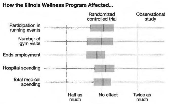
Unlike previous observational studies, this study found that offering a wellness program had no statistically significant effect on healthcare costs or absenteeism, nor did it increase gym visits and similar types of physical activity. (The one useful thing that the wellness program did was to increase the fraction of participants who underwent a health screening.) The figure on the right summarizes these results.
The randomized controlled trial found that being offered the wellness program had no effect on fitness activities, employee retention, or medical costs.
But why? Previous studies largely found beneficial effects. Was there something particularly ineffective about how the Illinois wellness program was designed? Or did this point to selection effects in the previous studies? In order to find out, the investigators ran a second analysis in which they set aside their control group, and looked only at the employees who were offered the chance to participate in the wellness program. Comparing those who were active in that program with those who were not, they found strong disparities in activity, retention, and medical costs between those who opted to participate and those who opted not to. These differences remained even when the authors tried to control for differences between those who participated and those who declined, such as age, gender, weight, and other characteristics. If these authors had done an observational study like previous researchers, they would also have observed that employees in workplace wellness programs were healthier and less likely to leave the firm.
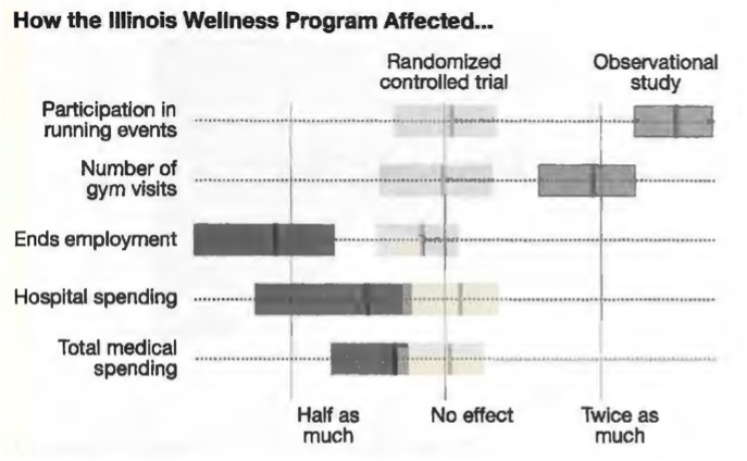
This is a classic example of a selection effect. People who are in good health are more likely to participate in wellness programs. It’s not that wellness programs cause good health, it’s that being in good health causes people to participate in wellness programs.