Motivating Scenarios:
You want to make the concepts of a null sampling distribution and a p-value more concrete, while also learning a very robust method for testing null hypotheses.
Learning Goals: By the end of this chapter, you should be able to:
- Explain what a permutation is.
- Describe why permuting data many times generates a sampling distribution under the null hypothesis.
- Use
Rto permute data to determine if two sample means come from different (statistical) populations.
- Recognize that permutation (shuffling) is used to generate null distributions, while bootstrapping (resampling with replacement) is used to estimate uncertainty.
- Generalize the concept of permutation as a method to test most null models.
One Simple Trick to Generate a Null Distribution
a permutation test is like low key the most useful method in all of statistics
— Killian Campbell (he/him/his) (@kdc509) January 25, 2021
In the previous chapter, we discussed the idea behind null hypothesis significance testing. Specifically, the challenge in null hypothesis significance testing is figuring out how often we would observe our result if some boring null hypothesis were true. A key step in this process is comparing our observed “test statistic” to its sampling distribution when the null hypothesis is true.
Later in the course, we will deal with special cases where mathematicians have estimated a sampling distribution under certain assumptions. But a really straightforward way to generate a null distribution is to shuffle your data randomly, as if nothing were happening. Unlike the mathematical tricks we will cover later, this shuffling approach, known as permutation, makes very few assumptions. The most critical assumptions of the permutation test are that samples are random, independent, collected without bias, and that the null hypothesis assumes no association.

Figure 1: Listen to the permutation anthem here.
Here’s a more succinct version focusing on the intuition behind permutation testing and its versatility, without diving deeply into parametric comparisons:
Why Permutation Works:
Permutation tests generate a null distribution directly from the data by randomly shuffling the explanatory variable (or the association between explanatory and response variables). This approach simulates the null hypothesis, where any observed differences or associations are due to random chance. By breaking the link between variables and reshuffling many times, we create a distribution of the test statistic (e.g., difference in means) that reflects what we would expect if there were no real effect. This allows us to compare our observed result to this empirically generated null distribution to determine if it’s significantly different from what we’d expect by chance.
Permutation tests are also highly versatile. They can be applied to a wide range of scenarios, from comparing group means to testing correlations or regression models. This makes them a flexible tool for testing hypotheses in various types of data, even in more complex designs involving non-independence (e.g., repeated measurements or data collected across different groups). The key advantage is that permutation testing doesn’t rely on strict assumptions, making it robust and adaptable to many situations.
Motivation:
One of the most common statistical questions we ask is, “Do these two samples differ?” For example:
- Do people who receive a vaccine experience worse side effects than those who receive a placebo?
- Does planting a native garden attract more pollinators?
Answering questions like these is fundamental to scientific research, and Null Hypothesis Significance Testing (NHST) provides a framework for addressing them. Recall that NHST works by comparing the observed test statistic to its sampling distribution under the assumption that the null hypothesis is true. We then reject (or fail to reject) the null model if our data — or something more extreme — is a rare or common outcome under the null model.
So, how do we build a null sampling distribution? Statisticians have developed many parametric null distributions (e.g., the t-distribution, Z-distribution, \(\chi^2\) distribution, etc.) that rely on certain assumptions about the data. However, these assumptions may not always hold, and even when they do hold I’m not sure they help us understand null hypothesis significance testing conceptually.
In this chapter, we focus on permutation tests, a powerful and flexible alternative that makes fewer assumptions and can be applied to many situations. Specifically, we will explore how to use permutation to test for differences between two groups. However, permutation is incredibly flexible and can be applied to most problems where the null hypothesis is “no association.”
Case study: Mate choice & fitness in frogs
There are plenty of reasons to choose your partner carefully. In much of the biological world a key reason is “evolutionary fitness” – presumably organisms evolve to choose mates that will help them make more (or healthier) children. This could, for example explain Kermit’s resistance in one of the more complex love stories of our time, as frogs and pigs are unlikely to make healthy children.
To evaluate this this idea Swierk and Langkilde (2019), identified a males top choice out of two female wood frogs and then had them mate with the preferred or unpreferred female and counted the number of hatched eggs.

Concept check
- Is this an experimental or observational study?
- Are there any opportunities for bias? Explain!
- What is the biological hypothesis?
- What is the statistical null?
Here are the raw data (download here if you like)
Visualize Patterns
One of the first things we do with a new dataset is visualize it!
A quick exploratory plot (refer back to our Intro to ggplot) helps us understand the distribution and shape of our data, and informs us how to develop an appropriate analysis plan.
library(ggforce)
ggplot(frogs, aes(x = treatment, y = hatched.eggs, color = treatment, shape = treatment)) +
  geom_violin(show.legend = FALSE)+
  geom_sina(show.legend = FALSE, size = 3, alpha = .6) +  # if you don't have ggforce, use geom_jitter
  stat_summary(fun.data = mean_cl_boot, geom = "pointrange", color = "black", show.legend = FALSE)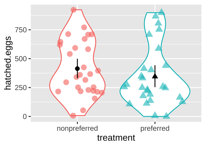
Figure 2: Visualizing the frog mating data.
Estimate Parameters
Now that we have a better understanding of the data’s shape, we can create meaningful summaries by estimating appropriate parameters (see the chapters on data summaries, associations, and linear models).
For the frog mating data, let’s first calculate the mean and standard deviation of the number of hatched eggs for both the preferred and non-preferred mating groups.
frog_summary <- frogs %>%
  group_by(treatment) %>%
  summarise(
    mean_hatched = mean(hatched.eggs),
    sd_hatched = sd(hatched.eggs),
    .groups = "drop"
  )

frog_summary
# A tibble: 2 × 3
treatment mean_hatched sd_hatched
<chr> <dbl> <dbl>
1 nonpreferred 414. 237.
2 preferred 345. 260.A high-level summary could be the difference in mean hatched eggs between the preferred and non-preferred mating groups. Since we “peeled off” the groups above (with .groups = "drop", the default behavior of summarise()), we can calculate the difference between these two means using the diff() function in another summarise(). The difference is:
mean_diff <- frog_summary %>%
  summarise(nonpref_minus_pref = diff(mean_hatched))

mean_diff %>%
  pull(nonpref_minus_pref) %>%
  round(digits = 2)  # round it to two digits
[1] -68.82… So both visual and numerical summaries suggest that, contrary to our expectations, more eggs hatch when males mate with non-preferred females. However, we know that sample estimates will differ from population parameters by chance (i.e., sampling error). So we …
Quantifying Uncertainty
Although the estimated means are not identical, we also know that there is substantial variability within each group. (The standard deviations are 260 for the preferred group and 237 for the nonpreferred group.)
To quantify this uncertainty, we use the ‘bootstrap’ method described in Chapter ??. Specifically, we resample within each treatment group with replacement, and:
- Calculate the group means in the resampled dataset.
- Calculate the distribution of differences in the means for each resample (bootstrap replicate).
n_reps <- 1000
# We perform bootstrapping by resampling within each treatment group with replacement
# and calculate the difference in means between the two groups for each replicate.

frogs_boot <- replicate(n = n_reps, simplify = FALSE,
  expr = frogs %>%
    group_by(treatment) %>%  # Separate by treatment group
    slice_sample(prop = 1, replace = TRUE) %>%  # Sample within each treatment with replacement
    summarise(mean_hatched = mean(hatched.eggs), .groups = "drop") %>%  # Calculate group means
    summarise(nonpref_minus_pref = diff(mean_hatched)))  %>%  # Calculate difference in means
  bind_rows()
Here are the bootstrap results:
Summarizing Uncertainty
To summarize uncertainty, we:
- Calculate the standard error as the standard deviation of the bootstrapped distribution of differences between treatments.
- Find the 95% Confidence Intervals by calculating the 2.5th and 97.5th percentiles of the bootstrapped distribution.
| se | lower_95_ci | upper_95_ci |
|---|---|---|
| 66.58 | -208.97 | 58.23 |
We can also visualize the bootstrap distribution and highlight the 95% Confidence Intervals:
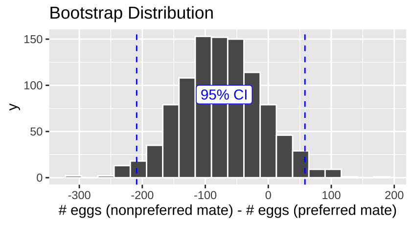
Figure 3: The bootstrap distribution for the difference between number of eggs laid with preferred and nonpreffered mates.
There is considerable uncertainty in our estimates. Our bootstrapped 95% confidence interval includes cases where preferred matings yield more hatched eggs than nonpreferred matings, as well as cases where nonpreferred matings result in more hatched eggs.
How do we test the null hypothesis that mate preference does not affect egg hatching? Let’s generate a sampling distribution under the null!
Permute to Generate a Null Distribution!
IT’S TIME TO…

PERMUTE THE FROG
In a permutation test, we generate a null distribution by shuffling the association between explanatory and response variables. We then calculate a p-value by comparing the test statistic from the actual data to the null distribution generated by shuffling.
Steps in a Permutation Test
- State the null (\(H_0\)) and alternative (\(H_A\)) hypotheses.
- Decide on a test statistic.
- Calculate the test statistic for the actual data.
- Permute the data by shuffling values of the explanatory variables across observations.
- Calculate the test statistic on this permuted data set.
- Repeat steps 4 and 5 many times to generate the sampling distribution under the null (a thousand permutations is standard; more permutations result in a more precise p-value).
- Calculate a p-value as the proportion of permuted values that are as or more extreme than what was observed in the actual data.
- Interpret the p-value.
- Write up the results.
1. State \(H_0\) and \(H_A\)
- \(H_0\): The number of hatched eggs does not differ between preferred and non-preferred matings.
- \(H_A\): The number of hatched eggs differs between preferred and non-preferred matings.
2. Decide on a test statistic
The test statistic for a permutation test can be whatever best captures our biological hypothesis. In this case, we’ll use the difference in the mean number of eggs hatched between non-preferred and preferred matings.
3. Calculate the test statistic for the actual data
In section on estimation, we found that the mean number of eggs hatched was:
- 345.11 for preferred matings
- 413.93 for non-preferred matings
This gives a difference of -68.82 between the means.
4. Permute the data
Now we permute the data by randomly shuffling the “treatment” onto our observed response variable, hatched.eggs, using the sample() function. Let’s make one permutation below:
After shuffling treatment labels onto values, some observations stay with the original treatment, and others swap. This process generates a null distribution by removing any biological explanation for an association.
5. Calculate the test statistic on permuted data
Next, we calculate the difference in means for this permuted dataset.
group_by()the permuted treatment
summarise()the permuted treatment means
- find the difference between group means using
diff().
# A tibble: 1 × 1
  diff_hatched
         <dbl>
1         142.
Our single permutation (one sample from the null distribution) revealed a difference of 142.45 eggs on average between non-preferred and preferred matings. Remember, we know there is no actual association here because we randomly shuffled the data. We now repeat this process many times to build the null sampling distribution.
This permuted difference of 142.45 is MORE extreme than the actual difference of -68.82 between treatments.
6. Build the null sampling distribution
One permutation is just one sample from the null distribution. We now repeat this process many times to generate the full sampling distribution.
PERMUTE MANY TIMES AND SUMMARIZE PERMUTED GROUPS FOR EACH REPLICATE
perm_reps <- 1000

many_perms <- replicate(n = perm_reps, simplify = FALSE,
 expr = frogs %>%
   dplyr::select(treatment, hatched.eggs) %>%
   dplyr::mutate(perm_treatment = sample(treatment, size = n(), replace = FALSE)) %>%
   group_by(perm_treatment) %>%
   summarise(mean_hatched = mean(hatched.eggs)) %>%
   summarise(diff_hatched = diff(mean_hatched))) %>%
bind_rows()ggplot(many_perms, aes(x = diff_hatched)) +
geom_histogram(bins = 25, color = "white") +
labs(title = "Permuted Sampling Distribution") +
geom_vline(xintercept = pull(mean_diff), color = "red", lty = 2) +
annotate(x = pull(mean_diff), y = 70, hjust = 1, geom = "label", label = "Observed", color = "red", alpha = .4)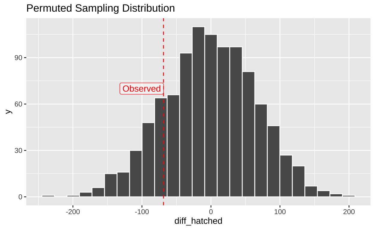
7. Calculate a p-value
Now that we have both our observed test statistic and the null sampling distribution, we can calculate the p-value—the probability of observing a test statistic as extreme as, or more extreme than, what we saw if the null hypothesis were true.
To conduct a two-tailed test, we use absolute values to account for extremes in both directions.
many_perm_diffs <- many_perms %>%
  dplyr::select(diff_hatched) %>%
  mutate(abs_obs_dif = abs(pull(mean_diff)),
         abs_perm_dif = abs(diff_hatched),
         as_or_more_extreme = abs_perm_dif >= abs_obs_dif)

ggplot(many_perm_diffs, aes(x = diff_hatched, fill = as_or_more_extreme)) +
  geom_histogram(bins = 25, color = "white") +
  scale_fill_manual(values = c("grey", "black")) +
  theme_light() +
  theme(legend.position = "bottom") +
  labs(title = "Permuted Distribution") +
  geom_vline(xintercept = c(-1, 1) * pull(mean_diff), color = "lightblue") +
  annotate(x = pull(mean_diff), y = 99, geom = "label", color = "lightblue", label = "Observed", alpha = .4) +
  scale_y_continuous(limits = c(0, 130))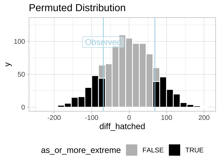
Figure 4: Sampling distribution for the difference in mean eggs hatched by treatment under the null hypothesis (light blue lines show the observed value).
CALCULATE A P-VALUE
We find the proportion of permutations that are as or more extreme than the observed data by calculating the mean of as_or_more_extreme (where FALSE = 0 and TRUE = 1).
# A tibble: 1 × 1
  p_value
    <dbl>
1    0.31
8. Interpret the p-value
We found a p-value of 0.31, meaning that in a world where there is no true association between mating treatment and the number of eggs hatched, 31% of samples would show a difference as or more extreme than what we observed in our sample.
Therefore, we fail to reject the null hypothesis, as we do not have enough evidence to support the alternative hypothesis that the number of eggs hatched differs between preferred and non-preferred matings.
9. Example write-up
In this study, we tested whether the number of hatched eggs differed between wood frogs that mated with preferred versus non-preferred females. Using a permutation test, we evaluated the null hypothesis that the number of eggs hatched does not differ between these two groups.
W On average, frogs that mated with their preferred partner hatched 345.11 eggs, while those that mated with their non-preferred partner hatched 413.93 eggs. The observed difference in the number of eggs hatched between the two groups was -68.82 eggs (Figure 5).
To assess the significance of this observed difference, we generated a null distribution of the differences in egg counts by permuting the treatment labels (preferred vs. non-preferred). After running 1,000 permutations, we calculated a two-tailed p-value of 0.31. This indicates that in a world where there is no true association between mating treatment and the number of eggs hatched, we would expect to see a difference as extreme as the observed one in 31% of cases due to random chance alone. We therefore fail to reject the null hypothesis. This suggests that there is insufficient evidence to support the claim that the number of hatched eggs is influenced by whether the male mated with a preferred or non-preferred female.
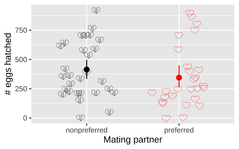
Figure 5: No evidence that the number of hatched eggs differed in nonpreferred vs preferred matings (two-tailed permutation based p-value >> 0.05). Emojis show raw data, points show groups means, and lines display bootstrapped 95% confidence intervals.
How to Deal with Non-Independence Using Permutation
Permutation can solve many statistical problems. However, when dealing with complex data (e.g., involving more than one explanatory variable), we need to carefully consider how to shuffle the data to ensure that we’re testing the hypotheses we’re interested in, and not inadvertently introducing confounding factors.
For example, in our frog experiment, the data were collected over two years, and the design was slightly unbalanced—there were more non-preferred couples than preferred ones in 2013. This imbalance introduces a confounding factor, meaning our previous p-value might not be accurate, as the difference between years could influence our results.
# A tibble: 4 × 3
# Groups:   year [2]
   year treatment        n
  <int> <chr>        <int>
1  2010 nonpreferred    15
2  2010 preferred       15
3  2013 nonpreferred    14
4  2013 preferred       12
Indeed, the mean number of hatched eggs differs substantially across the two years, which could confound our analysis.
frogs %>%
  ggplot(aes(x = factor(year), y = hatched.eggs, color = treatment,shape = treatment)) +
  geom_point(position = position_jitterdodge(jitter.width = .2), size = 3, alpha = .5) +
  stat_summary(position = position_nudge(x = c(-.2, .2)),color = "black", show.legend = FALSE)+
  stat_summary(geom="line",aes(group =  treatment), show.legend = FALSE)+
  labs(x = "year", y = "hatched eggs")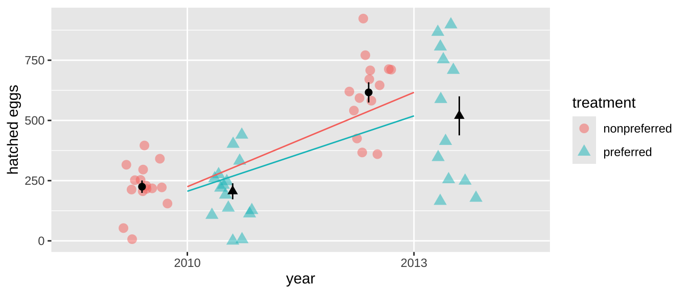
To address this non-independence, we need to shuffle treatments within each year rather than across the entire dataset. This ensures that any differences we detect are not confounded by the year of data collection. With more complex datasets, this issue can become even trickier, but the same principle applies: you need to preserve the structure of the data by permuting within appropriate groups.
To do this, we can use group_by() on any variable we need to shuffle within to maintain the integrity of the data structure. Here’s how we can shuffle treatments within each year:
By permuting within years, we’ve controlled for the potential confounding effect of year in our analysis. Now, let’s calculate summary statistics and find the p-value. Since we permuted within year, we no longer have to worry about the confounding effect of year!
abs_observed_mean <- frog_summary %>%
  summarise(diff_hatched = diff(mean_hatched),
            abs_diff_hatched = abs(diff_hatched)) %>%
  pull(abs_diff_hatched)

year_perm %>%
  summarise(abs_perm_diff_hatched = abs(diff_hatched_perm)) %>%
  ungroup() %>%
  mutate(as_or_more_extreme = abs_perm_diff_hatched >= abs_observed_mean) %>%
  summarise(p_value = mean(as_or_more_extreme))
# A tibble: 1 × 1
p_value
<dbl>
1 0.159This more appropriate p-value is still greater than the conventional \(\alpha\) threshold of 0.05, but it is much closer to the threshold compared to the previous p-value calculated without considering the effect of year. Although we still fail to reject the null hypothesis, we might now be more willing to entertain the idea that frogs lay more eggs with non-preferred mates, based on this corrected p-value.
Permutation I quiz
Figure 6: The accompanying permutation quiz I link.