Learning goals: By the end of this chapter, you should:
- Be able to explain and interpret summaries of the location and spread of a dataset.
- Recognize and use the mathematical formulae for these summaries.
- Calculate these summaries in R.
- Use a histogram to responsibly interpret a given numerical summary, and to evaluate which summary is most important for a given dataset (e.g. mean vs. median, or variance vs. interquartile range).
Four things we want to describe
While there are many features of a dataset we may hope to describe, we mostly focus on four types of summaries:
- The location of the data: e.g. mean, median, mode, etc…
- The shape of the data: e.g. skew, number of modes, etc…
- The spread of the data: e.g. range, variance, etc…
- Associations between variables: e.g. correlation, covariance, etc…
Today we focus mainly on the spread and location of the data, as well as the shape of the data (because the meaning of other summaries depend on the shape of the data). We save summaries of associations between variables for later chapters.
When summarizing data, we are taking an estimate from a sample, and do not have a parameter from a population.
In stats we use Greek letters to describe parameter values, and the English alphabet to show estimates from our sample.
We usually call summaries from data sample means, sample variance etc. to remind everyone that these are estimates, not parameters. For some calculations (e.g. the variance) the equations to calculate the parameter from a population differ slightly from equations to estimate it from a sample, because otherwise estimates would be biased.Data set for today
We will continue to rely on the the penguins data available in the palmerpenguins package.
](images/culmen_depth.png)
Figure 1: A description of bill measurements in the penguin dataset link
Measures of location
Figure 2: OPTIONAL Watch this video on Calling Bullshit on summarizing location (15 min and 05 sec) if you want another explanation.
We hear and say the word, “Average”, often. What do we mean when we say it? “Average” is an imprecise term for a middle or typical value. More precisely we talk about:
Mean (aka \(\overline{x}\)): The expected value. The weight of the data. We find this by adding up all values and dividing by the sample size. In math notation, this is \(\frac{\Sigma x_i}{n}\), where \(\Sigma\) means that we sum over the first \(i = 1\), second \(i = 2\) … up until the \(n^{th}\) observation of \(x\), \(x_n\). and divide by \(n\), where \(n\) is the size of our sample.
Median: The middle value. We find the median by lining up values from smallest to biggest and going half-way down.
Mode: The most common value in our data set. We will not discuss this in any detail.
Let’s explore this with the penguin data.
To keep things simple, let’s focus on the bill_length_mm all sexes and species at once.
We can calculate the sample mean as \(\overline{x} = \frac{\Sigma{x_i}}{n}\) so,
\(\overline{x} = \frac{38.9 + 49.5 + 35.7 + 37.5 + 36.8 + 37.5 + \dots + 45.3 + 39.7 + 45.4 + 47.3 + 39.7 + 40.8}{342}\)
\(\overline{x} = \frac{1.50213\times 10^{4}}{342}\)
\(\overline{x}= 43.922\)We can calculate the sample median by sorting the data(excluding NAs), going halfway down the table and take the value in the middle of our data (taking the average of the two values if we have an even number of observations). Following this protocol for bill length (Figure 3), we see the median bill length in our data set is 44.45 mm.
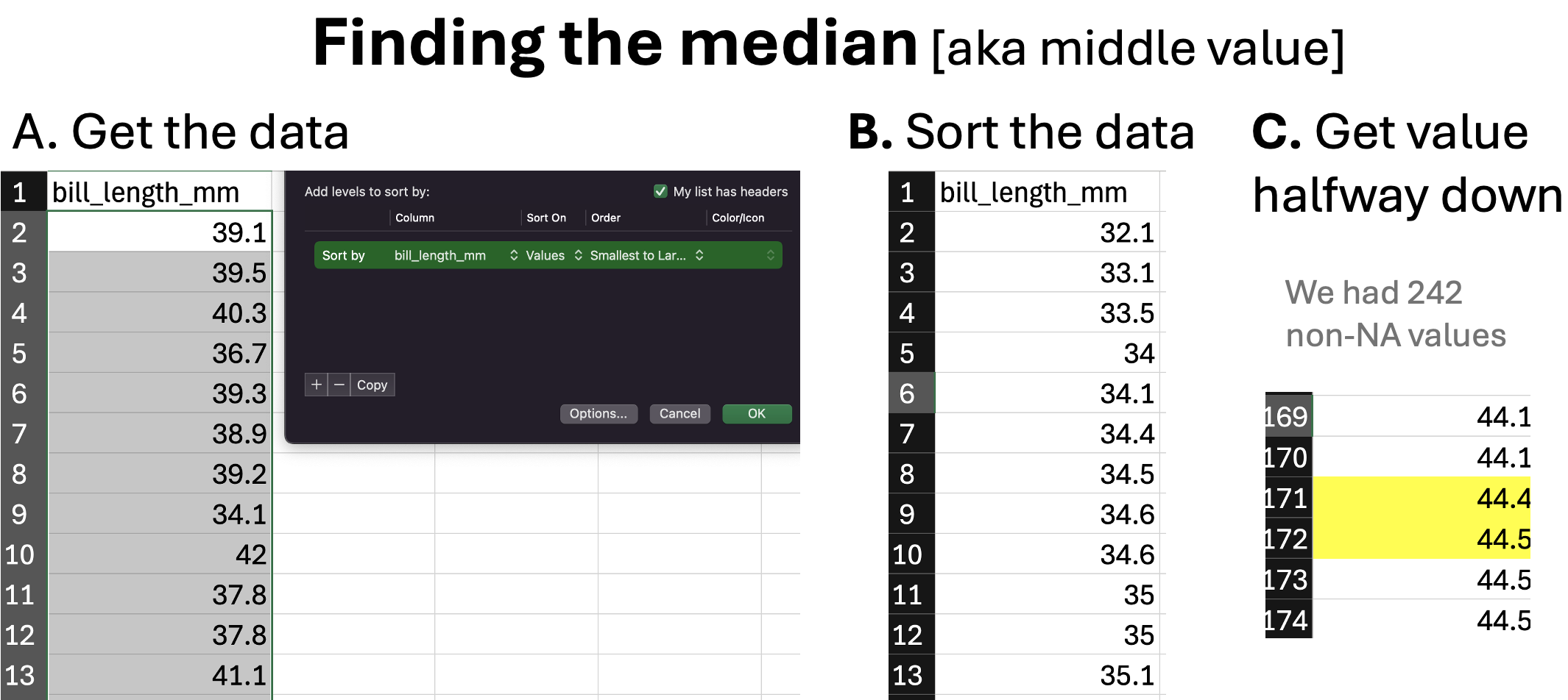
Figure 3: An illustration of finding the median.
Summarizing the location of our data in R
As we saw in the previous chapter we can use the summarize() to describe our data. Here we can use the mean() and median() functions (built into base R), or math (being sure to divide by the number of samples with data, not the total sample size) to find these values. In doing so, make sure to tell R to ignore missing data with na.rm = TRUE.
penguins %>%
  summarize(n = n(),
            n_with_data  = sum(!is.na(bill_length_mm)),
            mean_by_math = sum(bill_length_mm, na.rm  = TRUE) / n_with_data,
            mean_bill    = mean(bill_length_mm, na.rm  = TRUE),
            median_bill  = median(bill_length_mm, na.rm  = TRUE))
# A tibble: 1 × 5
n n_with_data mean_by_math mean_bill median_bill
<int> <int> <dbl> <dbl> <dbl>
1 344 342 43.9 43.9 44.4Getting summaries by group in R
As we saw previously we can combine the group_by() and summarize() to get summaries by group.
bill_length_summary <- penguins %>%
  group_by(species, sex)%>%
  summarize(mean_bill = mean(bill_length_mm, na.rm  = TRUE))%>%
  ungroup()

bill_length_summary
# A tibble: 8 × 3
species sex mean_bill
<fct> <fct> <dbl>
1 Adelie female 37.3
2 Adelie male 40.4
3 Adelie <NA> 37.8
4 Chinstrap female 46.6
5 Chinstrap male 51.1
6 Gentoo female 45.6
7 Gentoo male 49.5
8 Gentoo <NA> 45.6After a few quick tricks to make it easier to look at (by making it longer a.ka. untidy), we see that on average males have larger bills than females, and that Adelie penguins tend to have to smallest bills (see also Figure 4). Later in the term, we consider how easily sampling error could generate such a difference between estimates from different samples.
bill_length_summary %>%
  pivot_wider(names_from = sex,values_from = mean_bill)%>% # reformatting the table by magic
kable(digits = 2)| species | female | male | NA |
|---|---|---|---|
| Adelie | 37.26 | 40.39 | 37.84 |
| Chinstrap | 46.57 | 51.09 | NA |
| Gentoo | 45.56 | 49.47 | 45.62 |
# Let's use the gwalkr function in the GWalkR package to look at these data (ignore the code below)
visConfig2 <- '[{"config":{"defaultAggregated":false,"geoms":["tick"],"coordSystem":"generic","limit":-1},"encodings":{"dimensions":[{"fid":"c3BlY2llcw==","name":"species","basename":"species","semanticType":"nominal","analyticType":"dimension"},{"fid":"c2V4","name":"sex","basename":"sex","semanticType":"nominal","analyticType":"dimension"},{"fid":"gw_mea_key_fid","name":"Measure names","analyticType":"dimension","semanticType":"nominal"}],"measures":[{"fid":"YmlsbF9sZW5ndGhfbW0=","name":"bill_length_mm","basename":"bill_length_mm","analyticType":"measure","semanticType":"quantitative","aggName":"sum"},{"fid":"YmlsbF9kZXB0aF9tbQ==","name":"bill_depth_mm","basename":"bill_depth_mm","analyticType":"measure","semanticType":"quantitative","aggName":"sum"},{"fid":"ZmxpcHBlcl9sZW5ndGhfbW0=","name":"flipper_length_mm","basename":"flipper_length_mm","analyticType":"measure","semanticType":"quantitative","aggName":"sum"},{"fid":"Ym9keV9tYXNzX2c=","name":"body_mass_g","basename":"body_mass_g","analyticType":"measure","semanticType":"quantitative","aggName":"sum"},{"fid":"gw_count_fid","name":"Row count","analyticType":"measure","semanticType":"quantitative","aggName":"sum","computed":true,"expression":{"op":"one","params":[],"as":"gw_count_fid"}},{"fid":"gw_mea_val_fid","name":"Measure values","analyticType":"measure","semanticType":"quantitative","aggName":"sum"}],"rows":[{"fid":"YmlsbF9sZW5ndGhfbW0=","name":"bill_length_mm","basename":"bill_length_mm","analyticType":"measure","semanticType":"quantitative","aggName":"sum"}],"columns":[{"fid":"c2V4","name":"sex","basename":"sex","semanticType":"nominal","analyticType":"dimension"},{"fid":"c3BlY2llcw==","name":"species","basename":"species","semanticType":"nominal","analyticType":"dimension"}],"color":[{"fid":"c3BlY2llcw==","name":"species","basename":"species","semanticType":"nominal","analyticType":"dimension"}],"opacity":[],"size":[],"shape":[],"radius":[],"theta":[],"longitude":[],"latitude":[],"geoId":[],"details":[],"filters":[],"text":[]},"layout":{"showActions":false,"showTableSummary":false,"stack":"stack","interactiveScale":false,"zeroScale":true,"size":{"mode":"auto","width":320,"height":200},"format":{},"geoKey":"name","resolve":{"x":false,"y":false,"color":false,"opacity":false,"shape":false,"size":false}},"visId":"gw_RFEq","name":"Chart 1"}]';gwalkr(penguins, visConfig=visConfig2)
Figure 4: Ineractive visualization of the palmer penguin data set, highlighting species and sex differences in bill length
Summarizing shape of data
Figure 5: OPTIONAL: The shape of distributions from Crash Course Statistics.
Histograms show the shape of data
Always look at the data before interpreting or presenting a quantitative summary. A simple histogram is best for one variable, while scatter plots are a good starting place for two continuous variables.
🤔WHY? 🤔 Because knowing the shape of our data is critical for making sense of any summaries.… A lot of people don’t know what a histogram shows or how the chart works. This is a guide for that. Because seeing distributions is way more interesting than means and medians, which oftentimes overgeneralize. Start with some random data. We don’t care what the data is about right now. All you need to know is that darker dots represent higher values, and lighter dots represent lower values. The positions of the dots are random and don’t mean anything.

Given the random positions, it’s tough to make out any patterns in the data. Are there more data points on the low end or on the high end? What about values in the middle? put dots with the same (rounded) values in a stack and still sort horizontally? You get several stacks (or columns) of dots placed horizontally based on their values. Now you can easily see higher and lower stacks and where they sit on the value axis (the x-axis). Most of the data falls into the middle with fewer as you move out to the edges.
How about if you put dots with the same (rounded) values in a stack and still sort horizontally? You get several stacks (or columns) of dots placed horizontally based on their values. Now you can easily see higher and lower stacks and where they sit on the value axis (the x-axis). Most of the data falls into the middle with fewer as you move out to the edges.

You can make out the shape of the data and see individual data points. But what if you have a million data points instead of a hundred. There are only so many pixels on the screen or so much space on paper to show the individual dots. So instead, you can abstract the dot columns into bars. Bar heights match the heights of the dot columns.

The bars make the shape of the data straightforward. Again, you see higher frequencies in the middle of the value spectrum and then the bar heights taper off as you move away from the middle. When you see just means and medians, you only see a sliver of the middle and miss out on all the details of the full dataset. Maybe the spread is wider. Maybe it’s really narrow. Maybe the shape favors the left side or the right side.
The example above comes from Nathan Yau’s blog post, “How Histograms Work”.
Making a histogram in R
As we move through the term, we will use ggplot2, to make great looking plots in R. But right now, we just want to make a quick histogram. The easiest way do this is simply to use the gwalkr(data = <MY_TIBBLE>) function (where MY_TIBBLE is replaced wit hthe name of the data you are looking at – in this case, penguins) in the GWalkR package (make sure it is already installed, and then load it with [library](https://www.rdocumentation.org/packages/base/versions/3.6.2/topics/library)(GWalkR)). After running this, and clicking the DATA tab in your viewer, you will see a histogram for numeric variable as dispayed in Figure 8.
Skewness
To help think about the shape of the data, let’s stick with our penguin data set, but focus on body mass - as such data are skewed in many species.
Figure 6: Histogram of penguin body mass. The median is the dashed red line, and the mean is shown by the solid blue line.
We notice two related things about Figure 6:
1. There are a numerous extremely large values.
2. The median is substantially less than the mean.
We call data like that in Figure 6 Right skewed, while data with an excess of extremely small values, and with a median substantially greater than the mean are Left skewed.
In Figure 7, we show example density plots of left-skewed, unskewed, and right-skewed data.
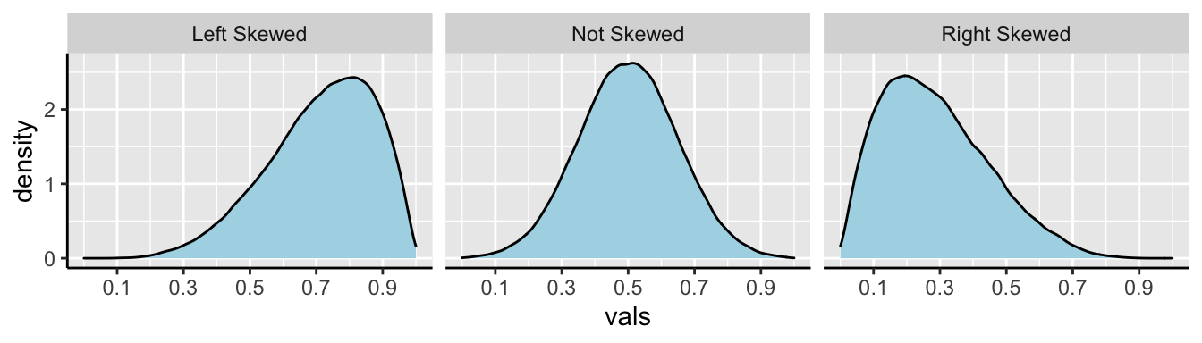
Figure 7: Examples of skew.
Number of modes
The number of “peaks” or “modes” in the data is another important descriptor of its shape, and can reveal important things about the data. Without any information about species or sex, the histogram penguin flipper lengths shows two conspicuous peaks in the data (Figure 8). Bimodal data suggests (but does not always mean) that we have sampled from two populations. Revisit Figure 4 and swap out bill_length_mm for flipper_length_mm to see if you can tell which groups correspond to these different peaks.
](images/flipper_dist_highlight.png)
Figure 8: Flipper length (shown with a yellow box) is bimodal. This plot can be found by clicking on the Data tab in the interactive plot above
Although multimodal data suggest (but do not guarantee) that samples originate from multiple populations, data from multiple populations can also look unimodal when those distributions blur into each other (Figure 9).
](images/body_mass_mode_diff.png)
Figure 9: Data from multiple (statistical) populations can appear to be unimodal. You can generate this plot from interactive plot above
Measures of width
Variability (aka width of the data) is not noise that gets in the way of describing the location. Rather, the variability in a population is itself an important biological parameter which we estimate from a sample. For example, the key component of evolutionary change is the extent of genetic variability, not the mean value in a population.
Common measurements of width are the
- Range: The difference between the largest and smallest value in a data set.
- Interquartile range (IQR): The difference between the \(3^{rd}\) and \(1^{st}\) quartiles.
- Variance: The average squared difference between a data point and the sample mean.
- Standard deviation: The square root of the variance.
- Coefficient of variation: A unitless summary of the standard deviation facilitating the comparison of variances between variables with different means.
Boxplots and Interquartile range (IQR)
We call the range and the interquartile range nonparametric because we can’t write down a simple equation to get them, but rather we describe a simple algorithm to find them (sort, then take the difference between things). Let’s use a boxplot to illustrate these summaries (Figure 10).
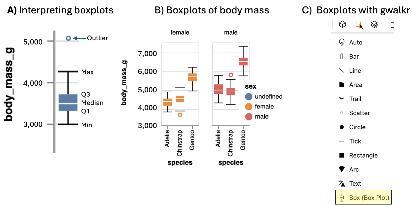
Figure 10: A) Boxplots display the four quartiles (max, Q3, media, Q2, and min) of our data. 75% of data points fall within the box, and the interquartile range is the difference between the top and bottom of the box. Extreme data points (aka outliers) are shown with a point. B) Boxplots of body mass of male and female penguins of three penguin species (modified from output of the interactive plot, above). C) Make a boxplot with GWalkr by clicking on the square widget and selecting the boxplot option.
We calculate the range by subtracting min from max (as noted in Fig. 10). But because this value increases with the sample size, it’s not super meaningful, and it is often given to provide an informal description of the width, rather than a serious statistic. I note that sometimes people use range to mean “what is the largest and smallest value?” rather than the difference between theme (in fact that’s what the
range()function in R does).We calculate the interquartile range (IQR) by subtracting Q1 from Q3 (as shown in Fig. 10). The IQR is less dependent on sample size than the range, and is therefore a less biased measure of the width of the data.
Calculating the range and IQR in R.
To calculate the range, we need to know the minimum and maximum values, which we find with the min() and max().
To calculate the IQR, we find the \(25^{th}\) and \(75^{th}\) percentiles (aka Q1 and Q3), by setting the probs argument in the quantile() function equal to 0.25 and 0.75, respectively.
penguins %>%
  group_by(species,sex) %>%
  summarise(mass_max   = max(body_mass_g, na.rm =TRUE),
            mass_min   = min(body_mass_g, na.rm =TRUE),
            mass_range = mass_max - mass_min,
            mass_q3    = quantile(body_mass_g, probs = c(.75), na.rm =TRUE),
            mass_q1    = quantile(body_mass_g, probs = c(.25), na.rm =TRUE),
            mass_iqr   = mass_q3 - mass_q1 ) %>%
  dplyr::select(mass_iqr, mass_range) %>% # we havent learned this function but it simply lets us chose columns to select
  ungroup()
# A tibble: 8 × 3
species mass_iqr mass_range
<fct> <dbl> <int>
1 Adelie 375 1050
2 Adelie 500 1450
3 Adelie 400 1275
4 Chinstrap 331. 1450
5 Chinstrap 369. 1550
6 Gentoo 412. 1250
7 Gentoo 400 1550
8 Gentoo 250 775Or we can get use R’s built in R functions
- Get the interquartile range with the built-in
IQR()function, and
- Get th difference between largest and smallest values by combining the
range()anddiff()functions.
penguins %>%
  group_by(species, sex) %>%
  summarise(mass_IQR   = IQR(body_mass_g, na.rm =TRUE) ,
            mass_range = diff(range(body_mass_g, na.rm =TRUE) ))
# A tibble: 8 × 4
# Groups: species [3]
species sex mass_IQR mass_range
<fct> <fct> <dbl> <int>
1 Adelie female 375 1050
2 Adelie male 500 1450
3 Adelie <NA> 400 1275
4 Chinstrap female 331. 1450
5 Chinstrap male 369. 1550
6 Gentoo female 412. 1250
7 Gentoo male 400 1550
8 Gentoo <NA> 250 775Variance, Standard Deviation & Coefficient of Variation.
The variance, standard deviation, and coefficient of variation all communicate how far individual observations are expected to deviate from the mean. However, because (by definition) the differences between all observations and the mean sum to zero (\(\Sigma x_i = 0\)), these summaries work from the squared difference between observations and the mean. As a reminder, the sample mean bill length in mm was 4201.754.
To work through these ideas and calculations, let’s return to the bill length across the entire penguin data set. Before any calculations, lets make a simple plot to help investigate these summaries:
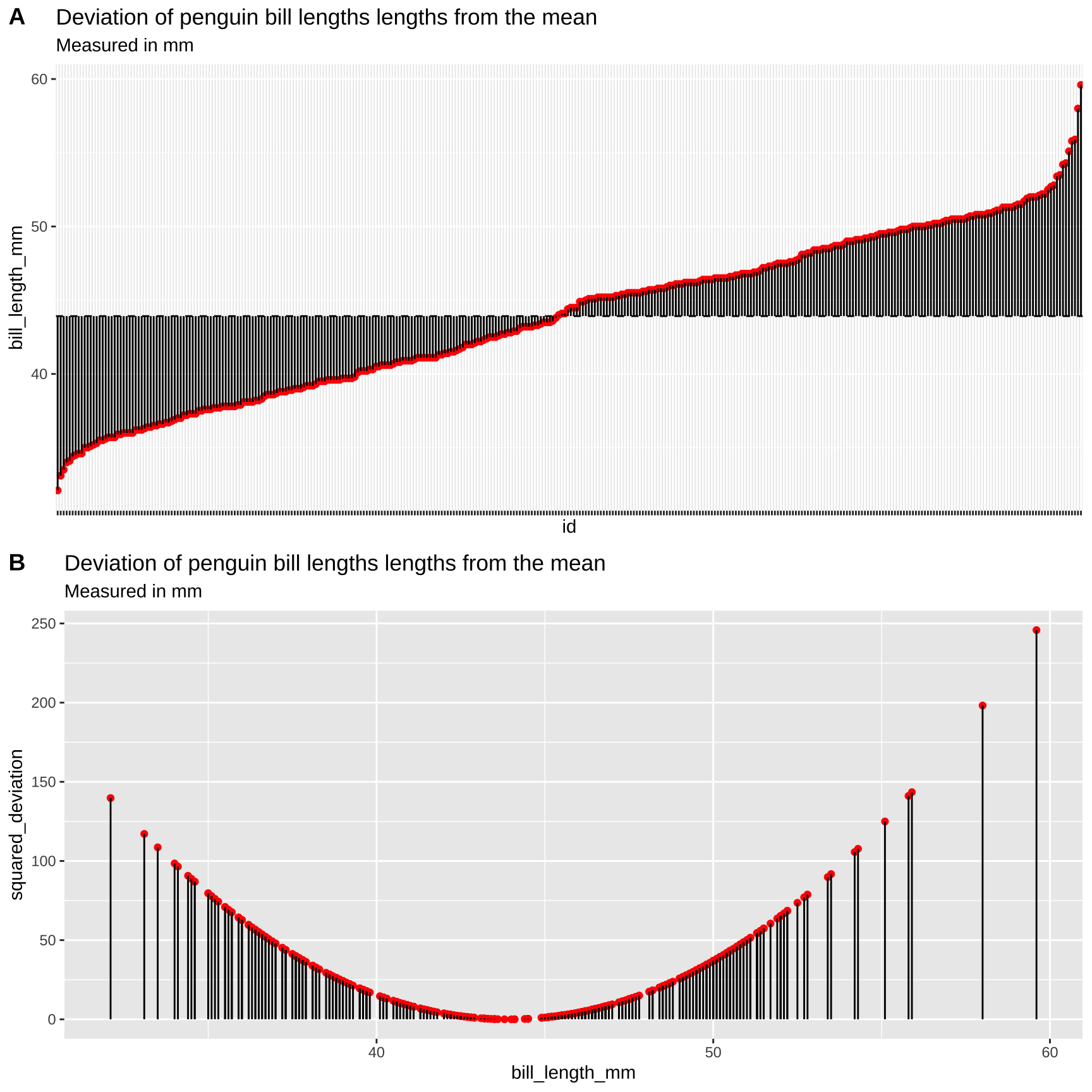
Figure 11: Visualizing variability in the Iris setosa style lengths. A) The red dots show the bill length (in mm) of each penguin, and the solid black lines show the difference between these values and the mean (dotted line). B) Every bill is shown on the x-axis. The y-axis shows the squared difference between each observation and the sample mean. The solid black line highlights the extent of these values.
Calculating the Sample Variance:
The sample variance, which we call \(s^2\), is the sum of squared differences of each observation from the mean, divided by the sample size minus one. We call the numerator ‘sums of squares x’, or \(SS_x\).
\[s^2=\frac{SS_x}{n-1}=\frac{\Sigma(x_i-\overline{x})^2}{n-1}\].
Here’s how I like to think the steps:
- Getting a measure of the individual differences from the mean, then.
- Squaring those diffs to get all the values positive,
- Adding all those up, then dividing them to get something close to the mean of the differences.
- Instead of dividing by \(n\), though, we use \(n-1\) to adjust for sample sizes (as we get larger numbers, subtracting one becomes less consequential).
We know that this dataset contains r nrow(penguins) observations (excluding NA values), so \(n-1 = 342 - 1\), so let’s work towards calculating the Sums of Squares x, \(SS_x\).
Figure 11A highlights each value of \(x_i - \overline{x}\) as the length of each line. Figure 11B plots the square of these values, \((x_i-\overline{x})^2\) on the y-axis, again highlighting these squared deviations with a line. So to find \(SS_x\), we.
- Take each observation,
- Subtract away the mean,
- Square this value for each observation.
- Sum across all observations.
For the penguins dataset, it looks like this: \(SS_x = (39.1 - 43.9)^2 + (39.5 - 43.9)^2 + (40.3 - 43.9)^2 + (NA - 43.9)^2 + (36.7 - 43.9)^2 + (39.3 - 43.9)^2 \dots\) with those dots meaning that we kept doing this for all observations.
Doing this, we find \[SS_x = 10164.2\]
Dividing \(SS_X\) by the sample size minus one (i.e. \(342 - 1 = 341\)), the sample variance is \[\frac{SS_x}{(n-1)} = 29.8\]
Calculating the Sample Standard Deviation:
The sample standard deviation, which we call \(s\), is simply the square root of the variance. So \(s = \sqrt{s^2} = \sqrt{\frac{SS_x}{n-1}} = \sqrt{\frac{\Sigma(x_i-\overline{x})^2}{n-1}}\). For the example above, the sample standard deviation, \(s\), equals \(\sqrt{29.807} = 5.46\).
🤔You may ask yourself🤔
When should you report or use the standard deviation vs the variance? Because they are simple mathematical transformations of one another, it is usually up to you—just make sure you communicate clearly.
Why teach or learn both the standard deviation and the variance? We teach both because they are presented in the literature, and sometimes one of these values fits more naturally in an equation.
Calculating the Sample Coefficient of Variation
The sample coefficient of variation standardizes the sample standard deviation by the sample mean. So the sample coefficient of variation equals the sample standard deviation divided by the sample mean, multiplied by 100:
\[CV = 100 \times \frac{s_x}{\overline{X}}\]
For the example above, the sample coefficient of variation equals \(100 \times \frac{5.46}{43.922} = 12.43%\).
The standard deviation often increases with the mean. For example, consider measurements of weight for ten individuals calculated in pounds or stones. Since there are 14 pounds in a stone, the variance for the same measurements on the same individuals will be fourteen times greater for measurements in pounds compared to stones. Dividing by the mean removes this effect. Because this standardization results in a unitless measure, we can then meaningfully ask questions like “What is more variable, human weight or dolphin swim speed?”
🤔 You may ask yourself🤔 When should you report the standard deviation vs the coefficient of variation?
When sticking to one study, it’s useful to present the standard deviation because no conversion is needed to make sense of this number.
When comparing studies with different units or measurements, consider using the coefficient of variation.
Calculating the Variance, Standard Deviation, and Coefficient of Variation in R
Calculating Variance, Standard Deviation, and Coefficient of Variation with Math in R
We can calculate these summaries of variability with minimal new R knowledge! Let’s work through this step by step:
# Step one: calculate the mean and squared deviation
penguins_var <- penguins %>%
  dplyr::select(bill_length_mm) %>%                        # select the bill length
  mutate(deviation_bill_length = bill_length_mm - mean(bill_length_mm, na.rm = TRUE),
         sqrdev_bill_length = deviation_bill_length^2)      # calculate deviation and squared deviation
So, now that we have the squared deviations, we can calculate all of our summaries of interest.
penguins_var %>%
    summarise(n = sum(!is.na(bill_length_mm)),
              mean_bill = mean(bill_length_mm,na.rm = TRUE),
              var_bill = sum(sqrdev_bill_length, na.rm = TRUE) / (n- 1), # find the variance by summing the squared deviations and dividing by n-1
              stddev_bill  = sqrt(var_bill),         # find the standard deviation as the square root of the variance
              coefvar_bill = 100 * stddev_bill / mean_bill) # make variability comparable by coefficient of variation
# A tibble: 1 × 5
n mean_bill var_bill stddev_bill coefvar_bill
<int> <dbl> <dbl> <dbl> <dbl>
1 342 43.9 29.8 5.46 12.4Calculating Variance and Related Measures with Built-in R Functions
The code above shows us how to calculate these values manually, but as we saw with the mean() function, R often has built-in functions to perform common statistical procedures. Therefore, there’s no need to write the manual code above for a serious analysis. We can use the var() and sd()) functions to calculate these summaries more directly.
penguins %>%
  dplyr::select(bill_length_mm) %>%                               # select the bill length
  summarise(mean_bill    = mean(bill_length_mm, na.rm = TRUE),    # mean
            var_bill     = var(bill_length_mm, na.rm = TRUE),     # variance
            sd_bill      = sd(bill_length_mm),                    # standard deviation
            coefvar_bill = 100 * sd_bill / mean_bill)             # coefficient of variation
# A tibble: 1 × 4
mean_bill var_bill sd_bill coefvar_bill
<dbl> <dbl> <dbl> <dbl>
1 43.9 29.8 NA NAParameters and estimates
Above we discussed estimates of the mean (\(\overline{x} = \frac{\Sigma{x_i}}{n}\)), variance (\(s^2 = \frac{SS_x}{n-1}\)), and standard deviation (\(s = \sqrt{\frac{SS_x}{n-1}}\)). We focus on estimates because we usually have data from a sample and want to learn about a parameter from a sample.
If we had an actual population (or, more plausibly, worked on theory assuming a parameter was known), we use Greek symbols and have slightly difference calculations.
- The population mean \(\mu = \frac{\Sigma{x_i}}{N}\).
- The population variance = \(\sigma^2 = \frac{SS_x}{N}\).
- The population standard deviation \(\sigma = \sqrt{\sigma^2}\).
Where \(N\) is the population size.
🤔 ?Why? 🤔 do we divide the sum of squares by \(n-1\) to calculate the sample variance, and but divide it by \(N\) to calculate the population variance?
Estimate of the variance are biased to be smaller than they actually are if we divide by n (because samples go into estimating the mean too). Dividing byn-1 removes this bias. But if you have a population you are not estimating the mean, you are calculating it, so you divide by N. In any case, this does not matter too much as sample sizes get large.
Rounding and number of digits, etc…
How many digits should you present when presenting summaries? The answer is: be reasonable.
Consider how much precision you would you care about, and how precise your estimate is. If I get on a scale and it says I weigh 207.12980423544 pounds. I would probably say 207 or 207.1 because scales are generally not accurate to that level or precision.
To actually get our values from a tibble we have to pull() out the vector and round() as we see fit. If we don’t pull(), we have to trust that tidyverse made a smart, biologically informed choice of digits – which seems unlikely. If we do not round, R gives us soooo many digits beyond what could possibly be measured and/or matter.
# Example pulling and rounding estimates
# not rounding
summarise(penguins,
          mean_bill = mean(bill_length_mm, na.rm=TRUE)) %>%  # get the mean
  pull(mean_bill)                                            # pull it out of the tibble
[1] 43.92193# rounding to two digits
summarise(penguins,
mean_bill = mean(bill_length_mm, na.rm=TRUE)) %>% # get the mean
pull(mean_bill) %>% # pull it out of the tibble
round(digits =2) # round to two digits[1] 43.92Quiz
Figure 12: The accompanying quiz link
Definitions, Notation, Equations, and Useful functions
Definitions, Notation, and Equations
Location of data: The central tendency of the data.
Width of data: Variability of the data.
Summarizing location
Mean: The weight of the data, which we find by adding up all values and dividing by the sample size.
- Sample mean \(\overline{x} = \frac{\Sigma x}{n}\).
- Population mean \(\mu = \frac{\Sigma x}{N}\).
Median: The middle value. We find the median by lining up values from smallest to biggest and going half-way down.
Mode: The most common value in a dataset.
Range: The difference between the largest and smallest value.
Interquartile range (IQR): The difference between the third and first quartile.
Sum of squares: The sum of the squared difference between each value and its expected value. Here \(SS_x = \Sigma(x_i - \overline{x})^2\).
Variance The average squared difference between an observations and the mean for that variable.
- Sample variance: \(s^2 = \frac{SS_x}{n-1}\)
- Population variance: \(\sigma^2 = \frac{SS_x}{N}\)
Standard deviation: The sqaure root of the variance.
- Sample standard deviation: \(s=\sqrt{s^2}\).
- Population standard deviation: \(\sigma=\sqrt{\sigma^2}\).
Coefficient of variation: A unitless summary of the standard deviation facilitating the comparison of variances between variables with different means. \(CV = 100 \times \frac{s}{\overline{x}}\).
R functions to help summarize data
If your vector has any missing data (or anything else R seen as NA, R will return NA by default when we ask for summaries like the mean, media, variance, etc… This is because R does not know what these missing values are.
NA values add the na.rm = TRUE, e.g. summarise(mean(x,na.rm = TRUE)).
General functions
group_by(): Conduct operations separately by values of a column (or columns).
summarize():Reduces our data from the many observations for each variable to just the summaries we ask for. Summaries will be one row long if we have not group_by() anything, or the number of groups if we have.
sum(): Adding up all values in a vector.
diff(): Subtract sequential entries in a vector.
sqrt(): Find the square root of all entries in a vector.
unique(): Reduce a vector to only its unique values.
pull(): Extract a column from a tibble as a vector.
round(): Round values in a vector to the specified number of digits.
Summarizing location
n(): The size of a sample.
mean(): The mean of a variable in our sample.
median(): The median of a variable in our sample.
max(): The largest value in a vector.min(): The smallest value in a vector.range(): Find the smallest and larges values in a vector. Combine with diff() to find the difference between the largest and smallest value…quantile(): Find values in a give quantile. Use diff(quantile(... , probs = c(0.25, 0.75))) to find the interquartile range.IQR(): Find the difference between the third and first quartile (aka the interquartile range).var(): Find the sample variance of vector.sd(): Find the sample standard deviation of vector.