Motivating scenarios: Motivating scenarios: you have a fresh new data set and want to check it out. How do you go about looking into it?
Learning goals: By the end of this chapter you should be able to:
- Build a simple ggplot.
- Explain the idea of mapping data onto aesthetics, and the use of different geoms.
- Match common plots to common data type.
- Use geoms in ggplot to generate the common plots (above).
A quick intro to data visualization.
Recall that as bio-statisticians, we bring data to bear on critical biological questions, and communicate these results to interested folks. A key component of this process is visualizing our data.
They say “a picture is worth a thousand words,” similarly a clear graph can communicate complex patterns in our data.
Exploratory and explanatory visualizations
![]()
We generally think of two extremes of the goals of data visualization
- In exploratory visualizations we aim to identify any interesting patterns in the data, we also conduct quality control to see if there are patterns indicating mistakes or biases in our data, and to think about appropriate transformations of data. On the whole, our goal in exploratory data analysis is to understand the stories in the data.
![]()
- In explanatory visualizations we aim to communicate our results to a broader audience. Here our goals are communication and persuasion. When developing explanatory plots we consider our audience (scientists? consumers? experts?) and how we are communicating (talk? website? paper?).
The ggplot2 package in R is well suited for both purposes. Today we focus on exploratory visualization in ggplot2 because
- They are the starting point of all statistical analyses.
- You can do them with less
ggplot2knowledge.
- They take less time to make than explanatory plots.
Later in the term we will show how we can use ggplot2 to make high quality explanatory plots.
Centering plots on biology
Whether developing an explanatory or exploratory plot, you should think hard about the biology you hope to convey before jumping into a plot. Ask yourself
- What do you hope to learn from this plot?
- Which is the response variable (we usually place that on the y-axis)?
- Are data numeric or categorical?
- If they are categorical are they ordinal, and if so what order should they be in?
The answers to these questions should guide our data visualization strategy, as this is a key step in our statistical analysis of a dataset. The best plots should evoke an immediate understanding of the (potentially complex) data. Put another way, a plot should highlight both the biological question and its answer.
Before jumping into making a plot in R, it is often useful to take this step back, think about your main biological question, and take a pencil and paper to sketch some ideas and potential outcomes. I do this to prepare my mind to interpret different results, and to ensure that I’m using R to answer my questions, rather than getting sucked in to so much Ring that I forget why I even started. With this in mind, we’re ready to get introduced to ggploting!
My approach to figure-making in #ggplot ALWAYS begins with sketching out what I want the final product to look like. It feels a bit analog but helps me determine which #geom or #theme I need, what arrangement will look best, & what illustrations/images will spice it up. #rstats pic.twitter.com/GUjeEgqZxj
— Shasta E. Webb, PhD (@webbshasta) May 22, 2020
The idea of ggplot
Figure 1: Watch this video about getting started with ggplot2 (It is 7 min and 17 sec long), from STAT 545.
As described in the video above ggplot is built on a framework for building plots called the grammar of graphics. A major idea here is that plots are made up of data that we map onto aesthetic attributes.
Lets unpack this sentence, because there’s a lot there. Say we wanted to make a very simple plot e.g. observations for categorical data, or a simple histogram for a single continuous variable. Here we are mapping this variable onto a single aesthetic attribute – the x-axis.
ggplot in one place, check out the ggplot2 book (Wickham 2016) and/or the socviz book (Healy 2018).
Mapping aesthetics to variables
So first we need to think of the variables we hope to map onto an aesthetic. We will first explore this idea by building a scatterplot.
Scatterplots
Two of the most familiar and commonly used aesthetics are x and y. When we have two continuous variables we usually map the explanatory variable onto the x axis and the response variable onto the y. We then tell ggplot that we want to display the data as points with geom_point().
Before doing this in ggplot, let us revisit the plots we can make in GWalkR. Figure 2 shows a GWalkR plot with body mass on the x and flipper length on the y, with data as points (“scatter” from the pull down menu).
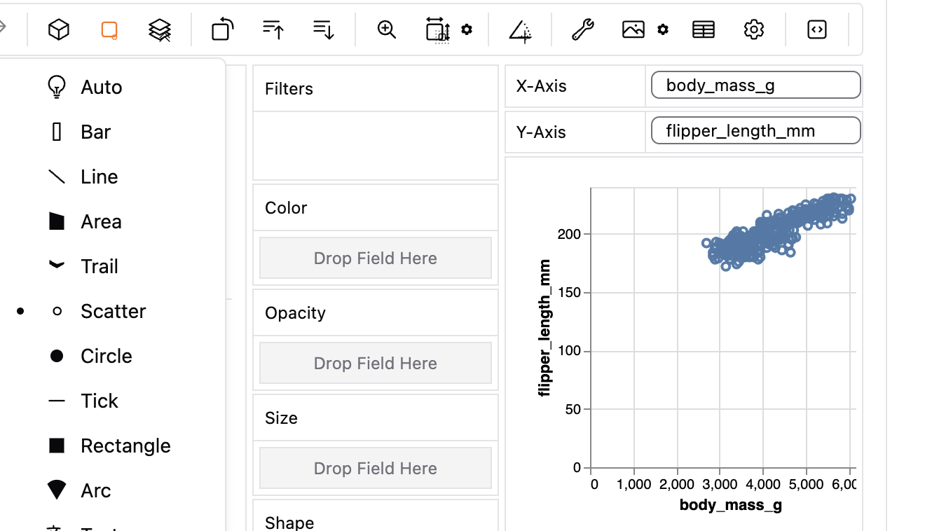
Figure 2: A GWalkR plot with continuous variables on the x and y axis, and showing the data as points (note the black dot next to scatter).
Figure 3 does the same thing in ggplot syntax. Here we map body mass and flipper length onto the x and y aesthetics, respectively, and show the data as points with geom_point().
ggplot(penguins, aes(x = body_mass_g, y = flipper_length_mm))+
  geom_point()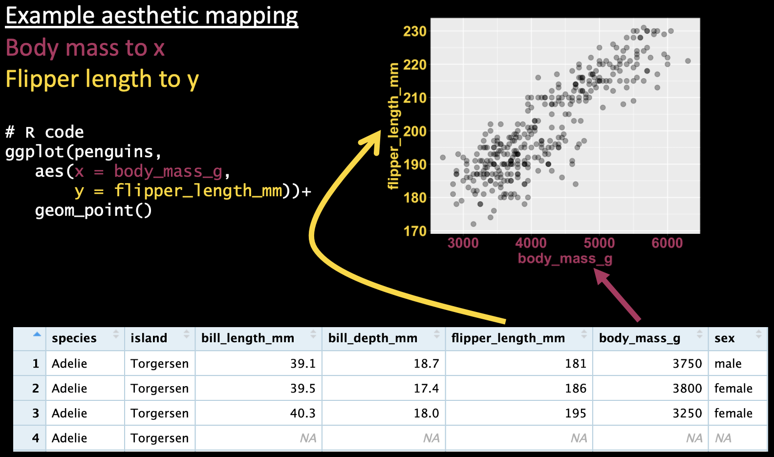
Figure 3: A ggplot mapping continuous variables onto the x and y axis, and showing the data as points.
This mapping approach can get pretty powerful, as it can allow us to visualize many dimensions. For example, we can map a categorical variable to shape and/or color to show additional aspects of our data. In GWalkR we would this by dragging species to color (e.g. Figure 4).
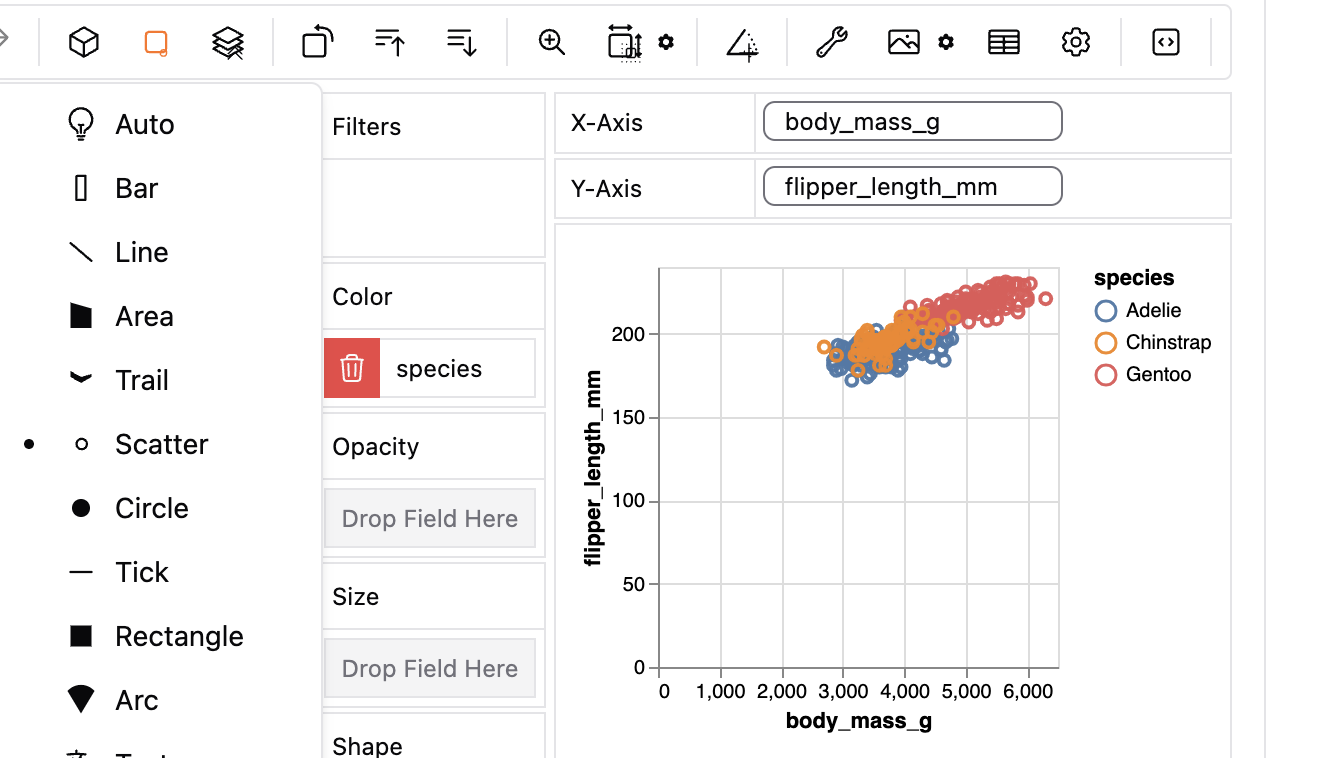
Figure 4: A gwalkr plot with continuous variables on the x and y axes, and a categorical variable (species) show by color, with data as points.
In ggplot, we do this by mapping species onto the color aesthetic (e.g. Figure 5).
ggplot(penguins, aes(x = body_mass_g, y = flipper_length_mm, color = species))+
  geom_point()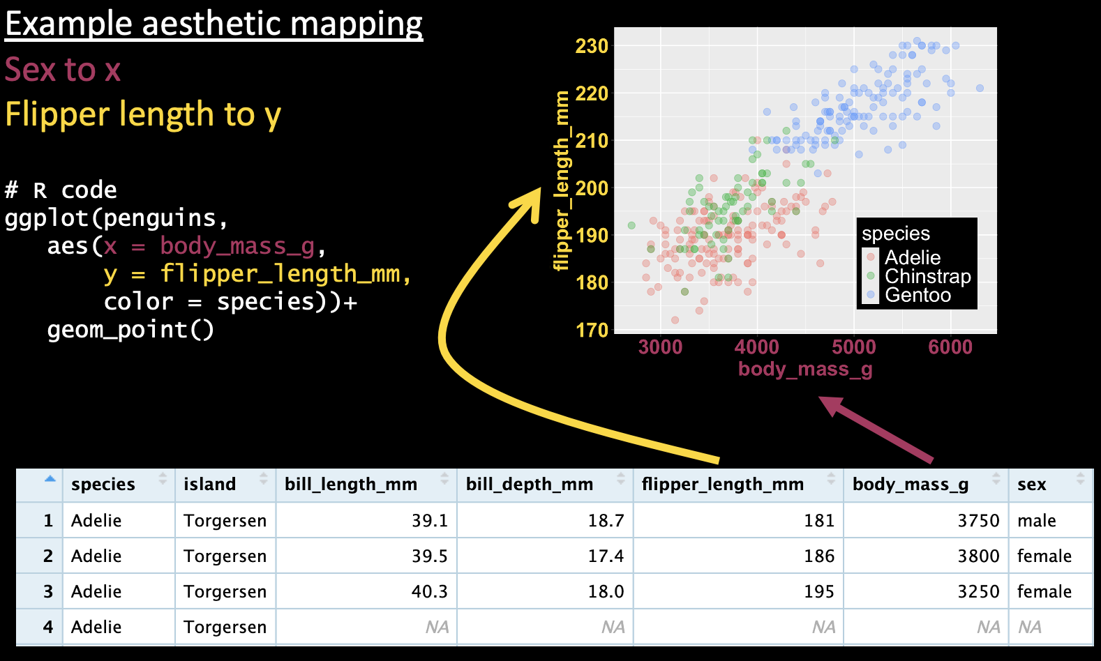
Figure 5: A ggplot mapping continuous variables onto the x and y axes, and a categorical variable (species) onto the color, and showing the data as points.
A categorical explanatory variable
We can use the same aesthetic mapping scheme to map a categorical variable onto the x-axis, as I show in Figure 6).
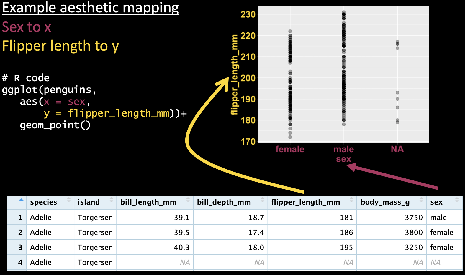
Figure 6: A ggplot mapping a categorical variable (sex) onto the x-axis, and a continuous variable (flipper length) onto the y axis, and showing the data as points.
However, these figures are are often difficult to interpret because many points on top of each other can all blur together (aka over-plotting). To avoid over-plotting, we can make the data somewhat transparent (controlled by the attribute alpha). There are a few solutions to this.
A jitterplot: We can spread the data across the x-axis (by changing to
geom_jitter(), as in 7A). When making a jitterplot, use thewidthargument to control the spread of points on the x-axis.A boxplot: As discussed previously, boxplots can show the spread of the data. We can make them in ggplot with
geom_boxplot()(Figure 7B). While boxplots do show the spread of data, they do not show individual data points and provide only a superficial view into the shape of the data.A histogram: Histograms clearly display the shape of our data. You can make them with
geom_histogram()as in Figure 7C).Rwill make some default decisions about the number of bins to display in a histogram, but you can make your own decision by either specifying the binwidth (geom_histogram(binwidth = THE_SIZE_OF_THE_BINS),or the number of bins (geom_histogram(bins = THE_NUMBER_OF_BINS). Note that when making a histogram we map our categorical variable onto the fill aesthetic – as opposed to color – as fills the bars, rather than coloring the lines around them. However, when we have more the distributions of categorical variables overlap, histograms can be hard to interpret.A density plot density plots (made with
geom_density()as in 7D) show a continuous distribution fit by our data. These both preserve the shape of the data, and allow us to overlay distributions for different categories (so long as we introduce some transparency into our density plots with thealphaargument). However, always remember that density plots are not our actual data but rather a distribution made to fit it.
I note that of these solutions, only the boxplot could be easily made in GWalkR (we could change the “geom”, by clicking on the boxplot logo in Marktype).
# Code to make the plots below (minus some bells and whistles)
# The actual code is here
# https://raw.githubusercontent.com/ybrandvain/code4biostats/main/categorical_explanatory.R
library(palmerpenguins)
library(ggplot2)

# A) Jitter plot
ggplot(data = penguins, aes(x = species, y = flipper_length_mm, color = species))+
  geom_jitter(height = 0, width = .2, size = 3,alpha = .4)

# B) Boxplot
ggplot(data = penguins, aes(x = species, y = flipper_length_mm, fill = species))+
  geom_boxplot()

# C) Histogram
ggplot(data = penguins, aes(x = flipper_length_mm,  fill = species))+
  geom_histogram()

# D) Density plot
ggplot(data = penguins, aes(x = flipper_length_mm, fill = species))+
  geom_density(alpha = .6)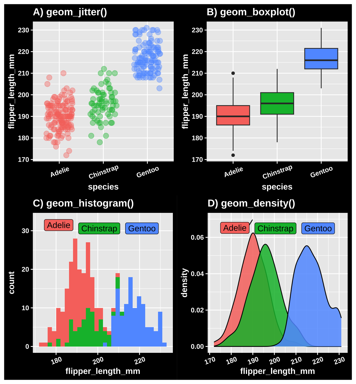
Figure 7: Three ways to show data with a categorical explanatory variable. A) A jitter plot. B) A bxoplot. C) A histogram. D) A density plot.
Adding small multiples geom layers
At the heart of quantitative reasoning is a single question: Compared to what? Small multiple designs, multivariate and data bountiful, answer directly by visually enforcing comparisons of changes, of the differences among objects, of the scope of alternatives. For a wide range of problems in data presentation, small multiples are the best design solution.
Edward Tufte (Tufte 1990)
Edward Tufte, a major figure in the field of data visualization - popularized the concept of “small multiples” – showing data with the same structure across various comparisons. He argued that such visualizations can help our eyes make powerful comparisons (See quote above). The idea of small multiples redacted Tufte – among the most famous such figures, The Horse in Motion (Figure 8), shows a horse as it runs.
 -- the first example of chronophotography -- is fantastic example of using *small multiples*.](https://upload.wikimedia.org/wikipedia/commons/7/73/The_Horse_in_Motion.jpg)
Figure 8: The Horse in Motion – the first example of chronophotography – is fantastic example of using small multiples.
Similarly the lunar phase can be well visulaized by using small multiples (Figure 9).
](https://miro.medium.com/v2/resize:fit:1204/format:webp/0*TYxvPE_R0PYPLtYY.jpg)
Figure 9: Using small multiples to show the lunar phase moon over a month. From this link
We can easily harness the power of small multiples in ggplot with the facet_wrap() and facet_grid() functions.
Let’s revisit our species differences in bill length in penguins and see how this differs by sex. Lets try two different ways to do this – first faceting by sex (Figure 10), and then by species (Figure 11). I show this both ways, because there is not a “right” way, and it is usually best to try multiple visualizations to see which best highlights the patterns in the data. In my view, faceting by sex better highlights the fact that most of the difference in flipper length is between species, but in some species, there is a modest difference between sexes.
ggplot(filter(penguins, !is.na(sex)), # lets remove individuals of unknow sex
              aes(x = species, y = flipper_length_mm, color = species))+
  geom_jitter(height = 0 , width = .3, show.legend = FALSE)+  # No need for a legend - its on the x
  facet_wrap(~ sex)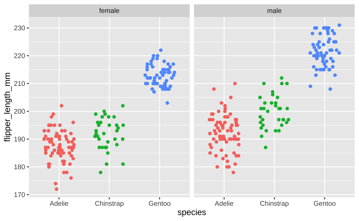
Figure 10: Flipper length by sex and species (faceting by sex).
ggplot(filter(penguins, !is.na(sex)), # lets remove individuals of unknow sex
              aes(x = sex, y = flipper_length_mm, color = sex))+
  geom_jitter(height = 0 , width = .3, show.legend = FALSE)+  # No need for a legend - its on the x
  facet_wrap(~ species)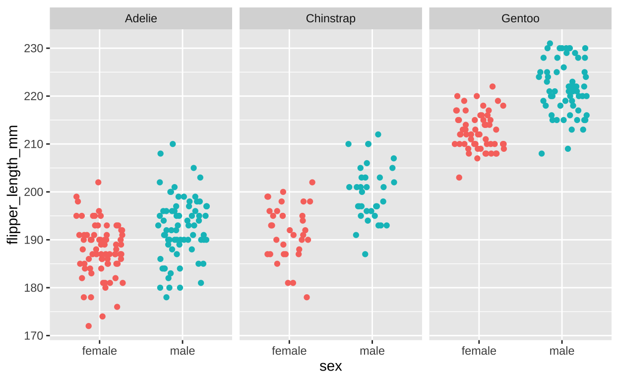
Figure 11: Flipper length by sex and species (faceting by species).
We can add even more information here! We can compare across years to show the flipper length seems pretty similar, but perhaps modestly increasing, each year and that this patterns is shared for sexes and species (Figure 12).
ggplot(filter(penguins, !is.na(sex)), # lets remove individuals of unknow sex
       aes(x = factor(year), y = flipper_length_mm, color = factor(year)))+
    geom_jitter(height = 0 , width = .1, show.legend = FALSE)+  # No need for a legend - its on the x
    facet_grid(sex~species, labeller = "label_both")+
    scale_color_grey(start=0.8, end=0.2) +
    theme_light()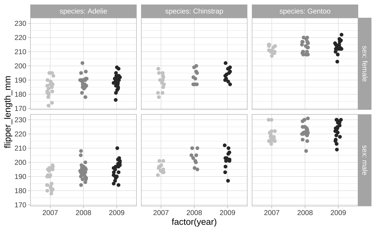
Figure 12: Flipper length by sex, species, and year (faceting by year).
Saving plots
The are a few ways to save plots in R.
The quick, dirty, and unprofessional way is to simply take a screen-grab. Note that this is imperfect because sometime weird shadows etc show up, and because it not vectorized, so it can get blurry etc.
Clicking the export button in the plot pane (Figure 13) is another approach. This can work well, and it allows you to easily pck formats etc. After saving in this way, be sure to open up the saved image to ensure that it looks like how you want it to.
The
ggsave()function allows you to save a plot with a script. You can specify file type, dimensions etc in the arguments to this function.
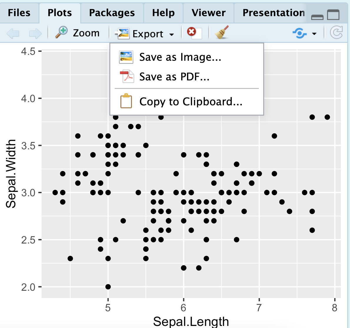
Figure 13: Click on the export tab in the plots pane to save a plot made in R.
Interactive plots in plotly.
Often during data exploration and data cleaning, we are interested in learning more about specific data points. Whether we are trying to understand an outlier, identify patterns, or verify the integrity of our data, having an interactive tool can be incredibly valuable. The plotly package is an easy way to make interactive plots in R for data exploration.
These interactive plots allow us to hover over individual data points to reveal additional information, zoom into areas of interest, and filter or highlight subsets of the data on the fly. This can greatly enhance exploratory data analysis (EDA) and quality control (QC).
For example, when examining a scatter plot of two variables, we can hover over a point to immediately see its exact values, helping us understand how it contributes to the overall trend or why it might be an outlier. In plotly, we can include additional information as part of the hover text without altering the visual aspects of the plot itself. This allows our interactive plot to tell us more about our data points, including attributes that aren’t directly plotted.
Returning to our penguins example in Figure 12, I add five new aesthetics (a through e) to include information about the penguins’ island of origin, bill depth and length, and body mass. While these are not plotted, they will be shown in the hover text, providing additional insights into the data (Figure 14).
library(plotly)
p <- ggplot(filter(penguins, !is.na(sex)),
            aes(x = factor(year), y = flipper_length_mm, color = factor(year),
                a = island,
                b = bill_length_mm,
                c = bill_depth_mm,
                d = body_mass_g,
                e = sex)) +
    geom_jitter(height = 0, width = .1) +
    facet_grid(sex ~ species, labeller = "label_both") +
    scale_color_grey(start = 0.8, end = 0.2) +
    theme_light()+
  theme(legend.position = "none")

ggplotly(p)
Figure 14: Plotly enables interactivity that facillitates both quality control and exploratory data analysis.
Quiz.
Figure 15: The accompanying quiz link
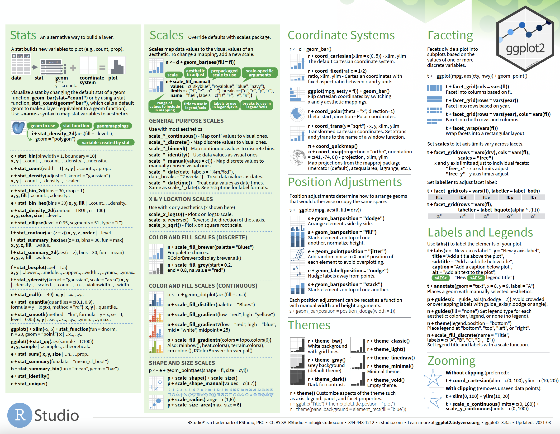
ggplot2: cheat sheet
There is no need to memorize anything, check out this handy cheat sheet!
And so much more
Throughout the term we will continue to make more plots, and will revisit the idea of making explanatory plots in ggplot2 near the term’s end.