Motivating Scenarios:
You’re thinking about how to communicate your results effectively through figures, or you’re concerned that someone may be misleading you with their figures.
Learning Goals: By the end of this chapter, you should be able to:.
- Explain the principles behind creating an effective figure and identify the specific elements that contribute to it.
- Critique figures to recognize when and how they may be manipulated.
In an earlier section (see here), we explored the goals of creating plots and started experimenting with our first ggplot2 visualizations. The purpose was to get hands-on experience—creating plots before worrying about perfecting them. Now, we’re ready to refine our approach!
In this section, we will:
- Delve deeper into what makes a plot effective,
- Reflect on common mistakes that make plots less impactful, and
- Investigate how visualizations can sometimes mislead us.
The goal is to differentiate two distinct challenges: (1) conceptualizing and interpreting a plot, and (2) the technical process of creating the plot in R. These are separate tasks. If you focus too early on the mechanics of R, you risk creating poorly designed visuals. However, once you have a clear vision of the plot, implementing it in R becomes much simpler. Tools like ChatGPT or other LLMs can help troubleshoot or refine your plots, and if you still run into issues, you can adjust the plot or make final tweaks in software like Illustrator. Throughout, I’ll introduce some R tips when the desired effect can be achieved easily.
Why Make a Plot?
It’s nearly impossible to look at raw numbers in a dataset and come away with a holistic understanding. Communicating results by listing numbers is inefficient and overwhelming. While summary statistics (see this link) are useful for efficiently conveying certain aspects of your data, they often hide important details. On their own, summary statistics can mislead, overlook critical patterns, and fail to provide readers with an intuitive way to evaluate your claims.
Why Make Exploratory Plots?
The first principle is that you must not fool yourself – and you are the easiest person to fool.
We’ve already discussed the limitations of relying solely on summary statistics. To responsibly interpret and communicate data, it’s essential to understand its shape and structure. Let’s reinforce this with a fun example from the datasauRus package. A quick look at the summary statistics shows that all datasets have nearly identical values:
\(\bar{x} = 54.3\), \(\bar{y} = 47.8\), \(s_x = 16.8\), \(s_y = 26.9\), and a correlation ranging from -0.069 to -0.060.
Looking at histograms of x and y reveals some differences between the datasets, but examining a scatterplot is truly revealing (see Figure 1)!
. paper [here](https://dl.acm.org/doi/10.1145/3025453.3025912), R pacakge [here](https://github.com/jumpingrivers/datasauRus)](10-betteRfigs_files/figure-html5/datasauRus-1.png)
So we build exploratory plots to learn the stroy of our data, and to understand how to build an apporpaite statistical model.
Why make explanatory plots?
Scientists use explanatory plots to effectively communicate their results and give skeptical readers the chance to evaluate their claims. Plots are such a critical tool in scientific communication that, in many lab meetings, papers are often discussed by focusing on the figures.
An effective plot should:
- Clearly communicate a high-level take home message, and
- Convince the skeptical reader to believe this message.
Clear communication is essential. We use plots because they efficiently convey complex information, allowing readers to quickly grasp the main message. As the number of categories or variables in a dataset increases, so does the cognitive load required to understand them through data summaries alone. Plots help reduce this complexity by visually organizing the data. However, the plot should not be a puzzle—it should clearly guide the reader through the most important findings in the (often complex) data.
Convincing the skeptical reader and inviting their thoughts. Most readers are naturally skeptical—they don’t just want to be told what the results are, they want the opportunity to evaluate them themselves. A good plot shows the data in a way that makes a clear claim while also allowing the reader to engage, question, or even critique the findings. As we will explore below, much of creating a trustworthy plot revolves around transparency. That is, showing the data without distorting or misleading. If readers suspect you’re trying to deceive them, they are likely to distrust your analysis, no matter how accurate it is.
WHY do we bring this up? You should always remember that you’re making plots for a reason, not just for the sake of it. Think carefully about the purpose of your plot as you create it—it should align with your goals of clear communication and inviting critical evaluation.
Telling a Story and Making a Point
When we tell a story, we don’t simply list everything that happened. We tell it with a purpose—we have a message or point we want to communicate.
A good figure, much like a good story, should:
- Make a clear point (or two or three).
- Be designed to highlight that point.
- Facilitate the understanding of that point.
- Be easy to follow.
- Be verifiable and honest.
- Hold up under scrutiny.
Figure 2: A good story video.
Assignment: After watching the video on telling a good story, reflect on the following questions:
- How does creating a good plot resemble telling a good story?
- How is making a good plot different from telling a story?
- How does thinking of a figure as a story change your approach to making it? How does it clarify ideas you’ve had before? How could it influence your future approach to creating figures?
What Point Are You Making?
Graphs exist to communicate clear points. Together, a set of plots should form a cohesive narrative. When creating an explanatory plot, ask yourself:
- What point am I trying to make?
- How does this point fit into the larger story I want to tell?
Example of Telling a Story:
In basketball, most shots are worth two points, while distant shots beyond the three-point line are worth three points. Around 2008, the NBA began embracing analytics, and analysts discovered that three-point shots provide more value than most two-point shots. As a result, teams shifted their strategy to prioritize three-pointers or high-percentage two-point shots close to the basket (podcast for the curious).
Figure 3A compares shot selection before and after the rise of analytics in the NBA. It demonstrates that before this shift, teams had no obvious trends in shot selection, while afterward, most teams focused on three-pointers and close-range shots. Figure 3B shows the dramatic rise in three-point attempts from 2006 to the present, providing historical context. Together, they tell the story of the NBA’s analytics revolution.
. Figure **B** is modified from an [article on espn.com](https://www.espn.com/nba/story/_/id/26633540/the-nba-obsessed-3s-let-fix-thing).](images/threes.jpeg)
Figure 3: Figure A is modified from images on Instagram @llewellyn_jean. Figure B is modified from an article on espn.com.
Did You Make Your Point?
Figure 3 is not perfect. For example, the team names are too small to read. But fixing this would be unnecessary—the team names don’t significantly contribute to the story we’re telling.
After you create your plot, take a moment to reflect. How well does your figure make its intended point? How could it detract from your message? Then brainstorm ways to improve your plot to more clearly and honestly convey your point.
The Process
Computational tools like ggplot2 are great for making good plots, but remember they are tools to help you, not constrain you. Many experts (and the internet) suggest that before jumping into ggplot, you should first:
- Sketch your desired plot to conceptualize it.
- Be cautious of defaults and common plots, as they might not always serve your needs.
My approach to figure-making in #ggplot ALWAYS begins with sketching out what I want the final product to look like. It feels a bit analog but helps me determine which #geom or #theme I need, what arrangement will look best, & what illustrations/images will spice it up. #rstats pic.twitter.com/GUjeEgqZxj
— Shasta E. Webb, PhD (@webbshasta) May 22, 2020
Creating a good plot is an iterative process. You will likely go back and forth between pencil-and-paper sketches and ggplot until you reach a design you’re happy with. See Figure 4 for an example of how this iterative process works. For a step-by-step guide, check out the full tutorial.
Figure 4: Making a plot is an iterative process. gif taken from tweet by @WeAreRLadies. See the evolution of a ggplot tutorial for a “how to”. We will refer to this example often below.
For an explanatory plot, share a draft with someone unfamiliar with the data to see if the point is immediately clear.
The Audience and the Goal
Not every plot needs to be a masterpiece. There’s a spectrum between exploratory and explanatory plots, and the best approach depends on your audience and your goal.
It can be helpful to develop a consistent set of colors, fonts, and styles in ggplot, so all your plots are clear and accessible with minimal effort.
The Audience
We tell stories to an audience, not a wall. Just as you would communicate differently with a friend versus a colleague, your plot should be tailored to its intended audience. When designing a figure, consider:
- What is their level of expertise? Are they familiar with the subject matter or statistics?
- How accustomed are they to interpreting plots? Will they need more guidance?
- How will they experience your plot—printed on paper, displayed in a presentation, or on a website?
For most of this course, your audience will be yourself, me, and your peers, all with some background in statistics. You’ll be designing plots to be viewed on a computer.
As you read the guidance below, think about how you might adjust your plots for different audiences.
Tailoring Presentations to Their Format
Science is communicated in many formats. Here’s how to tailor your plots to different mediums:
- Books / Papers: These plots are static and need to be self-contained. Readers should be able to understand the plot and its main point without relying on the accompanying text.
- Public Talks: In presentations, you control the flow of information. Use this to build up figures slide by slide, and ensure text is large enough to be legible from the back of the room.
- Posters: At conferences, a stunning visual can grab attention. Your figures should be designed to draw viewers in and encourage them to engage.
- Digital Formats: In online formats, you can incorporate interactive elements, GIFs, or animations to engage your audience more deeply. Interactive plots allow readers to explore the data themselves, enhancing their understanding and making the story more compelling.
The Goal
For publication or major presentations, people often spend a lot of time perfecting their plots. However, for most of your class assignments, the goal should be more straightforward: ensure that your plots are readable, clearly communicate their point, and are free of misleading elements.
While you don’t need to customize every plot to perfection, setting up consistent colors, shapes, and fonts early on can help ensure that all of your figures are clean and effective with minimal extra effort.
For more significant projects—like a final paper, senior thesis, or journal article—you can build on this foundation to produce publication-quality plots with more detailed customizations.
As you read the guidance below, consider what you would include in early exploratory drafts (for homework or personal use) versus what you would add to a final, polished version for a larger audience (for theses, publications, or presentations).
Making a Good Plot
While bad plots can be bad in various ways, all good plots share certain characteristics. Specifically, all good plots are:
- Honest
- Transparent
- Clear
- Accessible
To illustrate these principles, we will focus on the distribution of student-to-teacher ratios across continents (introduced in Figures 4) as an example. We’ll also introduce other datasets as needed.
Let’s start with two versions of this plot that are so bad, they’re difficult to create even in R.
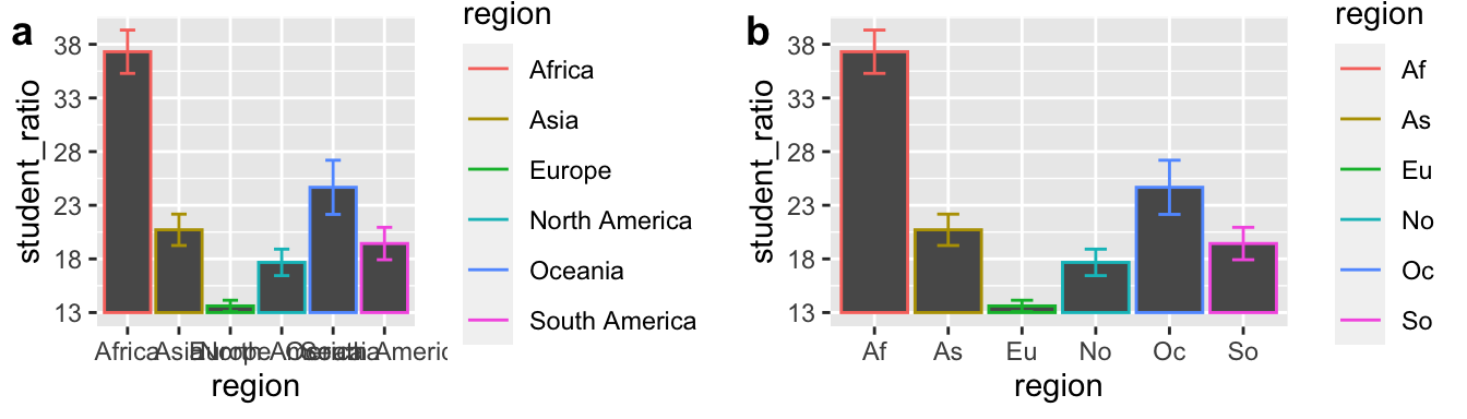
Figure 5: It is hard to make a plot this bad.
Take a moment to reflect on what makes Figures 5A and B so bad, and think about how you could improve them.
Good Plots Are Honest
Plots should clearly convey points without misleading or distorting the truth. A misleading exploratory plot can lead to confusion and wasted time, while a misleading explanatory plot can erode the reader’s trust. Honesty in plots builds credibility, helping ensure that both you and your audience stay on track.
Honest Axes
Misleading Y-Axes
When people see a filled area in a plot, they naturally interpret it in terms of ratios. If a reader isn’t carefully looking at the y-axis, they might think that student-to-teacher ratios in Africa are four times higher than in Asia, even though the actual difference is closer to two-fold. Compare Figures 6a and b.
Figure 6: Do not truncate the y-axis of bar plots, or other filled plots.
Not all y-axes need to start at zero: Truncating the y-axis is most misleading for filled plots, but it’s not always necessary to start at zero.
- Scatterplots: These don’t typically trick the eye the way bar plots do, so it’s less important to start the y-axis at zero. If you want to emphasize absolute differences, show the data as points and worry less about truncating the y-axis.
- Non-zero baselines: For variables like temperature, starting the y-axis at zero may be arbitrary.
Watch the assigned video below to learn more about when truncating the y-axis is misleading and when it’s acceptable to start at a non-zero point.
Figure 7: Misleading axes from calling bullshit.
Misleading X-Axes
Here’s a real-life example from May 2020, when the state of Georgia released a graph showing they were controlling the spread of coronavirus. Can you spot what’s misleading?
Figure 8: HINT: look at the x-axis.
Now, take a look at Figure 9. At first glance, it seems like the U.S. had a slump in science Nobel Prizes in the early 1970s. But what’s actually misleading here?
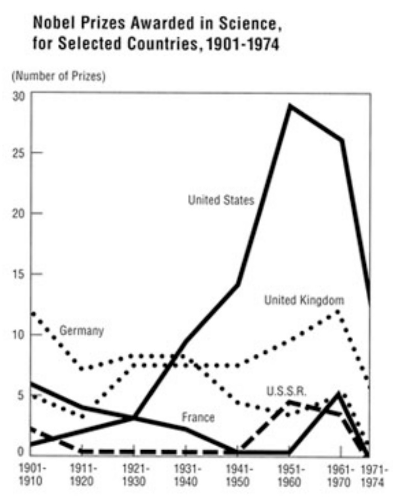
Figure 9: HINT: look at the number of years in each bin on the x-axis.
Honesty Includes Context
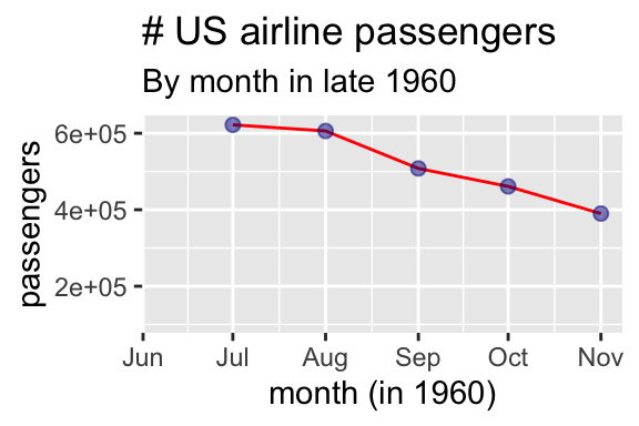
Figure 10: Was the airline industry crashing at the end of 1960?
Truncating the y-axis isn’t the only way to mislead—truncating the x-axis can also distort the message. Plots need to provide enough context to convey the bigger picture. For example, Figure 10 suggests that the airline industry was crashing in late 1960, but when you look at year-over-year data (Figure 11), you can see this is a predictable seasonal decline, not a catastrophic downturn.
Similarly, price data should be adjusted for inflation, and job numbers for seasonal fluctuations, to provide accurate context.
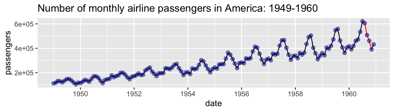
Figure 11: Seasonal fluctuations in US air travel (1949-1960).
Honest Bin Sizes
Figure 12: Different bin sizes might tell different stories (5 min and 15 sec from Calling Bullshit).
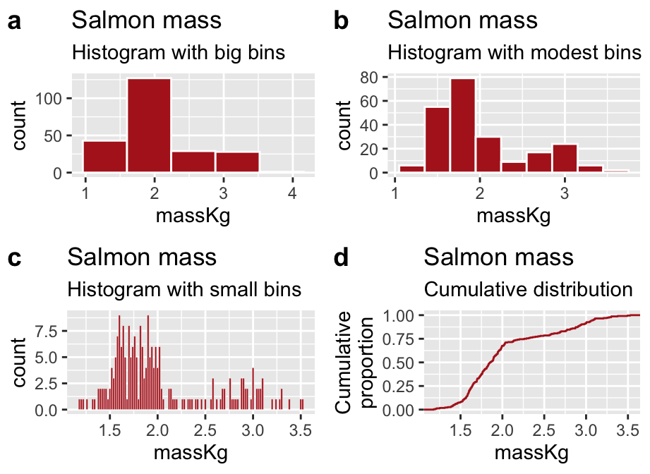
Figure 13: Be careful – different bin sizes can generate different stories.
The video above explains how bin sizes can mislead. This issue arises when using histograms to examine distribution shapes. For example, with large bins, salmon weight data might appear unimodal and right-skewed (Figure 13A), but with smaller bins, it becomes clear the data is bimodal (Figure 13B). However, using too many bins (Figure 13C) can obscure the overall shape.
So, what’s the solution? Experiment with different bin sizes using the bins or binwidth arguments in the geom_histogram() function.
If no bin size seems to work well, you can display the cumulative frequency distribution using stat_ecdf(). This method avoids the binning issue altogether. The y-axis shows the proportion of data with values less than x, and bimodality is revealed by the two steep slopes in the plot. However, these plots can be harder for inexperienced readers to interpret.
Finally, keep in mind that the same concerns about bin size apply to smoothing in density plots. In ggplot, you can control the smoothing of a density plot using the adjust argument in the geom_density() function.
Figure 14: This is very very bad.
We saw that plotting filled areas brings our attention to the area, not the point. As such, scaling data by height and width will trick brains into squaring differences. Figure 14 breaks all the rules and makes a truly misleading plot. If you are interested to here more you can watch an optional video from calling bullshit (the most relevant part is from 9:19 to 11:23).
Good Plots Present Data Transparently
As biostatisticians, we don’t want people to simply take our word for it. Instead, we aim to empower readers to evaluate our claims, critique them, test them for themselves, and even uncover new insights in our data. Showing the data is a critical step toward building trust with a skeptical audience and invites them to engage with the data themselves.
Transparency Means: Showing Your Data
As we saw in the datasauRus example, relying on summary statistics can obscure important patterns. Similarly, plots that only show summaries (e.g., barplots of means) fail to provide the full picture. Whenever possible, it’s best to honestly show your data. Figure 15 offers an example. (Weissgerber 2015) make a strong case against the overuse of barplots.

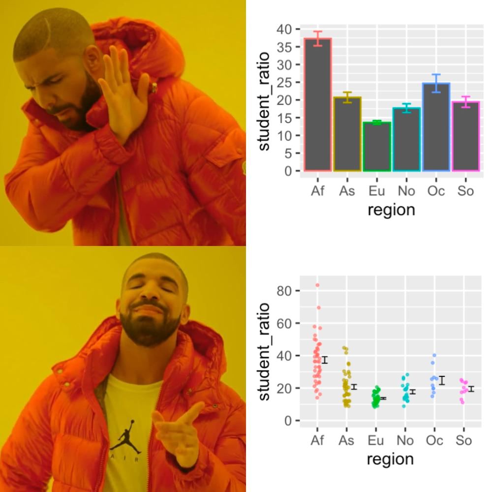
Figure 15: Hangin with some data points I’ve never seen before.
Transparency Links Data and Code to Figures and Analyses
The most transparent data are fully reproducible. Readers should be able to download your code and data, replicate your analysis, and understand the dataset well enough to perform their own analysis. As discussed in our previous sections on getting data and reproducible analyses, this level of transparency is becoming the standard in scientific research.
Transparency Avoids Overplotting
Sometimes, showing all your data can actually obscure patterns—a problem known as overplotting. Overplotting occurs when data points in a plot overlap or cluster so densely that it’s difficult or impossible to discern individual values or patterns in the data. This typically happens when you have a large number of data points, or when the range of data values is narrow, causing points to pile on top of each other. Overplotting can obscure the underlying distribution, relationships, or trends, making it hard to interpret the data accurately.
Figure 16 shows several techniques (e.g. like jittering, using transparency), and alternative plots (e.g., density plots, box plots, or sina plots) that we can use to reveal patterns that would otherwise be hidden.
, you can use [`geom_sina()`](https://ggforce.data-imaginist.com/reference/geom_sina.html) to create a sina plot. Data from @beall2006. Download the data [here](https://whitlockschluter3e.zoology.ubc.ca/Data/chapter02/chap02e3bHumanHemoglobinElevation.csv).](images/overplot-1.png)
Figure 16: Sometimes showing all the data hides patterns. (a) shows overplotting, where data points overlap and obscure the distribution of values. (b–i) demonstrate solutions for overplotting. The sina plot (f) is one of my favorites because it shows both the shape of the data and individual data points. After installing and loading the ggforce package, you can use geom_sina() to create a sina plot. Data from Beall (2006). Download the data here.
Good Figures Are Clear
Good plots are clear, with messages that stand out. To achieve clarity in a plot, we need to minimize cognitive burden, make the point obvious, and avoid distractions.
Minimize cognitive burden. Two of my favorite books are Crime and Punishment and 100 Years of Solitude. While they’re great stories, I disliked having to track relationships between characters or remember that Raskolnikov and Rodya are the same person. In a scientific figure, that won’t fly—be consistent and use strategies that minimize how much your reader has to keep in mind.
Make points obvious. A scientific figure should tell a story, but it shouldn’t be a mystery or a puzzle like Fight Club. The message should be clear from the start, without making the reader work to decipher it.
Avoid distractions. Readers should focus on your story, not on unnecessary visuals or effects.
Let’s see how these principles can help us build clear plots.
Clear Plots Help Readers Focus on Patterns
We should design plots to highlight the key results and make important comparisons easy to see.
Bring Out Important Comparisons
Simply presenting data is not enough. Good plots are designed to help readers see and evaluate the patterns central to the story you’re telling. Just like in storytelling, emphasizing the wrong details could mislead. With plots, we should draw attention to what’s important without hiding or distorting features. For example, the same dataset can tell very different stories depending on how it is plotted (see Fig. 17).
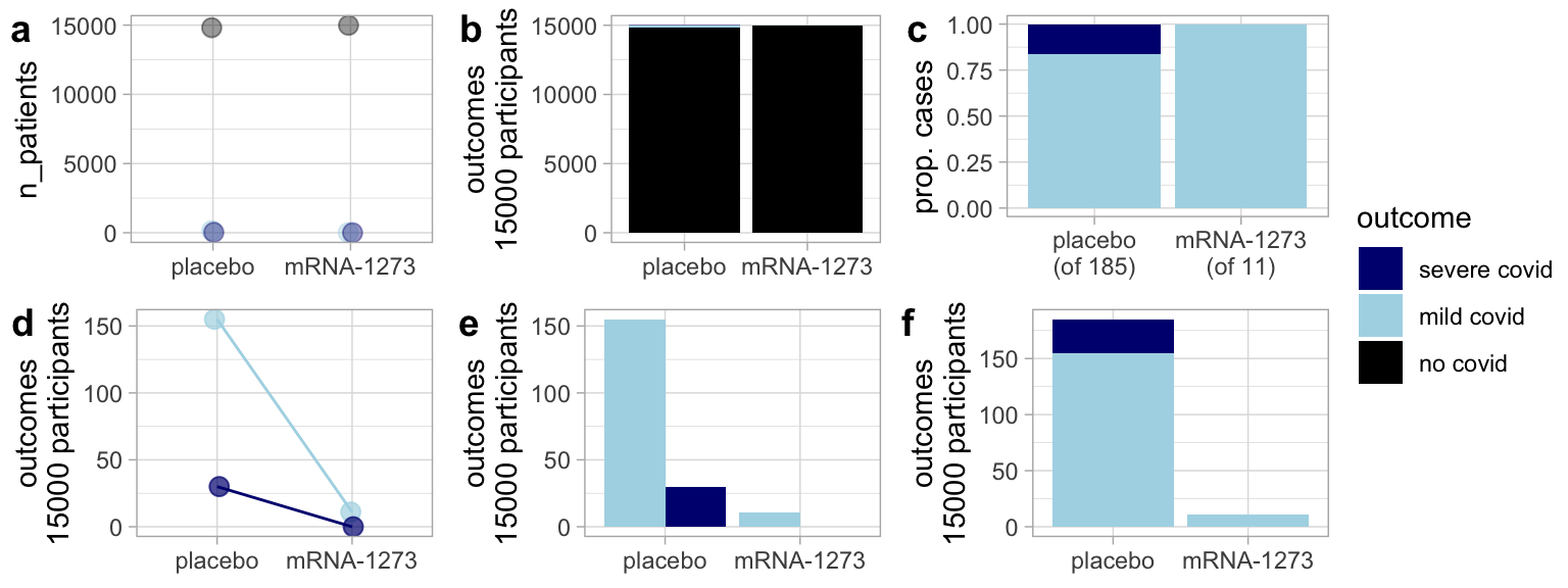
Figure 17: Same data, different message: Various plots of the Moderna vaccine trial data tell different stories. (a) and (b) imply the vaccine isn’t effective by highlighting that most participants didn’t develop COVID. (c) compares the severity of cases by treatment but hides the vaccine’s effect on infection risk. (d) and (e) emphasize the severity of cases, while (f) highlights vaccine efficacy but makes it harder to compare severity. (f) is my favorite despite this.
Consider How People Process Images
When creating a plot, consider not just the data but how readers will interpret it. Some conventions are well-known—like the fact that pie charts make comparisons difficult—but you do not need extensive design knowledge to make a good plot. A simple way to test clarity is to ask a friend what they see in your plot.
 by [Karl Broman](https://kbroman.org/).](images/bromancomparisontypes.png)
Figure 18: Facilitate comparisons – Which plot makes it easiest to compare A and B? Image from slide 28 of this presentation by Karl Broman.
Clear Plots Use Informative and Readable Labels
Figure 19a is a poor example — it is hard to read the region names. 19b, c, and d show alternatives.
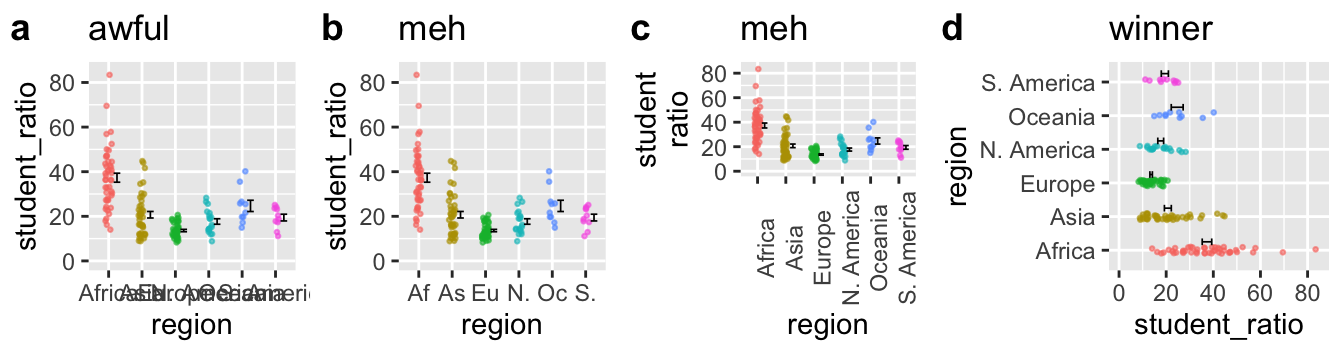
Figure 19: When dealing with long x-axis labels, it’s usually best to rotate the axis (d).
- Shortening labels to codes (as shown in 19b) might seem like a good idea, but it’s not. Using codes adds cognitive burden by forcing the reader to translate “As” into “Asia” which makes it harder to process the plot’s message.
- Rotating the x-axis labels (as shown in 19c) is not much better. Asking the reader to rotate the text in their head distracts them from the data.
- The best solution is to rotate the plot itself (as shown in 19d). By simply switching x and y, the labels become easier to read, letting readers focus on the data.
Clear Plots Are Consistent
Projects often have many plots, so consistency across them helps readers follow the story. For example, in Figure 20, colors and labels are consistent with previous figures, which makes it easier for readers to quickly grasp the comparisons.
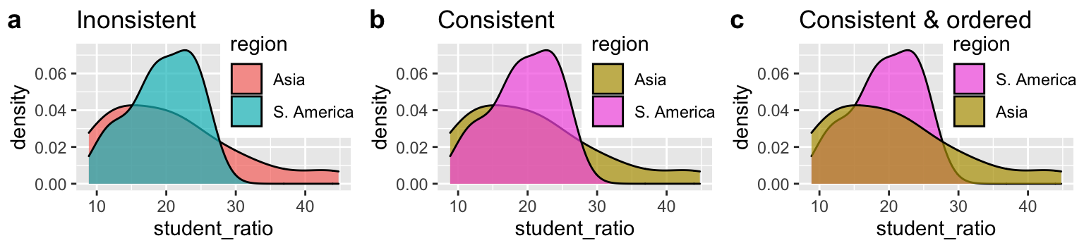
Figure 20: Consistency helps readers process results across multiple figures. (a) requires readers to associate regions with colors, while (b) uses consistent colors across plots to make the comparison easier. (c) goes further by sorting labels to match the order in which they appear in the plot.
Clear Plots Order Categories Sensibly
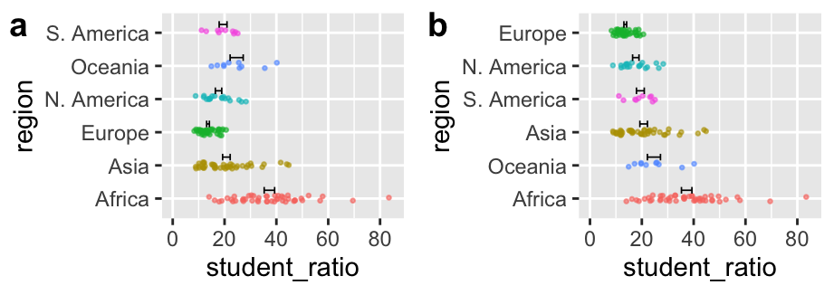
Figure 21: Order categories sensibly.
Be deliberate about how you order categories on the x-axis (when categorical). If the data are ordinal (e.g., months of the year), place them in their natural order. For nominal categories, order them by decreasing mean or value. If many categories have very low values, consider grouping them into “other” and placing it last (you can do this with (the fct_lump_*() family of functions in the forcats package can help with this.). R’s default alphabetical ordering is often unhelpful, so always specify the order deliberately.
Clear Plots Use Direct Labeling (When Helpful)
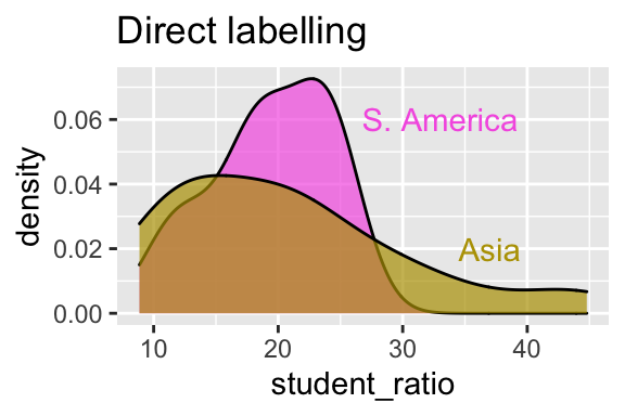
Figure 22: Use direct labeling to reduce cognitive burden.
Figure 22 improves on Figure 20c by using direct labeling instead of a legend. This allows readers to focus directly on the data without needing to match colors with labels.
Clear Plots Avoid Distractions
Buckminster Fuller aimed to be “invisible,” letting his ideas, not his appearance, speak. The same principle applies to figures: good figures highlight patterns in data, not themselves. This principle, which underlies the name of my favorite podcast on design, 99% Invisible, holds for making figures. A good figure calls attention to patterns in the data, not to itself. As Edward Tufte warned, avoid “chartjunk,” needless 3D, and “data viz ducks” — visuals that distract from the data.
Don’t use 3D or animation unnecessarily
3D and animation are only helpful for specific purposes, like showing protein structures or time-lapse data. Resist the urge to use them otherwise.

Figure 23: Just because you can do something, doesn’t mean it’s a good idea.
What the duck?
Tufte coined ‘duck’ to describe figures that showcase cleverness rather than data. An extreme example is the banana genome paper, where a banana drawing obscures the Venn diagram’s meaning. Watch this optional video if you want to hear a Calling Bullshit rant on Dataviz Ducks.
- Resist the temptation to create flashy but ineffective visuals.
- Remember: visuals should prioritize clarity over aesthetics.
. [Figure 4](https://www.nature.com/articles/nature11241/figures/4) of the [banana genome paper](https://www.nature.com/articles/nature11241) [@dhont].](https://media.springernature.com/full/springer-static/image/art%3A10.1038%2Fnature11241/MediaObjects/41586_2012_Article_BFnature11241_Fig4_HTML.jpg)
Figure 24: This plot is bananas. Figure 4 of the banana genome paper (D’Hont et al. 2012).
Avoid “glass slippers”
A “glass slipper” is when a visualization designed for one purpose is misapplied elsewhere, leading to confusion. Keep your visual tools fit for purpose. See this fun video from calling Bullshit if you like.
Lately I've been getting all my best bullshit from promoted tweets. Here from @NexthinkNews, a classic "glass slipper" visualization (https://t.co/09curqq0tU), in which data is shoehorned into a highly specialized and entirely inappropriate format. pic.twitter.com/aYGxBRkHPG
— Calling Bullshit (@callin_bull) March 14, 2019
Watch for chartjunk
Elaborations like 3D, glass slippers, and distracting backgrounds clutter the message. However, fun elements that aid understanding, like species silhouettes, can enhance memorability and comprehension.
Good Figures Are Accessible
Making figures accessible for all tends to make them better for everyone. Consider the diversity of people who may view your figure—this could include readers with color blindness, low vision, those who rely on screen readers, or even those who print your figure in black and white. A good figure should be interpretable by all of these individuals.
We have already highlighted several good practices. For example, describing the results of a figure in words can make it accessible to blind or visually impaired readers, while direct labeling can make the content clearer to readers with color vision deficiencies. These examples illustrate the benefits of universal design—they make figures better for all audiences, regardless of specific needs.
Color
Choosing effective colors is a challenge. Ensure that your color choices are easy to distinguish, particularly if printed in grayscale or viewed by colorblind individuals. Many R tools can help with this, including the colorspace package. I recommend testing your figures through a color vision deficiency emulator, such as the one available at http://hclwizard.org/cvdemulator/, to see how your plots appear to readers with color vision deficiencies. Additionally, avoid using colors that have cultural or emotional connotations that may not be appropriate in every context (e.g., red typically indicates ‘danger’ or ‘bad,’ but this may not translate universally).
Tip: When creating grayscale-friendly plots, consider using texture or shading to differentiate elements in addition to color.
Size
Ensure that all elements in your figure, including text, axis labels, and legends, are large enough to be easily read by people with poor eyesight. Always err on the side of larger text. Small text not only diminishes accessibility but can also make figures look cluttered and unclear.
](images/02_communication_presentations.png)
Figure 25: Bigger text is easier to read. Image from Advanced Data Science
Tip: Test your figures by viewing them at reduced sizes or printing them. If the labels and details are still readable, they’re likely large enough.
Redundant Coding
As discussed above, colors alone can sometimes be difficult to distinguish. Use redundant coding—such as mapping shape, line type, or pattern in addition to color for the same variable—to provide readers with multiple ways to differentiate categories. This is particularly helpful for readers with color vision deficiencies or when figures are printed without color. For example, in scatter plots, different shapes can be used alongside colors to represent different groups.
Alt Text for Figures
When creating figures for digital use (e.g., websites, PDFs, or presentations), it’s important to include descriptive alt text (alternative text) for individuals who rely on screen readers. Alt text provides a textual description of the figure, ensuring that people who cannot see the image can still understand its content.
Good alt text should describe the key information the figure conveys without unnecessary detail. It’s not enough to simply say “Figure showing data”; you need to explain what the reader should take away from the visual representation.
Writing About and Discussing Figures
Good figures should be clear enough to allow readers to interpret them on their own. Ideally, a reader should be able to examine your figure and draw a reasonable conclusion. However, we can enhance the reader’s understanding by guiding their interpretation and emphasizing key takeaways. Whether in writing, during presentations, or in figure legends, we have multiple opportunities to communicate effectively—let’s make the most of them.
Writing About Figures in Text
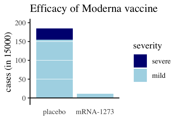
Figure 26: Moderna data, as an example for writing about figures
When writing up results, describing statistical analyses, summaries, and figures in prose is crucial. This is your chance to reiterate the key take-home messages from your analysis and to reference your figures and statistics as evidence supporting these messages. Here, we’ll focus on how to write about figures effectively, leaving the discussion of statistics for another time.
A bad write-up: Figure 26 compares COVID cases and severity of these cases for treatments and controls.
A better write-up: Figure 26 shows a significant difference in COVID case incidence between the placebo group and those vaccinated with Moderna’s mRNA-1273 vaccine. Of the 15,000 individuals in the placebo group, 185 contracted COVID, while only 11 of the 15,000 vaccinated individuals did. Additionally, none of the vaccinated participants who became infected developed severe COVID, whereas 30 of the 185 infected placebo recipients had severe cases (compare the dark blue bar above the control group and its absence above the mRNA-1273 group).
When reading text that discusses a figure, first look at the figure and think about its message. Then, consider the following:
- What features of the figure support their claims?
- How does your interpretation of the figure compare to theirs?
- Are there elements of the figure that contradict their interpretation?
Writing Good Figure Legends
Although well-designed figures should be interpretable without a figure legend, a good figure legend can enhance understanding by pointing out key details and take-home messages. A descriptive legend should build a deeper appreciation for the figure, offering context that may not be immediately obvious. Importantly, legends should not merely restate the figure but rather highlight critical insights or clarifications.
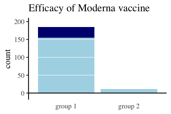
Figure 27: This is not what a legend is for. Group 1 received the control, and Group 2 received the vaccine. Light blue indicates mild cases, and dark blue represents severe cases.
.](images/goodcovid4legend-1.png)
Figure 28: Appropriate legend. Participants receiving a placebo had a significantly higher incidence of COVID than those receiving the Moderna vaccine (the bar on the left is much higher than that on the right). Moreover, all cases in the vaccinated group were mild (light blue bars), whereas the placebo group had both mild and severe (dark blue) cases. Data from the Moderna press release.
Make sure you’ve double-checked everything! Otherwise, you might end up with something like this:
Figure 29: Oops.
Data Tables
Although it is usually better to present data in figures rather than tables, there are times when presenting results in tables is more appropriate. When constructing tables, the goal is not to strictly adhere to tidy data principles but to present results in a way that is clear, honest, and facilitates comparisons. Tables should summarize key results and analyses rather than display raw data in full.
The knitr, DT, and kableExtra packages offer excellent tools for creating well-formatted tables in RMarkdown that follow best practices in design, readability, and interpretability.
Quiz
Figure 30: The accompanying quiz link