Motivating Scenarios:
We have a normally distributed sample, but only an estimate of its standard deviation—not the true population parameter. How can we estimate uncertainty and test hypotheses in this case? Alternatively, we may have a linear model and want to understand the commonly used test statistic, the \(t\)-statistic.
Learning Goals: By the end of this chapter, you should be able to:
- Explain the difference between the standard normal distribution (\(Z\)) and the \(t\) distribution.
- Interpret a \(t\) value simply.
- Calculate and interpret Cohen’s D as a measure of effect size
- Use the \(t\) distribution to calculate a 95% confidence interval for a sample from the normal distribution.
- Test the null hypothesis that a sample mean comes from a population with a given parameter value, including:
- Performing a one-sample t-test.
- Performing a paired t-test.
- Use the
_t()family of functions in R to: - Use the
t.test()function to conduct one sample and paired t tests in R.
The Dilemma and the Solution
The Dilemma
We previously explored samples drawn from a normal distribution. A key takeaway was the Z-transformation:
- For a single observation, \(Z = \frac{x - \mu}{\sigma}\)
- For the mean of a sample of size \(n\), \(Z = \frac{\overline{x} - \mu}{\sigma / \sqrt{n}}\)
This transformation allows us to meaningfully express values as their distance, in standard deviations, from the population mean.
However, there’s a problem: We typically have a sample estimate of the standard deviation (\(s\)), not the true population parameter (\(\sigma\)). As a result, the standard normal distribution (or Z distribution) isn’t exactly correct—it doesn’t account for the uncertainty in our estimate of the standard deviation. While it’s close, it’s not perfect.
The Solution
The solution to this dilemma is to use a different sampling distribution which incorporates the uncertainty in our estimate of the standard deviation. This the distriubtion is known as the t-distribution. Unlike the standard normal distribution, there are many t-distributions, each associated with a certain number of degrees of freedom (which reflects the number of observations that can vary before all values are determined).
The t-distribution closely resembles the standard normal distribution, but its tails are “fatter” to account for the possibility of underestimating \(s\). As our sample size (and degrees of freedom) increases, the t-distribution approaches the standard normal distribution (see Fig 1), because we gain more confidence in our estimate of the standard deviation.
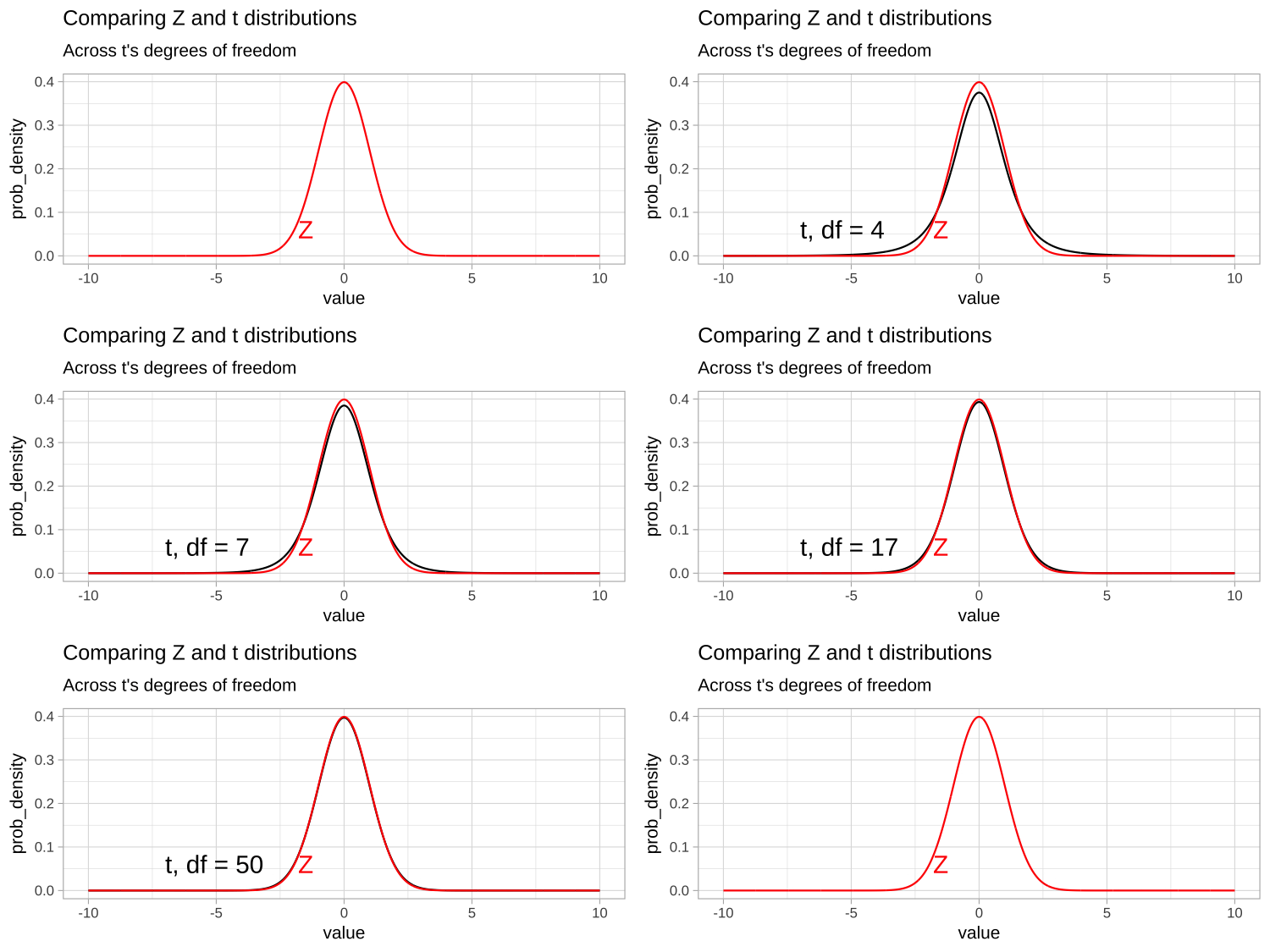
Figure 1: Comparing the t (black) and standard normal (Z, red) distributions for different degrees of freedom.
t as a Common Test Statistic
Since most sampling distributions are normal, but we rarely know the true population standard deviation, t-values are frequently used in statistics. Each time we encounter a t-value, it tells us how many standard errors our estimate is away from the hypothesized parameter under the null hypothesis. You will see t-values in almost every linear model, so it’s essential to become familiar with them. Here, we introduce the t-statistic by considering a single sample.
Put simply t is the distance (in standard errors) between our estimate and its proposed value under the null (incorporating uncertainty in our estimate of the standard deviation)
Calculations for a t-Distribution
Calculating t
Similar to the Z-distribution for a sample mean, the t-value represents the number of standard errors between our sample mean and the population parameter. The calculation for a t-value is essentially the same as for a Z-value: we subtract the hypothesized population parameter, \(\mu_0\), from our sample estimate, \(\overline{x}\), and divide that difference by the sample standard error, \(s/\sqrt{n}\).
\[t = \frac{\overline{x}-\mu_0}{SE_x} = \frac{\overline{x}-\mu_0}{s/\sqrt{n}}\]
Calculating the Degrees of Freedom
The degrees of freedom indicate how many individual data points we need to know after constructing our model of interest, before we can determine all the data points.
For example, if you have a sample of size:
- \(n = 1\), and I tell you the sample mean, you know every data point, so there are zero degrees of freedom.
- \(n = 2\), and I tell you the sample mean, you need one more data point to fill in the rest, leaving one degree of freedom.
- \(n = 3\), and I tell you the sample mean, you need two more data points to fill in the rest, so there are two degrees of freedom.
Thus, when estimating a sample mean \(\overline{x}\), from a sample of size, \(n\), the degrees of freedom equal the sample size minus one: \[\text{df}_t = n-1\]
Calculating a Confidence Interval
We use the t-distribution to calculate the \(1-\alpha\)% confidence interval for the estimated mean of a sample from a normal distribution.
To estimate the upper (or lower) \(1-\alpha\) confidence interval, we take our estimate and add (or subtract) the product of the sample standard error and the critical value, which separates the middle \(1-\alpha\) of the distribution from the tails. This approach ensures the interval contains 95% of sample means estimated from a population.
\[\begin{equation} \begin{split} (1-\alpha)\%\text{ CI } &= \overline{x} \pm t_{\alpha/2} \times SE_x\\ &= \overline{x} \pm t_{\alpha/2} \times s_x / \sqrt{n} \end{split} \tag{1} \end{equation}\]
Here, \(t_{\alpha/2}\) is the critical two-tailed t value for a specified \(\alpha\) level. We can find \(t_{\alpha/2}\) in R using the qt() function: qt(p = alpha/2, df = 9). Remember, we divide \(\alpha\) by two to account for both sides of the sampling distribution. The figure below illustrates the critical value (two-tailed \(\alpha = 0.05\)) for a sample from the t-distribution with nine degrees of freedom.
For example, the lower bound of a 95% confidence interval for a sample of size 10 can be calculated as:
- Lower 95% CI with 9 df = \(\overline{x} + t_{.05/2,df =9} \times SE_x\)
What is \(t_{.05/2,df =9}\)? From 2, it appears to be slightly less than 2.5. Let’s determine the exact value!
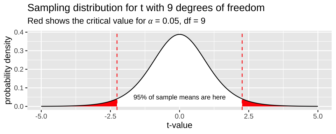
Figure 2: The sampling distribution for t with nine degrees of freedom. The red area shows the middle 95% of the distribution.
Finding the Critical Value in R
If you’ve taken statistics courses before, you might remember using statistical tables to look up critical values. R simplifies this with the q_ (for quantile) family of functions. For example, with a sample of size 10:
- You can type:
qt(p = .025, df = 10 - 1, lower.tail = FALSE)
- And R will return 2.2621572.
This finds the t-value that separates the upper 97.5% of the distribution (because lower.tail = FALSE) from the rest. So, for a sample of size 10, a 95% confidence interval would be:
- 95% CI with 9 df = \(\overline{x} \pm t_{.05/2} \times SE_x\)
- 95% CI with 9 df = \(\overline{x} \pm\)
qt(p = .05/2, df = 9)\(\times \frac{s_x}{\sqrt{10-1}}\) - 95% CI with 9 df = \(\overline{x} \pm\) -2.262 \(\times \frac{s_x}{3}\).
Figure 3 shows the critical t-values for two-tailed 95% and 99% confidence intervals across a range of degrees of freedom.
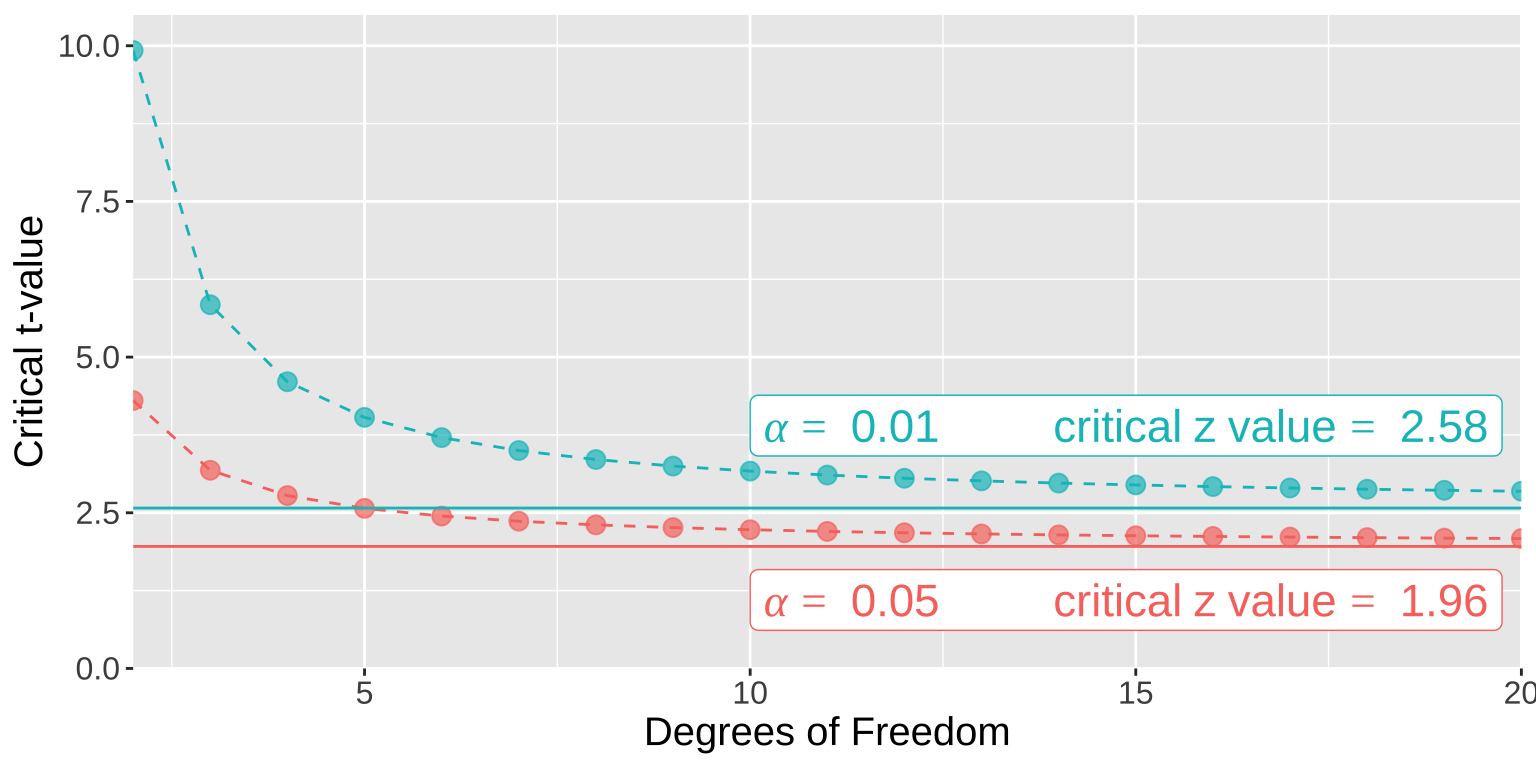
Figure 3: The critical t (points and dashed lines) and Z (solid horizontal lines) values for 𝛼= 0.01 and 𝛼= 0.05 in blue and red, respectively.
Calculating a p-value
Remember, the p-value represents the probability that a random sample from the null distribution would have a test statistic as or more extreme than the one we observed.
For example, let’s say we have a sample size of 10 and calculate a t-value of -1.5. To find the corresponding p-value, we would determine where this test statistic falls on the sampling distribution for t with nine degrees of freedom and integrate the area from that point to \(-\infty\). We then multiply this value by two to account for both tails of the distribution (i.e., the blue shaded region in Figure 4).
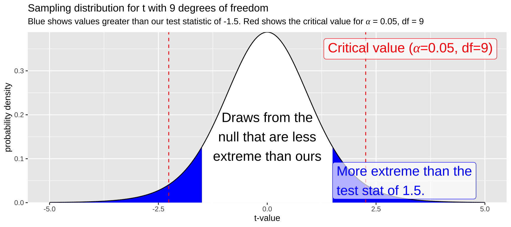
Figure 4: The sampling distribution for t with nine degrees of freedom. The area in blue represents values as or more extreme than the test statistic, -1.5. Red lines indicate the critical value.
While it is difficult to estimate the exact p-value by eye (I would guess the blue area integrates to about 0.2), this outcome suggests that \(p > \alpha\), so we fail to reject the null hypothesis.
Calculating a p-value in R with pt()
We can use the pt() function to find the probability that a random sample from the t-distribution has a test statistic as extreme or more extreme than ours. Make sure to consider both tails of the distribution (that’s why we multiply by two)!
df         <- 9
observed_t <- 1.5
p_val      <- 2 * pt(q = observed_t, df = df, lower.tail = FALSE)
The code above returns a p-value of 0.168, consistent with our visual estimate. Therefore, we fail to reject the null hypothesis.
Calculating the Effect Size
The t-statistic is useful for hypothesis testing and accounting for uncertainty in our estimates, but it does not measure the size of the effect. A common measure of effect size, known as Cohen’s d, indicates how many standard deviations our estimate is away from the null proposed by the mean (usually zero):
\[\text{Cohen's d} = \frac{\overline{x}-\mu_0}{s_x}\].
While exact values and importance depnds on the system and questions at stake, as a rough guidline we qualitvly categorize Cohen’s D as a small, medium, large or very large effect as follows:
| Cohen’s d Value | Effect Size |
|---|---|
| 0.0 - 0.5 | Small effect |
| 0.5 - 0.8 | Medium effect |
| 0.8 - 1.2 | Large effect |
| > 1.2 | Very large effect |
I recommend including Cohen’s D as a measure of effect size whenever it makes sense.
Assumptions of the t-Distribution
The t-distribution assumes that:
- Data are collected without bias
- Data are independent
- The mean is a meaningful summary of the data
- Samples (specifically, the sampling distribution) are normally distributed
What to Do When We Violate Assumptions
As always, bias is very difficult to address and is best managed by designing a better study.
Non-independent data can be modeled, but such models are beyond the scope of this chapter.
Whether the mean is a meaningful summary is a biological question.
The normality assumption is the easiest to address. If this assumption is violated, we can:
- Ignore it (if the violation is minor) because the central limit theorem helps us. OR
- Transform the data to an appropriate scale. OR
- Use bootstrapping to estimate uncertainty and/or conduct a binomial test, treating values greater than \(\mu_0\) as “successes” and less than \(\mu_0\) as “failures” (covered in future chapters).
- As a non-parametric alternative to the paired t-tests, we can generate a null sampling distribution by permuting within a pair, and find a p-value as the proportion of the null sampling distribution that is as or more extreme than our observation.
One-Sample t-Test example.
Has Climate Change Moved Species Uphill?
A common use of the t-distribution is to test the null hypothesis that the mean takes a specific value. This is called a one-sample t-test.
For example, Chen et al. (2011) aimed to test the hypothesis that organisms are moving to higher elevations as the climate warms. They collected data from 31 species, plotted below (Fig 5).
Estimation
The first step is to summarize the data. Let’s calculate the mean, sample size, standard deviation, and Cohen’s D (assuming \(\mu_0 = 0\)).
| n | this_mean | this_sd | cohens_d |
|---|---|---|---|
| 31 | 39.33 | 30.66 | 1.28 |
So we see that species’ ranges have shifted upwards by about 39.3 meters, which is more than one standard deviation in the change in elevation across species.
Evaluating Assumptions
- Are the data biased? Hopefully not, but this depends on the study design. For example, we might want to know if species had as much opportunity to increase in elevation as to decrease. How were the species selected?
- Are the data independent? Check out the data above. My sense is that they aren’t fully independent—so much data is from the UK (Figure 6). What if there’s something unique about low-elevation regions in the UK? This isn’t necessarily a reason to stop the analysis, but it’s worth considering.
- Is the mean a meaningful summary of the data? My sense is yes, but take a look and judge for yourself.
- Are the samples (or more specifically, the sampling distribution) normal? My sense is yes, but again, check the data and decide for yourself.
It looks like we’re ready to move on! However, we should keep non-independence in mind as a potential concern.
Uncertainty
We can estimate the uncertainty in our range shift estimate either through bootstrapping or by using the formulae mentioned above.
Bootstrap-Based Estimates of Uncertainty
As before, we can simulate a sampling distribution by resampling from our data with replacement multiple times. The variability in this sampling distribution provides an estimate of uncertainty.
n_reps <- 5000
replicate(n = n_reps, simplify = FALSE,
          expr = range_shift %>%
            slice_sample(prop = 1, replace = TRUE) %>%
            summarise(mean_vals = mean(elevationalRangeShift))) %>%
  bind_rows() %>%
  summarise(se = sd(mean_vals),
            lower_95CI = quantile(mean_vals, prob = 0.025),
            upper_95CI = quantile(mean_vals, prob = 0.975))
# A tibble: 1 × 3
se lower_95CI upper_95CI
<dbl> <dbl> <dbl>
1 5.41 28.9 50.0t-Distribution-Based Estimates of Uncertainty
Alternatively, we can approximate the sampling distribution using the t-distribution. Recall that the standard error is given by \(\frac{s}{\sqrt{n}}\):
alpha <- 0.05

range_shift_summary %>%
  mutate(se = this_sd / sqrt(n),
         lower_95CI = this_mean + se * qt(p = alpha/2, df = n-1, lower.tail = TRUE),
         upper_95CI = this_mean + se * qt(p = alpha/2, df = n-1, lower.tail = FALSE)) %>%
  dplyr::select(se, lower_95CI, upper_95CI)
# A tibble: 1 × 3
se lower_95CI upper_95CI
<dbl> <dbl> <dbl>
1 5.51 28.1 50.6Reassuringly, these values are quite close to those we obtained via bootstrapping.
Hypothesis Testing
Let’s lay out the null and alternative hypotheses:
- \(H_0:\) On average, organisms have neither increased nor decreased their elevation.
- \(H_A:\) On average, organisms have either increased or decreased their elevation.
How do we test this null hypothesis? Honestly, it’s a bit tricky to think of a good permutation approach here, so let’s stick with the t-distribution method!
Calculations for Hypothesis Testing in R
First, let’s calculate the test statistic \(t = \frac{\overline{x} - \mu_0}{se_x}\), and then use the pt() function to look up the p-value, remembering to multiply by two to account for both tails of the distribution.
mu_0 <- 0 # Null hypothesis: zero change

range_shift_summary %>%
  mutate(df = n - 1,                                      # Degrees of freedom
         se = this_sd / sqrt(n),                          # Standard error
         t  = (this_mean - mu_0) / se,                    # t-statistic
         p_val = 2 * pt(q = abs(t), df = df, lower.tail = FALSE)) %>%  # Two-tailed p-value
  dplyr::select(df, t, p_val)
# A tibble: 1 × 3
df t p_val
<dbl> <dbl> <dbl>
1 30 7.14 0.0000000606We find a very small p-value, suggesting that it is highly unlikely the null hypothesis would generate such extreme data. Since the p-value is smaller than the traditional \(\alpha\) threshold, we reject the null hypothesis and conclude that species ranges have shifted upward.
It’s important to remember, though, that rejecting the null doesn’t mean it’s wrong—it just means we’re proceeding as if it’s not true.
Functions for t-Testing in R
Alternatively, we could use the t.test() function in R, setting \(\mu\) to the value proposed by the null hypothesis.
mu_0 <- 0 # Null hypothesis: zero change
t.test(x = pull(range_shift, elevationalRangeShift), mu = mu_0)
    One Sample t-test

data:  pull(range_shift, elevationalRangeShift)
t = 7.1413, df = 30, p-value = 6.057e-08
alternative hypothesis: true mean is not equal to 0
95 percent confidence interval:
 28.08171 50.57635
sample estimates:
mean of x
 39.32903
Reassuringly, we get the same result from t.test() as we did from our manual calculations! We still reject the null hypothesis. As a bonus, the t.test() function also returns the confidence intervals, which again match our calculations.
To clean up the model output and make it easier to interpret, we can use the tidy() function from the broom package. To further illustrate this while advancing our analysis, let’s run the same test again, but this time exclude samples from the UK to minimize the influence of an overrepresented country.
library(broom)
range_shift_noUK <- range_shift %>%
  filter(str_detect(taxonAndLocation, "UK", negate = TRUE)) # Remove observations from the UK

t.test(x = pull(range_shift_noUK, elevationalRangeShift), mu = mu_0) %>%
  tidy()
# A tibble: 1 × 8
estimate statistic p.value parameter conf.low conf.high method
<dbl> <dbl> <dbl> <dbl> <dbl> <dbl> <chr>
1 48.6 4.95 0.000215 14 27.5 69.7 One Sample…
# ℹ 1 more variable: alternative <chr>Conclusion
After doing our stats, we must write about them sensibly. This should be a narrative and not a boring list of numbers. Here’s an example:
On average, species have shifted their range to higher elevations, with a mean shift of 39.3 meters, a standard error of 2.21 meters, and a 95% confidence interval between 28.1 and 50.6 meters. Although there is some variability among species (sd = 30.7), this variability is overshadowed by the overall trend toward higher elevations (Cohen’s d = 1.28). Such a large shift is highly unlikely under the null hypothesis (t = 7.14, df = 30, p = \(6.06 \times 10^{-8}\)). This result is not driven by the UK samples, which make up half of the dataset—we observe a similar result (mean = 48.6 meters, 95% confidence interval between 27.5 and 69.7 meters) after excluding them.
Paired t-Test
A common use of the paired t-test is to compare groups when there are natural pairs in each group. These pairs should be similar in every way, except for the difference we are investigating.
We cannot just pair random individuals and call it a paired t-test.
For example, suppose we wanted to test the idea that more money leads to more problems. We give some people $100,000 and others $1 and then measure their problems using a quantitative, normally distributed scale.
- If we randomly gave twenty people $100,000 and twenty people $1, we could not just randomly form 20 pairs and conduct a paired t-test.
- However, we could pair people by background (e.g., find a pair of waiters at similar restaurants, give one $100k and the other $1, then do the same for a pair of professors, a pair of hairdressers, a pair of doctors, and a pair of programmers, etc., until we had twenty such pairs). In that case, we could conduct a paired t-test.
Paired t-test Example:
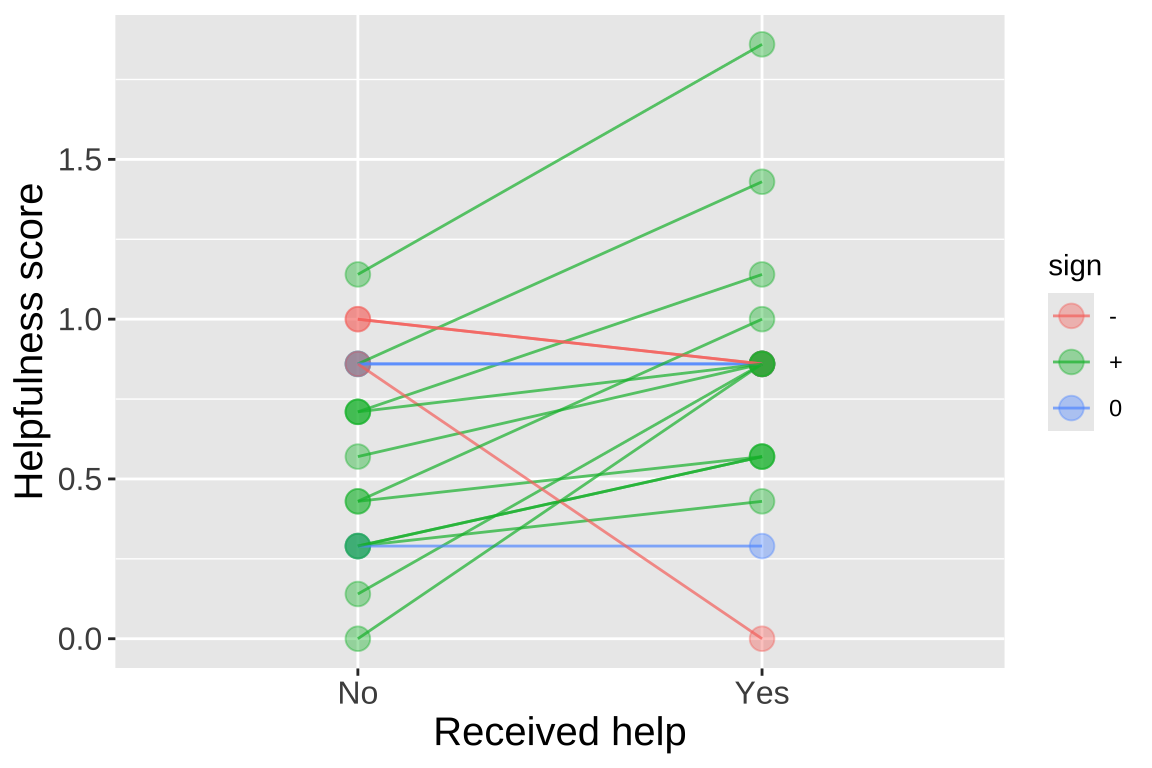
Rutte (2007) tested the existence of “generalized reciprocity” in the Norway rat, Rattus norvegicus. They investigated whether a rat that had just been helped by a second rat would be more likely to help a third rat compared to if it had not been helped. Female focal rats were trained to pull a stick attached to a tray that provided food for their partners but not for themselves. Each focal rat was then subjected to two treatments: in one, the rat was helped by three unfamiliar rats (who pulled the stick), and in the other, the focal rat received no help from three unfamiliar rats (who did not pull the stick). The order of treatments was randomized. Afterward, the focal rat’s tendency to pull for an unfamiliar partner rat was measured by the number of pulls per minute. The data, showing the number of pulls by 19 focal female rats after both treatments, is available here and is plotted below.
We can perform a paired t-test by running a one-sample t-test on the difference between paired observations of individual rats with a null difference of zero, as follows:
# A tibble: 1 × 8
  estimate statistic p.value parameter conf.low conf.high method
     <dbl>     <dbl>   <dbl>     <dbl>    <dbl>     <dbl> <chr>
1    0.219      2.42  0.0264        18   0.0287     0.409 One Sample …
# ℹ 1 more variable: alternative <chr>
Or by telling R to run a paired t-test directly, as follows:
# A tibble: 1 × 8
  estimate statistic p.value parameter conf.low conf.high method
     <dbl>     <dbl>   <dbl>     <dbl>    <dbl>     <dbl> <chr>
1    0.219      2.42  0.0264        18   0.0287     0.409 Paired t-te…
# ℹ 1 more variable: alternative <chr>
Either way, we get the same result: we reject the null hypothesis and conclude that rats who received help are more likely to help others (though we must remember the possibility of a false positive).
Quiz
Figure 9: Quiz on the t here
Extra Material for the Advanced / Bored / Curious
EVERYTHING BELOW IS OPTIONAL. YOU MAY NOT HAVE COVERED ENOUGH TO FULLY UNDERSTAND IT YET, BUT IT’S HERE IF YOU’RE INTERESTED.
Showing that t is like z with an unknown standard deviation
n_reps      <- 5000
sample_size <- 10
mu_0        <- 50
pop_sd      <- 20

bind_rows(tibble(vals = rnorm(n = n_reps * sample_size, mean = mu_0, sd = pop_sd),
                 replicate = rep(1:n_reps, each = sample_size)) %>%
            group_by(replicate) %>%
            summarise(t = (mean(vals) - mu_0) / (sd(vals) / sqrt(n()))) %>%
            mutate(simulation = "normal n = 10"),
          tibble(t = rt(n = n_reps, df = 9),
                 simulation = "t. df = 9")) %>%
  ggplot(aes(x = t, fill = simulation)) +
  geom_density(alpha = .2) +
  theme(legend.position = "bottom") +
  labs(title = "Showing that the t-distribution works",
       subtitle = "Comparing rt(n = n_reps, df = 9) to the means of ")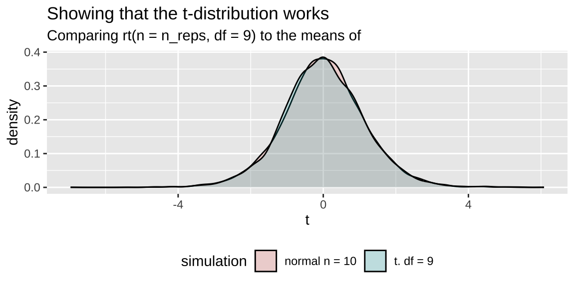
A Sign Test for Data that Don’t Meet Normality Assumptions
In our range example, the data clearly meet the assumptions of normality. But what if they didn’t? A common solution is to conduct a sign test. This involves counting the number of observations greater than the null expectation and conducting a binomial test against the null hypothesis that the numbers greater than and less than the null are equally likely (this is called a sign test).
NOTE: We haven’t covered this test yet, but we will later in the term. For now, think of it as a test of the null hypothesis that the difference is equally likely to be positive or negative.
p_0 <- 0.5
range_sign <- range_shift %>%
  mutate(sign = sign(elevationalRangeShift - mu_0)) %>%
  filter(sign != 0) %>% # remove zeros
  summarise(n = n(),
            up = sum(sign == 1))

binom.test(x = pull(range_sign, up), n = pull(range_sign, n), p = p_0)
    Exact binomial test

data:  pull(range_sign, up) and pull(range_sign, n)
number of successes = 12, number of trials = 31, p-value =
0.281
alternative hypothesis: true probability of success is not equal to 0.5
95 percent confidence interval:
 0.2184996 0.5781304
sample estimates:
probability of success
             0.3870968
Likelihood-Based Inference for a Sample from the Normal Distribution
We calculate likelihoods and perform likelihood-based inference for samples from a normal distribution in exactly the same way as we did previously. This process assumes we are using population parameters. Therefore, we calculate the standard deviation as the distance of each data point from the proposed mean, divided by n rather than n-1.
The big benefits of likelihood-based inference are:
Flexibility: We’re using it here for a simple t-test, which can be done without likelihoods. However, likelihood-based inference can be applied to any model you can write down, making it very useful when your data violate assumptions or when there is no standard test.
Use in Bayesian inference: Likelihoods are integral to Bayesian approaches.
Example: Are species moving uphill?
Calculating Log-Likelihoods for Each Model
First, we’ll grab our observations and propose a range of means—let’s say from -100 to 200 in increments of 0.01.
- Copy the data as many times as we have parameter guesses.
- Calculate the population variance for each proposed parameter value.
- Calculate the log-likelihood of each observation for each proposed parameter value.
lnLik_uphill_calc <- tibble(
  obs = rep(observations, each = length(proposed_means)), # Copy observations multiple times
  mu  = rep(proposed_means, times = length(observations)), # Copy parameter guesses multiple times
  sqr_dev = (obs - mu)^2
) %>%
  group_by(mu) %>%
  mutate(
    var = sum((obs - mu)^2) / n(), # Calculate the population variance for each proposed parameter value
    lnLik = dnorm(x = obs, mean = mu, sd = sqrt(var), log = TRUE) # Calculate log-likelihood for each observation
  )
Figure 10: Log-likelihoods of each data point for 100 proposed means (a subset of those investigated above).
Next, find the likelihood of each proposed mean by summing the log-likelihoods (i.e., multiplying on a linear scale, since the data points are independent) for all observations given the proposed parameter value.
lnLik_uphill <- lnLik_uphill_calc %>%
  summarise(lnLik = sum(lnLik))

ggplot(lnLik_uphill, aes(x = mu, y = lnLik)) +
  geom_line()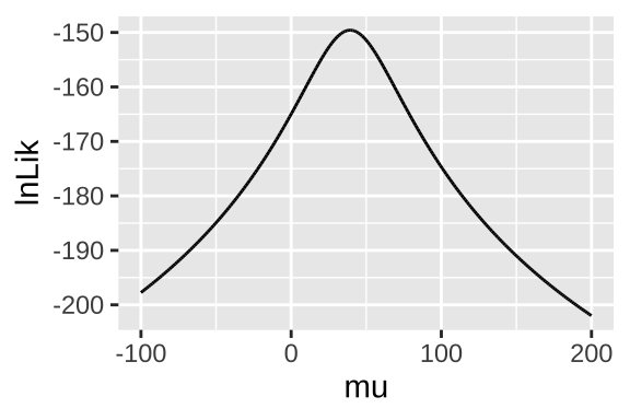
Figure 11: Likelihood profile for proposed mean elevational shift in species examined by data from Chen et al. (2011).
Maximum Likelihood Estimation / Confidence Intervals / Hypothesis Testing
Using the likelihood profile (Fig 11), we can perform standard analyses such as:
- Finding the best estimate (maximum likelihood estimator, MLE),
- Estimating confidence intervals,
- Testing null hypotheses.
First, let’s find our best guess—the maximum likelihood estimator (MLE).
# A tibble: 1 × 2
     mu lnLik
  <dbl> <dbl>
1  39.3 -150.
Reassuringly, this MLE matches the simple calculation of the mean: mean(observations) = 39.33.
Uncertainty: To use the likelihood profile to estimate uncertainty, we need one more trick. Log-likelihoods are approximately \(\chi^2\)-distributed with degrees of freedom equal to the number of parameters we’re inferring (in this case, just one: the mean). Therefore, the 95% confidence interval is everything within qchisq(p = 0.95, df = 1) / 2 = 1.92 log-likelihood units of the MLE.
CI <- lnLik_uphill %>%
  mutate(dist_from_MLE = max(lnLik) - lnLik) %>%
  filter(dist_from_MLE < qchisq(p = 0.95, df = 1) / 2) %>%
  summarise(lower_95CI = min(mu), upper_95CI = max(mu))

CI
# A tibble: 1 × 2
lower_95CI upper_95CI
<dbl> <dbl>
1 28.4 50.3Hypothesis Testing by the Likelihood Ratio Test
We can find a p-value and test the null hypothesis by comparing the likelihood of our MLE (\(log\mathcal{L}(MLE|D)\)) to the likelihood of the null model (\(log\mathcal{L}(H_0|D)\)). This is called a likelihood ratio test. In logs, we subtract instead of dividing.
\(log\mathcal{L}(MLE|D)\) = The sum of the log-likelihoods of each observation under the MLE =
pull(MLE, lnLik)= -149.594.\(log\mathcal{L}(H_0|D)\) = The sum of the log-likelihoods of each observation under the null hypothesis =
lnLik_uphill %>% filter(mu == 0) %>% pull(lnLik)= -164.989.
We then calculate \(D\), which is simply twice the difference in log-likelihoods. We calculate a p-value by noting that \(D\) is \(\chi^2\)-distributed with one degree of freedom (since we’re inferring the mean).
D     <- 2 * (pull(MLE, lnLik) - lnLik_uphill %>% filter(mu == 0) %>% pull(lnLik))
p_val <- pchisq(q = D, df = 1, lower.tail = FALSE)
tibble(D = D, p_val = p_val)
# A tibble: 1 × 2
D p_val
<dbl> <dbl>
1 30.8 0.0000000287Bayesian Inference
Often, we care about how probable our model is given the data, not the reverse. We can use likelihoods to solve this! Remember Bayes’ theorem:
\[(Model|Data) = \frac{P(Data|Model) \times P(Model)}{P(Data)}\]. Taking this apart
- \((Model|Data)\) is called the posterior probability – the probability of our model after we know the data.
- \(P(Data|Model) = \mathcal{L}(Model|Data)\). This is the likelihood we just calculated.
- \(P(Model)\) is called the prior probability. This is the probability our model is true before we have data. We almost never know this, so we make something up that sounds reasonable…
- \(P(Data)\). The probability of our data, called the evidence. We find this through the law of total probability.
Today, we’ll arbitrarily pick a prior probability. This isn’t ideal, as Bayesian inferences are only meaningful to the extent that we can meaningfully interpret the posterior, which depends on a reasonable prior. But for this example, let’s assume our prior is normally distributed around 0 with a standard deviation of 30.
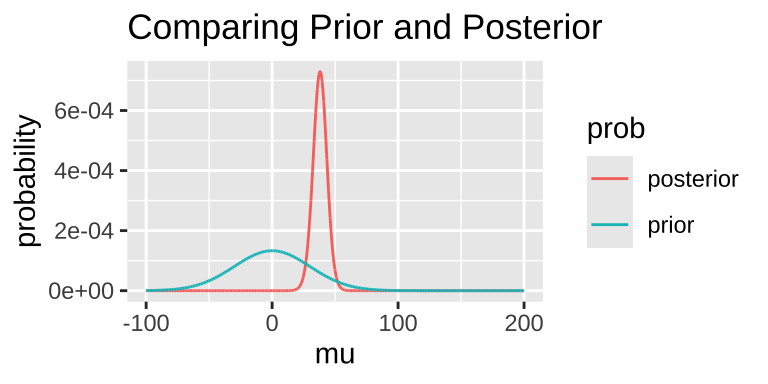
We can extract interesting information from the posterior distribution.
- For example, we can find the maximum a posteriori (MAP) estimate:
# A tibble: 1 × 6
     mu lnLik      lik     prior evidence posterior
  <dbl> <dbl>    <dbl>     <dbl>    <dbl>     <dbl>
1  38.1 -150. 1.05e-65 0.0000594 8.55e-67  0.000729
Note that this MAP estimate does not equal our MLE, as it is influenced by our prior.
- We can also calculate the 95% credible interval. Unlike confidence intervals, the 95% credible interval has a 95% probability of containing the true parameter (if our prior is correct).
bayes_uphill %>%
  mutate(cumProb = cumsum(posterior)) %>%
  filter(cumProb > 0.025 & cumProb < 0.975) %>%
  summarise(lower_95cred = min(mu), upper_95cred = max(mu))
# A tibble: 1 × 2
lower_95cred upper_95cred
<dbl> <dbl>
1 26.8 48.9Prior Sensitivity
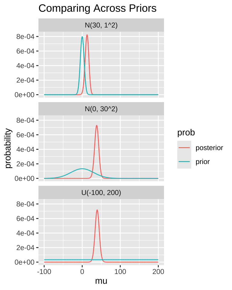
In an ideal world, our priors are well-calibrated. In a better world, the evidence in the data is so strong that our priors don’t significantly influence the result.
A good practice is to compare posterior distributions across different prior models. The plot below shows that if our prior is very restrictive, it can be difficult to shift the posterior away from it. In other words, if your prior belief is strong, it will take a lot of evidence to change it.
MCMC / STAN / brms
For more complex models, we often can’t use the math above to solve Bayesian problems. Instead, we use computational techniques like Markov Chain Monte Carlo (MCMC) to approximate the posterior distribution.
Programming this can be tedious, so there are programs like WINBUGS, JAGS, and STAN to simplify the computation. But even those can require a lot of work. Here, we use the R package brms, which runs STAN for us, to perform MCMC and Bayesian statistics. If you’re interested, I suggest looking into brms for starters, and learning STAN for more advanced analyses.
change.fit$fit# A tibble: 3 × 11
term mean se_mean sd `2.5%` `25%` `50%` `75%` `97.5%` n_eff
<chr> <dbl> <dbl> <dbl> <dbl> <dbl> <dbl> <dbl> <dbl> <dbl>
1 b_In… 37.8 0.06 5.69 26.6 34.1 37.9 41.6 48.8 7863
2 sigma 31.7 0.05 4.25 24.8 28.7 31.2 34.2 41.3 6444
3 lp__ -157. 0.02 1.04 -159. -157. -156. -156. -156. 4340
# ℹ 1 more variable: Rhat <dbl>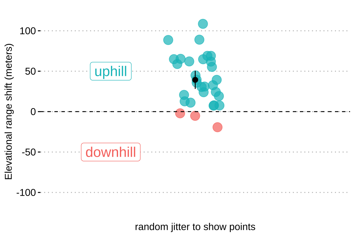
](22-t_files/figure-html5/allrange-1.png)
