One of the most common statistical questions we come across is “are the two variables associated?”
For instance, we might want to know if people who study more get better grades.
Such an association would be quite interesting, and if it arises in a randomized controlled experiment, it would suggest that studying caused this outcome.
Learning goals: By the end of this chapter you should be able to
- Summarize the association between to continuous variables as Covariance AND Correlation
- Use a regression equation to predict the value of a continuous response variable from a continuous explanatory variable.
- Explain the criteria for finding the line of “best” fit.
- Use equations to find the line of “best” fit.
Summarizing associations between variables
We focus on two common summaries of associations between variables – covariance and the correlation.
These summaries describe the tendency for values of X and Y to jointly deviate from the mean.
- If larger values of X tend to come with larger values of Y the covariance (and correlation) will be positive.
- If smaller values of X tend to come with larger values of Y the covariance (and correlation) will be negative.
- A covariance (or correlation) of zero means that – on average – X and Y don’t predictably deviate from their means in the same direction. This does not guarantee that X and Y are independent – if they are related by a curve rather than a line, X could predict Y well even if the covariance (or correlation) was zero. It does mean that the best fit line between X and Y will be flat.
ggplot(penguins, aes(x = body_mass_g, y = flipper_length_mm))+
  geom_point()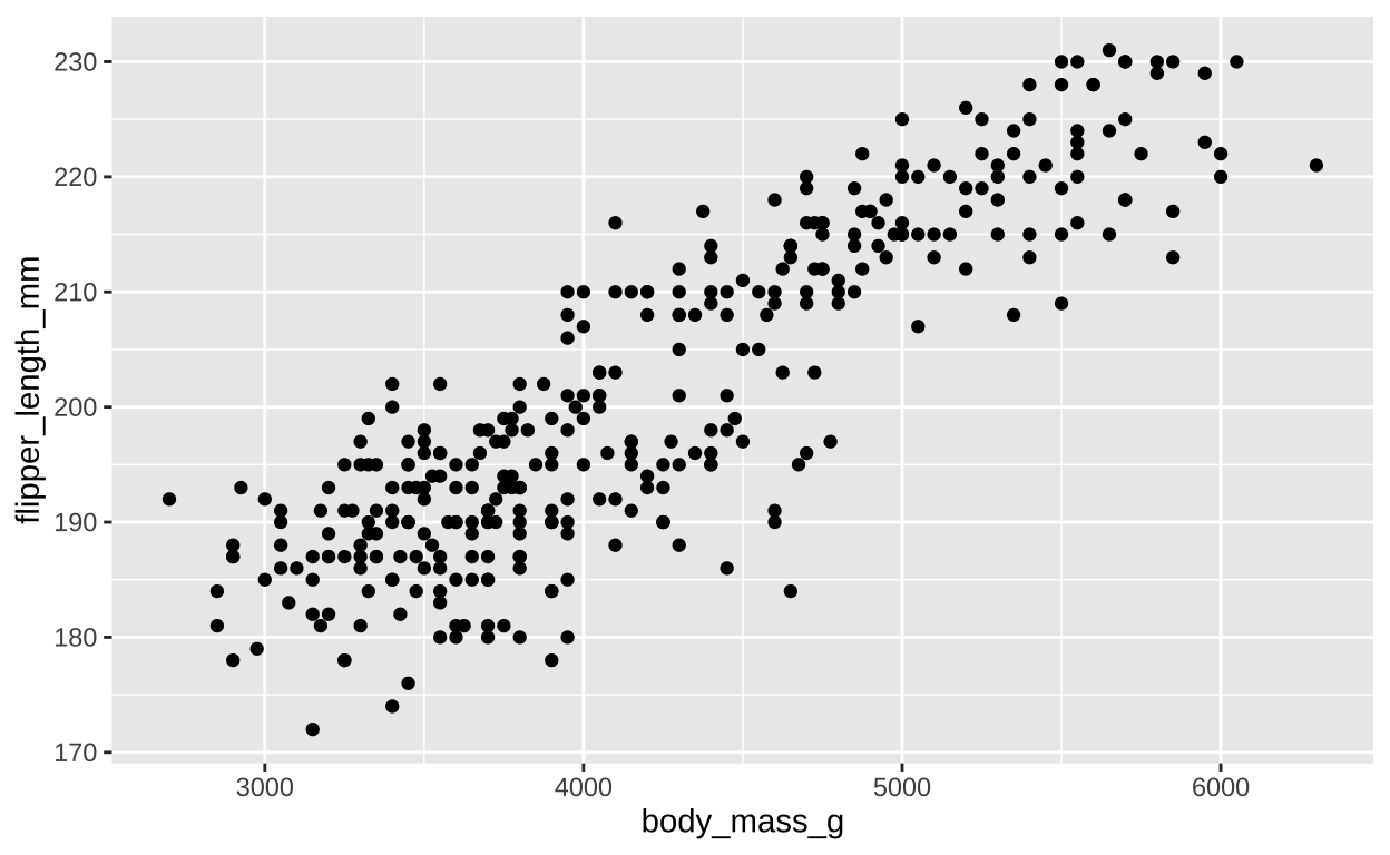
Figure 1: A scatterplot of body mass and flipper length.
For both the covariance and the correlation, X and Y are arbitrary - the covariance between penguin flipper length and penguin body mass is the same as the covariance between penguin body mass and penguin flipper length.
Covariance
The covariance quantifies the shared deviation of X and Y from the mean. S the sample covariance between X and Y, \(Cov(X,Y)\), is:
\[\begin{equation} \begin{split} Cov(X,Y) &=\frac{\sum{\Big((X_i-\overline{X})\times (Y_i-\overline{Y})\Big)}}{n-1}\\ \end{split} \tag{1} \end{equation}\]
The numerator in Eq. (1) is known as the ‘Sum of Cross Products’. This should remind you of the numerator in the variance calculation (Sum of squares = \(\sum(X-\overline{X})(X-\overline{X})\)) – in fact the covariance of X with itself is its variance. The covariance can range from \(-\infty\) to \(\infty\), but in practice cannot exceed the variance in X or Y.
Some algebra can rearrange Eq. (1) to become Eq. (2). These two different looking equations are identical. Often, computing the covariance from (1) is more convenient, but this isn’t always true, sometimes dealing with Eq. (2) is more convenient.
\[\begin{equation} \begin{split} Cov(X,Y) &= \frac{n-1}{n}(\overline{XY} - \overline{X} \times \overline{Y})\\ \end{split} \tag{2} \end{equation}\]
We can calculate the covariance by explicitly writing our math out in R or by using the cov() function:
penguins %>%
  filter(!is.na(body_mass_g) & !is.na(flipper_length_mm)) %>%
  mutate(x_prods = (flipper_length_mm-mean(flipper_length_mm)) * (body_mass_g-mean(body_mass_g))) %>%
  summarise(n = n(),
            sum_x_prods = sum(x_prods),
            cov_math   = sum_x_prods / (n-1),
            cov_math_b  = ( (n()-1) / (n()))*(
              mean(flipper_length_mm * body_mass_g) - mean(flipper_length_mm) * mean(body_mass_g)),
            cov_r       = cov(flipper_length_mm, body_mass_g))
# A tibble: 1 × 5
n sum_x_prods cov_math cov_math_b cov_r
<int> <dbl> <dbl> <dbl> <dbl>
1 342 3350126. 9824. 9767. 9824.Reassuringly we get the same result for all derivations – penguins with bigger flippers are more massive.
Covariance - a visual explanation
Some people have trouble intuiting a covariance, as the mean of the product of the difference X and Y and their means (just typing it is a mouthful).
So I’m hoping the visuals in Figures 2 and 3 help – if they don’t then skip them. To calculate the covariance,
- Draw a rectangle around a given data point and the means of X and Y.
- Find the area of that rectangle.
- If X is less than its mean and Y is greater than its mean (or vice versa) put a negative sign in front of this area.
- Do this for all data points.
- Add this all up and divide by \(n - 1\).
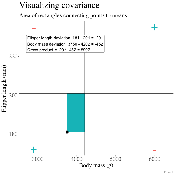
Figure 2: An animation to help understand the covariance. We plot each point as the difference between x and y and their means. The area of that rectangle is the cross product. We sum all of those up (Figure 2) to get the sum of cross products and divide by n-1 to get the covariance.
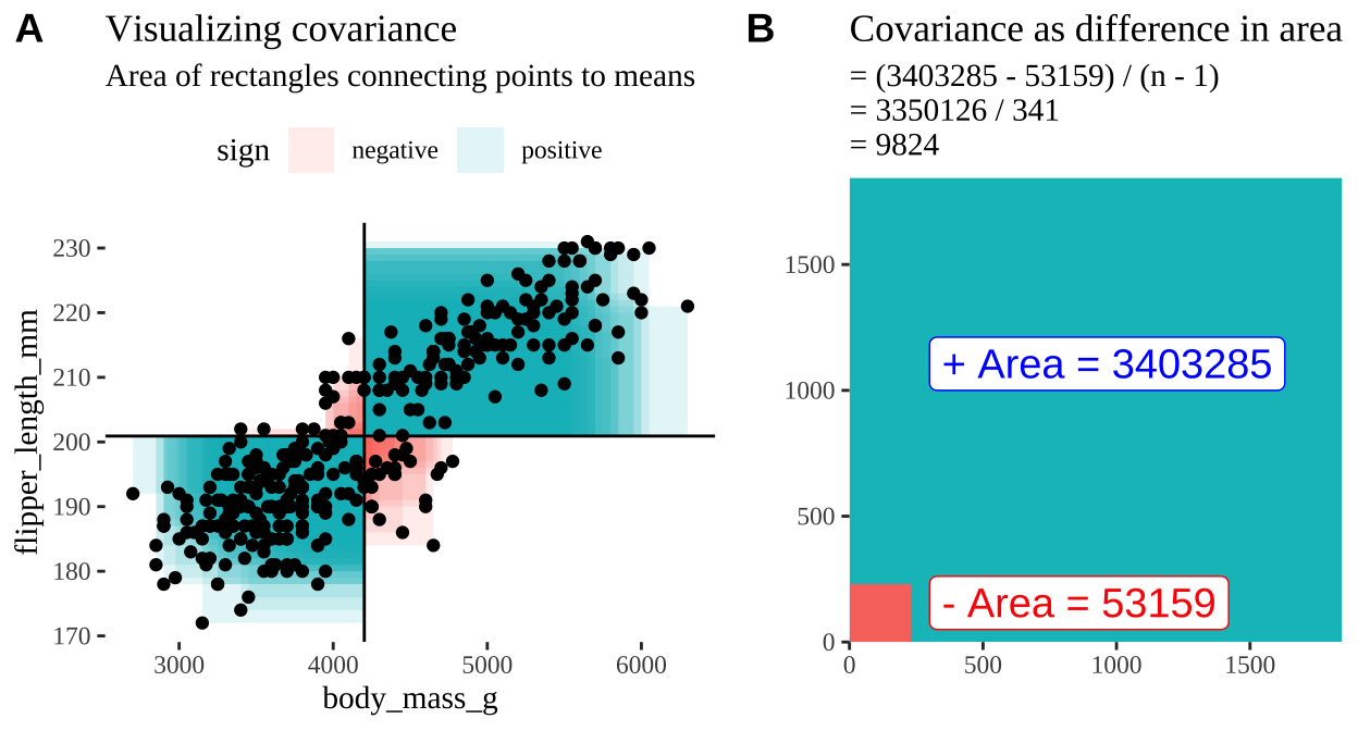
Figure 3: Visualizing covariance as areas from the mean. A) Considering each data point as an area of shared deviation of each variable from its mean. Values in the top left and bottom right quadrants are colored in red because x and y deviate from their means in different directions. Values in the bottom right and top left quadrants are colored in blue because they deviate from their means in the same direction. This is equivalent to showing all of Figure 1 at once. B) The sum of positive (blue) and negative (red) areas.
Correlation
We found a covariance in flipper length and body mass of 9824. . But is this value large or small? It’s hard to tell just from this number.
To provide a more interpretable summary of the association between variables, we use correlation. By dividing the covariance by the product of the standard deviations of each variable, the correlation ranges from -1 to 1. This standardization makes the correlation independent of the units of either variable and provides a clearer sense of the strength and direction of the relationship.
\[\begin{equation} \begin{split} \text{Corelation between X and Y} = Cor(X,Y) &= \frac{Cov(X,Y)}{s_X \times s_Y}\\ \end{split} \tag{2} \end{equation}\]
This formula shows that correlation is essentially a normalized version of covariance. Unlike covariance, correlation does not depend on the means of the variables, making it easier to interpret the strength and direction of the linear relationship.
Again we can push through with math, or use the cor() function in R to find the correlation
penguins %>%
  filter(!is.na(flipper_length_mm) & !is.na(body_mass_g))%>%
  summarise(n = n(),
            cov_r       = cov(flipper_length_mm, body_mass_g),
            cor_math    = cov_r / (sd(flipper_length_mm) * sd(body_mass_g)),
            cor_r       = cor(flipper_length_mm, body_mass_g))
# A tibble: 1 × 4
n cov_r cor_math cor_r
<int> <dbl> <dbl> <dbl>
1 342 9824. 0.871 0.871So the correlation is 0.871. This seems BIG – but note that biological importance of the strength of a correlation depends on the biology you care about - whether a correlation is “big” or “small” is a biological one - not a statistical one.
Associations between categorical variables.
Associations aren’t just for continuous variables; we can also describe associations between categorical variables, often in the form of covariance or correlation. This is most straightforward when dealing with binary categorical variables. Returning to our penguins, let’s consider the covariance between an individual being an “Adelie” penguin and originating from “Biscoe” island.
To do this, we first convert the nominal variables species and island into binary variables: “Is an Adelie” (TRUE/FALSE) and “Is from Biscoe” (TRUE/FALSE).
We can visualize the distribution of these binary variables using a bar plot:
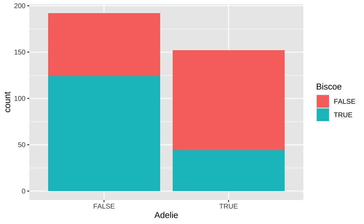
This visualization clearly show proportionately Adelie penguins on Briscoe than on other islands (the aqua portion of the left hand side of the plot (Briscoe TRUE , Adelie FALSE) side of the plot is way bigger than on the right hand side (Briscoe TRUE , Adelie TRUE).
Now that the data are Boolean (TRUE/FALSE) values, we treat TRUE as 1 and FALSE as 0. This allows us to compute the covariance and correlation in the same way we did for continuous variables:
# A tibble: 1 × 2
      cov    cor
    <dbl>  <dbl>
1 -0.0881 -0.354
The resulting covariance and correlation are negative, indicating that an Adelie penguin is less likely to be found on Biscoe island than we would expect based on the proportion of our sample that is and Adelie penguin, and the proportion of penguins in our sample that came from Biscoe. This jives with what we see in the plot above.
Linear regression
Above, we described the relationship between flipper length and body mass in terms of how tightly the two variables are correlated. While this is interesting, we are often more concerned with understanding how rapidly we expect our response variable to increase as we increase the value of the explanatory variable. More specifically, we often hope to predict the value of a response variable based on the value of an explanatory variable. For example, we might want to predict the flipper length of a penguin that weighs 5 kg.
So, in our example where we wish to predict the flipper length of a 5 kg (5000 g) penguin, we predict its flipper length, \(\hat{Y_i}\), as a function of its body mass, \(x_i\) (in grams, which equals 5000, i.e., 5 kg).
The regression as a linear model
A linear model is a common mathematical description of data. In a linear model, we predict the value of a response variable for individual \(i\) (\(\hat{Y_i}\)) as a function of some explanatory variables. In a simple linear regression, there is one explanatory variable, \(x\), so for individual, \(i\), the predicted value of the response variable, \(\hat{Y_i}\), is a function of its value of x, \(x_i\). That is, \(\hat{Y_i} = f(x_i)\). This model is more often written as
\[\hat{Y_i} = a + b x_i\]
where
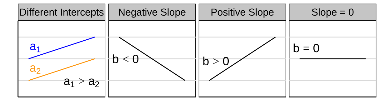
- \(a\) is the intercept (aka the value of when \(x=0\)),
- \(x_i\) is the \(i^{th}\) individual’s value for the quantitative explanatory variable x, and
- b is the slope — i.e., how quickly y changes with x.
Because we know that observations in the real world rarely match model predictions perfectly, an individual’s actual value for the variable
\[Y_i = \hat{Y_i} - e_i\]
So,
\[Y_i = a + b x_i - e_i\]
describes the difference between an observed value and its predicted value from a statistical model. This difference is often called the “residual.”
Showing the “line of best fit” in R
Visualizing the line of best fit can help us better understand the relationship between the variables. In R, we can easily add this line to a scatter plot using ggplot2 and the geom_smooth() function.Here we plot the flipper length against body mass for the penguins dataset and add the line of best fit:
ggplot(penguins, aes(x = body_mass_g, y = flipper_length_mm)) +
  geom_point() +  # Add points to the plot
  geom_smooth(method = "lm", se = FALSE)  # Add the line of best fit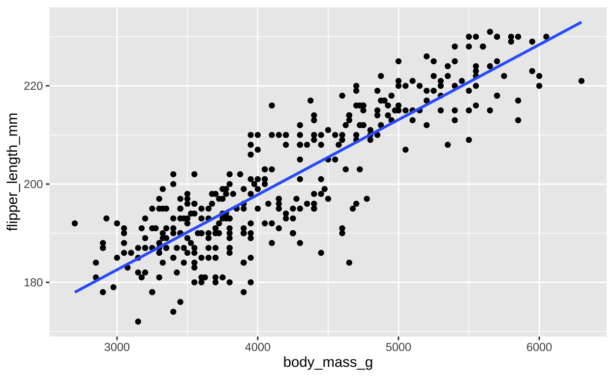
Finding the “line of best fit”
We could draw lots of lines through the points in 1, leading to a bunch of different values in our linear reression. How do we pick the best?
Statisticians have decided that the best line is the one that minimizes the sums of squared residuals. We visualize this concept in Figure 4, which shows that the best line has an intercept, \(a\) near 136 and a slope, \(b\) of about 0.015.
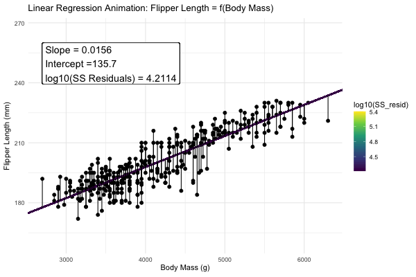
Figure 4: Minimizing the sums of squares residual. We could loop over a bunch of potential slopes and intercepts, and find the one that minimizes the sum of the squared lengths of the black lines connecting predictions (dots) to observations (lines). Color shows the residual sums of squares from high (yellow), to low (black).
Estimation for a linear regression
We could just go to a fine-r scale and jam through all combinations of slope, \(b\), and intercept, \(a\), calculate the sums of squares of the residuals of each point given our choices of \(a\) and \(b\), such that \(ss_{resid}|a,b = \sum(e_i^2|{a,b}) = \sum(Y_i - \widehat{Y_i})^2\), and find the combinations of slope and intercept that minimize this equation.
BUT mathematicians have found equations that find values for the slope and intercept that minimize the residual sums of squares, so we don’t need to do all that.
Estimating the slope of the best fit line
Recall that the covariance and correlation describe how reliably the response variable, Y, changes with the explanatory variable, X, but do not describe how much Y changes with** X. Our goal is to find \(b\) the slope which minimizes the sums of squares residual.
The regression coefficient (aka the slope, b), describes how much Y changes with each change in X. The true population parameter for the slope, \(\beta\) equals the population covariance standardized by the variance in \(X\), \(\sigma^2_x\). We estimate this parameter with the sample correlation, \(b\), in which we divide the sample covariance by the sample variance in X, \(s^2_X\).
\[\begin{equation} \begin{split} b = \frac{Cov(X,Y)}{s^2_X}\\ \end{split} \tag{3} \end{equation}\]
So for, our example
penguins %>%
  filter(!is.na(body_mass_g) & !is.na(flipper_length_mm)) %>%
  summarise(varx = var(body_mass_g),
            cov_xy = cov(body_mass_g, flipper_length_mm),
            slope = cov_xy / varx)
# A tibble: 1 × 3
varx cov_xy slope
<dbl> <dbl> <dbl>
1 643131. 9824. 0.0153There are two points to remember
- You will get a different slope depending on which variable is \(X\) & which is \(Y\). Unlike the covariance and correlation, for which \(X\) and \(Y\) are interchangeable.
- It’s possible to have a large correlation and a small slope and vice-versa.
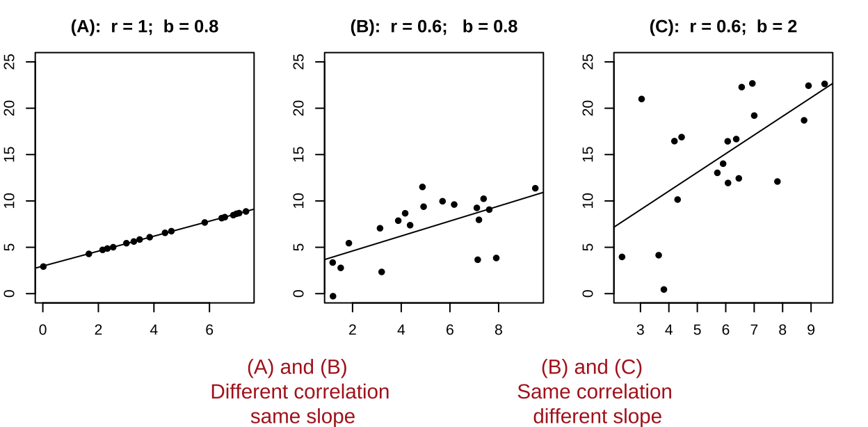
Figure 5: A smaller correlation can have a larger slope and vie versa.
Estimating the intercept of the best fit line
The true population intercept – the value the response variable would take if we follwoed the slope line all the way to zero – is \(\alpha\). We estimate the intercept as \(a\) from our sample as follows
\[\begin{equation} \begin{split} a = \overline{Y} - b \times \overline{X} \\ \end{split} \tag{4} \end{equation}\]
So we can estimate the slope and intercept in R by implementing equations (3), and (4) as follows
penguins %>%
  filter(!is.na(body_mass_g) & !is.na(flipper_length_mm)) %>%
  summarise(varx = var(body_mass_g),
            cov_xy = cov(body_mass_g, flipper_length_mm),
            slope = cov_xy / varx,
            intercept = mean(flipper_length_mm) - slope * mean(body_mass_g))%>%
  select(slope, intercept)
# A tibble: 1 × 2
slope intercept
<dbl> <dbl>
1 0.0153 137.This means that in this study, penguin flipper get longer, on average, by 0.0152 mm for each increase in gram of mass.
So, returning to our example in which we hope to predict
Fitting a linear regression with the lm() function.
We can fit a linear regression with the lm() function like this lm(<response> ~ <explanatory>, data = <data>). Doing this for our penguins data shows that we did not mess up our math.
 (Intercept)  body_mass_g
136.72955927   0.01527592
The squared correlation and the proportion variance explained
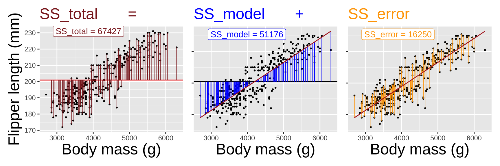
How much of the variation in flipper length in this dataset can be “explained” by variation in body mass? To determine this, we need to compare the sums of squares explained by our model to the total sums of squares for flipper length.
Calculate the variance explained by our model: This is the difference between the overall mean and the values predicted by our model \(SS_{model} = \Sigma (\hat{Y_i} - \overline{Y})^2\).
Compare this to the sums of squares for flipper length: \(SS_{total} = \Sigma (Y_i - \overline{Y})^2\)
Calculate the proportion of variance explained: The proportion of variance explained is \(r^2 = \frac{SS_{model}}{SS_{total}}\)
Not that this value \(r^2\) literally equals the correlation coefficient, r, squared!
penguins %>%
    filter(!is.na(body_mass_g) & !is.na(flipper_length_mm)) %>%
    mutate(predicted_flipper  =  coef(penguin_lm)[["(Intercept)"]] + body_mass_g * coef(penguin_lm)[["body_mass_g"]],
           SSmodel              = (predicted_flipper - mean(flipper_length_mm) )^2 ,
           SStot              =   (flipper_length_mm - mean(flipper_length_mm))^2        )  %>%
    summarise( sum(SSmodel) / sum(SStot),
               cor(body_mass_g,flipper_length_mm )^2)
# A tibble: 1 × 2
`sum(SSmodel)/sum(SStot)` `cor(body_mass_g, flipper_length_mm)^2`
<dbl> <dbl>
1 0.759 0.759Quiz
Figure 6: The accompanying quiz link
Table of Definitions and Formulas
| Concept | Definition | Formula |
|---|---|---|
| Linear Regression | A statistical method for modeling the relationship between a response variable and one or more explanatory variables. | \(\hat{Y_i} = a + b x_i\) |
| Slope (\(b\)) | The rate at which the response variable changes with respect to the explanatory variable. | \(b = \frac{\sum{(x_i - \bar{x})(y_i - \bar{y})}}{\sum{(x_i - \bar{x})^2}}\) |
| Intercept (\(a\)) | The expected value of the response variable when the explanatory variable is zero. | \(a = \bar{y} - b \bar{x}\) |
| Residual (\(e_i\)) | The difference between the observed value and the predicted value from the model. | \(e_i = Y_i - \hat{Y_i}\) |
| Sum of Squared Residuals (SSR) | The sum of the squares of residuals, used to assess the fit of the model. | $ |
| Proportion of Variance Explained (\(r^2\)) | The proportion of the total variance in the response variable explained by the model. | \(r^2 = \frac{SS_{\text{model}}}{SS_{\text{total}}}\) |
| Correlation Coefficient (\(r\)) | A measure of the strength and direction of the linear relationship between two variables. | \(r = \frac{\text{cov}_{x,y}}{s_x \times s_y}\) |
| Covariance | A measure of how much two random variables vary together. | \(\text{Cov}(X, Y) = \frac{\sum{(x_i - \bar{x})(y_i - \bar{y})}}{n-1}\) |