Motivating Scenario:
We have data. We have a continuous response variable with a categorical predictor. What do we do?.
Learning Goals: By the end of this chapter, you should solidify your understanding ot t tests and ANOVAs:
The Normal Distribution
The normal distribution naturally arises when an outcome is the consequences of adding up a bunch of random things. As such, it is very common in nature.
Additionally, because means happen by adding up stuff, most sampling distributions (when the sample size is sufficiently large) tend toward normality even if the underlying data are not normal. Therefore, the normal distribution is exceptionally common in statistics, and even statistical approaches that assume normality are often robust to modest violations of this assumption.
Normal distributions can be fully characterized by two summaries – their mean, \(\mu\), and variance \(\sigma^2\). Because of this, any normal distribution can be transformed to a normal distribution with a mean of zero and variance of one (aka the standard normal distribution). We can do this with a Z transform (Equation (1))
\[\begin{equation} Z_i = \frac{y_i-\bar{y}}{\sigma} \tag{1} \end{equation}\]
Where \(\sigma\), the population standard deviation is the square root of the variance, \(\sigma^2\).
Of all the things to know about the Z distribution, the most useful fact is that about 95% of the Z distribution is within two standard distributions of the mean.
The t distribution
The whole problem of statistics is that we are stuck with estimates from samples, not estimates from populations. So the Z transformation is rarely appropriate. Rather we often consider our sample estimate relative to some proposed null mean, \(\mu_0\). So that is the denominator for the difference between our estimate and some null value. Dividing this by our estimate of the standard error, SE = \(s/{\sqrt n}\), provides a t-value (Equation (2)):
\[\begin{equation} t = \frac{\bar{y}-\mu_0}{(s/{\sqrt n})} \tag{2} \end{equation}\]
Thus the t tells us the number of standard errors between our estimate and the null. Because the standard error is is estimated, the t-distribution has “fatter tails” than the Z distribution. However, the t distribution becomes more like the Z distribution, as the degrees of freedom increases (Figure 1).
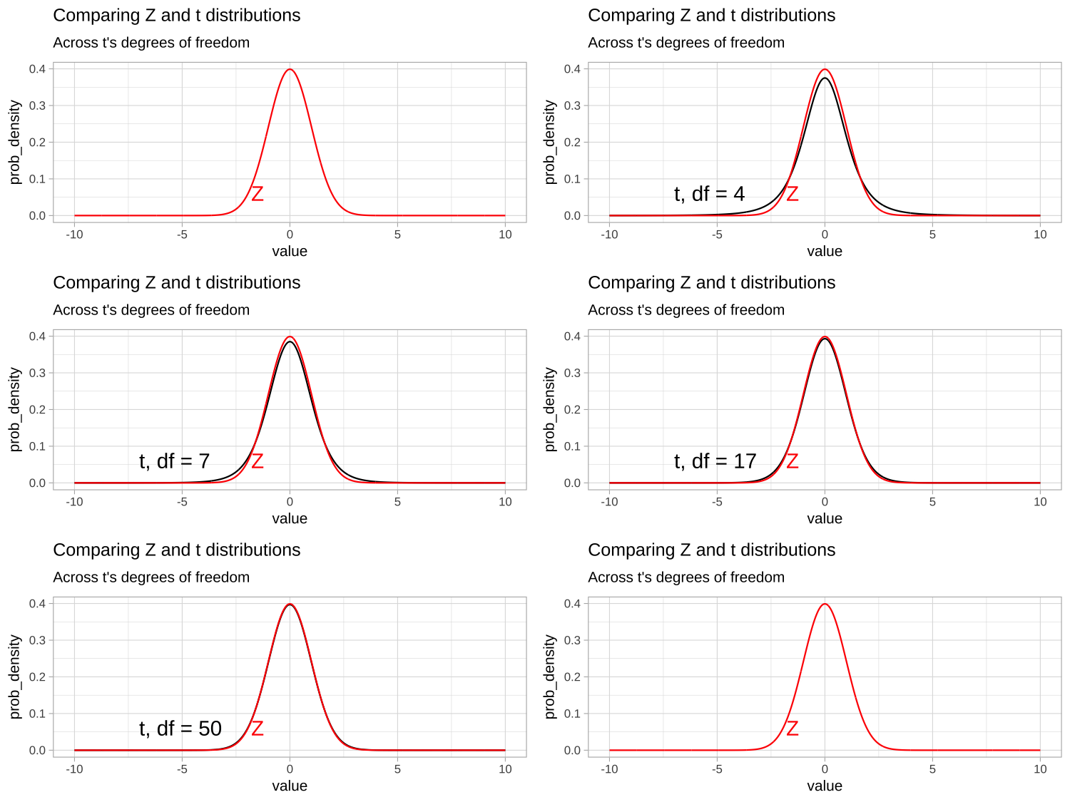
Figure 1: Comparing the t (black) and standard normal (Z, red) distributions for different degrees of freedom.
Uncertain t
We can use the t-distribution and understanding of the t-transform to build confidence intervals! We do this by
- Centering our x% = \(100\times(1-\alpha)%\) confidence intervals on the estimated mean.
- Finding the critical value (crit_t) that contain the middle X% of the t-distribution. (in
Rwe do this with theqt()function as follows:
qt(p =\(\alpha\)/2, df=<my_df>, lower.tail = FALSE)).
Here \(\alpha\) is 0.05 for a 95% confidence interval, and<my_df>is replaced by the degrees of freedom for your analysis. - Because (crit_t) is in units of standard errors, we multiply it by our estimated standard error to find how far from the mean we expect 95% f samples from it to lie.
- Finaly, we add and subtract this value, crit_t \(\times\) SE, to the estimate of the mean to find the upper and lower bounds of our confidence interval.
So with a mean (\(\bar{y}\)) of 5, a standard error (SE) of 1.5, and 11 degrees of freedom, our critical value is:
qt(p=.025, df=11, lower.tail=FALSE) = 2.2.
So our 95% confidence interval is
\(\bar{y} \pm crit_{t,\alpha=0.05} \times SE\)
\(=5 \pm 2.2 \times 1.5\)
\(=5\pm 3.3\)
\(=\{1.7,8.5\}\)
Null Hypothesis Significance testing.
The critical value described above also separates “significant results” (when abs(t) > crit_t) for which we reject the null hypothesis from “non-significant results” (when abs(t) < crit_t) for which we fail to reject the null hypothesis.
We can find a precise p value as \(\int_{abs(t)}^\infty + \int_{-abs(t)}^{-\infty}\). Because the t distribution is symmetric, this equals \(2 \times\int_{abs(t)}^\infty\). Rather than doing calculus, we find this in R with the pt() function:
p_val = 2 * pt(-abs(t), df = <my_df>)
So with t = 3.33, and 11 degrees of freedom, our p-value is:
2 * pt(-abs(3.33), df = 11)
= 2 * pt(- 3.33, df = 11)
= 0.0068
We would reject the null
Review of Linear models
t-tests and ANOVAs are types of linear models. In linear models, we predict a quantitative value of a response variable by adding up contributions from one or more explanatory variables (Equation (3)).
\[\begin{equation} \hat{Y_i} = a + b_1 y_{1,i} + b_2 y_{2,i} + \dots{} \tag{3} \end{equation}\]
Of course, individual observations, \(Y_i\) deviate from their predicted value, \(\hat{Y_i}\). The difference between reality and predictions from a linear model is known as a residual, \(\epsilon_i\) (Equation (4)).
\[\begin{equation} Y_i = \hat{Y_i} +\epsilon_i \tag{4} \end{equation}\]
Assumptions of linear modeling.
In addition to the assumptions that run through most of statistics (data are collected without bias, and data in our sample are independent), most linear models make the following assumptions:
- Residuals are (roughly) normally distributed.
- Equal variance within groups (or more broadly, that the variance in residuals is independent of the predictions. i.e. \(\text{Var}(\epsilon_{i})\) is independent of \(Y_i\)).
F, \(R^2\) and Variance components:

Figure 2: Partitioning deviations in an ANOVA. A Shows the difference between each observation, \(Y_i\), and the grand mean, \(\overline{\overline{Y}}\). This is the basis for calculating \(MS_{total}\). B Shows the difference between each predicted value \(\widehat{Y_i}\) and the grand mean, \(\overline{\overline{Y}}\). This is the basis for calculating \(MS_{model}\). C Shows the difference between each observation, \(Y_i\), and its predicted value \(\widehat{Y_i}\). This is the basis for calculating \(MS_{error}\).
Linear models decompose the total squared deviations from the mean (\(\text{SS}_\text{total} = \Sigma(y_i-\bar{y})^2\)) into two components. Figure 2, really helps me understand what we are doing in ANOVA – we think about all variability in our data (a) as the sum of the variability among (b), and within groups. To do so, we first square the length of each line in Figure 2, and add them up. These are called the sums of squares.
- \(\text{SS}_\text{model}\): The sum of the squared difference between model predictions and the grand mean: \(\text{SS}_\text{model} = \Sigma{(\hat{y_i}-\bar{y})^2}\)
- \(\text{SS}_\text{error}\): The sum of the squared difference between model predictions and the observed values: \(\text{SS}_\text{error} = \Sigma{(y_i-\hat{y_i})^2}\)
\(R^2\), the “proportion of variance explained” by the model equals \(\frac{\text{SS}_\text{model}}{\text{SS}_\text{total}}\)
Because we expect a similar amount of variation within and among groups under the null that all groups have the same mean, we can test this null by comparing the variability within and among groups. Dividing \(\text{SS}_\text{model}\) by its degrees of freedom (for now, the number of groups, \(k\), minus 1) provide the mean squares model, and dividing \(\text{SS}_\text{error}\) by \(n-k\) provides the mean squares error.
- \(\text{MS}_\text{model}=\frac{\text{SS}_\text{model}}{k-1}\) (where k is the number of groups).
- \(\text{MS}_\text{error}=\frac{\text{SS}_\text{error}}{n-k}\) (where n is the sample size).
- \(F= \frac{\text{MS}_\text{model}}{\text{MS}_\text{error}}\).
Under the null all samples come from the same population and therefore \(F=1\). We test the null by seeing if our observed F (or a larger value of) is particularly unlikely under the null. Specifically, we find a p-value by finding the proportion of the F (parameterized by \(df_1 = k-1\), and \(df_2=n-k\)) that exceed our F- value. So if we had an F of 3 with 30 samples from 5 groups, our p-value would be pf(q = 3, df1 = 4, df2 = 25, lower.tail = FALSE)= 0.0376 and we reject the null, and conclude that not all groups have the same mean.
Effect size
Remember a p-value describes how often we would see something as extreme as we did if the null were true. We “reject the null” if this probability is low. The p-value does not measure the size or importance of an effect.
Cohen’s D is a common summary of the effect size. In contrast to Z and t, which describe the distance between estimates and the null in units of standard errors (the relevant scale for considering sampling error), Cohen’s D describes the distance between estimates and the null in units of standard deviations (The relevant unit for considering the strength of an effect).
One sample t-test example.
Paired t-test
The most straightforward (but perhaps least common) use of the t is a one-sample t-test. This tests the null hypothesis that the mean is a certain value. Perhaps the most common application of the “one sample t-test” is in the “paired t-test.” In the paired t-test, we have data from two groups (e.g. treatment and control) that naturally come in pairs. We then use a one-sample t-test to test the null that the difference between pairs equals zero. This test assumes normally distributed differences between pairs.
Paired t-test example:

Cristina Cox Fernandes and colleagues were studying the number of electric fish species living in various parts of the Amazon basin were interested in whether the presence of tributaries affected the local number of electric fish species (Fernandes et al. 2004). They counted the number of electric fish species above and below the entrance point of a major tributary of 12 different river locations. Here is what they found:
| tributary | speciesUpstream | speciesDownstream |
|---|---|---|
| Içá | 14 | 19 |
| Jutaí | 11 | 18 |
| Japurá | 8 | 8 |
| Coari | 5 | 7 |
| Purus | 10 | 16 |
| Manacapuru | 5 | 6 |
| Negro | 23 | 24 |
| Madeira | 29 | 30 |
| Trombetas | 19 | 16 |
| Tapajós | 16 | 20 |
| Xingu | 25 | 21 |
| Tocantins | 10 | 12 |
Paired t-test data visualization:
Lets make a plot!
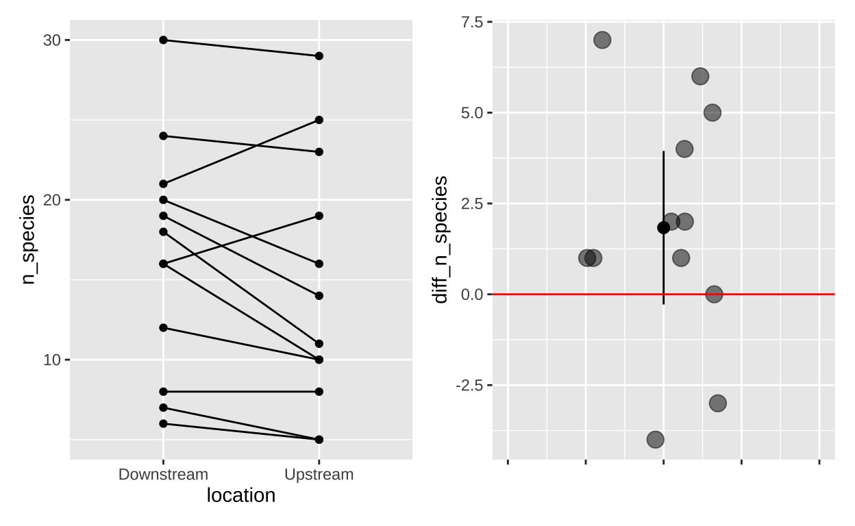
Figure 3: (A) The full data, (B) The difference in the number of fish species (Downstream - Upstream)
Paired t-test evaluating assumptions:
Now lets make a quick qq-plot to evaluate the assumption of normality. Remember that normal data will make a roughly linear qq-plot. Figure 4 shows the data seem pretty normal!
electric <- read_csv("https://whitlockschluter3e.zoology.ubc.ca/Data/chapter12/chap12q19ElectricFish.csv")
electric <- electric %>%
  mutate(diff_n_species = speciesDownstream-speciesUpstream)

ggplot(electric, aes(sample = diff_n_species ))+
  geom_qq()+
  geom_qq_line()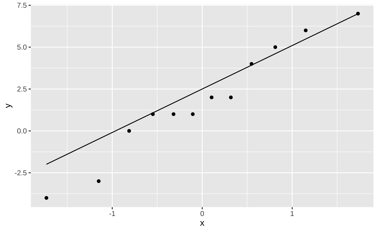
Figure 4: A qq=plot to evaluate the assumption of normality.
Paired t-test hypotheses.
- The null hypothesis is that the mean difference between pairs is zero.
- The alternative hypothesis is that the mean difference between pairs is not zero.
Paired t-test by hand
We can now find 95% confidence intervals and test the null! Recall that the degrees of freedom for a paired t-test is the number of pairs minus one:
electric %>%
  summarise(n        = n(),
            df       = n -1,
            crit_t   = qt(0.975, df = df),
            estimate = mean(diff_n_species),
            SE       = sd(diff_n_species) / sqrt(n),
            t        = estimate/SE,
            lower_95 = estimate - SE * crit_t,
            upper_95 = estimate + SE * crit_t,
pval = 2 * pt(q=-abs(t), df=df)) %>% kable()| n | df | crit_t | estimate | SE | t | lower_95 | upper_95 | pval |
|---|---|---|---|---|---|---|---|---|
| 12 | 11 | 2.200985 | 1.833333 | 0.960061 | 1.909601 | -0.2797467 | 3.946413 | 0.0825965 |
So \(p > \alpha\) so we ail to reject the null - there is not enough evidence to conclude that downstream has a different number of electric fish species than upstream does.
Paired t-test in R with t.test
Rather than these laborious calculations, we can have R do a paired t.test for us:
We can either do a one sample t-test on the difference
t.test(x= electric$diff_n_species,mu = 0)
    One Sample t-test

data:  electric$diff_n_species
t = 1.9096, df = 11, p-value = 0.0826
alternative hypothesis: true mean is not equal to 0
95 percent confidence interval:
 -0.2797467  3.9464134
sample estimates:
mean of x
 1.833333
Or as a paired t-test
We can either do a one sample t-test on the difference and get a similar output. I won’t bother you with that. Rather I will remind you that the tidy() function in the broom package converts that test output into a nice row.
# A tibble: 1 × 8
  estimate statistic p.value parameter conf.low conf.high method
     <dbl>     <dbl>   <dbl>     <dbl>    <dbl>     <dbl> <chr>
1    -1.83     -1.91  0.0826        11    -3.95     0.280 Paired t-te…
# ℹ 1 more variable: alternative <chr>
Paired t-test in R with lm()
We can also conduct a simple linear model
Call:
lm(formula = diff_n_species ~ 1, data = electric)

Residuals:
    Min      1Q  Median      3Q     Max
-5.8333 -1.0833 -0.3333  2.4167  5.1667

Coefficients:
            Estimate Std. Error t value Pr(>|t|)
(Intercept)   1.8333     0.9601    1.91   0.0826 .
---
Signif. codes:  0 '***' 0.001 '**' 0.01 '*' 0.05 '.' 0.1 ' ' 1

Residual standard error: 3.326 on 11 degrees of freedom
Let’s take a minute to interpret this output. Specifically, let’s start with coefficients. Here there is only one row – (Intercept) which, in this case, refers to the mean o the paired differences.
Estimate: Tells us the estimate.
Std. Error: Tells us the standard error of this estimate (note this matches our math!!).
t value: Tells us the t-value – i.e. the number of standard errors away rom the null of zero we are. -Pr(>|t|): Tell us the p-value - -the probability that a random sample from the null distribution would be this weird.
Piping these results to tidy changes some of the column names (t value is replaced by statistic)
# A tibble: 1 × 5
  term        estimate std.error statistic p.value
  <chr>          <dbl>     <dbl>     <dbl>   <dbl>
1 (Intercept)     1.83     0.960      1.91  0.0826
Effect size for a paired t-test.
We can summarise the effect size as Cohen’s D by diving the mean difference between pairs by the standard deviation of the difference between pairs.
electric %>%
  summarise(estimate = mean(diff_n_species),
            sd_diff = var(diff_n_species),
            cohens_D = estimate / sd_diff)
# A tibble: 1 × 3
estimate sd_diff cohens_D
<dbl> <dbl> <dbl>
1 1.83 11.1 0.166Lookin at our table to interpret Cohen’s D values, we see that this is a small effect.
| Cohen’s d Value | Effect Size |
|---|---|
| 0.0 - 0.5 | Small effect |
| 0.5 - 0.8 | Medium effect |
| 0.8 - 1.2 | Large effect |
| > 1.2 | Very large effect |
Putting it together: A brief report for a paired t-test.
You worked hard on your statistics. You owe it to yourself and your audience to explain everything well and honestly. A good and detailed write up should include the: Null hypothesis, Sample size, Effect size, The statistical test, Test statistics, Degrees of freedom, p-value, What you do to the null hypothesis, Caveats etc.
We tested the null hypothesis that tributaries had no effect on the local number of electric fish by comparing the difference in the number of electric fish species up and downstream of the tributaries of 12 rivers in the amazon. We found an average of 1.83 (sd = 11, 95 %CI = {-0.28, 3.95}) more electric fish species downstream than upstream of tributaries, a nonsignificant difference (paired t-test, = 1.91, df = 11, p = 0.083). While the lack of significance might be attributable to the small sample size, any real effect is probably modest because the effect size is small (Cohen’s D = 0.17). Finally, we warn about any causal interpretation of these results, as this was an observational study, not an experimental one.
Sometimes want to summarize results in a sentence, rather than a paragraph. Still include: Estimate and confidence intervals, the test, as well as the t, df and p-values.
Here the null and what we do to it is implied
We found a non-significant difference between the number of electric fish species downstream and downstream (mean difference = 1.83, 95 %CI = {-0.28, 3.95}, paired t-test: t = 1.91, df = 11, p = 0.083) of 12 tributaries in the amazon.
Two sample t-test example.
Often data are not paired. So we use a two-sample t-test to test the null hypothesis that two samplescome from the same statistical population.
Spinocerebellar ataxia 1 is a devastating inherited disorder with no cure. The disease occurs when a mutation in the gene for a protein called ataxin1 causes numerous repeats of the DNA sequence CAG (cytosine, adenine, guanine), the genetic code for an amino acid called glutamine. SCA1 first affects gait and motor skills, then swallowing, speech and cognition and eventually kills the person who has it.
To see if exercise could help organisms with this disease strengthen gait and motor skills, researchers had six of twelve young mice with this disease exercise and had the other six not exercise. They found no effect of exercise on gait or motor skills, but after putting them back in their cages and waiting a while they became interested in differences in lifespan between mice that did and did not get exercise as pups. Here is what they found:
| treatment | lifespan |
|---|---|
| NoExcercise | 240 |
| NoExcercise | 261 |
| NoExcercise | 271 |
| NoExcercise | 275 |
| NoExcercise | 276 |
| NoExcercise | 281 |
| Exercise | 261 |
| Exercise | 293 |
| Exercise | 316 |
| Exercise | 319 |
| Exercise | 324 |
| Exercise | 347 |
Two sample t-test visualization
Let’s check out the data
exercise_ataxia <- read_csv("https://whitlockschluter3e.zoology.ubc.ca/Data/chapter12/chap12q28SpinocerebellarAtaxia.csv")

exercise_ataxia_reordered <- exercise_ataxia  %>%
  mutate(treatment = fct_reorder(treatment, lifespan))

exercise_ataxia_reordered %>%
  ggplot(aes(x = treatment, y = lifespan, color = treatment)) +
  geom_jitter(,height = 0, width = .1, size = 3, alpha  = .6, show.legend = FALSE)+
  stat_summary(fun.data = "mean_cl_normal", color = "black")
Lets evaluate assumptions
Is it normal T sata lookgood enough - but not perfect, there is one outlier in each group.
exercise_ataxia_reordered %>%
  ggplot(aes(sample = lifespan))+
  geom_qq()+
  geom_qq_line()+
  facet_wrap(~treatment)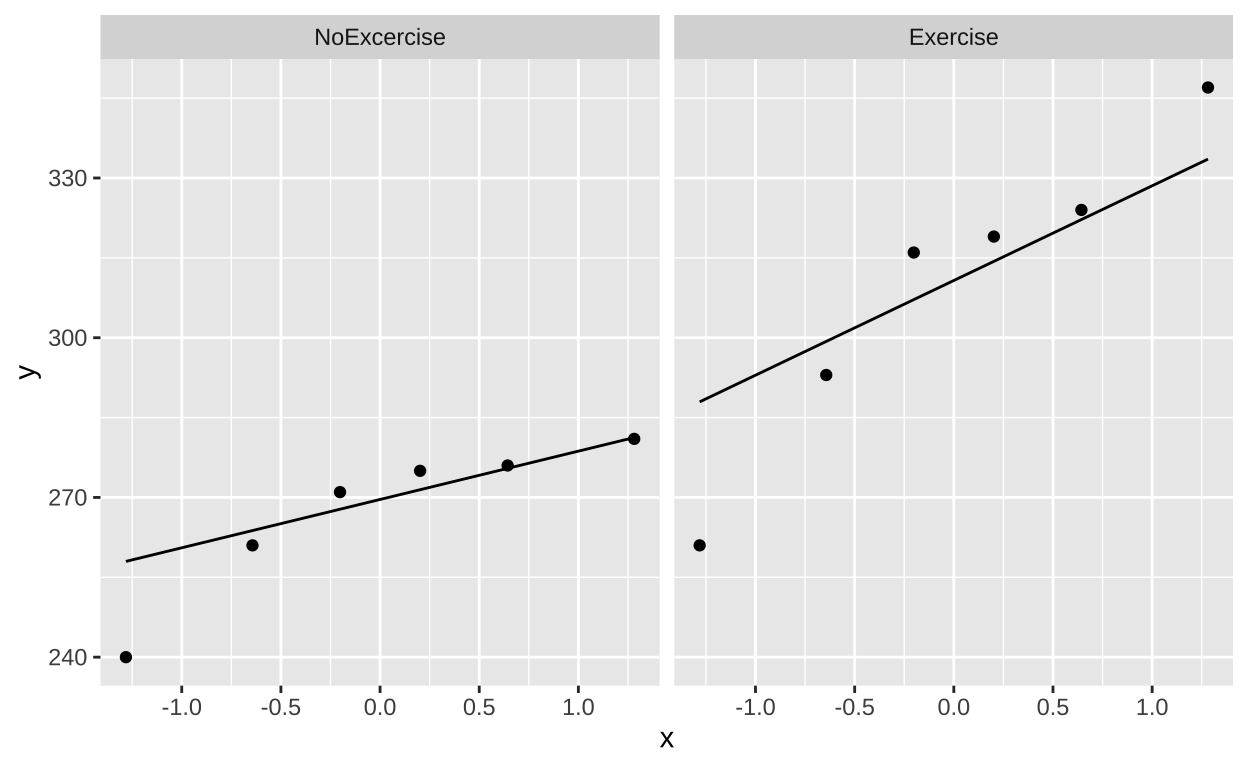
Lets test the null
- The null hypothesis is that there is no association between exercise and lifespan in mice with ataxia.
- The alternative hypothesis is that there is an association between exercise and lifespan in mice with ataxia.
Two sample t-test by hand
# get summaries for each group
ataxia_group_summaries <- exercise_ataxia_reordered %>%
  group_by(treatment)    %>%
  dplyr::summarise(mean_lifespan = mean(lifespan),
                   sd_lifespan   = sd(lifespan),
                   var_lifespan  = var(lifespan),
                   sample_size   = n())

ataxia_group_summaries
# A tibble: 2 × 5
treatment mean_lifespan sd_lifespan var_lifespan sample_size
<fct> <dbl> <dbl> <dbl> <int>
1 NoExcercise 267. 15.0 224. 6
2 Exercise 310 29.6 874. 6# get summaries for differece between groups
ataxia_group_summaries %>%
dplyr::summarise(est = diff(mean_lifespan), # 1. data summaries
pooled_var = sum(var_lifespan * (sample_size - 1)) / sum(sample_size-1),
cohensD = est / sqrt(pooled_var),
se = sqrt(pooled_var * sum(1/sample_size)), # 2. uncertainty
df = sum(sample_size - 1),
crit_t = qt(p = 0.975, df = df),
lower_95 = est - se *crit_t,
upper_95 = est + se *crit_t,
t = abs(est) / se, # 3. NHST
reject_null = t > crit_t,
p_value = 2 * pt(t, df = df, lower.tail = FALSE)) %>% kable()| est | pooled_var | cohensD | se | df | crit_t | lower_95 | upper_95 | t | reject_null | p_value |
|---|---|---|---|---|---|---|---|---|---|---|
| 42.66667 | 549.3333 | 1.820416 | 13.53186 | 10 | 2.228139 | 12.51581 | 72.81752 | 3.153054 | TRUE | 0.0102795 |
\(p<\alpha\) So we reject the null!
Paired t-test in R with t.test
As seen above, the t.test function in R will do your t-test for you! You can look at the full output, which is most informative. But here I will run you through the output summarized by tidy().
t.test(lifespan ~ treatment, data = exercise_ataxia_reordered , var.equal = TRUE) %>% # Formula syntax
  tidy()
# A tibble: 1 × 10
estimate estimate1 estimate2 statistic p.value parameter conf.low
<dbl> <dbl> <dbl> <dbl> <dbl> <dbl> <dbl>
1 -42.7 267. 310 -3.15 0.0103 10 -72.8
# ℹ 3 more variables: conf.high <dbl>, method <chr>,
# alternative <chr>estimate: The difference in means (make sure you know which one we’re subtracting).
estimate1: The mean for group one (make sure you know which this means).
estimate2: The mean for group two (make sure you know which this means).
statistic: The t value.
parameter: The degrees of freedom.
Two sample t-test in R with lm()
Call:
lm(formula = lifespan ~ treatment, data = exercise_ataxia_reordered)

Residuals:
    Min      1Q  Median      3Q     Max
-49.000  -9.000   6.833  10.167  37.000

Coefficients:
                  Estimate Std. Error t value Pr(>|t|)
(Intercept)        267.333      9.568  27.939 8.01e-11 ***
treatmentExercise   42.667     13.532   3.153   0.0103 *
---
Signif. codes:  0 '***' 0.001 '**' 0.01 '*' 0.05 '.' 0.1 ' ' 1

Residual standard error: 23.44 on 10 degrees of freedom
Multiple R-squared:  0.4985,    Adjusted R-squared:  0.4484
F-statistic: 9.942 on 1 and 10 DF,  p-value: 0.01028
We can look at just the Coefficients bit with tidy
# A tibble: 2 × 5
  term              estimate std.error statistic  p.value
  <chr>                <dbl>     <dbl>     <dbl>    <dbl>
1 (Intercept)          267.       9.57     27.9  8.01e-11
2 treatmentExercise     42.7     13.5       3.15 1.03e- 2
Let’s work through this output:
- First let’s consider the
(Intercept)column. This refers to the mean of our reference group,NoExcercise:estimate: Refers to the mean for theNoExcercisegroup. This is useful.std.error: Describes the uncertainty this estimate. That’s good to know.
statistic(ort value): Says how many standard errors away from the null of zero lifespan we think we are. But zero lifespan is a ridiculous null, and we don’t care about it. So that t is meaningless.
p.value(orPr(>|t|)): Describes the probability of having a lifespan so much different than zero if the true lifespan was zero. This is a stupid null hypothesis. Ignore this p-value.
- Now let’s consider the
treatmentExercisecolumn. This refers to the difference between the means of the exercise and the NoExercise groupestimate: Refers to the difference in means. How much longer individuals in the exercise group lived, compared to the no NoExercise group. This is useful.
std.error: Describes the uncertainty this estimate. That’s good to know.
statistic(ort value): Says how many standard errors away form the null of zero difference in lifespan between groups we think we are. This is a good null hypothesis and a sensible thing to calculate. -p.value(orPr(>|t|)): Describes the probability of having a difference in lifespans between the exercise and noExercise group as extreme as we saw, if they did in fact have the same mean. This is a useful p-value.
Two sample t-test as an ANOVA:
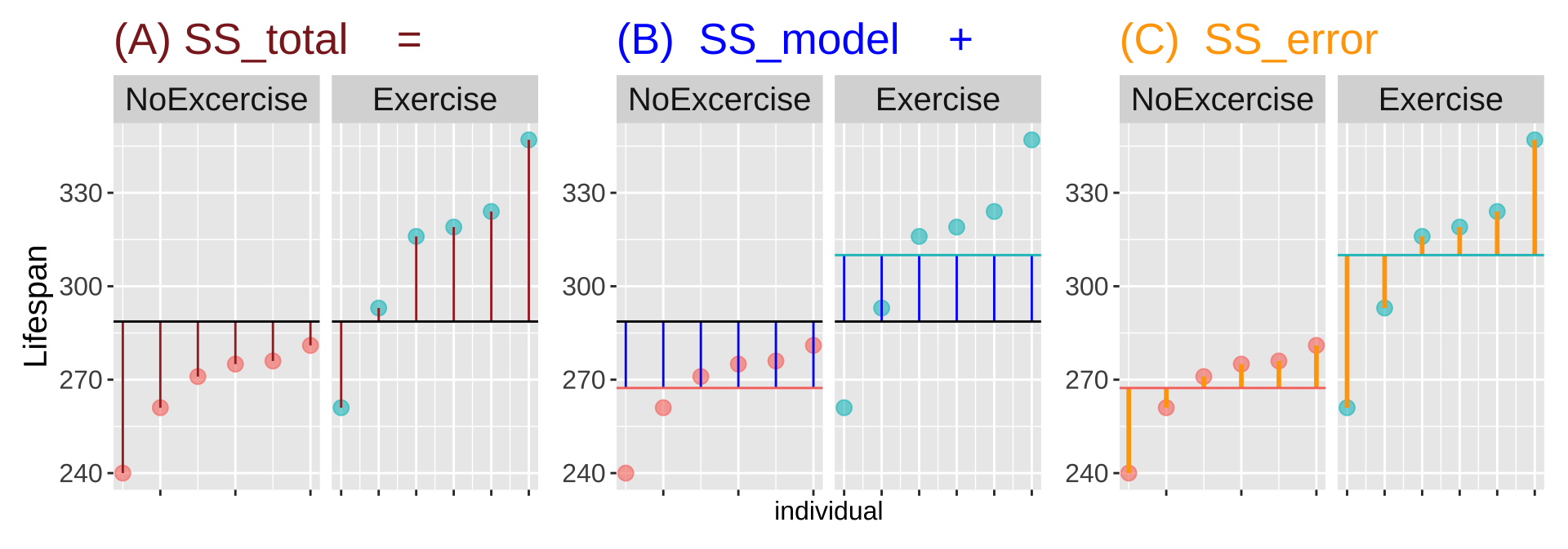
Figure 5: Partitioning the sums of squares for a model of lifespan of mice with ataxia with and without excercise (code [here]).
As it is a linear model, we can also consider a two sample t-test as an ANOVA.
\[Y_i = a + b_i x_i+\epsilon_i\].
- \(a\) is the intercept, representing the mean of the reference group,
- \(b_1\), is the coefficient for each non-reference group – i.e. how different its mean is from the reference group.
- \(x_{1,i}\), is a binary indicator (0 or 1) that activate the respective coefficient if an observation belongs to the non-reference group (then add \(b_1\)) or not (then don’t add \(b_1\)).
- \(\epsilon_{i}\) is the residual.
Recall our linear model. Here \(a\) = 267.33, and \(b_1\) = 42.67.
      (Intercept) treatmentExercise
        267.33333          42.66667
We can use the augment function in broom to help us find \(R^2\) and \(F\)
lm(lifespan ~ treatment, data = exercise_ataxia_reordered ) %>%
  augment() %>%
  summarise(df1 = n_distinct(treatment) - 1,
            df2 = n() - n_distinct(treatment),
            SS_total = sum((lifespan - mean(lifespan))^2),
            SS_model = sum((.fitted - mean(lifespan))^2),
            SS_error = sum((lifespan - .fitted)^2),
            MS_model =  SS_model / df1,
            MS_error = SS_error / df2,
            F_val    = MS_model/MS_error,
            p_val    = pf(q = F_val, df1 = df1, df2 = df2, lower.tail = FALSE),
r2 = SS_model/SS_total) %>% kable()| df1 | df2 | SS_total | SS_model | SS_error | MS_model | MS_error | F_val | p_val | r2 |
|---|---|---|---|---|---|---|---|---|---|
| 1 | 10 | 10954.67 | 5461.333 | 5493.333 | 5461.333 | 549.3333 | 9.941748 | 0.0102795 | 0.4985394 |
Alternatively, we could pass our linear model object to anova()
Analysis of Variance Table

Response: lifespan
          Df Sum Sq Mean Sq F value  Pr(>F)
treatment  1 5461.3  5461.3  9.9417 0.01028 *
Residuals 10 5493.3   549.3
---
Signif. codes:  0 '***' 0.001 '**' 0.01 '*' 0.05 '.' 0.1 ' ' 1
Putting it together: A brief report for a two sample t-test.
As I wrote for the paired t-test, you owe it to yourself and your audience to clearly explain you analyses and results.
We tested the null hypothesis that the lifspan of mice with ataxia was indepdent of their perscribed excercise regime. We found that excerice increase lifespan by nearly 43 days (95 %CI from 12.5 to 98.2 days). This exceptionally large effect (Cohen’s D = 1.8), is significnat (two sample t-test, t = 3.15, df = 10, p = 0.0103). This experimental study is quite proomising and suggest that excercise can increase liespan in mcie with ataxia.
Sometimes want to summarize results in a sentence, rather than a paragraph. Still include: Estimate and confidence intervals, the test, as well as the t, df and p-values.
Here the null and what we do to it is implied
An experimental study found that exersice significanly (two-sample t-test: t = 3.15, df = 10, p = 0.01) increased the lifspan of ataxia mice by nearly 43 days (95 %CI from 12.5 to 98.2 days).
ANOVA Example
Above, we did an ANOVA instead of a two sample t-test. You can see the results where the same, but it is an unusual thing to do. More often we conduct an ANOVA when we have more than two categories for our predictor.
Here we take an example that asks the question: “Does genetic diversity impact productivity?” Researchers planted 18 eelgrass shoot in each plot, but they could be from one, three, or six genotypes. They then counted the number of shoots at the end of the experiment
eelgrass <- read_csv("https://whitlockschluter3e.zoology.ubc.ca/Data/chapter15/chap15q15EelgrassGenotypes.csv")
glimpse(eelgrass)
Rows: 32
Columns: 2
$ treatmentGenotypes <dbl> 1, 1, 1, 1, 1, 1, 1, 1, 1, 1, 1, 1, 3, 3,…
$ shoots <dbl> 71, 61, 49, 38, 36, 32, 30, 28, 27, 21, 1…Note that I want to run an ANOVA, but R reasonably thinks that treatment genotypes is a number (<dbl>. I always check these things when I run an anova on things that might be numbers). Lets fix that
eelgrass <- eelgrass  %>%
  mutate(treatmentGenotypes = as.factor(treatmentGenotypes))

eelgrass_plot <- ggplot(eelgrass , aes(x = treatmentGenotypes, y = shoots, color= treatmentGenotypes))+
  geom_sina(size=3, alpha =.5, maxwidth = .4)+
  stat_summary(fun.data = mean_cl_normal, position = position_nudge(x = .3,y=0))+
  theme(legend.position = "none",
        axis.title = element_text(size=15),
        axis.text = element_text(size=12))+
  labs(x = "number of genotypes plants", y = "number of shoots observed")

eelgrass_plot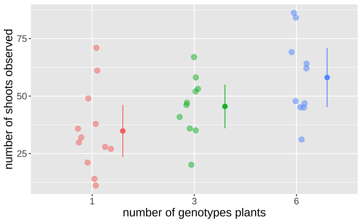
- Here the null hypothesis is: The number of shoots is the same for each number of genotypes planted.
- Here the alternative hypothesis is: The number of shoots differs for at least one of the umber of genotypes planted.
Rather than doing calculations by hand we’ll use R’s function for this ANOVA. Remember that we can do this with the lm() or aov() functions.
Evaluating assumptions.
Before we get too serious, let’s evaluate our assumptions.
How similar are the variances? Linear models (yes you too ANOVA) assume similar variance in each group. Lets see if our data meet that assumption
# A tibble: 3 × 2
  treatmentGenotypes variance
  <fct>                 <dbl>
1 1                      322.
2 3                      177.
3 6                      325.
They are all within a factor of two! Seems good enough
Next we assume normally distributed residuals. Lets evaluate this by making a quick linear model, grabbiging residuals from the output of [augment()] and plotting these as a qqplot:
lm(shoots ~ treatmentGenotypes, data = eelgrass) %>%
  augment() %>%
  ggplot(aes(sample = .resid))+
  geom_qq()+
  geom_qq_line()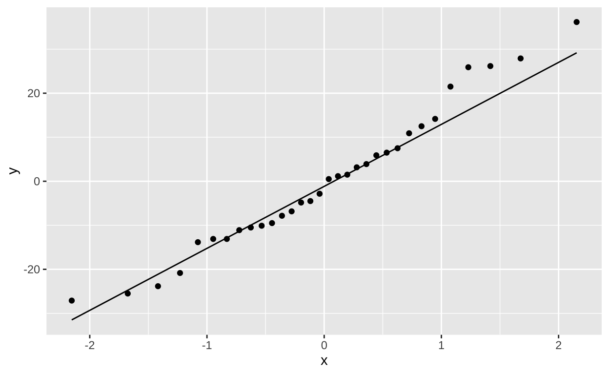
This too, looks good enough for me!!! So lets goooo
An ANOVA with lm()
Call:
lm(formula = shoots ~ treatmentGenotypes, data = eelgrass)

Residuals:
    Min      1Q  Median      3Q     Max
-27.100 -10.650  -1.167   8.350  36.167

Coefficients:
                    Estimate Std. Error t value Pr(>|t|)
(Intercept)           34.833      4.809   7.243 5.64e-08 ***
treatmentGenotypes3   10.667      7.133   1.495  0.14563
treatmentGenotypes6   23.267      7.133   3.262  0.00283 **
---
Signif. codes:  0 '***' 0.001 '**' 0.01 '*' 0.05 '.' 0.1 ' ' 1

Residual standard error: 16.66 on 29 degrees of freedom
Multiple R-squared:  0.2684,    Adjusted R-squared:  0.2179
F-statistic: 5.319 on 2 and 29 DF,  p-value: 0.01077
First, consider the bottom three lines. This looks like familiar ANOVA output. We get \(R^2\) and F and a p-value for our model. To just get this stuff as a tibble use the glance() function from the broom package
glance(eelgrass_lm)# A tibble: 1 × 12
r.squared adj.r.squared sigma statistic p.value df logLik AIC
<dbl> <dbl> <dbl> <dbl> <dbl> <dbl> <dbl> <dbl>
1 0.268 0.218 16.7 5.32 0.0108 2 -134. 276.
# ℹ 4 more variables: BIC <dbl>, deviance <dbl>, df.residual <int>,
# nobs <int>We can see that p = 0.01077, so we reject the null and conclude not all groups have the same mean.
Now let’s work through the output under Coefficients: We can get this as a column with the tidy() function from broom
tidy(eelgrass_lm)# A tibble: 3 × 5
term estimate std.error statistic p.value
<chr> <dbl> <dbl> <dbl> <dbl>
1 (Intercept) 34.8 4.81 7.24 0.0000000564
2 treatmentGenotypes3 10.7 7.13 1.50 0.146
3 treatmentGenotypes6 23.3 7.13 3.26 0.00283 First let’s consider the
(Intercept)column. As in the two-sample t test, the(Intercept)refers to the reference value, in this case, one genotype. As while theestimate, andstd.errare meaningful and interesting,t valueandPr(>|t|)refer to the nonsensical null that there are zero shoots with one genotype. So we ignore these.Now let’s consider the
treatmentGenotypes3andtreatmentGenotypes6columns. As in the two sample t-test, the estimates(Intercept)refers to difference between the means of these treatments and the estimate. This is just what we want out of a. linear model! The standard error is also usefull measure of uncertainty. Unfortunately, the t and p-values here are not particularly meaningful as they describe just the pairwise comparison between these estimates and the reference value, and do not consider the broader model. So we ignore these.
How do we get the p-values for the relevent pairwise comparisons? With a Tukey post hoc test!!
An ANOVA with aov()
In R we run post-hoc Tukey’s test with the TukeyHSD() function. This function requires an ANOVA object which we generate as follows:
eelgrass_aov <- aov(shoots ~ treatmentGenotypes, data = eelgrass)If we sent this to summary – e..g summary(eelgrass_lm_aov) we would get the standard anova table which is the same as anova(eelgrass_lm)
summary(eelgrass_aov) Df Sum Sq Mean Sq F value Pr(>F)
treatmentGenotypes 2 2953 1476.4 5.319 0.0108 *
Residuals 29 8049 277.6
---
Signif. codes: 0 '***' 0.001 '**' 0.01 '*' 0.05 '.' 0.1 ' ' 1Now let’s conduct our post hoc test to see which treatments differ:
TukeyHSD(eelgrass_aov) Tukey multiple comparisons of means
95% family-wise confidence level
Fit: aov(formula = shoots ~ treatmentGenotypes, data = eelgrass)
$treatmentGenotypes
diff lwr upr p adj
3-1 10.66667 -6.950231 28.28356 0.3078894
6-1 23.26667 5.649769 40.88356 0.0077397
6-3 12.60000 -5.800250 31.00025 0.2256389We see that 6 and 1 differ from on another, but neither differ significantly from 3. So we put 1 in significance group a, 6 in significance group, b, and place 3 in groupsa and b. We can ass these siginificance groupings to our plot:
eelgrass_plot +
  geom_label(data = tibble(treatmentGenotypes = c("1","3","6"),
                           sig_group = c("a","a,b","b")),
             aes(y =95, label = sig_group), size =10, alpha =.4)+
  coord_cartesian(ylim = c(0,100))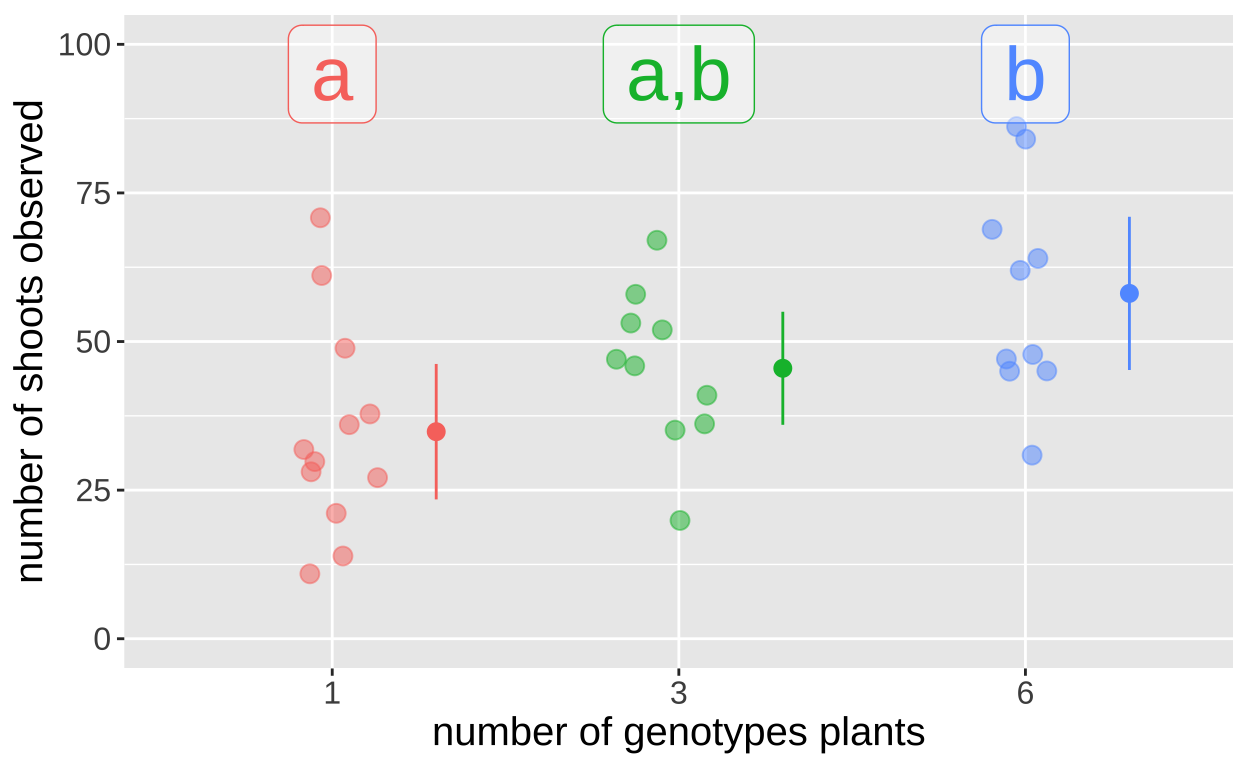
Putting it together: A brief report for ths ANOVA test
As I wrote for the t-tests, you owe it to yourself and your audience to clearly explain you analyses and results.
We tested the null hypothesis that genetic diversity was not associated with productivety in an experimental study of 32 eelgrass plots seeded with 12 plants with 1, 3 or 6 genotypes. We found that the number of genotpyes was associated with the number of shoots (F = 5.32, df1 = 2, df2 = 29, p = 0.0108). Post hoc analyses revealed tha plots with six genotypes initially planted had 23 more shoots than plots with one genotype (p = 0.007739). However neither the mean of 10.6 more shoots found in plots with three, as compared to one genotype, nor the additional 12.6 shoots found in plots with six, as compared to three genotypes were significant (p equals 0.31, and 0.23, respectively).
Quiz
Figure 6: Quiz on the reviewing linear models here