8 Visualize in R
Having discussed the reasons for visualizations, their key elements, and principles for evaluating them (in Chapter 7), we now get our hands dirty with code.
As data is mostly conceptualized as numeric information, R is often viewed as a programming language for statistical computing. R is really good at that, of course, but there are many tools for doing statistics. An alternative motivation for using R relies on its immense graphical powers — not just for visualizations of data, but also for defining colors, illustrating mathematical constructs, designing charts and diagrams, and even creating computational art.
Starting our own journey into data science by creating visualizations is a bit unusual. However, working with graphics is a great way of introducing basic representational constructs (e.g., by defining colors or geometric shapes) and elementary programming concepts (e.g., by incrementally creating a visualization). As we can try out and play with different versions of a script and always see the effects of our commands, visualizing data provides us with immediate feedback and a great sense of achievement. And although creating effective visualizations is challenging, it can also be very enjoyable.
Preparation
Recommended background readings for this chapter include:
After reading this chapter, Chapter 2: Visualizing data of the ds4psy textbook (Neth, 2025a) provides an introduction to the ggplot2 package.
Preflections

Before you read on, please take some time to reflect upon the following questions:
Which basic elements (or ingredients) does a scientific visualization contain?
What types of visualizations do you know?
Which goals or tasks do they support?
Which aesthetic features can be varied?
8.1 Introduction
Above all else show the data.
Edward R. Tufte (2001)
Having thought about the motivations for and evaluation of visualizations, this chapter turns practical by introducing particular tools and technologies for creating visualizations. Having criticized the graphs of others, trying to create some relatively simple graphs will serve as a lesson in humility: As it turns out, it is rather difficult to create a good visualization.
While R supports our creative endeavors, many key elements of graphs (e.g., regarding variable mappings, colors, and labels) require conscientious and intelligent decisions. Thus, our initial insight that any representation can be good or bad at serving particular purposes is an important point to keep in mind throughout this chapter and book part.
8.1.1 Contents
This chapter introduces the plotting functions of base R (including the graphics and grDevices packages).
8.1.2 Data and tools
This chapter primarily uses functions of base R (including the graphics and grDevices packages).
The data to be plotted will mostly be generated on the fly, but we will also use several pre-defined data sets (e.g., the airquality, iris, Nile, Orange, and UCBAdmissions data of the datasets package, as well as the mpg data of the ggplot2 package).
Some colors or color palettes will be based on the unikn package and an example (in Section 8.3.3) uses the riskyr package.
8.1.3 Types of graphs
There are many different types of visualizations and corresponding classifications. Most typologies initially try to categorize visualizations by their geometric objects (e.g., bar, line, point, etc.), but then realize that the same visual shape can support different tasks (e.g., an area can be used to judge distributions, the magnitude of values, or trends). Thus, we can describe and distinguish between types of visualizations on at least three dimensions:
by data: Visualize the values of one variable, two variables, vs. multiple variables.
by geometric objects: Draw areas, bars, lines, points, rectangles, or other shapes.
by tasks: View amounts or magnitudes, evaluate the shape of distributions, compare groups, judge trends, see relationships between variables, etc.
In Chapter 7 we argued that a visualization’s ecological rationality depends on the interplay between the current task, the visualization’s geometric and aesthetic properties, and the viewer’s expectations and skills. To enable a match, visual designers must select the data to visualize, the geometric objects to display, and additional aesthetic properties.
To select a suitable type of visualization, it helps to be familiar with a wide array of visualization types. This chapter will focus on some basic types for which R provides dedicated functions. For additional inspirations, see the elegant icons in 5: Directory of visualizations (Wilke, 2019).
8.1.4 Overview
This chapter introduces base R graphics, rather than ggplot2, which is covered in Chapter 9 and in Chapter 2: Visualizing data of the ds4psy book. Here, we distinguish between two general approaches for plotting:
-
Basic plots (Section 8.2) use pre-packaged plotting functions for specific visualizations:
- Hands-on instructions on visualizing data in base R.
- Distinguishing between different types of visualizations.
- Adding aesthetics: Color, shape, size, etc.
-
Complex plots (Section 8.3) allows combining various elements into more elaborate visualizations:
- Composing plots as programs/scripts
- Preparing the canvass prior to plotting
- Adding elements
- Adjusting plotting parameters
Two important constraints for this chapter are:
- Visualizations often require transforming the data into a specific format or shape. We will always show the to-be-plotted data here, but ignore the need for data transformation. Getting data into this shape is covered in chapters on wrangling data (e.g., Chapter 13 on Transforming data. However, whenever creating a new visualization, a good question to always ask is:
- What type and shape of data does this type of visualization require?
- We will use color functions when creating visualizations in this chapter (e.g., from
colors()of the grDevices package or the unikn package), but explaining how colors and color palettes are defined, created and used in R will only be covered in Chapter 10 on Using colors (or Appendix D: Using colors of the ds4psy book).
8.2 Basic plots
Due to the inclusion of the core packages graphics and grDevices, a standard installation of R comes with pretty powerful tools for creating a variety of visualizations.
Unfortunately, the plot() function of R is a chameleon:
As it serves as an umbrella function for many different functions, its flexibility tends to confuse novice users.
In contrast to more specialized plotting functions, plot() responds differently based on the arguments and data structures it receives as inputs.
Thus, depeding on its input, evaluating plot() results in different types of visualization.
In this section, we introduce some basic commands for creating typical (named) graphs. We then distinguish between basic and complex plots:
- Basic plots (discussed in this section) aim to create an entire plot by one function call. Dedicated R functions for creating basic plots include:
-
hist()for creating histograms;
-
plot()for creating point or line plots (given corresponding inputs, but see below); -
barplot()for creating bar charts; -
boxplot()for creating box plots; and -
curve()for drawing arbitrary lines and curves.
By contrast, complex plots (introduced in Section 8.3) are created by multiple function calls. They are typically started with a generic call to:
-
plot(), and then followed by several specific plotting functions, like -
grid(),abline(),points(),text(),legend(),title(), etc.
As we can always add visual elements to basic plots, the borderline between basic and complex plotting is often blurred. Nevertheless, it makes sense to begin with some basic R plotting functions and then proceed to more complex plots.
8.2.1 Histograms
The hist() function shows distribution of values in a single variable.
For demonstration purposes, we create a vector x that randomly draws 500 values of a normal distribution:
This looks fairly straightforward, but due to the random nature of x the distribution of its values will vary every time we re-create the vector x.
Note that the hist() command added some automatic elements to our plot:
- a descriptive title (above the plot);
- an \(x\)- and a \(y\)-axis, with appropriate value ranges, axis ticks and labels;
- some geometric objects (here: vertical bars or rectangles) that represent the frequency of values in our data.
Under the hood, the function re-arranged the input vector and computed something:
It categorized the 500 values of x into bins of a specific width and counted the number of values falling into each bin (to show their frequency on the \(y\)-axis).
Whenever we are unhappy with the automatic defaults, we can adjust some parameters of a plot.
In the case of histograms, an important parameter is the number of separate bins into which the data values are being categorized. This can be adjusted using the breaks argument:
# different values of breaks:
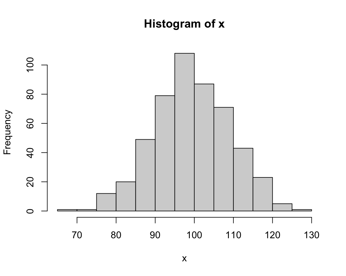
hist(x, breaks = 5) # wider bins, higher values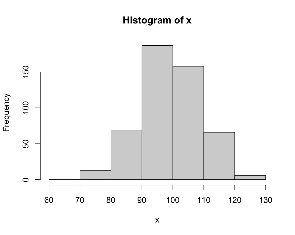
hist(x, breaks = 30) # narrower bins, lower values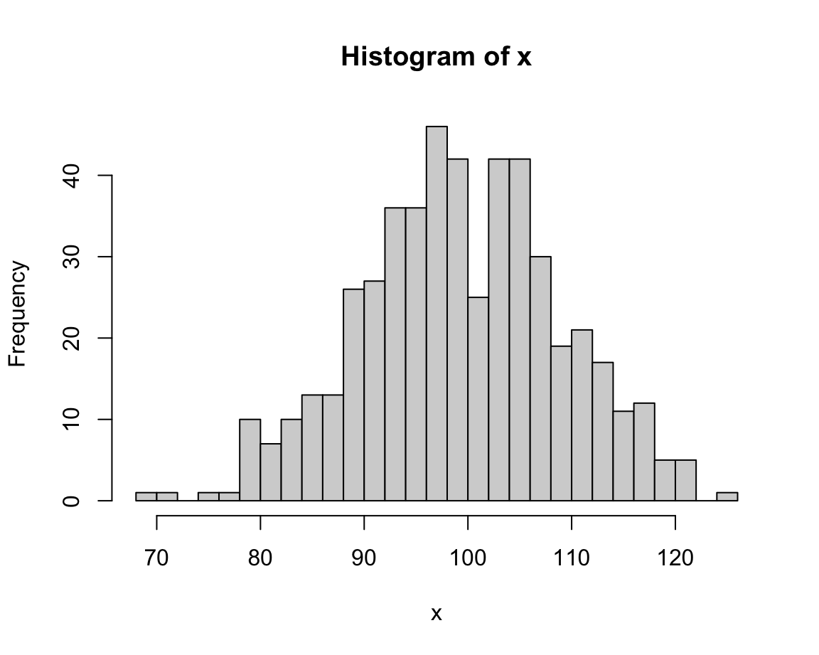
The value of breaks determines the resolution of a histogram.
Lower break values generally yield fewer bars (and higher frequencies) than higher break values.
In the current case, an intermediate value (e.g., of 20) seems appropriate (or we could just stick with the default, which would use a formula for basing bin sizes on the range of x).
Once we have settled on the basic parameters, we can adjust the labels and aesthetic aspects of a plot.
A good plot should always contain informative titles, value ranges, and labels.
In the following expression, we adjust the main title (using the main argument),
the label of the x-Axis (using xlab argument),
the colors of the bars and their border (using the col and border arguments, respectively):
# with additional aesthetics:
hist(x, breaks = 20,
     main = "My first histogram",
     xlab = "Values of x",
     col = "skyblue", border = "steelblue")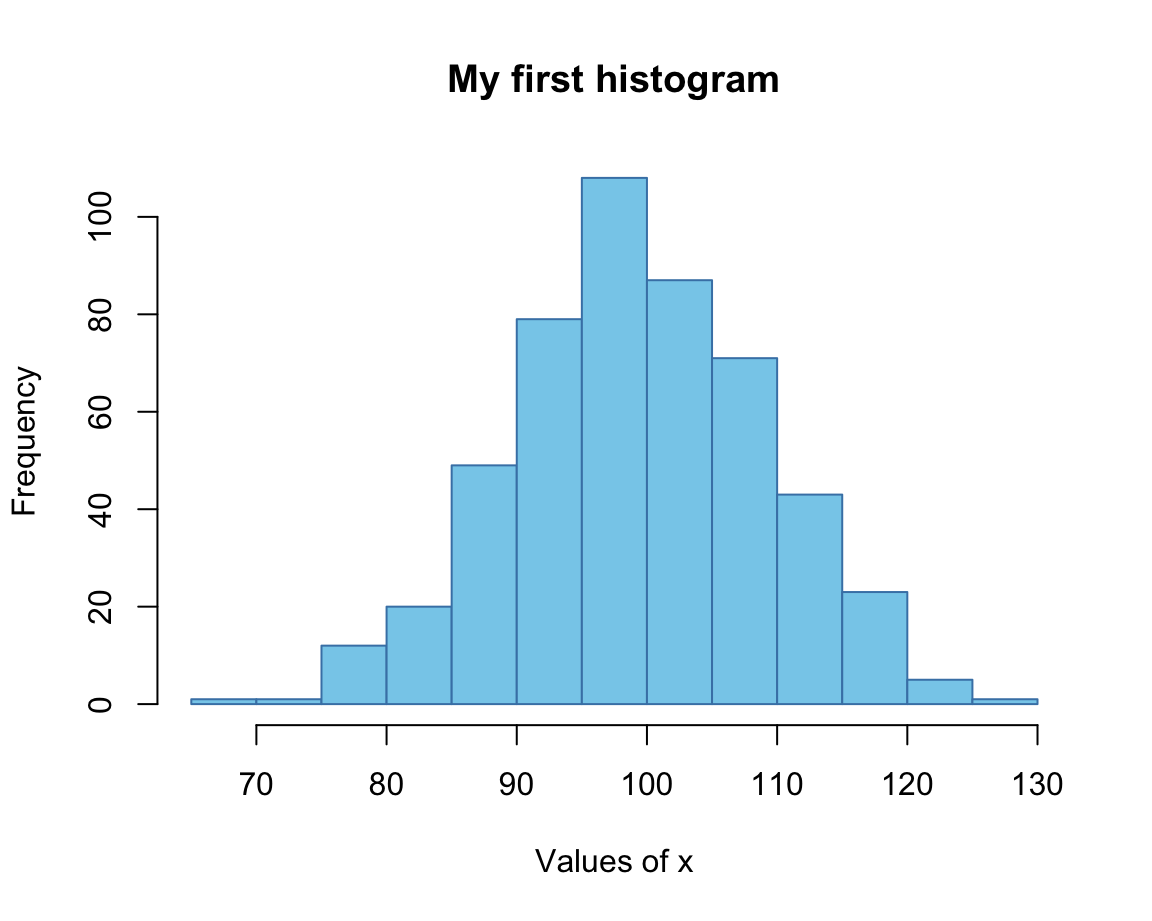
Here, we provided colors as R color names, which can be inspected by evaluating colors().
(Chapter 10 will show us additional options.)
Note that we the range of values on the \(x\)- and \(y\)-axes were chosen automatically.
If we wanted to adjust these ranges, we could have done so by providing the desired ranges (each as a vector with two numeric values) to the xlim and ylim arguments:
# with aesthetics and limits:
hist(x, breaks = 20,
     main = "The distribution of x values",
     xlab = "Values of x",
     col = "wheat", border = "tan",
     xlim = c(50, 150), ylim = c(0, 120))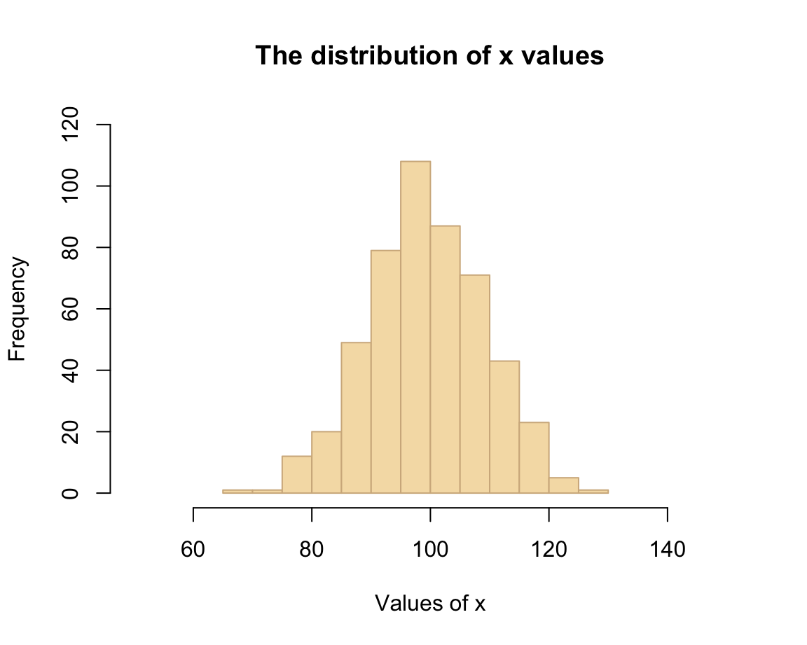
As we can see, choosing different aesthetic parameters can alter the impression of a visualization. Ideally, we should always aim to get the basics right before starting tweaking aesthetic parameters.
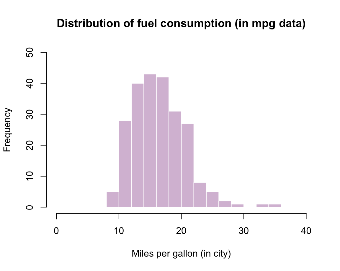
Practice: Histogram of mpg data
Using the mpg data from the ggplot2 package, create a histogram that shows the distribution of values of the cty variable (showing a car’s fuel consumption, in miles per gallon (MPG), in the city).
Getting the data:
mpg <- ggplot2::mpg Before starting to plot anything, we should always first inspect and try to understand our data:
# Print data table:
mpg  # a tibble with 234 cars, 11 variables

# Turn variable into a factor:
mpg$class <- factor(mpg$class)

# We are first interested in the vector
mpg$cty

# Note:
?mpg # describes the dataSolution: Here is how a corresponding histogram could look like:
8.2.2 Scatterplots
A scatterplot illustrates the relation between the values of two variables x and y by drawing a point symbol for each observation.
Basics
A basic feature of the plot() function is to show the relationship between two variables x and y.
Assuming that x and y are two vectors of numeric values (of the same length),
evaluating plot(x, y) creates a scatterplot with a point symbol for the values of each observation.
For example, a very simple scatterplot can be created by
plot(x = 1:10, y = 1:10,
     main = "A minimal scatterplot")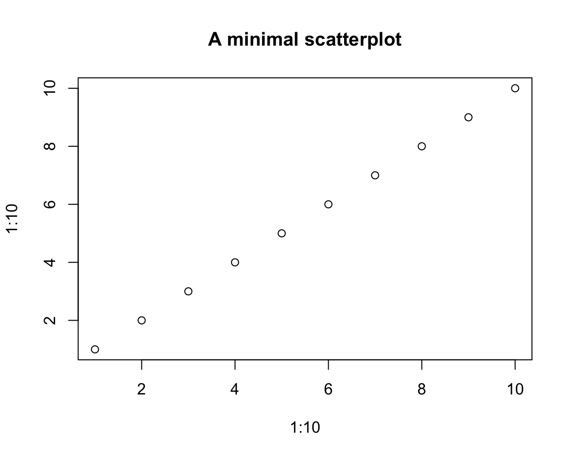
This seems straightforward, but the interpretation of a correspondence between the values of x and y is non-trivial.
Note that the \(i\)-th values of the vectors x and y were interpreted as the coordinate values of the \(i\)-th element (or “observation”) of either vector.
To enable this interpretation, x and y must have the same length.
In our first example, x and y also had the same values (hence the perfect correlation between them).
Let’s see what happens when we allow x and y to have different values:
# Data:
x <- 11:43
y <- c(sample(5:15), sample(10:20), sample(15:25))

# Scatterplot (of points):
plot(x = x, y = y,
     main = "A positive correlation")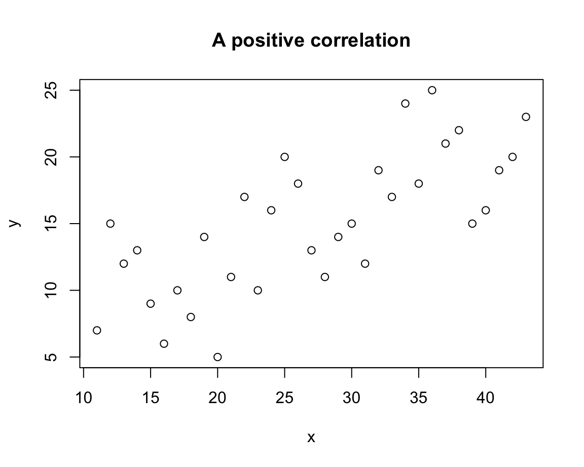
In this scatterplot, the values of x and y can no longer be linked by a straight line, but larger values of x tend to correspond to larger values of y. In the plot, this trend shows up as a positive correlation.
As scatterplots allow detecting and evaluating the existence and shape of associations between two variables, they are habitually used to visualize such relationships.
We generally must be careful not to over-interpret such relationships.
In the present case, the positive correlation is not due to some magical influence of one variable on the other, but caused by the way in which we created both vectors:
Whereas x was defined as a linear sequence of integers, y combined three samples of lower, intermediate, and higher numeric values (contrast the linear sequence of x with the increasing sample() ranges of y).
Note that the aesthetics of the points and ranges of both axes have been chosen automatically. If we wanted to modify them, we can use various arguments that regulate the plot’s features and aesthetics:
# Scatterplot (of points):
plot(x = x, y = y,
     pch = 20, cex = 2, col = "pink",
     xlim = c(0, 50), ylim = c(0, 30),
     xlab = "Value of x", ylab = "Corresponding value of y",
     main = "A basic scatterplot")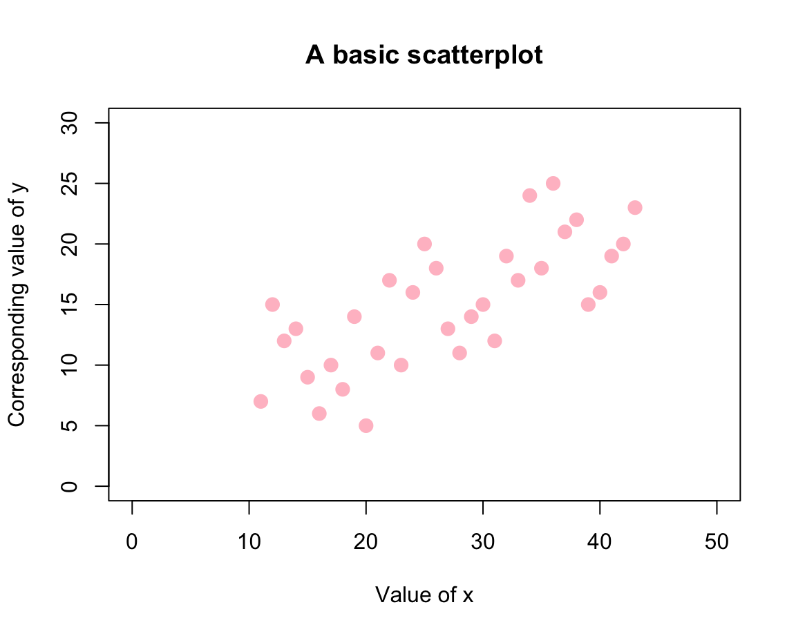
Here, the value of pch selected a plotting character (where values between 19 and 25 correspond to symbols with a border, see ?pch for details), cex set the size (and probably stands for “character expansion”), and col provides a color (selected as a name from colors()). The rest of the arguments set the axis ranges and various text labels.
We have mentioned that the flexibility of the plot() function can be confusing.
As an example, we could first combine x and y into a data frame df (with two columns named x and y) and then provide this entire data frame as the argument x of plot(). In this case, plot() creates the same plot as before:
# Combine x and y into (the columns of) a data frame:
df <- data.frame(x, y)

plot(x = df,
     main = "Plotting a data frame")
Another source of confusion is that plot(x, y) creates a plot of points, but there also is a points() function.
The difference is that the latter assumes an existing plot to which we want to add points.
Hence, the visualizations created by the following two expressions differ only in the color of their points:
plot(x, y,   col = "grey")  # creates a new plot (with points)
points(x, y, col = "gold")  # adds the same points (to an existing plot)
When we further discuss the incremental composition of complex plots below (in Section 8.3),
we will see that one of the uses of plot() is to merely define a new plotting area (i.e., create a new canvas).
In the rest of this section, we will illustrate another flexibility of plot() (based on its type argument) and a general problem when creating visualizations (known as overplotting).
Variants of plot()
We mentioned above that the plot() function serves multiple purposes in R.
In the rest of this section, we show that calling the function with different arguments creates different variants of visualizations.
In this section, we will begin with two vectors x and y to create a scatterplot (i.e., a plot of points).
However, we will then show that plot() allows creating different plots of the same data, specifically:
- a scatterplot (of points);
- a line plot (by linking the points);
- a combination of point and line plots;
- a type of bar plot or histogram (showing the heights of \(x\) values);
- a step function.
Again, we first create some simple data to plot.
Here are two simple numeric vectors x and y (where y is defined as a function of x):
# Data to plot:
x <- -10:10
y <- x^2
When providing these vectors x and y to the x and y arguments of the plot() function, we obtain:
plot(x = x, y = y, type = "n")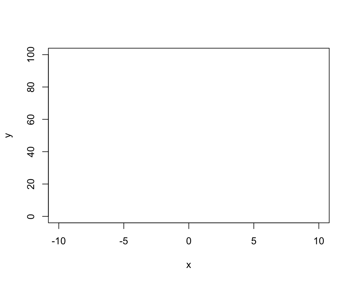
# A scatterplot:
plot(x = x, y = y,
     main = "A scatterplot")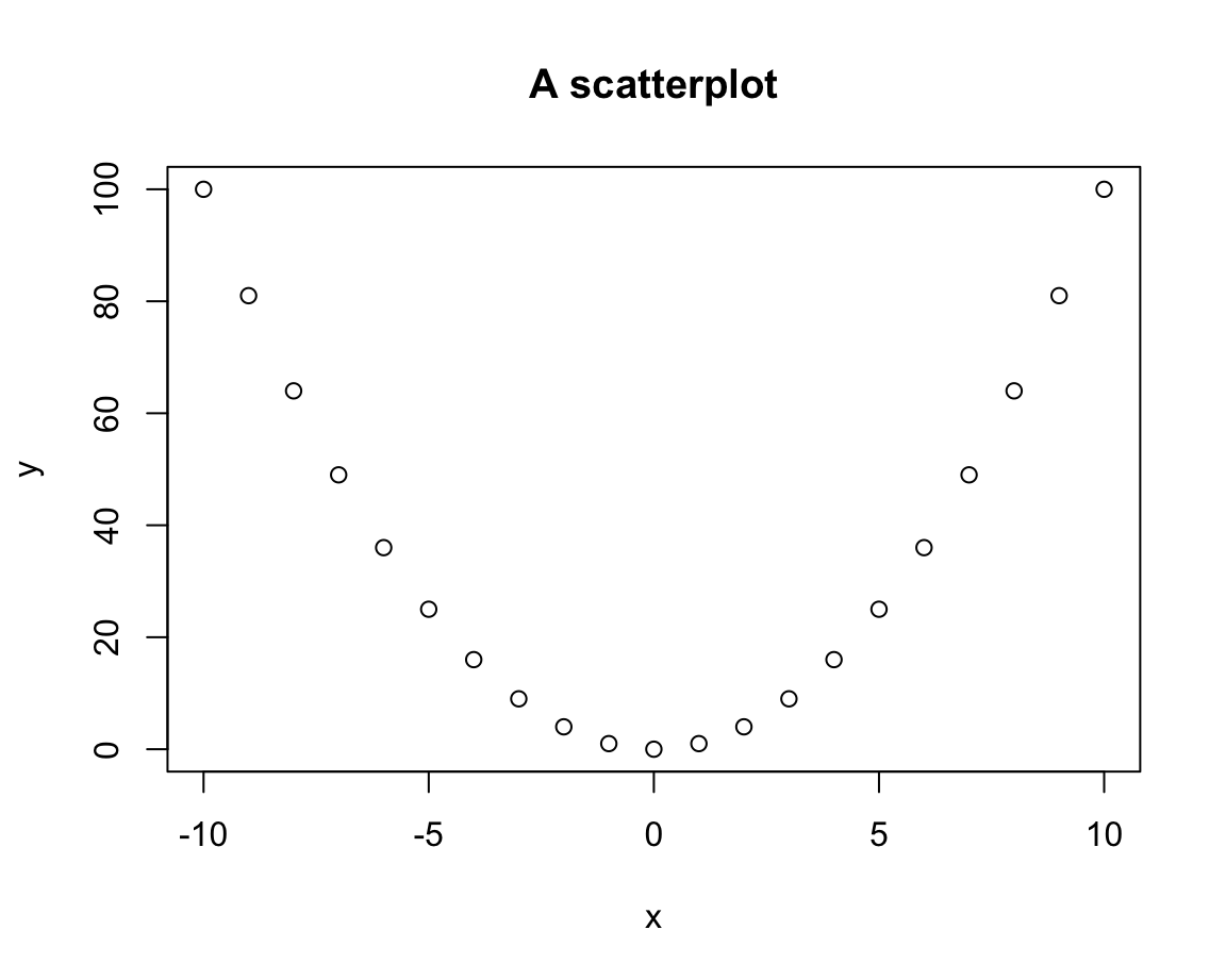
Thus, the default plot chosen by plot() was a scatterplot (i.e., a plot of points).
We can change the plot type by providing different values to the type argument:
# Distinguish types:
plot(x, y, type = "p")  # points
plot(x, y, type = "l") # lines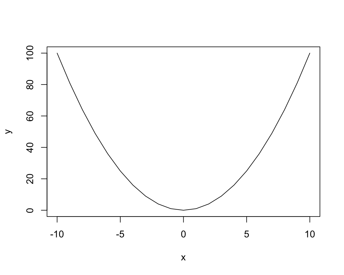
plot(x, y, type = "b") # both points and lines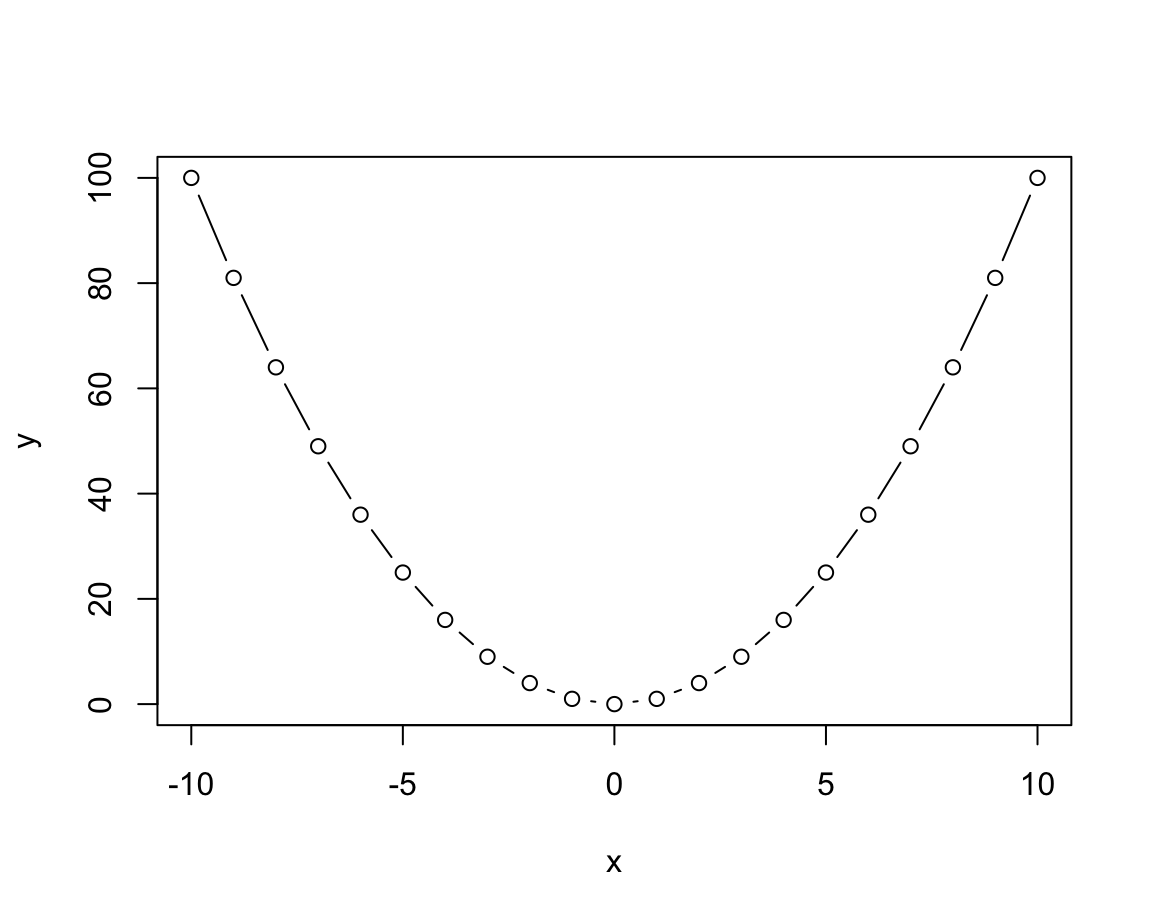
plot(x, y, type = "o") # both overplotted 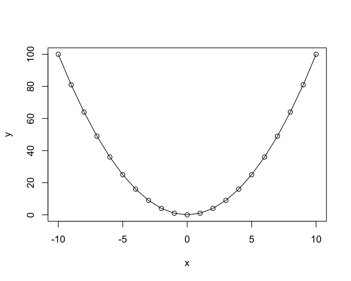
plot(x, y, type = "h") # histogram or height density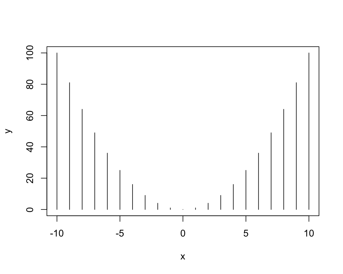
plot(x, y, type = "s") # steps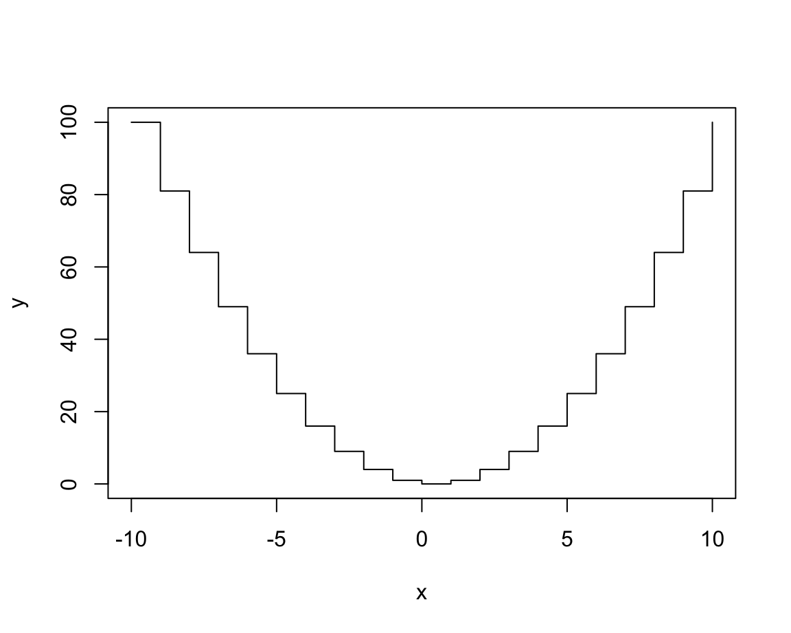
See the documentation ?plot() for details on these types and additional arguments.
For most datasets, only some of these types make sense.
Actually, one of the most common uses of plot() uses the type n (for “no plotting”):
plot(x, y, type = "n",        # no plotting: plot "nothing"
main = "An empty plot") 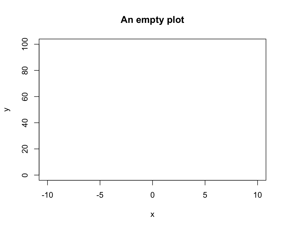
As we see, this does not plot any data, but created an empty plot, but with appropriate axis ranges. When creating more complex plots (below), we usually start like this and then add various custom objects to our plot.
Once we have selected our plot, we can fiddle with its aesthetic properties and labels to make it both prettier and more informative:
# Set aesthetic parameters and other options:
plot(x, y, type = "b",
     lty = 2,  pch = 16, lwd = 2, col = "turquoise", cex = 1.5,
     main = "A basic plot (showing the relation between x and y)",
     xlab = "X label", ylab = "Y label",
     asp = 1/10  # aspect ratio (x/y)
     )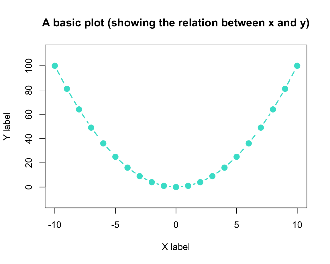
Study the documentation of plot() and par() for setting the main and various aesthetic plotting parameters.
Overplotting
A common problem with any type of plot is known as overplotting: Whenever too many objects compete for the same spatial area, a plot gets crowded and over-populated. In scatterplots, this problem is particularly common: Whenever the number of data points or the size of their symbols increases, the symbols are overlapping with each other. For instance, suppose we wanted to plot the following data points:
Here is how basic scatterplot (with filled and fairly large points) would look like:
# Basic scatterplot:
plot(x, y, type = "p",
     pch = 20, cex = 5, # filled circles with increased size
     main = "An example of overplotting")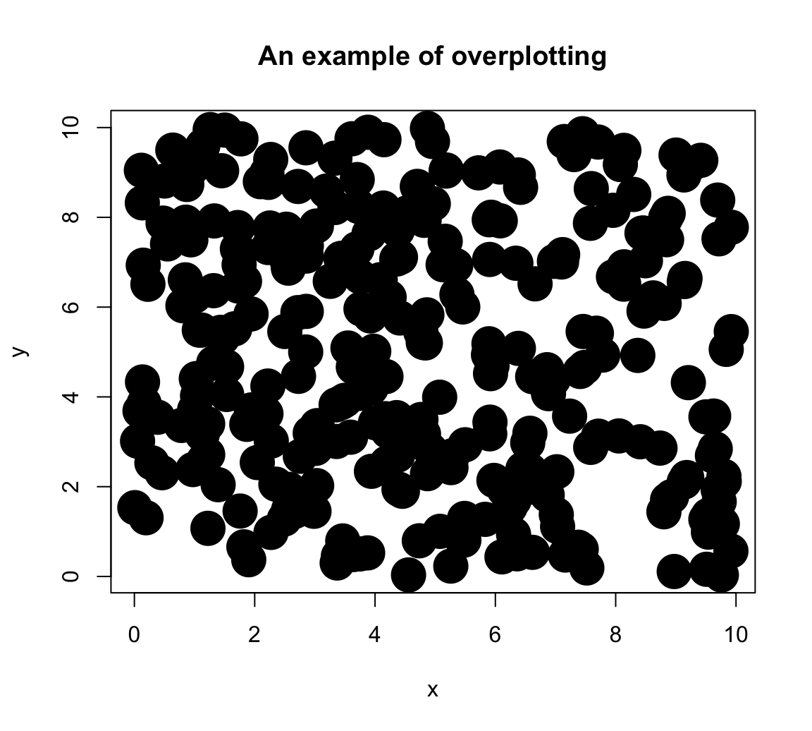
Although it is already difficult to place rlength(x)points on a plot, the amount of overplotting has been increased in this example by the setting\pchand\cex` to non-default values. To obtain information more information on these graphical parameters:
- Calling
?par()provides detailed information on a large variety of graphical parameters - Calling
par()shows the current default system settings.
One of several solutions to the overplotting problem lies in using transparent colors, that allow viewing overlaps of graphical objects. There are several ways of obtaining transparent colors.
For instance, the following solution uses the unikn package to select some dark color (called Petrol) and then use the usecol() function to set it to 1/3 of its original opacity:
Providing my_col to the col argument of plot() yields:
# Set aesthetic parameters and other options:
plot(x, y, type = "p",
     pch = 20, cex = 5,
     col = my_col,
     main = "Addressing overplotting (by color transparency)")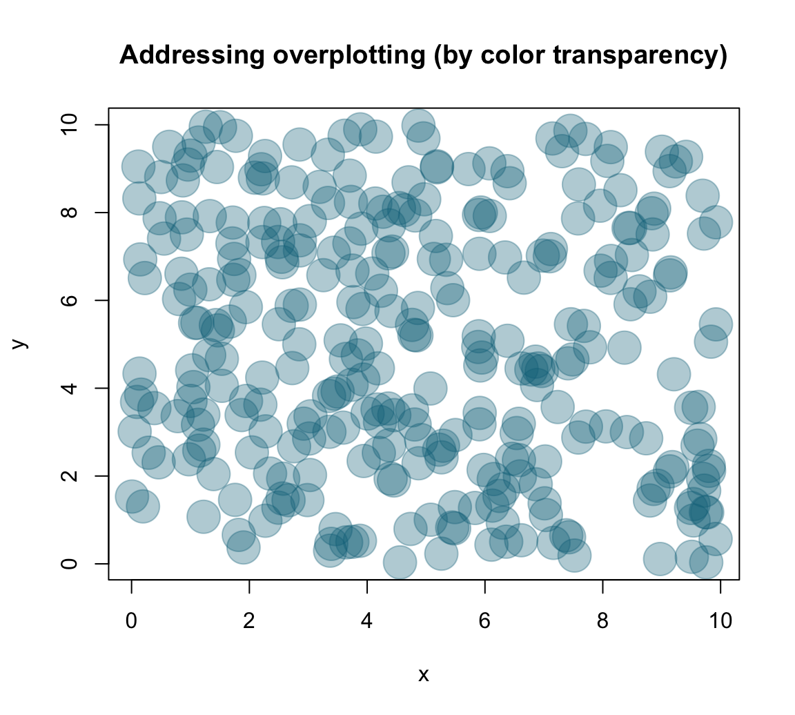
Practice
- Plotting different
plot()types
We learned that the plot() function allows for different types of plots.
This practice exercise illustrates that some type variants may look pretty, but make very limited sense.
- Evaluate the following
plot()expressions (with the current settings ofxandy):
plot(x, y, type = "l", col = unikn::Seeblau)
plot(x, y, type = "b", col = unikn::Pinky)
plot(x, y, type = "h", col = unikn::Seegruen)
plot(x, y, type = "s", col = unikn::Bordeaux) - Why do these
typesettings do not make sense?
Solution
A first answer could be: Which type of plot makes sense is primarily a function of the data that is to be plotted.
Here, the non-systematic relationship between the value of x and y is simply not illustrated well by a line, histogram, or step function.
Note, however, that this changes when the values of both vectors were sorted:
# Sort both vectors:
x <- sort(x)
y <- sort(y)

# Redo plots:
plot(x, y, type = "l", col = unikn::Seeblau)
plot(x, y, type = "b", col = unikn::Pinky)
plot(x, y, type = "h", col = unikn::Seegruen)
plot(x, y, type = "s", col = unikn::Bordeaux)
However, our notion of ecological rationality (from Section 1.2.5) provides a more precise answer: A good visualization requires a fit between the data (what is being represented?), the visualization (i.e., what is and how are objects being shown?), and the user’s goal or task (what should the user see?).
- Creating scatterplots of
mpgdata
Create a scatterplot to examine the relation between two variables of the mpg data (from ggplot2):
mpg <- ggplot2::mpg- Create a scatterplot of this data that shows the relation between each car’s
-
x: engine displacement (i.e., variabledisplof thempgdata), and -
y: fuel consumption on highways (i.e., variablehwyof thempgdata).
-
- Can you avoid overplotting?
Solution
A basic version of the plot could be created as:
# basic version:
plot(x = mpg$displ, y = mpg$hwy)

# shorter version: with()
with(mpg, plot(displ, hwy))
As this plot suffers from overplotting (as many points are placed at the same locations), a more nuanced version of the plot could use color transparency to distinguish between rare and popular locations:
# Define some color (from unikn, with transparency):
my_col <- unikn::usecol(unikn::Bordeaux, alpha = 1/4)

# With aesthetics (see ?par):
plot(x = mpg$displ, y = mpg$hwy, type = "p",
     col = my_col, pch = 16, cex = 1.5,
     main = "A basic scatterplot (showing the relation between x and y)",
     xlab = "Displacement", ylab = "MPG on highway",
     asp = 1/10)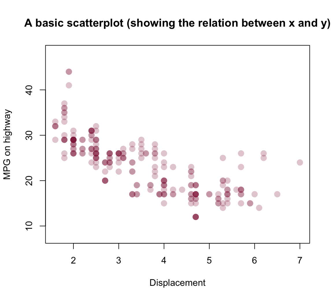
Note that — despite specifying many arguments — our plot still relies on many default settings. For instance,
- the plot dimensions (e.g., size of plotting area and its borders) are using default values
- the ranges and values of axes were chosen automatically
8.2.3 Bar plots
One of the most common, but also quite complicated types of plots are bar plots (aka. bar charts). The two main reasons why bar plots are complicated are:
the bars often represent processed data (e.g., counts, or the means, sums, or proportions of values).
the bars can be arranged in multiple ways (e.g., stacked vs. beside each other, grouped, etc.)
When we have a named vector of data values that we want to plot, the barplot() command is pretty straightforward:
# A vector as data:
v <- c(1, 3, 2, 4, 2)        # some values
names(v) <- c(LETTERS[1:5])  # add names

barplot(height = v, col = unikn::Seeblau)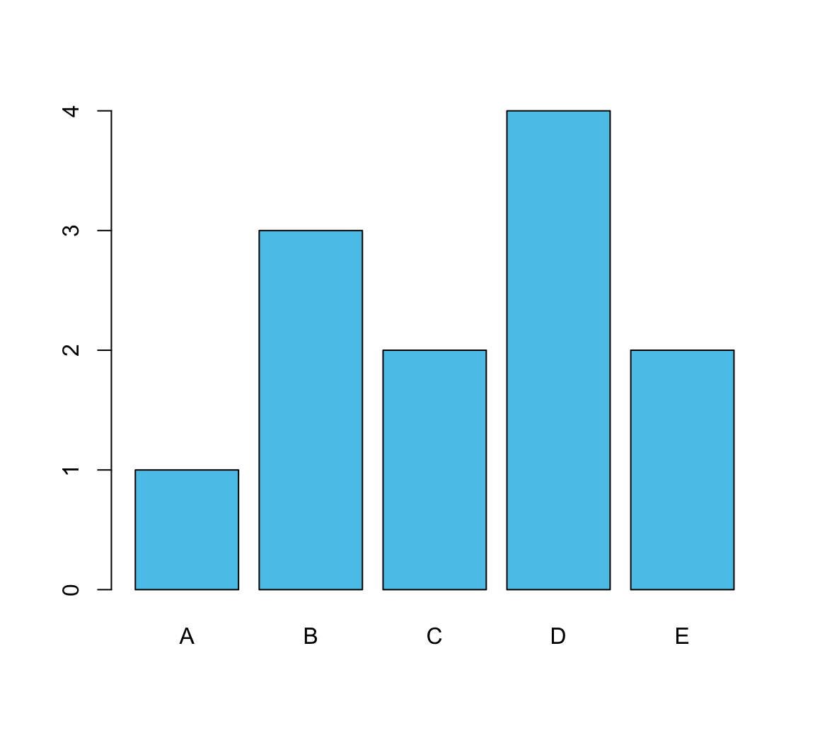
In most cases, we have some more complicated data (e.g., a data frame or multiple vectors). To create a bar graph from data, we first create a table that contains the values we want to show.
A simple example could use the mpg data from ggplot2:
# From data:
mpg <- ggplot2::mpg
The following table() function creates a simple table of data by counting the number of observations (here: cars) for each level of the class variable:
# Create a table (with frequency counts of cases):
fc <- table(mpg$class)
# names(fc)
fc
#>
#>    2seater    compact    midsize    minivan     pickup subcompact        suv
#>          5         47         41         11         33         35         62
Providing this table as the height argument of barplot() creates a basic bar plot:
barplot(height = fc) # basic version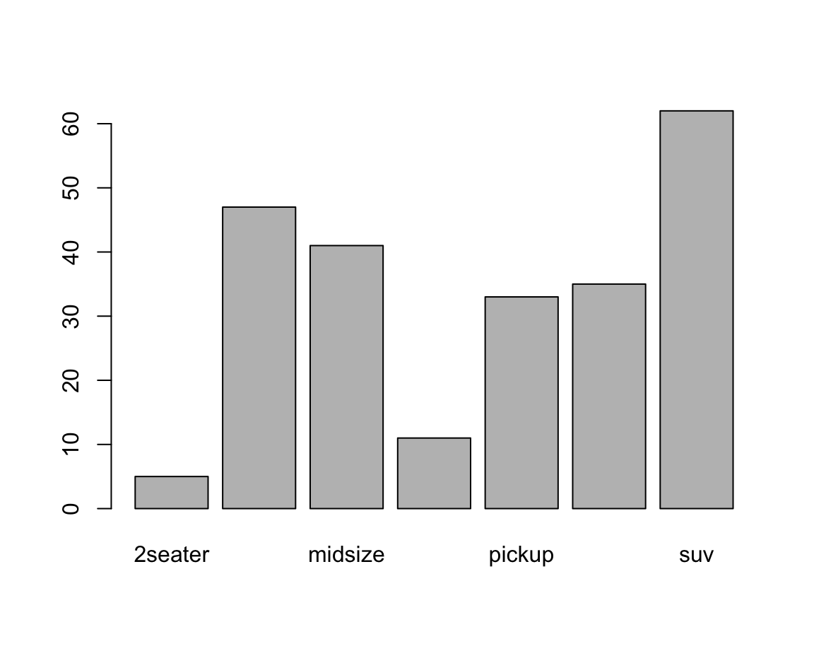
Adding aesthetics and labels renders the plot more colorful and informative:
car_cols  <- unikn::usecol(pal_unikn_light)

barplot(height = fc,
        main = "Counts of cars by class",
        xlab = "Class of car",
        las = 2,  # vertical labels
        col = car_cols)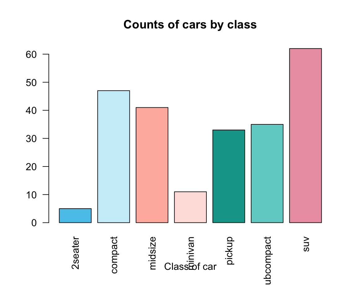
An alternative way of creating a barplot() would use the data and formula arguments:
Using the UCBAdmissions data (of the datasets package) and two unikn colors:
df <- as.data.frame(UCBAdmissions)

df_A <- df[df$Dept == "A", ]
df_E <- df[df$Dept == "E", ]

# Select 2 colors:
my_cols <- c(unikn::Seeblau, unikn::Bordeaux)
Create two bar plots:
# A:
barplot(data = df_A, Freq ~ Gender + Admit, beside = TRUE,
        main = "Department A", col = my_cols, legend = TRUE)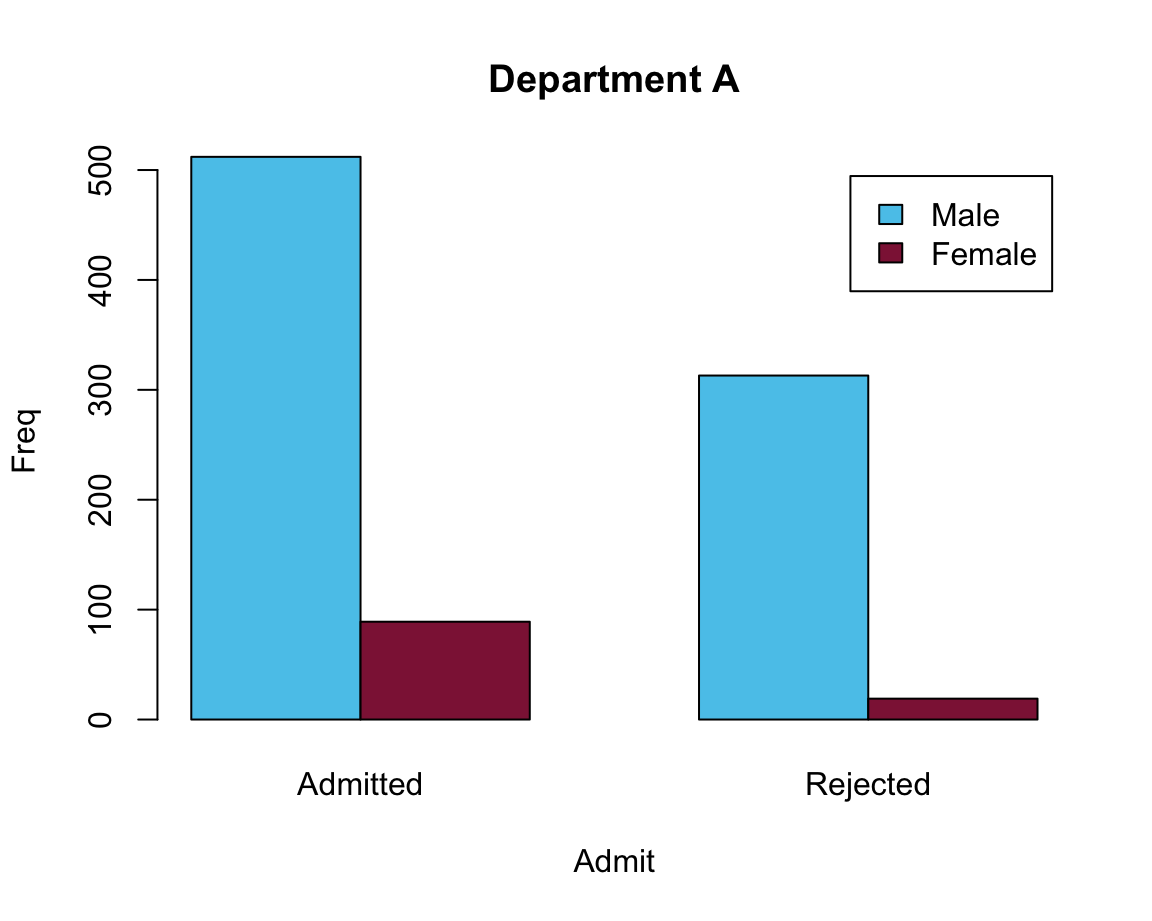
# E:
barplot(data = df_E, Freq ~ Gender + Admit, beside = TRUE,
        main = "Department E", col = my_cols, legend = TRUE)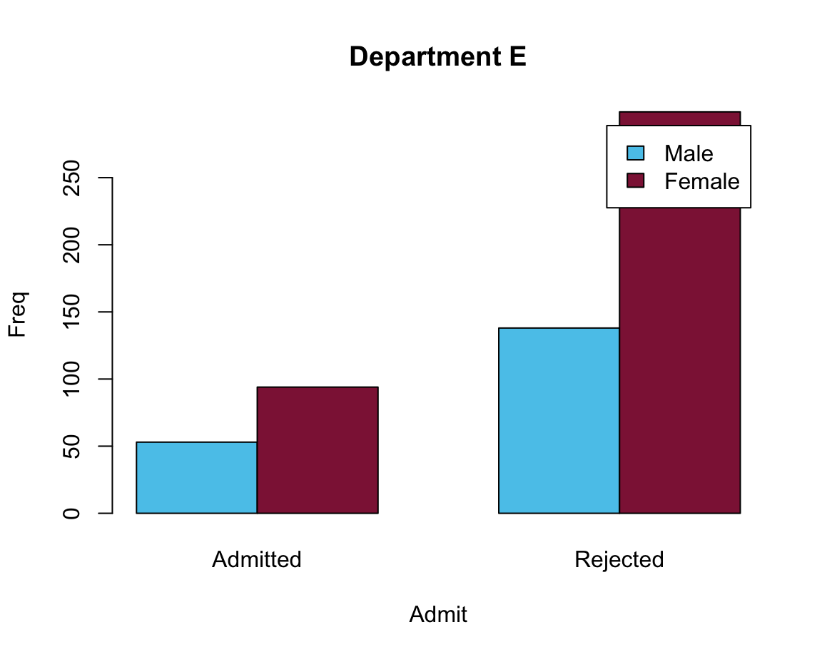
Problem: The legend position overlaps with the bars.
Two possible solutions:
# Moving legend position:
# Solution 1: specify args.legend (as a list)
barplot(data = df_E, Freq ~ Gender + Admit, beside = TRUE,
        main = "Department E", col = my_cols,
        legend = TRUE, args.legend = list(bty = "n", x = "topleft"))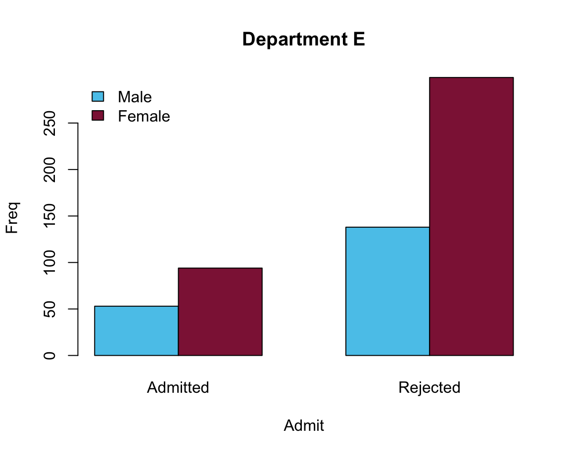
# Solution 2: Adjust the size of the x-axis:
barplot(data = df_E, Freq ~ Gender + Admit, beside = TRUE,
        main = "Department E", col = my_cols,
        legend = TRUE, xlim = c(1, 8))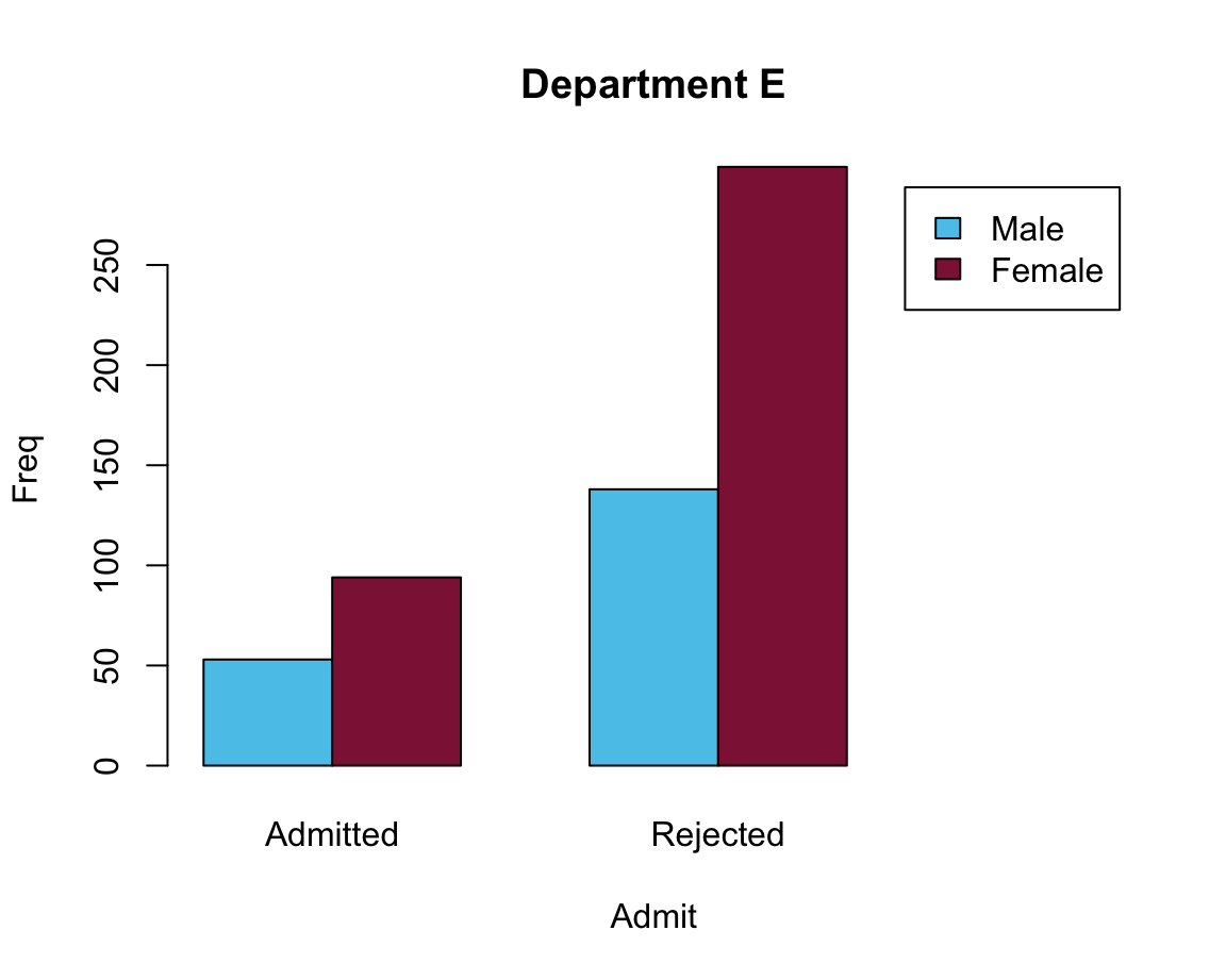
Practice
- Bar plots of election data
To practice our bar plot skills, we re-create some bar plots of election data shown here with base R commands:
- with stacked bars (i.e., one bar per year);
- with bars beside each other (i.e., three bars per year).
Data
Here is the election data from of a data table de (and don’t worry if the functions used to generate the data table are unknown at this point — we will cover them in the following chapters):
library(tidyverse)

# (a) Create data:
de_new <- data.frame(
    party = c("CDU/CSU", "SPD", "Others"),
    share_2013 = c((.341 + .074), .257, (1 - (.341 + .074) - .257)),
    share_2017 = c((.268 + .062), .205, (1 - (.268 + .062) - .205))
    )
de_new$party <- factor(de_new$party, levels = c("CDU/CSU", "SPD", "Others"))  # optional
# de_new

## Check that columns add to 100:
# sum(de_new$share_2013)  # => 1 (qed)
# sum(de_new$share_2017)  # => 1 (qed)

## (b) Converting de_new into a tidy tibble:
tb <- de_new %>%
  gather(share_2013:share_2017, key = "election", value = "share") %>%
  separate(col = "election", into = c("dummy", "year")) %>%
  select(year, party, share)

# Choose colors:
my_col <- c("black", "firebrick", "gold")   # three specific colors
# my_col <- sample(x = colors(), size = 3)  # non-partisan alternative

# Show table:
knitr::kable(tb, caption = "Election data (2013 vs. 2017).")| year | party | share |
|---|---|---|
| 2013 | CDU/CSU | 0.415 |
| 2013 | SPD | 0.257 |
| 2013 | Others | 0.328 |
| 2017 | CDU/CSU | 0.330 |
| 2017 | SPD | 0.205 |
| 2017 | Others | 0.465 |
Solution
Prior to plotting anything, we first select and define some colors that facilitate the interpretation of the plots:
my_cols <- c("black", "firebrick", "gold") # define some colorsSee colors() or demo(colors()) for color names available in R.
We can now solve the tasks using the barplot() function:
- with stacked bars (i.e., one bar per year)
The following expressions plot a stacked bar plot (using the formula interface) and add colors and a legend:
# (a) Stacked bars:
barplot(data = tb, share ~ party + year)

# Add colors and legend:
barplot(data = tb, share ~ party + year,
        col = my_cols, legend = TRUE)
However, a better solution could also re-size the x-axis (to position the legend at the right of the plot):
# Solution 1: limit x width to make space for legend to right:
barplot(data = tb, share ~ party + year,
        col = my_cols, legend = TRUE, xlim = c(0, 4))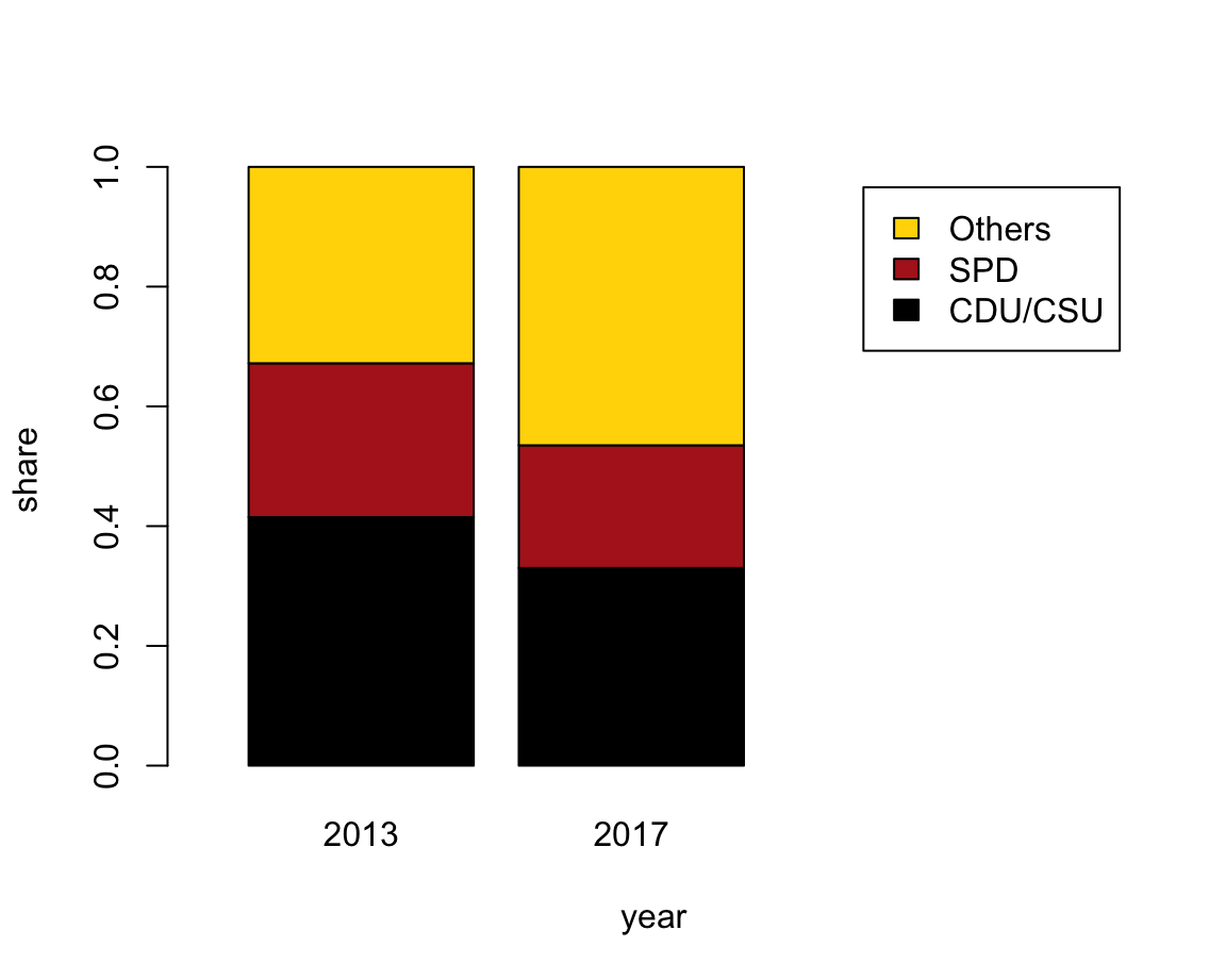
- with bars beside each other (i.e., three bars per year).
The following expression plots a bar plot with the bars beside each other and adds a legend:
# (b) Bars beside each other:
#     with legend (default position is "topleft"):
barplot(data = tb, share ~ party + year,
        beside = TRUE, col = my_cols, legend = TRUE)
Again, a better solution would position the legend and re-size the limits of the y-axis:
# Solution 2: Adjust legend parameters (to move in center and no border):
barplot(data = tb, share ~ party + year,
        beside = TRUE, col = my_cols,
        legend = TRUE, args.legend = list(bty = "n", x = "top"),
        ylim = c(0, .5))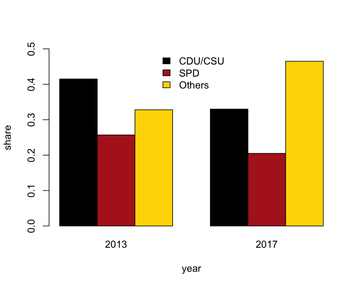
8.2.4 Box plots
A common situation in most sciences consists in the following scenario:
We want to describe the value(s) of some quantitative variable (i.e., some dependent variable \(y\))
as a function of a categorical variable (i.e., some independent variable \(x\)).
For instance, given the mpg dataset, we could wonder:
- How does a car’s average fuel consumption in the city (i.e., the dependent variable
cty) vary as a function of its type (or independent variableclass)?
The following Table 8.2 describes this information:
| class | n | mean | SD |
|---|---|---|---|
| 2seater | 5 | 15.40000 | 0.5477226 |
| compact | 47 | 20.12766 | 3.3854999 |
| midsize | 41 | 18.75610 | 1.9465416 |
| minivan | 11 | 15.81818 | 1.8340219 |
| pickup | 33 | 13.00000 | 2.0463382 |
| subcompact | 35 | 20.37143 | 4.6023377 |
| suv | 62 | 13.50000 | 2.4208791 |
How can we express such information in a visual format? A standard solution consists in creating a so-called boxplot. Boxplots are also known as box-and-whisker plots (see Wikipedia: Box plot for details) and were promoted by John Tukey in the 1970s (e.g., Tukey, 1977).
In R, we can create boxplots by using the boxplot() function.
Its data argument allows specifying a dataset (typically a dataframe or tibble)
and its formula allows specifying a dependent variable dv and an independent variable iv as dv ~ iv.
In the context of our example, we could call:
boxplot(formula = cty ~ class, data = mpg)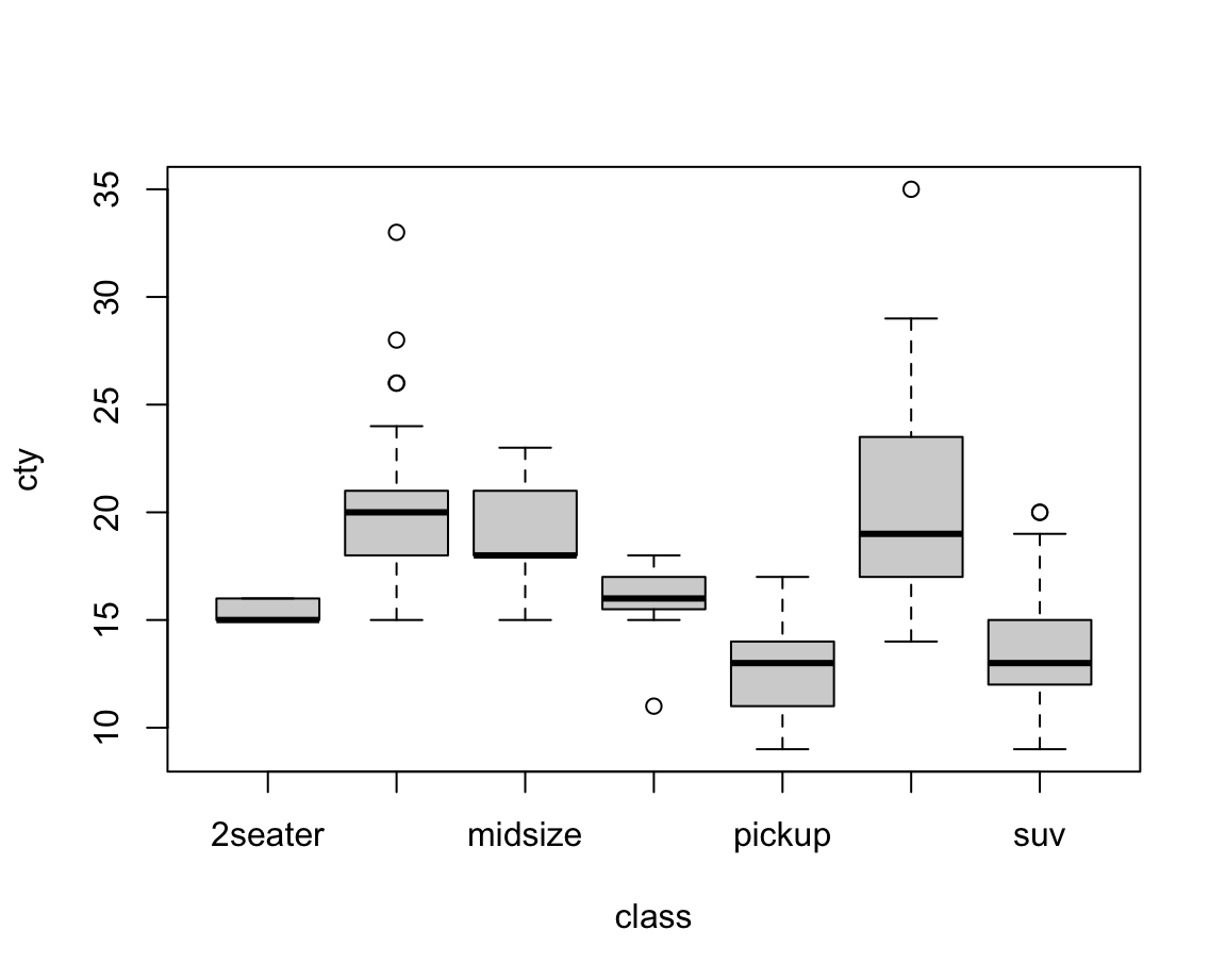
Figure 8.1: A bare (base R) boxplot.
A slightly prettier version of the same plot could add some aesthetic features and labels (Figure 8.2):
bp <- boxplot(formula = cty ~ class, data = mpg,
              col = car_cols, # using color vector (defined above)
              las = 2,        # rotate labels on axes
              main = "Box plot on cars' fuel consumption (in city) by class",
              xlab = "Vehicle class", ylab = "MPG (in city)")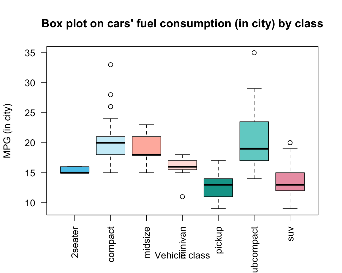
Figure 8.2: A boxplot shows non-parametrical information on the mean and variation of each group.
A boxplot provides a standardized, non-parametrical way of displaying the distribution of group-based data based on a four types of information:
the fat horizontal line shows the median \(Md\) (50th percentile of data) of each group;
-
the box for each group shows the interquartile range (\(IQR\)) around the median \(Md\) in both directions (i.e., the middle 50% of the data):
- below: \(Q1\) (25th percentile to \(Md\)) vs.
- above: \(Q3\) (\(Md\) to 75th percentile);
- the whiskers (dotted lines) show the ranges to the bottom 25% and the top 25% of the data values, excluding outliers:
- lower whisker: minimum (\(Q1 - 1.5 \cdot IQR\)) to the
- upper whisker: maximum (\(Q3 + 1.5 \cdot IQR\));
- lower whisker: minimum (\(Q1 - 1.5 \cdot IQR\)) to the
- the points beyond the whiskers show the outliers of each group.
Overall, box plots provide information on the center, spread/range, and outliers of each group, without making restrictive assumptions about the distribution of values in a group. Note that the width and shape of the boxes and whiskers also provide information on group size and skew. In Figure 8.2, we can infer that
- the group of “2seater” cars is very homogeneous and probably small (given its tiny variations);
- the group of “midsize” cars is more skewed (many small, some larger values);
- the group of “pickup” cars is more symmetrical than the others.
Plots as side effects vs. plot outputs
When creating Figure 8.2, we saved the output of the boxplot() function to an object bp. This illustrates that plots can occasionally return outputs that are worth saving as R objects.
To explain this, we first need to distinguish between the values returned by a function and their side effects.
In our chapter on basic R concepts and commands, we have learned that functions are R objects that do stuff and typically return an object or value. However, some functions do more than just returning an object: They change variables in some environment (e.g., the assignment <- function), plot graphics (e.g., plot()), load or save files, or access a network connection. Such additional operations are collectively called the side effects of a function.
Plots typically change something in our interface (by printing a plot or some part of a plot onto a canvas, e.g., in the Plots window), but this has no lasting effect on our code. Unless a plot returns something that we save into an R object it leaves no trace in our current environment — the plot is a mere side effects of a function call. Consider, for instance, our simple example (from above) that created our first plot:
x <- -10:10
y <- x^2
z <- plot(x, y)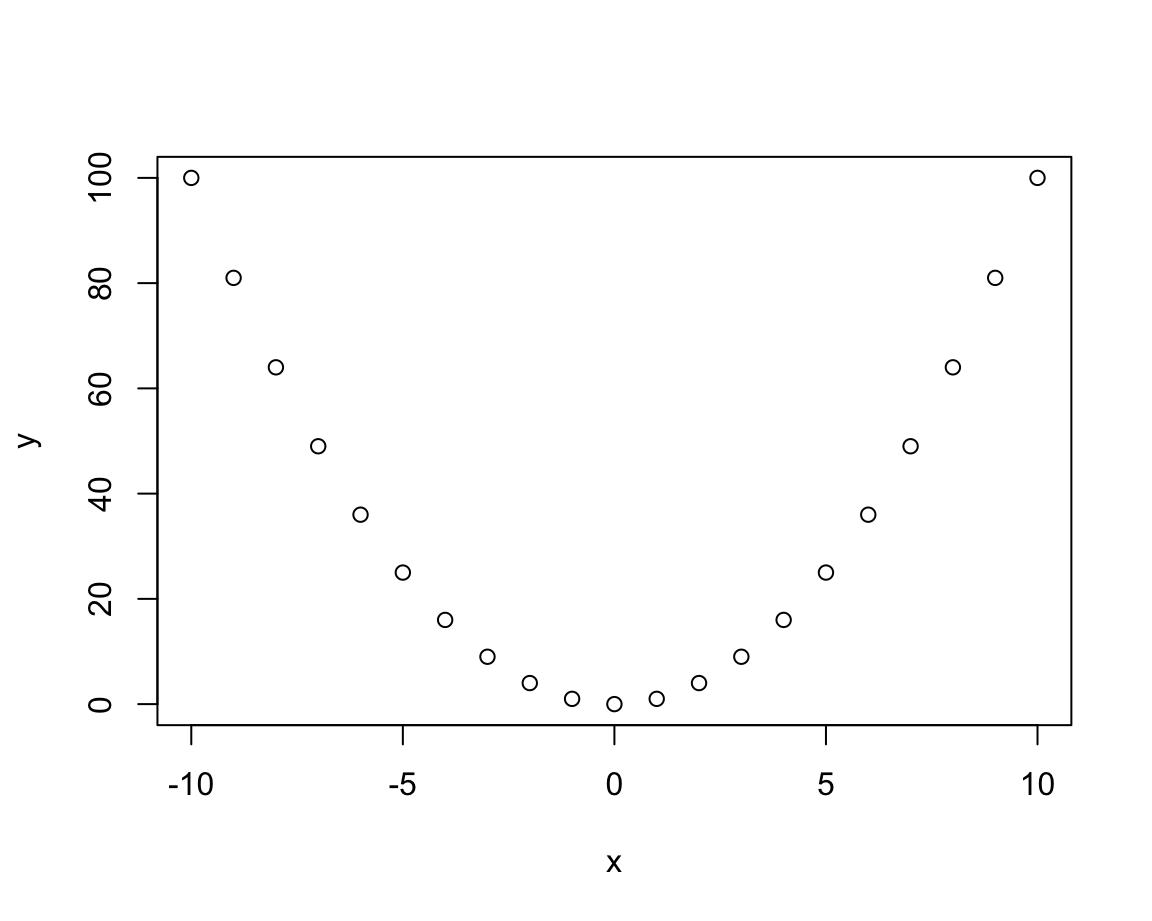
This plot is printed to some electronic canvas (a so-called R plotting device).
Further using or changing this plot as an R object would require either (a) that the plot() function returns an object which we can further manipulate, or (b) that we obtain additional functions that manipulate the same canvas (or plotting device). As we will see shortly, base R typically opts for option (b): Plots are created as side effects of functions and other functions can add more side effects to the same plot. This allows incrementally creating to a plot, and then changing it as long as we can access the same plotting canvas.
We could ask: What object does the plot() function return?
Actually, we just tested this by assigning the result of plot(x, y) to an object z.
So let’s see what z contains by evaluating (i.e., printing) it:
z
#> NULL
The answer is surprising — and definitely not a plot.
A value of NULL is R’s way of saying: This object contains nothing (but has been defined and is not NA).
In the present context, it means that plot() did not return anything we can further work with in our current R environment.
But although it is good to know that plots are created as side effects, it is false that all plotting functions do return nothing (or NULL).
For instance, the boxplot() function actually does return an R object that we can work with.
In the documentation ?boxplot we can read that it returns a value as a list with various components (called stats, n, conf, etc.).
Thus, our reason for assigning its output to an object bp (above) was to later access these components (e.g., by the $ notation for accessing list elements):
bp$n      # size of groups
#> [1]  5 47 41 11 33 35 62
bp$names  # names of groups
#> [1] "2seater"    "compact"    "midsize"    "minivan"    "pickup"
#> [6] "subcompact" "suv"

bp$stats  # summary of stats
#>      [,1] [,2] [,3] [,4] [,5] [,6] [,7]
#> [1,]   15   15   15 15.0    9 14.0    9
#> [2,]   15   18   18 15.5   11 17.0   12
#> [3,]   15   20   18 16.0   13 19.0   13
#> [4,]   16   21   21 17.0   14 23.5   15
#> [5,]   16   24   23 18.0   17 29.0   19
bp$conf   # confidence intervals (of notch)
#>         [,1]    [,2]     [,3]     [,4]     [,5]     [,6]     [,7]
#> [1,] 14.2934 19.3086 17.25974 15.28542 12.17487 17.26405 12.39802
#> [2,] 15.7066 20.6914 18.74026 16.71458 13.82513 20.73595 13.60198

bp$out    # outliers (beyond notch)
#> [1] 26 28 26 33 11 35 20 20
bp$group  # group to which outlier belongs
#> [1] 2 2 2 2 4 6 7 7
All this may sound a bit complicated, but illustrates a really powerful aspect of R: Functions can do stuff on the side (e.g., create a visualizations on some plotting device), but still return complicated objects that later allow us accessing particular details of a result. As our tasks and the functions that address them are getting more complex (e.g., when performing some statistical analysis), this is R’s way of offering a variety of results all at once.
8.2.5 Curves and lines
Before turning to more complex plots, we consider two more functions that are often needed when creating plots in base R. The function
curve()computes and plots the values of a function — specified byexpr— for a given range of values.abline()computes and plots the values of a linear function (specified by their interceptaand slopeb, or a vertical valuev, or a horizontal valueh).
Both functions seem quite similar, yet allow illustrating another inconsistency in the base R visualization system:
The curve() function has an argument add that is FALSE by default, which means that a new plot is created whenever calling the function.
To add a curve to an existing plot, we need to specify add = TRUE.
By contrast, the abline() function assumes that a plot exists (i.e., some variant of plot() has been evaluated before calling abline()). In fact, abline() actually issues an error that plot.new has not been called yet when it is called without an existing plot.
Such quirks and inconsistencies are inevitable when using a graphics system that has evolved for over 30 years. Once we successfully navigate them, the system is quite powerful for creating a variety of curves and lines:
# Creating a curve plot:
curve(expr = x^2, from = -10, to = +10,
      ylab = "y-value", main = "Curvy plots")

# Adding curves to an existing plot:
curve(expr = x^3/5 + 50, col = "red", add = TRUE)
curve(expr = 20 * sin(x) + 50, col = "gold", add = TRUE)

# Adding lines to an existing plot:
curve(expr = -4 * x + 40, col = "green", add = TRUE)  # curve can be a line
# vs.
abline(a = 50, b = -4, col = "blue")   # a linear function
abline(v =  0, col = "grey", lty = 2)  # a vertical (dashed) line
abline(h = 50, col = "grey", lty = 3)  # a horizontal (dotted) line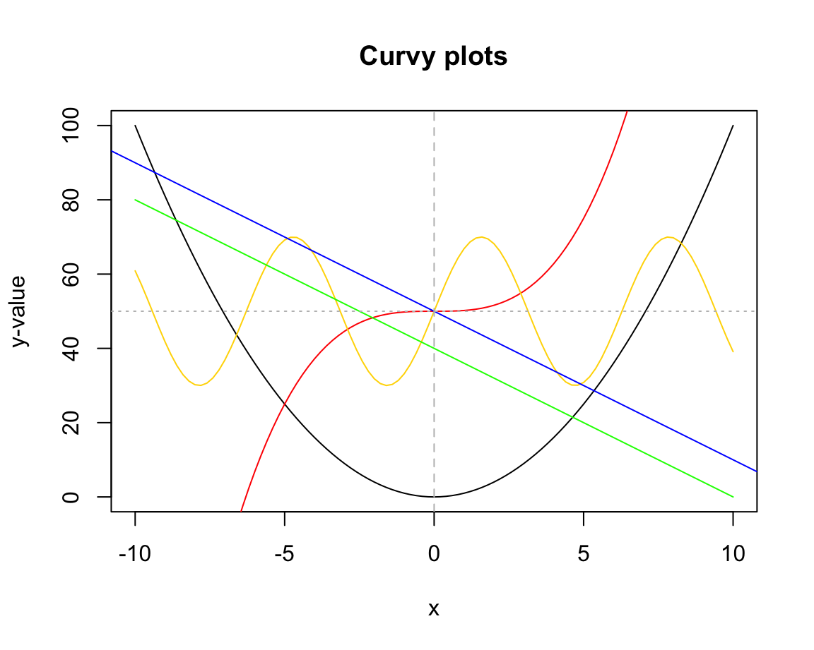
Figure 8.3 illustrates another difference between both functions:
curve() only plots the specified function over the specified interval (from, to), whereas abline() plots the function for the entire range of x-values.
8.2.6 Other basic plots
There are base R functions for many additional types of visualizations. Many of them are highly specialized and are rarely used. But as they can be useful in particular purposes, it is good to be aware of their existence. Here are some examples:
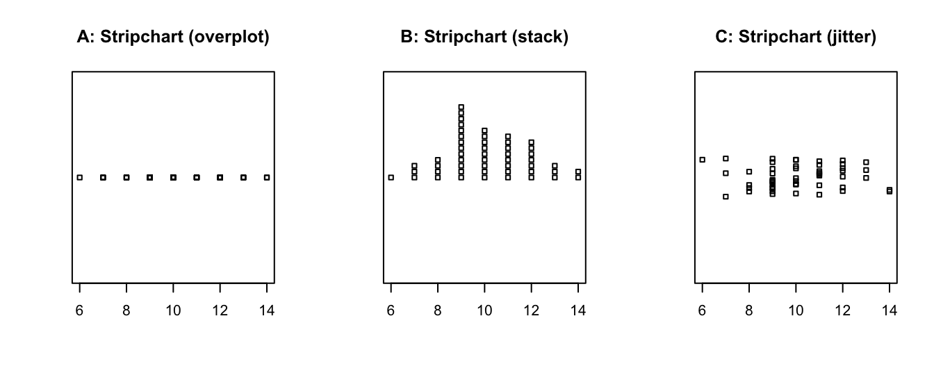
- Stripcharts create a 1-D scatter plot — perhaps the most basic plot available:
# Create a vector of random values:
set.seed(123)  # reproducible randomness
v <- round(rnorm(n = 50, mean = 10, sd = 2), 0)  # rounded to nearest integer

stripchart(v)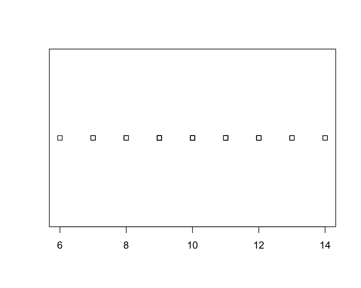
The default method = "overplot" is only useful if there are no repeated values.
If there are, the method settings "stack" or "jitter" distribute the values that would otherwise be plotted at the same location:
- The
smoothScatter()function produces density plots, with the option of marking outliers:
N <- 200
x <- rnorm(n = N, mean = 50, sd = 10)
y <- runif(N, min = 0, max = 100)

smoothScatter(x, y, nrpoints = 10, col = "gold", cex = 1, pch = 16)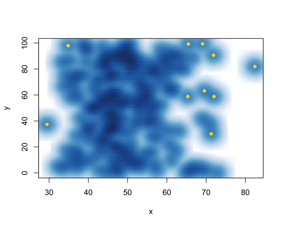
- Pie charts rarely make sense and are to be avoided:
c_data <- c(20, 12, 3, 16, 2, 13)
countries <- c("U.S.", "U.K.", "Austria", "Germany", "Switzerland", "France")
pie(c_data, labels = countries, main = "Pie chart of country data")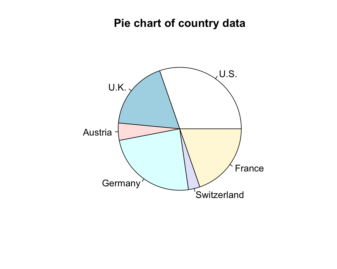
- Normal quantile plots:
d <- rnorm(n = 50, mean = 100, sd = 10)
qqnorm(d,
       main = "Normal Q-Q plot",
       xlab = "Theoretical quantiles",
       ylab = "Data quantiles",
       asp = 1/10)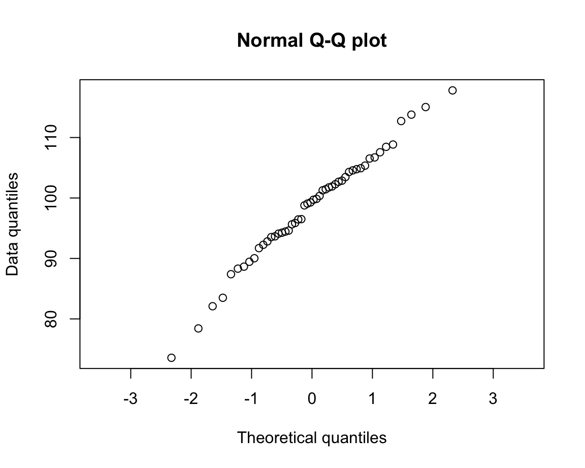
As each of these plotting functions serves special purposes, their usefulness depends on the particular data and task that we are trying to visualize. Although many types of visualizations are delegated to dedicated R packages, the range of base R plotting functions allows creating very complex and highly customized visualizations.
Next, we learn how to compose more complex plots as miniature computer programs. As this will give us more control over plot elements, this enables us to create more flexible and powerful visualizations.
8.3 Complex plots
The commands covered so far provide shortcuts and all do multiple things (e.g., choose default layouts, select value range and labels on axes, as well as drawing particular objects). To gain more control about the details of our plots or modify some of the default choices, we need to explicitly specify all parts of a plot.
Complex plots are created by multiple function calls and typically start by calling plot() with type = "n" to create a basic plot or canvass, before adding additional objects to it.
More specific plotting functions include grid(), abline(), points(), text(), title().
As these functions add specific elements to an existing plot, they are also known as annotation functions.
By setting graphical parameters (with the par() function), we can influence the overall appearance and arrangement of plots.
Given the long history of R and the graphics and grDevices packages that contain its visualization functions, we can only cover a selection here. In the following, we will sketch the general workflow of complex graphics and illustrate some important functions in the context of some visualizations.
8.3.1 Composing plots as programs
More advanced plots in the base R plotting system are created by calling successive R functions to incrementally build a visualization.
When constructing more advanced visualizations, plotting occurs in two main stages:
Calling
plot()for creating and defining the dimensions of a new plot;Using annotation functions for adding elements to the plot (e.g., points, lines, or text elements, as well as grids, titles, labels, and legends).
This two-stage process essentially turns the holistic task of “making a plot” into one of step-wise planning and composition. Rather than just calling one command that creates the entire plot, we start with a simple and reduced version (think: a blank canvas) and then use the tools provided by R (think: brushes, color, shapes, etc.) to improve our visualization.
Actually, creating beautiful and convincing visualizations typically requires an additional step. Whenever we want to change the standard values that govern the properties or appearance of a plot, we may have to adjust the default graphical parameters or define some auxiliary objects to be used in the plot (e.g., a palette of colors). If we include the preparatory steps that precede plotting, the process of creating a complex visualization is structured like any other computer program:
Define data objects and other elements to be used (e.g., the values of titels, colors) or change existing graphical parameters (e.g., how plots are to be arranged on the canvas);
Prepare the plotting canvas (e.g., its dimensions, axes);
Add objects by calling functions that create visual elements (e.g., points, lines, labels, titles, etc.).
Note that — just as in other programs — the order of operations matters. When creating complex plots, this is true in both a logical and a visual sense: We generally need to define an object (e.g., a value or color) prior to using it in an evaluated expression or function. But when creating a visualization and wanting to show some object A in front of another object B, we need to draw B before drawing A (so that A is plotted later than/on top of B).
8.3.2 Starting a new plot
We have seen above that the plot() function can create a scatterplot, or other types of plot depending on the type of object being plotted. However, plot() can also be used to merely create a blank plot (i.e., start a new screen device, e.g., in the Plots window of RStudio) to which we then add the elements of our graph.
To understand this process, evaluate and compare the result of the following commands:
We see that both commands create a new plot, but plot(x = 0) creates a scatterplot of a single point (with coordinates of \((0, 0)\)) whereas adding the argument type = "n" instructed R to merely define a new plotting canvas. However, the new plot still used x to choose ranges for both axes.
If we want different ranges, we either can change our data inputs (to x and/or y) or explicitly control the ranges of axes:
# (a) use data to define ranges:
xs <- -10:10
ys <- xs^2

plot(x = xs, y = ys, type = "n")

# (b) define ranges without data:
plot(x = 0, xlim = c(-10, 10), ylim = c(0, 100), type = "n") 
Note that both plots just created use the same ranges, but differ in the labels used on the x- and y-axes.
If we wanted to control these manually, we could have used the xlab and ylab arguments of plot().
8.3.3 Annotating plots
Once we have created a new screen device and defined the dimensions of our plotting region, we can use so-called annotation functions to add to an existing plot. Some key annotation functions include:
points()adds points (or point symbols) to a plotabline(),lines(), andsegments()add various types of lines to a plot (given theirxandycoordinates, or defining other properties, like a linear function’s intercept and slope)rect()adds rectangles or boxes (given the coordinates of their corners)text()adds text labels to a plot (to specificxandycoordinates)
Other functions allow adding or editing elements on the plot background, axes, and margins:
axis()adds axis labels and ticksgrid()adds orientation linestitle()adds labels to the axes, title, and subtitle, and outer marginmtext(): add arbitrary text labels to the plot’s (inner or outer) margins
Overall, these and other functions allow the composition of arbitrarily complex visualizations. As an example, the following code illustrates the process of first defining a plotting region and then using functions for adding various points, lines, shapes, and text elements. To really understand this process, it makes sense to evaluate the chunk in a step-by-step fashion (i.e., one command at a time):
# (0) Define some colors: -----
library(unikn)  # for color palettes
my_colors <- usecol(pal_unikn_light)
# seecol(my_colors)  # view color palette

# (1) Create canvas (but specify dimensions and some labels): -----
plot(x = 0, xlim = c(-10, 10), ylim = c(0, 100),
     type = "n",
     main = "Plotting various shapes and text labels",
     xlab = "X value", ylab = "Y value")

# (2) Add lines: -----
abline(h = 50, lty = 2)
abline(v =  0, lty = 2)
abline(a = 10, b = 10)

# (3) Add points (as circles): -----
points(x = c(-5, 0, 5), y = c(40, 50, 60),
       pch = 21, cex = 20, lwd = 4,
       col = my_colors[c(1, 3, 5)],
       bg  = usecol("grey", alpha = 1/2))

# (4) Add text labels: -----
text(x =  0, y = 50, labels = "R", cex = 4)
text(x = -5, y = 40, labels = "my", cex = 2)
text(x =  5, y = 60, labels = "stuff", cex = 2)

# (5) Add other shapes: -----
rect(xleft = c(-1, -9), xright = c(7, 1),
     ybottom = c(0, 80), ytop = c(20, 95),
     col = usecol(my_colors, alpha = 1),
     border = my_colors[c(7, 5)], lwd = 4)

# (6) More text labels: -----
text(x =  -4, y = 87, labels = "R pour l'art", col = Bordeaux, cex = 1.5)
text(x =   3, y = 10, labels = "WOW!", col = Karpfenblau, cex = 3)

# (7) Add line segments: -----
segments(x0 = c(-4, -4, 5, 9), y0 = c(20, 40, 25, 30),
         x1 = c(9, 3, -8, -4), y1 = c(35, 85, 60, 80),
         lwd = 5, col = my_colors)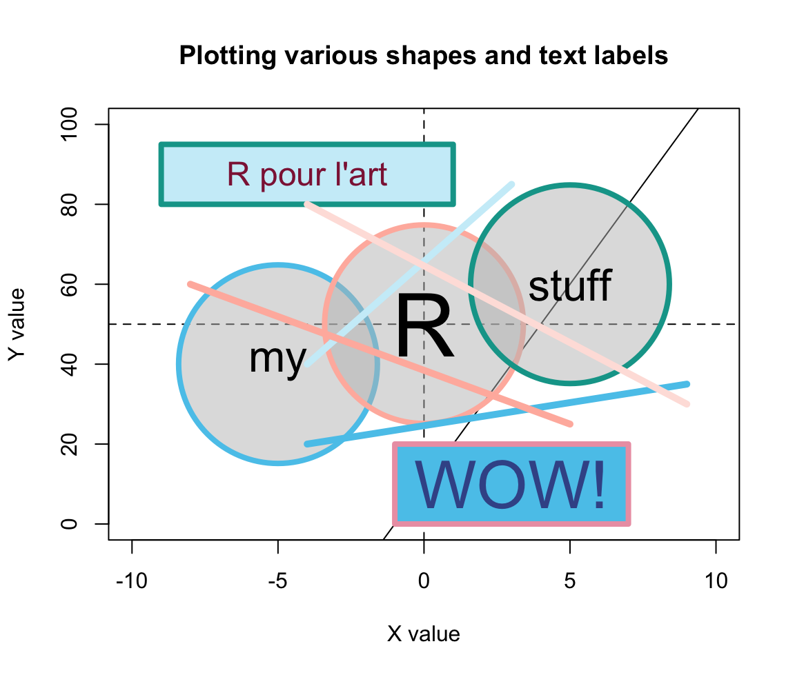
Figure 8.4: An example of a complex plot, in which various elements are added to a prepared canvas.
Figure 8.4 shows that using transparent colors somewhat tempers the constraints imposed by sequentially plotting objects.
For instance, the horizontal, vertical, and diagonal lines created by abline() (in Step 2) are not completely covered by the round shapes (due to setting alpha = 1/2 in their background color bg). By contrast, the two rectangles created by rect() (in Step 5) used a setting of alpha = 1 in their col definition. As a color’s alpha level ranges from 0 to 1 (with 0 indicating complete transprency and 1 indicating no transparency), using alpha = 1 is equivalent to “no transparency” — which is why the rectangles cover the lines created by abline().
Whereas Figure 8.4 arranges graphical elements without a particular purpose, the same methods can be used to produce highly versatile and useful visualizations. For instance, the R package riskyr package (Neth, Gaisbauer, et al., 2025) provides a range of visualizations that depict the effects of probabilistic binary distinctions based on a population of elements (aka. Bayesian reasoning or diagnostic testing).
Here is an example that illustrates the type of problem addressed by such diagrams:
Suppose there is a pandemic (e.g., called COVID-19) that infects 5% of some population of people.
-
There is a diagnostic screening test with the following properties:
If someone is infected with COVID-19, the tests detects this accurately with a probability of 99%.
If someone is not infected with COVID-19, the tests detects this accurately with a probability of 95%.
Someone receives a positive test result. How likely is it that this individual is infected?
In diagnostic terms, the problem specifies the prevalence of some condition (here: 5% of some population are infected with COVID-19) and the sensitivity (99%) and specificity (95%) of some diagnostic test. The problem then asks for the conditional probability of being infected, given a positive test result (which is known as the test’s positive predictive value, PPV).
Research has shown that this problem is notoriously difficult, even for medical experts (see REFs for an analysis and meta-review). As the correct answer is the inverse conditional probability of the sensitivity provided (and we are also provided with a base rate/prevalence and the specificity), the answer could be computed using Bayes’ theorem (see Section 20.2.2 for details). Given the current set of probabilities, the predictive value of a positive test result (PPV) is about 51%. Thus, throwing a coin is about as accurate as a single result of this test. (Importantly, this does not mean that the test is bad or useless. Things change dramatically if the prevalence of the condition in your environment (which is typically only a sub-part of the population) increased. For instance, if the prevalence of Covid in your environment was 20%, the same test would have a PPV of 83.2%. Alternatively, performing multiple tests with positive results would quickly raise the value of the test results.)
However, there are many other ways of computing the correct answer — and most of them involve a representational change in perspective (see Neth et al., 2021, for an analysis). Our goal here is not to solve the problem, but merely to illustrate that the problem could be solved by drawing frequency diagrams — and that we could use base R functions for creating relatively complex diagrams out of lines, shapes, and text labels. For many problems, we do not even need to do this ourselves, as the chances are quite high that someone else has already written an R package that does the job for us. In the current case, the riskyr package illustrates the relationship between a diagnostic test’s accuracy and predictive values in a variety of ways. (Note that you do not need to install the package for yourself, unless you wanted to re-create the plots.)
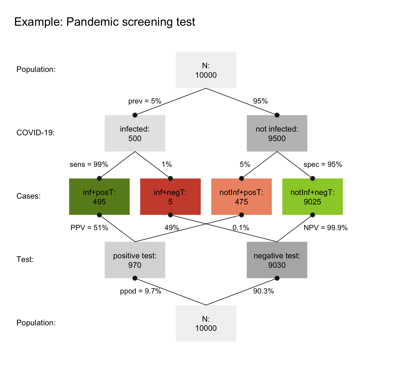
Figure 8.5: A prism diagram illustrating the relation between diagnostic accuracy and predictive power of a test (using the riskyr package).
Figure 8.5 illustrates the relation between the test’s ability for detecting infected vs. healthy people and its predictive values in a diagram that combines two trees (one top-down, and an inverted one bottom-up). To provide concrete frequencies, both trees assume a fixed population of 10,000 individuals. The top one first dissects the population by condition (cd, i.e., 5% of the people are infected vs. 95% are not infected), then by the specificity and sensitivity of the test. The lower and inverted tree re-combines the four middle cells (in which green cells indicate correct classifications, whereas red ones indicate erroneous classifications) by test result or decision (dc, i.e., positive vs. negative tests). This reveals that the desired probability of being infected, given a positive test result is only \(PPV=51\)% — much lower than most people would expect.
Importantly, we could create visualizations like Figure 8.5 from scratch by plotting boxes, lines, and labels. As this would be a lengthy and laborious process, R packages like riskyr facilitate creating various types of plots (see riskyr.org for interactive versions). But it is good to know that we can always create things ourselves, if we had to or wanted to do so.
8.3.4 Useful combinations
In practice, most R plots require not just one command, but multiple functions. We typically start out with a simple plot and then add or change elements to improve it. Here are some combinations that are quite common and worth knowing:
Example 1: A scatterplot with a grouping variable (and legend)
The iris data contained in the datasets package of R contains four types of measurements of three Species of flowers. Suppose we wanted to plot the relationship between Sepal.Length and Petal.Length as a scatterplot.
The following plot would reveal a positive correlation between both measurements:
plot(x = iris$Sepal.Length, y = iris$Petal.Length,  # x and y variables
     pch = 16, cex = 2,                             # aesthetic parameters
     xlab = "Sepal Length", ylab = "Petal Length",  # axis labels
     main = "Flower characteristics in Iris")       # title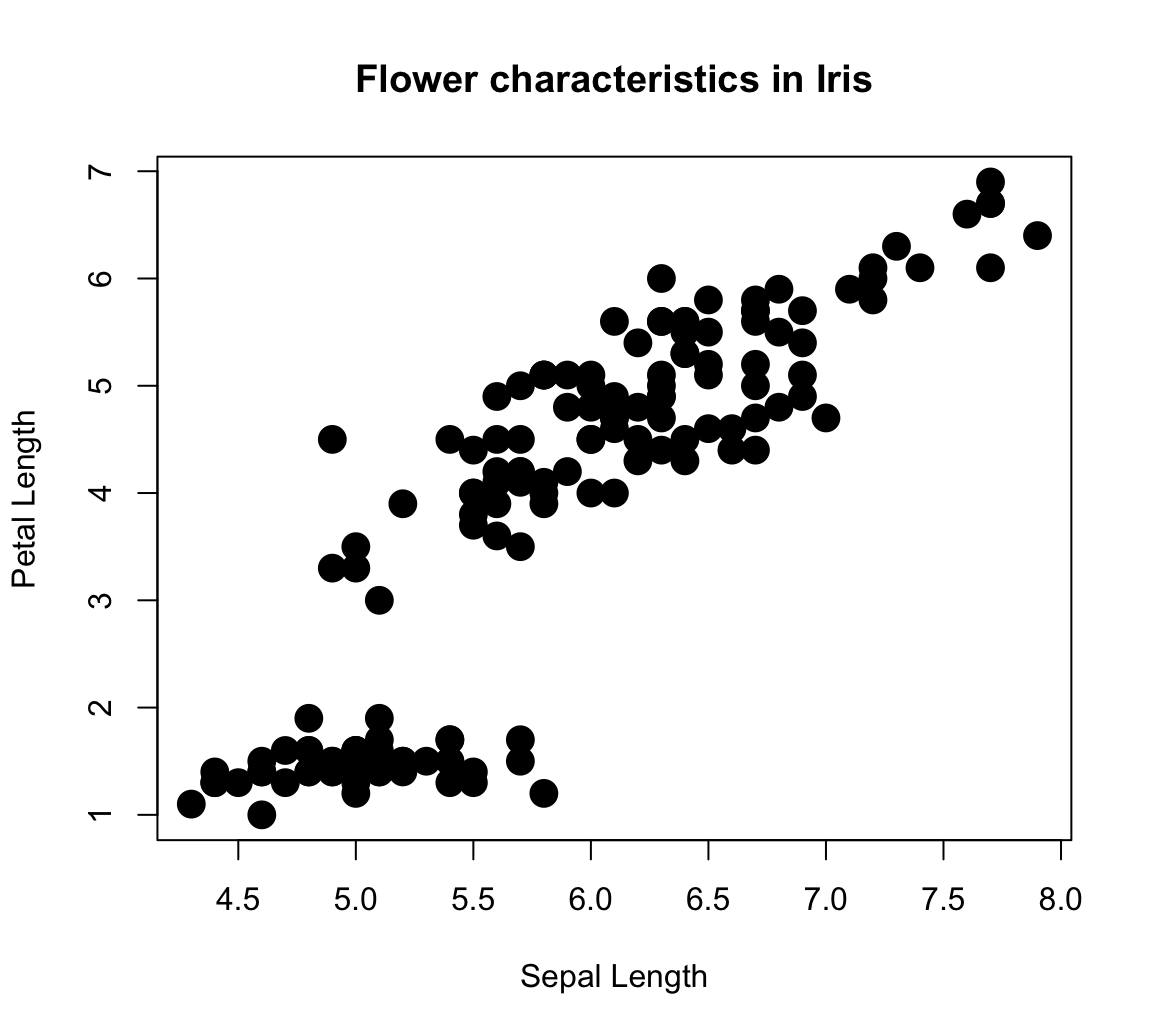
However, the plot is deficient in an important respect:
We lack all information regarding the Species of each point (which happens to be a factor variable of the iris data). An interesting feature of scatterplots is that we can assign its col aesthetic to a factor variable (i.e., internally encoded by a different integer value for each level of a categorical variable).
The R plotting system uses a color vector palette() as its default colors.
Setting col = iris$Species essentially instructs R to use the 1st color of palette() for the 1st species, the 2nd color of palette() for the 2nd species, etc.
plot(x = iris$Sepal.Length, y = iris$Petal.Length,  # x and y variables
     col = iris$Species,                            # color by species!
     pch = 16, cex = 2,                             # aesthetic parameters
     xlab = "Sepal Length", ylab = "Petal Length",  # axis labels
     main = "Flower characteristics in Iris")       # title

# Adding grid:
grid()

# Adding a legend:
legend (x = 4.5, y = 7,
        legend = levels(iris$Species),
        pch = 16, col = c(1:3))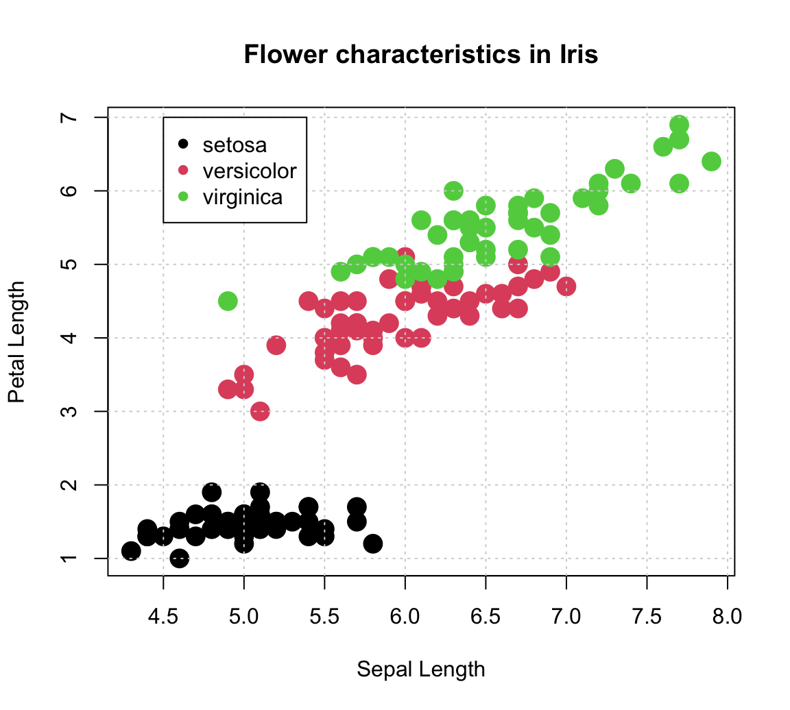
Note that we used the legend() function to explicate the mapping of colors to species.
The function’s x- and y-coordinates placed its top-left corner inside the plot, but its two key arguments were:
legendto print the levels ofiris$Species(as a character vector);colexplicitly set to the first three colors of the defaultpalette().
Defining another color palette:
# (a) Default (base R):
palette()  # show current default colors
#> [1] "black"   "#DF536B" "#61D04F" "#2297E6" "#28E2E5" "#CD0BBC" "#F5C710"
#> [8] "gray62"

# Set to different values:
palette(rainbow(4))  # use color function
palette(c("steelblue", "gold", "firebrick", "forestgreen"))  # use color() names

# (b) Use hcl color palettes:
# hcl.pals()
palette(hcl.colors(3, "Red-Blue"))
palette(hcl.colors(3, "Viridis"))

# (c) color packages:
library(unikn)
palette(usecol(pal_unikn_pref))       # use color function with palette
palette(c(Seeblau, Pinky, Seegruen))  # use color names
palette(usecol(c(Seeblau, Pinky, Seegruen), alpha = 2/3))  # by names, plus transparency

# palette("default")  # reset to default color palette
Adding a linear regression line:
plot(x = iris$Sepal.Length, y = iris$Petal.Length,  # x and y variables
     col = iris$Species,                            # color by species!
     pch = 16, cex = 2,                             # aesthetic parameters
     xlab = "Sepal Length", ylab = "Petal Length",  # axis labels
     main = "Flower characteristics in Iris")       # title

# Adding grid:
grid()

# Adding a legend:
legend (x = 4.5, y = 7, legend = levels(iris$Species),
        pch = 16, col = c(1:3))

# Linear regression:
fit <- lm(Petal.Length ~ Sepal.Length, data = iris)   # carry out linear regression
# fit
# summary(fit)
abline(fit, lty = "dashed", col = Karpfenblau, lwd = 2)    # add regression line

# Adding text annotation:
text(x = 7, y = 6.7, col = Karpfenblau,
     labels = "R^2 = .76\nP < 2.2e-16")   # add a label to the plot at (x,y)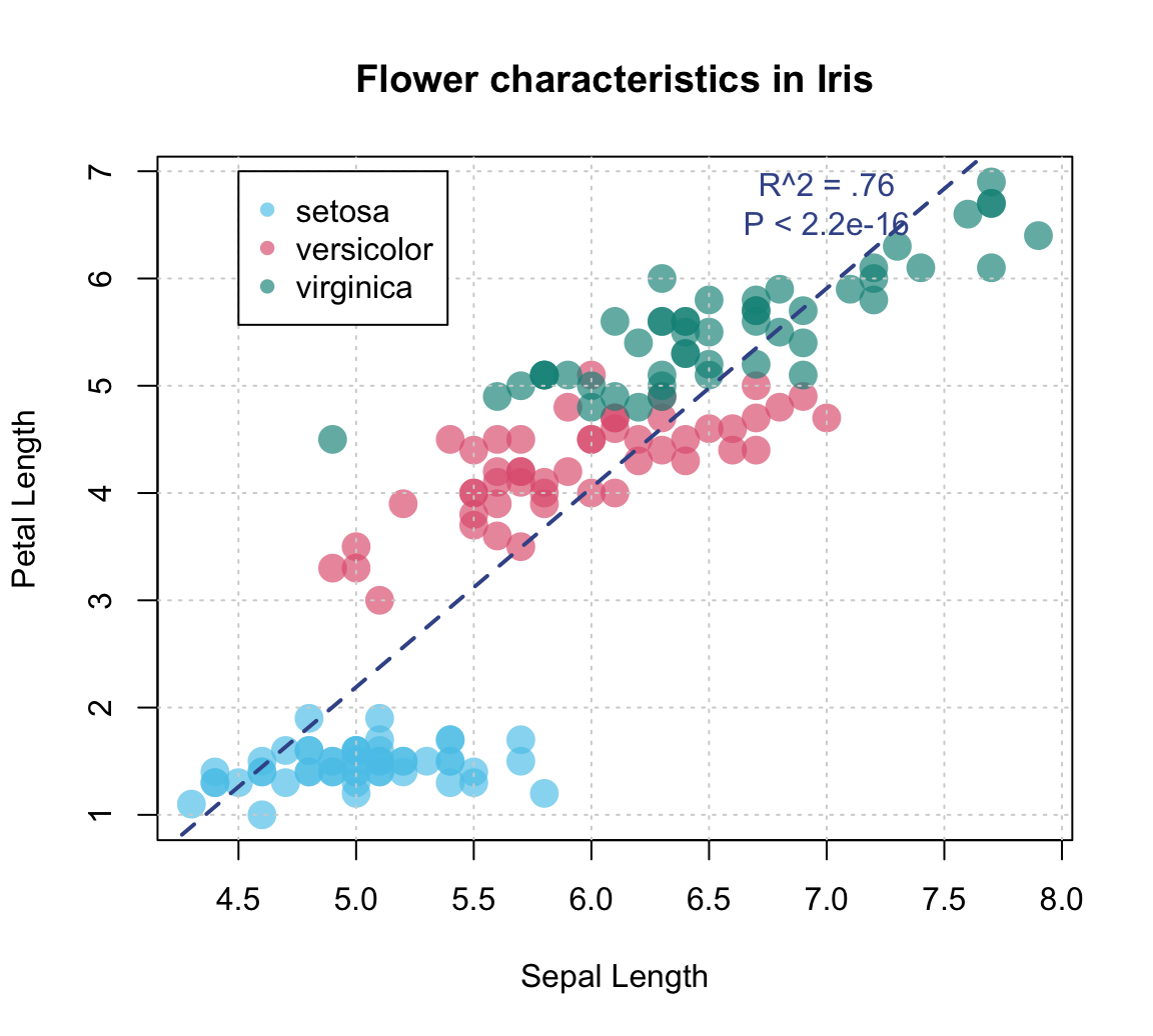
An alternative (older) example:
# Demo: Basic scatterplot (based on some data) with a regression line:

# Create data:
year <- ds4psy::what_year(ds4psy::sample_date(from = "1990-01-01", to = "2002-12-31", size = 100),
                          as_integer = TRUE)
value <- 2 * (year - 1990) + runif(length(year), 0, 100)
df <- data.frame(year, value)


# Scatterplot:
plot(df$year, df$value, type = "p",
     col = "skyblue", lwd = 2,                     # aesthetic parameters
     xlab = "X label", ylab = "Y label",       # axis labels
     main = "Line plot with regression line")  # plot title

# Regression:
fit <- lm(value ~ year, data = df)           # carry out linear regression
fit
#>
#> Call:
#> lm(formula = value ~ year, data = df)
#>
#> Coefficients:
#> (Intercept)         year
#>   -2410.625        1.238
abline(fit, lty = "dashed", col = "blue", lwd = 2)    # add regression line

# Adding text annotation:
summary(fit)
#>
#> Call:
#> lm(formula = value ~ year, data = df)
#>
#> Residuals:
#>     Min      1Q  Median      3Q     Max
#> -49.707 -20.278  -0.705  24.112  51.957
#>
#> Coefficients:
#>               Estimate Std. Error t value Pr(>|t|)
#> (Intercept) -2410.6248  1479.2834   -1.63   0.1064
#> year            1.2378     0.7412    1.67   0.0981 .
#> ---
#> Signif. codes:  0 '***' 0.001 '**' 0.01 '*' 0.05 '.' 0.1 ' ' 1
#>
#> Residual standard error: 26.39 on 98 degrees of freedom
#> Multiple R-squared:  0.02767,    Adjusted R-squared:  0.01775
#> F-statistic: 2.789 on 1 and 98 DF,  p-value: 0.09811
text(x = 2000, y = 20,
     labels = "R^2 = 0.123\nP = 1.2e-12")   # add a label to the plot at (x,y)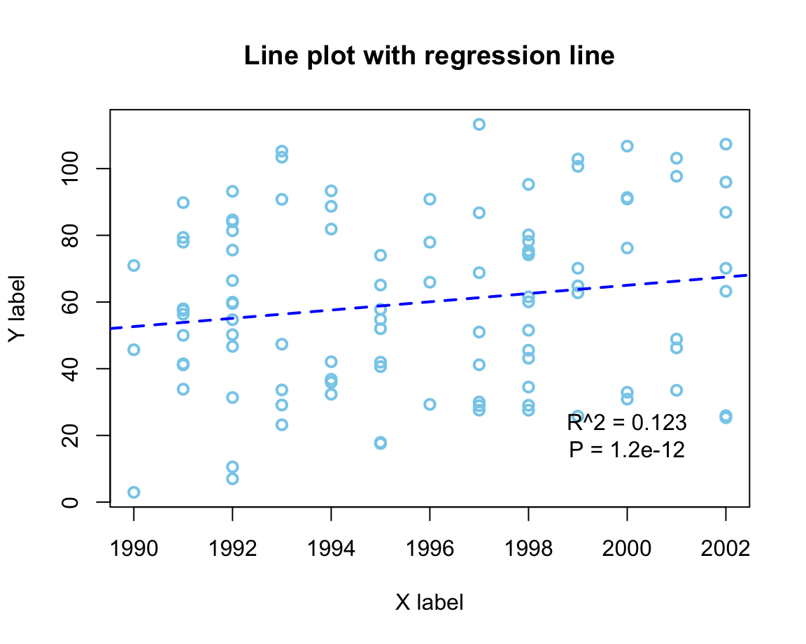
Example 2: Plotting grouped raw data as a box plot
A scatterplot makes sense when both the x- and the y-dimension can be mapped to continuous variables.
If one variable is continuous, but another one is categorical, the plot() function automatically chooses a box plot as a better alternative (see Figure 8.2).
For instance, when using the mpg data to plot the values of the continuous variable cty as a function of the categorical variable class, we get:
plot(cty ~ class, data = mpg,
     pch = 20, cex = 2,
     col = usecol(Seegruen, alpha = 1/4),
     main = "Fuel consumption in city by class of car")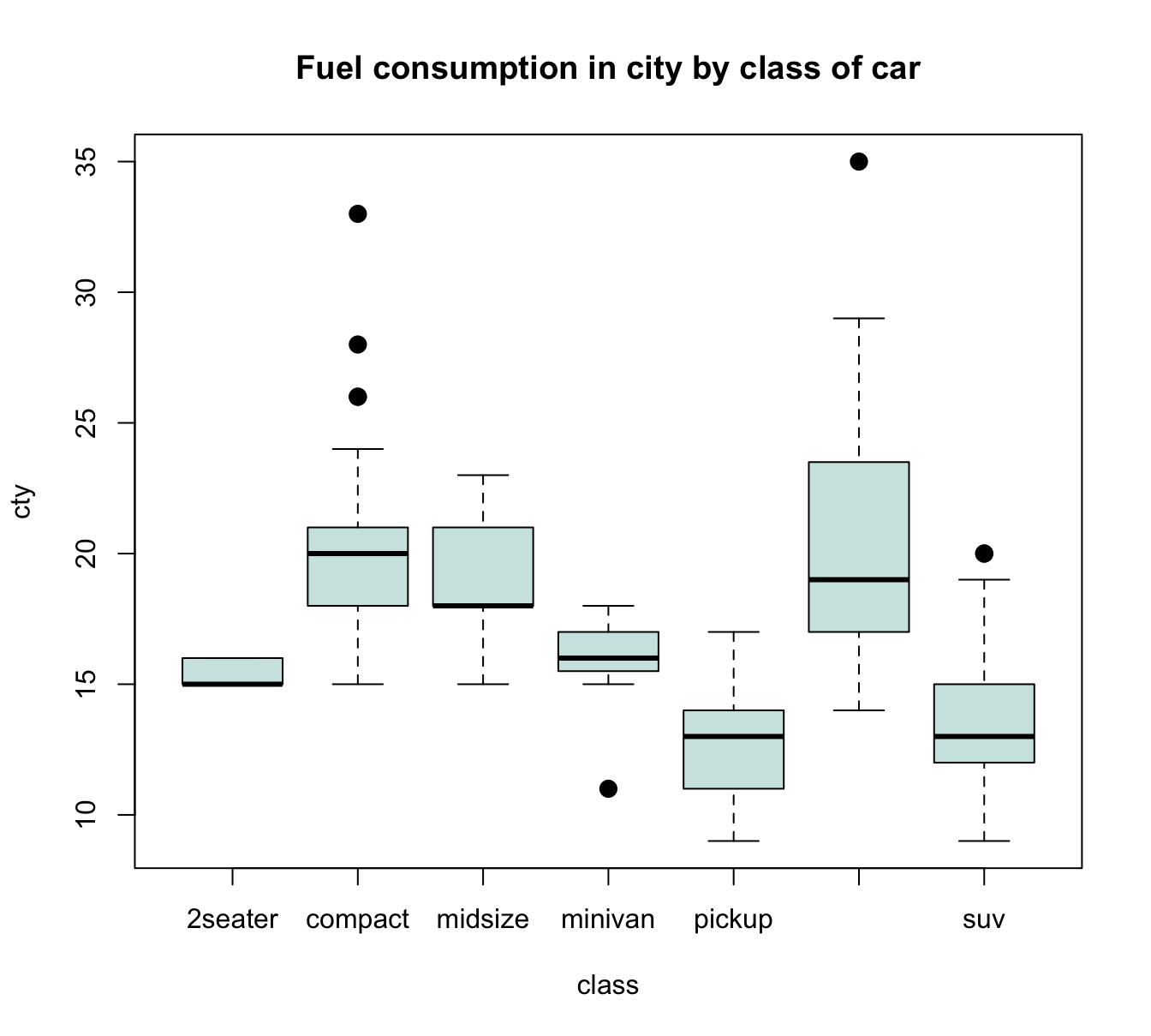
Figure 8.6: A boxplot showing a continuous y-variable as a function of a categorical x-variable.
Alternatively, it often is desirable to also see the individual data points.
A means of doing so is provided by the jitter(x, factor) function, that accepts a numeric vector x and a factor or amount by which the values of the numeric vector are to be jittered (i.e., randomly increased and decreased). The idea behind jittering is that adding random noise can sometimes help to distinguish between elements (e.g., when plotting them). Jittering works best in combination with transparent colors, as this enables us to see the density of overlapping elements.
In our present context, we primarily would need to add noise to our x-variable class, so that its values become distinguishable. Using jitter(as.numeric(class), 3/4) as our x-variable automatically transforms the boxplot into a scatterplot. However, we could also add some noise to our y-variable cty, which reduces the amount of overlap of points. Here are the results of both plots:
plot(cty ~ jitter(as.numeric(class), 3/4), data = mpg,
     pch = 20, cex = 2,
     col = usecol(Bordeaux, alpha = 1/4),
     main = "A. cty by class (with horizontal jitter)")

plot(jitter(cty, amount = 3/4) ~ jitter(as.numeric(class), 3/4), data = mpg,
     pch = 20, cex = 2,
     col = usecol(Bordeaux, alpha = 1/4),
     main = "B. cty by class (with horizontal and vertical jitter)")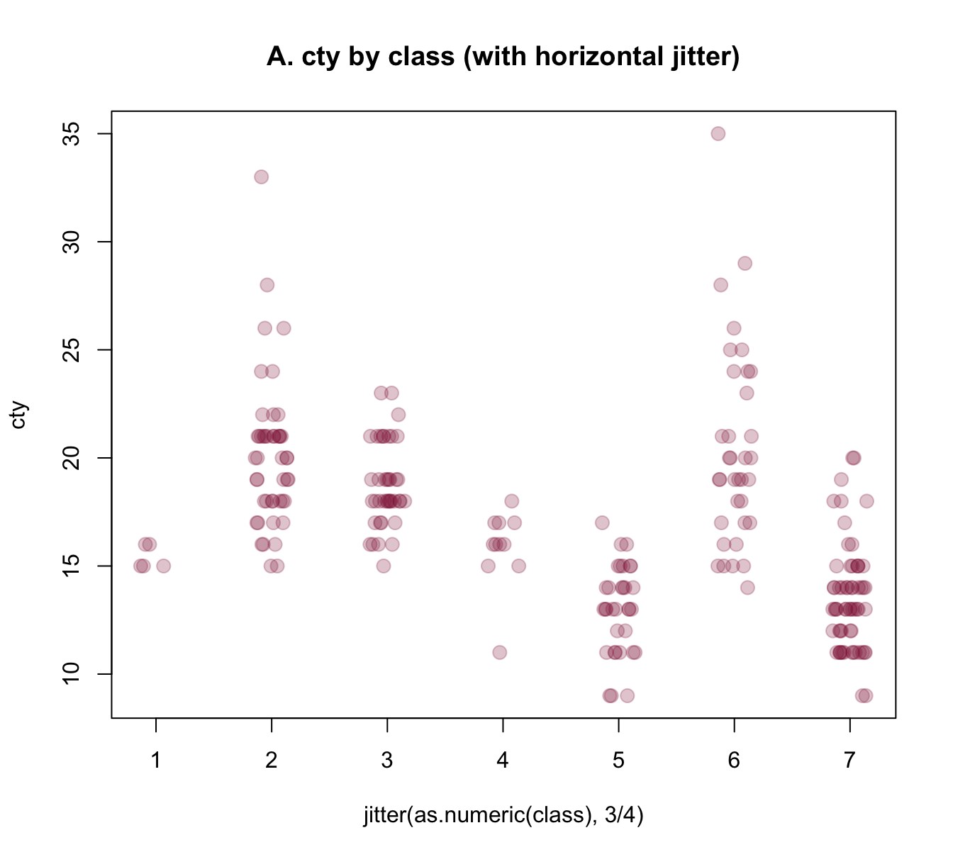
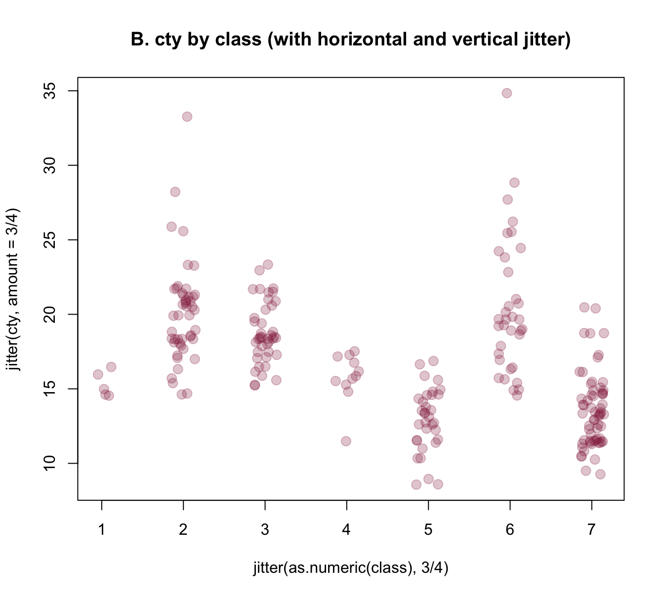
Figure 8.7: Jittering categorical or/and continuous variables to show raw data points as scatterplots.
The jittered raw data plots of Figure 8.7 provide some additional information over the boxplot of Figure 8.6 (e.g., they nicely illustrate the group sizes), but also have some deficiencies:
As we converted
classinto a numeric variable, their x-axis is numeric, rather than categorical. Can we use the previous class labels on our x-axis?The raw data plots lack the explicit information about means and dispersion of groups that the boxplot provided. Can we combine both plots to provide a more complete picture?
The answer to both questions is yes, of course. R provides several approaches for tackling these challenges, but all involve creating a plot in several steps.
To gain more control about the axes, we could use an initial plot() function to define the basic dimensions and labels of our plot, but not yet include any axes (by setting axes = FALSE). We then add two axis() commands (to explicitly define an x- and y-axis and specify its steps, labels, and the orientation of labels) and a grid() command (to show some orientation lines in the background). Finally, we can use the points() annotation function with the jitter() instructions from above to add our raw data points to the canvas. Overall, the resulting plot provides a better impression of the raw data points:
plot(x = 0, type = "n",
     xlim = c(0.5, 7), ylim = c(0, 40),
     axes = FALSE,
     main = "Raw data plot (with random jitter)",
     xlab = "Class X", ylab = "Value of Y")

axis(1, at = 1:7, labels = levels(mpg$class), las = 2) # x-axis
axis(2, at = seq(0, 40, by = 5), las = 1) # y-axis

grid() # add grid lines

# plot raw data (as points with jitter):
points(jitter(cty, 3/4) ~ jitter(as.numeric(class), 3/4), data = mpg,
       pch = 20, cex = 2,
       col = usecol(Bordeaux, alpha = 1/4))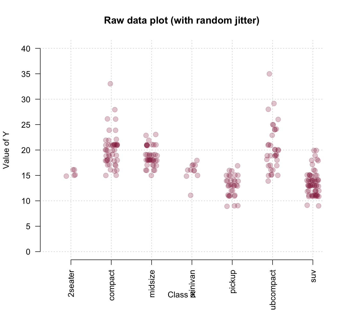
To combine the benefits of the more abstract box plot with those of plotting the raw data, we could first draw a boxplot and later add the individual data points to it. Saving the boxplot to an R object also allows us to later use this object to add details to the plot. The following example inspects and uses the object bp to add text labels of group sizes and label two outliers:
# boxplot:
bp <- boxplot(cty ~ class, data = mpg,
              col = usecol(Seegruen, alpha = 1/4),
              las = 2, ylim = c(0, 40),
              main = "Boxplot (with jittered raw data and some details)",
              xlab = "Class of car", ylab = "MPG in city")

grid() # add grid lines

# plot raw data (as points with jitter):
points(jitter(cty, 3/4) ~ jitter(as.numeric(class), 3/4), data = mpg,
       pch = 20, cex = 2,
       col = usecol(Bordeaux, alpha = 1/4))


# Add group sizes (as text labels):
text(x = 1:7, y = 0, labels = paste0("[", bp$n, "]"), cex = .85)

## Check some outliers:
# bp$out
# bp$group
# mpg[mpg$cty>30, ]

# Add some text labels:
text(x = 2, y = bp$out[4], labels = "VW New Beetle 1999",
     cex = .85, col = Bordeaux, pos = 3)
text(x = 6, y = bp$out[6], labels = "VW Jetta 1999",
     cex = .85, col = Bordeaux, pos = 3)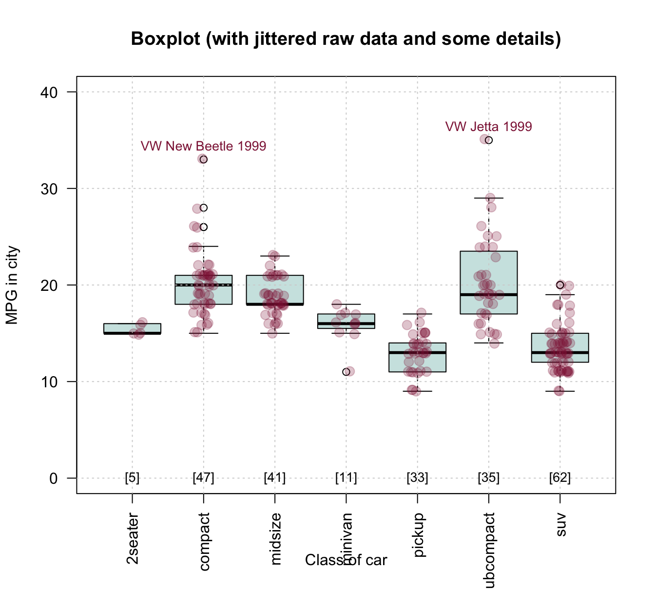
Figure 8.8: Combining a box plot and a jittered raw data plot (plus some details).
Example 3: Plotting curves from functions
Given some diagnostic test’s sens and spec values, what are the test’s positive and negative predictive values (PPV and NPV) as a function of prev?
Without understanding any details, we can use the functions provided by some package to compute the desired values. Here, we use the riskyr package (mentioned above, but not needed to create the visualizations of this section):
library(riskyr)

comp_PPV(prev = .05, sens = .99, spec = .95)
#> [1] 0.5103093
comp_NPV(prev = .05, sens = .99, spec = .95)
#> [1] 0.9994463
However, rather than just making predictions for individual prevalence values prev, we want a curve that shows PPV and NPV as a function of prev:
# Prepare canvas:
plot(x = 0, type = "n",
     xlim = c(0, 1), ylim = c(0, 1),
     main = "Predictive values as a function of prevalence",
     xlab = "Prevalence", ylab = "Predictive values")

grid()

# Set parameters and compute some points:
prev <- .05
PPV  <- comp_PPV(prev = prev, sens = .99, spec = .95)
NPV  <- comp_NPV(prev = prev, sens = .99, spec = .95)

col_PPV <- "darkorange"
col_NPV <- "steelblue"

# Curves:
curve(expr = comp_PPV(prev = x, sens = .99, spec = .95),
      from = 0, to = 1, col = col_PPV, lwd = 2, add = TRUE)

curve(expr = comp_NPV(prev = x, sens = .99, spec = .95),
      from = 0, to = 1, col = col_NPV, lwd = 2, add = TRUE)

# Vertical line:
abline(v = prev, lty = 2, lwd = 1, col = "grey50")

# Points:
points(x = prev, y = PPV,
       pch = 20, cex = 2, col = col_PPV)
points(x = prev, y = NPV,
       pch = 20, cex = 2, col = col_NPV)

# Text labels:
text(x = prev, y = PPV, label = "PPV",
     cex = 1, pos = 4, col = col_PPV)
text(x = prev, y = NPV, label = "NPV",
     cex = 1, pos = 1, col = col_NPV)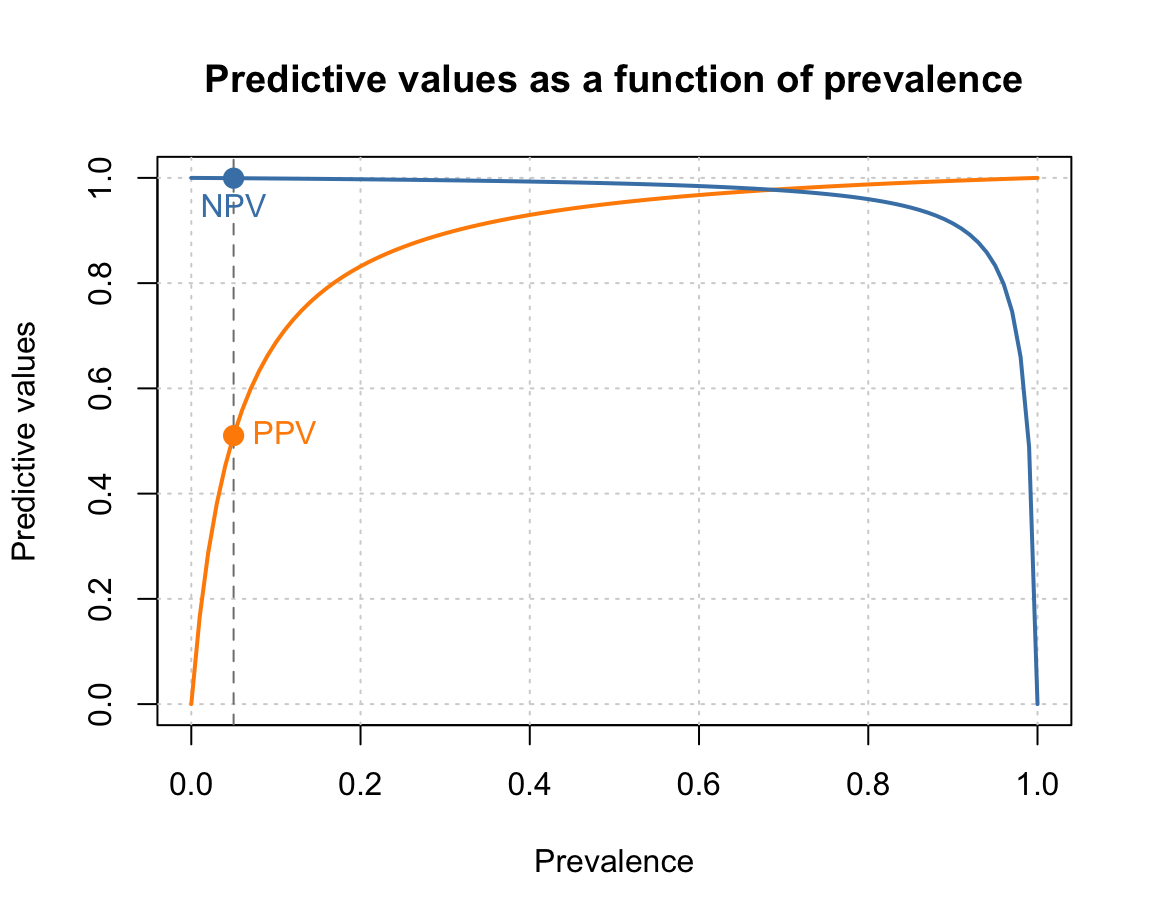
Note that creating such plots implies many organizational and structural aspects. For instance, we first define some constants so that they can be used in various commands later. Similarly, the order of functions matters, as objects are plotted on top of earlier ones.
Overall, designing such plots implies writing a small script or computer program. Each step either defines some feature or computes an object by applying a function. When the steps are arranged and evaluated in the right order, they create a graphical representation.
8.3.5 Setting graphical parameters (par())
The appearance of any graphical device in R depends on many graphical parameters.
For instance, the dimensions and margins of plots, the colors of fore- or background elements, and the appearance of labels, points, or lines is governed by such parameters.
The par() function allows both checking and setting these parameters.
It displays and allows to change a large number of parameters as tagged values (i.e., in a form tag = value, where tag is the name of a graphical parameter and value its current or desired value).
In this section, we introduce some important parameters (see ?par for the full list of parameters and options).
Example parameters
Here are the default values of the most important graphical parameters:
# Plot margins
par("mar", "oma")  # margin (in lines on bottom, left, top, right) and outer margins
#> $mar
#> [1] 5.1 4.1 4.1 2.1
#>
#> $oma
#> [1] 0 0 0 0

# Colors:
par("col", "bg")  # color of plot foreground and background
#> $col
#> [1] "black"
#>
#> $bg
#> [1] "white"
par("col.axis", "col.lab", "col.main")  # additional colors
#> $col.axis
#> [1] "black"
#>
#> $col.lab
#> [1] "black"
#>
#> $col.main
#> [1] "black"

# Points:
par("pch")  # point symbol (0-25, see ?points() for values)
#> [1] 1

# Lines:
par("lty", "lwd")  # line type and width
#> $lty
#> [1] "solid"
#>
#> $lwd
#> [1] 1

# Fonts:
par("family", "font")  # font family and type
#> $family
#> [1] ""
#>
#> $font
#> [1] 1

# Text and symbol size:
par("cex")  # magnification value for text and symbols
#> [1] 1
See ?par for details and options.
Arranging multiple plots
We often want to fit two or more plots into the plotting area.
The “mfrow” and “mfcol” parameters of par() provide or allow to change a vector c(nr, nc) that indicates the number of plots per row (nr) and column (nc).
Thus, setting par(mfrow = c(1, 2)) would fit two plots into one row, whereas par(mfrow = c(2, 1)) would stack two plots on top of each other.
Storing parameters
Whenever changing the default graphical parameters, it is a good idea to store the original (or current) values, so that they can be restored later.
This can easily be done by copying the current parameters in an object (e.g., in an R object opar, short for “original par”):
opar <- par()stores the original (default) par settingspar(opar)restores the original (default) par settings
As some parameters can only be read (but not changed), we typically exclude “read-only” parameters by storing opar <- par(no.readonly = TRUE).
Here is an example for storing the current parameters, changing the defaults to create a plot, and then restoring the original parameters:
# 1. Store original parameters: ----
opar <- par(no.readonly = TRUE)

# 2. Change plotting parameters: ----

# (a) Arrange multiple plots:
par(mfrow = c(1, 2))  # 1 row, 2 columns

# (b) Change default parameters:
par(mar = c(4, 4, 2, 1),
    bty = "l", pch = 20, lwd = 2,
    family = "mono", font = 2, cex = .8,
    col = "white", bg = "steelblue4",
    col.main = "white", col.axis = "gold", col.lab = "orange")

# Plot plots (with these settings):
plot(x = mpg$cty, y = mpg$hwy, main = "A. mpg data")
plot(Nile, main = "B. Nile data")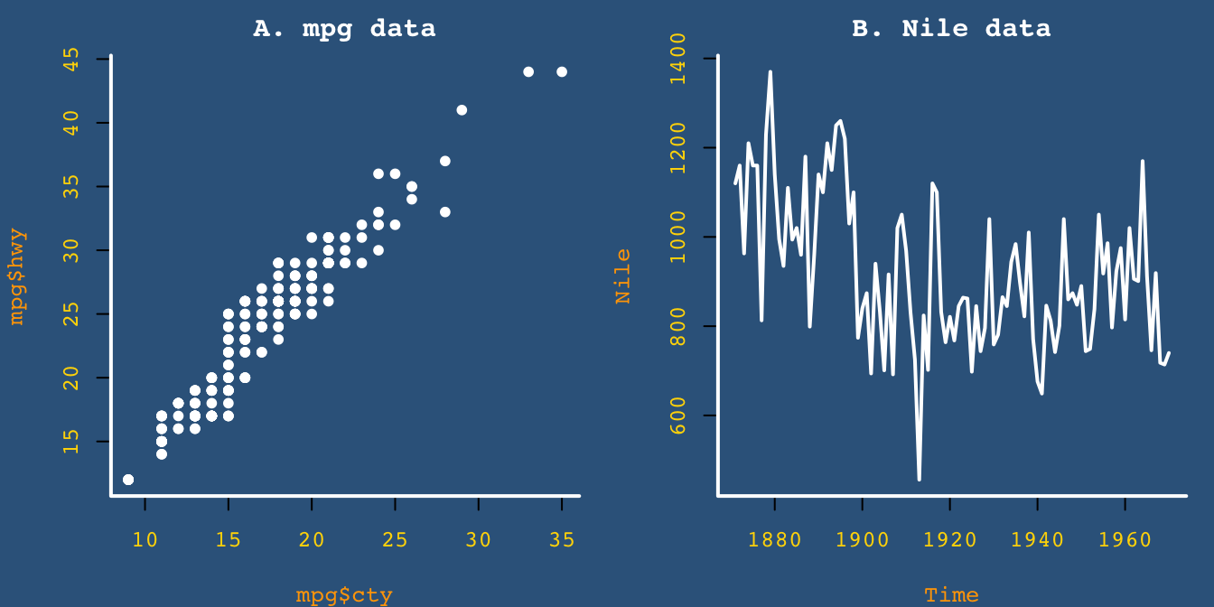
# 3. Restore original parameters: ----
par(opar)
See ?par for the list of parameters and options.
Practice
- The data frame
Orangeof datasets provides the age and circumference values of five orange trees. Create a line plot that show their growth (i.e.,circumference) as a function of theirage.
Hint: Here’s what our result could look like:
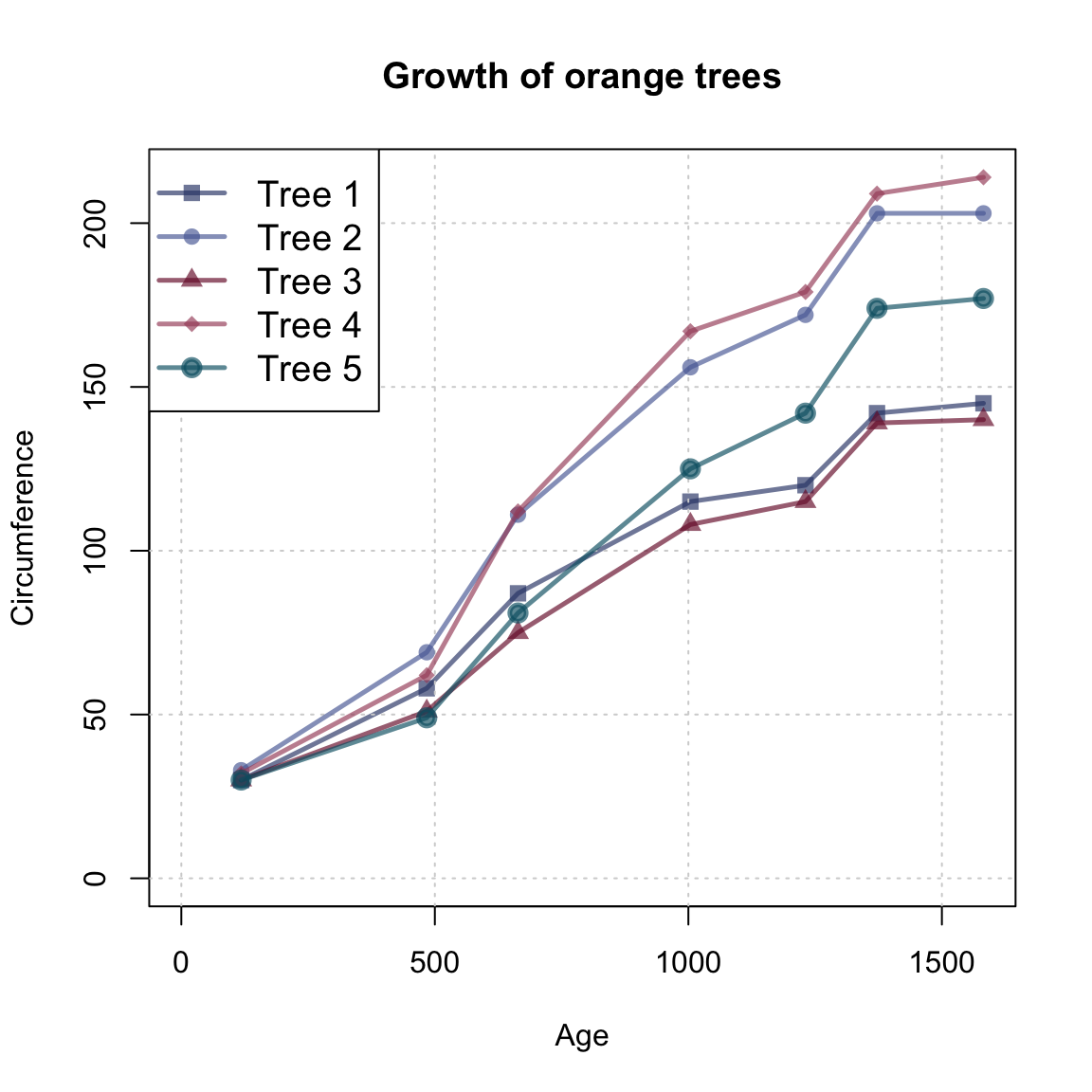
Solution
We first copy the data into an object otree and inspect it:
# data:
otrees <- datasets::Orange
dim(otrees)
#> [1] 35  3

# as tibble:
(tibble::as_tibble(otrees))
#> # A tibble: 35 × 3
#>   Tree    age circumference
#>   <ord> <dbl>         <dbl>
#> 1 1       118            30
#> 2 1       484            58
#> 3 1       664            87
#> 4 1      1004           115
#> 5 1      1231           120
#> 6 1      1372           142
#> # ℹ 29 more rows

table(otrees$Tree)  # 7 rows/measurements per tree
#>
#> 3 1 5 2 4
#> 7 7 7 7 7
Note that the data provides measurements (of age and circumference) for 5 trees and contains a block of 7 measurements (rows) per tree.
Step by step:
library(unikn)

# Define visual parameters:
my_lwd <- 2.5
my_cex <- 1.2
my_col <- unikn::usecol(pal_unikn_dark, alpha = 2/3)

# Basic plot (with first line):
plot(x = otrees$age[1:7], y = otrees$circumference[1:7],
     type = "o", lwd = my_lwd, pch = 15, cex = my_cex,
     col = my_col[1],
     xlim = c(0, max(otrees$age)), ylim = c(0, max(otrees$circumference)),
     xlab = "Age", ylab = "Circumference",
     main = "Growth of orange trees")

# Add grid:
grid()

# Loop through data frame (in 5 steps, reading 7 lines at a time):
for (i in 1:5){

  lines(x = otrees$age[((7*i) + 1):((7*i) + 7)],
        y = otrees$circumference[((7*i) + 1):((7*i) + 7)],
        type = "o", lwd = my_lwd, pch = (15 + i), cex = my_cex,
        col = my_col[i + 1])
}

# Adding legend:
legend("topleft", legend = paste0("Tree ", 1:5),
       lwd = my_lwd, pch = 15:20, cex = my_cex, col = my_col)
Note that the lines() function is embedded in a for loop (to generate multiple lines) and uses numeric indexing to select the block of 7 measurements (rows) from the otrees data that describes each tree. Rather than using a for loop and numeric indexing, we could have used logical indexing to identify each tree and repeated the following steps for each tree:
# Tree 2:
i <- 2

lines(x = otrees$age[otrees$Tree == i], y = otrees$circumference[otrees$Tree == i],
      type = "o", lwd = my_lwd, pch = (15 + i), cex = my_cex,
col = my_cols[i])- Further examining graphical parameters:
What kind of data structure is returned by
par()?How would a plot change when the graphical parameters were set to
par(mar = c(0, 0, 0, 0), omi = c(1, 1, 1, 1))?What would change if the graphical parameters were set to
par(mfrow = c(2, 1))?Which graphical parameters can be read, but not set?
Hint: Study the documentation of par(), or try storing and re-setting par_org <- par(); par(par_org).
8.4 Conclusion
8.4.1 Summary
Visualizations can be good, bad, or anything in between. The success of any particular visualization depends on its ecological rationality: On the one hand, the type of graph chosen and its aesthetic features need to fit to the data that is being shown. On the other hand, the message to be conveyed and the audience that is to view and interpret the graph need to be considered.
Plotting in R
Overall, the base R plotting system is very flexible, powerful, and offers a high degree of control over plotting. But as the graphical functions of R have been developed over a long period of time, they are quite heterogeneous. The main reason for this heterogeneity is that the basic R plotting system simultaneously pursues two distinct strategies:
On the one hand, there are many pre-packaged graphical commands — like
hist(),barplot(), orboxplot()— that combine several aspects and provide options for quickly generating some particular type of visualization.On the other hand, there are many low-level plotting functions for designing new visualizations from scratch, or for modifying existing plots.
As the latter functions often need to be combined with the former, the combination of both strategies increases complexity and frequently confuses R novices.
An alternative to a range of different functions for creating different visualizations would be a unified system that generates many different types of visualizations from a common set of principles. Remember the Swiss knife analogy invoked in Chapter 2 on Basic R concepts and commands: Rather than using a range of specialized tools, someone could design a toolbox that provides many different functions in a systematic fashion (e.g., by sharing the same arguments and command syntax for different visualizations). Such a toolbox is provided by the ggplot2 package, which is discussed in Chapter 9 and in Chapter 2 on Visualizing data of the ds4psy book (Neth, 2025a).
Plot types
There are many different types of graphs and corresponding commands in R. In this chapter, we have learned to use base R functions for creating a few of them:
histograms show a variable’s distribution of values;
scatterplots (and some variants) show the relation between two variables;
bar plots show the values of one or more categorical variables;
etc.
See the icons in 5: Directory of visualizations (Wilke, 2019) for many additional types of plots.
Aesthetic elements
Key aesthetic elements (and corresponding arguments of base R functions) include:
color of various elements (
col,border,bg,fg)line width (
lwd) and type (lty)point shape (
pch, see?pointsfor possible values)size of symbols or text (
cex)
For a primer on using colors in R, see Appendix D: Using colors of the ds4psy textbook (Neth, 2025a).
Plot elements
Key arguments for setting properties of plot() include:
mainfor providing a plot title (as character);xlabandylabfor proving axes labels (as character);xlimandylimfor proving the limits of axes ranges (as a numeric vector of start and end values);aspfor setting the aspect ratio (as a number y/x);lasfor setting the orientation of axis labels (as a number 0–3).
For additional parameters, see the documentations of ?plot() and ?par().
Creating plots
Scientific visualizations should typically contain the following elements:
A descriptive title or caption that states what the graph is showing;
axes with descriptive labels and sensible value ranges;
one or more geometric objects (e.g., points, bars, lines) that depict the data in a clear fashion;
informative labels or a legend that explains the mapping of geometric objects and aesthetic features to data elements (e.g., which color, line, or shape, is showing which variable for which group).
When creating a new graph, planning these four steps is a good heuristic for creating successful graphs. Due to an abundance of options, we should always aim to create the basic plot before fiddling with labels and aesthetic parameters (like colors, themes, etc.).
Conclusion
Creating good visualizations is both an art and a craft. R provides abundant tools, but using them in a successful fashion is mostly a matter of experience.
The insight that any representation can be good or bad at serving particular purposes is an important point to keep in mind beyond visualizations.
8.4.2 Resources

Here are some links to general resources on visualization, not just in R.
Background information and inspiration
Books or scripts on data visualization include the landmark publications by Jacques Bertin (e.g., Bertin, 2011) and Edward R. Tufte (Tufte et al., 1990; Tufte, 2001, 2006) combine sound advice with many inspiring examples. Friendly (2008) provides a historical perspective with many beautiful examples.
More recent publications that are geared to the needs of aspiring data scientists include:
Data Visualization. A practical introduction (Healy, 2018) is beautiful, informative, and elegant.
Fundamentals of Data Visualization (Wilke, 2019) provides many instructive examples and helps distinguishing good from bad and ugly graphs.
R Graphics Cookbook (Chang, 2012) provides hands-on advice on using ggplot2 and many useful recipes for data transformation.
Data Visualization with R (Kabacoff, 2018) relies heavily on the ggplot2 package, but also covers other approaches.
More specific resources on the principles of data visualization (with many beautiful or bizarre examples) include:
Various books (e.g., Cairo, 2012, 2016) and The functional art weblog (by Alberto Cairo)
Various books (e.g., Yau, 2011, 2013) and the Flowing data site (by Nathan Yau)
The principle of proportional ink and the Calling bullshit weblog (by Carl T. Bergstrom and Jevin West)
Data visualization principles (by Rafael A. Irizarry)
Data visualization: Basic principles (by Peter Aldhous)
Online resources
Inspiration and tools for additional types of visualizations can be found at (from specific to general):
From Data to Viz: A decision tree for selecting graphical representations
Plotting in base R
Here are some links to helpful resources on the base R plotting system:
Chapter 9: The Base Plotting System of Exploratory Data Analysis with R (Peng, 2020)
R base plotting without wrappers (by Karolis Koncevicius, 2022) provides an elegant tutorial on base R plotting.
Colors in R
The grDevices component of R comes with many options and tools for selecting and modifying colors:
- Call
colors()ordemo("colors")in the Console to view the in-built colors of R.
For a primer on using colors in R, see Appendix D: Using colors of the ds4psy textbook (Neth, 2025a).
8.4.3 Preview
Given that we have some basic knowledge on the base R graphics system, a good next step is to check out the ggplot2 package (Wickham, Chang, et al., 2025). We do so in the next Chapter 9, but other introductory chapters include:
Chapter 2: Visualizing data of of the ds4psy textbook (Neth, 2025a)
Chapter 3: Data visualization of the r4ds textbook (Wickham & Grolemund, 2017)
Chapter 2: Visualizing data of the ds4psy textbook (Neth, 2025a)
8.5 Exercises

8.5.1 Plot types
Evaluate and compare the following commands in R:
plot(Nile)plot(cars)plot(iris)plot(Titanic)
Can you explain the types of the resulting plots in terms of the data provided?
Solution
The type of plot automatically chosen by R depends on the data provided to the plot() function (see Figure 8.9):
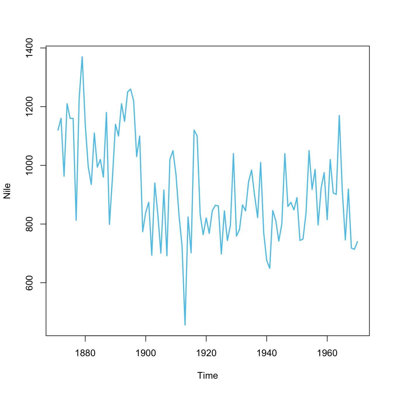
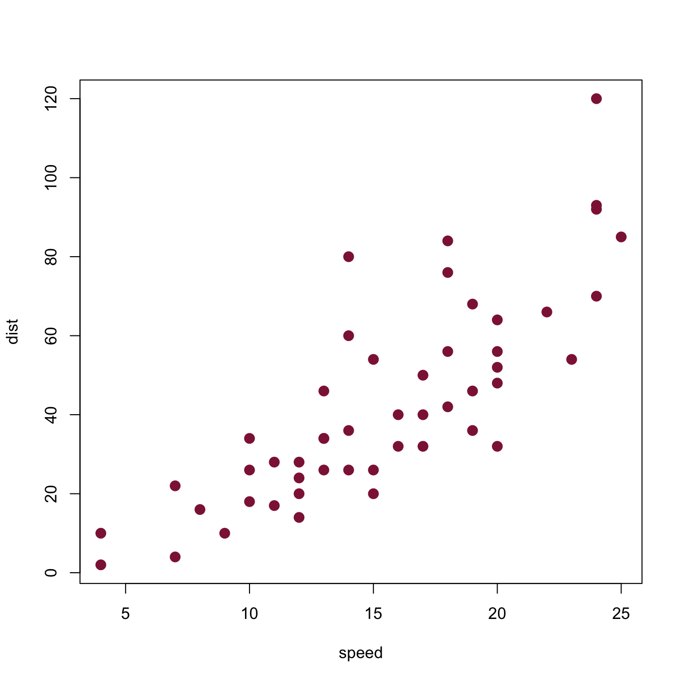
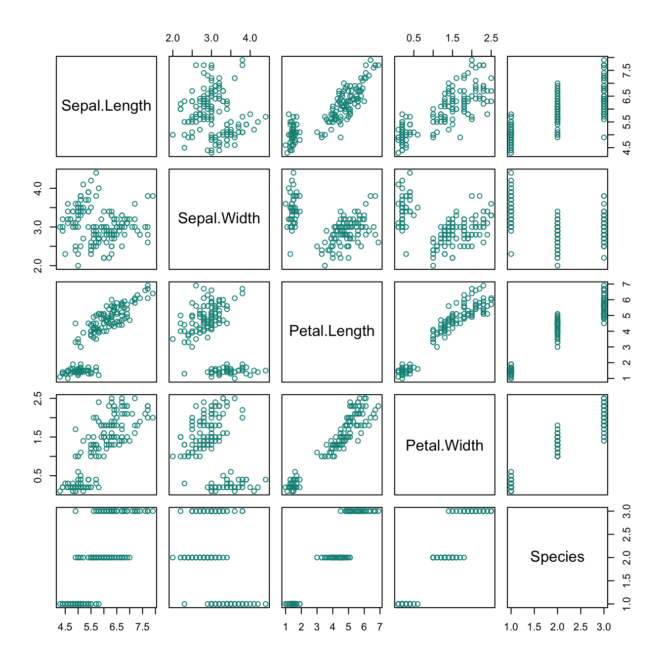
Figure 8.9: Plots created by calling plot(x) with different types of objects x.
-
plot(Nile)plots a time series as a line plot. -
plot(cars)plots a data frame of 50 observations and 2 variables as a scatterplot. -
plot(iris)plots a data frame with 150 cases and 5 variables (4 numeric, 1 character) as 5x5 scatterplots. -
plot(Titanic)plots the counts of 4 categorical variables as a (complex) mosaic plot.
8.5.2 Plotting the Nile
The Nile data of datasets provides a time series.
- Study the documentation of
?Nileand its examples. - Plot the
Niledata and justify your choice of plot.
Solution
As a good start, Figure 8.10 shows some options.
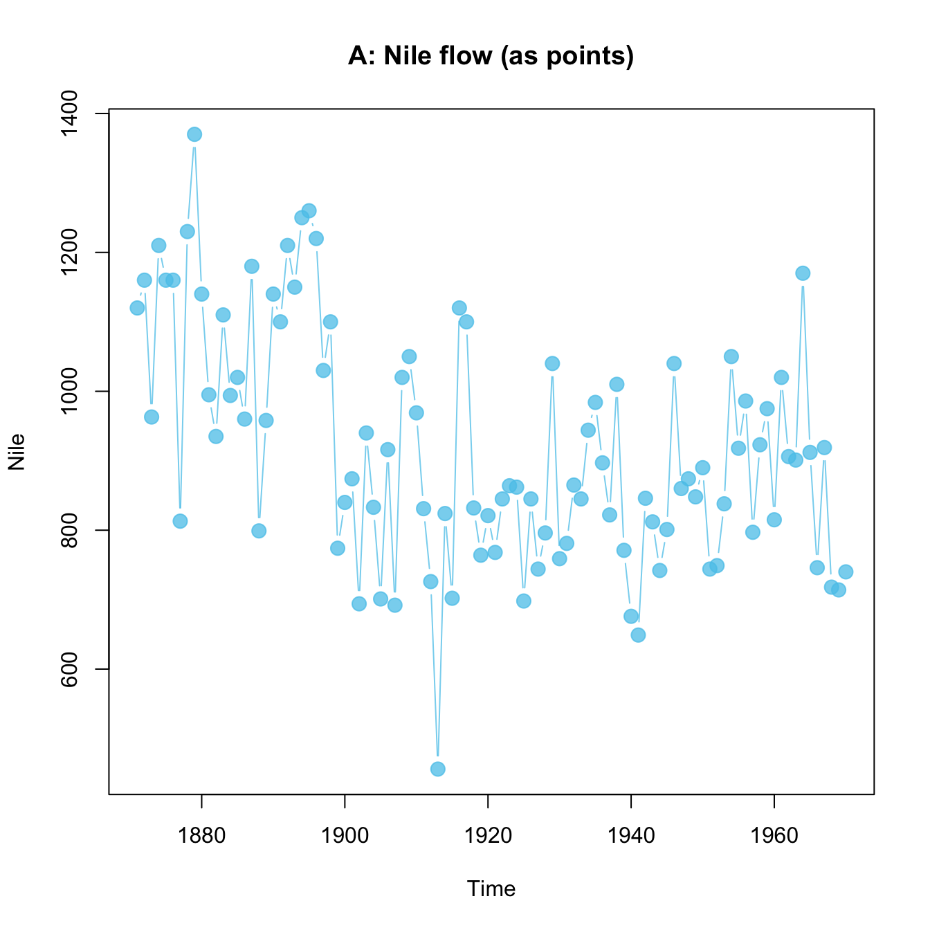
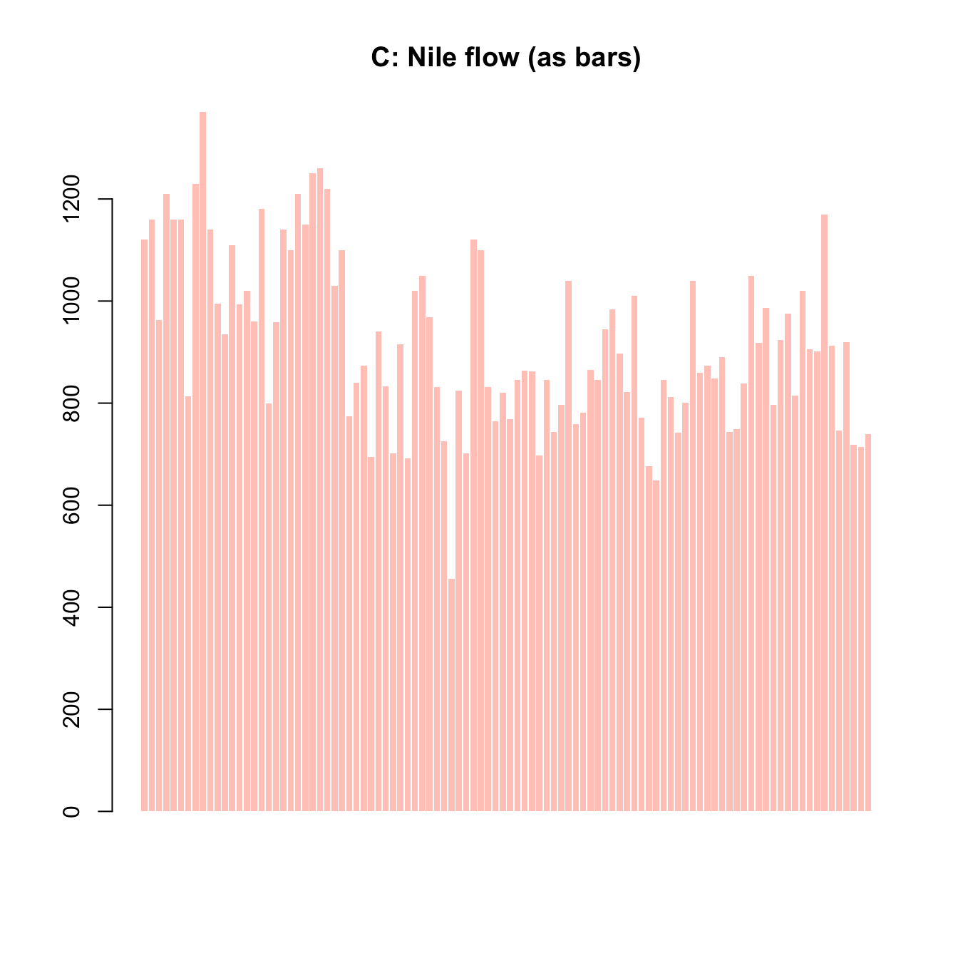
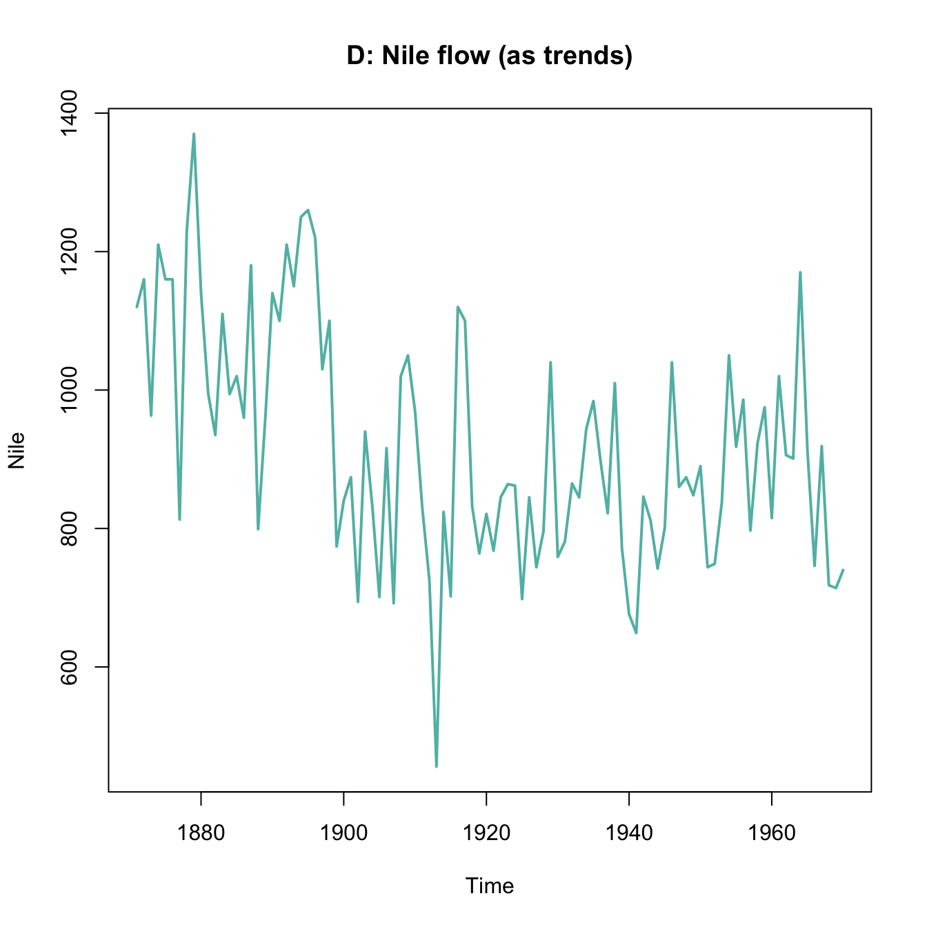
Figure 8.10: Various ways of plotting the Nile data emphasize different aspects.
8.5.3 Plotting a histogram
Using the mpg data from the ggplot2 package, create a histogram that shows the distribution of values of the cty variable (showing a car’s fuel consumption, in miles per gallon (MPG), in the city).
Getting the data:
mpg <- ggplot2::mpgBefore starting to plot anything, we should always first inspect and try to understand our data:
# Print data table:
mpg  # a tibble with 234 cars, 11 variables

# We are interested in the vector
mpg$cty

# Note:
?mpg  # describes the data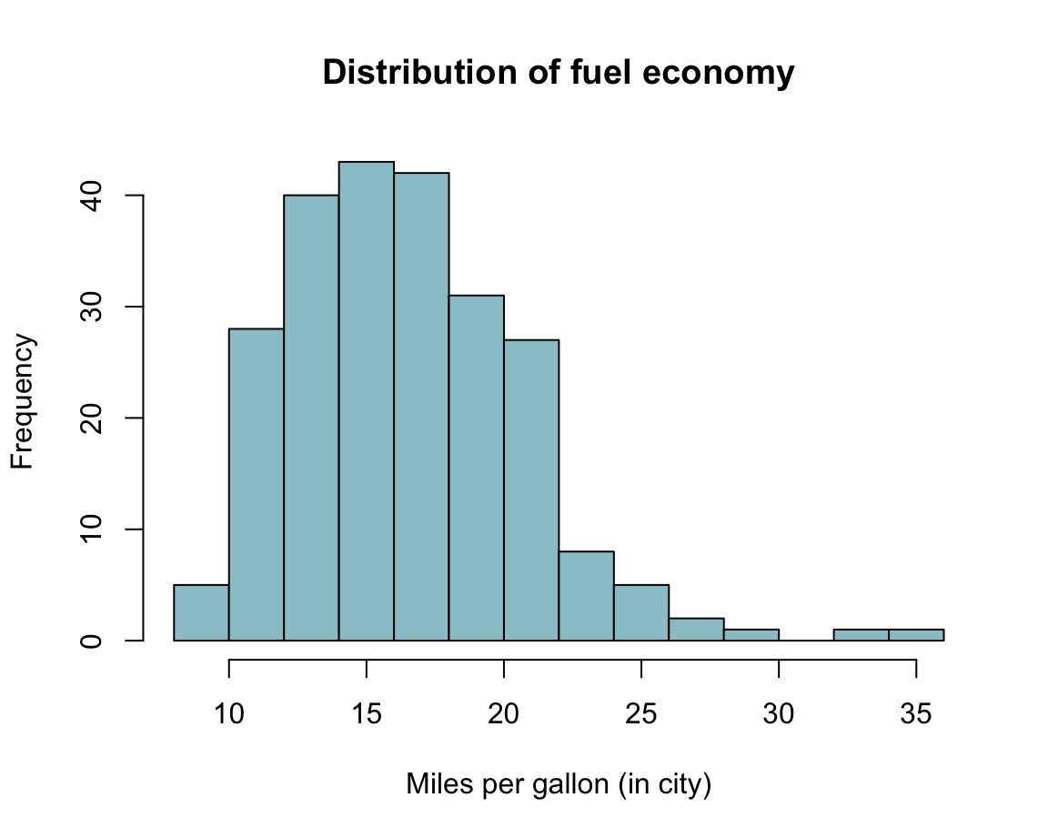
8.5.4 Plotting more mpg data
As a Practice exercise of Section 8.2.2, we used the mpg data of the ggplot2 package to create a scatterplot that showed some car’s fuel consumption on highways (hwy on the y-axis) as a function of its engine displacement (displ on the x-axis).
Pick two alternative variables from
mpg. Would you expect a relationship between those variables?Create a scatterplot or boxplot of the two variables. Why did you choose this type of plot?
What exactly does the plot show? Is there a relationship between both variables?
Can you avoid overplotting?
8.5.5 Plotting bar plots (of election results)
As a Practice exercise of Section 8.2.3, we plotted the share of votes for the two most popular parties of the German Federal elections of 2013 and 2017.
- Include the data from Bundestag election 2021 to plot the corresponding results for three elections (from 2013 to 2021):
- with stacked bars (i.e., one bar per year);
- with bars beside each other (i.e., three bars per year).
Here is the data (as a data frame/tidy tibble):
library(tidyverse)

## (a) Create a tibble of data:
de_new <- data.frame(
    party = c("CDU/CSU", "SPD", "Others"),
    share_2013 = c((.341 + .074), .257, (1 - (.341 + .074) - .257)),
    share_2017 = c((.268 + .062), .205, (1 - (.268 + .062) - .205)),
    share_2021 = c((.189 + .052), .257, (1 - (.189 + .052) - .257))
    )
de_new$party <- factor(de_new$party, levels = c("CDU/CSU", "SPD", "Others"))  # optional
# de_new

## Check that columns add to 100:
# sum(de_new$share_2013)  # => 1 (qed)
# sum(de_new$share_2017)  # => 1 (qed)
# sum(de_new$share_2021)  # => 1 (qed)

## (b) Converting de_new into a tidy tibble:
tb <- de_new %>%
  gather(share_2013:share_2021, key = "election", value = "share") %>%
  separate(col = "election", into = c("dummy", "year")) %>%
  select(year, party, share)

# Choose colors:
my_col <- c("black", "firebrick", "gold")   # three specific colors
# my_col <- sample(x = colors(), size = 3)  # non-partisan alternative

# Show table:
knitr::kable(tb, caption = "Election data (2013--2021).")| year | party | share |
|---|---|---|
| 2013 | CDU/CSU | 0.415 |
| 2013 | SPD | 0.257 |
| 2013 | Others | 0.328 |
| 2017 | CDU/CSU | 0.330 |
| 2017 | SPD | 0.205 |
| 2017 | Others | 0.465 |
| 2021 | CDU/CSU | 0.241 |
| 2021 | SPD | 0.257 |
| 2021 | Others | 0.502 |
Solution
Here is how a solution could look like:
- with bars beside each other:
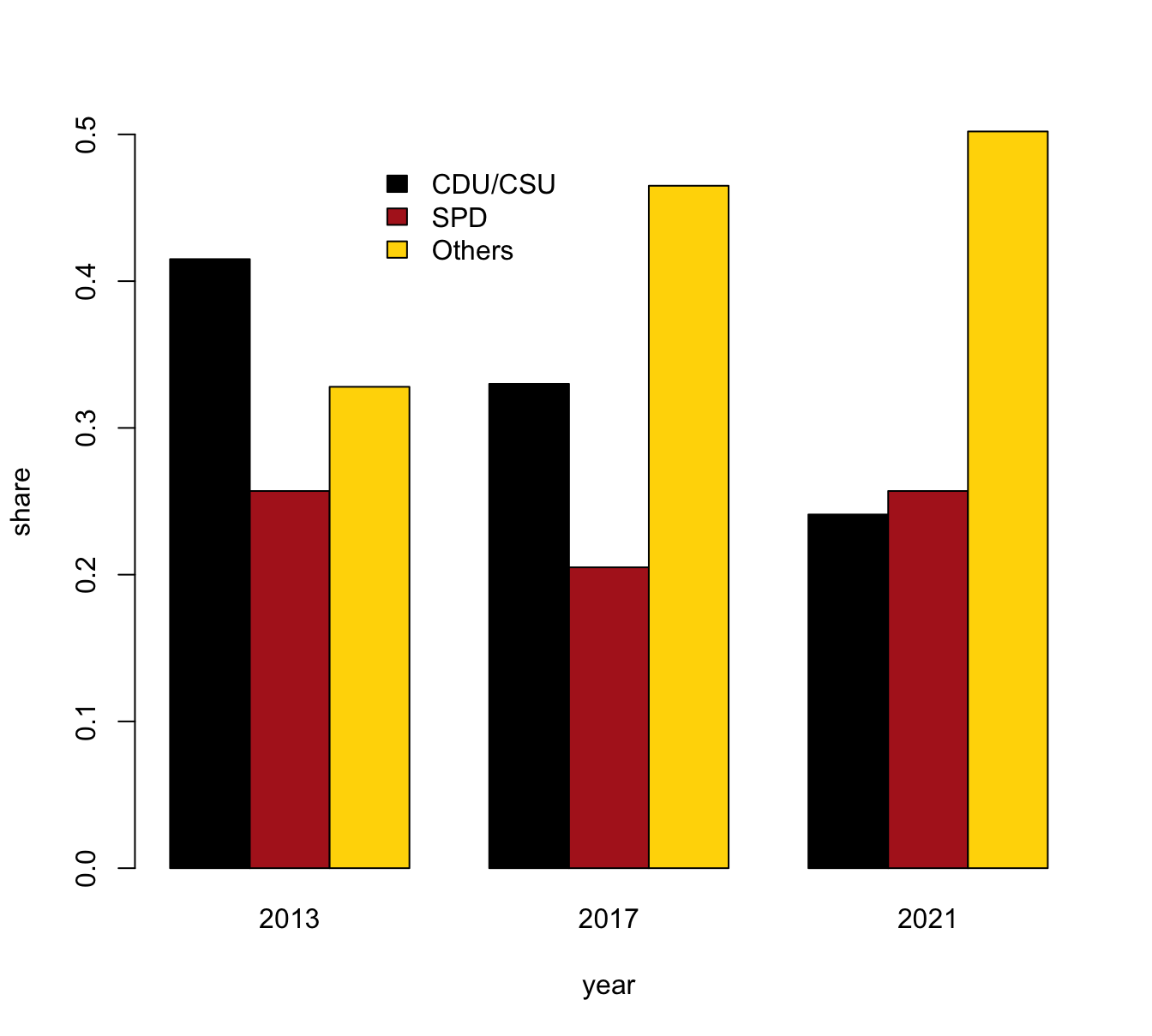
- with stacked bars (i.e., one bar per year):
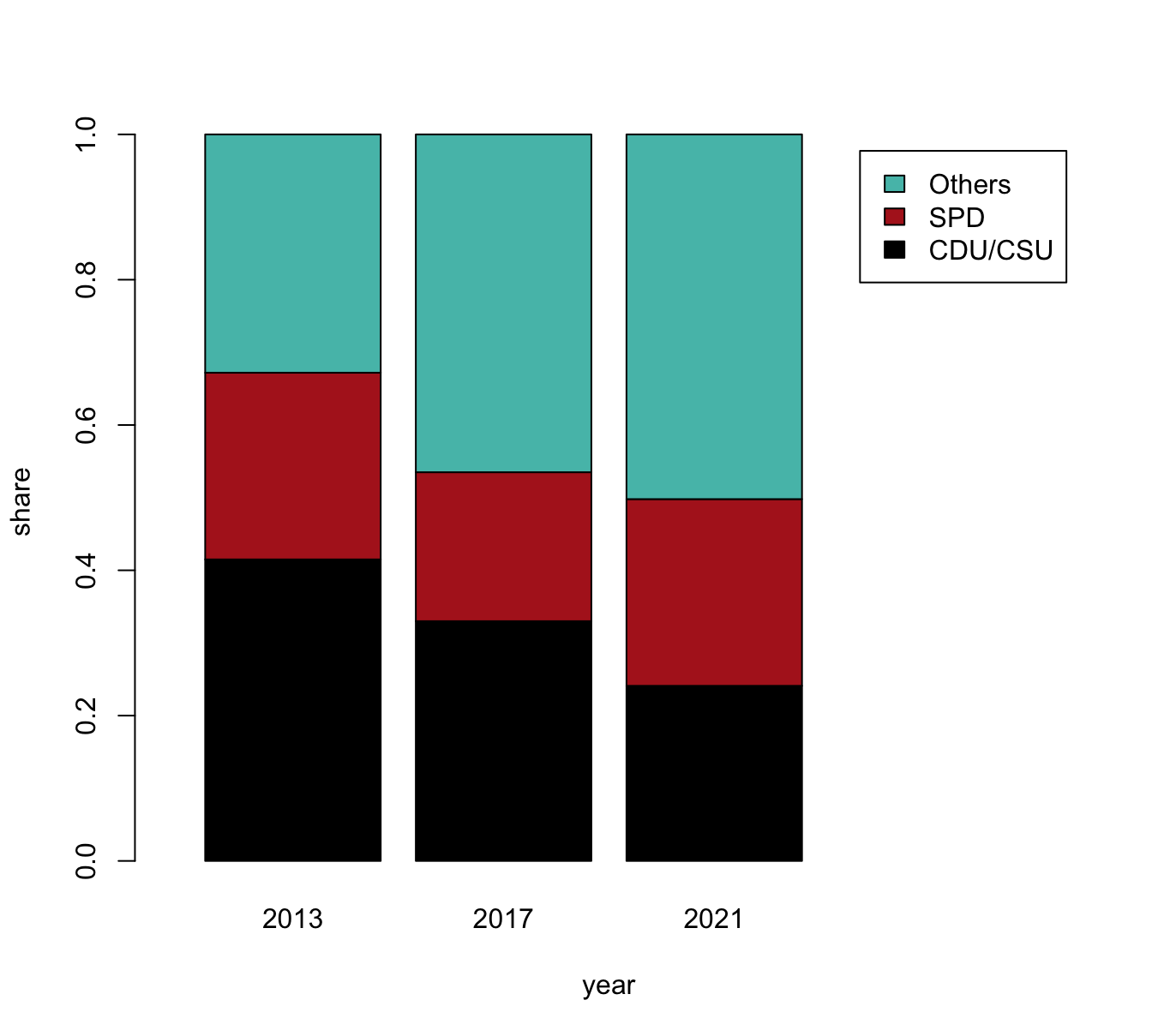
Note that the vector my_col was set to three specific colors to facilitate the interpretation of this plot.
Interestingly, changing ranks of the third and fourth most popular parties made this choice more difficult for this visualization.
Anyone objecting to this choice is welcome to select different colors, or trying out random colors (e.g., by setting my_col to sample(x = colors(), size = 3)).
- Bonus: Try extending the plot(s) to show the percentage of 2nd votes for all parties.
8.5.6 Plotting air quality data
Using the airquality data (included in datasets):
aq <- tibble::as_tibble(datasets::airquality)- Create a boxplot and two raw data plots:
Plot the values of Ozone as a function of Month in three ways:
- (a) as a boxplot
- (b) as a raw data plot (with jittered and transparent points)
- (c) as a combination of (a) and (b)
- Combining scatterplots:
Create three scatterplots of the levels of Ozone by
- (a)
Solar.R - (b)
Temp - (c)
Wind
Add a linear regression line for each subplot. Try combining all three plots in one figure.
Solution
The following plots show possible solutions:
- Create a boxplot and two raw data plots:
Plot the values of Ozone as a function of Month in three ways:
- (a) A boxplot:
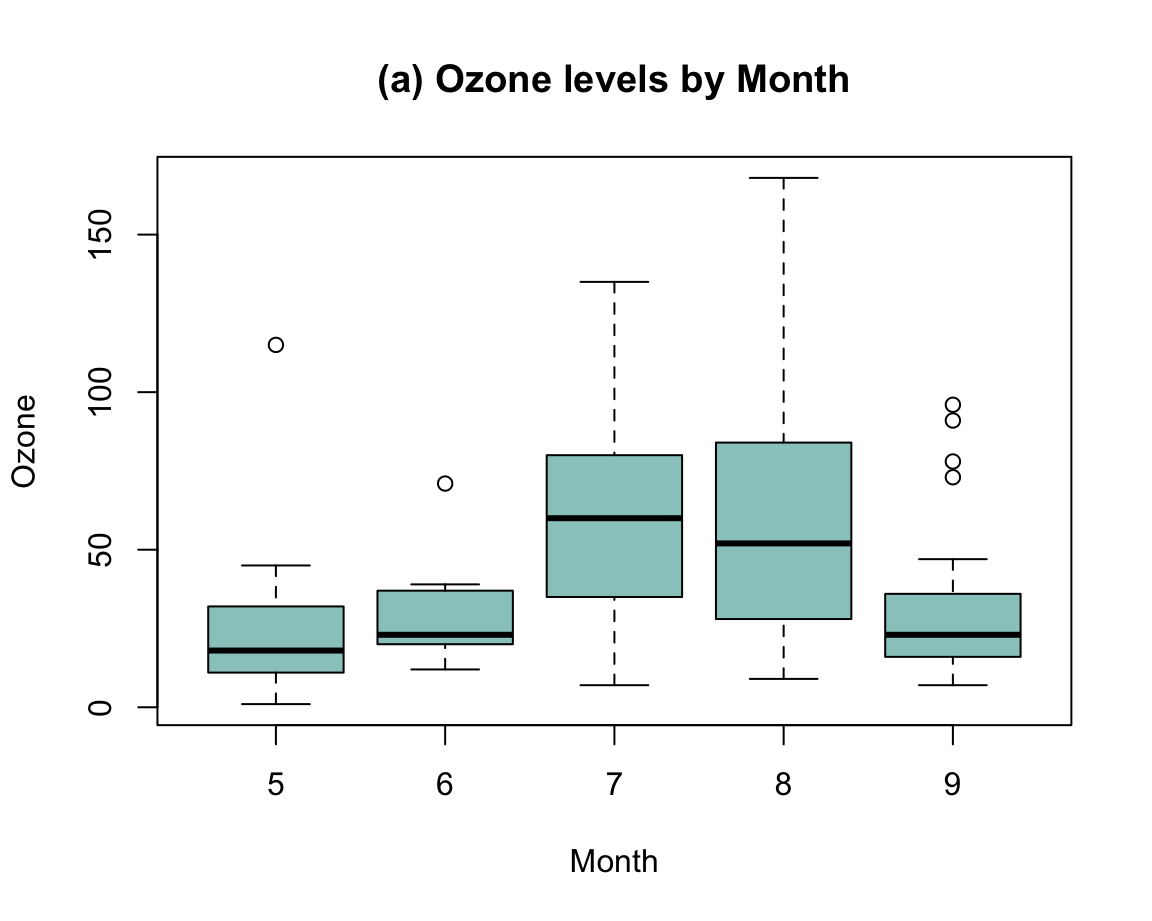
- (b) A raw data plot:
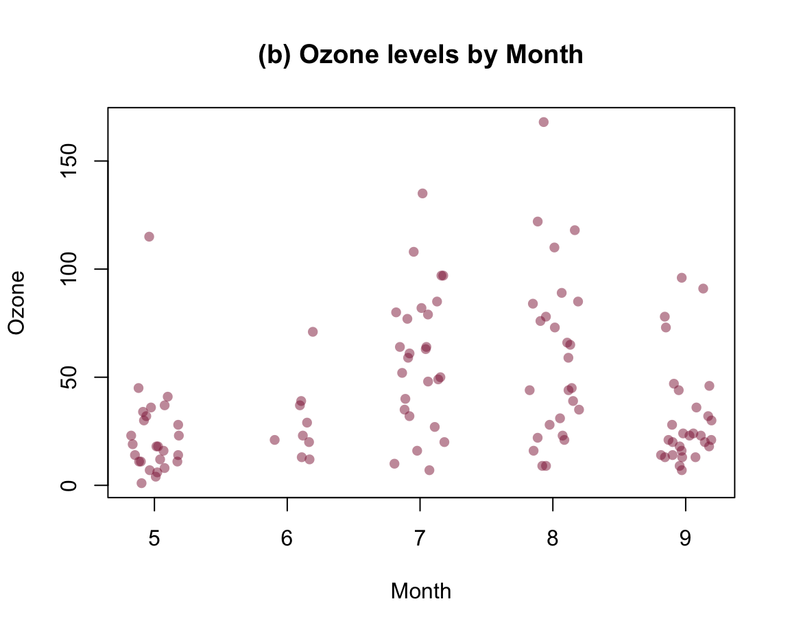
- (c) Combination:
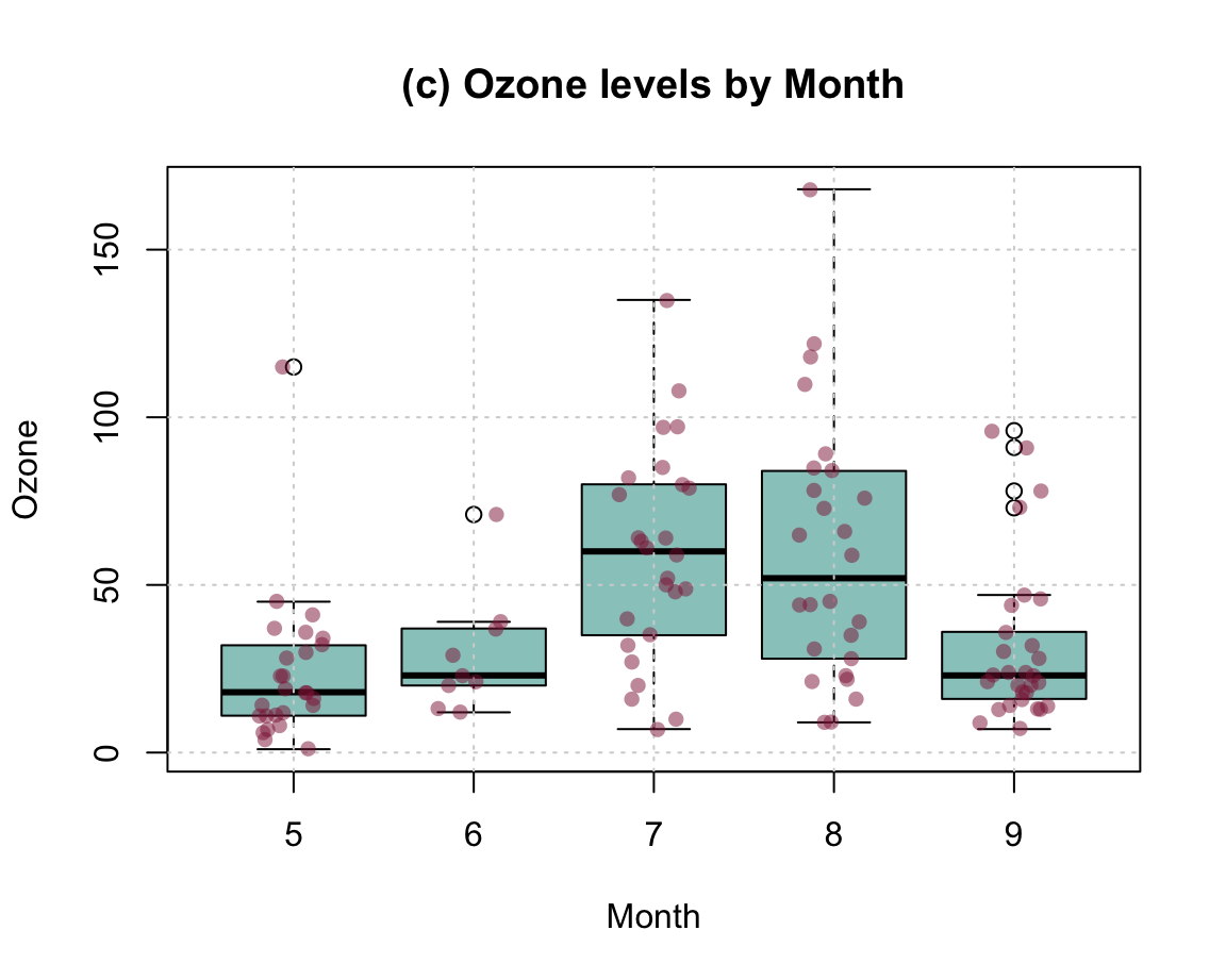
- Combining scatterplots:
Create three scatterplots of the levels of Ozone by
- (a)
Solar.R - (b)
Temp - (c)
Wind
Add a linear regression line for each subplot. Try combining all three plots in one figure.
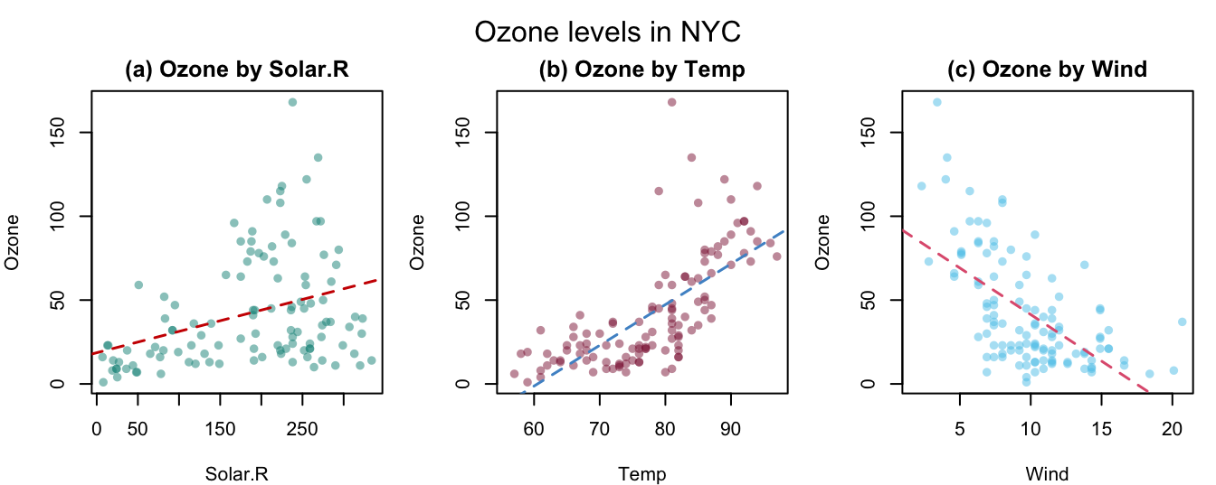
Bonus exercises
The following exercises (marked as Bonus) are optional (i.e., not required for passing this course).
8.5.7 Bonus: Plotting lake levels
Find a site showing historic trends of the Bodensee’s lake level (e.g., at Bodenseee.net) and reconstruct its key data as an R data frame.
Re-create a line plot that allows comparing the current levels with historic benchmarks (min, max, mean, and last year’s value).
Which alternative visualizations would make sense (for answering which question)?
In short, re-create the “Wasserstand Jahresgang” visualization at Bodenseee.net and consider alternative visualizations.
Hint: To do this, you first need to re-create the data from the plot using an x-column for (weekly or monthly) dates and value vectors (as separate columns) for the data series to plot.
8.5.8 Bonus: Plotting expenses (as absolute values vs. proportions)
The bar plots in Exercise 8.5.5 were simplified by the fact that the raw data in tb contained proportions (i.e., vote shares adding up to 100% per election).
By contrast, we often are given a table of raw values that do not add up to a neat sum and may add up to different sums for different categories.
For instance, let’s assume the following table exp contains an account of someone’s monthly expenses:
| Jan | Feb | Mar | Apr | May | Jun | Jul | Aug | Sep | Oct | Nov | Dec | |
|---|---|---|---|---|---|---|---|---|---|---|---|---|
| rent | 410 | 410 | 410 | 420 | 420 | 420 | 440 | 440 | 440 | 440 | 440 | 440 |
| utils | 80 | 80 | 80 | 80 | 90 | 90 | 90 | 90 | 100 | 100 | 100 | 100 |
| food | 120 | 135 | 165 | 150 | 180 | 110 | 75 | 120 | 100 | 95 | 80 | 110 |
| phone | 30 | 15 | 35 | 30 | 20 | 25 | 5 | 10 | 10 | 20 | 15 | 15 |
| fun | 100 | 90 | 70 | 80 | 60 | 75 | 65 | 75 | 45 | 60 | 50 | 40 |
| save | 70 | 75 | 85 | 90 | 60 | 95 | 25 | 55 | 40 | 65 | 30 | 50 |
- Create a corresponding bar plot and discuss why the bars are of different heights. Which comparisons are supported by a plot with the bars beside each other vs. a plot with stacked bars?
Solution
Here’s how two corresponding bar plots look:
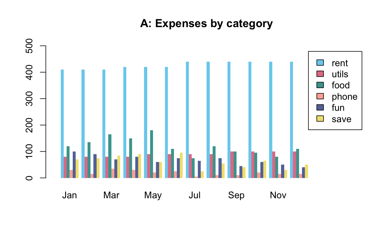
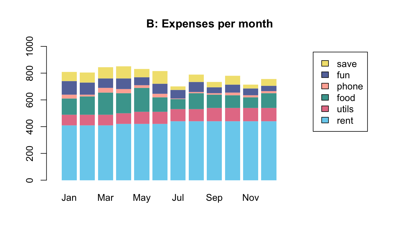
Interpretation:
Plot A (with bars beside each other) allows comparing amounts between different months.
Plot B (with stacked bars) additionally allows comparing total amounts between months.
This shows that the overall amount of expenses appears to be decreasing, although the expenses for rent and utils are increasing.
-
Now assume that we want to compare the proportions of money spent on each expense category per month (similar to the vote shares in different elections in Exercise 8.5.5):
How can we change the plots (or data to be plotted) to show monthly proportions per category, rather than raw values?
What new information does a proportional plot show that was not being shown by the raw data plots? What information is being lost?
Solution
The following plots show possible solutions:
#> [1] TRUE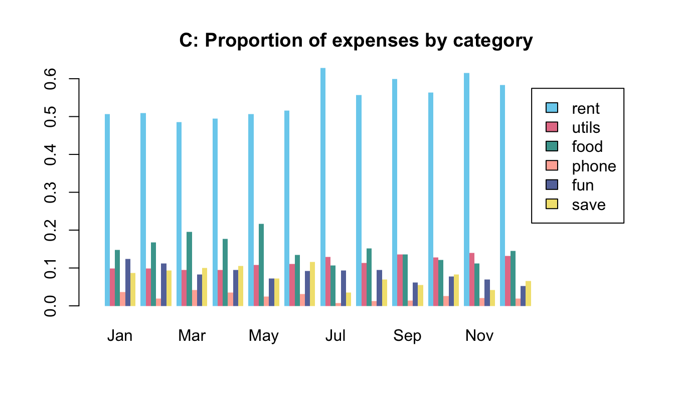
Interpretation:
Not surprisingly, a plot showing the proportions of some category is good for revealing changes or stability in these proportions.
In this example, some proportions show different trends than the raw values.
For instance, whereas the absolute amounts of money spent on the rent and utils were monotonically increasing, the corresponding proportions show no systematic trend and vary only slightly over the year.
Importantly, these benefits in easiliy comparing proportions come at the cost of losing all information regarding the underlying raw values. For instance, if all amounts were tripled in a particular month, Plots A and B would clearly show this, but Plots C and D would not change at all. Thus, whenever being confronted with comparisons between proportions, it’s a useful heuristic to also ask for the raw values. (Note that this also applies to election results, e.g., when comparing vote shares of a big vs. small state.)
8.5.9 Bonus: Plotting curves (for getting even with percentage changes)
Percentage changes have the peculiar property that gains and losses of the same absolute magnitude differ in their nominal amounts. For instance, when an investment loses \(\frac{1}{4} = 25\%\) of its original value, it would have to gain \(\frac{1}{3} \approx 33\%\) to recover its original value.
Use base R to draw a curve that shows the compensatory percentage gain (on the y-axis) for changes from \(-100\%\) to \(+200\%\) (on the x-axis).
Solution
We first derive an equation that expresses \(y\) in terms of \(x\):
- initial value: \(V_0\)
- change by \(x\%\): \(V_1 = V_0 \cdot (1 + x/100)\)
- change by \(y\%\): \(V_2 = V_1 \cdot (1 + y/100)\)
- we want that \(V_2 = V_0\): \(V_0 = V_1 \cdot (1 + y/100) = V_0 \cdot (1 + x/100) \cdot (1 + y/100)\)
- solving for \(y\) yields: \(y = \frac{100^2}{100+x} - 100\)
The following code implements this equation as an R function and checks it for a vector of values v:
# Function:
y_comp <- function(x){100^2/(100+x) - 100}

# Check:
v <- c(-100, -75, -50, -100/3, -20, -10, 0, 10, 20, 100/3, 50, 75, 100, 200)
y_comp(x = v)
#>  [1]        Inf 300.000000 100.000000  50.000000  25.000000  11.111111
#>  [7]   0.000000  -9.090909 -16.666667 -25.000000 -33.333333 -42.857143
#> [13] -50.000000 -66.666667
A corresponding plot could look as follows:
Figure 8.11: The percentage gain/loss required for recovering a loss/gain of x%.
Figure 8.11 shows the non-linear relationship between an initial gain/loss (on the \(x\)-axis) and the compensatory loss/gain (on the \(y\)-axis) when both changes are expressed as percentages of the current amount. As the dashed line markes the line where losses and gains were equal, we see that gains by \(x\%\) are compensated by nominally smaller losses (\(x > |y|\)) and losses by \(x\%\) are compensated by nominally larger gains (\(|x| < y\)). This implies the counterintuitive fact that first gaining and then losing \(x\%\) — or vice versa — results in an overall loss.
8.5.10 Bonus: Anscombe’s quartet
Re-create the Anscombe plots (shown in Figure 7.1) using the data from datasets::anscombe and base R functions.
Solution
Figure 8.12 shows a possible solution:
Figure 8.12: Scatterplots of Anscombe’s quartet.
Hint:
To create Figure 8.12 with base R functions, we need to set the mfrow argument of par() to arrange four plots in two rows and two columns.
The four subsets of datasets::anscombe can then be plotted by four calls to plot(x = datasets::anscombe$x1, y = datasets::anscombe$y1), etc.
8.5.11 Bonus: Re-creating complex plots
Re-create Figure 1.5 (from Section 1.2.3) on the areas of data science.
Re-create (parts of) the Uni Konstanz logo (see the unikn package).
Re-create (parts of) pirateplots in yarrr (see Phillips, 2018).
Re-create (parts of) diagrams in the riskyr package (see https://riskyr.org/ for an interactive version).