9 The Base Plotting System
Watch a video of this chapter: Part 1 Part 2
The core plotting and graphics engine in R is encapsulated in the following packages:
graphics: contains plotting functions for the “base” graphing systems, includingplot,hist,boxplotand many others.grDevices: contains all the code implementing the various graphics devices, including X11, PDF, PostScript, PNG, etc.
The grDevices package was discussed in the previous chapter and it contains the functionality for sending plots to various output devices. The graphics package contains the code for actually constructing and annotating plots.
In this chapter, we focus on using the base plotting system to create graphics on the screen device.
9.1 Base Graphics
Base graphics are used most commonly and are a very powerful system for creating data graphics. There are two phases to creating a base plot:
- Initializing a new plot
- Annotating (adding to) an existing plot
Calling plot(x, y) or hist(x) will launch a graphics device (if one is not already open) and draw a new plot on the device. If the arguments to plot are not of some special class, then the default method for plot is called; this function has many arguments, letting you set the title, x axis label, y axis label, etc.
The base graphics system has many global parameters that can set and tweaked. These parameters are documented in ?par and are used to control the global behavior of plots, such as the margins, axis orientation, and other details. It wouldn’t hurt to try to memorize at least part of this help page!
9.2 Simple Base Graphics
9.2.1 Histogram
Here is an example of a simple histogram made using the hist() function in the graphics package. If you run this code and your graphics window is not already open, it should open once you call the hist() function.
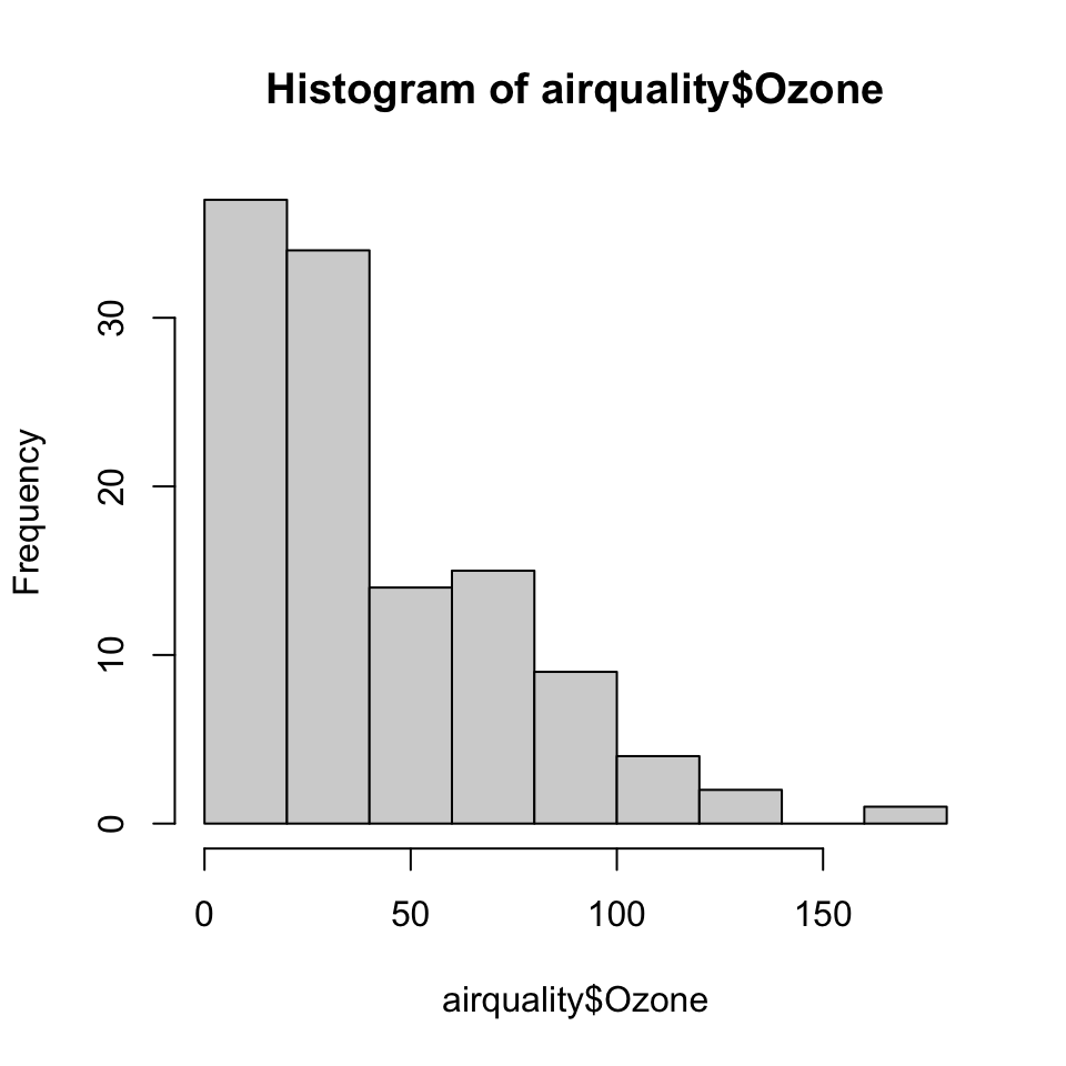
Figure 5.1: Ozone levels in New York City
9.2.2 Boxplot
Boxplots can be made in R using the boxplot() function, which takes as its first argument a formula. The formula has form of y-axis ~ x-axis. Anytime you see a ~ in R, it’s a formula. Here, we are plotting ozone levels in New York by month, and the right hand side of the ~ indicate the month variable. However, we first have to transform the month variable in to a factor before we can pass it to boxplot(), or else boxplot() will treat the month variable as continuous.
> airquality <- transform(airquality, Month = factor(Month))
> boxplot(Ozone ~ Month, airquality, xlab = "Month", ylab = "Ozone (ppb)")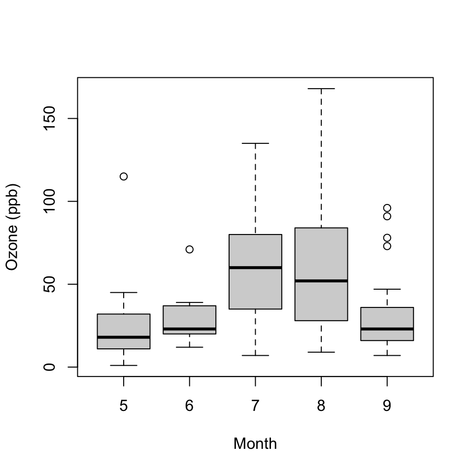
Figure 5.2: Ozone levels by month in New York City
Each boxplot shows the median, 25th and 75th percentiles of the data (the “box”), as well as +/- 1.5 times the interquartile range (IQR) of the data (the “whiskers”). Any data points beyond 1.5 times the IQR of the data are indicated separately with circles.
In this case the monthly boxplots show some interesting features. First, the levels of ozone tend to be highest in July and August. Second, the variability of ozone is also highest in July and August. This phenomenon is common with environmental data where the mean and the variance are often related to each other.
9.2.3 Scatterplot
Here is a simple scatterplot made with the plot() function.
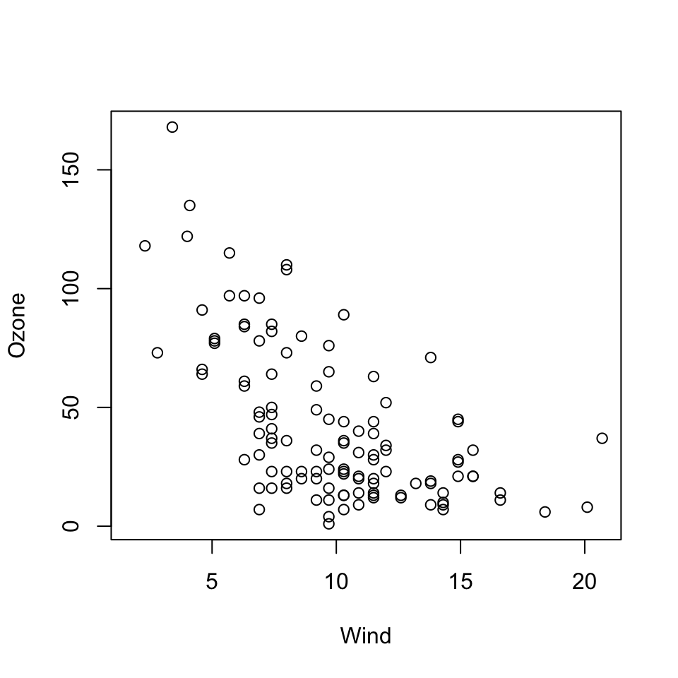
Figure 5.3: Scatterplot of wind and ozone in New York City
Generally, the plot() function takes two vectors of numbers: one for the x-axis coordinates and one for the y-axis coordinates. However, plot() is what’s called a generic function in R, which means its behavior can change depending on what kinds of data are passed to the function. We won’t go into detail about that behavior for now. The remainder of this chapter will focus on the default behavior of the plot() function.
One thing to note here is that although we did not provide labels for the x- and the y-axis, labels were automatically created from the names of the variables (i.e. “Wind” and “Ozone”). This can be useful when you are making plots quickly, but it demands that you have useful descriptive names for the your variables and R objects.
9.3 Some Important Base Graphics Parameters
Many base plotting functions share a set of global parameters. Here are a few key ones:
pch: the plotting symbol (default is open circle)lty: the line type (default is solid line), can be dashed, dotted, etc.lwd: the line width, specified as an integer multiplecol: the plotting color, specified as a number, string, or hex code; thecolors()function gives you a vector of colors by namexlab: character string for the x-axis labelylab: character string for the y-axis label
The par() function is used to specify the global graphics parameters
that affect all plots in an R session. These parameters can be
overridden when they are specified as arguments to specific plotting functions.
las: the orientation of the axis labels on the plotbg: the background colormar: the margin sizeoma: the outer margin size (default is 0 for all sides)mfrow: number of plots per row, column (plots are filled row-wise)mfcol: number of plots per row, column (plots are filled column-wise)
You can see the default values for global graphics parameters by calling the par() function and passing the name of the parameter in quotes.
Here are some more default values for global graphics parameters.
For the most part, you usually don’t have to modify these when making quick plots. However, you might need to tweak them for finalizing finished plots.
9.4 Base Plotting Functions
The most basic base plotting function is plot(). The plot() function makes a scatterplot, or other type of plot depending on the class of the object being plotted. Calling plot() will draw a plot on the screen device (and open the screen device if not already open). After that, annotation functions can be called to add to the already-made plot.
Some key annotation functions are
lines: add lines to a plot, given a vector ofxvalues and a corresponding vector ofyvalues (or a 2-column matrix); this function just connects the dotspoints: add points to a plottext: add text labels to a plot using specified x, y coordinatestitle: add annotations to x, y axis labels, title, subtitle, outer marginmtext: add arbitrary text to the margins (inner or outer) of the plotaxis: adding axis ticks/labels
Here’s an example of creating a base plot and the adding some annotation. First we make the plot with the plot() function and then add a title to the top of the plot with the title() function.
> library(datasets)
>
> ## Make the initial plot
> with(airquality, plot(Wind, Ozone))
>
> ## Add a title
> title(main = "Ozone and Wind in New York City") 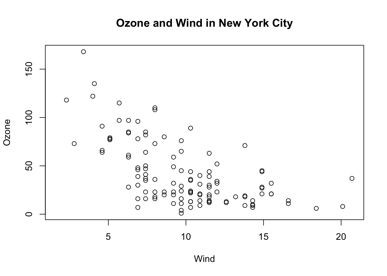
Figure 5.6: Base plot with annotation
Here, I start with the same plot as above (although I add the title right away using the main argument to plot()) and then annotate it by coloring blue the data points corresponding to the month of May.
> with(airquality, plot(Wind, Ozone, main = "Ozone and Wind in New York City"))
> with(subset(airquality, Month == 5), points(Wind, Ozone, col = "blue"))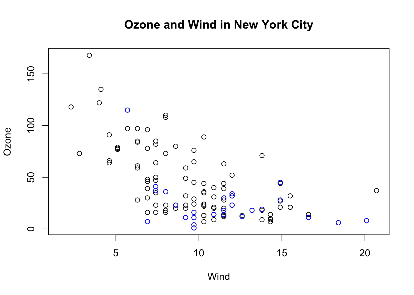
Figure 5.7: Base plot with annotation
The following plot colors the data points for the month of May blue and colors all of the other points red.
Notice that when constructing the initial plot, we use the option type = "n" in the call to plot(). This is a common paradigm as plot() will draw everything in the plot except for the data points inside the plot window. Then you can use annotation functions like points() to add data points. So here, we create the plot without drawing the data points, then add the blue points and then add the red points. Finally, we add a legend with the legend() function explaining the meaning of the different colors in the plot.
> with(airquality, plot(Wind, Ozone, main = "Ozone and Wind in New York City", type = "n"))
> with(subset(airquality, Month == 5), points(Wind, Ozone, col = "blue"))
> with(subset(airquality, Month != 5), points(Wind, Ozone, col = "red"))
> legend("topright", pch = 1, col = c("blue", "red"), legend = c("May", "Other Months"))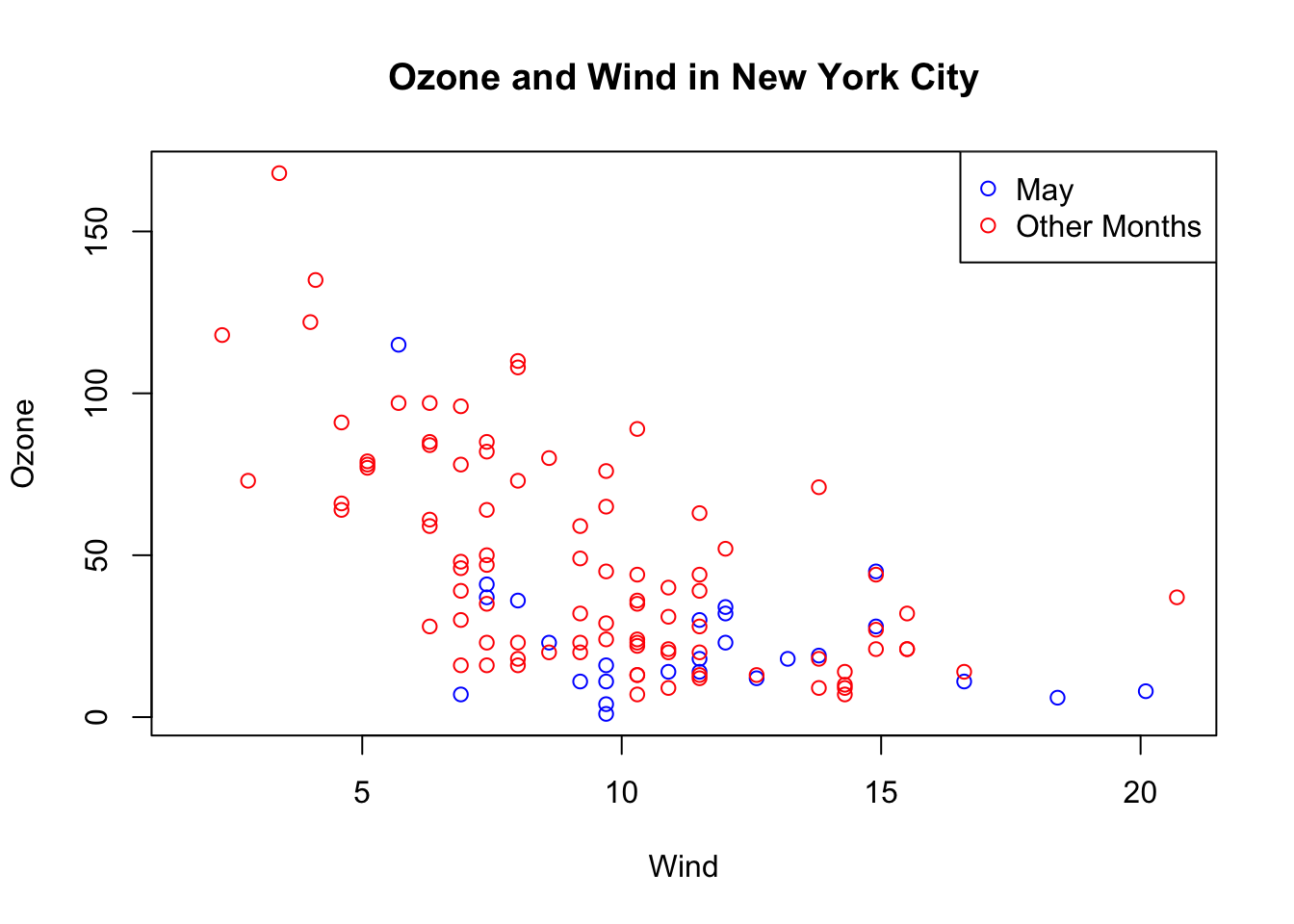
Figure 5.8: Base plot with multiple annotations
9.5 Base Plot with Regression Line
It’s fairly common to make a scatterplot and then want to draw a simple linear regression line through the data. This can be done with the abline() function.
Below, we first make the plot (as above). Then we fit a simple linear regression model using the lm() function. Here, we try to model Ozone as a function of Wind. Then we take the output of lm() and pass it to the abline() function which automatically takes the information from the model object and calculates the corresponding regression line.
Note that in the call to plot() below, we set pch = 20 to change the plotting symbol to a filled circle.
> with(airquality, plot(Wind, Ozone, main = "Ozone and Wind in New York City", pch = 20))
>
> ## Fit a simple linear regression model
> model <- lm(Ozone ~ Wind, airquality)
>
> ## Draw regression line on plot
> abline(model, lwd = 2)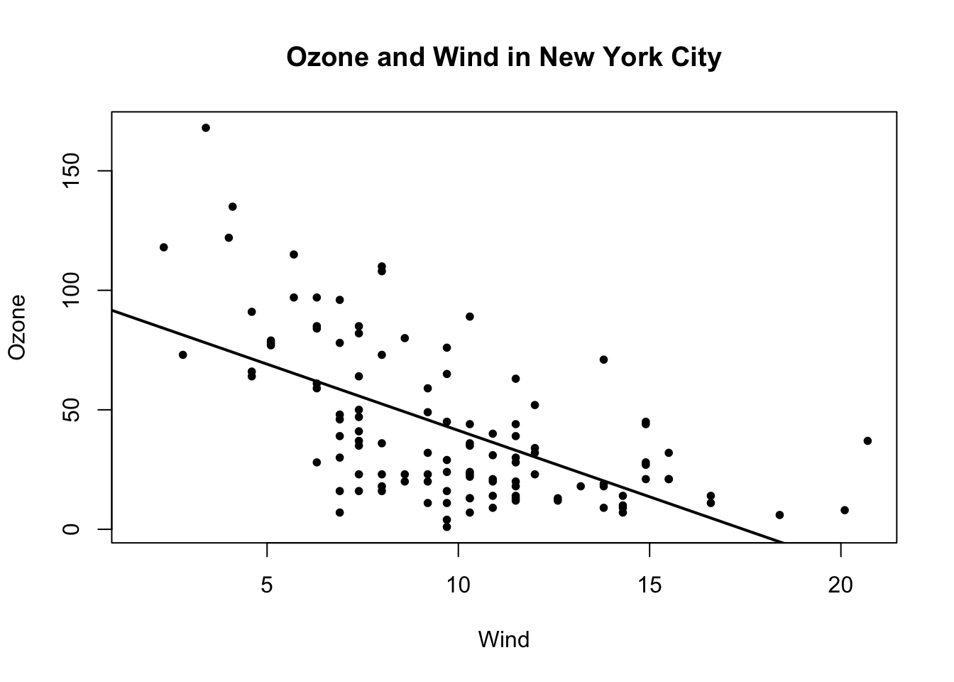
Figure 5.9: Scatterplot with linear regresion line
9.6 Multiple Base Plots
Making multiple plots side by side is a useful way to visualize many relationships between variables with static 2-D plots. Often the repetition of data across a single plot window can be a useful way to identify patterns in the data. In order to do this, the mfrow and mfcol parameters set by the par() function are critical.
Both the mfrow and mfcol parameters take two numbers: the number of rows of plots followed by the number of columns. The multiple plots will be arranged in a matrix-like pattern. The only difference between the two parameters is that if mfrow is set, then the plots will be drawn row-wise; if mfcol is set, the plots will be drawn column-wise.
In the example below, we make two plots: one of Ozone and Wind and another with Ozone and Solar.R. We set par(mfrow = c(1, 2)), which indicates that we one row of plots and two columns of plots.
> par(mfrow = c(1, 2))
> with(airquality, {
+   plot(Wind, Ozone, main = "Ozone and Wind")
+   plot(Solar.R, Ozone, main = "Ozone and Solar Radiation")
+ })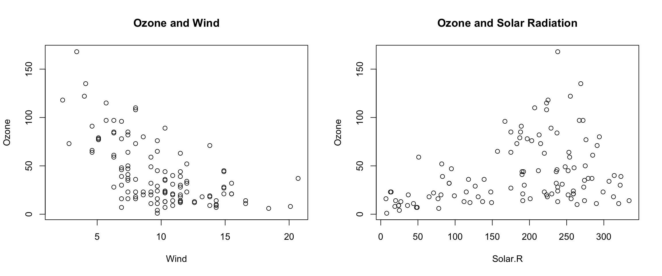
Figure 6.1: Panel plot with two plots
The example below creates three plots in a row by setting par(mfrow = c(1, 3)). Here we also change the plot margins with the mar parameter. The various margin parameters, like mar, are specified by setting a value for each side of the plot. Side 1 is the bottom of the plot, side 2 is the left hand side, side 3 is the top, and side 4 is the right hand side. In the example below we also modify the outer margin via the oma parameter to create a little more space for the plots and to place them closer together.
> par(mfrow = c(1, 3), mar = c(4, 4, 2, 1), oma = c(0, 0, 2, 0))
> with(airquality, {
+   plot(Wind, Ozone, main = "Ozone and Wind")
+   plot(Solar.R, Ozone, main = "Ozone and Solar Radiation")
+   plot(Temp, Ozone, main = "Ozone and Temperature")
+   mtext("Ozone and Weather in New York City", outer = TRUE)
+ })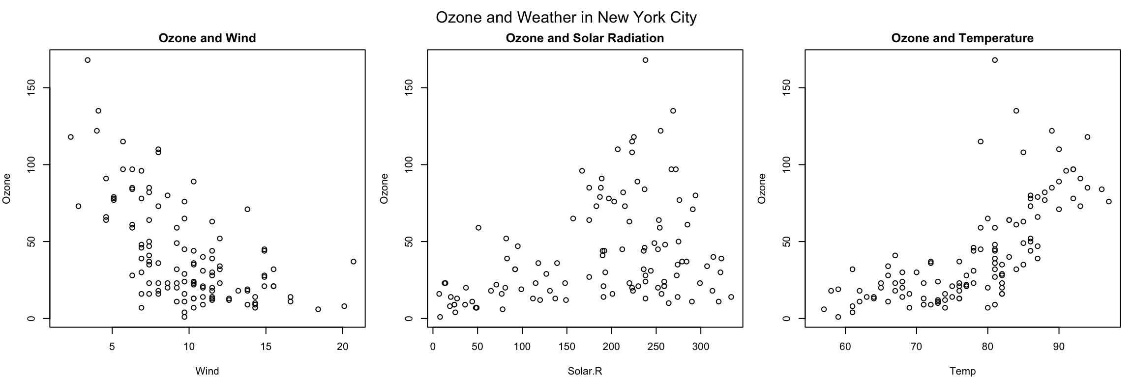
Figure 6.2: Panel plot with three plots
In the above example, the mtext() function was used to create an overall title for the panel of plots. Hence, each individual plot has a title, while the overall set of plots also has a summary title. The mtext() function is important for adding text annotations that aren’t specific to a single plot.
9.7 Summary
Plots in the base plotting system are created by calling successive R functions to “build up” a plot
Plotting occurs in two stages:
  - Creation of a plot
  - Annotation of a plot (adding lines, points, text, legends)
The base plotting system is very flexible and offers a high degree of control over plotting