9 Visualize with ggplot2
This chapter introduces data visualization with the R package ggplot2 (Wickham, Chang, et al., 2025). Essentially, ggplot2 provides an abstract language and powerful toolbox for creating scientific visualizations. If R was not already awesome in itself, ggplot2 would make it worthwhile to learn it.
Please note: Although this chapter is quite long, it still is incomplete. (Blame ggplot2 for being so rich in functionality.)
Preparation
Recommended readings for this chapter include:
Chapter 2: Visualizing data of the ds4psy book (Neth, 2025a)
Chapter 3: Data visualisation of the r4ds book (Wickham & Grolemund, 2017), or Chapter 1: Data visualization of its 2nd edition (Wickham, Çetinkaya-Rundel, et al., 2023)
Preflections
Each element of a visualization (e.g., a line or shape) has both a form (aesthetic or visual appearance) and serves a function (goal or purpose). The following questions address the difference between form and function the context of visualizations:
- What are common functional elements of visualizations?
- What is the relation between data and those elements?
- What are aesthetic features of visualizations?
- How can aesthetic features reflect or emphasize features of the data?
Whereas the form of visual elements seems obvious (but includes features like color, shape, or size), their function and relation to data remains abstract and difficult to describe. But abstraction is helpful for discovering the patterns or principles that organize some phenomenon. A useful heuristic for identifying functions of visual elements is asking questions like: “What does this element (aim to) show?” and “How does it achieve this?”
9.1 Introduction
The ggplot2 package (Wickham, Chang, et al., 2025) and the corresponding book ggplot2: Elegant graphics for data analysis (Wickham, 2016) provide an implementation of The Grammar of Graphics (Wilkinson, 2005), which develops a systematic way of thinking about — or a language and philosophy of — data visualization. The notion of a “grammar” is one that we are familiar with (e.g., when studying a foreign language), but its exact meaning remains difficult to define. Wilkinson (2005) notes that a grammar provides the rules that make languages expressive. The essence of a grammar is to specify how elementary components can be combined to create well-formed expressions. Thus, knowing the grammar of a language allows us to combine elementary concepts (e.g., nouns and verbs) into sentences (e.g., assertions and questions) to express some meaning (e.g., “I am happy.”, “Is this fun?”). Similarly, learning the grammar of graphics will allow us to express aspects of our data by creating visualizations.
Learning how to use ggplot2 is — just like learning a new language — a journey, rather than a destination.
Just as we can learn and use sentences of a foreign language without being fully aware of its grammatical rules, we will start using the functions of ggplot2 to visualize data without understanding all details.
Hence, we should not be surprised if some concepts and relations remain somewhat obscure for a while.
Fortunately, there is no need to understand all about the ggplot() function to create awesome visualizations with it.
9.1.0.1 Terminology
Distinguishing ggplot2 from ggplot():
ggplot and ggplot2 denote R packages (currently in its version ggplot2 4.0.1), whereas
ggplot()is the main function of those packages for generating a visualization.
Beyond this technical distinction, the grammar of graphics includes many new concepts:
mapping data variables to visual aspects or dimensions (e.g., axes, groups);
distinguish a range of geoms (i.e., geometric objects, e.g., areas, bars, lines, points) that transform data via statistics (
statarguments orstat_*functions);aesthetic features (e.g., colors, shapes, sizes) and descriptive elements (e.g., text captions, labels, legend, titles);
combining graphical elements into layers and viewing different facets of a visualization.
We will explain those terms when we encounter and need them, but using their corresponding functions is more important than explicit knowledge of their definitions.
9.1.1 Contents
This chapter provides an introduction to the ggplot2 package (Wickham, Chang, et al., 2025). It covers some basic types of visualizations (e.g., histograms, bar charts, box plots, line plots, and scatterplots), shows how they can be improved by adding aesthetic features (e.g., colors, labels, and themes), and discusses more advanced aspects (e.g., by combining layers, using facets, and extensions).
The following table provides a first mapping of visualization tasks to common types of visualizations. Importantly, we organize this chapter by visualization tasks, rather than visualization types. The reason for this is quite simple: Multiple types of visualizations can solve the same task.
| Task: Visualize… | Type of visualization | In ggplot2 |
|---|---|---|
| distributions | histogram | ? |
| summaries | bar chart | ? |
| box plot | ? | |
| relations | scatterplot | ? |
| line plot | ? | |
| trend line | ? |
The question marks in the final column of the table require ggplot2 functions that solve the task at hand by creating a corresponding type of visualization. The bulk of this chapter will introduce geometric objects (so-called geoms) that create some type of visualization. Each geom function comes with some required and some optional arguments that can either be set to constant values or mapped to a data variable. Thus, learning the language of ggplot2 involves some knowledge of its grammar and vocabulary. While the grammar requires some understanding of the layered structure of visualizations, the vocabularly mostly consists of geoms and their required arguments.
9.1.2 Data and tools
This chapter primarily uses the functions of the ggplot2 package:
but also some related packages:
library(patchwork)  # for combining and arranging plots
library(unikn)      # for colors and color functions
In addition to using data from the datasets and ggplot2 packages, we use the penguins dataset
from the palmerpenguins package (Horst et al., 2022):
library(palmerpenguins) # for penguins dataThere is no particular reason for using this data, other than penguins are easier to love than most other referents of data. (We will use people data in some exercises.)
9.2 Essentials of ggplot2
An obstacle to many technologies is that insiders tend to converse in special terms that appear to obscure rather than reveal insight. In this respect, ggplot2 is no exception. Fortunately, the number of needed terms is limited and the investment is worthwhile.
Before we can plot our first visualizations, we inspect the layered structure of visualizations created by ggplot2, introduce a minimal code template for ggplot() commands, explain some related terminology, and explicate a requirement on the input data that defines our plot.
9.2.1 The structure of ggplot2 plots
Figure 9.1 illustrates the layered structure of plots created by ggplot2:
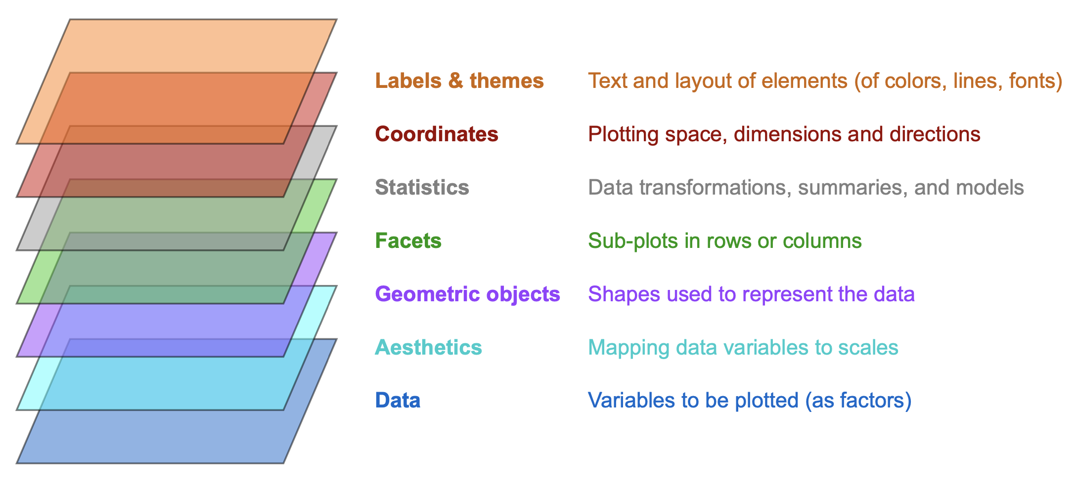
Figure 9.1: The layered structure of plots in ggplot2 (adapted from the Introduction to ggplot2).
Many terms of Figure 9.1 will initially seem a bit strange and technical. At this point, we only need to realize that every visualization (e.g., a bar chart) is based on data, which is transformed in some way (e.g., summarized for each level of some variable) and represented by geometric objects (e.g., rectangular shapes) with aesthetic features (colors and sizes) and further explained by text elements (e.g., labels and titles).
In ggplot2, a visualization is conceptualized as the combination of multiple layers.
As each layer identifies a key ingredient, the rules for their combination provides a general language for creating visualizations.
To create a particular plot, we must learn to specify the details of each layer — or hope for sensible default values.
9.2.2 A minimal template
Generally speaking, a plot takes some <DATA> as input and creates a visualization by mapping data variables or values to (parts of) geometric objects.
A minimal template of a ggplot() command can be reduced to the following structure:
# Minimal ggplot template:
ggplot(<DATA>) +              # 1. specify data set to use
  <GEOM_fun>(aes(<MAPPING>))  # 2. specify geom + variable mapping(s)
The minimal template includes the following elements:
The
<DATA>supplied to thedataargument is usually a data frame or tibble that contains all variables to be plotted and is shaped in a suitable form (see below).
Its variable names are the levers by which the data values are being mapped to the plot.<GEOM_fun>is a function that maps data to a geometric object (“geom”) according to an aesthetic mapping that is specified inaes(<MAPPING>). A mapping specifies a relation between two entities. Here, the mapping specifies the correspondence of variables to graphical elements, i.e., what goes where.-
A geom’s visual appearance is controlled by aesthetics (e.g., colors, shapes, sizes, …) and can be customized by keyword arguments (e.g.,
color,fill,shape,size…). There are two general ways and positions to do this:- within the aesthetic mapping (when varying visual features as a function of data properties), or
- by setting its arguments to specific values in
<arg_1 = val_1, ..., arg_n = val_n>(when remaining constant).
Note that the functions that make up a ggplot() expression (which are typically positioned on separate lines) are connected by the + operator, rather than some other pipe operator.
9.2.3 Terminology
The two abstract notions that are most relevant in the context of the ggplot2 package are geoms and mapping.
Geometric objects
Basic types of visualizations in ggplot2 involve geometric objects (so-called geoms), which are accessed via dedicated functions (<GEOM_fun>).
When viewing ggplot2 as a language for creating visualizations, geoms provide our main vocabulary (e.g., the concepts that need to be linked to create well-formed sentences).
Thus, when first encountering ggplot2, it makes sense to familiarize ourselves with some basic geom functions that create key types of visualizations.
Just like other R functions, geoms require specific input arguments to work.
As we get more experienced, we will realize that geoms can be combined to create more complex plots and can invoke particular computations (so-called stats).
Mapping data to visual elements
When creating visualizations, the main regularity that beginners tend to struggle with is to define the mapping between data and elements of the visualization. The notion of a mapping is a relational concept that essentially specifies what goes where. The what part typically refers to some part of the data (e.g., a variable), whereas the where part refers to some aspect or part of the visualization (e.g., an axis, geometric object, or aesthetic feature).
Beyond these basic concepts, additional terms that matter in the context of ggplot2 are layers, aesthetics, facets, stats, and themes. Rather than explicitly defining each of these concepts, we will learn to use them when we need them.
An important requirement of ggplot() is that the to-be-plotted data must be in the right format (i.e., shape). Whereas this requirement often remains implicit (when the data is provided by a textbook or tutorial), it often is the biggest hurdle for using ggplot2 for visualizing one’s own data.
Data format
The <DATA> provided to the data argument of the ggplot() function must be rectangular table (i.e., a data.frame or tibble).
Beyond this data type, ggplot() assumes that the data is formatted in a specific ways (in so-called “long” format, using factor variables to describe measurement values).
Essentially, this format ensures that some variables characterizes or describes the values of other variables.
In most sciences, we can distinguish between control variables (e.g., a person’s age, education, gender, or income), independent variables (e.g., different experimental conditions or treatments), and dependent variables (e.g., some test or performance score).
When these three types are represented as different variables (so that the values of each individual is stored in a row of data), the values of control and independent variables can be thought of as characterizing or describing the value of the dependent variable.
Another way of viewing this is that the control and independent variables provide “handles” that allow to sort or group the values of the dependent variables.
At this point, we do not need to worry about this and just work with existing sets of data that happen to be in the right shape. (We will discuss corresponding data transformations in Chapter 14 on Tidying data.)
The data used in the subsequent examples is copied from the penguins object of the palmerpenguins package (Horst et al., 2022).
This data provides basic measurements of three species of penguins that were observed on islands of the Palmer Archipelago, Antarctica (Figure 9.2):
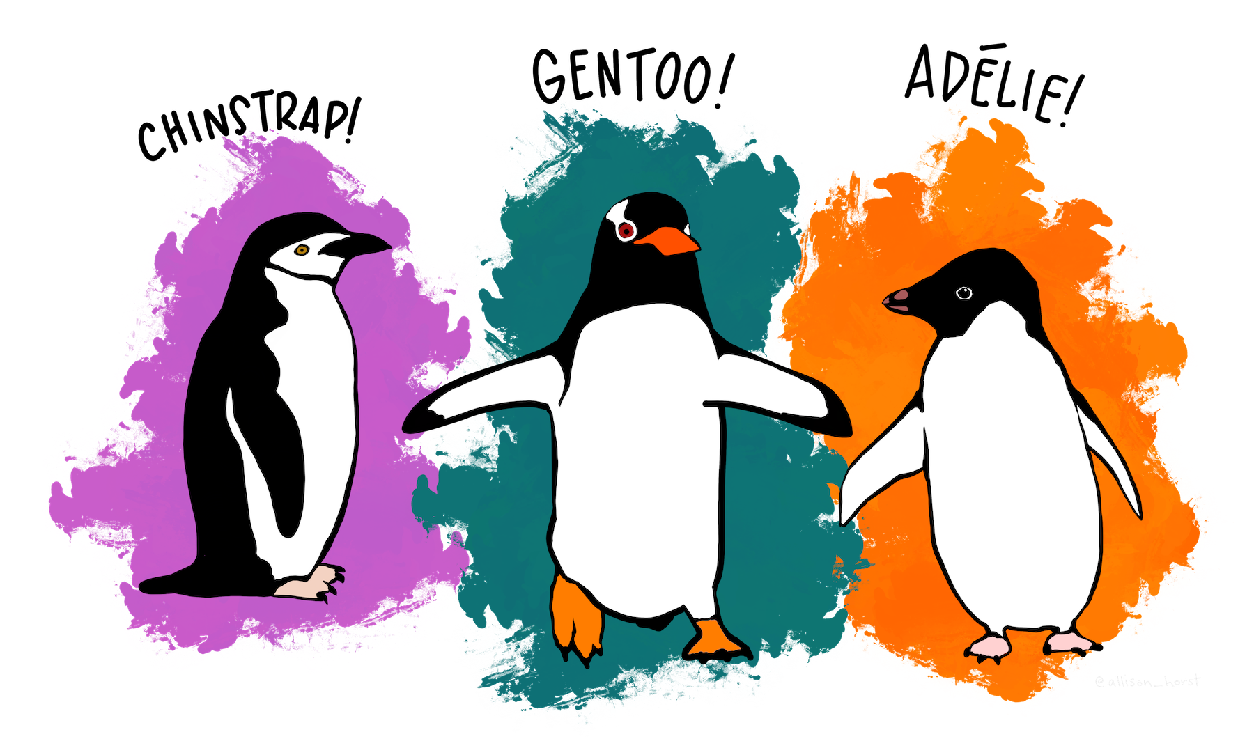
Figure 9.2: Meet the penguins of the Palmer Archipelago, Antarctica. (Artwork by @allison_horst.)
For convenience, we assign the penguins data to an R object pg and inspect it:
# Data:
pg <- palmerpenguins::penguins

# Inspect data:
dim(pg)
#> [1] 344   8

# Compact structure:
# str(pg)

# Print some cases:
set.seed(100)  # for reproducible randomness
s <- sample(1:nrow(pg), size = 10)
knitr::kable(pg[s, ], caption = "10 random cases (rows) of the `penguins` data.")| species | island | bill_length_mm | bill_depth_mm | flipper_length_mm | body_mass_g | sex | year |
|---|---|---|---|---|---|---|---|
| Gentoo | Biscoe | 45.2 | 15.8 | 215 | 5300 | male | 2008 |
| Adelie | Biscoe | 45.6 | 20.3 | 191 | 4600 | male | 2009 |
| Gentoo | Biscoe | 50.1 | 15.0 | 225 | 5000 | male | 2008 |
| Adelie | Torgersen | NA | NA | NA | NA | NA | 2007 |
| Chinstrap | Dream | 49.7 | 18.6 | 195 | 3600 | male | 2008 |
| Chinstrap | Dream | 49.8 | 17.3 | 198 | 3675 | female | 2009 |
| Adelie | Dream | 40.3 | 18.5 | 196 | 4350 | male | 2008 |
| Adelie | Torgersen | 38.9 | 17.8 | 181 | 3625 | female | 2007 |
| Gentoo | Biscoe | 47.3 | 15.3 | 222 | 5250 | male | 2007 |
| Chinstrap | Dream | 43.2 | 16.6 | 187 | 2900 | female | 2007 |
The table shows the names of the 8 variables in our pg data, which are rather self-explanatory.
For instance, the levels of the factor variables species and island can be used to group the other values (e.g., measurements of penguin physiology).
Note that each row of data refers to one observation of a penguin and the data contains some missing (NA) values on some variables.
Do not worry if some of these variables remain unclear at this point. The following sections will provide plenty of examples that — hopefully — further explain and illustrate their meaning.
9.2.4 Plotting distributions
In Chapter 8, we used histograms and the hist() function to visualize the distribution of variable values (see Section 8.2.1).
The corresponding geom function in ggplot2 is geom_histogram().
The data to be used is pg and the only aesthetic mapping required for geom_histogram() is to specify a continuous variable whose values should be mapped to the \(x\)-axis.
Let’s use the flipper_length_mm variable for this purpose and create our first visualization with ggplot() (Figure 9.3):
# Basic histogram:
ggplot(data = pg) +
  geom_histogram(mapping = aes(x = flipper_length_mm))
#> `stat_bin()` using `bins = 30`. Pick better value with `binwidth`.
#> Warning: Removed 2 rows containing non-finite outside the scale range
#> (`stat_bin()`).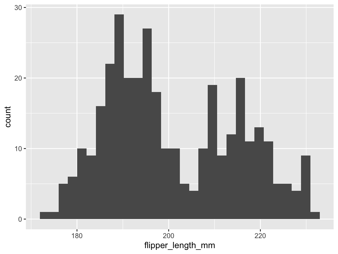
Figure 9.3: A basic histogram showing a distribution of variable values (created by ggplot2).
Note that we succeeded in creating our first histogram in ggplot2.
This visualization is rather basic, but includes the bars of a histogram on a grey background with white grid lines (its signature theme_grey() is based on Tufte, 2006) and two axes with appropriate labels.
As with the hist() function (from the base R graphics package), the default behavior of the geom_histogram() function is to categorize the values of the specified variable in discrete bins and display the counts of values per bin (as a bar chart).
Note also that evaluating our ggplot() command printed a message and a warning.
Whereas the warning is due to our flipper_length_mm variable containing 2 missing (NA) values,
the message suggests that we could specify a numeric value to the bins or to the binwidth parameters to override the default setting of bins = 30.
Just as we can use a natural language to say the same thing in different ways, the grammar of graphics allow for considerable flexibility in creating the same visualization. For instance, we can omit argument names of R functions, as long as the arguments (here data and x) are unambiguous and can move aesthetic mappings to the first line of the ggplot() expression.
As a consequence, the following variants all create the same visualization:
# Basic histogram variants:

# A: explicit version:
ggplot(data = pg) +
  geom_histogram(mapping = aes(x = flipper_length_mm), bins = 30) +
  theme_grey()

# B: short version:
ggplot(pg) +
  geom_histogram(aes(flipper_length_mm))

# C: moving aesthetic mapping to the 1st line:
ggplot(pg, aes(flipper_length_mm)) +
  geom_histogram(bins = 30)
Adding colors, layers, labels, and themes
Before discovering more features of ggplot2, we should learn to improve its default visualizations.
The basic histogram of Figure 9.3 is informative, but can be embellished by adding colors, more informative text labels, and choosing a different theme.
Colors that do not vary by a data variable can be set as constants (i.e., outside the aes() function) to color-related arguments of the current geom.
For the bars of geom_histogram(), the color argument refers to the border of the bars, whereas the bars themselves are colored by a fill argument.
We can set these arguments to any of the 657 named R colors, available by evaluating colors().
(More complex color settings involving data variables and color scales will be introduced below.)
The best way to change default text labels is by using the labs() function, which allows setting a range of labels by intuitive argument names.
A good visualization should usually have a descriptive title and informative labels for its x- and y-axes.
The theme() function of ggplot2 allows re-defining almost any aesthetic aspect of a plot.
Rather than specifying all of them manually, we can choose one of the theme_*() functions that come with ggplot2.
An improved version of Figure 9.3 can be created as follows (Figure 9.4):
# Adding colors, labels and themes:
ggplot(pg) +
  geom_histogram(aes(x = flipper_length_mm), binwidth = 2,
                 color = "grey20", fill = "deepskyblue") +
  labs(title = "Distribution of penguin flipper length",
       x = "Flipper length (in mm)", y = "Frequency") +
  theme_classic()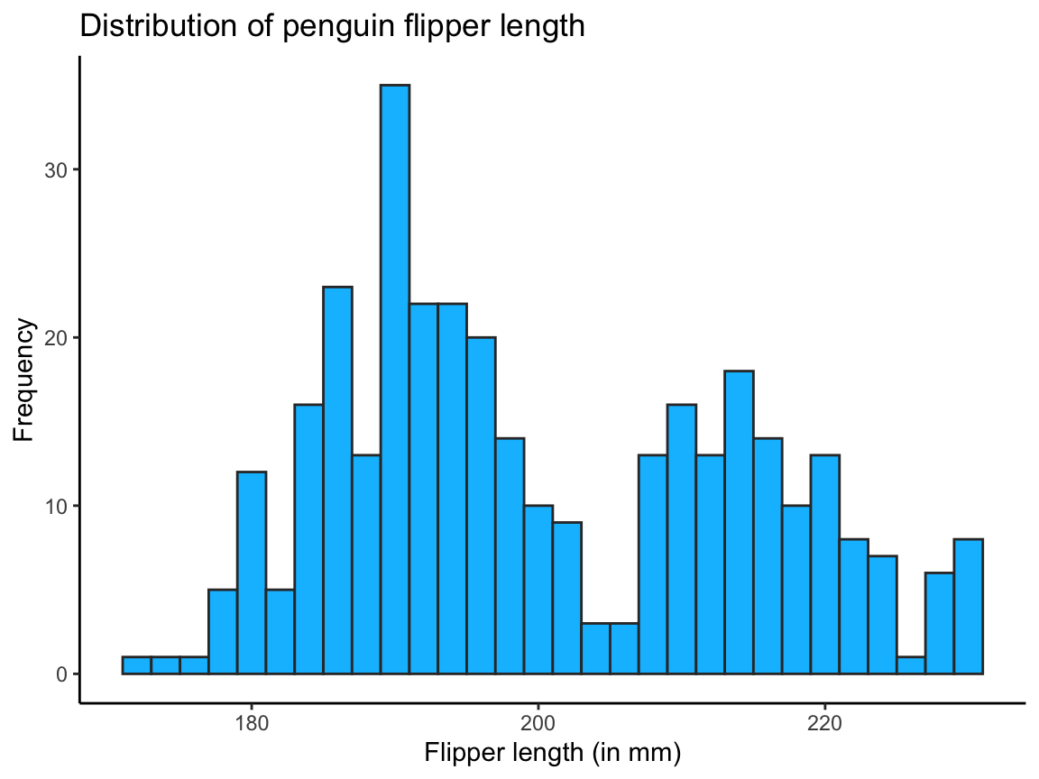
Figure 9.4: A histogram showing a distribution of values (with colors, labels, and a theme).
The code for Figure 9.4 shows that ggplot() commands can be viewed as a sequence of sub-commands, joined by the + operator.
A neat feature of ggplot2 is that plots can be stored as R objects and then modified later.
For instance, the code of the previous chunk could be decomposed into two steps:
# Adding colors, labels and themes:
pg_1 <- ggplot(pg) +
  geom_histogram(aes(x = flipper_length_mm), binwidth = 2,
                 color = "grey20", fill = "deepskyblue")
# pg_1  # basic plot with default settings

pg_2 <- pg_1 +
  labs(title = "Distribution of penguin flipper length",
       x = "Flipper length (in mm)", y = "Frequency") +
  theme_bw()  # choose a different theme
pg_2  # annotated plot (with labels and a modified theme)
Figure 9.5: The same histogram as Figure 9.4, but created in two steps.
When storing a plot as an R object, evaluating the object prints the plot to the visualization area of RStudio.
Here, pg_1 provides the basic histogram (plus two color constants), and pg_2 adds text labels and changes the default plot theme.
Given the vast range of possible modifications, the best practice and strategy for working with ggplot2 is to first get the basic mechanics of the plot right (i.e., by adjusting geoms and variable mappings) before adding further bells and whistles for creating a more appealing visualization (e.g., by selecting aesthetics, text labels, or themes).
The modular structure of ggplot2 objects supports this strategy.
Multiple layers (by adding geoms)
A powerful feature of ggplot2 is that visualizations can contain multiple layers. The notion of layers echoes the composition of complex plots when using base R graphics (see Section 8.3). Theoretically, each layer could use its own variable mappings and aesthetics, but most multi-layered plots employ different geoms, but share some mappings and use compatible aesthetics.
Which other geom fits to an existing plot depends on (a) the \(x\)- and \(y\)-axis mapping of an existing plot, and (b) the message to be expressed by adding another geom. Hence, it usually makes sense to select a primary geom and then check whether adding others improves a visualization. As we have only used ggplot2 to drawn a histogram so far, we can ask:
- Which object (and corresponding geom) would add useful information to a histogram?
As the histogram visualizes the distribution of a variable’s values, we may want to add some measure of central tendency (e.g., a mean or median) or variability (e.g., standard deviation or error) to a plot. A geom that would allow us to do this would be geom_vline() which draws a vertical line by specifying a constant value for xintercept (and allows for aesthetic settings that change the color, linewidth and linetype of the line):
# Compute the mean flipper length:
mn_flip_len <- mean(pg$flipper_length_mm, na.rm = TRUE)

# Add a vertical line (as a 2nd geom) to a histogram:
ggplot(pg) +
  # 2 geoms:
  geom_histogram(aes(x = flipper_length_mm), binwidth = 2,
                 color = "grey20", fill = "deepskyblue") + # primary geom
  geom_vline(xintercept = mn_flip_len,
             color = "deeppink", linewidth = 1) +          # 2nd geom
  # Labels and themes:
  labs(title = "Distribution of penguin flipper length",
       x = "Flipper length (in mm)", y = "Frequency") +
  theme_bw()  # choose a different theme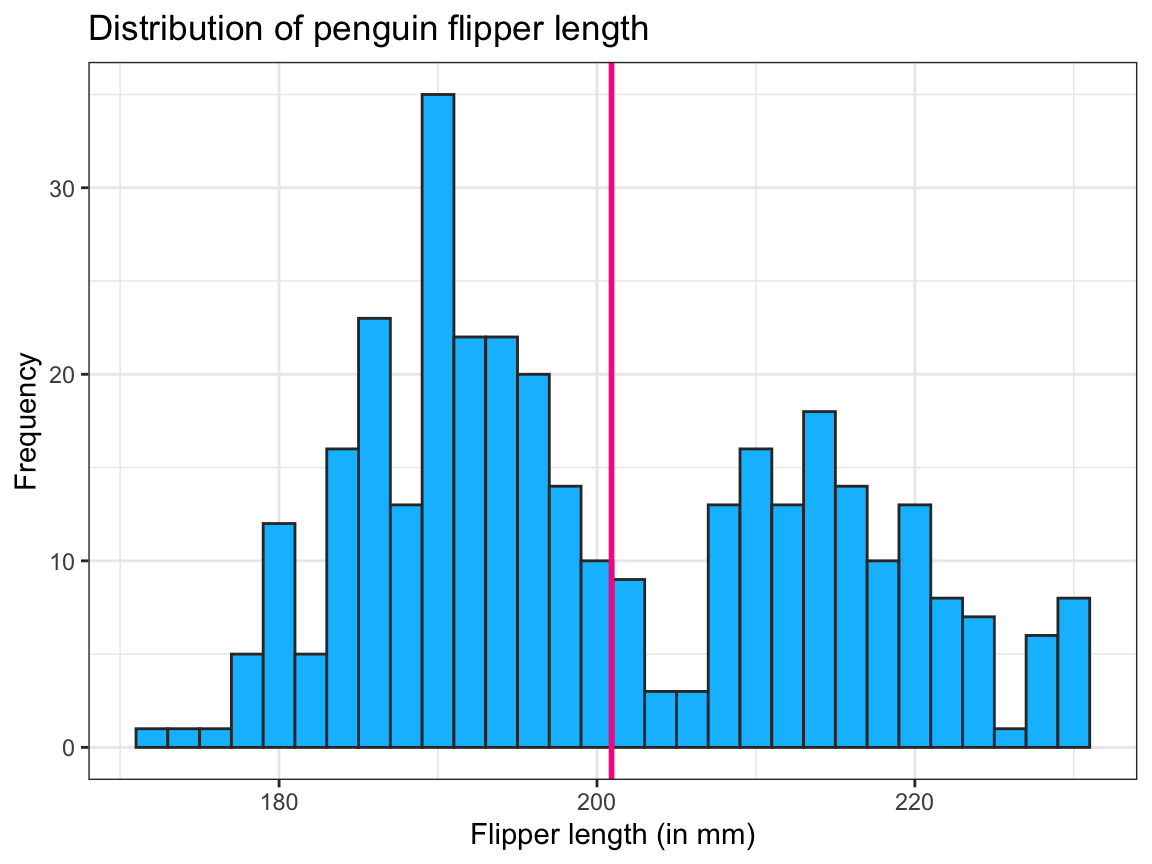
Note that our geom_vline() used only constant values, hence required no variable mappings in its aes() argument.
Also, additional geom functions are entered as a new line of code by adding the + symbol (rather than the pipe) at the end of each function.
Note also that we chose to compute the mean value mn_flip_len before and outside of our ggplot() function (and since the flipper_length_mm vector in pg contains missing values, we included na.rm = TRUE to ignore all missing values).
But we could also compute the mean value of pg$flipper_length_mm inside the ggplot() function:
# Compute mean add it as a vertical line (as a 2nd geom) to a histogram:
ggplot(pg) +
  # 2 geoms:
  geom_histogram(aes(x = flipper_length_mm), binwidth = 2,
                 color = "grey20", fill = "deepskyblue") + # primary geom
  geom_vline(xintercept = mean(pg$flipper_length_mm, na.rm = TRUE),
             color = "deeppink", linewidth = 1) +          # 2nd geom
  # Labels and themes:
  labs(title = "Distribution of penguin flipper length",
       x = "Flipper length (in mm)", y = "Frequency") +
  theme_bw()  # choose a different theme
And as we have stored our earlier histogram as pg_2 (above), we could have added the layer that plots the vertical line as follows:
pg_2 +
  geom_vline(xintercept = mean(pg$flipper_length_mm, na.rm = TRUE),
             color = "deeppink", linewidth = 1)
When using more than one geom, the order of geoms matters insofar as later layers (or geoms) are added on top of earlier ones. This usually implies that the plot’s \(x\)- and \(y\)-dimensions are based on the initial geom.
Irrespective of how we choose to draw the vertical line, the bi-modal distribution of the flipper length values seems rather ill-described by a single mean value. One way of further exploring the distribution lies in asking:
- Do all kinds of penguins have the same distribution of values, or do different species have different distributions?
Grouping observations by mapping variables to aesthetics
Noting that “colors that do not vary by a data variable can be set as constants” (in the previous section) raises a question:
- What functions can colors serve in a visualization?
A prominent function of color lies in distinguishing between different groups of observations.
This requires that a color element of our visualization is mapped to the levels of a categorical variable or factor (i.e., a variable for which we only care about class membership or whether any two observations have the same vs. different values).
In ggplot2, we can easily achieve this by moving a color argument into the aesthetic mapping function aes() and assigning it to a categorical variable of our data.
For instance, the following code maps the factor variable species to the fill color of the histogram bars (Figure 9.6):
# Grouping by mapping aesthetics (fill color) to a data variable (species):
pg_3 <- ggplot(pg) +
  geom_histogram(aes(x = flipper_length_mm, fill = species), binwidth = 2,
                 color = "white", linewidth = .50)
pg_3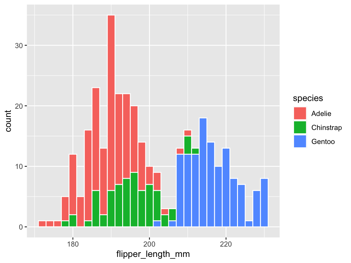
Figure 9.6: A histogram showing a distribution of values and color-coding a categorical variable.
Note that moving fill = species into the aes() function had two effects:
First, the counts of observations (penguins) that were expressed in the bars are now separated and color-coded for the three different species of penguins. This reveals that the flipper length of penguins seems to vary between species: The flippers of Adelie and Chinstrap are shorter than those of Gentoo.
Importantly, the different types of bars are stacked on top of each other, rather than positioned besides each other.
Hence, the absolute height of the bars (on the y-axis) represents the counts of one, two, or three species based on their flipper_length_mm (on the x-axis).
Note also that the colors for distinguishing the three different species were automatically chosen.
We will learn how to select specific color palettes in a moment, but note how our aesthetic mapping of a variable to the geom’s fill aesthetic differs from the constant color = "white" setting, which was specified outside the scope of the aes() function.)
Additionally, a legend that describes the mapping of colors to species appeared to the right of the plotting area.
This is a useful default behavior, but we may want to adjust the aesthetic properties (e.g., the fill color) to custom colors.
Finally, our example focused on the color and fill aesthetics of geom_histogram(), but other geometric objects may have additional features. For instance, points have a shape and lines have a linewidth and linetype.
The distinction between setting a feature to a constant value versus mapping it to a variable within the aes() function applies to these other features as well. Hence, mapping an argument to a data variable provides a general mechanism for grouping visual elements.
Changing color scales
When using ggplot2 without any additional specifications, the ggplot() function uses default colors.
Depending on the categorical or continuous nature of the data variables that are being plotted, this can involve various color palettes.
To signal that color is a dimension like x and y, the ggplot2 term for a color palette is “scale”.
Some geometric objects (e.g., the rectangles of a histogram) further distinguish between a fill color and the color used to draw their borders.
Consequently, these objects are mapped to multiple color scales.
Deviating from the default colors usually requires mapping a data variable to the color or fill aesthetic and specifying a corresponding color scale.
The range of color scale functions and corresponding palettes can be confusing and usually requires looking up the scale_color_* function.
A popular option is to use one of the palettes of the RColorBrewer package (Neuwirth, 2022) that come pre-packaged with ggplot2.
The Brewer scales provide sequential, diverging and qualitative color palettes (see https://colorbrewer2.org for more information).
Looking up ?scale_color_brewer reveals that its qualitative scales are labeled as “Accent”, “Dark2”, “Paired”, “Pastel1”, “Pastel2”, “Set1”, “Set2”, and “Set3”.
As we aim to change the fill colors, we can select the corresponding palettes by specifying scale_fill_brewer(), e.g.,
# Grouping by aesthetics (and using a different color scale):
ggplot(pg) +
  geom_histogram(aes(x = flipper_length_mm, fill = species), binwidth = 2,
                 color = "white", linewidth = .50) +
  scale_fill_brewer(palette = "Set1")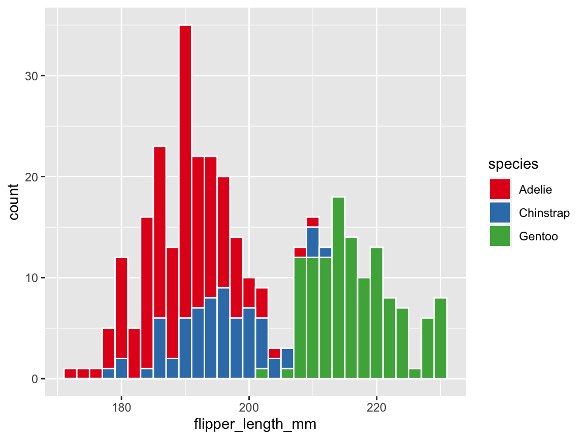
When aiming to create a range of visualizations in a uniform style, it is advisable to define one or more palettes of custom colors. There are many R functions and packages supporting this task. For instance, we can use the unikn package, as it combines pleasing colors with useful color functions:
library(unikn)  # for colors and color functions

# seecol(pal_unikn_pref)  # view a (categorical) color palette

# A: Using unikn colors:
my_cols <- usecol(pal = c(Seeblau, Pinky, Seegruen), alpha = .67)  # 3 specific colors
my_cols <- usecol(pal = pal_unikn_pref, alpha = .67)               # a color palette
We discuss the basics of using colors and color functions in R in Chapter 10 on Using colors.
For now, we simply use the usecol() function to create a semi-transparent palette of three named colors (inspired by Figure 9.2 above) as follows:
# B: Using the penguin species colors (from Figure 9.1):
my_cols <- usecol(pal = c("orange", "orchid3", "turquoise4"), alpha = .67)
The usecol() function allows defining a color palette (of a variable length n ) and add transparency (by setting the alpha parameter to a value from 0 to 1).
Using color transparency is a primary way to prevent overplotting (see Chapters 8 on Visualize in R and Chapter 10 on Using colors for more details and examples).
As we saved our plot as pg_3 above, we can add labels, apply our new custom color palette, and change the default theme as follows (Figure 9.7):
# Adding labels, color scale, and theme (to an existing plot):
pg_4 <- pg_3 +
  labs(title = "Distribution of penguin flipper length (by species)",
       x = "Flipper length (in mm)", y = "Frequency", fill = "Species:") +
  scale_fill_manual(values = my_cols) +
  theme_unikn()
pg_4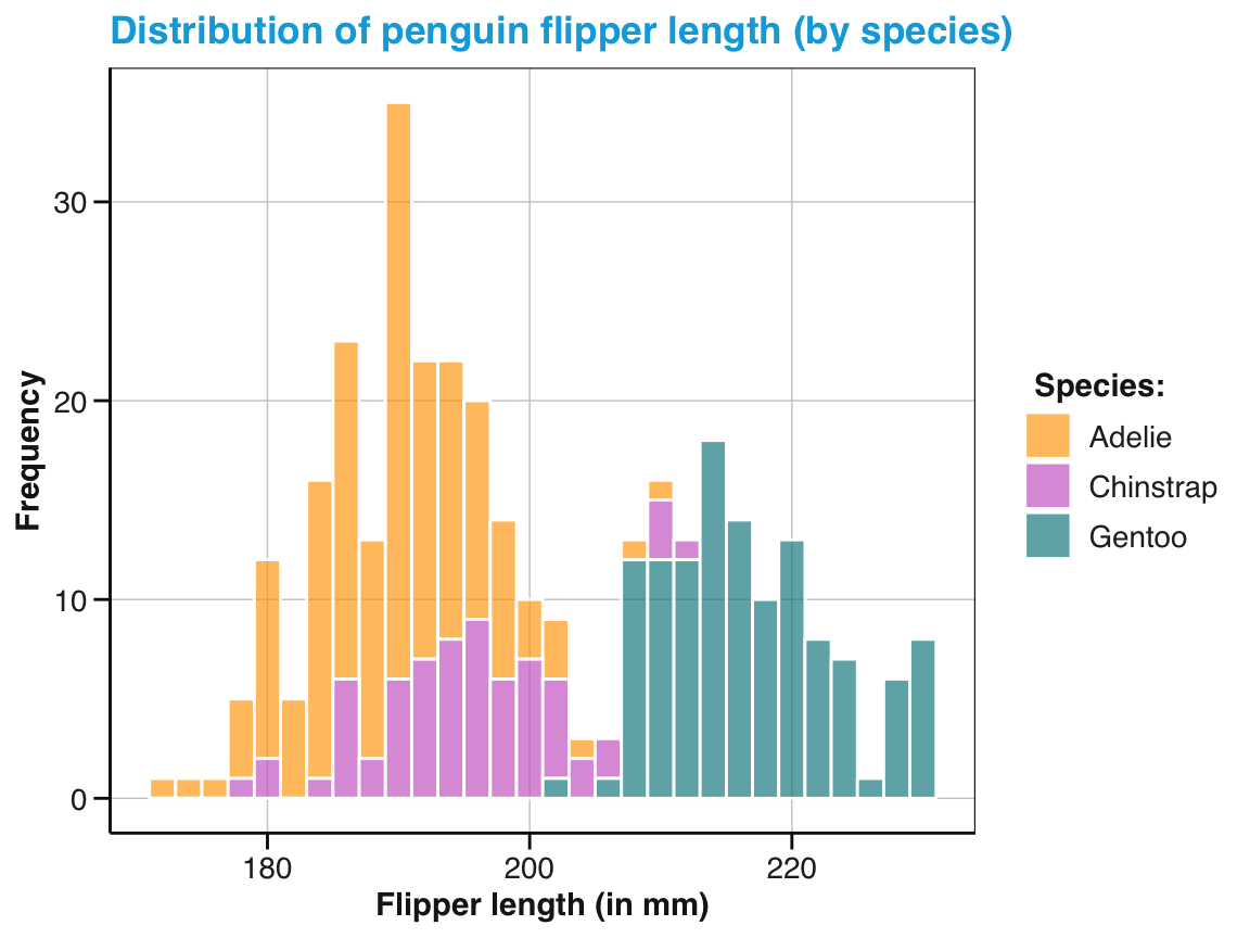
Figure 9.7: A labeled and themed histogram showing a distribution of values and color-coding a categorical variable.
Figure 9.7 is essentially a fancier version of Figure 9.6. But a good strategy when working with ggplot is to always create a basic plot first (by specifying the data, appropriate geoms, and variable mappings) before tweaking the plot further (by choosing colors, adding labels, or a theme).
Histograms are not the only way to transport information about the distribution of values.
Later in this chapter, we will encounter geom_violin() and geom_rug() that also signal distributions.
But before moving on to additional geoms, we practice what we have learned about ggplot2 so far.
Practice
Here are some practice tasks for plotting distributions:
-
Playing with parameters: Re-create the basic histogram of Figure 9.3 and vary the
binsorbinwidthparameters.- What happens to the values on the \(y\)-axis when varying the parameters and why?
- What happens when we change the variable mapping from
xtoy? - Which
binwidthparameter corresponds to a value ofbins = 30?
Multiple layers: Show that the order of layers matters by plotting a variable’s mean value (as a vertical line) before showing its distribution (as a histogram).
Multiple data arguments: When composing visualizations out of multiple layers (and geoms), we can pre-compute summary data and provide this data to additional geoms. The following code illustrates how we could pre-compute some values that are mapped to a 2nd layer of a plot. Evaluate and explain how this is done. Specifically,
- What exactly does the plot show?
- Which geom uses which data and variable mappings?
- Why are there two color scale arguments?
- Why is there only one color legend?
# Compute summary data:
means_by_species <- aggregate(flipper_length_mm ~ species, data = pg, FUN = mean)
means_by_species

ggplot(pg) +
  # Geoms:
  geom_histogram(mapping = aes(x = flipper_length_mm, fill = species),
                 binwidth = 2, color = "white", linewidth = .50) +
  geom_vline(data = means_by_species,
             mapping = aes(xintercept = flipper_length_mm, color = species),
             linewidth = 1, linetype = 2) +
  # Labels and aesthetics:
  labs(title = "Distribution of penguin flipper length (by species)",
       x = "Flipper length (in mm)", y = "Frequency",
       color = "Species:", fill = "Species:") +
  scale_fill_manual(values = my_cols) +
  scale_color_manual(values = my_cols) +
theme_unikn()-
Alternative geoms for distributions: Study the documentation to
geom_histogram()and explore its alternativesgeom_density()andgeom_freqpoly().- Create a histogram, density plot, and frequency polygon to show the distribution of body mass (for the 3 species of penguins).
- What does the \(y\)-axis of a density plot show?
- Which 2 of the 3 geoms can be combined with each other? Why not the 3rd?
Hint: It seems that geom_histogram() and geom_freqpoly() use a common scale of \(y\)-values.
However, note that their following combination yields a peculiar error:
# Due to the different y-scales, geom_density() cannot be combined with the others.
# But geom_histogram() and geom_freqpoly() share the same scale:
ggplot(pg) +
  geom_histogram(aes(x = body_mass_g), fill = "gold") +
  geom_freqpoly(aes(x = body_mass_g), color = "steelblue", linewidth = 1) +
  scale_fill_manual(values = my_cols) +
  theme_unikn()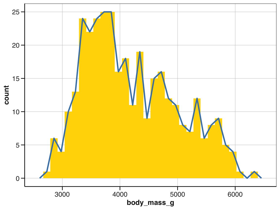
# However, for grouped values, we obtain:
ggplot(pg) +
  geom_histogram(aes(x = body_mass_g, fill = species), binwidth = 150) +
  geom_freqpoly(aes(x = body_mass_g, color = species), binwidth = 150, linewidth = 2) +
  scale_color_manual(values = my_cols) +
  scale_fill_manual(values = my_cols) +
  theme_unikn()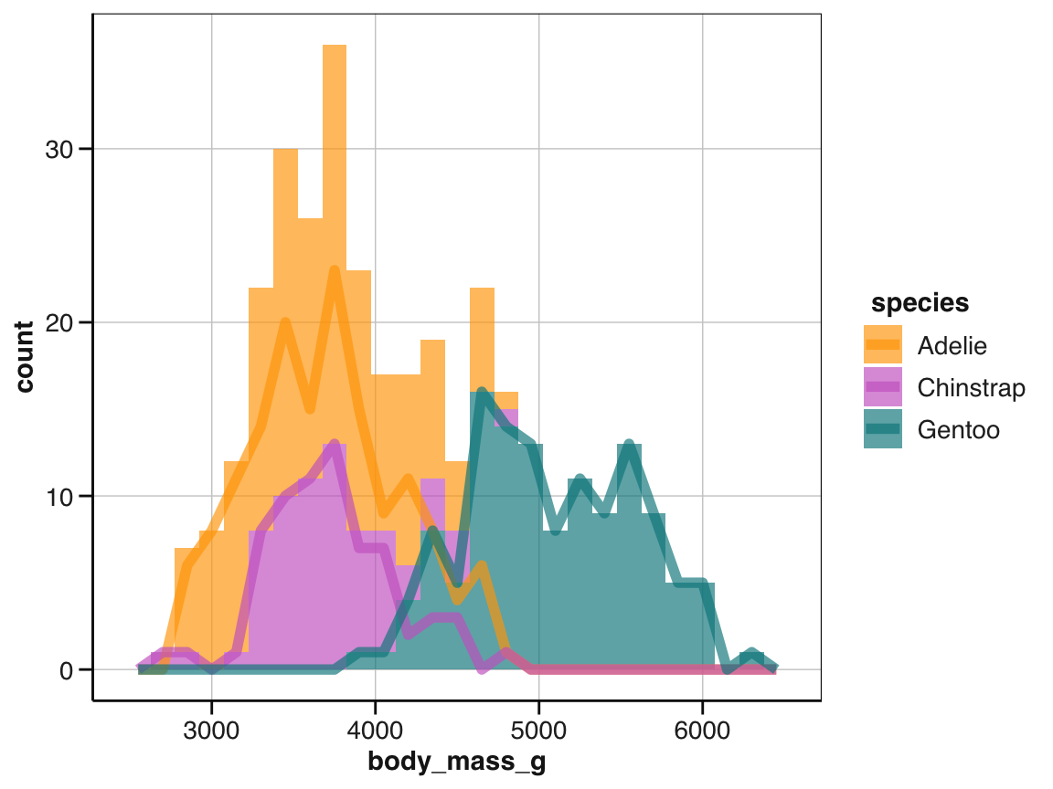
To fix this, study the documentation of geom_histogram() and then adjust its position argument.
9.2.5 Plotting summaries
In addition to plotting distributions, a common type of visualization aims to show a summary of one or more variables. Although there are many ways of summarizing data, we will focus on bar charts and box plots.
Bar charts
A bar chart (or bar plot) summarizes some variable (usually as frequency counts or the means of some continuous variable on the \(y\)-axis) as a function of some categorical variable (usually mapped to the \(x\)-axis).
This seems simple, but actually provides a wide and confusing array of options.
To realize this, we use a ggplot() expression for our pg data and geom_bar(), mapping the factor variable species to its \(x\)-axis (Figure 9.8):
# Create basic bar chart: Showing counts/frequency per group:
ggplot(pg) +
  geom_bar(aes(x = species))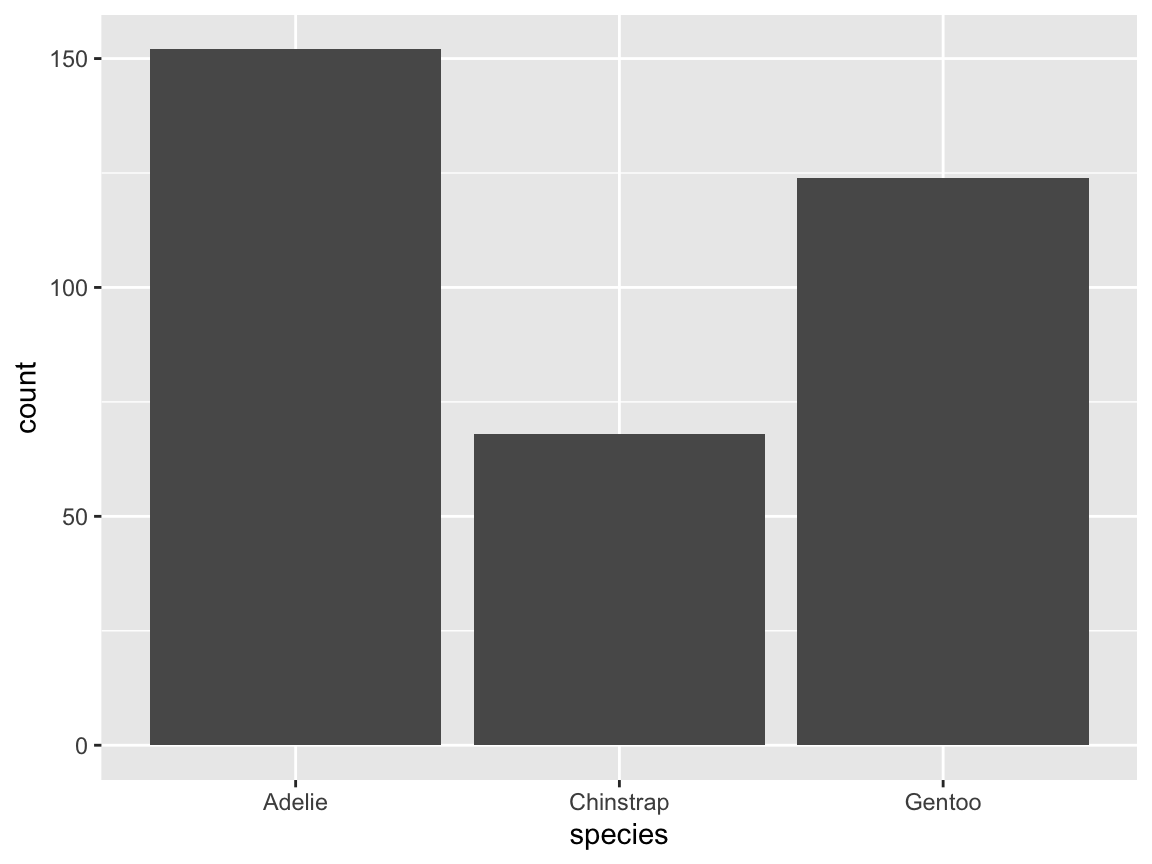
Figure 9.8: A basic bar chart (showing the counts or frequency of cases).
As we have seen for histograms (above), we can change colors, text labels, and the theme by adding corresponding functions (Figure 9.9):
# Create a bar chart with additional labels, colors, and a theme:
bc_1 <- ggplot(pg) +
  geom_bar(aes(x = species, fill = species)) +
  labs(title = "Frequency of penguin observations by species",
       x = "Species", y = "Frequency", fill = "Species") +
  scale_fill_manual(values = my_cols) +
  theme_unikn()

# Print plot:
bc_1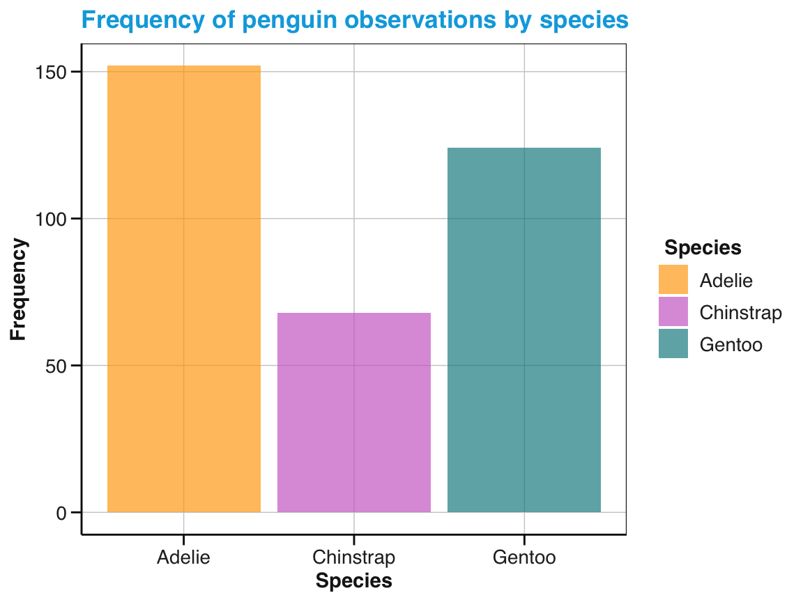
Figure 9.9: A bar chart (showing the counts or frequency of cases) with additional labels, colors, and a theme.
Figure 9.8 illustrates that geom_bar() does not simply plot given data values, but instead performs some computation.
In ggplot2, geoms that compute stuff are linked to a so-called stat option (for statistics).
By default, geom_bar() groups observations into the categories specified by the variable levels mapped to x and counts the number of cases per category (i.e., groups or bins).
The following expression is a more explicit version of the previous code chunk (and would create the exact same plot as Figure 9.8):
Specifying stat = "count" as an option of geom_bar() raises the question which other options exist.
The most prominent alternative to counting (i.e., computing and mapping the frequency of cases per group to y) is stat = "identity" (i.e., map the values of some pre-computed variable to y without changing them). Under the hood of ggplot2, the functions for geoms are linked to so-called stat_* functions. Specifically, geom_bar() is linked to stat_count() or stat_identity().
While we usually do not care about this connection when creating a visualization, the following section provides a glimpse that may help to explain unexpected behavior or avoid typical problems.
The relation between geoms and stats
We have seen above that geom_histogram() categorized observations in our data into groups (bins) and counted their frequency (Figure 9.3).
Similarly, geom_bar() automatically counted the observations in the levels of a variable mapped to x (Figure 9.8).
These default behaviors illustrate a hidden complexity in creating visualizations.
Rather than merely showing existing data values, many types of visualizations first require computations or transformations of the input data.
Whenever we provide data to ggplot2, many geom functions aim to guess which transformation we desire by linking the geom to some stat option (and corresponding functions).
The details of possible relations between geoms and stat options are difficult to understand.
Rather than aiming to explain them here, we can only emphasize that geoms that compute values are linked to statistical functions and those functions can also be invoked directly.
When searching for ggplot2 advice (e.g., online), experts often provide nifty solutions that perform quite complicated data transformations in variable mappings.
Here are some examples that — spoiler alert — are likely to confuse you:
- We can instruct ggplot2 to count the observations shown by
geom_bar()by mapping the option..count..to a variable:

Figure 9.10: A bar chart counting the number of penguin observations by species.
- Instead of assigning
yto..count.., we can also ask for proportions (provided that we also specify somegrouplevel):
# Compute proportions (in y and group mapping):
ggplot(pg) +
  geom_bar(aes(x = species, y = ..prop.., group = 1))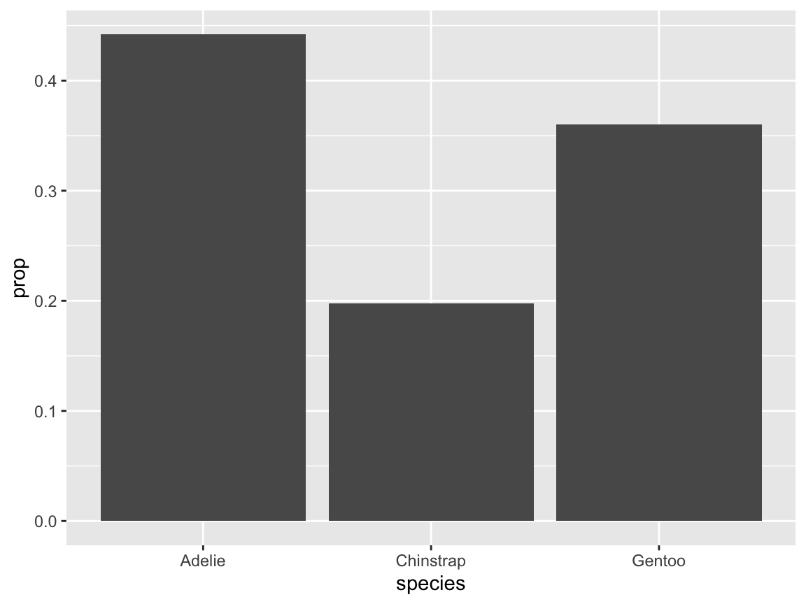
Figure 9.11: A bar chart computing proportions of penguin species.
- In case this cryptic code does not suffice to confuse you, we can even omit the
geom_function altogether and directly ask for the summary of a given variable mapping (and specify thegeomas an option of thestat_summary()function). Figure 9.12 shows penguin’s mean body mass by species as a bar chart:
# Compute a bar chart of means (by using stat_summary):
ggplot(pg, aes(x = species, y = body_mass_g)) +
    stat_summary(fun = mean, geom = "bar")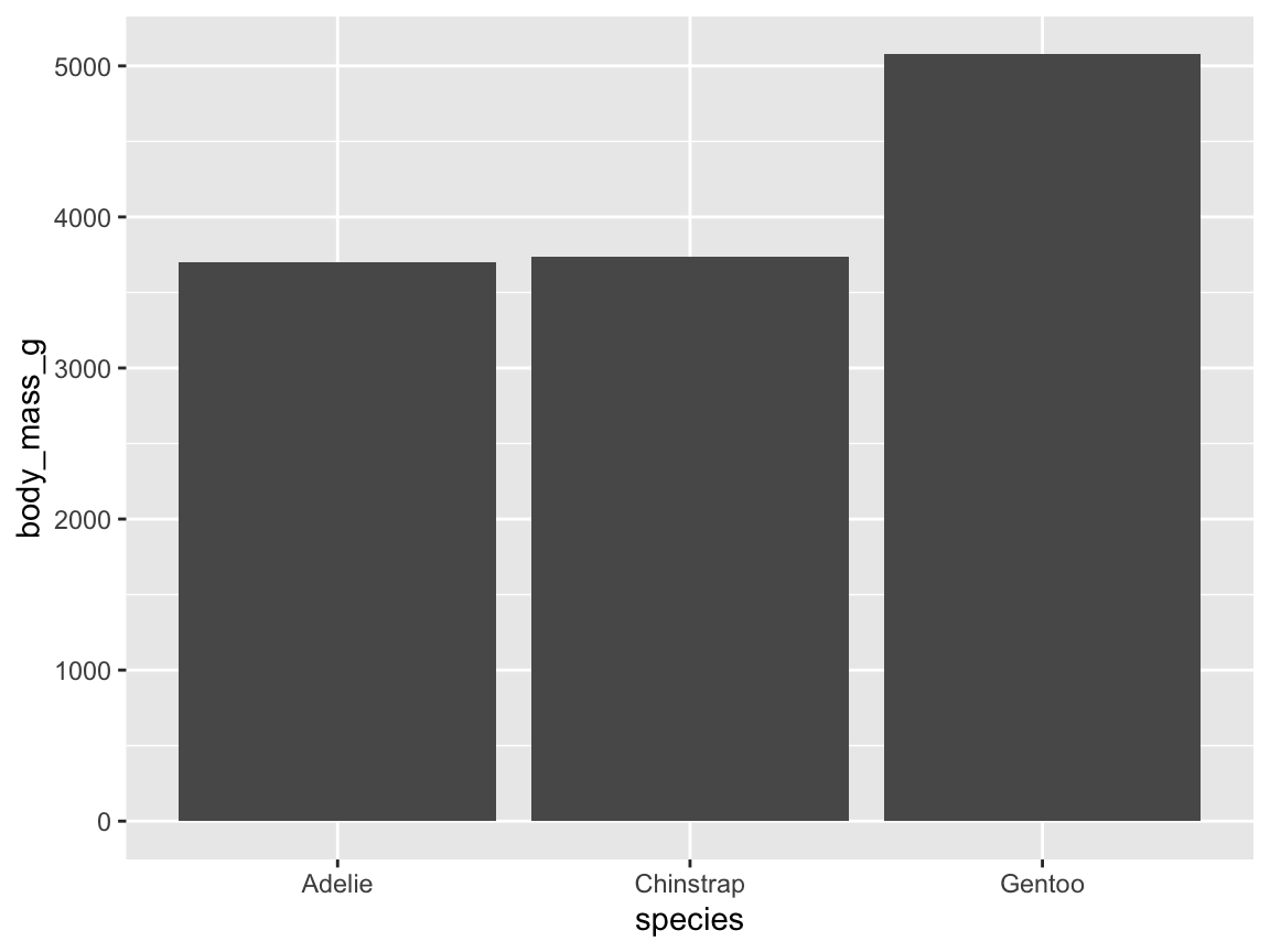
Figure 9.12: A bar chart computing penguin’s mean body mass by species from data (without an explicit geom function).
Do not worry if the last three examples remain rather confusing at this point!
They are shown here only to illustrate the intimate connection between data visualization and data transformation.
The main point here is that geoms may perform implicit computations that can be explicated and controlled by using stat_ functions.
While computing values from data within geoms may be convenient and powerful, it is also intransparent and error-prone.
Fortunately, novice users of ggplot2 only need to know that some geoms provide stat options and choose an appropriate one (e.g., "count" vs. "identity") if the default option fails.^[For more detailed explanations of the connection between geoms and stats, see the ggplot2 documentation or the online article Demystifying stat layers in ggplot2 (by June Choe, 2020-09-26).
Rather than relying on implicit computations, a better and safer way of creating visualizations is to first compute all summaries that we are interested in (e.g., some measures of central tendency and variability) and then directly visualize these values (i.e., using stat = "identity" without further computations).
We will illustrate this method below (in Section 9.3.2).
Grouping by aesthetics
Figure 9.9) (stored as bc_1 above) used geom_bar() (with its default stat = "count") to show the frequency of penguins by species:
# Re-create basic bar chart with labels, colors, and a theme:
bc_1 <- ggplot(pg) +
  geom_bar(aes(x = species, fill = species)) +
  labs(title = "Frequency of penguin observations by species",
       x = "Species", y = "Frequency", fill = "Species") +
  scale_fill_manual(values = my_cols) +
  theme_unikn()

# Print plot:
bc_1
Before we move on to box plots, we can briefly ask:
- What happens if we map the
xandfilloptions ofgeom_bar()to different variables?
As we have observed similar mappings for histograms (above), we can guess the result. Alternatively, we can simply try and find out (see Figure 9.13):
# Add a sub-category (by mapping 'x' to 'species' and 'fill' to 'sex'):
bc_2 <- ggplot(pg) +
  geom_bar(aes(x = species, fill = sex)) +
  labs(title = "Penguin observations by species and sex",
       x = "Species", y = "Frequency", fill = "Sex:") +
  scale_fill_manual(values = my_cols) +
  theme_unikn()

# Print plot:
bc_2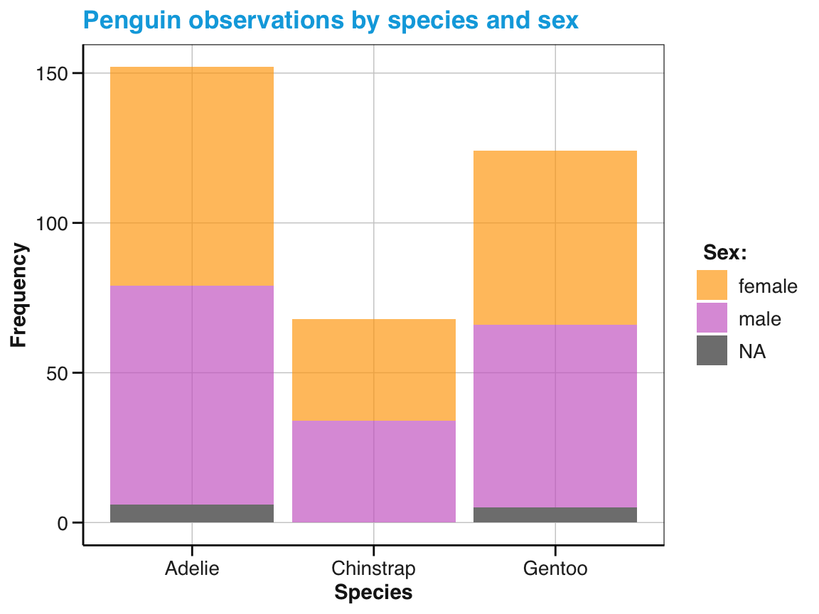
Figure 9.13: A bar chart showing frequency counts, but mapping x and fill color to different variables.
We see that adjusting the fill options of Figure 9.13 added a sub-category to the bars. Each bar still depicts the penguin frequency by species (due to x = species), but the bars are now divided into sub-sections that differ by sex (due to fill = sex).
Thus, we revealed additional information about our data by mapping different variables to different aesthetics.
Also, note that our manual color definitions (stored in my_cols) no longer match the semantics of our fill color definition.
To use a more intuitive color-coding, we re-define the sex-denoting colors in the stereotypical pink-blue scheme (widely used in the Western world since the 1950s, see Wikipedia), but include a color for NA cases (Figure 9.14):
# Choose 3 new colors (to be mapped to sex):
my_3_cols <- usecol(c(Pinky, Seeblau, "gold"), alpha = .80)
# seecol(my_3_cols)

# Show sub-category (as stacked bars):
ggplot(pg) +
  geom_bar(aes(x = species, fill = sex), position = "stack") +
  labs(title = "Penguin observations by species and sex",
       x = "Species", y = "Frequency", fill = "Sex:") +
  scale_fill_manual(values = my_3_cols) +
  theme_unikn()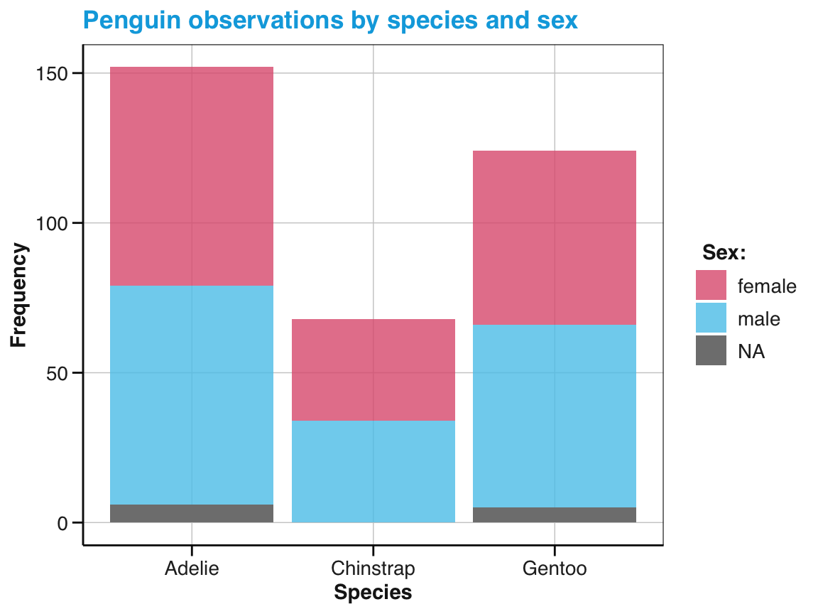
Figure 9.14: A bar chart with stacked bars and different fill colors.
Note that our 3rd color in my_3_cols has not been used. Instead, NA values were depicted in “grey” (due to the default value of na.value in scale_fill_discrete()).
Note also the default position setting of the divided bars:
The sub-categories within each bar of Figure 9.14 are stacked on top of each other. The reason for this is that the position argument of geom_bar() is set to "stack" by default. An alternative position setting is position = "dodge" (Figure 9.15):
# Show sub-category (as stacked bars):
ggplot(pg) +
  geom_bar(aes(x = species, fill = sex), position = "dodge") +
  geom_text(aes(x = species, fill = sex, label = ..count..), stat = "count",
            position = position_dodge(width = .9), vjust = -.50, size = 3) +
  labs(title = "Penguin observations by species and sex",
       x = "Species", y = "Frequency", fill = "Sex") +
  scale_fill_manual(values = my_3_cols) +
  theme_unikn()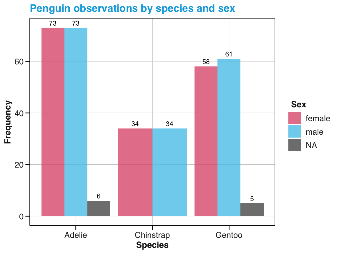
Figure 9.15: A bar chart with dodged bars in different fill colors.
Note that the \(y\)-axis of the bar chart with dodged bars (in Figure 9.15) has been automatically adjusted to account for the lower counts of individual sub-categories (relative to the totals displayed in Figure 9.14).
As not all categories contain the same sub-categories (here: The penguins of the Chinstrap species contain no NA values on the sex variable), the width of the bars may need further adjustments.
Box plots
When aiming to visualize summary information of a continuous variable by the levels of some categorical variable, a good alternative is provided by a box plot. A box plot (or boxplot) compactly displays the mean tendency and distribution for all levels of a continuous variable. More specifically, it visualizes five summary statistics: The median (as a horizontal line), two hinges (indicating the value range’s 25th and 75th percentiles), and two whiskers (marking $$1.5 of the inter-quartile range, IQR). Additionally, any outliers beyond this range are shown (as points beyond the end of the whiskers).
To create a boxplot in ggplot2, we use geom_boxplot() and map a categorical variable to x and a continuous variable to y.
Figure 9.16 uses the pg data to illustrate penguin body mass (i.e., the variable body_mass_g) by species:
ggplot(pg) +
  geom_boxplot(aes(x = species, y = body_mass_g), fill = "gold")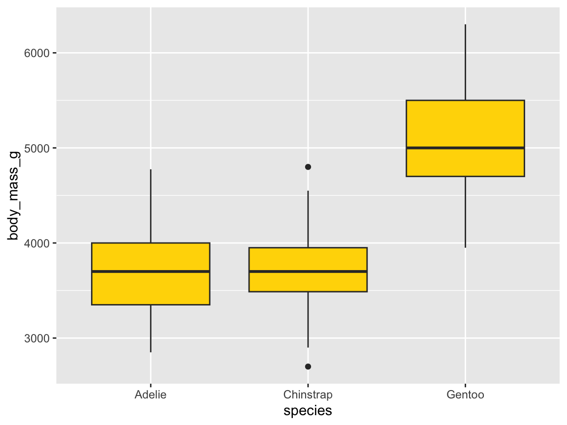
Figure 9.16: A box plot showing penguin’s body mass by species (with additional range information).
In the basic box plot of Figure 9.16, the fill aesthetic was set to a constant (e.g., the color name "gold"). Hence, the 50%-range of values within the hinges were drawn in this color.
But as we distinguished penguins by species (in our mapping to x), the fill color could also be mapped to the species variable.
Figure 9.17 does this, and uses the manual color choices (from above), as well as adding text labels and a theme:
ggplot(pg) +
  geom_boxplot(aes(x = species, y = body_mass_g, fill = species)) +
  scale_fill_manual(values = my_cols) +
  labs(title = "Penguin mass by species",
       x = "Species", y = "Mean mass (in g)", fill = "Species") +
  theme_bw()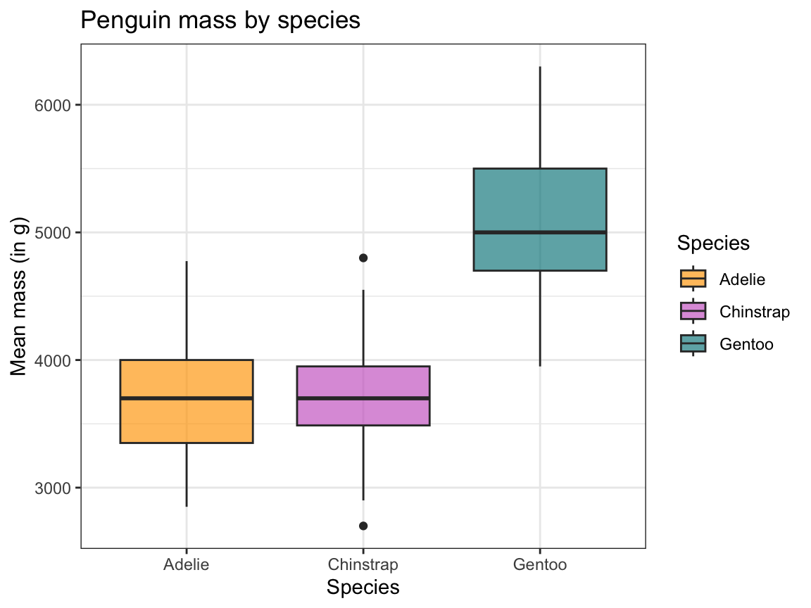
Figure 9.17: A box plot showing penguin’s body mass by species (with labels and aesthetic tweaks).
Overall, investing into manual data transformation and computations adds control and transparency to our visualizations and simplifies the code.
As an example, we have shown that bar charts showing means of some variable can be created by using geom_col() rather than by using geom_bar().
However, when transforming data to be plotted we must make sure that the data supplied as input to gglot() contains all the variables and values that we want to visualize.
Better bar plots are often column plots: Pre-compute the values to display.
If we had pre-computed the counts, we could map them to y and specify stat = "identity".
A good alternative to many bar charts — if they provide mean information — is provided by box plots.
Practice
Here are some practice tasks on plotting summaries in bar charts or box plots:
-
Understanding geoms:
Using the summary table
tb, explain the result of the following command:
# Create summary data (as tb):
tb <- pg %>%
  group_by(species) %>%
  summarise(mn_flip_len  = mean(flipper_length_mm, na.rm = TRUE))
tb
#> # A tibble: 3 × 2
#>   species   mn_flip_len
#>   <fct>           <dbl>
#> 1 Adelie           190.
#> 2 Chinstrap        196.
#> 3 Gentoo           217.

# Plot:
ggplot(tb) +
  geom_bar(aes(x = species))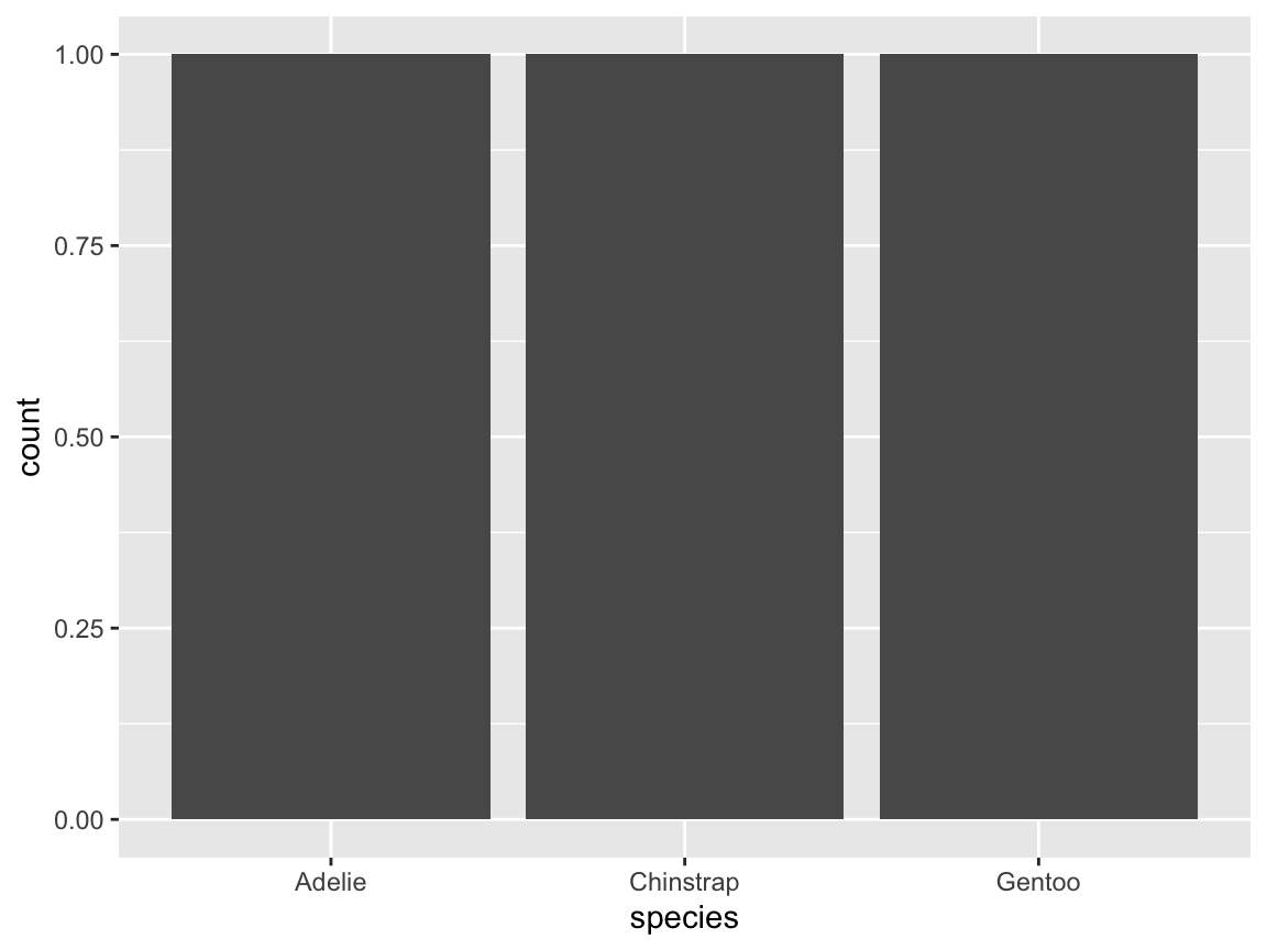
- How could we fix this plot (to show the average flipper length by species)?-
Flipping coordinates:
- Evaluate the following expression and explain its result:
ggplot(pg) +
  geom_bar(aes(x = species)) +
  coord_flip()
- How can an identical plot be created without using `coord_flip()`?-
Simple bar charts: Create a bar plot for the
pgdata showing the counts of penguins observed on each island.- by using
geom_bar() - by using
geom_col() - distinguish different penguin
speciesas a sub-category
- by using
The stat function in bar charts: Our original bar chart automatically counted the number of instances of
species:

# same plot (with an explicated stat function):
ggplot(pg) +
  geom_bar(aes(x = species), stat = "count")
Now suppose we already had data that contains these counts (as the values of a variable), as in the following data frame df:
tb <- table(pg$species)
df <- data.frame(tb)
names(df) <- c("species", "freq")

# Print:
df
#>     species freq
#> 1    Adelie  152
#> 2 Chinstrap   68
#> 3    Gentoo  124
How can we create a bar chart of the (pre-computed) freq counts in df?
Note: The following attempts will not work — why not?
# Erroneous plots:
ggplot(df) +
  geom_bar(aes(x = species))

ggplot(df) +
  geom_bar(aes(x = species), stat = "count")
Try using a different variable mapping and stat setting…
-
Misleading settings: Explain the output of the following command and find a better solution.
- Why is it misleading?
- How could it be fixed?
# Adding a factor variable:
ggplot(pg, aes(x = species, y = body_mass_g, fill = sex)) +
stat_summary(fun = mean, na.rm = TRUE, geom = "bar", position = "stack")-
Create a box plot that shows the mean flipper length of penguins on each of the three islands.
- Add
aes(fill = island))togeom_boxplot()and interpret the result. - Change the
fillaesthetic ofgeom_boxplot()toaes(fill = species))and explain the result.
- Add
ggplot(pg) +
  geom_boxplot(aes(x = island, y = body_mass_g, fill = island))

# same as:
ggplot(pg, aes(x = island, y = body_mass_g)) +
  geom_boxplot(aes(fill = island))

# Fill color by species:
ggplot(pg) +
geom_boxplot(aes(x = island, y = body_mass_g, fill = species))- A box plot with multiple mappings:
- Interpret and explain the result of the following expression:
# Fill color by island:
ggplot(pg) +
  geom_boxplot(aes(x = species, y = body_mass_g, fill = island))
9.2.6 Plotting relations
Another common type of plot visualizes the relationship between two or more variables. Important types of plots that do this include scatterplots and visualizations of lines or trends. This section will introduce corresponding ggplot2 geoms.
Scatterplots
Scatterplots visualize the relation between two variables for a number of observations by corresponding points that are located in 2-dimensional space. Assuming two orthogonal axes (typically \(x\)- and \(y\)-axes), a primary variable is mapped to the \(x\)-axis, and a secondary variable is mapped to the \(y\)-axis of the plot. The points representing the individual observations then show the value of \(y\) as a function of \(x\).28
As an example of a simple scatterplot, we aim to solve the following task:
- Visualize the relationship between body mass and flipper length for (the 3 species of) penguins.
Solving this task in ggplot2 is simple and straightforward.
We provide our pg data to ggplot() and select the geometric object geom_point() with the aesthetic mappings x = body_mass_g and y = flipper_length_mm (Figure 9.18):
ggplot(pg) +
  geom_point(aes(x = body_mass_g, y = flipper_length_mm))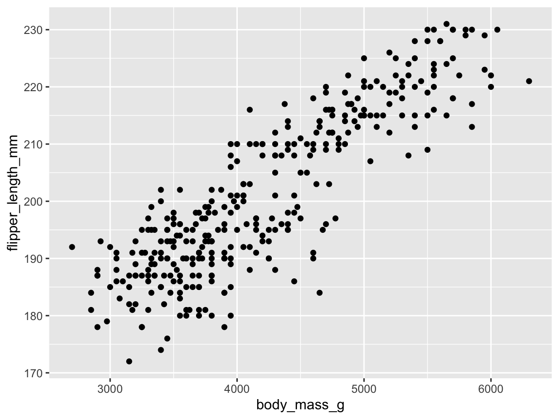
Figure 9.18: A basic scatterplot using geom_point(), but suffering from overplotting.
Overall, this basic scatterplot suggests a positive and possibly linear correlation between penguin’s body mass (mapped to the values on the \(x\)-axis) and their flipper length (mapped to the values of the \(y\)-axis). However, the example also illustrate a typical problem of scatterplots: When many points are clustered near each other or even at the same locations, they overlap or obscure each other — a phenomenon known as overplotting. There are many ways of preventing overplotting in ggplot2. In the context of scatterplots, a popular strategy against overplotting consists in using colors, color transparency, or grouping points into clusters by changing their aesthetic features.
The aesthetic features of points include colors, sizes, and symbol shapes.
As we have seen for other geoms, we can map either constant values or variables to aesthetic features of geom_point().
Figure 9.19 still expresses the relation between penguins’ body mass (by mapping x to body_mass_g) and their flipper length (by mapping y to flipper_length_mm), but additionally groups the data (by mapping color and shape to the categorical variable species):
sp_01 <- ggplot(pg) +
  geom_point(aes(x = body_mass_g, y = flipper_length_mm,  # essential mappings
                 color = species, shape = species         # aesthetic variables
                 ),                                       # vs.
             alpha = .50, size = 2                        # aesthetic constants
             )
sp_01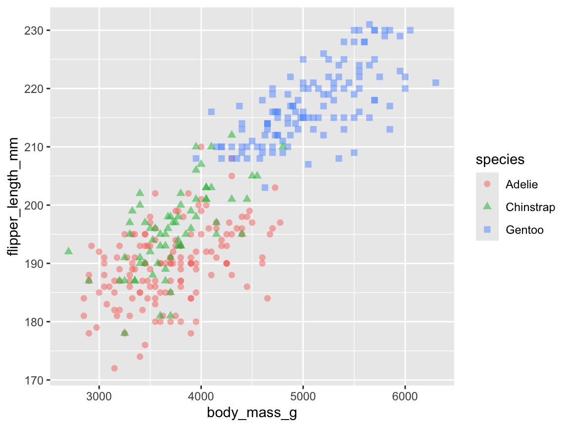
Figure 9.19: A scatterplot using geom_point() with two continous variables (body_mass_g and flipper_length_mm) and a categorical grouping variable (species).
Note that Figure 9.19 mapped two aesthetic features (col and shape) to a variable (species),
whereas two others (alpha and size) were mapped to constant values.
The effect of this difference is that the species variable is used to group the geom’s visual elements (i.e., varying point color and shape by the different types of species), whereas their color transparency and size is set to constant values.
Finally, we can further improve our previous plot by choosing custom colors, text labels, and choosing another theme.
Since Figure 9.19 was saved as an R object (sp_01), we can adjust the previous plot by adding labels, color scales, and theme functions (Figure 9.20):
sp_01 +
  labs(title = "Penguin's flipper length by body mass (by species)",
       x = "Body mass (in g)", y = "Flipper length (in mm)",
       col = "Species:", shape = "Species:") +
  scale_color_manual(values = my_cols) +
  theme_bw()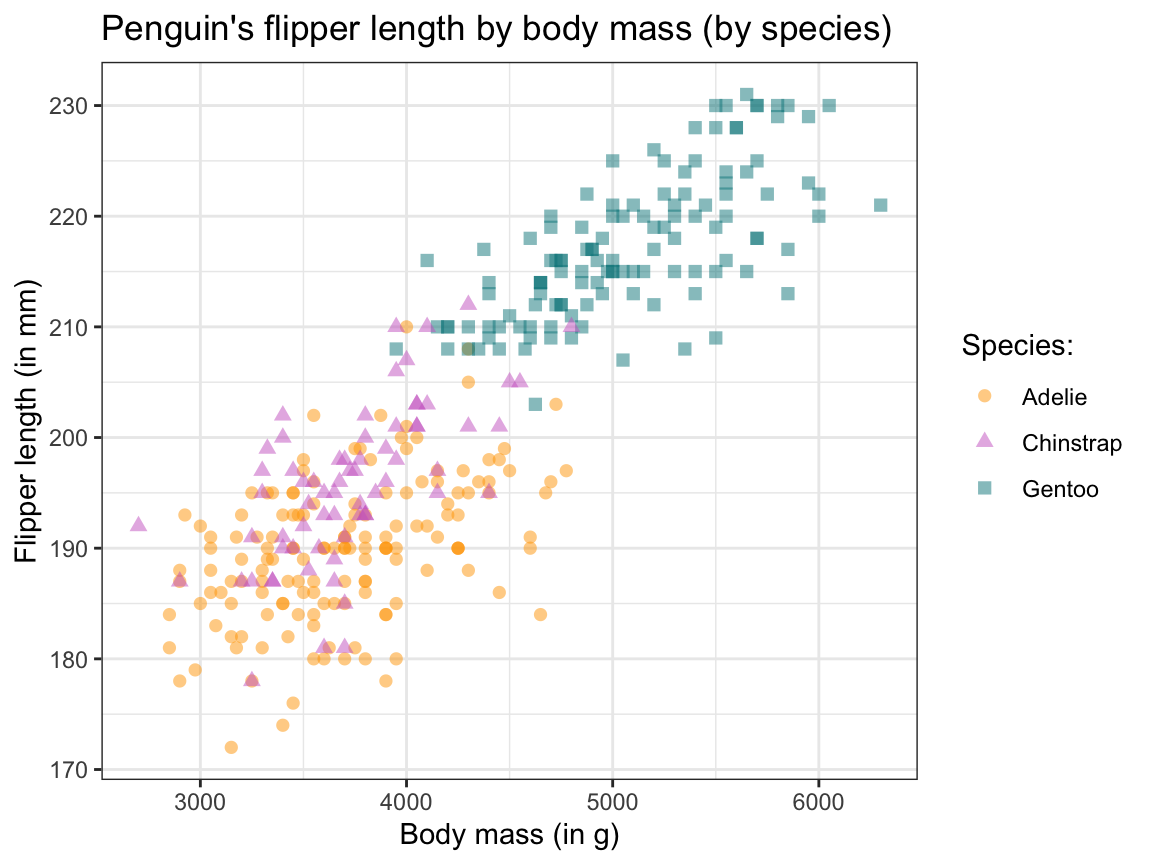
Figure 9.20: Adjusting our scatterplot’s text labels, color scale, and theme.
As before, tweaking aesthetics and adding text labels to the initial plot improved our visualization by making it both prettier and easier to interpret. (We will later see that faceting — i.e., splitting a plot into several sub-plots — is another way of preventing overplotting in ggplot.)
Lines and trends
As plotting a line shows some value as a function of another, it also expresses relations. The key element of choosing a line (rather than a sequence of points or shapes) suggests that this relation is of a continuous nature (e.g., showing some development or trend over time). By contrast, bar charts or scatterplots can also express relations, but suggest that the relation is of a discrete nature (i.e., some variable is categorical).
However, choosing continuous or discrete visual elements to express functions and relations is mostly a matter of perspective. Although using continuous lines to link categorical variables or showing continuous trends as categorical elements can indicate a poor choice of a visualization. However, it also can make sense to mix up dimensions in order to draw attention or highlight particular aspects. In short, whereas bar charts are better suited for visualizing similarities or differences between groups, line plots are better suited for showing similarities or changes over some continuous variable.
When we distinguish between different kinds of line plots, we primarily distinguish them by the way in which their data or definition is available:
Mathematical functions: Plot a function defined as a mathematical expression (
geom_*line()orgeom_function())Linking data values: Link values given by data (
geom_line()orgeom_path())Summary trends: Compute trends over some other data variable (
geom_smooth())
1. Mathematical functions
We first consider visualizing curves that are defined as mathematical functions. Such functions typically define some output variable \(y\) as some transformation of an input variable \(x\). Straight lines are a special case of a curve and are defined as \(y = ax + b\), with the values of the slope \(a\) and \(y\)-intercept \(b\) being constants.
Linear functions:
Plotting linear functions in ggplot2 is straightforward, but there are geoms for horizontal (geom_hline()), vertical (geom_vline()), or any linear line (geom_abline()), each with corresponding arguments (yintercept, xintercept, or intercept and slope, respectively).
From the user’s perspective, the hardest part here is to provide some data and an appropriate aesthetic mapping. In the following, we provide a minimal data frame (only containing a variable x with a single value of 0) and the mapping x = x:
# Plotting linear functions:
ggplot(data = data.frame(x = 0), aes(x = x)) +
  geom_hline(yintercept = -2, color = Seeblau,  linewidth = 1) +
  geom_vline(xintercept =  4, color = Seegruen, linewidth = 1, linetype = 2) +
  geom_abline(intercept = -1, slope = 1, color = Pinky, linewidth = 1, linetype = 4) +
  # Setting axis limits (and types):
  scale_x_continuous(limits = c(-10, 10)) +
scale_y_continuous(limits = c(-10, 10)) 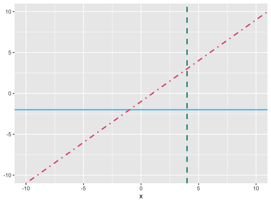
Figure 9.21: Plotting (horizontal, vertical, or arbitrary) linear functions.
Note that the code for Figure 9.21 explicitly defined the limits of both axes by scale_ functions. Otherwise, ggplot() would have chosen an automatic range.
Beyond plotting straight lines, we can use geom_function() for plotting statistical or any arbitrary function. To do so, the data to be plotted by the ggplot() function should specify the range of x (e.g., as a data frame containing the minimum and maximum values of the to-be-plotted range) and the aesthetic mapping should indicate aes(x = x).
(We could also plot functions without providing any data, but then need to specify the axis range, e.g., by xlim(-10, 10).)
Statistical functions:
We first demonstrate geom_function() for statistical R functions.
As R originated in a statistics context, its native stats package provides many useful functions. For instance, the density of a normal distribution is provided by the dnorm() function, which takes two arguments (mean and sd). We can provide the function’s name and its arguments as a list to geom_function():
# 1st statistical function: Density of normal distribution:
sf_1 <- ggplot(data.frame(x = c(0, 1)), aes(x = x)) +
               geom_function(fun = dnorm, args = list(.50, .15),
                             aes(color = "Function 1"), linewidth = 1)
sf_1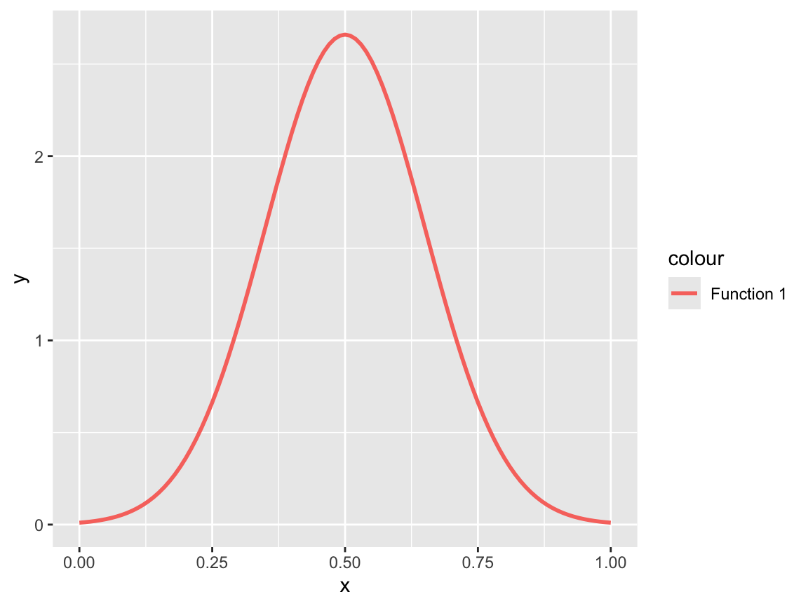
As we have seen for other ggplot2 objects, we can improve our visualization by adding more function curves, change the \(x\)-axis, or edit text labels, colors, or the plot theme:
# Add a 2nd statistical function & change appearance:
sf_1 +
  geom_function(fun = dnorm, args = list(.60, .10),
                aes(color = "Function 2"), linetype = 2, linewidth = 1) +
  # Change axes, labels, colors, and a theme:
  scale_x_continuous(name = "Probability", breaks = seq(0, 1, .20), limits = c(0, 1)) +
  labs(title = "Two normal density curves",
       y = "Frequency", color = "Normal curves:") +
  scale_color_manual(values = my_cols) +
  theme_unikn()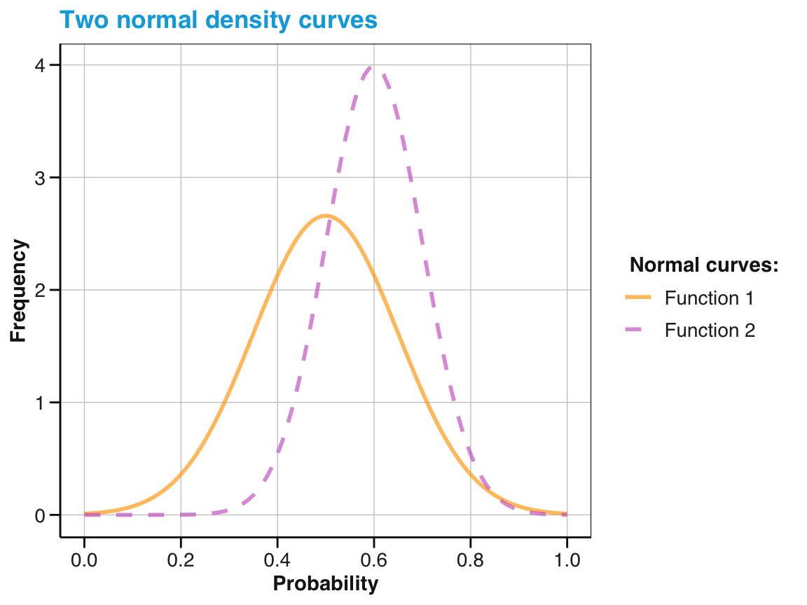
Arbitrary functions:
Beyond plotting pre-defined functions, we can define and plot any arbitrary function.
As we have seen in Chapter 5 on Functions, we can easily define our own functions (as my_fun <- function(){}). We can then visualize it by ggplot2 by using geom_function():
# Any function of x:
my_fun <- function(x){
  sin(x)
}

# Using geom_function():
ggplot(data.frame(x = c(0, 13)), aes(x = x)) +
  geom_function(fun = my_fun, color = Seeblau, linewidth = 1)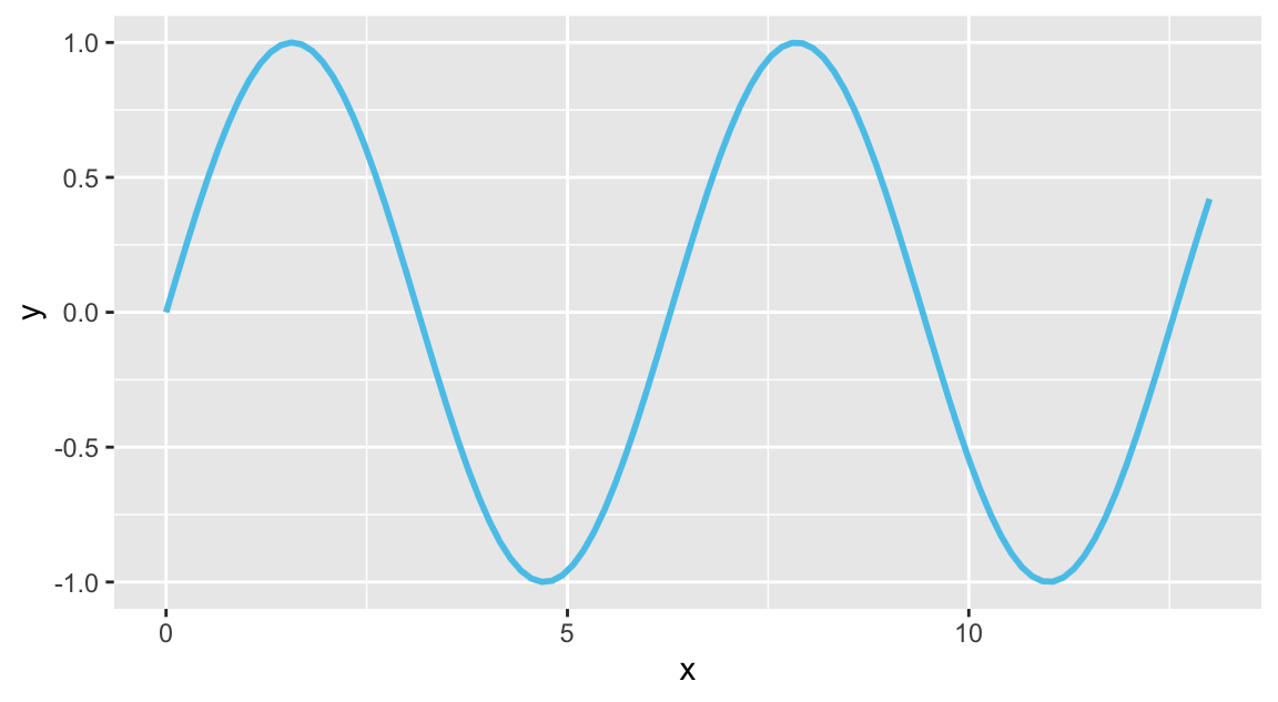
As geom_function() is linked to stat_function(), the last ggplot() expression is identical to:
# Using stat_function():
ggplot(data.frame(x = c(0, 13)), aes(x = x)) +
  stat_function(fun = my_fun, color = Seeblau, linewidth = 1)
If a user-defined function contains additional arguments, these can be supplied as a list of args to geom_function() or stat_function():
# A function of x with 2 arguments:
my_fun <- function(x, shift, fac){
  sin(x - shift) * fac
}

# Using geom_function():
ggplot(data.frame(x = c(0, 13)), aes(x = x)) +
  geom_function(fun = my_fun, args = list(1, 2), color = Seeblau, linewidth = 1) +
  geom_function(fun = my_fun, args = list(3, 1), color =   Pinky, linewidth = 1) +
  theme_minimal()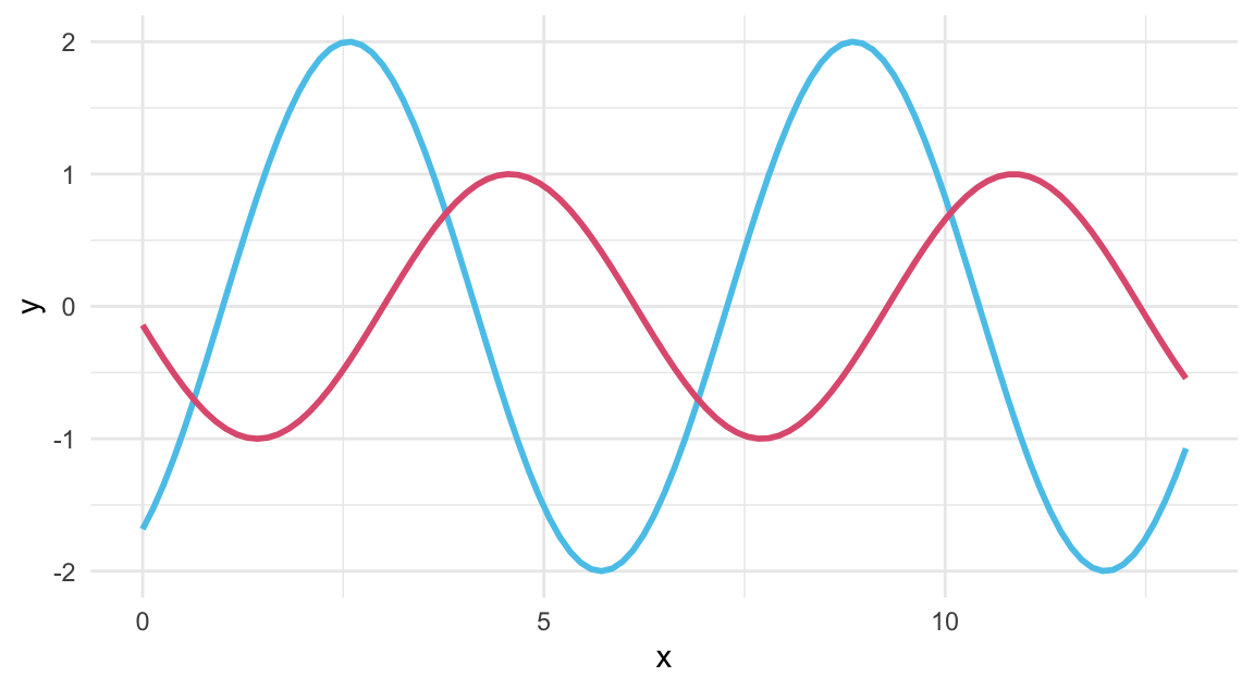
Again, the two instances of geom_function() in the last ggplot() call could be replaced by corresponding stat_function() calls:
# Using stat_function() to draw lines:
ggplot(data.frame(x = c(0, 13)), aes(x = x)) +
  stat_function(fun = my_fun, args = list(1, 2), color = Seeblau, linewidth = 1) +
  stat_function(fun = my_fun, args = list(3, 1), color = Pinky,   linewidth = 1)  +
  theme_minimal()
A neat feature of using stat_function() is that it is linked to geom_line() by default, but can flexibly be used with other geoms:
# Using stat_function() with various geoms:
ggplot(data.frame(x = c(0, 13)), aes(x = x)) +
  stat_function(fun = my_fun, args = list(1, 2),  geom = "line",    color = Seeblau, linewidth = 1) +
  stat_function(fun = my_fun, args = list(3, 1),  geom = "point",   color = Pinky,  size = 1.5) +
  stat_function(fun = dnorm,  args = list(7, .5), geom = "polygon", color = Petrol, fill = "honeydew") +
  theme_minimal()
For a maximum of flexibility, we can even omit the initial data and aes() mapping,
and define functions, their geom, \(x\)-axis range xlim, and aesthetic features as arguments of stat_function():
ggplot() +
  stat_function(fun = function(x, s, c){-(x - s)^2 + c}, args = list(5, 10),
                xlim = c(-5, 10), color = Seeblau, linewidth = 1) +
  stat_function(fun = function(x, a, b){a * x + b}, args = list(5, -50),
                xlim = c(0, 15), geom = "point", color = Pinky, shape = 21)  +
  theme_minimal()
When lines are not defined as mathematical functions, but instead by the data that is being visualized, we can express their development as line or trend plots.
2. Line plots
Line plots can show developments or relations: Trends over time or the values of some variable as a function of some other variable.
The penguins data is probably not the most suitable data for asking developmental questions:
It only contains observations from three years and its measures of penguin physiology are unlikely to show large changes in that time span.
Nevertheless, we can use it to visualize penguin flipper length over the observed three years.
Using our pg version of the data, we first compute a quick summary table that provides the mean flipper length by species and year.
(We do so using a dplyr pipe, which we will discuss in Chapter 13 on Transforming data.)
# Data:
# pg

# Create some time-based summary:
# Penguin's measurements by species x year)
tb <- pg %>%
  group_by(species, year) %>%
  summarise(nr = n(),
            # nr_na = sum(is.na(flipper_length_mm)),
            # mn_body_mass = mean(body_mass_g, na.rm = TRUE),
            mn_flip_len  = mean(flipper_length_mm, na.rm = TRUE))

# Print tb:
knitr::kable(tb,
             caption = "Mean flipper length of penguins by `species` and `year`.",
digits = 1)| species | year | nr | mn_flip_len |
|---|---|---|---|
| Adelie | 2007 | 50 | 186.6 |
| Adelie | 2008 | 50 | 191.0 |
| Adelie | 2009 | 52 | 192.1 |
| Chinstrap | 2007 | 26 | 192.4 |
| Chinstrap | 2008 | 18 | 197.7 |
| Chinstrap | 2009 | 24 | 198.1 |
| Gentoo | 2007 | 34 | 215.1 |
| Gentoo | 2008 | 46 | 217.6 |
| Gentoo | 2009 | 44 | 218.4 |
As our summary table tb is in “long” format (i.e., contains our variable of interest mn_flip_len as a function of two other variables species and year), we use it as input to a ggplot() expression. (Note that tb is a much more compact table than pg.)
As we want our lines to vary by year and species, we map year to x and use species as a group factor in geom_line().
To further distinguish our lines, we also map species to color and use the same data with geom_point() that additionally maps species to the shape:
lp_1 <- ggplot(data = tb) +
  geom_line(aes(x = year, y = mn_flip_len, group = species, color = species), linewidth = 1.5) +
  geom_point(aes(x = year, y = mn_flip_len, color = species, shape = species), size = 3)
lp_1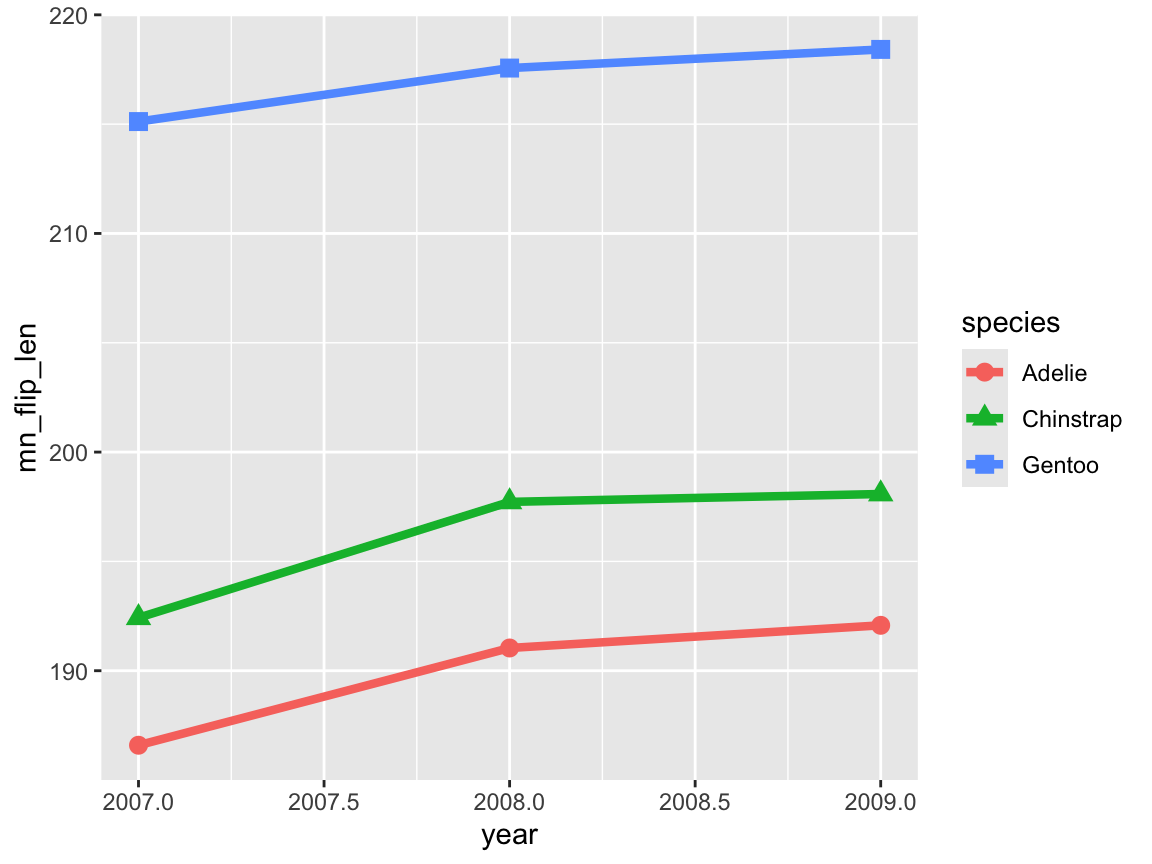
The resulting line plot shows three lines (with different colors and point shapes) for the three species, and even suggests that there may be some increase in the mean flipper length over the three years.
However, when noting ggplot2’s automatic choice of axis scales, we realize that the magnitude of these changes may be a bit misleading (especially due to truncating the range of \(y\)-axis values).
We therefore adjust our initial line plot lp_1 to a sensible axis values, and add some labels, scales, and another theme (Figure 9.22):
# Adjusting axes and tweaking aesthetics:
lp_1 +
  # Adjust labels, scales, and theme:
  labs(title = "Mean penguin flipper length by species over 3 years",
       x = "Year", y = "Mean flipper length (mm)", color = "Species:", shape = "Species:") +
  scale_x_continuous(limits = c(2007, 2009), breaks = c(2007, 2008, 2009)) +
  scale_y_continuous(limits = c(0, 220)) +
  scale_color_manual(values = my_cols) +
  theme_bw()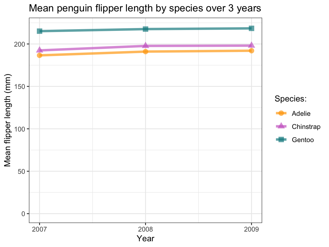
Figure 9.22: A line plot illustrating the mean flipper length of penguins observed in three years.
In Figure 9.22, the apparent increase in the mean flipper length values looks a lot less dramatic — illustrating that we should never trust plots with truncated axes and delegate judgments regarding differences to statistical analysis. And although Figure 9.22 provides a fine example of a line plot, using continuous lines suggests that we are observing the same penguins over time. If this is not the case, using some visualization with discrete elements (e.g., a bar or point chart) may be a better choice. (Note that Exercise 9.5.5 will create lines plots that depict larger changes over time.)
3. Trend lines
Summary trends show developments (over time or some other variable), but also average over some other variable. Trend lines can help judging the shape of relations (e.g., linear, quadratic, or curvilinear) or discovering patterns (e.g., clusters, trends).
Task: Plotting summary trends, which requires computing trends over some other data variable.
Fortunately, geom_smooth() does the computation for us.
Figure 9.18 showed the relation between penguins’ body mass and flipper length as a scatterplot.
Rather than showing the individual data points with geom_points(), we can use geom_smooth() to depict the average trend as a line (Figure 9.23):
ggplot(pg) +
  geom_smooth(aes(x = body_mass_g, y = flipper_length_mm)) +
  labs(title = "Penguin flipper length by body mass (as curvilinear trend)")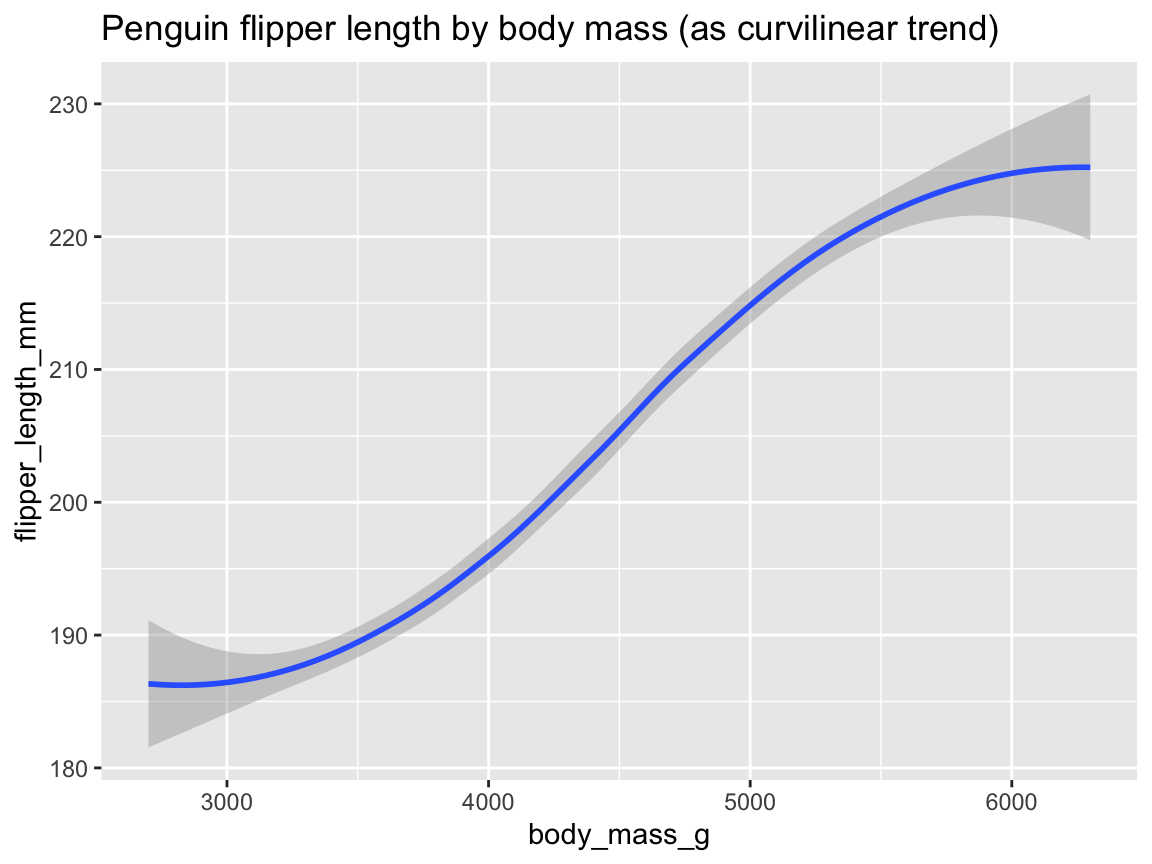
Figure 9.23: Plotting the (curvilinear) trend between two variables by geom_smooth().
Figure 9.23 illustrates the positive association between penguins’ body mass and flipper length as both a trend line with dispersion information (as a shaded area around the trend line).
The trend computed by geom_smooth()’s default smoothing method (known as "loess" for fewer than 1,000 observations) appears somewhat curvilinear, but could well be approximated by a linear model when ignoring the sparser and more uncertain data at both extremes of the body mass range.
Figure 9.24 shows this linear trend by specifying method = "lm" as an argument to geom_smooth():
ggplot(pg) +
  geom_smooth(aes(x = body_mass_g, y = flipper_length_mm), method = "lm") +
  labs(title = "Penguin flipper length by body mass (as linear trend)")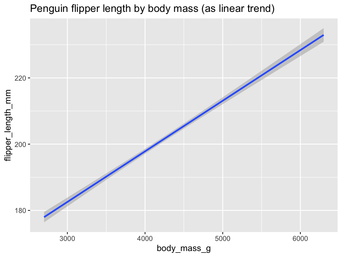
Figure 9.24: Plotting the linear trend between two variables by geom_smooth().
Let’s add a grouping variable to further inspect trends:
In our section on scatterplots, Figure 9.19 used the aesthetic mapping color = species to group the points by species.
We can now extend this logic to our trend, by adjusting the mapping of geom_smooth() in an analog fashion (Figure 9.25):
tp_02 <- ggplot(pg) +
  geom_smooth(aes(x = body_mass_g, y = flipper_length_mm, color = species)) +
  labs(title = "Penguin flipper length by body mass and species (as curvilinear trends)")
tp_02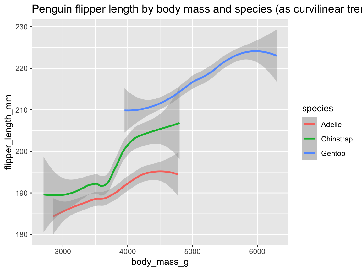
Figure 9.25: Plotting (curvilinear) trends by geom_smooth() with an aesthetic grouping variable (species).
Note that Figure 9.25 added geom_smooth() with analog mappings to Figure 9.19.
In psychology, we are often interested in linear trends (or linear regression models).
We can obtain this in geom_smooth() by adding method = "lm" (Figure 9.26):
tp_03 <- ggplot(pg) +
  geom_smooth(aes(x = body_mass_g, y = flipper_length_mm, col = species), method = "lm", alpha = .20) +
  labs(title = "Penguin flipper length by body mass and species (as linear trends)")
tp_03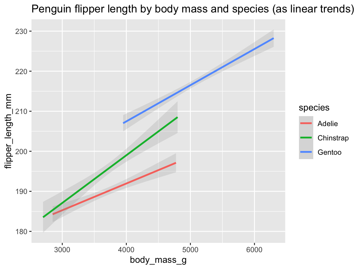
Figure 9.26: Plotting linear trends by geom_smooth() with an aesthetic grouping variable (species).
As before, we can further improve our plots by choosing better colors, labels, or themes.
Again, since Figure 9.26 was saved as an R object (tp_03), we can adjust it by adding labels, color scales, and a theme (Figure 9.27):
tp_04 <- tp_03 +
  labs(title = "Penguin flipper length by body mass and species",
       x = "Body mass (in g)", y = "Flipper length (in mm)",
       col = "Species:", shape = "Species:") +
  scale_color_manual(values = my_cols) +
  theme_unikn()
tp_04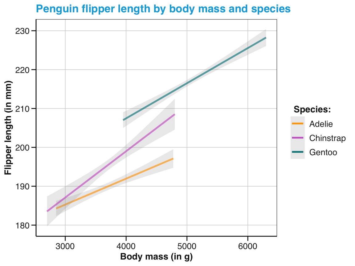
Figure 9.27: An adjusted version of linear trends by geom_smooth() with an aesthetic grouping variable (species).
As we have seen, geom_smooth() provides flexible ways of depicting relationships between two continuous variables as trend lines.
In practical applications, it will often make sense to combine scatterplots with trend lines (see the subsection Better relational plots of Section 9.3.2 below).
We conclude this section on line plots by some exercises that practice what we have learned.
Practice
Here are some practice tasks on plotting relationships in scatterplots, lines or trends:
-
Bill relations: What is the relation between penguin’s bill length and bill depth?
- Create a scatterplot to visualize the relationship between both variables for the
pgdata. - Does this relationship vary for different species of penguins?
- Create a scatterplot to visualize the relationship between both variables for the
-
Scattered penguins: The following code builds on our previous scatterplot (Figure 9.19, saved above as
sp_01), but maps the aesthetic featureshapeto the data variableisland, rather than tospecies.- Evaluate the code and the explain the resulting scatterplot.
- Criticize the plot’s trade-offs: What is good or bad about it?
- Try improving the plot so that the different types of
speciesandislandbecome more transparent.
ggplot(pg) +
  geom_point(aes(x = body_mass_g, y = flipper_length_mm, # essential mappings
                 col = species, shape = island),         # aesthetic variables vs.
             alpha = .50, size = 2)                      # aesthetic constants
# Possible solutions:

# Good: Mapping 2 variables means that there are many things to see
# Bad:  Complexity makes some things hard to see.

# Possible solutions:

# A: Tweaking aesthetics to improve visibility: ----
ggplot(pg) +
  geom_point(aes(x = body_mass_g, y = flipper_length_mm,  # essential mappings
                 col = species, shape = island            # aesthetic variables
                 ),                                       # vs.
             alpha = .40, size = 5                        # aesthetic constants
             ) +
  scale_color_manual(values = my_cols) +
  theme_minimal()

# B: Using 3 facets: ----
ggplot(pg) +
  geom_point(aes(x = body_mass_g, y = flipper_length_mm,  # essential mappings
                 col = species, shape = island            # aesthetic variables
                 ),                                       # vs.
             alpha = .50, size = 2                        # aesthetic constants
             ) +
  facet_wrap(~island)

# C: Using 3 x 3 faceting: ----
ggplot(pg) +
  geom_point(aes(x = body_mass_g, y = flipper_length_mm,  # essential mappings
                 col = species, shape = island            # aesthetic variables
                 ),                                       # vs.
             alpha = .50, size = 2                        # aesthetic constants
             ) +
facet_grid(species~island)-
Plotting mathematical functions: Figure 9.28 visualizes three mathematical functions.
- Try re-creating each line using
geom_function()(without restraining the range of \(x\)-values). - Try re-creating Figure 9.28 using
stat_function()(with the same ranges of \(x\)-values).
- Try re-creating each line using
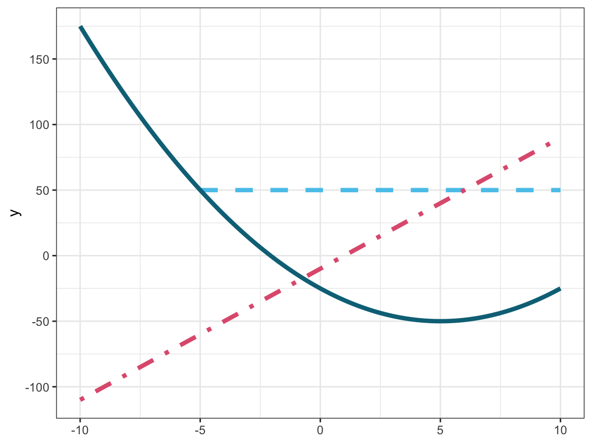
Figure 9.28: Plotting three mathematical functions (i.e., two linear and one quadratic function).
-
Penguin lines: Create a line plot that uses the
pgdata to show the development of penguin’s mean body mass by island over the observed period of three years. Note that the steps required for this task are analog to those leading to Figure 9.22 (above):- Create a small summary table that contains all desired variables.
- Use this table to create a basic line plot.
- Tweak the line plot (by adjusting its scales, labels, and theme) to provide a clear view of the “development” over time.
- Turn your line plot into a bar plot.
-
Bill trends: Add trend lines to your scatterplot showing the relation between penguin’s bill length and bill depth (from 1 above).
- Add trend lines both to the overall scatterplot and to the version distinguishing three
species. - Explore the effects of different
methodarguments.
- Add trend lines both to the overall scatterplot and to the version distinguishing three
Having learned to use ggplot2 to visualize
distributions (e.g., by using geom_histogram() or geom_density()), summaries (geom_bar(), geom_col(), or geom_boxplot())
or relations as sets of points (geom_point()) or lines (geom_function(), geom_line(), geom_smooth()),
we are ready to discover some of its more advanced aspects.
9.3 Advanced aspects of ggplot2
Using more advanced features of ggplot2 requires a more general template than the minimal one of Section 9.2.2 (above).
In addition to aesthetic mappings and layers of geoms, we will encounter facets.
Whereas layers denote multiple levels of geoms on a plot (behind/before each other),
facets create multiple variants of a plot (beside/next to each other).
The additional topics mentioned in this section are:
- Creating better plots by combining geoms
- Splitting up plots into facets
- Adjusting axis ranges and coordinate systems
- Combining and saving plots
We will conclude this section by mentioning ggplot2 extensions.
9.3.1 Generic template
A generic template for creating a visualization in ggplot2 with some additional bells and whistles has the following structure:
# Generic ggplot template:
ggplot(data = <DATA>) +                 # 1. specify data set to use
  <GEOM_fun>(mapping = aes(<MAPPING>),  # 2. specify geom + mappings
             <arg_1 = val_1, ...) +     # - optional arguments to geom
  ...                                   # - additional geoms + mappings
  <FACET_fun> +                         # - optional facet function
  <LOOK_GOOD_fun>                       # - optional colors, labels, and themes
The generic template includes the following elements (beyond the <DATA> and <GEOM_fun> of the minimal template):
Multiple
<GEOM_fun>yield layers of geometric elements. Variable mappings shared by all geoms can be moved up into theggplot()function, but geoms can also use specific mappings.An optional
<FACET_fun>uses one or more variable(s) to split a complex plot into multiple sub-plots.A sequence of optional
<LOOK_GOOD_fun>adjust the visual features of plots (e.g., by adding titles and text labels, color scales, plot themes, or setting coordinate systems).
9.3.2 Better plots with ggplot2
We saw above that plots can be constructed out of multiple layers.
The ability to combine geoms can be a powerful tool for creating better plots.
However, not every geom can or should be combined with every other.
While there is no general rule that determines whether a given geom A fits to another geom B, most matching geoms share some variable mappings (e.g., to the plot dimensions X or Y).
When using multiple geoms (in layers):
- We can specify common mappings globally, rather than locally.
- We should consider the order of geoms: Later geoms appear on top of earlier geoms.
In the following, we will improve the basic plot types introduced above by combining layers of geoms. Specifically, we will provide three examples for advanced uses of ggplot2:
- Better summary plots (by combining raw values, distribution and summary information)
- Better summary plots (by combining mean values with dispersion information)
- Better relational plots (by combining scatterplots with trends)
As we often lack an established name for a visualizations that we create by flexibly combining geoms, it makes sense to identify plots by the function(s) they serve (e.g., visualize raw values, distributions, summaries, or relations). For the following examples, we will first identify a task and then combine geoms to create visualizations that address this task.
Better summary plots (with raw data and distribution information)
When first encountering new data, we often want to inspect the values of a variable \(A\) as a function of another variable \(B\). When \(A\) is continuous (e.g., denoting some measurement or score) and \(B\) is categorical (e.g., expressing natural or experimental groups), we face the following task:
- Task: Provide an overview of raw data values with summary information on means and distributions
Showing both raw values and summary information in the same visualization might seem odd at first. But since many summary plots raise questions that are answered by viewing raw values, such combinations often makes sense. But how could we visualize raw values and summaries in a single plot?
Actually, we are already familiar with most elements that we need for such a plot.
Figure 9.17 (above) showed penguin’s body mass by species as a box plot and
Figure 9.19 showed flipper length as a function of body mass as a scatterplot, but grouped by penguin species.
The key step in combining boxplot and scatterplot lies in mapping a continuous variable to y and a categorical variable to x.
Figure 9.29 combines geom_boxplot() with geom_point():
ggplot(pg) +
  geom_boxplot(aes(x = species, y = body_mass_g)) +
  geom_point(aes(x = species, y = body_mass_g))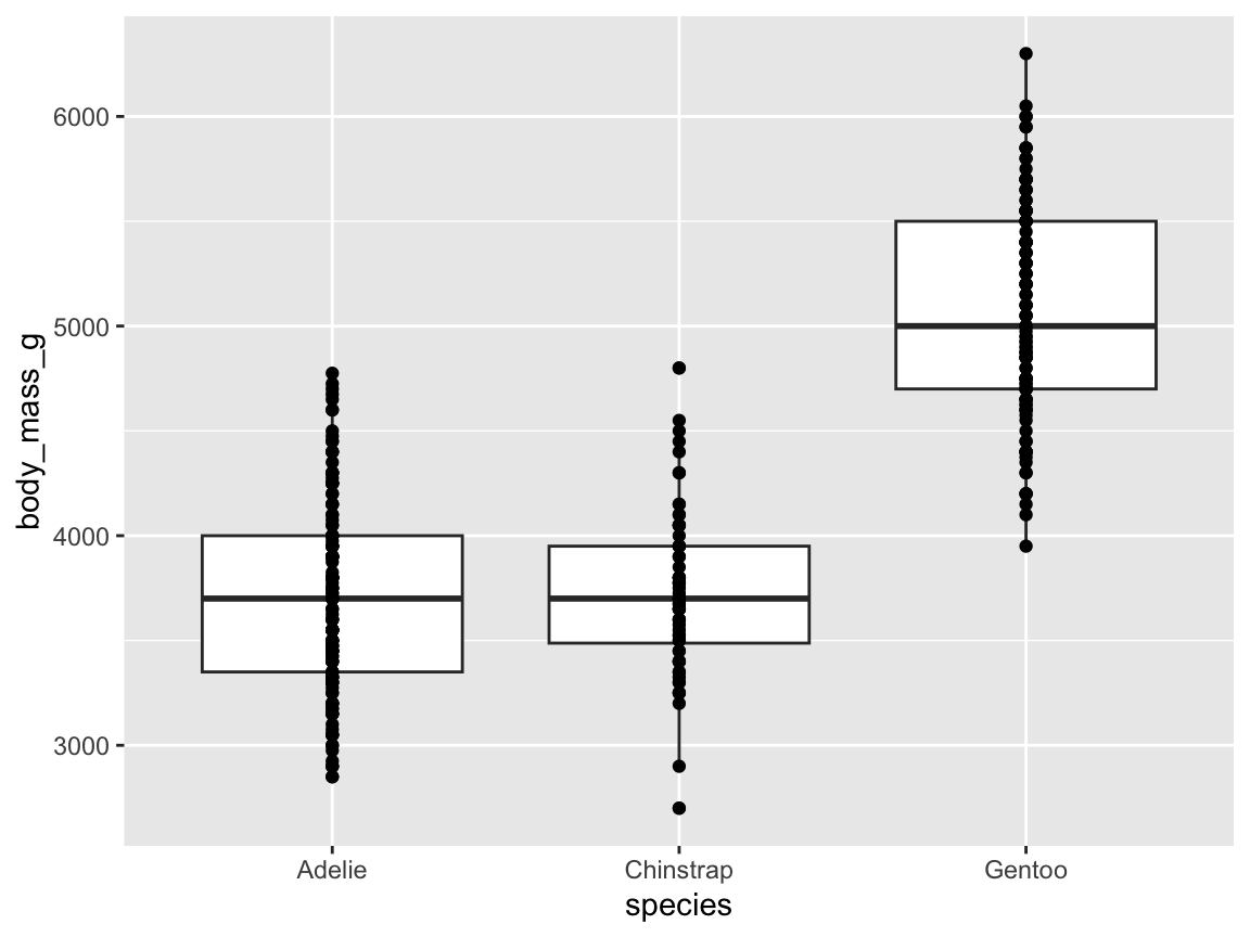
Figure 9.29: A basic raw and summary data plot, with a categorical variable x and a continuous variable y.
Note that our chosen order of geoms plots the scatterplot on top of the boxplot, rather than vice versa.
An immediate problem with Figure 9.29 is that many of the individual body mass values within a penguin species are plotted on top of each other (i.e., overplotting).
Rather than using color transparency for the points, we can improve the plot by adding randomness to the point locations. For instance, we can set the position option to the keyword "jitter" (Figure 9.30):
ggplot(pg) +
  geom_boxplot(aes(x = species, y = body_mass_g)) +
  geom_point(aes(x = species, y = body_mass_g), position = "jitter")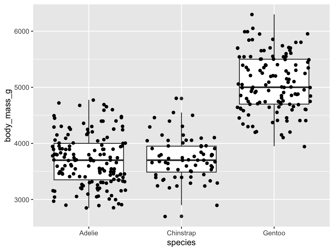
Figure 9.30: A raw and summary data plot, with a categorical variable x and a continuous variable y, and jittered point positions.
Figure 9.30 is an improvement, but we can do even better.
First, when using jittered points, we can replace geom_point() by geom_jitter() and control the amount of horizontal and vertical position jittering by convenient width and height arguments.
Second, we can provide additional information about the distribution of values within a species by adding geom_violin() with the same aesthetic mappings to x and y (Figure 9.31):
raw_p_1 <- ggplot(pg) +
  geom_violin(aes(x = species, y = body_mass_g, fill = species)) +
  geom_boxplot(aes(x = species, y = body_mass_g)) +
  geom_jitter(aes(x = species, y = body_mass_g), width = .10, height = 0)
raw_p_1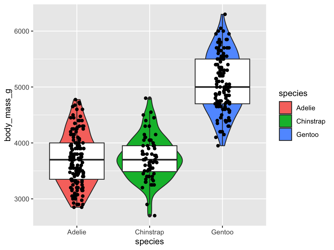
Figure 9.31: A raw and summary data plot with additional information on the distribution of values within each categorical variable.
The code for Figure 9.31 repeats the same aesthetic variable mappings for three geoms. As common aesthetic mappings can be abstracted by moving them into first line (as an argument of the initial ggplot() function), the following code would provide the same plot (except for the randomness in the horizontal point positions):
raw_p_2 <- ggplot(pg, aes(x = species, y = body_mass_g)) +
  geom_violin(aes(fill = species)) +
  geom_boxplot() +
  geom_jitter(width = .10, height = 0)
raw_p_2
Finally, we add some tweaks to improve our visualization further.
Beyond adding text labels, choosing a customized color palette and a theme, Figure 9.32 adjusts the width option of all three geoms to compatible values:
ggplot(pg, aes(x = species, y = body_mass_g)) +
  geom_violin(aes(fill = species), width = .60) +
  geom_boxplot(width = .25) +
  geom_jitter(width = .08, height = 0, color = grey(0, .33)) +
  scale_fill_manual(values = my_cols) +
  labs(title = "Penguin mass by species",
       x = "Species", y = "Mean mass (in g)", fill = "Species") +
  theme_unikn()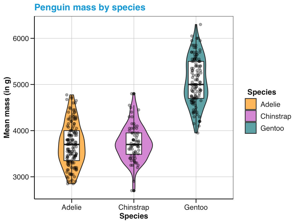
Figure 9.32: The same raw and summary data plot with manual colors, width parameters, and informative labels.
Overall, Figure 9.32 provides detailed information on the central tendency and the value distribution of some variable of interest (i.e., penguin’s body mass) as a function of a categorical variable (species).
The issue of overplotting the individual data points is addressed both by jittering their (horizontal) positions and by coloring them in a transparent shade of grey (by grey(0, .33))
Nevertheless, showing each individual data point may become impractical for datasets with many observations. In this case, combining geom_violin() with geom_jitter() may still provide a useful option.
Better summary plots (with mean value and dispersion information)
We learned above that bar charts are complicated by implicit computations.
By default, geom_bar() assumes that we want to count the number of observations per category.
For example, Figure 9.8 counted the number of penguins per species.
By contrast, many bar charts provide information on the average of some variable.
For example, Figure 9.12 showed penguin’s mean body mass by species.
This difference shows that the height of the bars in a bar chart can denote different kinds of quantities: Counts, means, proportions, sums, or the values of any other continuous variable.
Many of these variables imply corresponding values of additional variables.
As an example, statistical comparisons between means typically raise questions regarding the dispersion of values, which are typically answered by displaying errors bars or confidence intervals.
This section addresses a common task in this context:
- Task: Combine a data summary plot with variation information and text annotations.
In this section, we will focus on bar charts, but the general strategy for designing them can be applied to other types of visualizations. Rather than relying on intransparent data transformations (performed by geoms), a better way to create visualizations is to explicitly compute all values that we aim to visualize. This may require a bit more effort upfront, but also provides more control and is both transparent and reproducible.
As an example, we integrate the basic counts of Figure 9.8 and the mean chart of Figure 9.12 in a different way. As we can only display one variable by the heights of bars, we will display the counts or frequency of penguins as text labels, while the bars denote their average mass per species. Interestingly, doing so will not require geom_bar(), but rather geom_col(), plus additional geoms (for displaying other variables as error bars or text labels).
The following steps provide a general recipe for creating better summary plots:
-
Pre-process data:
We first use the raw data to compute all variables and values that we want to display in a summary table.
For the present visualization, we use the
pgdata to count its observations and compute summary values for the continuousbody_mass_gvariable byspecies. Specifically, we compute the numbernof observations and the number of missing (NA) values per category, their means, standard errors, and use the two latter values to compute the 95%-confidence intervals (which extend 1.96 standard error units below and above the mean values).
As base R does not include a function for computing standard errors (SE), we look up its definition online (e.g., on Wikipedia). For a vector of data values \(\bar{x}\) of length \(n\), we find
\(SE(\bar{x}) = \frac{SD(\bar{x})}{\sqrt{n}}\)
This formula can easily be translated into an R function:
# Compute the standard error (SE) for a vector x:
se <- function(x) {

  # Handle NA values:
  if (any(is.na(x))){

    x <- x[!is.na(x)]  # remove NA values

  }

  # Compute SE:
  sd(x) / sqrt(length(x))

}
Note that the bulk of our makeshift se function deals with missing values in x by removing them.
We now could use our base R skills from Chapters 2 and 3 to compute a new data frame of summary values by species. For instance, some useful computations could be:
table(pg$species)  # Number of observations (per species)
#>
#>    Adelie Chinstrap    Gentoo
#>       152        68       124
tapply(pg$body_mass_g, pg$species, mean, na.rm = TRUE)  # Mean body mass (per species)
#>    Adelie Chinstrap    Gentoo
#>  3700.662  3733.088  5076.016
tapply(pg$body_mass_g, pg$species, se)  # SE (per species)
#>    Adelie Chinstrap    Gentoo
#>  37.31758  46.60747  45.45463
As ggplot() accepts only one data argument, we would need to compute all required variables first and then assemble them into a new data frame.
These steps can be simplified by using the dplyr package and the R pipe operator |>, which links multiple functions.
As we will introduce dplyr and the pipe in Chapter 13 on Transforming data, the next code chunk will remain a little obscure at this point. Nevertheless, you can copy and run the code and realize that it performs many useful steps in one efficient chain of commands.
Specifically, the following pipe computes all our desired values (means, counts, SE values, and confidence intervals) at once and returns a table tb that we can then provide to ggplot():29
library(dplyr)  # see Chapter 13: Transforming data

# Summarize body_mass_g of penguins (per species):
tb <- pg |>
  group_by(species) |>
  summarise(n = n(),
            n_NA = sum(is.na(body_mass_g)),
            mean_body_mass = mean(body_mass_g, na.rm = TRUE),
            se_body_mass = se(body_mass_g),
            ci_low  = mean_body_mass - (1.96 * se_body_mass),
            ci_high = mean_body_mass + (1.96 * se_body_mass)
            )
# tb

# Print tb:
knitr::kable(tb, caption = "The tibble `tb` contains summary values (by species) computed from the `pg` raw data .", digits = 1)| species | n | n_NA | mean_body_mass | se_body_mass | ci_low | ci_high |
|---|---|---|---|---|---|---|
| Adelie | 152 | 1 | 3700.7 | 37.3 | 3627.5 | 3773.8 |
| Chinstrap | 68 | 0 | 3733.1 | 46.6 | 3641.7 | 3824.4 |
| Gentoo | 124 | 1 | 5076.0 | 45.5 | 4986.9 | 5165.1 |
Next, we will use the summary table tb — rather than the raw data pg — to create a bar chart.
- Basic visualization: In a second step, we use ggplot2 to create a basic visualization. This visualization is “basic” insofar it contains only a bare scaffold, which we can adorn and improve upon later. Nevertheless, it is important to get this step right — and bar charts provide a wealth of options that can easily lead us astray.
For demonstration purposes, let’s first re-create Figure 9.8 (showing the number of penguin observations by species). As our summary table tb already contains the desired counts (as the values of a variable named n), we no longer need geom_bar() to count anything.
Thus, we now can map the y variable of geom_bar() to n and switch off the geom’s default counting behavior (i.e., its default of stat = "count") by specifying stat = "identity":

An even easier way to achieve the same result is to replace geom_bar() by geom_col() (for “column”).
Whereas geom_bar() by default uses stat = "count", geom_col() uses stat = "identity" by default:
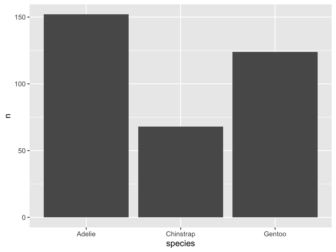
When visualizing pre-computed values (as contained in our table tb), using geom_col() generally provides a better way of creating bar charts. The main reason for pre-computing the values is that the computation of the values in tb was fully transparent and entirely under our control.
For instance, if it turned out that we made an error in our standard error computation, we could fix our se() function and re-create the values of tb.
A related benefit is that the pre-computed summary table tb can contain several variables that we want to display. We could decide to use distinct variables of tb for creating different visualizations, or for including multiple variables in a single visualization.
Presently, we primarily want to re-create Figure 9.12, which depicted penguin’s mean body mass by species. Based on our summary table tb, we can easily do this by using geom_col(), but now changing the variable mapping of y to the variable mean_body_mass:
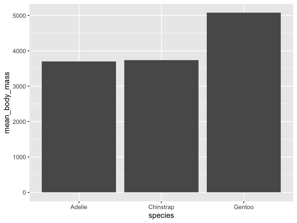
This ggplot() command is arguably much clearer and easier than the one that created Figure 9.12 (above). Hence, beyond increasing our control over the computation of values, a secondary benefit of pre-computing all needed values in a summary table tb lies in simplifying our visualization code.
-
Adding variables (as layers of geoms):
Having achieved our initial goal (of showing penguin’s mean body mass by species), we can improve our basic visualization by adding information to it.
When this involves adding information about other variables, it usually implies adding layers of geoms that work well with an existing setup (i.e., using
geom_col()andx = species). In the context of our current bar chart, we include two common variables, both of which were pre-computed intb:
- confidence intervals around the mean values (as error bars)
- the number of individuals per species (as text annotations)
A range around existing mean values can marked by geom_errorbar(), which accepts ymin and ymax options to set the lower and higher boundary of each error bar. Importantly, we also need to include aes(x = species) to obtain three error bars for our three bars.
Similarly, text annotations can be achieved by a geom_text() function, again with aes(x = species). To show the counts of the variable tb$n1 as the label of each bar, we use the mapping label = n in the aes() part of geom_text().
A basic solution is created by Figure 9.33:
ggplot(tb) +
geom_col(aes(x = species, y = mean_body_mass)) +
geom_errorbar(aes(x = species, ymin = ci_low, ymax = ci_high), width = .50) +
geom_text(aes(x = species, y = mean_body_mass/2, label = n))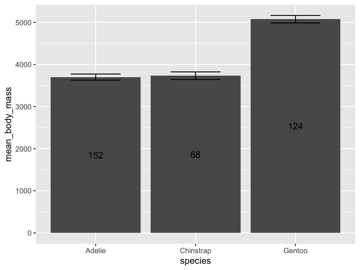
Figure 9.33: A basic bar chart of means, with error bars and text labels showing a different variable.
Note that mapping the \(y\)-value of geom_text() to a value of mean_body_mass/2 placed the text labels in the middle of each bar. Alternatively, we could have located the labels directly above or below the top of each bar (e.g., by setting y = mean_body_mass - 500) , or used a constant value (e.g., by setting y = 500 to place the labels near the lower base of each bar).
Before fine-tuning our visualization, we unify shared aesthetic mappings as arguments of the aes()-part of the initial ggplot() function. As all three geoms share the mapping x = species, we can simplify our code as follows:
ggplot(tb, aes(x = species)) +
  geom_col(aes(y = mean_body_mass)) +
  geom_errorbar(aes(ymin = ci_low, ymax = ci_high), width = .50) +
  geom_text(aes(y = mean_body_mass/2, label = n))
The resulting visualization is fully functional, but bare in terms of aesthetics and labels. Thus, we add those elements in the next and final step.
-
Adjusting aesthetics and labels:
Although Figure 9.33 contained all data variables that we wanted to show, its appearance can still be improved.
The final step in creating a visualization includes adding text labels (e.g., a plot title, labels for axes, and legends) and decorations (e.g., suitable colors and a theme).
Figure 9.34 adds the aesthetic mapping
fill = speciestogeom_col(), sets the fill color scale tomy_cols(from above), and edits various text labels (by addinglabs()):
ggplot(tb, aes(x = species)) +
  geom_col(aes(y = mean_body_mass, fill = species)) +
  geom_errorbar(aes(ymin = ci_low, ymax = ci_high), width = .33, linewidth = .75) +
  geom_text(aes(y = mean_body_mass/2, label = paste("N =", n)), size = 4) +
  # Adjust aesthetics:
  labs(title = "Mean penguin body mass by species",
       x = "Species", y = "Mean body mass (in g)", fill = "Species:") +
  scale_fill_manual(values = my_cols) +
  guides(fill = "none") +
  theme_unikn()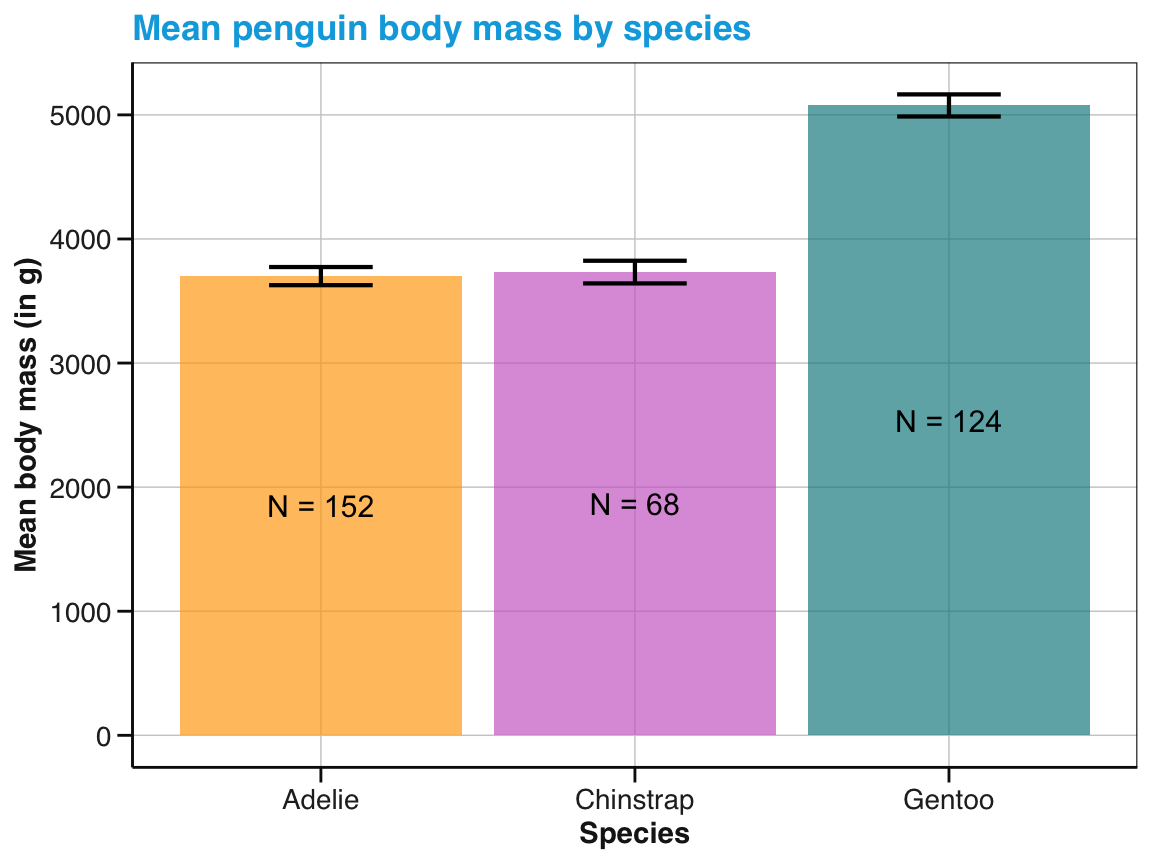
Figure 9.34: A bar chart with three data variables and additional aesthetic settings (labels, colors, and a theme).
The function guides(fill = "none") removes the legend of the fill color. While showing legends is generally recommended, this legend would be redundant here, as the three penguin species are identified on the \(x\)-axis.
Figure 9.34 may not be perfect, but is more informative than all previous summary charts (above). Regarding functionality, it combines information on the central tendency (means), variation (confidence intervals), and counts (frequency of penguins) per species in a single visualization.
Additionally, it provides informative text labels and a color scale and theme that correspond to related visualizations in this chapter.
Thus, we conclude that our summary table tb has been successfully visualized.
Providing raw data vs. summary data to ggplot()
We conclude this section by reflecting on the differences between using the pg raw data versus the table of pre-processed summary values tb as the data argument of a corresponding ggplot() function.
First, both data tables vastly differ in terms of size:
Whereas pg is a raw data table of 344 rows and 8 columns, tb is only a small summary table of 3 rows and 7 columns.
As tb resulted from pre-computing the values we wanted to display, the ggplot() functions for creating visualizations were simple and straightforward.
By contrast, creating corresponding visualizations from pg would require implicit computations (e.g., performed by the stat functions of geoms) and typically ignore most variables present in the data.
A second difference directly depends on the variables present in the data argument of ggplot().
As long as tb contains all the variables and values that we need, it is perfectly sufficient for creating visualizations in a lean and straightforward fashion. However, a limitation of using a pre-processed summary table is that it dropped a lot of information that was present in pg. In other words, smaller is not always better.30
For instance, if we ever wanted to visualize additional aspects of the data, the data argument provided as input to the ggplot() function must provide corresponding variables. To illustrate this point, imagine further differentiating our bar chart of Figure 9.34 by island or sex. As we have dropped these variables from tb, we would either need to use the original pg data for this purpose or, alternatively, include island or sex information in an extended version of tb.
Better relational plots (by combining raw values with trends)
Task: Combine scatterplots with (curvilinear or linear) trends and distribution info (rugs)
Figure 9.18 showed the relation between penguins’ body mass and flipper length as a scatterplot, whereas
Figure 9.23 illustrated the same relation as a curvilinear trend.
As each version has its unique strengths, it is straightforward to combine both layers.
Figure 9.35 combines geom_smooth() with geom_point() to show a trend line with raw data information:
ggplot(pg) +
  geom_smooth(aes(x = body_mass_g, y = flipper_length_mm)) +
  geom_point(aes(x = body_mass_g, y = flipper_length_mm)) +
  labs(title = "Penguin flipper length by body mass (as scatterplot and curvilinear trend)")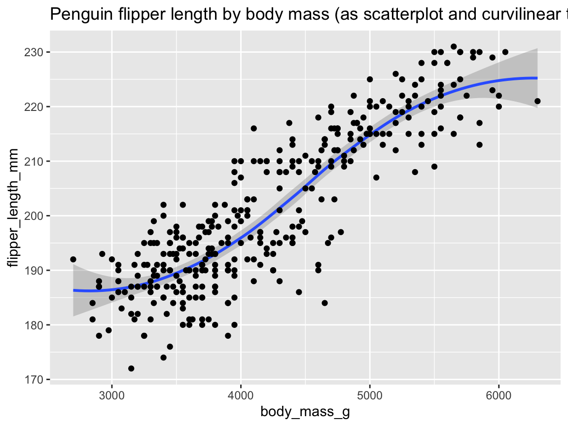
Figure 9.35: Plotting the relation between two variables as a scatterplot with trend line.
A third geom that could be added to Figure 9.35 is geom_rug().
Figure 9.36 shows distribution information on the axes, in addition to the scatterplot with a (linear) trend line:
ggplot(pg) +
  geom_smooth(aes(x = body_mass_g, y = flipper_length_mm), method = "lm") +
  geom_point(aes(x = body_mass_g, y = flipper_length_mm)) +
  geom_rug(aes(x = body_mass_g, y = flipper_length_mm), linewidth = 1, alpha = .20) +
  labs(title = "Penguin flipper length by body mass (as scatterplot and linear trend, with value distribution)")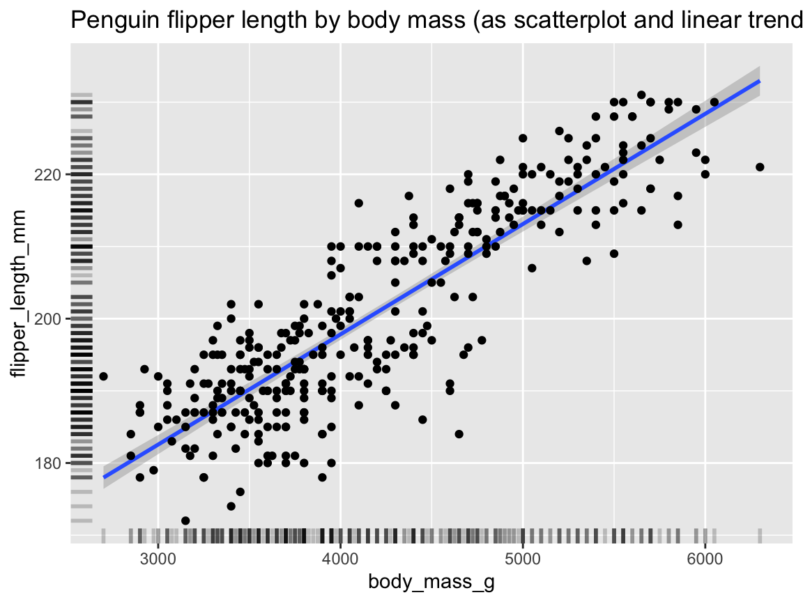
Figure 9.36: Plotting the relation between two variables as a scatterplot with (linear) trend line and distribution information.
As all three geoms use the same variable mappings to x and y, we can simplify the code of Figure 9.36 as follows:
ggplot(pg, aes(x = body_mass_g, y = flipper_length_mm)) +  # shared mappings (for all geoms)
  geom_smooth(method = "lm") +
  geom_point() +
  geom_rug(linewidth = 1, alpha = .20) +
  labs(title = "Penguin flipper length by body mass (as scatterplot and linear trend, with value distribution)")
To add further information, we can combine the same geoms with an additional grouping variable. For instance, a better version of the linear trends of penguin flipper length by body mass for each species (Figure 9.27) is provided by Figure 9.37:
tpr_01 <- ggplot(pg) +
  geom_smooth(aes(x = body_mass_g, y = flipper_length_mm, color = species),
              method = "lm", alpha = .20) +
  geom_point(aes(x = body_mass_g, y = flipper_length_mm, color = species, shape = species),
             alpha = .50, size = 2.5) +
  geom_rug(aes(x = body_mass_g, y = flipper_length_mm),
           position = "jitter", linewidth = 1, alpha = .20) +
  # Set labels, colors, and theme:
  labs(title = "Penguin flipper length by body mass and species",
       x = "Body mass (in g)", y = "Flipper length (in mm)",
       color = "Species:", shape = "Species:") +
  scale_color_manual(values = my_cols) +
  theme_unikn()
tpr_01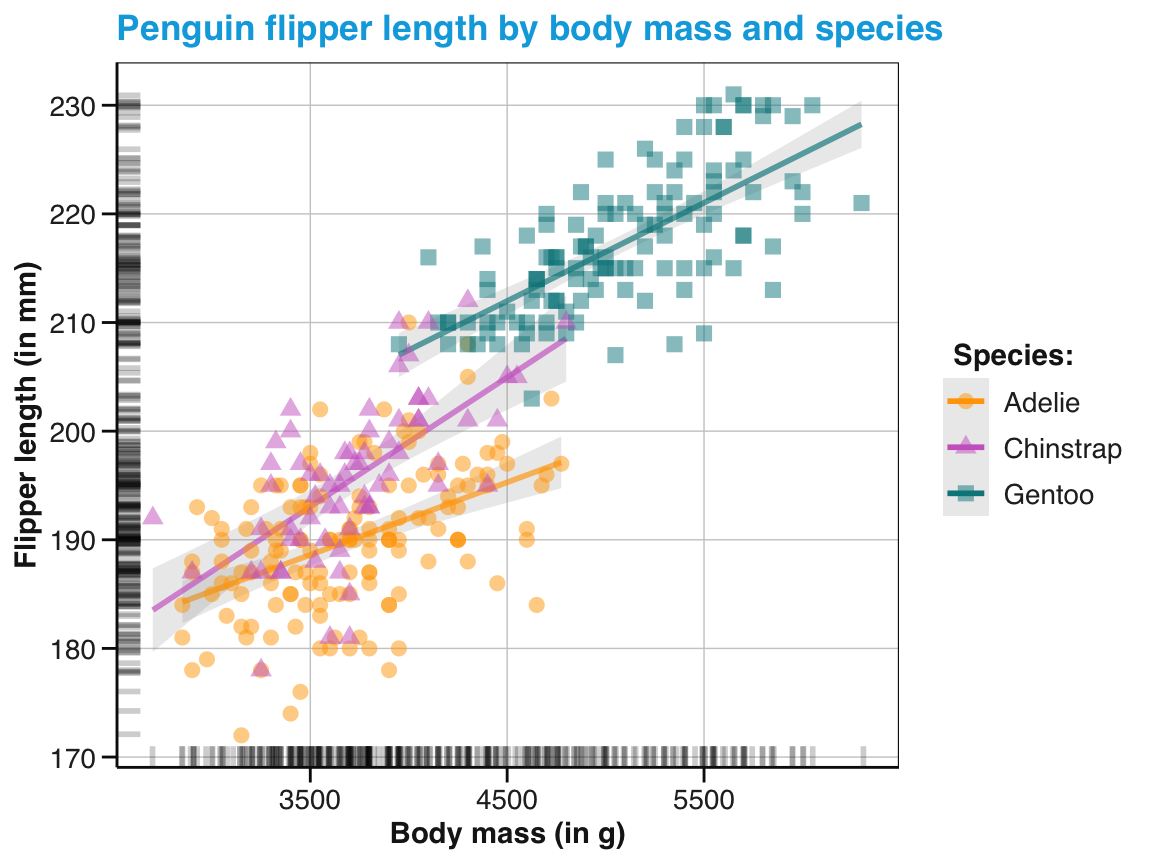
Figure 9.37: Plotting a scatterplot with linear trends and distribution information and an aesthetic grouping variable (species).
Note that Figure 9.37 used the aesthetic mapping col = species in geom_smooth() and ingeom_point(), but _not_ ingeom_rug(). As a consequence, the rugs (positioned by default on the $x$- and $y$-axis) indicate the overall distribution of values, rather than on value distributions grouped by species. Again, we can simplify the code by moving shared aesthetic mappings up to the initialggplot()` function:
tpr_02 <- ggplot(pg, aes(x = body_mass_g, y = flipper_length_mm)) +
  geom_smooth(aes(color = species), method = "lm",  alpha = .20) +
  geom_point(aes(color = species, shape = species), alpha = .50, size = 2.5) +
  geom_rug(position = "jitter", linewidth = 1, alpha = .20) +
  # Set labels, colors, and theme:
  labs(title = "Penguin flipper length by body mass and species",
       x = "Body mass (in g)", y = "Flipper length (in mm)",
       color = "Species:", shape = "Species:") +
  scale_color_manual(values = my_cols) +
  theme_unikn()
tpr_02
Before we encounter even more features of ggplot2, let’s practice what we learned about creating better plots with ggplot2.
Practice
- Layering geoms: Creating better plots by combining multiple geoms.
- What happens when we reverse the positions of
geom_boxplot()andgeom_point()of Figure 9.29? Why?
ggplot(pg) +
  geom_point(aes(x = species,   y = body_mass_g)) +
geom_boxplot(aes(x = species, y = body_mass_g))- Re-create a version of Figure 9.32 without showing the individual data points (i.e., without
geom_jitter()). What happens if you change the order of geoms?
-
Tricky bar charts:
Assuming the data from the summary table
tb(computed above), predict and explain what the following commands would show or yield? How could you fix each command to create a better plot?
ggplot(tb) +
  geom_bar(aes(x = species))

ggplot(tb) +
  geom_bar(aes(x = species, y = mean_body_mass))

ggplot(tb) +
geom_col(aes(x = n, y = mean_body_mass))-
Better bar charts:
Figure 9.34 used the data from a summary table
tbto visualize penguin’s mean body mass, corresponding confidence intervals, and frequency (counts per category) as a bar chart. However, ourtbtable also contained information on the number of missing (NA) exemplars per category.
- Modify the code for Figure 9.34 to include this information in the bar chart.
- Change the code to map the frequency counts per category to bar heights, and the mean mass in some other way.
- Explain what would be needed to group the data contained in the summary table
tbbyislandor bysex.
- Better scatterplots: Create a scatterplot with curvilinear trends that illustrates the relation between penguin body mass and bill length:
9.3.3 Faceting
Visualizations that show a lot of data or use multiple geoms can quickly become rather crowded (as some examples in the last section may illustrate). When this happens, a truly powerful feature of ggplot2 is the ability to split plots into sub-plots by so-called faceting. Facets use the levels of a categorical variable (or factor) to split complicated plots into simpler sub-plots (i.e., the facets or panels of an overall visualization).
Faceting a visualization is very similar to grouping by a variable.
As we have seen, mapping a categorical data variable (or factor) to an aesthetic feature (like color, fill, or shape) results in grouping visual elements into the category levels of this variable.
Whereas such grouping occurs within a visualization, faceting groups data between sub-plots of a visualization.
Instead of grouping instances by an aesthetic mapping (e.g., distinguishing types by shape or color), this is achieved by providing categorical data variables to a faceting function.
As an example, consider the histogram of penguin flipper lengths in which we grouped the fill color by the species variable (i.e., using geom_histogram() with an aesthetic mapping function aes(x = flipper_length_mm, fill = species), as in Figure 9.7 above, which we saved as pg_4):
# Using a color-coded histogram (defined above):
pg_4
Modifying the overall histogram (of Figure 9.4) by mapping the fill color to the species variable (in Figure 9.7) revealed additional information, but also made the frequency counts harder to interpret, as some bars included counts of only one, but others of two, or even of three different species.
We can disentangle both aspects (frequency overall vs. by species) by splitting the visualization into three panels by using the facet_wrap() function:
# Explicit grouping/splitting by 1 faceting variable:
pg_4 +
  facet_wrap(~species)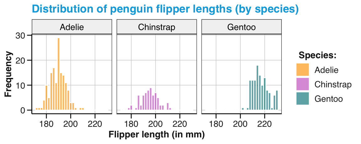
Figure 9.38: A histogram split into 3 facets or panels.
The three panels of Figure 9.38 allow comparing frequency counts within a species and between species.
Interestingly, not only is the \(y\)-axis shared by all three panels, but an identical \(x\)-axis for all panels also allows judging shifts in the distributions by their relative positions.
Note that we provided the species variable as an argument to facet_wrap() in the formula notation ~species (i.e., preceded by the squiggly tilde symbol ~) and that the automatic panel headings render the legend for the fill color redundant (so that we could remove it by adding theme(legend.position = "none")).
Using two categorical variables to split a busy visualization into panels extends this strategy into a facet grid. The facet_grid() function creates a matrix of panels that are labeled on so-called strips on the top (for the levels of the \(x\)-dimension) and on the right (for the levels of the \(y\)-dimension):
# Explicit grouping/splitting by a faceting grid:
pg_4 +
facet_grid(island ~ species) 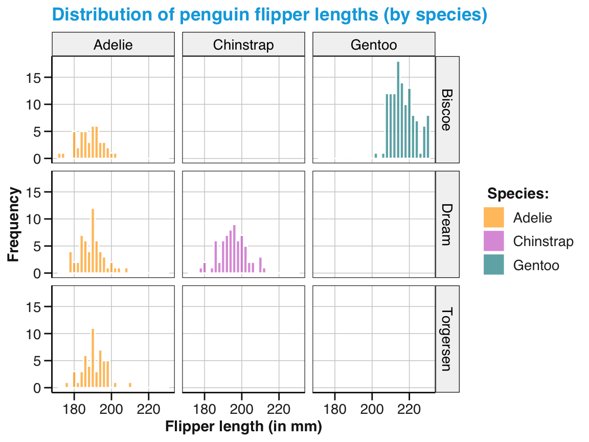
Figure 9.39: A histogram split into 3 x 3 facets or panels.
Figure 9.39 is a bit sparse, but may be well-suited to communicate the absence of some species on some islands. Note that all facets/panels again use the same \(x\)- and \(y\)-axes.
Overall, faceting both de-clutters complex visualizations and enables comparisons across rows or columns.
9.3.4 Even more features
In case you have not been convinced yet, here are some additional features that may make ggplot2 the greatest thing since sliced bread. In this section, we will briefly illustrate three points:
Defining axis ranges and coordinate systems
Combining several independent plots
Saving and restoring plots
Axis ranges and coordinate systems
When creating new visualizations, we usually rely on the automatic ranges for the values on the \(x\)- and \(y\)-axis. But sometimes it is desirable or necessary to manually set the value ranges of axes.
To illustrate this point, we briefly compute the average penguin bill length and bill depths (using a dplyr pipe that we will learn to understand in Chapter 13 on Transforming data):
# Pre-process data: Compute mean bill length and depth
pg_bill <- pg %>%
  group_by(species) %>%
  summarize(n = n(),
            mn_bill_len = mean(bill_length_mm, na.rm = TRUE),
            mn_bill_dep = mean(bill_depth_mm,  na.rm = TRUE))

# Print summary table:
knitr::kable(pg_bill, caption = "Summary data on penguin bill length vs. width by species.")| species | n | mn_bill_len | mn_bill_dep |
|---|---|---|---|
| Adelie | 152 | 38.79139 | 18.34636 |
| Chinstrap | 68 | 48.83382 | 18.42059 |
| Gentoo | 124 | 47.50488 | 14.98211 |
Next, we visualize penguins’ mean bill length by species as a bar chart (using geom_col() in Figure 9.40):
# A: automatic y-axis:
ggplot(pg_bill) +
  geom_col(aes(x = species, y = mn_bill_len, fill = species)) +
  labs(title = "Penguin bill length by species") +
  scale_fill_manual(values = my_cols)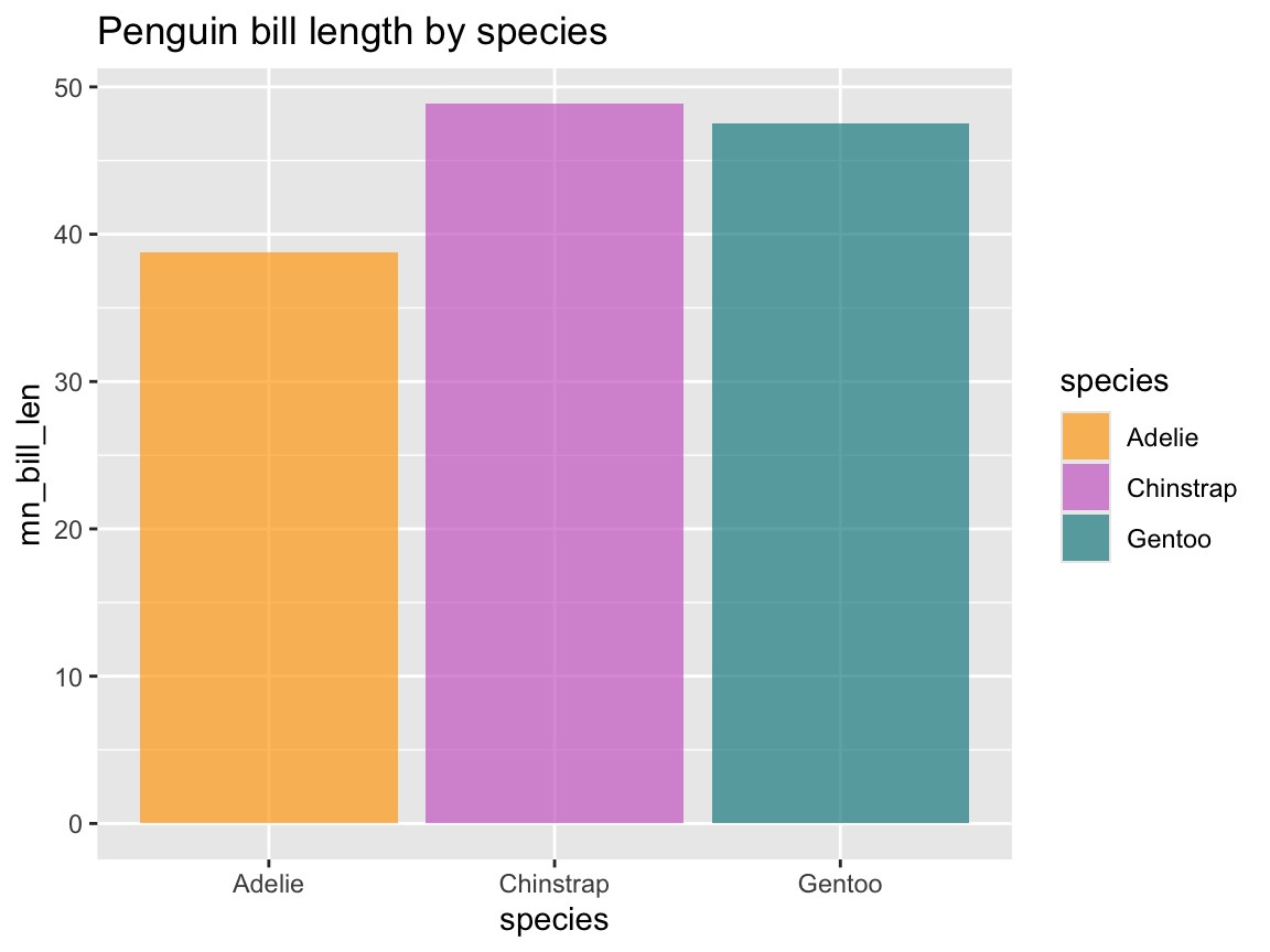
Figure 9.40: A bar chart with automatic range for \(y\)-axis values.
If we were to create the same plot for bill depth, merely replacing the mapping y = mn_bill_len by y = mn_bill_dep would automatically re-scale the \(y\)-axis to a lower range of values (as the average bill depth does not exceed 20mm).
To set this to a similar range as in Figure 9.40, we need to re-scale the y-axis to a wider range of values. As y is to be mapped to a continuous variable (mn_bill_dep), we use
scale_y_continuous(limits = c(0, 50)):
# B: adjusting y-axis range:
ggplot(pg_bill) +
  geom_col(aes(x = species, y = mn_bill_dep, fill = species)) +
  scale_y_continuous(limits = c(0, 50)) +
  labs(title = "Penguin bill depth by species") +
  scale_fill_manual(values = my_cols)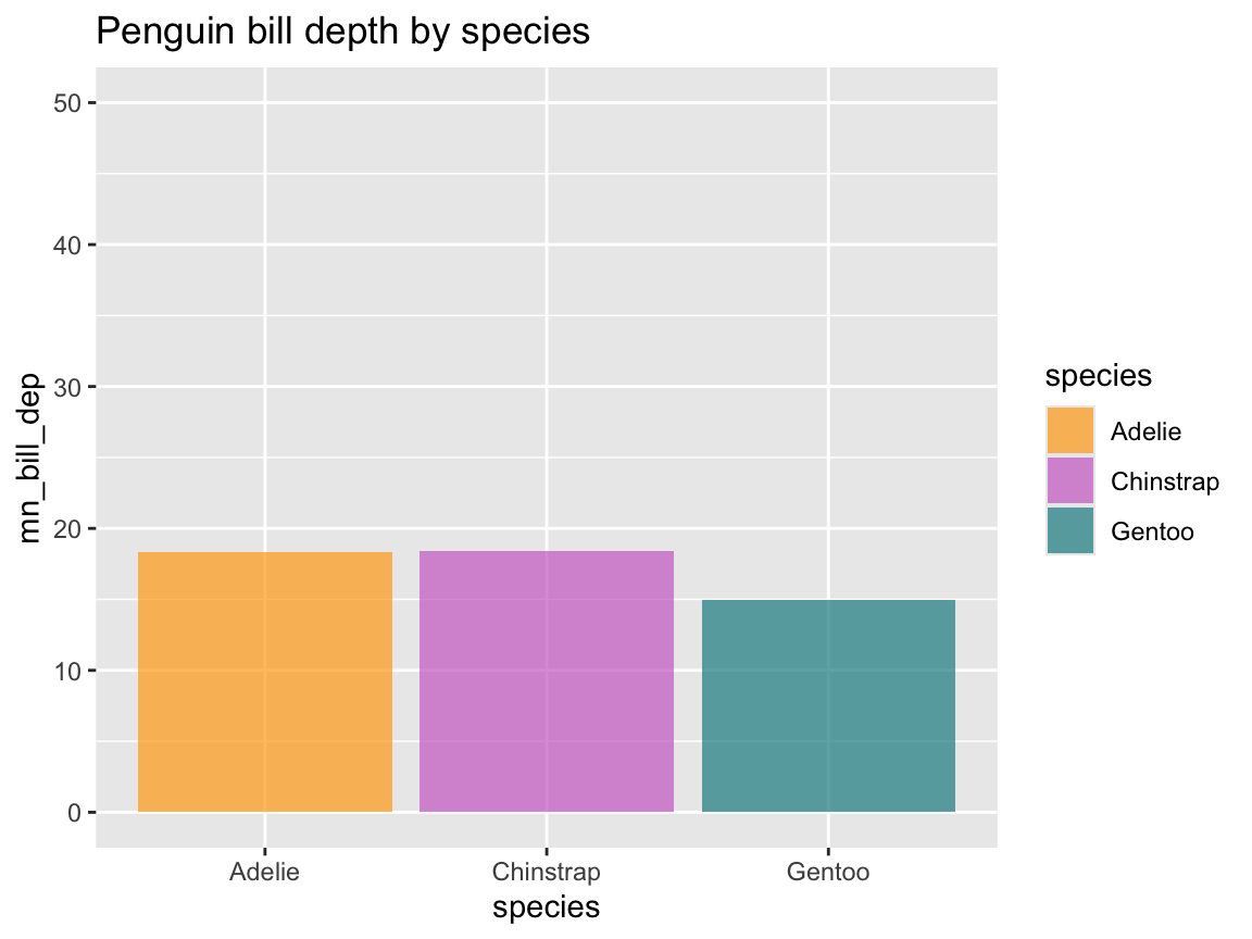
Figure 9.41: A bar chart with a specific range for \(y\)-axis values.
Although the ranges of values on the \(y\)-axes of Figure 9.40 and Figure 9.41 are very similar, they are not identical.
If identity was important (e.g., for displaying both figures side-by-side), we could use the same range definition for both visualizations.
Alternatively, we could use facets, as we saw above that all panels use a common \(y\)-axis.
However, this would require some initial processing of our table of summary values pg_bill (into a longer format, which we will learn in Chapter 14 on Tidying data):
pg_bill_long <- pg_bill %>%
  pivot_longer(mn_bill_len:mn_bill_dep)

# Recode some variables:
pg_bill_long$name[pg_bill_long$name == "mn_bill_len"] <- "length"
pg_bill_long$name[pg_bill_long$name == "mn_bill_dep"] <- "depth"

# Visualize (in 2 facets):
ggplot(pg_bill_long) +
    facet_wrap(~name) +
    geom_col(aes(x = species, y = value, fill = species)) +
    labs(title = "Penguin bill depth and length by species") +
    scale_fill_manual(values = my_cols)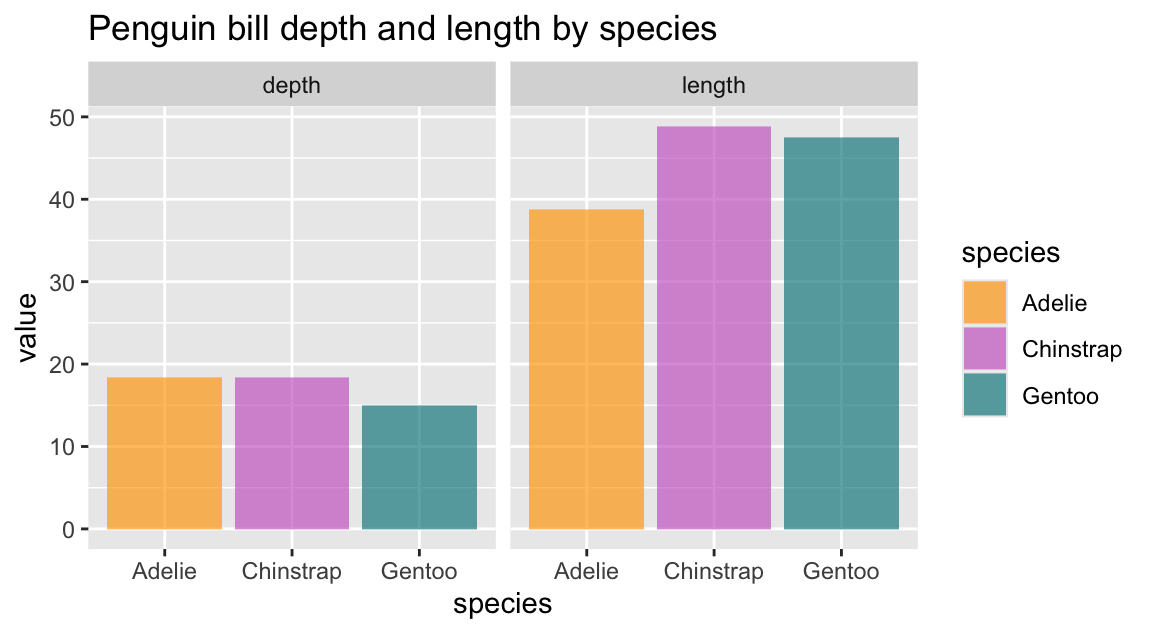
A related issue: Coordinate systems and the spacing of axis intervals
Example for using coord_equal():
# Using automatic axes:
pg_co_1 <- ggplot(pg, aes(x = bill_length_mm, y = bill_depth_mm, color = species)) +
  geom_point() +
  geom_smooth(method = "lm") +
  labs(title = "Penguin bill depth by bill length (by species)") +
  scale_color_manual(values = my_cols)
pg_co_1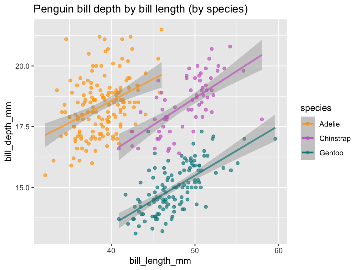
# Scaling axes to equal units:
pg_co_1 +
  coord_equal()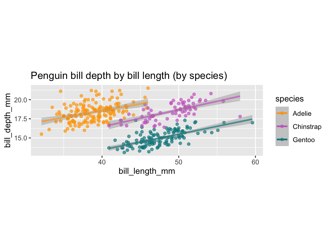
Flipping coordinate systems by coord_flip() (i.e., effectively swapping axis mappings):
# A horizontal bar plot:
pg_hoba <- ggplot(pg_bill) +
  geom_col(aes(x = species, y = n, fill = species)) +
  labs(title = "Penguin observations by species") +
  scale_fill_manual(values = my_cols) +
  coord_flip()
pg_hoba
# Note: Same as (reverse x- and y-mappings, without coord_flip()):
ggplot(pg_bill) +
  geom_col(aes(x = n, y = species, fill = species)) +
  labs(title = "Penguin observations by species") +
  scale_fill_manual(values = my_cols)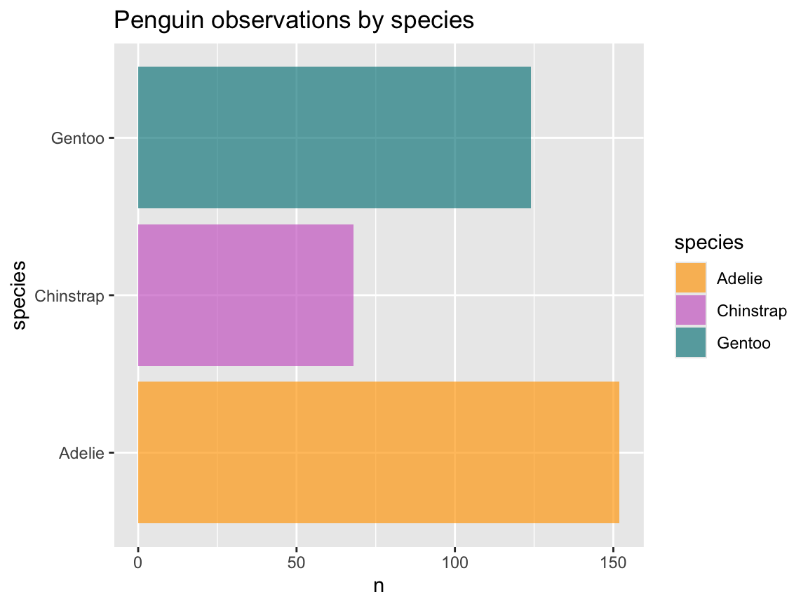
Cartesian vs. polar coordinates
Finally, we have been using the ggplot2 default of a Cartesian coordinates system so far (which we could explicitly invoke by the coord_cartesian() function).
A good reason for using coord_cartesian() in plots that already use this default coordinate system is for changing the limits of the visible \(x\)- or \(y\)-axis range without dropping any data from the plot (which would happen if we explicitly restricted xlim() or ylim() ranges).
Effectively, setting the limits in coord_cartesian() performs a visual zoom on the image, rather than changing its contents.
As an example, recall our histogram of flipper length distribution pg_4 (from above):
# Histogram of distribution (from above):
pg_4
We can use coord_cartesian() for zooming into a region of an existing visualization as follows:
# Using coord_cartesian() for zoomin in on part of a histogram:
pg_4 +
  coord_cartesian(xlim = c(195, 215), ylim = c(0, 20)) +
  labs(title = "Zooming in on penguin flipper length distribution")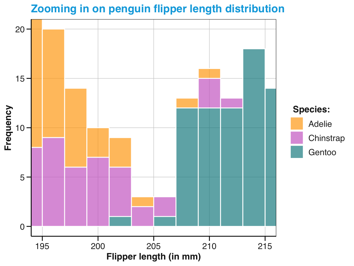
Figure 9.42: Zooming in on an existing visualization.
An example of using polar coordinates on horizontal bar plot (which is rarely a good idea):
ggplot(pg_bill) +
  geom_col(aes(x = n, y = species, fill = species)) +
  labs(title = "Penguin observations by species") +
  scale_fill_manual(values = my_cols) +
  coord_polar()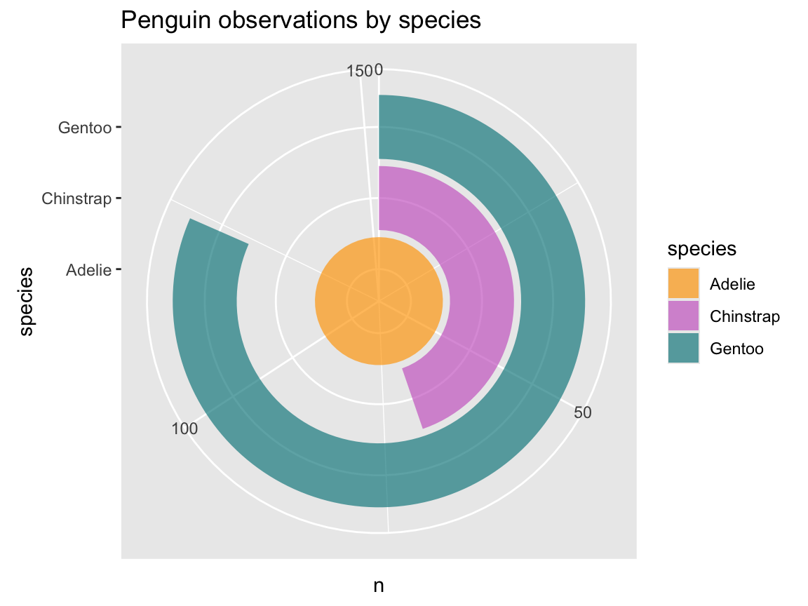
Combining plots
Above, we have occasionally saved the output of ggplot() expressions as R objects.
This allows for getting the basic plot right (i.e., selecting geoms and mapping aesthetics) before adding more bells and whistles (e.g., colors, labels, and a theme).
Another good reason for saving plots as R objects is to combine multiple plots later. Combining plots differs from faceting, as the combined plot do not need to share the same axes and coordinate system. Instead, we can combine and arrange arbitrary plots into the sub-panels of a compound figure.
In this section, we provide examples using the patchwork R package (Pedersen, 2025), but the ggpubr, cowplot and gridExtra packages provide similar functionality.
For instance, if we wanted to re-capitulate the journey from our first histogram (Figure 9.3 above) to our final version of it (Figure 9.7) we could re-create and save the former as an R object pg_0 and combine it with our final histogram, which was saved as R object pg_4 (Figure 9.43):
# Re-create basic histogram (from above), but store it as pg_0:
pg_0 <- ggplot(data = pg) +
  geom_histogram(mapping = aes(x = flipper_length_mm))

library(patchwork)  # for combining plots

# Combine 2 plots:
# pg_0 + pg_4  # beside each other
pg_0 / pg_4    # above each other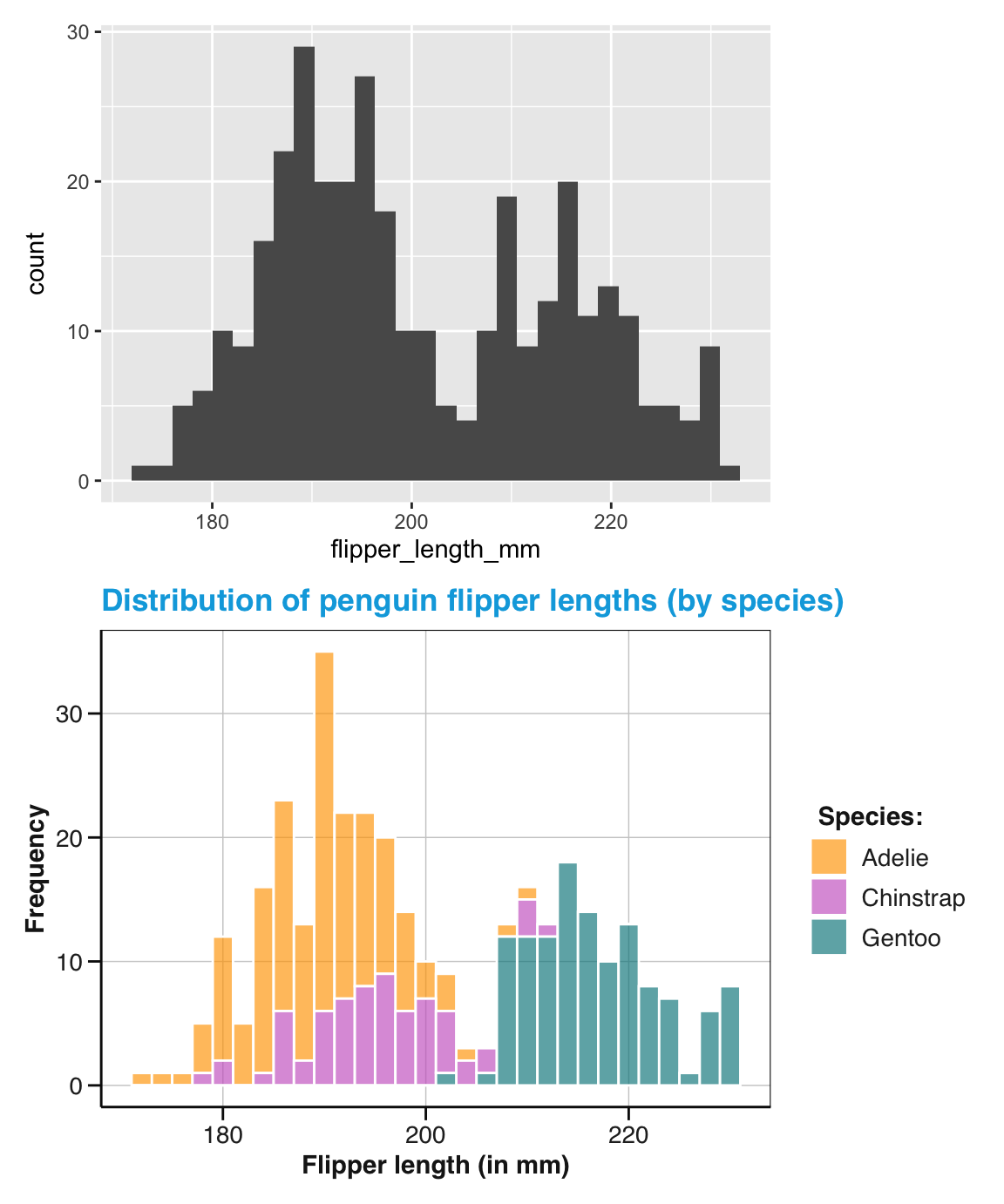
Figure 9.43: Combining two ggplot2 plots (using the patchwork package).
Using the gridExtra package (Auguie, 2017), we could have achieved the similar results by the grid.arrange() function:
library(gridExtra)  # for combining plots

# Combine 2 plots:
# gridExtra::grid.arrange(pg_0, pg_4, nrow = 1)
gridExtra::grid.arrange(pg_0, pg_4, nrow = 2)
However, a neat aspect of patchwork is that the height or width of sub-plots are automatically scaled to the same size.
When combining multiple plots, we usually want to arrange, annotate, or tag them, so that we can easily see and refer to their components. The patchwork package provides rich options for laying out and annotating plots. The following example also shows that it usually pays off to use a uniform color scheme and theme when combining plots (Figure 9.44):
# Create 3 plots (with common colors and theme):
bx_1 <- ggplot(pg) +
  geom_boxplot(aes(x = species, y = body_mass_g, fill = species)) +
  labs(x = "Species", y = "Body mass") +
  scale_fill_manual(values = my_cols) +
  theme_bw() +
  theme(legend.position = "none")

bx_2 <- ggplot(pg) +
  geom_boxplot(aes(x = species, y = flipper_length_mm, fill = species)) +
  labs(x = "Species", y = "Flipper length") +
  scale_fill_manual(values = my_cols) +
  theme_bw() +
  theme(legend.position = "none")

st_1 <- ggplot(pg, aes(x = body_mass_g, y = flipper_length_mm, col = species)) +
  geom_point() +
  geom_smooth(method = "lm", se = FALSE) +
  labs(x = "Body mass", y = "Flipper length") +
  scale_color_manual(values = my_cols) +
  theme_bw() +
  theme(legend.position = "none")


# Combine plots:
patch_plot <- (bx_1 | bx_2) / st_1  # 2 plots above 1 wide plot

# Annotate: Title(s) and caption
patch_plot <- patch_plot +
  plot_annotation(title = "Body mass and flipper length in penguins",
                  caption = "Note: Nice, but not too surprising.")

# Tag (basic):
# patch_plot +
#   plot_annotation(tag_levels = 'A')  # Options: '1', 'a' 'A', 'i' 'I'

# Tag (nested layout):
patch_plot[[1]] <- patch_plot[[1]] + plot_layout(tag_level = 'new')
patch_plot + plot_annotation(tag_levels = c('A', '1'))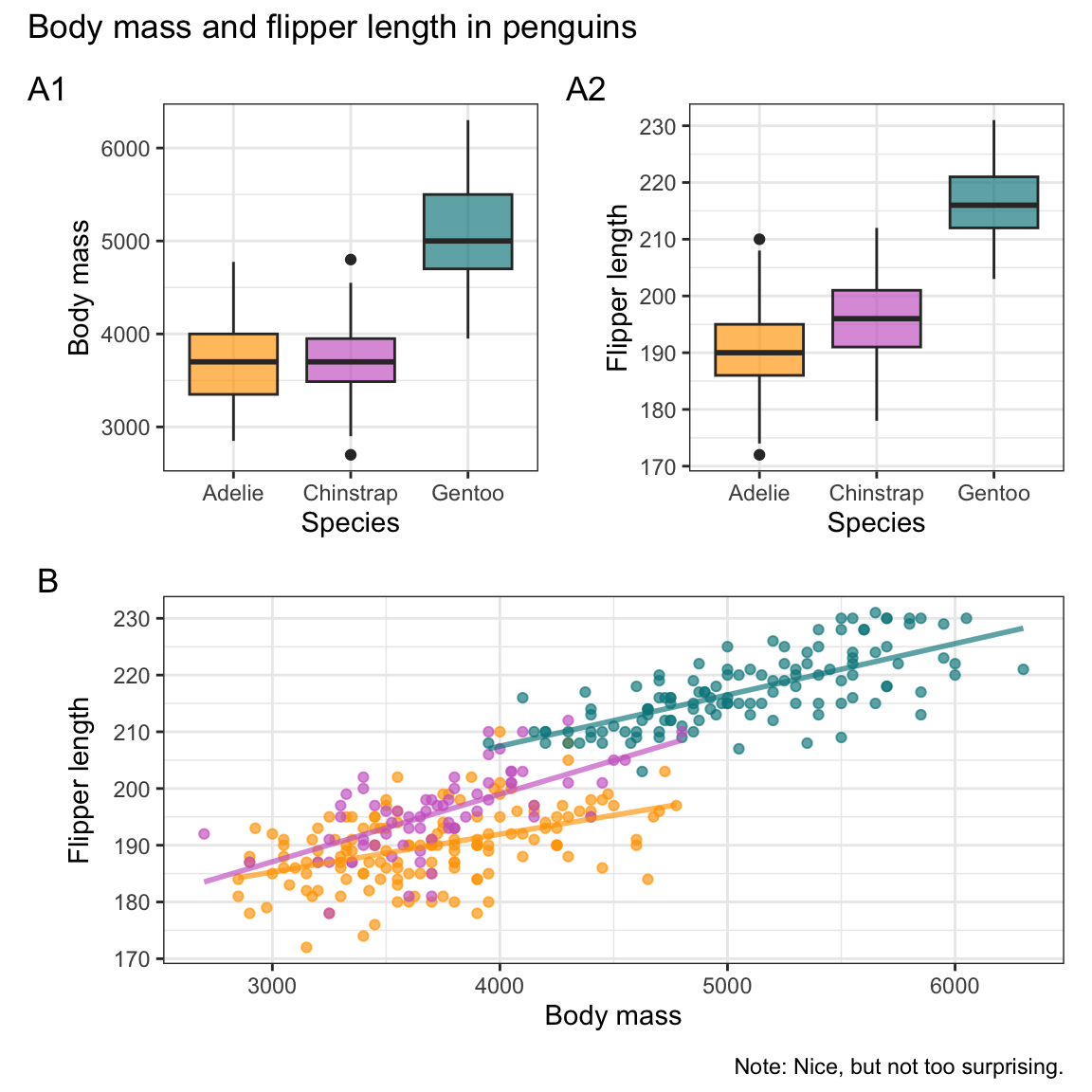
Figure 9.44: Combining annotated and tagged plots (using the patchwork package).
Note that Figure 9.44 omitted all color legends to save space. As a consequence, the scatterplot and linear trend lines of Panel B would not be interpretable when shown in isolation, but the mapping of colors to the three penguin species is explained by the boxplots shown as Panels A1 and A2.
See Chapter 9: Arranging plots of the ggplot 2 book (3e) for more patchwork examples.
Extensions
A powerful aspect of ggplot2 is that it can be extended by other packages, which can provide all kinds of elements, including geoms, themes, or fonts. Here are some examples:
Geoms
-
ggridges provides a
geom_density_ridges()that allows visualizations of variable distributions on different levels:
# install.packages('ggridges')
library(ggridges)

ggplot(pg, aes(x = flipper_length_mm, y = species, fill = species)) +
  # facet_wrap(~species) +
  geom_density_ridges() +
  scale_fill_manual(values = my_cols) +
  labs(title = "Distributions of penguin flipper length by species",
       x = "Flipper length (mm)", y = "Species", fill = "Species:") +
  theme_unikn()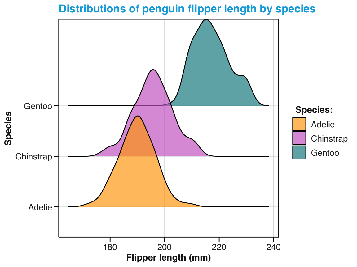
Themes
- ggthemes for many additional and fancy themes:
# install.packages('ggthemes')
library(ggthemes)

pg_4 +
  theme_fivethirtyeight()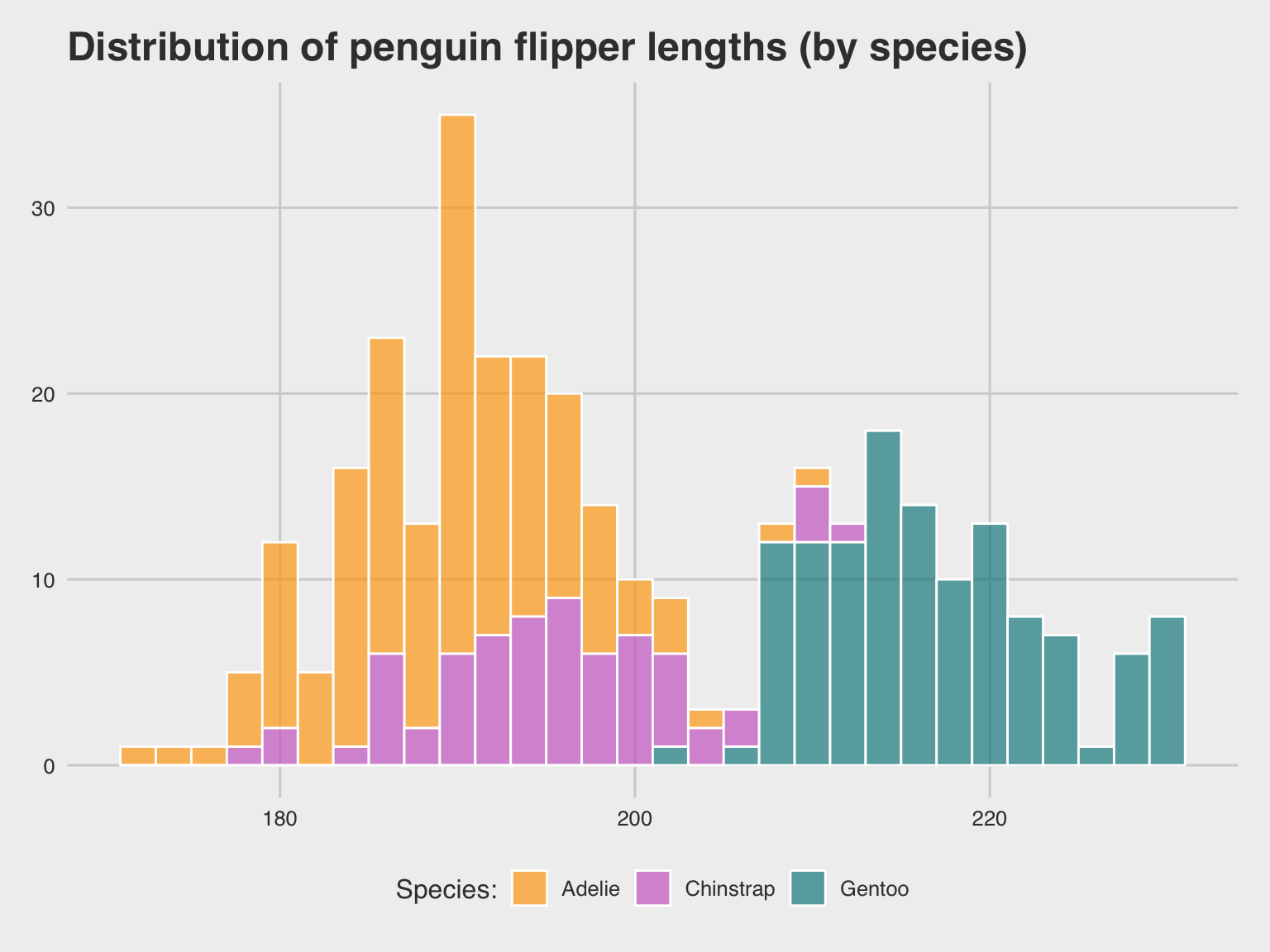
tp_04 +
  theme_economist_white()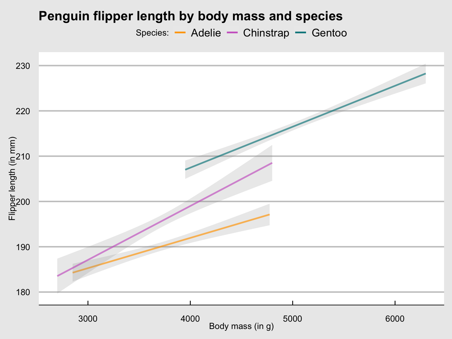
Fonts
- The extrafont package provides additional fonts for plotting (e.g., to mimics the visual style of the popular XKCD comic)
Practice
- Faceting: Use facets to split Figure 9.26 into three subplots showing the trends and points for each species (and remove the obsolete legend).
Since Figure 9.26 was saved as an R object tp_03 (above), we can easily add faceting by species (by adding facet_wrap()) and remove the plot legend (by a corresponding theme() function):
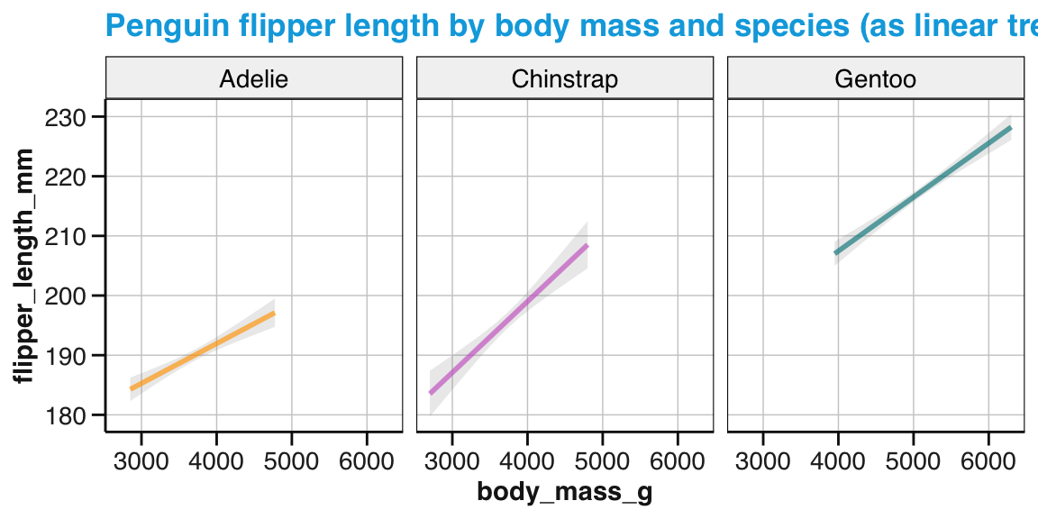
Figure 9.45: A faceted version of Figure 9.26.
- The following visualization task is a bit more challenging, but could be addressed by a faceted plot:
- Is the relationship between bill depth and bill length the same male and female penguins in all penguin species?
The following solution uses scatterplots with linear trends and facets by species and sex:
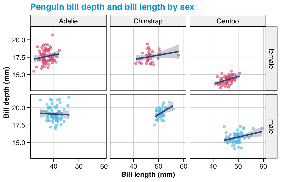
Figure 9.46: A facet grid showing the relation between bill depth and bill length by species and sex.
- Coordinate systems
-
Combining plots: Use the histograms showing the distributions of bill depth and bill length for penguins by island (from practising distributions, Task 2 above) and combine them into a single plot.
- Print both plots side-by-side (i.e., in two columns of a single row).
- If both plots show the same legend, remove one of them to only show one legend (on the right).
This concludes our glimpse into some of the more advanced aspects of ggplot2.
9.4 Conclusion
This chapter created various visualizations by using the R package ggplot2 (Wickham, Chang, et al., 2025), which provides a comprehensive toolbox for producing scientific data visualizations. Unlike the collection of functions in base R graphics, ggplot2 uses a conceptual framework based on the grammar of graphics (Wilkinson, 2005). This allows us to construct a graph from composable elements, instead of being limited to a predefined set of charts or creating complex visualizations from scratch.
The true power of ggplot2 results from its modular and extensible structure: It provides a set of tools that can be flexibly combined to create many different visualizations. As ggplot2 currently contains over 50 different geoms, the ones discussed in this chapter provide only an introductory glimpse of the available options.
9.4.1 Summary
Learning ggplot2 first involves getting a grasp on its terminology (e.g., aesthetic mappings, geoms, themes, layers, and facets) and its way of combining functions to create visualizations. Figure 9.47 merely repeats Figure 9.1 (from above). Hopefully, the terms used in the figure and the interplay between the layers will now seem a bit more familiar.
Figure 9.47: The layered structure of plots in ggplot2 (adapted from the Introduction to ggplot2).
Here’s an updated version of our initial table in Section 9.1.1 (above) that maps visualization tasks to types, but now also includes corresponding geoms of ggplot2:
| Task: Visualize… | Type of visualization | In ggplot2 |
|---|---|---|
| distributions | histogram | geom_histogram() |
geom_density() |
||
geom_freqpoly() |
||
geom_violin() |
||
geom_rug() |
||
| summaries | bar chart | geom_bar() |
geom_col() |
||
| box plot | geom_boxplot() |
|
| relations | scatterplot | geom_point() |
geom_jitter() |
||
| line plot | geom_line() |
|
geom_abline() |
||
geom_hline() |
||
geom_vline() |
||
geom_path() |
||
geom_function() |
||
| trend line | geom_smooth() |
|
| Additional elements: | error bars | geom_errorbar() |
| text labels | geom_text() |
Many more geoms exist — and many geoms can be used for more than one type of visualization.
Using ggplot2 usually assumes that the data is formatted as factors (i.e., some variables describe the values of other variables). A smart strategy when creating visualizations with ggplot2 is to first select appropriate geoms and adjust variable mappings, before tuning aesthetics, labels, and themes. More advanced uses of ggplot2 usually pre-process data (e.g., to add variables or compute averages and dispersion measures), combine layers of geoms, or split plots into facets.
Overall, using ggplot2 implies using geoms and aesthetic mappings for solving visualization tasks. Mastering the grammar of graphics provides us with a powerful toolbox for creating informative and beautiful visualizations.
9.4.2 Resources

Books and book chapters
The two main references on ggplot2 and its history are Wilkinson (2005) and Wickham (2016).
- ggplot2: Elegant Graphics for Data Analysis (3rd edition) is the current online version of the ggplot2 book
Introductory chapters on ggplot2 include:
- Chapter 2: Visualizing data of the ds4psy book (Neth, 2025a)
As the original ggplot package was a pre-cursor of the so-called tidyverse dialect or movement (Wickham et al., 2019), corresponding textbooks provide good introductions to ggplot2:
Chapter 3: Data visualization of the r4ds textbook (Wickham & Grolemund, 2017), or
Chapter 1: Data visualization of its 2nd edition (Wickham, Çetinkaya-Rundel, et al., 2023)
Online resources
One of the best starting points for learning ggplot2 is https://ggplot2.tidyverse.org/ and its vignettes:
Note also the helpful FAQ sections in the articles of https://ggplot2.tidyverse.org
Helpful insights into the relation between geoms and stats are provided by the following article:
- Demystifying stat layers in ggplot2 (by June Choe, 2020-09-26)
Further inspirations and tools for using ggplot2 include:
R Graphics Cookbook (Chang, 2012) provides hands-on advice on using ggplot2 and many useful recipes for data transformation.
Data Visualization with R (Kabacoff, 2018) relies heavily on the ggplot2 package, but also covers other approaches.
ggplot2 Extensions expand the range and scope of ggplot2 even further.
Cheatsheets
Here are some pointers to related Posit cheatsheets:
- Data visualization with ggplot2
Figure 9.48: Data visualization with ggplot2 from Posit cheatsheets.
The corresponding online reference provides an overview of key ggplot2 functionality.
9.4.3 Preview
We now learned to create visualizations in base R (in Chapter 8) and the ggplot2 package. Irrespective of the tools we use, colors are an important aesthetic for making more informative and pleasing visualizations. Chapter 10 on Using colors introduces the topic of color representation and show us how to find and manipulate color palettes.
9.5 Exercises

9.5.1 Re-creating a base R histogram
In Chapter 8, we created our first histogram for a vector of numeric values x as follows:
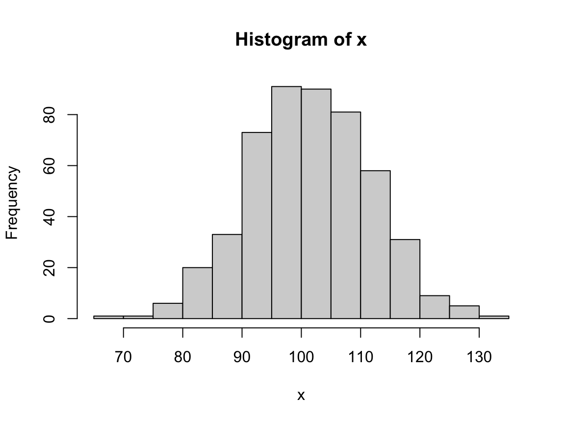
- Re-create an analog histogram in ggplot2.
- What are the similarities and differences to the base R version?
- Add some aesthetics and labels to improve your histogram.
-
Bonus: Discuss the relation between (and the use of
statsin) histograms and bar charts.
Hint:
In this example, the data x consisted of a single vector.
However, as ggplot() requires its data to be in tabular form, we use data.frame() to convert it into a data frame with one variable x:
# Convert vector x into df:
df <- data.frame(x)
head(df)
#>           x
#> 1 111.84809
#> 2  94.10383
#> 3 114.64747
#> 4 116.86578
#> 5 112.23627
#> 6 103.30240
Now we can fill in the minimal template and use the geom_histogram() function for creating a histogram.
9.5.2 Penguin bill distributions
Using the penguins data from palmerpenguins,
create a (series of) histogram(s) that show(s) the distribution of bill depth and bill length for penguins by island.
For each histogram,
- Explain your choices of arguments and variable mappings,
- Which aesthetic settings are provided as constants vs. variables? Why?
Hint: A solution could look as follows:
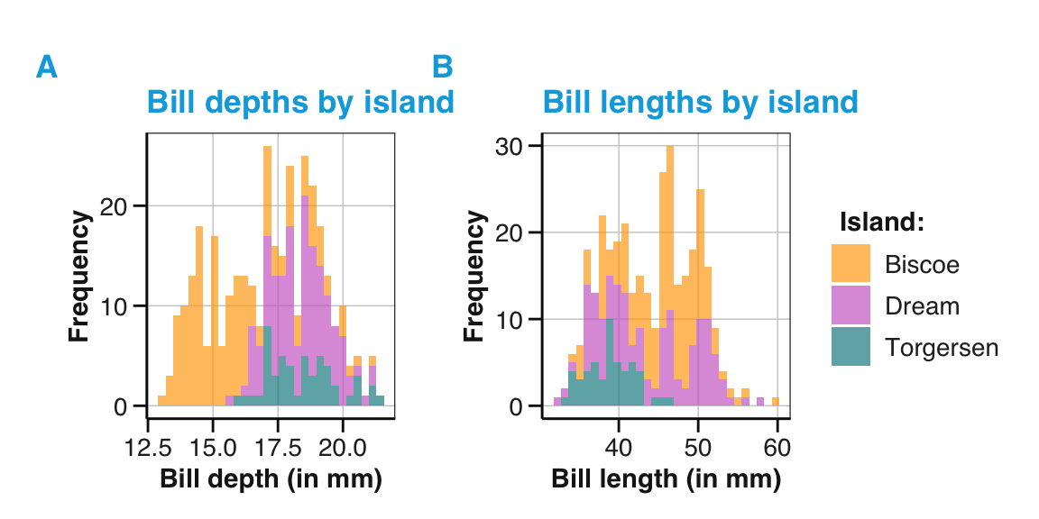
9.5.3 Basic bar chart and box plot
Using the penguins data from palmerpenguins, summarize the relation between penguin’s flipper length and species:
Simple bar chart: Create a bar chart showing the average flipper length for each species of penguins.
Simple box plot: Create a box plot showing the same relationship. What additional information does this type of plot show?
9.5.4 Basic scatterplot
In Chapter 8, we created a scatterplot for a vector of numeric values x and y as follows:
# Data:
x <- 11:43
y <- c(sample(5:15), sample(10:20), sample(15:25))

# Scatterplot (with base R aesthetics):
plot(x = x, y = y,  # variable mappings
     pch = 21, bg = unikn::Pinky, cex = 2, # aesthetics
     main = "A positive correlation")
grid()
Re-create an analog scatterplot in ggplot2.
Create a scatterplot of fuel consumption on the highway (
hwy) by engine displacement (displ) for thempgdata (inggplot2::mpg) in base R or ggplot2.
9.5.5 Line plots
In this exercise, you will create line plots for data tracking the development of five trees over time.
Create some line plots using the Orange data (from base R’s datasets package):
Inspect the
Orangedata and extract (or filter) the lines for one tree to plot a line of itscircumferencebyage.Create an analog plot to shows the growth of all five trees (as five different lines).
Adjust the line plot of 3. so that it is legible (i.e., its lines are distinguishable) in black-and-white print.
Adjust your line plot (of 2. or 3.) so that an additional box plot shows the average growth of the five trees. (Hint: The
groupaesthetic forgeom_boxplot()will be different from thegroupaesthetic ofgeom_line().)Use the same
Orangedata to illustrate the related geomsgeom_path(),geom_step(), andgeom_smooth(). What are their similarities or differences togeom_line()?
Solution
- ad 1: Inspecting the
Orangedata:
# Data:
as_tibble(Orange)
#> # A tibble: 35 × 3
#>    Tree    age circumference
#>    <ord> <dbl>         <dbl>
#>  1 1       118            30
#>  2 1       484            58
#>  3 1       664            87
#>  4 1      1004           115
#>  5 1      1231           120
#>  6 1      1372           142
#>  7 1      1582           145
#>  8 2       118            33
#>  9 2       484            69
#> 10 2       664           111
#> # ℹ 25 more rows

# Note: Tree is a factor variable with a strange order of levels:
Orange$Tree
#>  [1] 1 1 1 1 1 1 1 2 2 2 2 2 2 2 3 3 3 3 3 3 3 4 4 4 4 4 4 4 5 5 5 5 5 5 5
#> Levels: 3 < 1 < 5 < 2 < 4

# Relevel Tree factor:
Orange$Tree <- factor(Orange$Tree, levels = 1:5)- ad 2: Figure 9.49 shows the growth of
Orangetrees as a line plot:
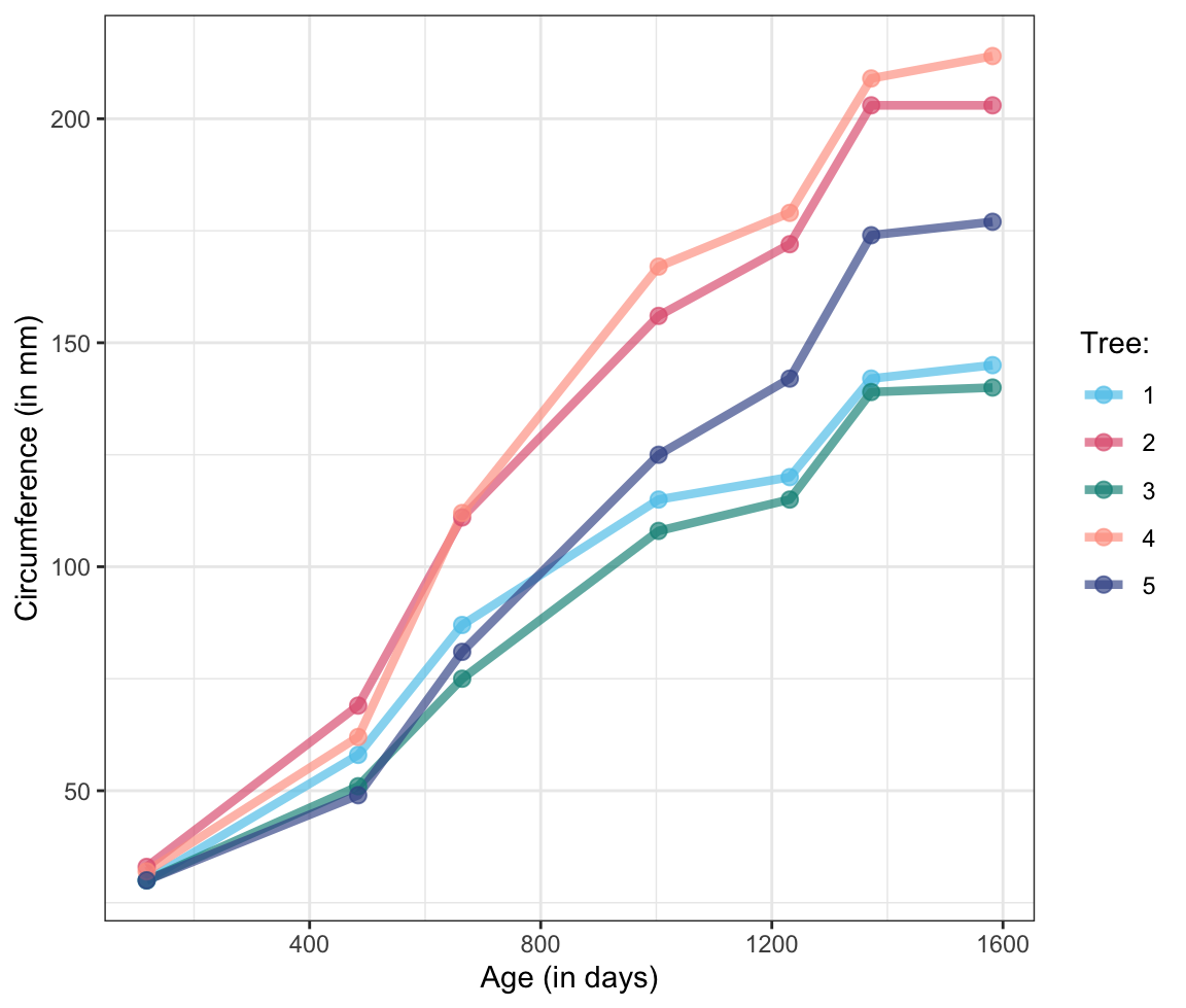
Figure 9.49: A line plot illustrating the growth of Orange trees.
9.5.6 Inspecting participant information
Use the participant information data of available as posPsy_p_info in the R package ds4psy to create some plots that describe a sample of participants.
Study the data documentation of
?ds4psy::posPsy_p_info:
How many observations and variables are there? What do the variables and their values mean? Which variables are independent (treatment) variables and which are control or dependent (outcome) variables?Create and interpret histograms to visualize the distributions of the
age,educ, andincomevariables. Then group these distributions byinterventionorsexand interpret them again.Create bar charts or box plots to inspect and interpret the average values of
age,educ, andincomebyinterventionorsex.
Make sure that all your plots provide informative axes, titles, and text labels.
The following table shows the first observations in the posPsy_p_info data (of the ds4psy package):
| id | intervention | sex | age | educ | income |
|---|---|---|---|---|---|
| 1 | 4 | 2 | 35 | 5 | 3 |
| 2 | 1 | 1 | 59 | 1 | 1 |
| 3 | 4 | 1 | 51 | 4 | 3 |
| 4 | 3 | 1 | 50 | 5 | 2 |
| 5 | 2 | 2 | 58 | 5 | 2 |
| 6 | 1 | 1 | 31 | 5 | 1 |
Note: For background and source information of the positive psychology dataset, see Appendix B.1 of the ds4psy book (Neth, 2025a).
9.5.7 Better summary charts
The visualizations in this exercise explore and improve upon the basic summary charts from above (Section 9.5.3):
- A dodged bar chart with additional text labels: Re-create the dodged bar chart in Figure 9.15, but
Map the
fillcolor to theislandvariable, rather than to thesexvariable.Try to display the counts by
speciesandislandas text labels above each bar.
Solution
A solution could look as follows:
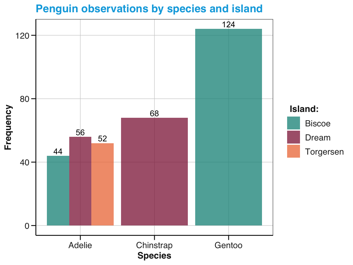
Figure 9.50: A dodged bar chart showing the number of penguin observations by species and island in different fill colors and labels.
-
Better bar chart:
Transform the
pgdata to compute means, SE values, and corresponding confidence intervals for theflipper_length_mmvariable, then usegeom_bar(),geom_errorbar(), andgeom_text()to plot these means with confidence intervals and a text label (e.g., showing the number of observations within each bar/group).
- Better box plot: Provide a box plot showing the average flipper length for each species of penguins, but also information on their raw values and distributions.
Solution
Hint: The se() function (defined above) allows computing the standard error (SE) of a variable.
# Pre-process pg raw data:
# Compute summaries of penguin flipper_length_mm by species:
tb_2 <- pg %>%
  group_by(species) %>%
  summarise(n = n(),
            mean_flipper_length = mean(flipper_length_mm, na.rm = TRUE),
            se_flipper_length = se(flipper_length_mm),
            mn_conf_min = mean_flipper_length - 1.96 * se_flipper_length,
            mn_conf_max = mean_flipper_length + 1.96 * se_flipper_length
            )
tb_2
9.5.8 The rule of 72
In finance, the rule of 72 is a heuristic strategy for estimating the doubling time of an investment. Dividing the number (72) by the interest percentage per period (usually years) yields the approximate number of periods required for doubling the initial investment. (See Wikipedia for details: en | de.)
- Create a line graph that compares the true doubling time with the heuristic estimates for a range of (positive) interest rates.
Hints:
9.5.9 Advanced ggplot expressions
The following ggplot() expressions are copied from the documentation of the corresponding geoms.
Run the code, inspect the result, and then try to explain how they work:
- A facet of histograms:
ggplot(economics_long, aes(value)) +
  facet_wrap(~variable, scales = 'free_x') +
  geom_histogram(binwidth = function(x) 2 * IQR(x) / (length(x)^(1/3)))
9.5.10 Horse trading
A notorious problem that has been studied extensively in psychology (e.g., Maier & Burke, 1967, p. 305) is the following:
A man bought a horse for $60 and sold it for $70.
Then he bought it back again for $80 and sold it for $90.
How much money did he make in the horse business?
Create a visualization that illustrates all four transactions and the problem’s solution.
- How can we see the correct solution?
- Why do many people provide a different solution?
Hint: The problem’s key data could be represented as follows:
| nr | type | object | price |
|---|---|---|---|
| 1 | buy | horse | 60 |
| 2 | sell | horse | 70 |
| 3 | buy | horse | 80 |
| 4 | sell | horse | 90 |
9.5.11 Bonus: Anscombe’s quartet again
An exercise of the previous chapter (Section 8.5.10) re-created the Anscombe plots of Figure 7.1 by using the data from datasets::anscombe and base R functions.
However, the original Figure 7.1 (in Section 7.2.1) was actually created in ggplot2.
Hence, try to re-create the following figure from the data in datasets::anscombe:
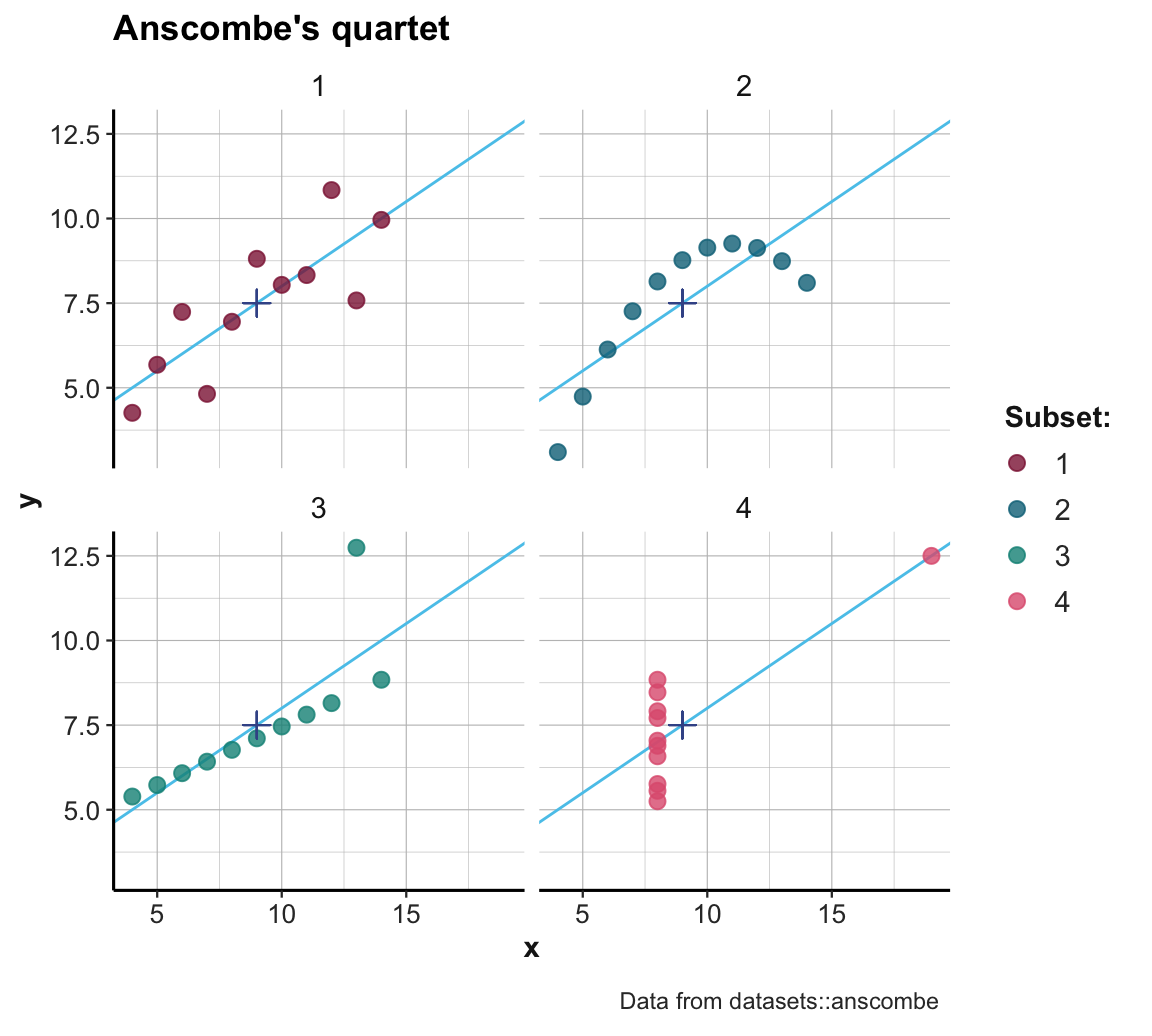
Figure 9.51: Scatterplots of the four subsets. (The \(+\)-symbol marks the mean of each set; blue lines indicate the best fitting linear regression line.)
Hint:
We first need to transform the data in datasets::anscombe into a longer format (which uses two variables for x- and y-values and a separate factor variable set that indicates the identity or number of the set).
More exercises
For even more exercises on using ggplot2,
see the Exercises of Chapter 2 of the ds4psy textbook (Neth, 2025a).
Bonus: Re-create the base R plots of Section 8.5 (of Chapter 8) in ggplot2.
Note the relation between the mathematical and the computational notion of a function: The scatterplot visualization shows a relation by mapping values on some dimension \(x\) to values on some dimension \(y\). If we view the \(x\)-values as inputs and the \(y\)-values as outputs, the underlying function is the relation that transforms the former into the latter.↩︎
The table
tbis actually of type “tibble”, which is a simplified version of a data frame. Thus, tibbles can be provided to thedataargument ofggplot().↩︎In Chapter 13 on Transforming data, we will distinguish between reshaping and reducing data. As creating
tbreduced the data ofpg, we cannot recover all information contained inpg.↩︎