25 Shiny applications
Shiny is a framework and tool that enables us to create interactive web applications (in R or in Python). In R, the shiny package (Chang et al., 2025) bridges the gap between data analysis or visualization on one side, and web development on the other side. Whenever we have created a function that visualizes some aspect of our data or a relationship between parameters, we can use Shiny as a tool to illustrate our function or communicate our results in an elegant way. For instance, a Shiny dashboard provides an interactive version of one or more R functions. In a Shiny app, users can provide inputs to R functions via a user interface and their outputs are interpreted and shown in real-time.
In this chapter, we illustrate the path from turning R functions into interactive Shiny apps. We will begin with simple functions and user inputs and then proceed to more complicated ones. By the end of this chapter, we will be familiar with the most relevant concepts and — having seen and played with some simple Shiny dashboards — we will be ready for creating more demanding applications.
Please note: This chapter is readable, but parts of it are still incomplete.
Preparation
Recommended background readings for this chapter are the first Get started with Shiny lessons at the Shiny site:
-
Lesson 1 explains the structure and basic interaction of an app;
- Lesson 2 builds a user interface;
- Lesson 3 provides an overview of the most basic input options.
These initial lessons provide an excellent introduction, but the other lessons and tutorials on the Shiny site are worthwhile studying as well.
Preflections

What are the differences between an R session and an interactive web page?
Which types of user inputs exist?
Which outputs of R can we distinguish?
What would we want an interactive application for?
25.1 Introduction
Shiny is a tool for building interactive applications, reports, or dashboards in R or in Python.
A Shiny app is a web page (ui) connected to a computer running a live R session (server).
The R package shiny (Chang et al., 2025) is illustrated and documented online at the Shiny site.
25.1.1 Terminology
As we have seen with other technologies, learning Shiny involves learning some new concepts:
- Shiny is a technology and tool for developing interactive applications. In R, we install and load Shiny via the R package shiny (Chang et al., 2025).
A product of Shiny are reactive applications or apps, sometimes referred to as a dashboard or interactive report.
-
The
uivs.serverare two connected components of a Shiny app. By interacting with theui, users provide inputs that are interpreted by theserverinto outputs that update theui:The user interface
uiis a web page styled by HTML-based technologies and R functions for layouts and themes. Think of this as the application’s frontend that determines its general appearance and the structure of input elements (user-manipulated by so-called control widgets) and output elements.The
serverruns an R session that evaluates inputs from theuiand directly returns corresponding outputs. Think of this component as the dynamic backend or brains of our application that contains R functions and reactive expressions that listen and respond to changes in theui.
25.1.2 Contents
This chapter introduces building interactive applications in Shiny. We will first create a basic dashboard for exploring a visualization function, before exploring some advanced features of and options for designing Shiny apps.
25.1.3 Data and tools
This chapter primarily uses the R package shiny (Chang et al., 2025):
Related R packages allow using layouts and Bootstrap themes in Shiny apps and extend our range of control widgets for enabling user inputs:
# Shiny extensions:
library(bslib)         # a modern UI toolkit
library(shinythemes)   # Bootstrap themes
library(shinyWidgets)  # control widgets/user inputs
To illustrate a Shiny dashboard, we use a visualization function from the riskyr package (Neth, Gaisbauer, et al., 2025):
More specifically, we will create a simple dashboard app for riskyr’s plot_prism() function that we have used in Section 20.2 of Chapter 20 on Basic simulations.
Auxiliary packages used in this chapter include:
25.2 Essentials of Shiny
A Shiny app consists of a web page (or user interface ui) that is connected to an ongoing R session (running on a server).
When a user enters inputs on the ui (e.g., by entering text, clicking boxes, choosing menu options, or moving a slider), a live R session on the server “listens” and interprets them, and directly sends back the corresponding outputs to the ui.
Thus, Shiny allows building interactive applications in R.
25.2.1 Overview
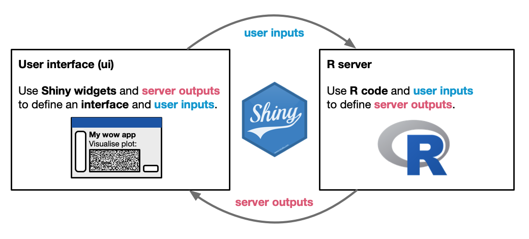
Figure 25.1: Shiny apps are based on the interaction between a user interface (ui) and an R server.
Figure 25.1 illustrates the two main components of a Shiny app (a user interface and an R server) and their interaction through lists of inputs and outputs.
As we will find out, the user interface (ui) contains control widgets that define user inputs and display elements that use server outputs.
The server runs a live R session and creates and defines server outputs by using R code and user inputs.
Hence, Shiny essentially creates an application that connects a ui to its server and manages their interplay when the app is running.
Although both main parts are written in R, the ui is translated into an HTML document, and thus links R to corresponding technologies and standards (e.g., HTML tags, CSS, or snippets of JavaScript code).
As we have seen for ggplot2 (in Chapter 9), the shiny R package is only the starting point for a rich array of Shiny tools.
The app’s overall functionality (e.g., range of inputs and outputs) and its design (e.g., ui layout and theme) can be styled and extended by functions from other R packages (like bslib, shinythemes, or shinyWidgets).
25.2.2 App structure
All files belonging to a Shiny app should be stored in one directory (named by the app’s name).
Simple Shiny apps can consist of a single file (usually called app.R), but more refined apps include optional DESCRIPTION and README files, an R directory for storing auxiliary R code, and a www directory for storing additional files (like images or web scripts).
New Shiny apps are typically created by copying and modifying an existing app or by creating a new app from a template.
To generate a new app from a template, we can select File > New File > Shiny Web App in the RStudio IDE.
We select a new name and location for our app and choose between two application types “Single file (app.R)” and “Multiple file (ui.R/server.R)”.
For a simple first app, we can use the single file option, but splitting up server and ui into separate files will later make sense for more complicated apps.
Clicking on “Create” will open a file that includes a basic Shiny app template that we can explore and modify. The essential template will look something like the following (with additional elements implementing specific app elements):
# Description of the app's goal and purpose.


# R packages: ----------

library(shiny)


# User interface: ----------

ui <- fluidPage(

    # App title:
    titlePanel("The Title"),

    sidebarLayout(

        sidebarPanel(
           # inputs are provided here
        ),

        mainPanel(
           # outputs are shown here
        )
    )
)


# Server: ----------

server <- function(input, output) {

   # R code turning data and inputs into outputs

}


# Run the app: ----------

shinyApp(ui = ui, server = server)
If the template obtained by clicking on “Create” contains code similar to the one shown in this basic template (but with more specific R code replacing the placeholders), we can already turn this basic template into a working app. The notion of running an app combines generating the app (from R code) and listening and reacting to user inputs by adjusting and displaying corresponding outputs in the user interface. To run our current app, we can click on “Run App” (in the top right) to build and run the app. Depending on our system settings, the app will either open (a) in a new window, (b) our viewer pane, or (c) in an external web browser. Feel free to play around with this basic app to explore the effects of user inputs on the display.
While the app is running, the R Console states that R is “Listening” on some http server. Once we are done, we click on the stop sign in our R Console to return to our original R session.
Practice
-
Create, run, and explore a first Shiny app:
Create a new Shiny app from the RStudio template. This should generate a basic app that explores the Old Faithful geyser data stored in
faithfulin an interactive histogram.Run the app and explore the effects of user inputs on the display.
Close the app and modify some of the R code (e.g., text labels or aesthetic elements), then re-run the app to examine the effects of your changes.
-
The shiny package comes with a range of example apps (also featured in the Get started section of the Shiny site).
- Run the first demo app (
01_hello) as follows (and inspect the app’s code in showcase mode):
- Run the first demo app (
# Run a demo app:
runExample("01_hello")

# Run in showcase mode:
runExample("01_hello", display.mode = "showcase")- For exploring the range of options and their implementation, run the other example apps (both in default and in showcase mode):
# runExample()  # lists all examples

runExample("01_hello")                             # histogram
runExample("01_hello", display.mode = "showcase")  # (show code)

runExample("02_text")       # tables and data frames
runExample("03_reactivity") # a reactive expression
runExample("04_mpg")        # global variables
runExample("05_sliders")    # slider bars
runExample("06_tabsets")    # tabbed panels
runExample("07_widgets")    # help text and submit buttons
runExample("08_html")       # Shiny app built from HTML
runExample("09_upload")     # file upload wizard
runExample("10_download")   # file download wizard
runExample("11_timer") # the current date/time- Ask yourself: Which elements of these examples could be adapted for my app ideas?
25.2.3 A basic Shiny app
Our first Shiny app will provide a simple dashboard interface for riskyr’s plot_prism() function.
This function takes the numeric inputs of a so-called “Bayesian task scenario” as its inputs
(e.g., the prevalence of some condition, the sensitivity and specificity of some diagnostic test) and provides a tree diagram or double tree/prism plot as its output.
As the function allows for a wide range of user inputs and provides flexible outputs, it is a good candidate for being demonstrated and explored interactively.
(We have discussed its theoretical background and used it for visualizations in Section 20.2 of Chapter 20 on Basic simulations.)
For building our own Shiny app, it makes sense to begin with an even more minimal template that removes all R code belonging to a specific application.
Minimal template
A minimal template of a new Shiny can be obtained by typing shinyapp and pressing Tab in the RStudio IDE.
It generally is structured into the following parts:
# A minimal shiny app template.

# R packages: ----------

library(shiny)


# UI: ----------

ui <- fluidPage(

)


# Server: ----------

server <- function(input, output) {

}


# Run: ----------

shinyApp(ui, server)
After describing the app’s goal or purpose (in comments) and loading required R packages, the minimal template reveals the essential elements of a Shiny app. Note that this template contains two R objects (ui and server, both defined as functions) and one additional function:
- The
uiobject defines the app’s user interface. We can think of this as the frontend of our application — the part that the user sees and interacts with to provide inputs and observes outputs. Theuialso defines the app’s overall appearance (i.e., its layout, structure, and style). The arguments of thefluidPage()function include- layout functions (that determine the locations of page elements),
-
input functions (for adding interactive buttons, fields, or sliders that send user inputs to the
server), and -
output functions (for showing the results provided by the
server).
- The
serverobject provides the functional backend of the application — the logic providing the brains of our application. Defined as a generic R function, theservercontains R expressions that process user inputs into corresponding outputs. Here we include reactive expressions and functions that respond to changes in input values defined in theui. When running as a live R session, theserverlistens to the user inputs on theui, evaluates them, and dynamically returns corresponding outputs to theui. The reactive expressions ensure that our app remains responsive and updates while the user interacts with it.
- The
shinyApp(ui, server)function connectsuiandserver. Evaluating it creates the application and runs it in an interactive R session.
25.2.4 User interface
Building our first own Shiny app requires specifying the details of the ui and the server.
We first modify the ui object to define the overall layout, structure and appearance of our app.
Note that our entire ui is wrapped by a fluidPage() function, so that we add any R code as arguments to this function (i.e., separated by commas).
UI layout
The general layout of page elements in our ui is governed by page, layout, and panel functions.
# User interface: ----------

ui <- fluidPage(

    # App title:
    titlePanel("The Title"),

    # Layout:
    sidebarLayout(

        sidebarPanel(
           # inputs are provided here
        ),

        mainPanel(
           # outputs are shown here
        )
    )

)
As the first argument to fluidPage() function, we add a descriptive panel title via the titlePanel() function.
As we are implementing the plot_prism() function from the riskyr package — which plots either a tree or network diagram — we name our panel “Visualizing risks as a tree or network diagram”:
fluidPage(

  # App title:
  titlePanel("Visualizing risks as a tree or network diagram"),

  ...
)
Throughout this chapter, the ... refers to other arguments (within functions) or R code (within the server function definition).
Below the titlePanel() function, the sidebarLayout() function in the basic Shiny template is structured into a sidebarPanel() and a mainPanel() function.
This combination structures the basic layout of our app into two components.
Using two vertical panels is a common layout pattern familiar from many web pages and applications:
Whereas the sidebar panel typically contains input controls (e.g., buttons, text fields, sliders, dropdown menus, etc.), the main panel displays outputs (e.g., plots, tables) and — optionally — further elements (e.g., buttons).
By default, the sidebar panel will be located on the left-hand side of our app, while the main panel (the main content of our app) will appear to its right. However, we can easily switch their positions by setting position = "right" within the sidebarLayout() function.
(We will discuss options for more advance tabbed layouts in Section 25.3 below.)
25.2.5 User inputs
To provide users with some way of interacting with our app, we need to add on or more control widgets to our interface.
Control widgets could be placed anywhere on our user interface, but are often grouped together in a sidebarPanel of the ui.
Internally, each control widgets creates an element of the input list.
Inputs typically appear on both the ui and the server, but in different roles:
They are created and defined in the ui, but used on the server.
To move our app along, we will repeatedly perform the following three steps of Shiny app development:
create and define some input options (on the
ui),use these inputs to create and define some output (on the
server), anduse these outputs (in our
ui).
Identifying key inputs
To provide sensible user inputs, let us take a closer look at the plot_prism() function of the riskyr package.
In its documentation, we see that it accepts a wide range of arguments that users may want to control. Some key arguments that an app user may want to change include:
N: The population size (as an integer value)prev: The prevalence of some condition (as a probability value ranging from 0 to 1)sens: The sensitivity of some decision or test (as a probability value ranging from 0 to 1)spec: The specificity of some decision or test (as a probability value ranging from 0 to 1)by: A character code specifying either 1 or 2 perspective(s) that split(s) the population into 2 subsets, with perspective codes for 3 tree options (cd,dc,ac) and 6 double tree/prism options (cddc,cdac,dccd,dcac,accd, andacdc)area: A character code specifying the shapes of the frequency boxes, with 3 options (no,hr, orsq)
The function contains many more arguments, but out app will only make a subset of essential options available to the user and use the default arguments for all others.
Numeric inputs
The first input argument we want to provide to the user is the population size N.
To do so, we add an interactive input element, also called a “control widget”, as an argument to the sidebarPanel() function.
As N is numeric, it makes sense to use the numericInput() function provided by Shiny:
sidebarPanel(

  # Numeric input:
  numericInput(inputId = "N",
               label = "Population size:",
               min = 1,
               max = 1000,
               value = 100),

  ...
)
When defining a new input, we first provide an inputId to refer to the current input.
Its name or value does not have to be "N" (i.e., correspond to the N argument of our function), but we should choose an ID that we can remember later, when specifying the server function.
By contrast, the label argument specifies a text label of the input field that is shown to the app user.
As we are aiming for a numerical input value, we also define its minimum and maximum values (min and max, respectively), as well as an initial default (value).
25.2.6 Creating server outputs
Given some user inputs, we would like to evaluate R code that uses them to transform inputs into outputs. This transformation happens in the body of the server function.
On the server, we want to use our input list element N as an argument of riskyr’s plot_prism() function.
The resulting plot is first turned into an output object by enclosing it in a renderPlot() function and then assigned to an element of the output list.
We can perform these steps by adding the following code into the server body:
server <- function(input, output) {

  # Create plot output:
  output$prism_plot <- renderPlot({
    plot_prism(N = input$N)
  })

  ...
}
This uses the user-specified input value of N as the plot_prism() function’s N argument, renders the plot, and assigns it to the prism_plot slot of the output list.
25.2.7 Using outputs
Given some server output, the next challenge consists in getting it to appear in our app’s user interface.
We can add our server-generated output to our ui by referring to the plot’s outputID in the mainPanel() function:
mainPanel(

  # Use plot output:
  plotOutput(outputId = "prism_plot"),

  ...
)
This will add and show the generated plot in the mainPanel of our user interface.
If we wanted to describe or explain our visualization further, we could add headings or text elements above or below the plot (see the HTML tag functions above).
Outputs on the server vs. on the ui
The last two code chunks have shown that Shiny outputs typically appear on both the server and the ui, but in different roles:
They are created and defined on the server, but used on the ui.
As our example has illustrated, creating and using outputs involves two related steps:
To create and define an output, we need to run some R code on the
serverside. For instance, if our app should show a visualization, this needs to be created using our typical R tools (e.g., by evaluating some base R graphics or ggplot2 command) and defined as an element of theoutputlist. In order to turn this visualization into an object that can be used in our UI, we wrap it into a suitable Shinyrender*()function and assign it to a new element of theoutput$outputIdlist (e.g.,output$my_plot <- renderPlot(...)).To use the
serveroutput in ourui, we need to refer to it in a suitable*Output()function that displays this output to the app’s user. For instance, to show the visualization created asoutput$my_ploton theserver, we must add a correspondingplotOutput(outputId = "my_plot"),argument to ourui. Note that the ID or name of theoutputlist element is now quoted and the*Output()is followed by a comma (as it is an argument inside a*Panel(),*Layout(), orfluidPage()function).
This two step procedure is the reason why render*() and *Output() functions come in corresponding pairs.
The render*() function is used to create an output on the server, the corresponding *Output() function uses this output in the ui.
The pair of functions are linked by the outputId of an element of the output list.
(See Section 25.3 for an overview of core output types and corresponding render*() and *Output() function pairs.)
The full-circle move (from adding user inputs to displaying outputs in Shiny apps) is often discussed under the notions of reactivity and reactive flow. (See the Reactive flow section at the Shiny site for an overview and further information.)
Intermediate summary
Here is what our preliminary app code looks so far:
# app.R: Illustrate the plot_prism() function of the riskyr package


# R packages: ----------

library(shiny)
library(riskyr)


# UI: ----------

ui <- fluidPage(

  # App title:
  titlePanel("Visualizing risks as a tree or network diagram"),

  sidebarLayout(

    sidebarPanel( # inputs are provided here:

      # Numeric input:
      numericInput(inputId = "N",
                   label = "Population size:",
                   min = 1,
                   max = 1000,
                   value = 100),

    ),

    mainPanel( # outputs are shown here:

      # Use plot output:
      plotOutput(outputId = "prism_plot"),

    )
  )

)


# Server: ----------

server <- function(input, output) {

  # Create plot output:
  output$prism_plot <- renderPlot({
    plot_prism(N = input$N)
  })

}


# Run: ----------

shinyApp(ui, server)
Congratulations, you have just created your first interactive Shiny app in R! We can always click on “Run App” to build the app and explore its functionality.
Our current app is rather basic, as it only allows for and reacts to one type of user input (i.e., choosing a population size N).
But now that we know how to create control widgets and link them to output elements,
we can increase its functionality by adding further input elements.
25.2.8 More user inputs
There is a large number of control widgets that we can use for allowing additional user inputs. In the following, we will first add some text to our interface and then choose some common input types that make sense for our particular function and app.
Text inputs
Most interfaces contain some text elements.
When adding text to our interface, we need to distinguish between text that is merely displayed in the user interface versus text that is to be controlled by app users.
As we have seen in Section 25.2.5, static text to be shown on the interface can be entered by Shiny functions that mimic common HTML tags (e.g., h1(), br(), p(), a(), or HTML()).
For instance, we could add some mid-level headings to both the sidebarPanel() and mainPanel() functions as follows:
sidebarPanel(...,

  # Heading:
  h3("User inputs"),
  ...
)

mainPanel(...,

          # Heading:
          h3("Plot output"),
          ...
)
Similarly, to include a page footer with a reference and link to riskyr.org, we could add the following arguments to the bottom of our mainPanel() function:
mainPanel(...,

          br(),  # line break

          hr(),  # horizontal rule

          # Text and link to URL:
          p("Visit   ", a("riskyr.org", href = "https://riskyr.org/"),
            "   for more information on the  ", strong("riskyr"), "R package.",
            style = "float: right"),


          ...
)
Note that the p() function is pretty smart by separating its arguments by single spaces and allows for HTML-like style arguments.
Dynamic text elements to be changed by app users require that we provide control widgets for corresponding user inputs.
For instance, we can provide users with an interactive way of changing the page title on the mainPanel() of our app’s interface.
To achieve this, we need to proceed in the same three steps as when we added numeric inputs to our interface:
- We need to add an option for entering a page title as an input.
Using the
textInput()function as a new argument to oursidebarPanel()will do this:
sidebarPanel(...,

  # Text input:
  textInput(inputId = "page_title",
            label = "Page title:",
            value = "Plot output"),
  ...
)
Note that we named this input by inputId = "page_title" and provided value = "Plot output" as its default.
- Before we can display user inputs on the interface, they need to be interpreted and rendered by the
server. Hence, we add arenderText()function that refers toinput$page_titleto theserverfunction definition (and could combine it with additional text here, e.g., by wrapping our input in apaste()function). To pass our rendered text to the user interface, we need to define a corresponding server output:
server <- function(input, output) {

  # Create and define text output:
  output$panel_heading <- renderText({
    input$page_title
    })

  ...
}
Note that we named our output panel_heading. We could have called it page_title (as the corresponding input element was called), but chose a different name to illustrate that input and output really are two separate lists.
- Finally, we can use the new output in the
mainPanel()function ofui. Referring totextOutput(outputId = "panel_heading")inside our previoush3()function renders our panel heading in a dynamic fashion:
mainPanel(...,

      # Heading:
      h3(textOutput(outputId = "panel_heading")),

      ...
)
When user-defined text elements are used to modify an existing plot, we can omit the last step (as our plot is already updated and used on our interface). In this case, we need to refer to a corresponding input element in a text argument of our plot_prism() function.
We leave this task as an easy practice exercise to our readers.
Practice
Solve an analog task:
- Allow users to define the
mainargument of theplot_prism()function (to change the plot’s title).
Sliders
The sliderInput() function creates a slider bar.
This makes sense for numeric inputs on continuous variables, like the prevalence argument prev (ranging from 0 to 1).
The function’s arguments are essentially the same as for the numericInput() function above.
We again should specify an inputId, a label that describes the control widget’s input value to the user, a minimum and maximum value of the slider, and a default value:
Now that we added another control widget, we also have to make use of the corresponding variable and link it to the server section. Keeping all other things the same, we can simply add one arguments to the plot_prism() function that renders our plot:
server <- function(input, output) {

  plot_prism(...,
             prev = input$prev
  )

  ...
}
Note that — by adding more inputs to the same renderPlot() function on the server — we do not need to create additional output objects or use any outputs on the ui. Running the app shows that we now can control the prev argument of our prism diagram by selecting values on the new slider bar.
To practice our new sliderInput() skills, we add and use two analog slider widgets for the input arguments sens and spec.
Practice
Solve two analog tasks:
Allow setting the
sensargument of theplot_prism()function (with a default value of .95) to other values.Allow setting the
specargument of theplot_prism()function (with a default value of .90) to other values.
Select options
A common type of control widget allows users to select inputs from a given range of options.
In the case of plot_prism(), this makes sense for the function’s by and area arguments.
The selectInput() function creates a drop-down box with choices to select from.
Next to the inputId and label, we have to specify between which options (choices) one can select and what the default option (selected) is set to:
sidebarPanel(...,

             # Select from given input options:
             selectInput(inputId = "by",
                         label = "Diagram order/perspective:",
                         choices = c("cd", "dc", "ac",
                                     "cddc", "cdac", "dccd", "dcac", "accd", "acdc"),
                         selected = "cddc"),

             ...
)
Again, now that we added an input option by a new control widget, we should make use of the corresponding variable and link to it on the server side of our app.
We can yet again simply add a new argument (by = input$by) to the existing arguments of the plot_prism() function wrapped inside of the renderPlot() function.
Again, we first examine the effects of selecting different input options.
If all works as expected, we go ahead and add another selectInput() widget for the area argument of the plot_prism() function.
Practice
Solve an analog task:
- Allow setting the
areaargument of theplot_prism()function (with a default value of"cddc") to other values.
Checkbox inputs
Let’s hide the probability labels (for links) by setting p_lbl = "no, unless an option for showing those labels are explicitly requested.
The checkboxInput() function creates a single check box, allowing for inputs that are either TRUE or FALSE.
This generally makes sense for logical variables, but can also be used for arguments of other data types by checking for the input value on the server.
To create a check box widget, we specify their inputId, a visible label, and a default value:
sidebarPanel(...,

             # Checkbox inputs:
             checkboxInput(inputId = "p_lbl",
                           label = "Show probability link labels:",
                           value = FALSE),

             ...
)
Note that we set the default value of input$p_lbl to FALSE (i.e., aim to hide the probability labels unless they are explicitly requested).
Importantly, the type of the argument in the R plotting function does not necessarily have to correspond to the input type in the Shiny app.
In our current app, the p_lbl argument of the riskyr plot_prism() function expects an argument of type character, but the input$p_lbl value from our ui provides a logical value.
We have the power to change inputs so that the control widget on the ui is easy and intuitive to use.
When doing so, we are slightly decoupling the correspondence between our app and the function.
But as app designers we should primarily focus on the goals and needs of our app users, rather than the options provided by the underlying R functions.
As before, we now have to use our input variable on the server side.
For translating the logical value of input$p_lbl into a character option of the p_lbl argument, we have to be a bit creative.
One solution could be to use a simple conditional statement:
server <- function(input, output) {...

  # Use logical input value to distinguish 2 options:
  if (input$p_lbl) {   # if TRUE:
    p_option <- "def"  # set to "def" (abbr. + value)
  } else {             # else
    p_option <- "no"   # set to "no" (hide)
  }

  # Add a corresponding plot_prism() argument:
  plot_prism(...,
             p_lbl = p_option
             )

  ...
}
As always, we first build and run our app to examine whether our new checkbox works as intended.
If this is the case, we can solve analog tasks.
For instance, we could make the sample option of the plot_prism() function available to our app users.
Practice
Solve an analog task:
- Allow setting the
sampleargument of theplot_prism()function (with a default value ofFALSE) toTRUE.
Basic app summary
This concludes this section and leaves us with an interactive app to demonstrate riskyr’s plot_prism() function.
Here is what our basic app code looks so far:
# app.R: Illustrate the plot_prism() function of the riskyr package


# R packages: ----------

library(shiny)
library(riskyr)


# UI: ----------

ui <- fluidPage(

  # App title:
  titlePanel("Visualizing risks as a tree or network diagram"),

  # Layout:
  sidebarLayout(

    sidebarPanel( # All inputs are provided here:

      h3("User inputs"),

      # Numeric inputs:

      numericInput(inputId = "N",
                   label = "Population size:",
                   min = 1,
                   max = 1000,
                   value = 100),

      # Slider inputs:

      sliderInput(inputId = "prev",
                  label = "Prevalence of condition:",
                  min = 0,
                  max = 1,
                  value = 0.50),

      sliderInput(inputId = "sens",
                  label = "Sensitivity of decision/test:",
                  min = 0,
                  max = 1,
                  value = 0.95),

      sliderInput(inputId = "spec",
                  label = "Specificity of decision/test:",
                  min = 0,
                  max = 1,
                  value = 0.90),

      # Select options:

      selectInput(inputId = "by",
                  label = "Draw diagram order/perspective by:",
                  choices = c("cd", "dc", "ac",
                              "cddc", "cdac", "dccd", "dcac", "accd", "acdc"),
                  selected = "cddc"),

      selectInput(inputId = "area",
                  label = "Node area:",
                  choices = c("no", "hr", "sq"),
                  selected = "no"),

      # Checkbox inputs:

      checkboxInput(inputId = "p_lbl",
                    label = "Show probability link labels?",
                    value = FALSE),

      checkboxInput(inputId = "sample",
                    label = "Sample frequencies?",
                    value = FALSE),

      # Text inputs:

      # Text in interface:
      textInput(inputId = "page_title",
                label = "Page title:",
                value = "Plot output"),

      # Text in plot:
      textInput(inputId = "main",
                label = "Plot title:",
                value = ""),

    ),

    mainPanel( # All outputs are shown here:

      # Heading:
      h3(textOutput(outputId = "panel_heading")),

      br(),

      # Use plot output:
      plotOutput(outputId = "prism_plot"),

      br(),

      hr(),  # horizontal rule

      # Text and link to URL:
      p("Visit   ", a("riskyr.org", href = "https://riskyr.org/"),
        "  for more information on the  ", strong("riskyr"), "R package.",
        style = "float: right"),

    )
  )

)


# Server: ----------

server <- function(input, output) {

  # Create text output:
  output$panel_heading <- renderText({
    input$page_title
  })

  # Create plot output:
  output$prism_plot <- renderPlot({

    if (input$p_lbl) { p_label <- "def" } else { p_label <- "no" }

    plot_prism(N = input$N,
               prev = input$prev,
               sens = input$sens,
               spec = input$spec,
               by   = input$by,
               area = input$area,
               # Binary options:
               p_lbl  = p_label,
               sample = input$sample,
               # Text labels:
               main = input$main,
               sub  = NA
    )

  })

}


# Run: ----------

shinyApp(ui, server)
This app could already be quite useful in teaching students the implications of a condition’s prevalence and test characteristics for interpreting the results of diagnostic tests. Nevertheless, we will discuss ways of improving apps further (by fancy layouts, themes, animations, and additional input and output options).
25.3 Advanced features of Shiny
Shiny apps are built for providing interactive functionality. But once their basic functionality is provided, they can often be improved by adding features or tuning existing ones. This section mentions features and options of Shiny applications that are of interest once the basic interplay of components is given. Further adding features or tweaking options can aide the users’ experience or their understanding. In other words, we aim to polish our Shiny apps so that they can shine a little more…
Our introduction of more advanced Shiny features is structured into three sub-sections:
- Design: Using images, more complex layouts, and themes (Section 25.3.1)
- Inputs: Adding different and more control widgets (Section 25.3.2)
- Outputs: Adding different and more output types (Section 25.3.3)
25.3.1 Better designs
Although the default looks of Shiny control widgets and outputs are perfectly functional, most users may eventually explore alternative designs. In this section, we will mention a way of specifying more complex layouts and themes that unify the overall aesthetics of application interfaces.
However, beware that the way towards more appealing interfaces is paved by distractions and temptations. Exploring alternative designs can be an awful time sink, often with marginal benefits in functionality.
Adding images
Any images to be displayed on the user interface should be stored in a sub-directory entitled www so that our Shiny web application can find and show them.
Suppose we had created an image file riskyr_logo.png (shown on the right) and wanted to place this logo at the top right corner of our user interface. In this case, we could use the following img() tag as the first argument to our app’s mainPanel() function:
mainPanel(

  # Image:
  img(src = "riskyr_logo.png",
      style = "width: 150px; float: right; "),

  br(),  # line break/empty line
  br(),
  br(),

  ...
)
Note that the img() function allows for common HTML style specifications for re-sizing and positioning an image.
To prevent conflicts between the position of our logo and the display of our main plot output, we add some vertical blank space by including some br() functions below the image.
In case we wanted to add an image that links to an URL, we could use the following and more complicated combination HTML tags:
mainPanel(

  # Image with link to URL:
  tags$a(href = "https://riskyr.org",
         tags$img(src = "riskyr_logo.png",
                  title  = "Visit riskyr.org >",
                  width  = "150px",
                  style = "float: right")
  ),

  ...
)
Tabbed layouts
Beyond single page layouts, some Shiny layouts support more complex application designs.
For an interactive dashboard (as the one created in Section 25.2), a single page sub-divided into a sidebar and a main panel is usually sufficient.
But to include multiple pages in an app, we may want re-structure our panel designs by employing a tabbed layout that employs a combination of navbarPage() and tabPanel() functions.
Whereas the navbarPage() function creates a navigation bar under which multiple tabs can be nested, each tabPanel() function creates a tab that acts like a normal page.
Here is how an app template with a tabbed user interface could look:
# Shiny app template with a tabbed layout.

# User interface: ----------

ui <- fluidPage(

  # Navigation bar:
  navbarPage(
    "App title",

    # Tab 1:
    tabPanel("Tab 1 name",

             sidebarPanel(# some inputs:

               h5("Sidebar of Tab 1")

             ),

             mainPanel(# some inputs/outputs:

               h4("Main panel of Tab 1")

             )
    ),

    # Tab 2:
    tabPanel("Tab 2 name",

             sidebarPanel(# some inputs:

               h5("Sidebar of Tab 2")

             ),

             mainPanel(# some inputs/outputs:

               h4("Main panel of Tab 2")

             )

    )
  )
)

# Server: ----------

server <- function(input, output) {

   # R code turning data and inputs into outputs

}


# Run the app: ----------

shinyApp(ui = ui, server = server)
In the structure of this particular ui component, each tabPanel() function includes a combination of sidebarPanel() and mainPanel().
There are many more functions for laying out and designing the user interfaces of Shiny apps (see Layout components and Tabs and tabset panels at the Shiny site for further information).
Themes
While Shiny interfaces are generally functional and pretty, choosing a non-default theme allows us to design the aesthetic appearance and the functional “look and feel” of an app. Given extensive support from packages, it is easy to employ some fairly fancy styles for our UI. For instance, we can choose among a wide range of visual themes by using packages based on Bootstrap themes:
- The bslib package (Sievert et al., 2025) provides a modern UI toolkit for previewing and selecting themes:
library(bslib)

# Theme preview:
# bs_theme_preview()

# Decent themes include:
# cerulean cosmo lumen lux minty sandstone sketchy spacelab zephyr

# As UI argument:
# theme = bs_theme(),                         # default theme
theme = bs_theme(bootswatch = "sandstone"), # sandstone theme- The older shintythemes package (Chang, 2021) also supports many themes:
library(shinythemes)

# Decent themes include:
# cerulean cosmo flatly lumen paper readable sandstone
# simplex slate spacelab superhero united yeti

# As UI argument:
theme = shinytheme("sandstone"),
As theme is an argument to the fluidPage() function defining our ui object, it is followed by a comma.
The range of available Bootstrap themes cover the needs and tastes of most Shiny developers and users. More experienced web designers can further customize the appearance of a Shiny app to integrate it into existing websites. As our entire Shiny UI is a web application, we can use a range of powerful styling elements and technologies (e.g., HTML tags, CSS, JavaScript) to further style the look and feel of an app.
There are many more functions for further customizing the user interfaces of Shiny apps (see Interface builder functions and Theming at the Shiny site for further information).
25.3.2 Better inputs
Improving user inputs by improving existing or by providing additional types of control widgets:
Improving existing inputs:
-
Better sliders:
- Using
sliderTextInput()from the shinyWidgets package (Perrier et al., 2025) to provide numerical inputs on a categorical scale.
- Using
Animating sliders by setting
animate = TRUE.
Additional types of inputs:
Data file inputs (and outputs)
Choosing/defining colors
There are many more ways for providing user inputs to Shiny apps (see UI inputs at the Shiny site for further information).
25.3.3 Better outputs
So far, we used a plot output and text output in our basic example app illustrating riskyr’s plot_prism() function (in Section 25.2).
But as there are many more potential types of outputs, Shiny provides additional functions for creating and including them.
The following table illustrates the render*() and *Output() function pairs of typical Shiny output types.
Core output types in Shiny include the following:
| Visual element | Create output in server
|
Use output in ui
|
|---|---|---|
| Text | renderText() |
textOutput() |
| Text | renderPrint() |
verbatimTextOutput() |
| Image | renderImage() |
imageOutput() |
| Visualization | renderPlot() |
plotOutput() |
| Table | renderTable() |
tableOutput() |
| Data table | DT:renderDataTable() |
dataTableOutput() |
| UI | renderUI() |
uiOutput() |
Additional outputs:
- Download files or images
There are many more functions for creating and using outputs within Shiny apps (see Rendering functions and UI outputs at the Shiny site for further information).
25.4 Conclusion
Shiny apps are easy to build and fun to use. Exploring them can allow app users to understand data (by viewing various aspects and results) and inspire new insights (e.g., by manipulating interactive visualizations). From a designer’s and developer’s perspective, Shiny provide flashy interactive ways to demonstrate, visualize, and communicate our R-related efforts.
25.4.1 Summary
Shiny is a tool for creating interactive applications in R or in Python.
In R, the shiny package creates and manages the interaction between a user interface ui and a live R server.
This basic structure is reflected in our app code, that essentially defines two corresponding R objects
(Figure 25.2):
Figure 25.2: Shiny apps are based on the interaction between a user interface (ui) and an R server.
Creating a Shiny app involves layout and design decisions (on the ui), but primarily consists in repeatedly performing three steps:
- creating and defining user inputs (by adding control widgets) in the
ui, - using these inputs to create and define outputs on the
server,
- using these outputs in the
ui.
The links between ui and server are established by defining and referring to the elements of an input and an output list.
In our app’s code, Shiny inputs and outputs typically appear on both the ui and the server, but in different roles:
- Inputs are created and defined in the
ui, but used on theserver; - Outputs are created and defined on the
server, but used on theui.
Shiny apps make our R code shine. When carefully designed to highlight aspects of data or reveal relationships between variables, Shiny is a powerful tool for promoting understanding, conveying insights, and communicating results.
25.4.2 Resources

Available instructions and resources on Shiny are abundant, often excellent, and — due to their interactive nature — fun to play with:
Books and book chapters
- The Mastering Shiny book (Wickham, 2021)
- Chapter 30: A Gentle Introduction to Shiny of the online textbook Reproducible Medical Research with R (by Peter D.R. Higgins, 2024)
Online resources
To learn Shiny for R, here are some useful resources:
Shiny for R’s Get Started Tutorials.
-
Useful overviews at the Shiny site include:
- Posit’s Demos and Tutorials on YouTube
Cheatsheets
Here are some pointers to related Posit cheatsheets:
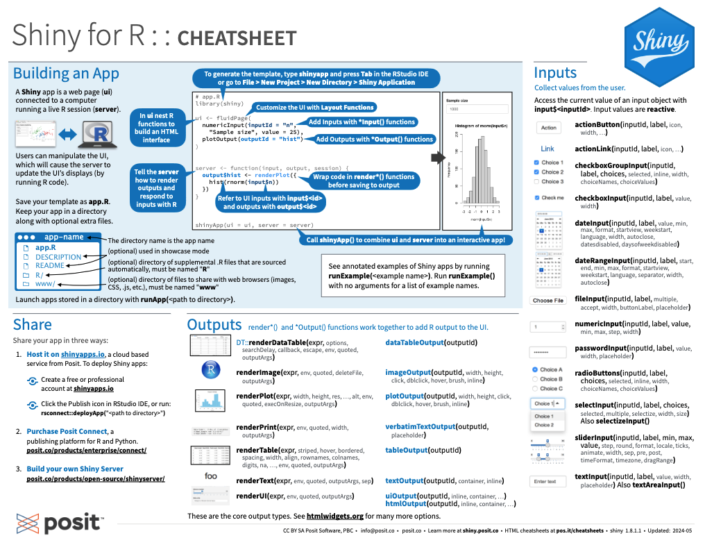
Figure 25.3: A shiny overview from Posit cheatsheets.
On https://shiny.posit.co/, the corresponding articles and reference provide an overview of key shiny functionality.
25.5 Exercises

The following exercises allow checking and verifying our skills in creating interactive Shiny applications:
25.5.1 A Shiny distribution app
Create a Shiny app that draws a given number of values from statistical distributions and illustrates their results (e.g., as histograms or density curves).
25.5.2 A Shiny color app
- Create a Shiny app that accepts some color-related inputs (e.g., one ore more colors, their transparency, and the number of desired colors) and creates and shows a corresponding color palette. The color inputs could be chosen interactively (e.g., by using colourpicker) or defined (by their names, HEX-, or RGB-values).
Hint: The unikn package provides useful functions for this app.
For instance, the newpal() function allows creating new color palettes, the seecol() function illustrates them, etc.
- Create a Shiny app that illustrates a given color palette for various visualizations.
Hint: Again, consider using functions from the unikn package.
For instance, the demopal() function creates various visualization types for a given color palette.
- Combine your apps from 1. and 2. into a single application.