7.2 Prediction and ROC Curves
7.2.1 The story so far (review)
Okay, so thus far, we have worked out how to create a model when our response variable is binary – yes or no, 1 or 0. The actual response isn’t linearly related to the predictors, but the log odds of the response are. So we use the logit or log odds function to link the response to the predictors.
For example, given a dataset about graduate school admissions, we can build a model like this, where we use each applicant’s GRE score and rank within their class, by quartile, to predict their chance of admission:
admissions_dat = read.csv("_data/admissions.csv") %>%
  mutate(rank = as.factor(rank))
admissions_dat %>% head()
## admit gre gpa rank
## 1 0 380 3.61 3
## 2 1 660 3.67 3
## 3 1 800 4.00 1
## 4 1 640 3.19 4
## 5 0 520 2.93 4
## 6 1 760 3.00 2admissions_glm = glm(admit ~ gre + rank,
data = admissions_dat,
family = binomial)
admissions_glm %>% summary()##
## Call:
## glm(formula = admit ~ gre + rank, family = binomial, data = admissions_dat)
##
## Deviance Residuals:
## Min 1Q Median 3Q Max
## -1.5199 -0.8715 -0.6588 1.1775 2.1113
##
## Coefficients:
## Estimate Std. Error z value Pr(>|z|)
## (Intercept) -1.802365 0.672982 -2.678 0.007402 **
## gre 0.003224 0.001019 3.163 0.001562 **
## rank2 -0.721737 0.313033 -2.306 0.021132 *
## rank3 -1.291305 0.340775 -3.789 0.000151 ***
## rank4 -1.602054 0.414932 -3.861 0.000113 ***
## ---
## Signif. codes: 0 '***' 0.001 '**' 0.01 '*' 0.05 '.' 0.1 ' ' 1
##
## (Dispersion parameter for binomial family taken to be 1)
##
## Null deviance: 499.98 on 399 degrees of freedom
## Residual deviance: 464.53 on 395 degrees of freedom
## AIC: 474.53
##
## Number of Fisher Scoring iterations: 4The model equation here is:
\[\log\left(\frac{\widehat{p}}{1-\widehat{p}}\right) = b_0 + b_1GRE + b_2I_{2nd~ q} + b_3I_{3rd~q} + b_4I_{4th~q}\]
or, with the fitted values for the coefficients:
\[\log\left(\frac{\widehat{p}}{1-\widehat{p}}\right) = -1.80 + 0.0032*GRE - 0.72*I_{2nd~ q} - 1.29*I_{3rd~q} - 1.60*I_{4th~q}\]
…where \(\widehat{p}\) is the estimated probability of admission for this student.
Given a student’s predictor values – their rank quartile and GRE score – we could use this model to get multiple kinds of predictions:
- Predict their log odds of admission just by plugging in values on the right-hand side of this equation
- Predict their odds of admission by exponentiating their log odds
- Predict their probability of admission by applying the logistic function to their log odds
Conveniently, R’s predict function will give us either the predicted log odds or the predicted probability, depending on what we use for the argument type. Suppose we have a student with a GRE score of 700, who’s in the top quartile of their class:
new_student = data.frame(gre = 700, rank = "1")
predict(admissions_glm, newdata = new_student,
        type = 'link')
## 1
## 0.4543717predict(admissions_glm, newdata = new_student,
type = 'response')## 1
## 0.6116782So we predict that this student’s log odds of admission at this particular school are 0.45, which translates to a predicted probability of about 61%.
But there’s one other level. What we predicted here was a probability; we did not predict whether or not this student would get in! Suppose they’re deciding whether to rent an apartment in the same town as the graduate school. They don’t want to know the exact probability of their admission; they can’t rent the apartment 61% of the way. They need a yes or no answer, in or out, so they can make a decision.
7.2.2 Predicting the response
So this is an interesting mathematical conundrum. We can predict the probability of admission, \(\widehat{p}\), using our model, but we never actually observe the true probability of admission, \(p\): we just observe whether or not a given student got in. But we can get clever and translate our \(\widehat{p}\) into those terms.
You may already have been doing this mentally! Take our example, a student with a predicted probability of 61%. They ask you whether you think they’ll get in, and you have to give them a yes or no answer.
Response moment: What do you tell this person? And while we’re at it, what would your cutoff be – how high would the predicted probability have to be for you to tell them “yes” instead of “no?”
Be sure to pause here and write down your answer before I influence your thinking – just note it down if you’re not filling out the form yet. I really enjoy seeing the distribution of everyone’s ideas on this :)
Now the reasoning that you just did here (maybe) is, you thought about the consequences of being wrong. For example, you might have thought “if I tell the student they’ll get in and they don’t, they’ll be on the hook for this apartment they don’t need.” Or you might have thought “if I tell them they won’t get in but they do, they won’t have anywhere to live when they get there.”
This brings us back to a familiar (I hope) concept: types of error!
7.2.3 Being wrong (or not)
Most often, we think about error types in the context of hypothesis testing. Rejecting \(H_0\) when you shouldn’t have is a false positive or Type I error, and failing to reject when you should have is a false negative or Type II error. You get that rejection decision by comparing the p-value to a threshold or cutoff value, \(\alpha\). So, by changing the \(\alpha\) level you’re using, you can change your risk of type I and type II errors.
Now, in this context, we’re making a binary decision about what to predict about this student’s admission. So a false positive here would be if we (well, the model) said the student would get in, but they didn’t; and a false negative would be if we said the student wouldn’t get in, but they did. Just like before, we’re basing this binary decision on how some value (in this case, \(\widehat{p}\)) compares to a cutoff. So changing the cutoff will affect how likely we are to make each of these types of errors.
It’s actually more common to frame this question in a more, if you will, optimistic way: along with the chance of being wrong, let’s think about the chance of being right. The true positive rate is similar to power in the hypothesis testing context: given that a student actually does get in, what’s the chance that we successfully said that they would?
So, for a given cutoff, we can ask:
- For admitted students, how often did we predict “yes?” That’s the true positive rate.
- For non-admitted students, how often did we predict “yes?” That’s the false positive rate.
If we use a very stringent cutoff, like “I’m not saying yes unless your chance of admission is 99%!” then we will have a low false positive rate, but we’ll also have a low true positive rate: there’ll be a lot of students who got in, but we said they wouldn’t.
If we use a very generous cutoff, like “Eh, if your chance of admission is better than 40%, I’m gonna say you’ll make it,” we will have a very good true positive rate: for almost everyone who did get in, we said they would. But we’ll also have a lot of false positives – we will have said “yes” to a lot of the students who actually didn’t get in.
Just as with hypothesis testing, there’s a tradeoff here. By adjusting the cutoff, we change the balance between false positive and true positive rate.
7.2.4 The ROC curve
I know “ROC curve” feels like it’s redundant, like “PIN number” and “ATM machine,” but it’s not. The C in ROC is for “characteristic.” We’re good!
Now here’s where this gets fancy. We can actually create a plot to help illustrate this tradeoff between false positives and true positives. It’s called a receiver operating characteristic curve, or ROC curve, for historical reasons. It looks like this:
require(ROCR)
admissions_pHat = predict(admissions_glm, type = 'response')
admissions_prediction = prediction(admissions_pHat, admissions_dat$admit)
admissions_performance = performance(admissions_prediction,
                                     measure = "tpr", # true positive rate
                                     x.measure = "fpr") # false positive rate
plot(admissions_performance, colorize = TRUE) #colors correspond to cutoffs
How do we read this plot? This curve represents what happens if we change our cutoff – the \(\widehat{p}\) we require in order to say “yes.” In fact, the color of the curve at each point corresponds to that cutoff! Then the x-coordinate is the false positive rate, and the y-coordinate is the true positive rate, that we’d get by using that cutoff.
For example, let’s start at the top right corner. That dark blue corresponds to a cutoff of 0.08: if we predict that a student’s probability of admission is at least 8%, we’ll say sure, that person’s going to get in. That’s, mm, a fairly optimistic approach. So how well does it work? Well, the true positive rate is 1, or 100%. Out of all the students who got in, we correctly guessed that 100% of them would get in. Yay! But on the other hand, the false positive rate is…also 1. Out of all the students who didn’t get in, we said that 100% of them would get in. Whoops. Of course what’s happening here is that everyone in the dataset has a \(\widehat{p}\) of at least 8%, so we just said everybody would get in.
Way down at the other end of the curve, the bottom-left corner, we have the opposite situation: a cutoff so high that we’re not going to say that anybody gets in. Our false positive rate is 0, but our true positive rate is also 0 – there were some people in the dataset who got in, but we didn’t think anyone would. Based on the color scale, this cutoff is around 0.7, which is an interesting thing about this dataset – nobody has a \(\widehat{p}\) of more than 0.7.
Now, in practice, we probably don’t want to pick either of these cutoffs. The cutoff we choose depends on what kinds of errors we’re willing to accept – just like when we were choosing \(\alpha\) for hypothesis testing. For example, we might say that we’re willing to accept a false positive rate of 10%, but no more. Then we could look at \(x=.1\) on this plot. Seems like we’d be able to get a true positive rate of only about 35%, but that’s life. Eyeballing the color scale it looks like we’d want to use a cutoff of around 45 to 50%: if a student’s \(\widehat{p}\) is more than that, we’ll predict that they get admitted.
Of course, a color scale is not a precision instrument, and it’s completely useless for some folks, so in practice you’d do the calculations to figure out the actual true and false positive rates for a given cutoff. But this is a way to get a general sense of things.
7.2.5 The AUC
One other thing that ROC curves are useful for is comparing models. For example, let’s fit a different model to predict the chances of admission, this one using just GRE score without class rank:
admissions_glm_compare = glm(admit ~ gre,
                      data = admissions_dat,
                      family = binomial)
Now we get the predicted probability of admission for each student according to this model:
admissions2_pHat = predict(admissions_glm_compare, type = 'response')Then, given any cutoff, we can get a yes/no prediction for each student. We can calculate the true positive rate and false positive rate, and plot all of this stuff with an ROC curve:
admissions2_prediction = prediction(admissions2_pHat, admissions_dat$admit)
admissions2_performance = performance(admissions2_prediction,
                                     measure = "tpr", # true positive rate
                                     x.measure = "fpr") # false positive rate
plot(admissions2_performance, colorize = TRUE) #colors correspond to cutoffs
Let’s say that, as before, we’re willing to put up with a 10% false positive rate. According to this curve, that means we’re going to have a true positive rate of around, eh, 20-25%.
But wait! Remember that with the last model, using GRE and rank, we could get a true positive rate of, like, 35% with a false positive rate of just 10%. So that model is better, in the sense that for a given false positive rate, it could give us a better true positive rate.
Let’s look at the two curves side by side:
plot(admissions_performance, colorize = TRUE)
plot(admissions2_performance, colorize = TRUE)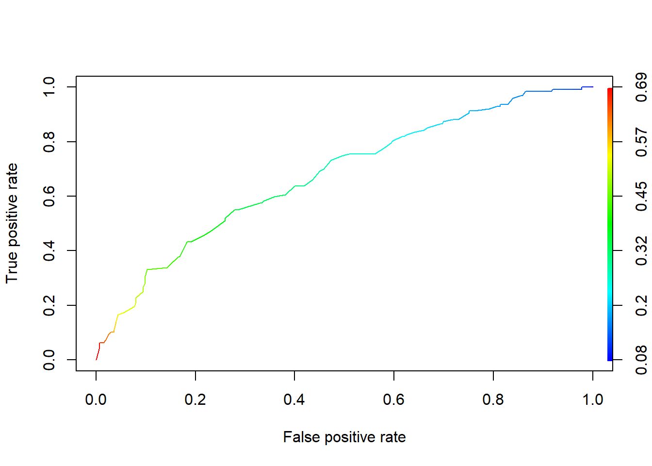
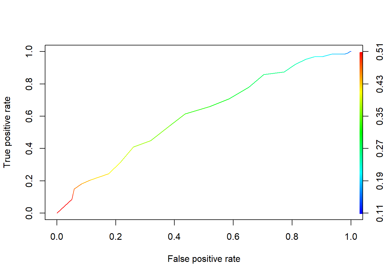
On the left is the larger model, using rank along with GRE, and on the right is the smaller model using just GRE. You can see that throughout, the left-hand curve is “higher” than the right-hand curve at each x-coordinate. That is, given any false positive rate, the larger model gives us a better true positive rate than the smaller model.
You can actually quantify this by calculating the area under the curve, or AUC. The more area under the curve, the better the model does at predictions. Here’s the code:
performance(admissions_prediction, "auc")@y.values## [[1]]
## [1] 0.6764154performance(admissions2_prediction, "auc")@y.values## [[1]]
## [1] 0.6093709So the AUC for the larger model is 0.67, which is noticeably better than the smaller model’s AUC of 0.60. Looks like it is, indeed, useful to include rank in the model – we get better predictions!
Now you may start to get suspicious here. After all, we’re calculating this ROC curve and AUC using our success/failure rate on the original dataset – the same dataset we used to fit the model. In a sense, we’re testing this model’s performance on its own training set. This is kind of optimistic!
And more than that, it raises the same kind of problems as, say, \(R^2\): if you make the model more complex and add more predictors, the AUC is going to get better. So the question becomes: if you have a more complex model with a higher AUC, is it really enough higher to be worth the complexity? Are the models… significantly different? Stay tuned for inference!