1.3 Interactions
1.3.1 What’s an interaction?
So here we are with a nice multiple regression. We have a response \(y\), and some predictors \(x_1\), \(x_2\), and so on. We get a dataset and fit the model, so we have coefficients \(b_1\), \(b_2\), etc. Each one tells us about the (linear) relationship between one of the predictors and the response – after accounting for the effects of the other predictors.
Here’s the official line: an interaction effect between two (or more!) predictors occurs when the relationship of one predictor to the response depends on the value of the other predictor (or predictors!). We’ll focus on the two-way version here, but bear in mind that higher-order interaction effects between three or more predictors can occur, though they’re perhaps less common.
In various application areas, you may hear people talk about synergistic effects, or constructive/destructive interference, or one factor acting as a moderator for the effect of another. But “interaction” is the general term.
So what does that mean, “the relationship between \(x_1\) and \(y\) depends on the value of \(x_2\)?” Let’s see an example.
1.3.2 Athlete example
Let’s take a dataset of physical measurements on Australian athletes, each of whom is top-level in some particular sport. Suppose we are interested in the medical question of the characteristics of athletes’ blood. We decide to look at how each athlete’s red blood cell count relates to their white blood cell count, with red as the response and white as the predictor.
athlete_cells_dat = ais %>%
  filter(sport %in% c("T_400m", "T_Sprnt", "Tennis"))
athlete_cells_dat %>%
  ggplot() +
  geom_point(aes(x = wcc, y = rcc))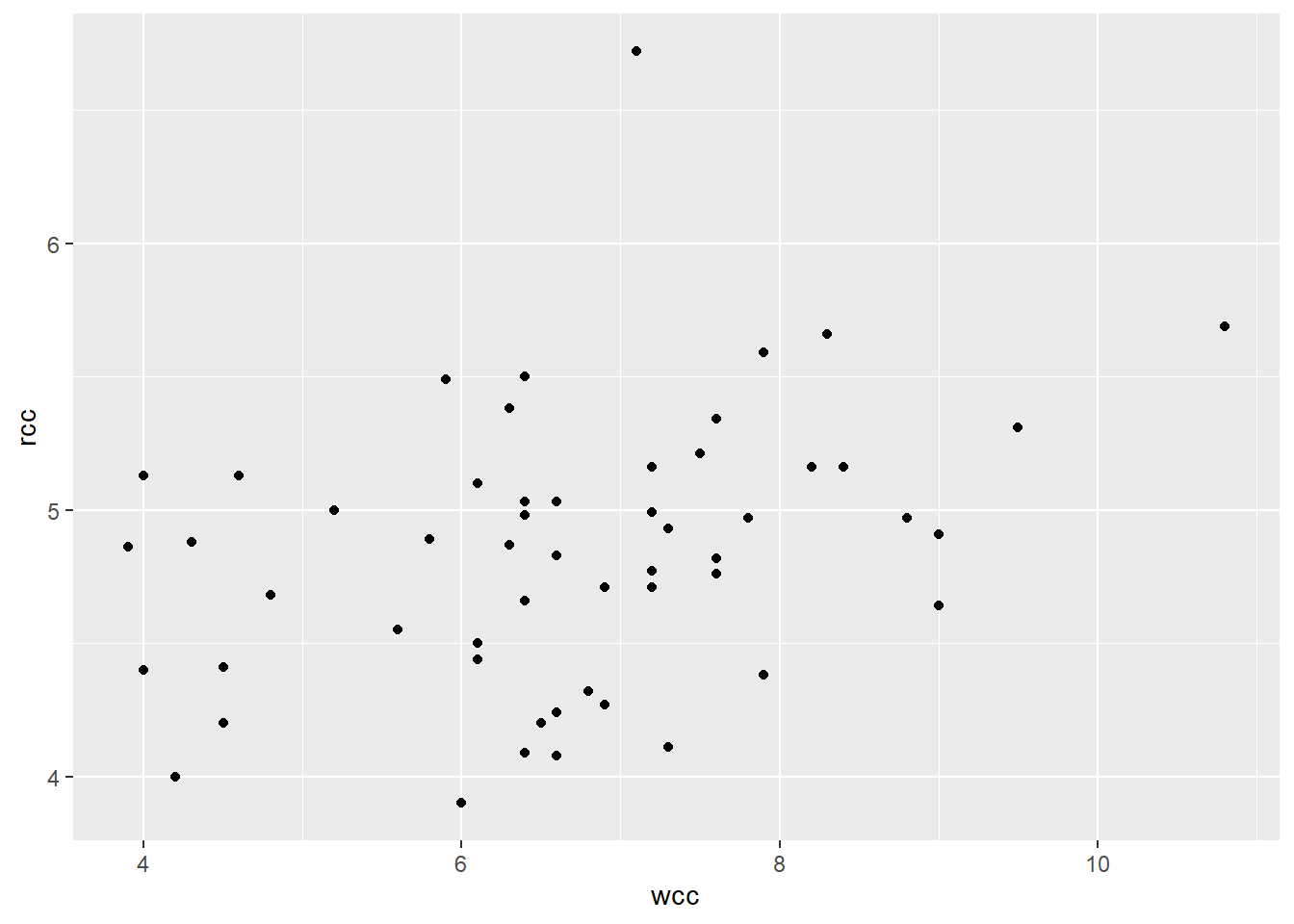
Looks like a weak positive relationship, no noticeable bends, reasonably constant variance. There’s one outlier with a really high red blood cell count, but on the other hand, that person has almost no leverage (since their white blood cell count is pretty average) so the outlier probably isn’t affecting the slope much. On the flip side, there’s a person with unusually high white cell count, who might be high-leverage…but their red cell count seems to be in line with what the other points would suggest, so that point probably isn’t affecting the slope much either. I could look into both of these people to find out what’s up, but for the purposes of this exercise, let’s keep rolling.
1.3.3 Multiple predictors
Now, I could do a regression of just rcc on wcc:
\[\widehat{rcc} = b_0 + b_{wcc}*wcc\]
But I suspect that the athlete’s sport might also help me predict their red cell count: red blood cells help you process oxygen, so maybe athletes in different kinds of sports develop different amounts of them.
Let’s look at the athletes from two track events: the 400 meters, and the sprint (50 meters, I think).
athlete_cells_dat %>%
  filter(sport %in% c("T_400m", "T_Sprnt")) %>%
  ggplot(aes(x = wcc, y = rcc, color = sport)) +
  geom_point()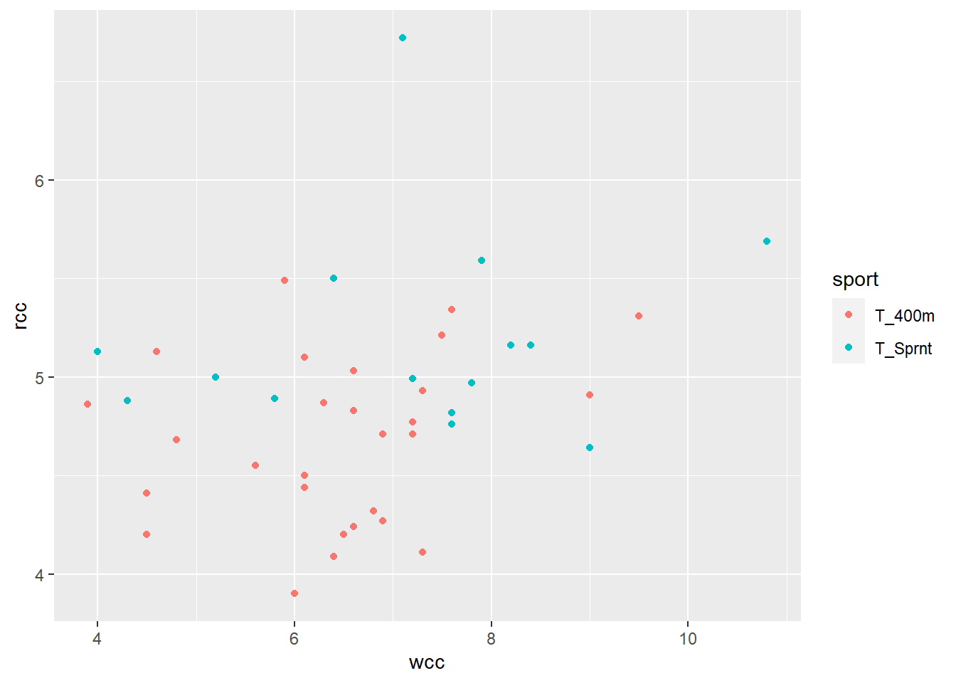
Ohoho! It looks like, for a given white cell count, the sprinters tend to have higher red cell counts than the 400 m runners. I can express this by adding a term to my model, \(I_{Sprint}\), with its own coefficient:
\[\widehat{rcc} = b_0 + b_{wcc}*wcc + b_{sprint}*I_{sprint}\]
This term will add a certain amount to my prediction of rcc if the athlete is a sprinter. So my prediction will be based on the intercept, the athlete’s white cell count, and an adjustment if they’re a sprinter.
The effect of this is, in a way, to create two lines with one equation:
athlete_cells_dat %>%
  filter(sport %in% c("T_400m", "T_Sprnt")) %>%
  ggplot(aes(x = wcc, y = rcc, color = sport)) +
  geom_point() +
  stat_smooth(method = 'lm', se = FALSE)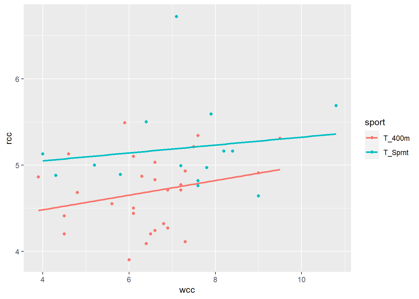
One line is for 400-meter runners:
\[\widehat{rcc} = b_0 + b_{wcc}*wcc\]
…and the other is for sprinters:
\[\widehat{rcc} = b_0 + b_{wcc}*wcc + b_{sprint}\]
Geometrically, the difference is that I shift the entire line up for sprinters – I change the intercept.
1.3.4 An interaction effect
But wait! What about the tennis players?
athlete_cells_dat %>%
  # filter(sport %in% c("T_400m", "T_Sprnt")) %>%
  ggplot(aes(x = wcc, y = rcc, color = sport)) +
  geom_point() +
  stat_smooth(method = 'lm', se = FALSE)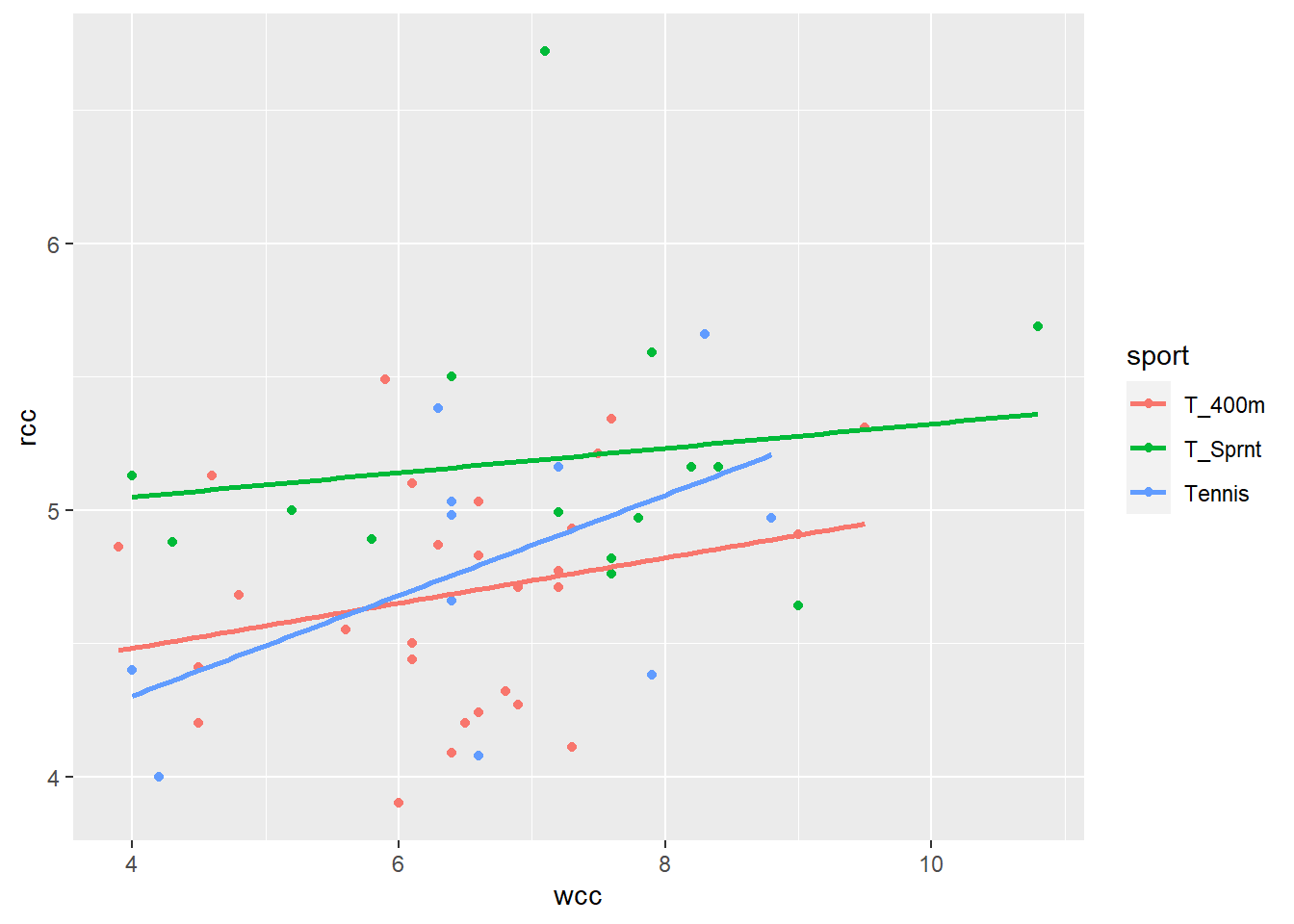
Now this is interesting. When I separate out the athletes by sport, the best-fit lines for sprinters and 400-meter runners have different intercepts, but their slopes are the same. But tennis players are, well, playing by different rules. Not only does their line have a different intercept, it has a different slope.
This is an example of an interaction. The relationship between wcc and rcc – the slope of wcc – is different for tennis players than for sprinters, or 400-meter runners. We call this an interaction between wcc and sport. If I ask you “hey, what’s the slope of rcc vs. wcc?” you can’t answer me, unless I also tell you which sport I’m talking about.
Well, fine. We can extend our model for this, too. Before, we needed to adjust the intercept based on sport, so we added a constant adjustment if the athlete was a sprinter. We can throw in one for tennis players, too:
\[\widehat{rcc} = b_0 + b_{wcc}*wcc + b_{sprint}*I_{sprint} + b_{tennis}*I_{tennis}\]
Notice there’s no \(b_{400m}\) or anything – the 400-meters crowd are the baseline group.
This equation would allow us to describe three different lines: they all have the same slope of wcc, but they have different intercepts depending on the sport. So now we need to add a term to adjust the slope of wcc depending on the sport. Like this:
\[\widehat{rcc} = b_0 + b_{wcc}*wcc + b_{sprint}*I_{sprint} + b_{tennis}*I_{tennis} + b_{WT}*wcc*I_{tennis}\]
Basically, if the athlete is a tennis player, we’re going to add “another slope” for wcc – that is, we adjust the slope of wcc.
Now in practice, if you’re going to have an interaction involving one level of a categorical predictor, you want to put it in for all the levels, just for completeness’s sake. Like this:
\[\widehat{rcc} = b_0 + b_{wcc}*wcc + b_{sprint}*I_{sprint} + b_{tennis}*I_{tennis} + b_{WS}*wcc*I_{sprint} + b_{WT}*wcc*I_{tennis}\]
Let’s ask R to find the best-fit values of all these \(b\)’s, shall we? In R’s formula notation, we denote an interaction with the colon, :.
athlete_cells_lm = lm(rcc ~ wcc + sport + wcc:sport, data = athlete_cells_dat)
athlete_cells_lm$coefficients
## (Intercept) wcc sportT_Sprnt sportTennis wcc:sportT_Sprnt
## 4.14331169 0.08466930 0.72214112 -0.59306937 -0.03883325
## wcc:sportTennis
## 0.10356979If you want to have two factors and their interaction, you can use the shorthand *. So A + B + A:B is the same as A*B.
athlete_cells_lm2 = lm(rcc ~ wcc*sport, data = athlete_cells_dat)
athlete_cells_lm2$coefficients # same as above!
## (Intercept) wcc sportT_Sprnt sportTennis wcc:sportT_Sprnt
## 4.14331169 0.08466930 0.72214112 -0.59306937 -0.03883325
## wcc:sportTennis
## 0.10356979So the fitted equation is:
\[\widehat{rcc} = 4.14 + 0.085*wcc + 0.722*I_{sprint} - 0.593*I_{tennis} - 0.039*wcc*I_{sprint} + 0.104*wcc*I_{tennis}\]
If the athlete is a 400-meter runner, all the indicator variables are 0, and this simplifies to: \[\widehat{rcc} = 4.14 + 0.085*wcc\]
If they’re a sprinter, \(I_{sprint}=1\) but \(I_{tennis} = 0\), so we get: \[\widehat{rcc} = 4.14 + 0.085*wcc + 0.722 - 0.039*wcc\] \[\widehat{rcc} = (4.14 + 0.722) + (0.085 - 0.039)*wcc\]
…a different intercept, and a very slightly different slope. You can work this out for the tennis players too if you like: for them both the intercept and the slope of wcc will be noticeably different than for 400-meter runners.
In this example we had an interaction between one quantitative predictor (sport) and one categorical predictor (white blood cell count). This is the easiest kind of interaction to visualize, but it’s not the only kind that exists. Any time the relationship between some X and the response is different for different values of some other predictor, that’s an interaction.
Here’s an example of an interaction between two categorical variables. Suppose my response is salary, and one of my predictors is “does this person have children?” There is a relationship between salary and whether the person has children…but that relationship is very different for different genders. I haven’t seen enough data to know about non-binary folks, but for women, the average salary after having children is much lower than the average salary for women without children – and that gap doesn’t exist for men. So if I ask you “what’s the relationship between salary and having children?” you can’t tell me, until I tell you what gender I’m talking about.
Response moment: Try and think of an example where you might have an interaction between two quantitative predictors. That is, the slope between \(X_1\) and \(Y\) is different for different values of \(X_2\) – what could \(X_1\), \(X_2\), and \(Y\) be?