7.1 Prediction and Residuals
One of the possible Goals for a model we’ve talked about is prediction. We’re pretty used to this idea: we build a model, and then for given values of the predictors, we get a predicted value for the response. (Or some function of the response!)
Each time we get a predicted value for a point that’s in our dataset, we also generate a residual – the difference between the actual response value for that point and our prediction for that point. This is all old news. But in GLMs, because of that extra link function standing between \(\boldsymbol{X\beta}\) and \(y\), residuals get a little bit…funky.
7.1.1 Grad school admissions data
As an example, let’s return to the graduate school admissions data:
admissions_dat = read.csv("_data/admissions.csv") %>%
  mutate(rank = as.factor(rank))
admissions_dat %>% head()
## admit gre gpa rank
## 1 0 380 3.61 3
## 2 1 660 3.67 3
## 3 1 800 4.00 1
## 4 1 640 3.19 4
## 5 0 520 2.93 4
## 6 1 760 3.00 2We’ll start by fitting a logistic regression model for admission, using each candidate’s class quartile and GRE score. Here it is:
admissions_glm = glm(admit ~ gre + rank,
                      data = admissions_dat,
                      family = binomial)
admissions_glm %>% summary()
##
## Call:
## glm(formula = admit ~ gre + rank, family = binomial, data = admissions_dat)
##
## Deviance Residuals:
## Min 1Q Median 3Q Max
## -1.5199 -0.8715 -0.6588 1.1775 2.1113
##
## Coefficients:
## Estimate Std. Error z value Pr(>|z|)
## (Intercept) -1.802365 0.672982 -2.678 0.007402 **
## gre 0.003224 0.001019 3.163 0.001562 **
## rank2 -0.721737 0.313033 -2.306 0.021132 *
## rank3 -1.291305 0.340775 -3.789 0.000151 ***
## rank4 -1.602054 0.414932 -3.861 0.000113 ***
## ---
## Signif. codes: 0 '***' 0.001 '**' 0.01 '*' 0.05 '.' 0.1 ' ' 1
##
## (Dispersion parameter for binomial family taken to be 1)
##
## Null deviance: 499.98 on 399 degrees of freedom
## Residual deviance: 464.53 on 395 degrees of freedom
## AIC: 474.53
##
## Number of Fisher Scoring iterations: 47.1.2 Getting predictions
Now here’s where it gets interesting. We’ve previously seen the use of the function predict() to generate predicted/fitted values from an lm object. That function works on glm objects too. But in a new twist, it can generate either of two types of predictions! It can give the predicted log odds, or “translate” all the way back to predicted probability of admission.
Which flavor of prediction the function gives you is controlled by the type argument inside predict().
Note the syntax here. Previously, we’ve used predict() with an argument newdata, to get predictions for a specified set of \(x\) values. Here, I didn’t provide newdata, only the model object. R’s response to this is to generate predictions for every point in the original dataset that we used to fit the model. In an lm object, this is like accessing the fitted values with my_lm_object$fitted.
admissions_predictions = admissions_dat %>%
  mutate(
  "logOdds" = predict(admissions_glm, type = 'link'), # note "type" argument!
  "pHat" = predict(admissions_glm, type = 'response')
)
Let’s plot these predictions to see how they behave. Just as we previously noted, in a logistic regression model, the predicted log odds have a linear relationship with the predictors:
admissions_predictions %>%
  ggplot() +
  geom_point(aes(x = gre, y = logOdds,
                 color = rank))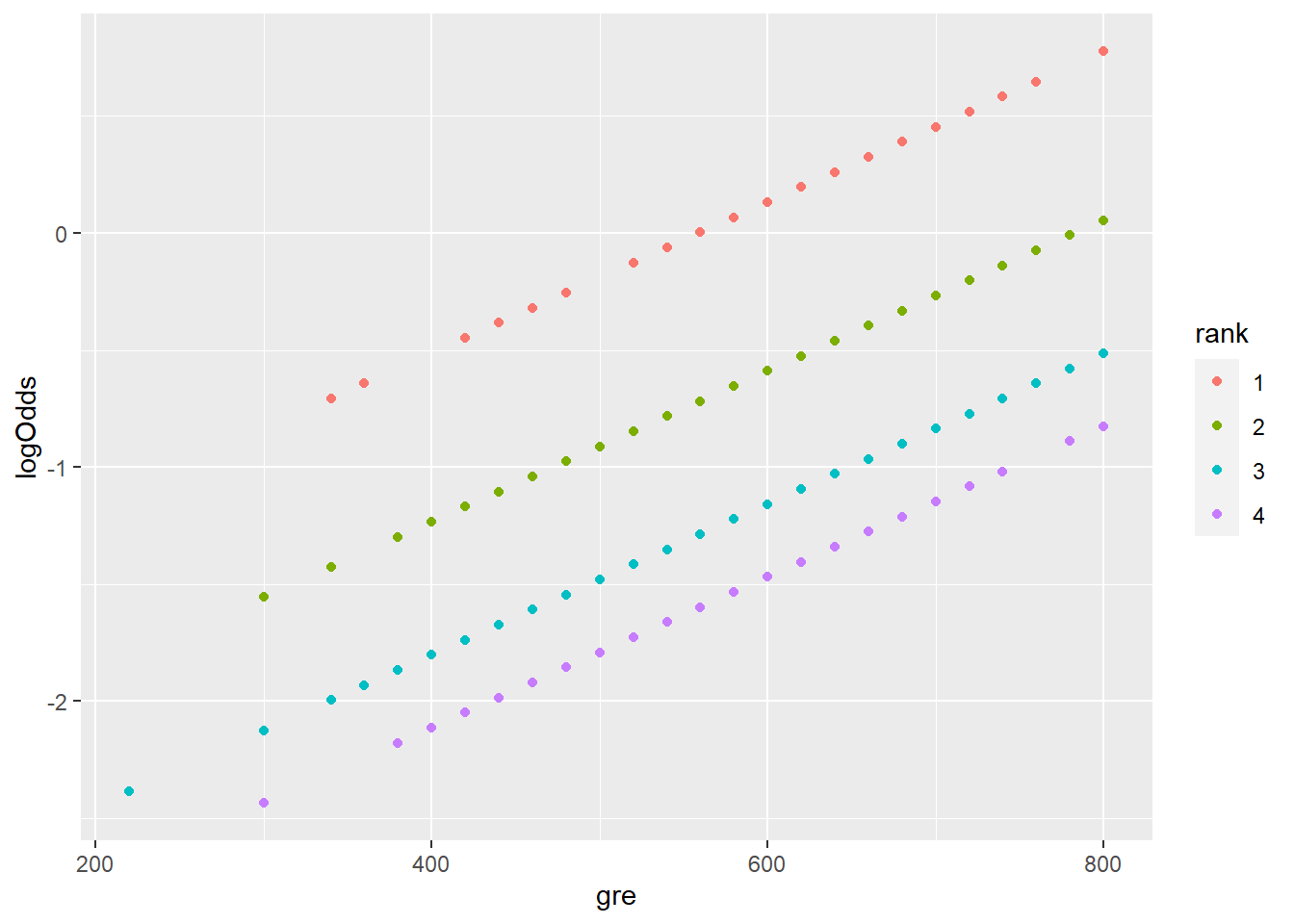
Take a moment to unpack this plot! What’s with the pattern here? Why do there appear to be multiple “lines?”
But by contrast, the predicted probability \(\widehat{p}\) has a nonlinear relationship:
admissions_predictions %>%
  ggplot() +
  geom_point(aes(x = gre, y = pHat,
                 color = rank))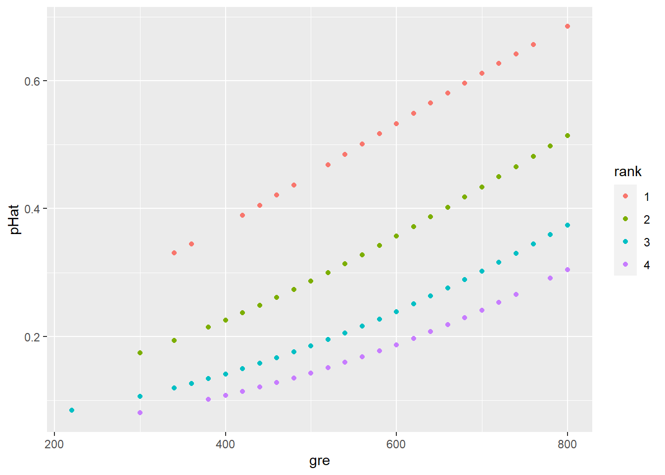
Since these are probabilities we’re predicting, it’s reasonable to rescale the \(y\) axis to go from 0 to 1. This makes it easier to eyeball the kinds of probabilities we’re looking at:
admissions_predictions %>%
  ggplot() +
  geom_point(aes(x = gre, y = pHat,
                 color = rank)) +
  ylim(0,1)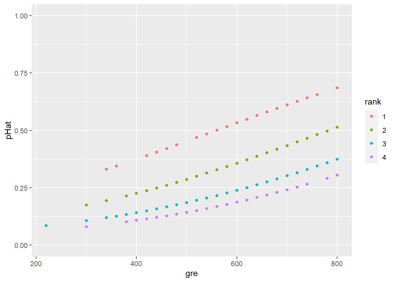
7.1.3 Residuals
Okay, so we have some predicted values. Let’s focus on just the predicted values (\(\widehat{p}\)) for various 3rd-quartile students:
admissions_predictions %>%
  filter(rank == "3") %>%
  ggplot() +
  geom_point(aes(x = gre, y = pHat)) +
  ylim(0,1)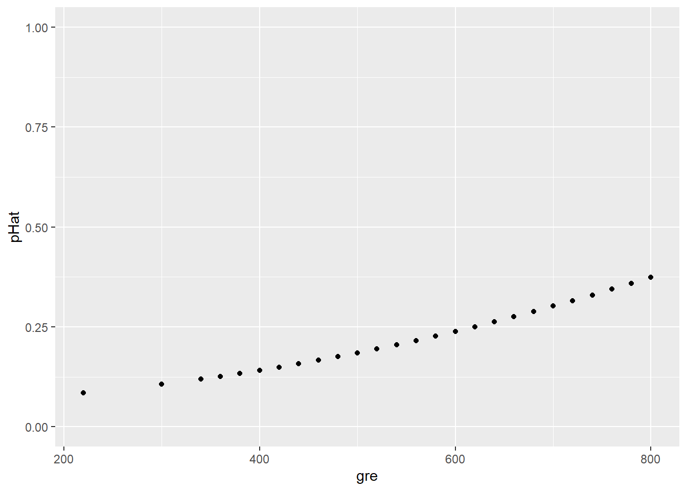
Note the slightly different jitter syntax here. This approach jitters the points in both directions (x and y coordinates). Putting jitter() around pHat inside the aes() call would jitter the points only vertically, leaving their x-coordinates alone.
In this plot, some candidates’ predicted values overlap since they have the same GRE score and thus the same \(\widehat{p}\). We can “jitter” the points (smush ’em around a little) so we can see them all:
jitter = position_jitter(width = 0, height = 0.02)
admissions_predictions %>%
  filter(rank == "3") %>%
  ggplot() +
  geom_point(aes(x = gre, y = pHat),
             position = jitter) +
  ylim(0,1)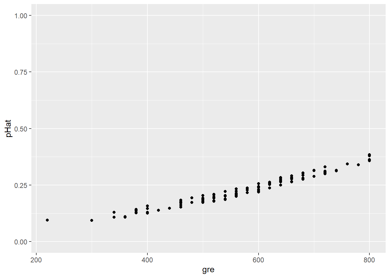
But what actually happened? Let’s add the actual outcome for each student to this plot:
admissions_predictions %>%
  filter(rank == "3") %>%
  ggplot() +
  geom_point(aes(x = gre, y = pHat), position = jitter) +
geom_point(aes(x = gre, y = admit), position = jitter, color = "blue") 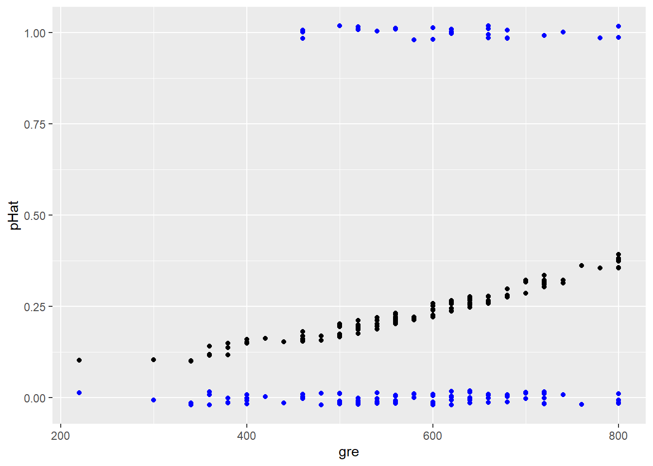
Intriguing! For any given \(\widehat{p}\) there are only two possible outcomes…and therefore only two possible errors: the student does get admitted (positive residual) or they don’t (negative residual). Thus when we plot the residuals vs. the fitted values, we get two “curves”:
admissions_glm %>% plot(1)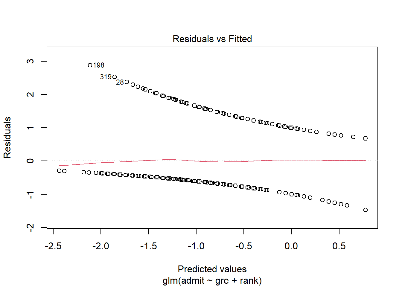
This is the same kind of residuals-vs.-fitted plot you have used so often in linear regression! It’s giving you the same information…but it sure does look different. We’ll return to this plot when we start looking at checking conditions for GLMs.
7.1.4 What about Poisson/count regression?
For a count data example, we’ll use the data about squirrels eating pine cones (well, eating the seeds out of pine cones):
data("nuts")## Warning in data("nuts"): data set 'nuts' not foundsquirrel_dat = nutsHere’s a basic scatterplot of the data, with each point representing a small area of forest. It shows us that parts of the forest with taller trees tend to have more cones eaten:
squirrel_dat %>%
  ggplot() +
  geom_point(aes(x = height, y = cones))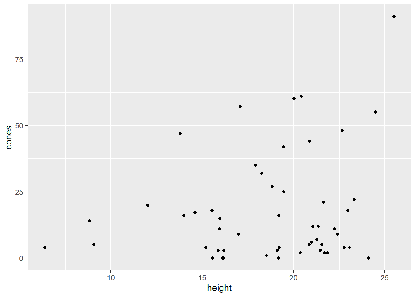
Okay then! We fit a simple Poisson regression model:
squirrel_glm = glm(cones ~ height, data = squirrel_dat,
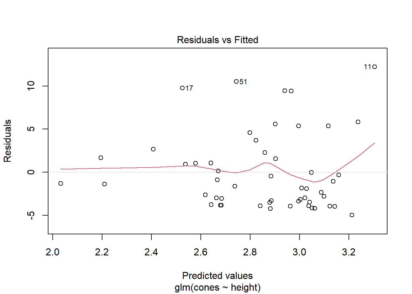
family = poisson()) # check out the "family"!These residuals also look a little different than you’re used to, although frankly not as weird as logistic residuals. For any predicted average count \(\hat{\lambda}\), there are multiple possible outcomes and thus multiple possible residuals. But, since the actual outcomes have to be integer counts (and they’re all fairly small counts in this dataset), there aren’t very many possible residuals, which is reflected in the plot.
squirrel_glm %>% plot(1)