6.1 Logistic Regression: Why and How?
Both SLR and MLR are linear (I mean, it’s right there in the name!) – that is, they look for linear relationships between the response and the predictor(s). But if the response isn’t quantitative, that doesn’t really make sense! Here, we’ll explore logistic regression, which is used when the response is a binary variable with only two possible values.
6.1.1 Example: the Challenger O-ring data
Back in 1986, NASA launched the Challenger space shuttle for a new mission. Tragically, the shuttle disintegrated catastrophically less than a minute after launch, killing everyone aboard.
This was horrible and sad – but even worse, it should have been preventable. See, the explosion occurred because a particular seal called an O-ring failed, allowing a leak of rocket fuel, with disastrous results.
The thing about those O-rings is that they were made of rubber. You know what happens to rubber when it gets cold? Yes? It gets super brittle, that’s what; it develops cracks, and the seal fails.
The engineers involved did know this, and had some data from previous shuttle launches in various weather, where they’d observed damage or partial failure of O-rings. Let’s look at some.
Here are a few rows of the dataset:
require(vcd)
data('SpaceShuttle')
head(SpaceShuttle)
## FlightNumber Temperature Pressure Fail nFailures Damage
## 1 1 66 50 no 0 0
## 2 2 70 50 yes 1 4
## 3 3 69 50 no 0 0
## 4 4 80 50 <NA> NA NA
## 5 5 68 50 no 0 0
## 6 6 67 50 no 0 0So what happens if we make a plot of failures on the \(y\) axis, with the temperature at the time of the launch on the \(x\) axis?
SpaceShuttle$Fail = as.numeric(SpaceShuttle$Fail) - 1 #originally a factor
SpaceShuttle %>%
  ggplot() +
  geom_point(aes(x = Temperature, y = Fail))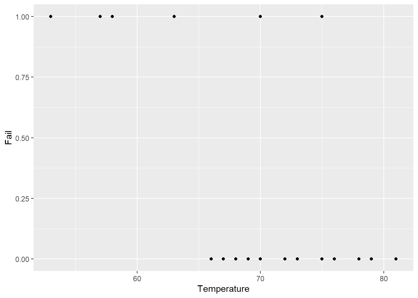
Without doing any formal modeling, we can definitely see a pattern here – launches at lower temperatures seem to be more likely to involve failures.
I didn’t mention this, but the 1986 launch was taking place in January. The temperature at launch was 30 degrees Fahrenheit.
The eyeball test clearly shows that the launch was a bad idea. (It’s easy to spot when you show the data this way; we can have a whole other conversation in office hours about communicating data effectively, and what went wrong with the process for the Challenger.) But can we quantify this with a model?
Well, I guess we could try a linear regression model? Let’s fit a model:
shuttle_lm = lm(Fail ~ Temperature, data = SpaceShuttle)Now we’ll see what that model predicts for each possible launch temperature, all the way down to 30 Fahrenheit:
lm_predictions = data.frame(
  "Temperature" = seq(30,80,by=.1)
)
lm_predictions$Prediction = predict(shuttle_lm,
                                newdata = lm_predictions)
lm_predictions %>%
  ggplot() +
  geom_line(aes(x = Temperature, y = Prediction)) +
  geom_point(data = SpaceShuttle,
             aes(x = Temperature, y = Fail),
             color = "blue")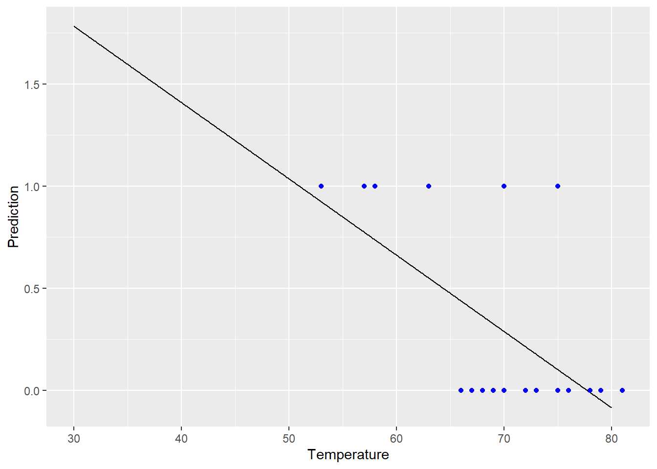
Well, okay, that didn’t really make any sense. The response here is just “failure/no failure.” It doesn’t make sense to predict values greater than 1, and it definitely doesn’t make sense to predict values less than 0! What we really want to predict is the probability of failure, and that has to be between 0 and 1.
So we’d really like some model that gives more reasonable predicted values for \(y\). Like this:
glm_predictions = data.frame(
  "Temperature" = seq(30,80,by=.1)
)
glm_predictions$Prediction = predict(shuttle_glm,
                                newdata = glm_predictions,
                                type = "response")
glm_predictions %>%
  ggplot() +
  geom_line(aes(x = Temperature, y = Prediction)) +
  geom_point(data = SpaceShuttle,
             aes(x = Temperature, y = Fail),
             color = "blue")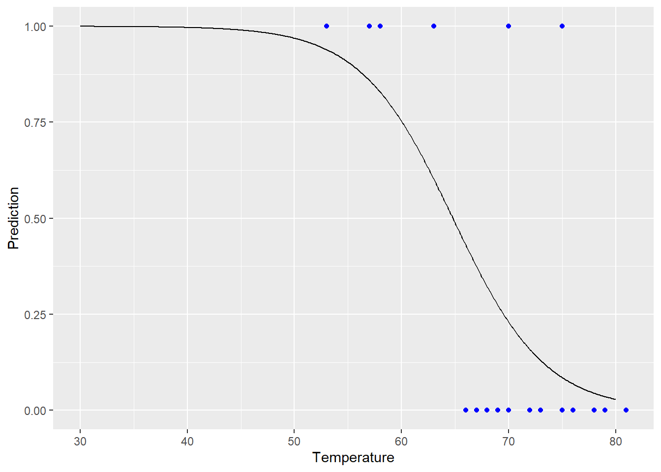
This brings us to…
6.1.2 A new variation: logistic regression
Remember that thus far, when we built a model, what we’ve been trying to predict is the average value(s) of the response given certain predictor values:
\[\widehat{y} = b_0 + b_1 x_1 + \dots+ b_kx_k\]
Problem is, according to this setup, if you put in sufficiently extreme values for the predictors – the \(x\)’s – you can get \(\widehat{y}\) to have any value between \(-\infty\) and \(\infty\). Lines are infinite!
Yes, I know “p” is already being used for other things, I’m sorry, it’s traditional. Stats is pretty much brought to you by the letter p.
But suppose my response is a binary variable, like “did the patient survive the operation?” Then what we’re trying to predict is the probability that the patient survived – we could call this \(p\), and then add a hat when we’re talking about the estimated probability, \(\widehat{p}\). Now, this probability \(p\) logically has to be between 0 and 1 for each patient. So it doesn’t make sense for our prediction \(\widehat{p}\) to be any value outside \([0,1]\), regardless of what I plug in for that patient’s \(x\) values.
So we need to find a transformation of our response \(p\), such that the transformed values can go from \(-\infty\) to \(\infty\). Then we can create a linear model for these transformed values in the usual way. What transformation can we do to take \(p\) (which is somewhere in \([0,1]\)) to the whole real line, \(-\infty\) to \(\infty\)?
The canonical transformation (which means, the usual thing people do) here is the called the logit or log odds function: \[ g(p) = \log\left(\frac{p}{1-p}\right)\text{ for }~ 0<p<1\]
It looks like this:
logit_data = data.frame(
  "p" = seq(0,1,by=.001)
) %>%
  mutate("logit" = log(p/(1-p)))
logit_data %>%
  ggplot() +
  geom_line(aes(x = p, y = logit))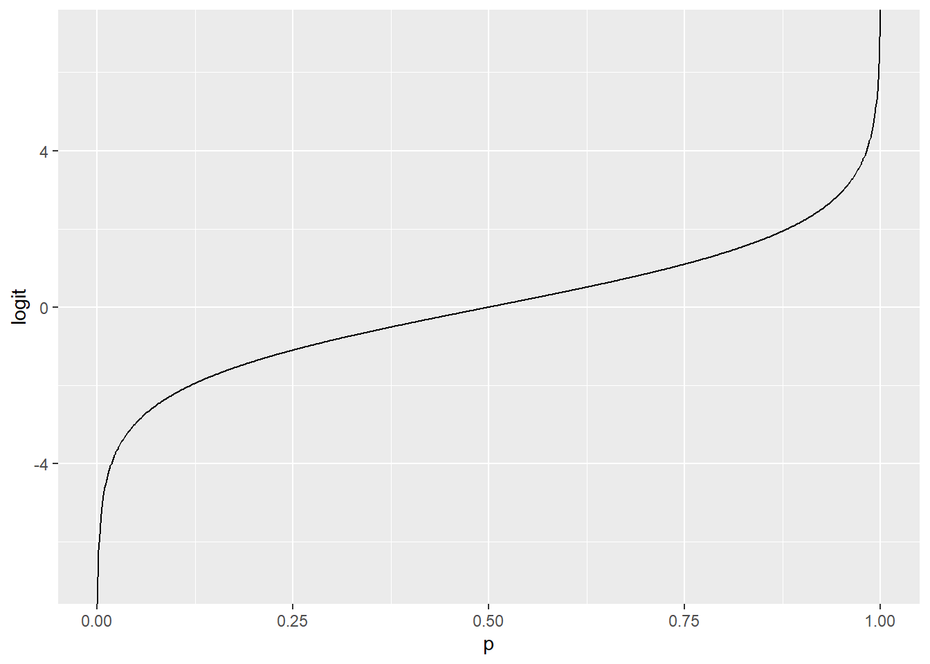
This is a bit of an interesting function. When \(p\) is a probability, the quantity \(\left(\frac{p}{1-p}\right)\) is called the odds – yes, as in the phrase “what are the odds?” So what we’re doing here is taking the log of the odds. Is that intuitive? Absolutely not. But it allows us to take something that’s stuck between 0 and 1, the probability, and transform it so that it can have any value on the whole number line.
What if we want to go back? That is, what if we have log odds and we want to map it back so we can talk about probabilities? No problem: the logit function has an inverse, called the logistic function. This function maps back from the entire real line, \((-\infty,\infty)\), to \((0,1)\). The formula is:
\[ g^{-1}(x) = \frac{e^{x}}{1+e^{x}}\]
…and it looks like this:
logistic_data = data.frame(
  "x" = seq(-10,10,by=.01)
) %>%
  mutate("logistic" = exp(x)/(1+exp(x)))
logistic_data %>%
  ggplot() +
  geom_line(aes(x = x, y = logistic))
So what does this all mean? If we apply the logit transformation to the probability of success (or failure), we end up with a quantity that we can predict with a linear model. Like this:
\[g(\widehat{p}) = \log\big(\frac{\widehat{p}}{1-\widehat{p}}\big) = \beta_0 + \beta_1x\]
Now, this equation describes the True, population model. We’d have to estimate those \(\beta\)’s based on our sample data. Turns out this is a bit complicated, but the good news is, R can do it so you don’t have to. That will give us a fitted model equation like this:
\[g(\widehat{p}) = \log\big(\frac{\widehat{p}}{1-\widehat{p}}\big) = b_0 + b_1x\]
6.1.3 Back to the Challenger
We were trying to predict the probability of an O-ring failure, and we saw that a straight-up (har har) linear model didn’t give us sensible fitted values. Instead, let’s try using the logit transformation to “link” \(\widehat{p}\) and \(b_0+b_1x\).
Note the use of the glm function (which you have actually seen before!). This stands for “generalized linear model.” A generalized linear model is, roughly speaking, a linear model for a transformation of the response variable. This transformation is called the link function, because it “links” your actual response with the linear part \(b_0 + b_1x\). In logistic regression, we use the log odds function as the link, but there are many other kinds of generalized linear models that use different link functions. It’s a Whole Thing.
The model here is referred to as “binomial” in the code – remember (possibly?) that a binomial distribution is how you model the number of successes in a series of \(n\) Bernoulli trials. (Remember Bernoulli trials?)
shuttle_glm = glm(Fail ~ Temperature,
                  data = SpaceShuttle, family = binomial(link = logit))
The predict function allows me to get predictions from this model for each launch temperature. I can get the predicted log odds, or I can ask R to “translate” back for me, from the log odds to the actual predicted probability of failure.
glm_predictions = data.frame(
  "Temperature" = seq(30,80,by=.1)
)

# log odds of failure at each launch temp
glm_predictions$LogOdds = predict(shuttle_glm,
                                newdata = glm_predictions,
                                type = "link")

# predicted probability of failure at each launch temp
glm_predictions$PredictedProb = predict(shuttle_glm,
                                newdata = glm_predictions,
                                type = "response")
The log odds have a linear relationship with launch temperature:
glm_predictions %>%
  ggplot() +
  geom_line(aes(x = Temperature, y = LogOdds))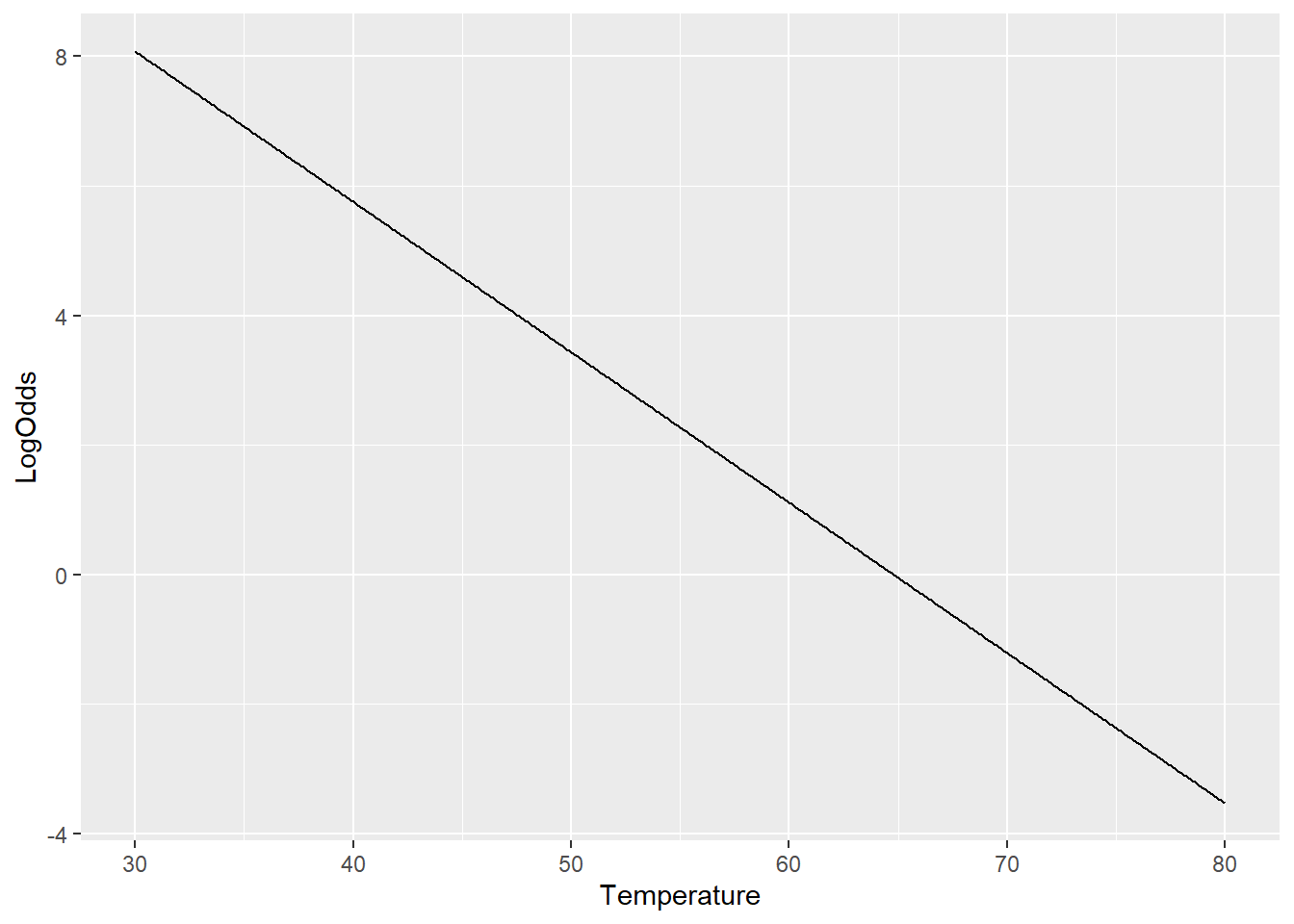
But the actual predicted probability of failure stays nicely between 0 and 1 for any launch temperature:
glm_predictions %>%
  ggplot() +
  geom_line(aes(x = Temperature, y = PredictedProb)) +
  geom_point(data = SpaceShuttle,
             aes(x = Temperature, y = Fail),
             color = "blue")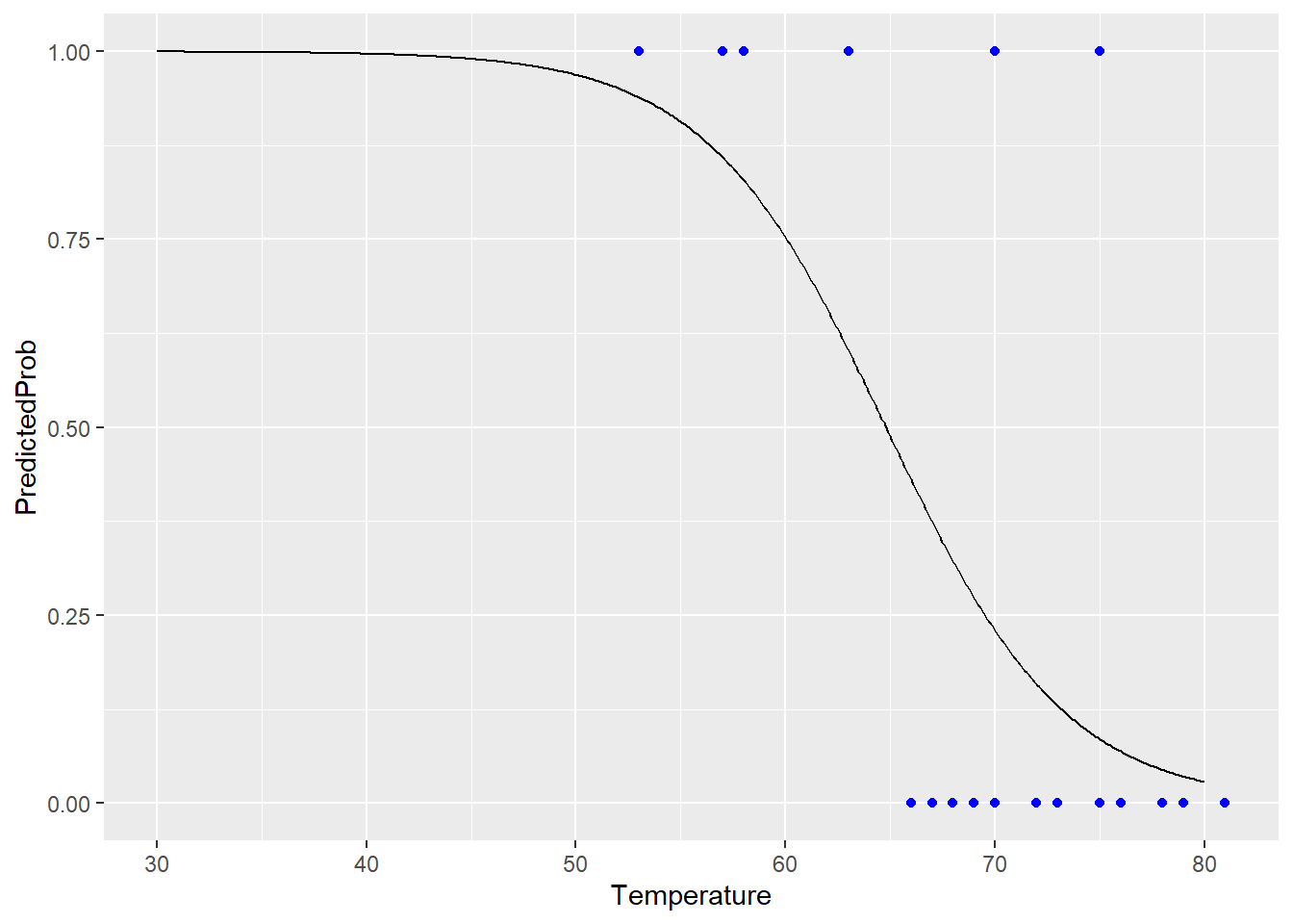
Much better!
6.1.4 Heads-up: interpreting coefficients
The interpretation of a model like this is a little tricky, because you have to remember that your linear model is actually predicting the log odds. Let’s look at the summary info:
shuttle_glm %>% summary()##
## Call:
## glm(formula = Fail ~ Temperature, family = binomial(link = logit),
## data = SpaceShuttle)
##
## Deviance Residuals:
## Min 1Q Median 3Q Max
## -1.0611 -0.7613 -0.3783 0.4524 2.2175
##
## Coefficients:
## Estimate Std. Error z value Pr(>|z|)
## (Intercept) 15.0429 7.3786 2.039 0.0415 *
## Temperature -0.2322 0.1082 -2.145 0.0320 *
## ---
## Signif. codes: 0 '***' 0.001 '**' 0.01 '*' 0.05 '.' 0.1 ' ' 1
##
## (Dispersion parameter for binomial family taken to be 1)
##
## Null deviance: 28.267 on 22 degrees of freedom
## Residual deviance: 20.315 on 21 degrees of freedom
## (1 observation deleted due to missingness)
## AIC: 24.315
##
## Number of Fisher Scoring iterations: 5There’s some stuff happening here, which we can explore more another time, but a lot of this is quite similar to what we’re used to seeing in lm summary output. Note the estimated coefficient for Temperature: -0.23. Be careful – we can’t interpret this as the slope between failure probability and temperature. Instead, we have to say that according to this model, a day with 1 degree higher temperature has log odds of failure that are 0.23 units lower. You’d have to apply the logistic function to convert this back into a statement about the probability of failure.
Response moment: Although I can’t interpret -0.23 as the “slope of failure probability vs. temperature,” I can look at its sign – whether it’s positive or negative. What does the sign of this coefficient tell me in context, and why is it okay for me to look at the sign without applying the logistic function first?