1.5 Correlation
1.5.1 Two quantitative variables
Let’s step back for a moment and think about descriptives. When we have two quantitative variables, our go-to plot is a scatterplot. Here’s an example. Each case here is a different model of car; on the x axis is the car’s horsepower, and on the y axis is its quarter-mile time, in seconds.
my_cars %>%
  ggplot() +
  geom_point(aes(x = hp, y = qsec))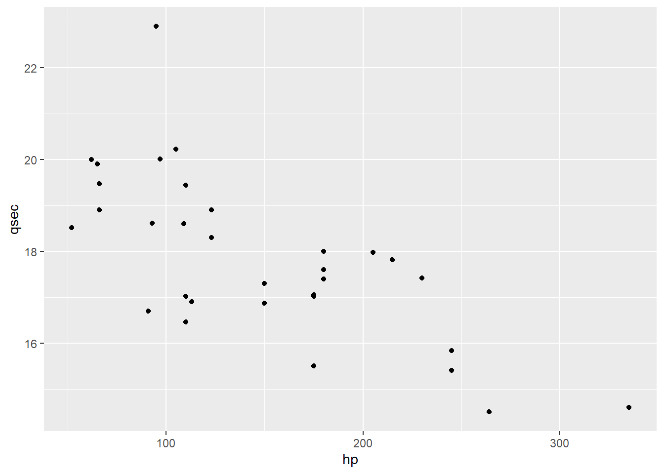
What do we see in this plot? The features to look for are “direction, form, and strength,” plus of course anything odd-looking that jumps out at you.
The direction here is negative: as hp increases, qsec decreases.
The form is, I’d say, more or less linear.
Though, speaking of odd-looking stuff, there does seem to be a high outlier around 100 hp: this car has a larger (i.e., slower) quarter-mile time than we’d expect from cars of a similar horsepower. I’d also maybe wonder about that one car with unusually large horsepower – it’s hard to say whether its qsec value is typical because we just don’t have a lot of other cars out there. These kinds of questions will crop up again when we’re looking at regression.
For now, let’s consider the strength: how closely do these points seem to follow a pattern? Are they kind of all over the place with only a vague indication of a trend, or tightly gathered around a line or other shape?
I’d call this pretty moderate. There is clearly a linear relationship here, at least outside of the outliers. But it’s not particularly strong – the points are still pretty scattered even given this relationship.
But hey, we are statisticians: we can do better than eyeballing a plot and saying “eh, pretty moderate.” Let’s put a number on this!
1.5.2 Correlation: the basics
In particular, that number is called correlation. Correlation is a measure of the strength of the linear relationship between two quantitative variables. It can go from -1 to 1. The sign of the correlation tells you the direction of the linear relationship: a negative relationship, where \(y\) decreases as \(x\) increases, has a negative correlation.
Most commonly a correlation of \(\pm 1\) happens when you accidentally measured the same thing twice – for example, if you have “distance in miles” and “distance in km” in your dataset. It will also happen, of course, if you have only two data points, and can also happen with a small number of data points if your variables are discrete (but probably won’t unless your dataset is really small). Very occasionally it happens because of data fraud, but most people are clever enough not to make their data fraud that obvious.
And the magnitude of the correlation tells you the strength of the linear relationship. A correlation close to 1 or -1 indicates a strong relationship, with points tightly grouped around a line. A correlation of exactly 1 or -1, by the way, indicates that the points are exactly on a straight line, which in practice means something has gone wrong in your dataset, because nothing in the real world is that perfect. A correlation of 0, meanwhile, indicates that there’s no linear relationship between the variables.
That “linear” is really important! Correlation only applies to a certain form or shape of relationship: a straight line. If your variables have a relationship that isn’t linear – maybe it’s curved, like this:
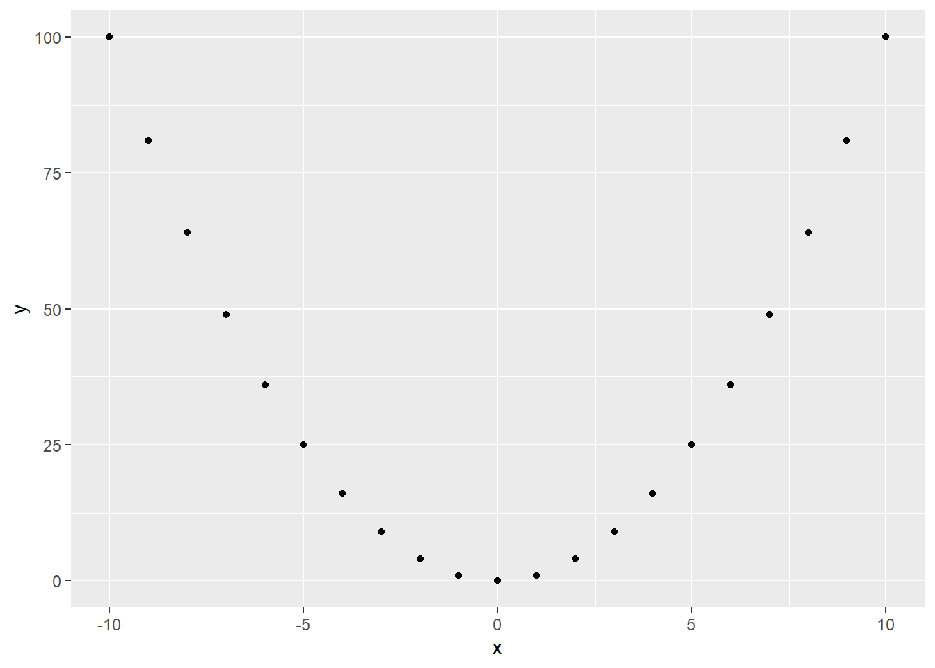
…that relationship can be super duper strong, but correlation won’t pick up on it! The correlation of the points in that plot is actually zero. But there is clearly a relationship between these variables – it’s just not linear.
1.5.3 Calculating correlation
Let’s go work with the car data again. I spotted a couple of possible outliers earlier, so because this is a class lecture and I want things to look nice, I’m going to filter them out of the dataset. In practice, you would want to look into outlying points to try and find out whether they belonged in the dataset; and if there wasn’t a clear justification for removing them, you’d present your analysis both with and without the outliers.
cars.new = my_cars %>%
  filter(hp < 300,
         qsec < 22)
cars.new %>%
  ggplot() +
  geom_point(aes(x = hp,y = qsec))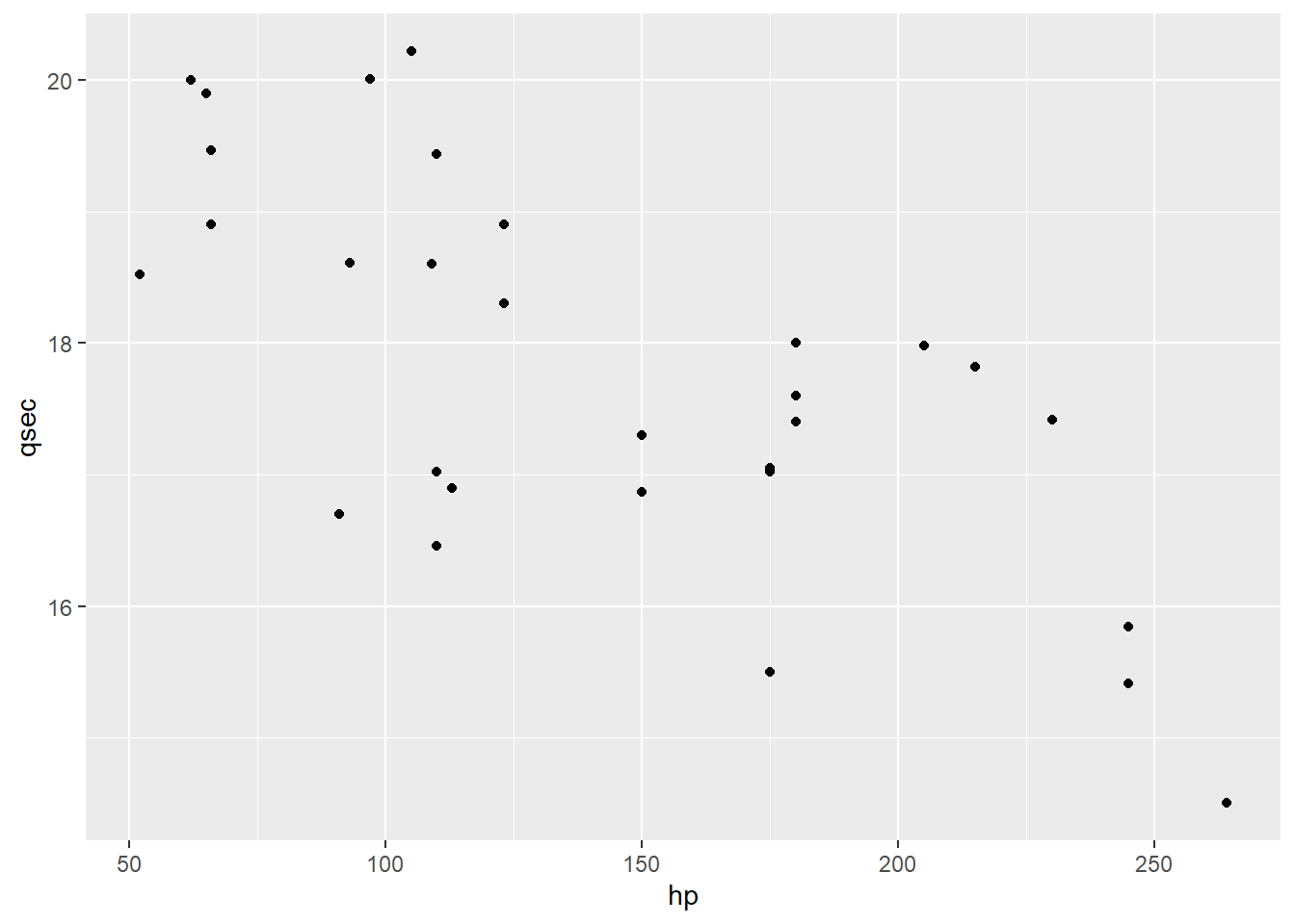
When we talked about this scatterplot earlier, we mentioned that its direction was negative: high values of hp were associated with lower values of qsec. But we have a tool for talking about whether a particular value is high or low in terms of a specific variable…our old friend the z-score!
I’m going to modify my dataset, using mutate to add a couple of new variables: the z-scores of the cars for hp and qsec.
cars.new2 = cars.new %>%
  mutate(hpZ = (hp - mean(hp))/sd(hp),
         qsecZ = (qsec - mean(qsec))/sd(qsec))
cars.new2 %>%
  dplyr::select(hp, qsec, hpZ, qsecZ) %>%
  head()
## hp qsec hpZ qsecZ
## 1 110 16.46 -0.5290793 -0.9028164
## 2 110 17.02 -0.5290793 -0.5223017
## 3 93 18.61 -0.8089865 0.5580882
## 4 110 19.44 -0.5290793 1.1220653
## 5 175 17.02 0.5411538 -0.5223017
## 6 105 20.22 -0.6114050 1.6520680When I make a scatterplot of the z-scores, it looks just like the original, but the axes have changed:
cars.new2 %>%
  ggplot() +
  geom_point(aes(x = hpZ, y = qsecZ))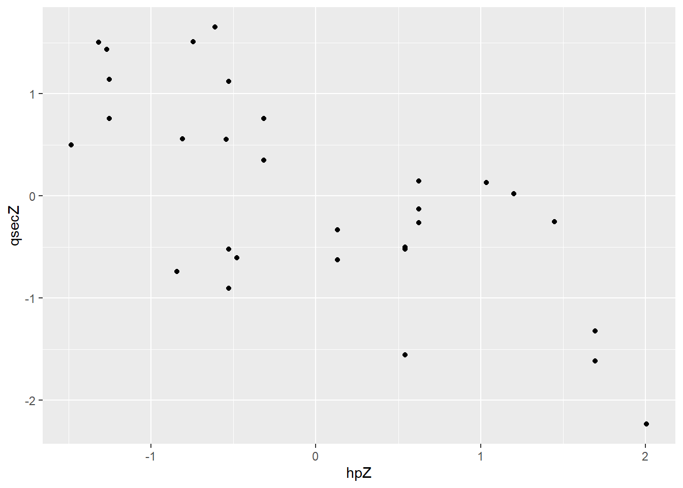
By adding horizontal and vertical lines at 0, I can see that I have recentered the data – some points have positive z-scores, and some negative.
cars.new2 %>%
  ggplot() +
  geom_point(aes(x = hpZ, y = qsecZ)) +
  geom_hline(yintercept=0) +
  geom_vline(xintercept=0)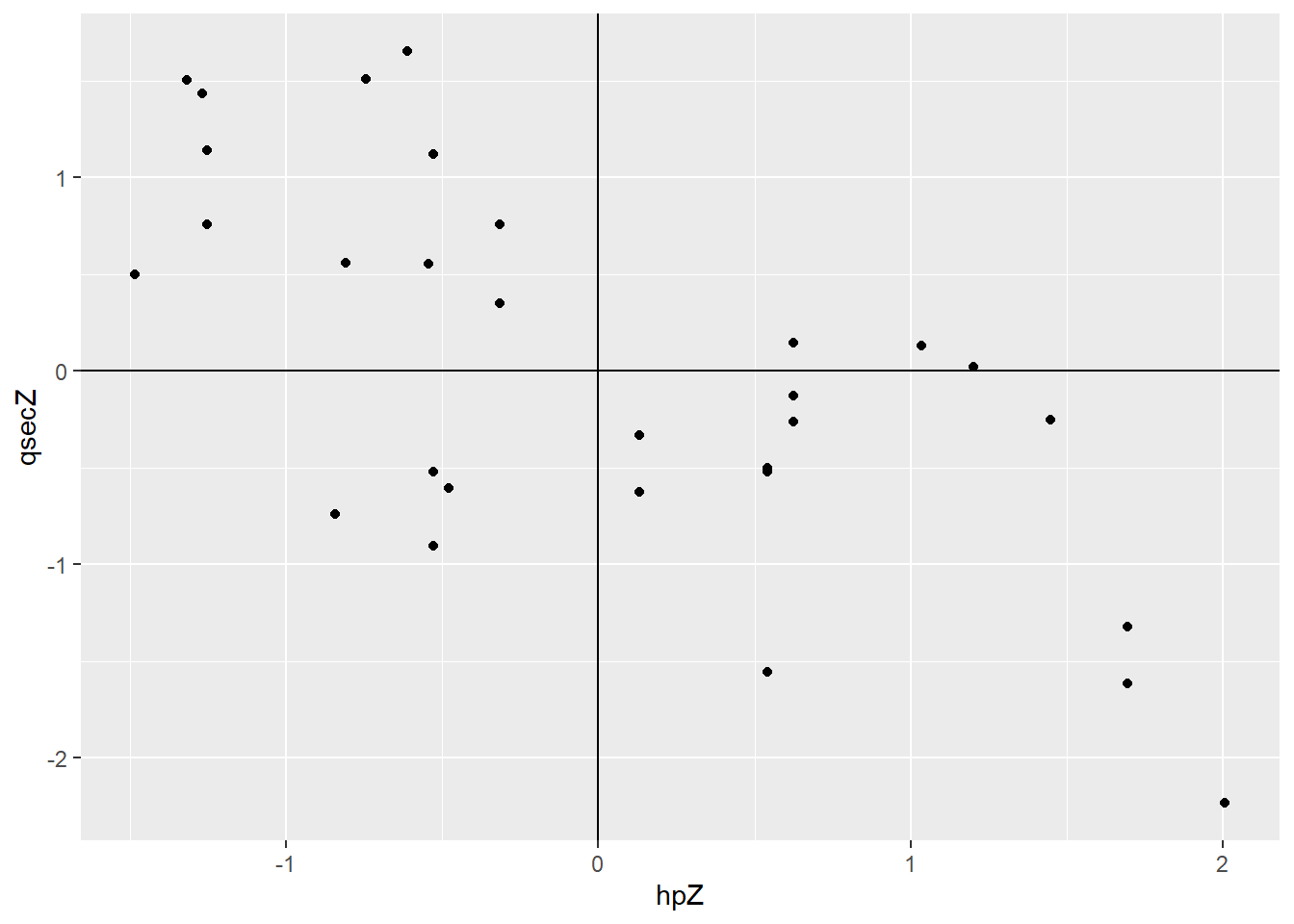
Most points with a positive z-score for hp have a negative z-score for qsec, and vice versa. That’s just a more formal way of saying “high horsepower tends to mean low quarter-mile time.”
Degrees of freedom reasons, to be a little more specific.
Now we can combine that information into an actual number – the correlation, \(r\). We multiply each point’s hp and qsec z-scores together, and then, more or less, we take the average: add ’em up and divide by how many there are. Minus 1, for reasons we will not go into here. So:
\[r = \frac{\sum z_x z_y}{n-1}\]
In our case, because most points have a positive z-score for one variable and a negative z-score for the other, most of the terms in that sum are “a negative times a positive,” or “a positive times a negative” – so most terms are negative numbers. And when we add them up, we get a negative number. So the correlation is negative, reflecting the direction of the relationship.
Note that part of calculating the correlation is standardizing the variables – taking the z-scores. So if I do some sort of shifting or scaling on the variables, it won’t matter: that’ll get wiped out when I standardize them. For example:
cor(cars.new2$hp, cars.new2$qsec)## [1] -0.7041487cor(cars.new2$hp*100, cars.new2$qsec)## [1] -0.7041487cor(cars.new2$hpZ, cars.new2$qsecZ)## [1] -0.7041487…are all the same!
1.5.4 Correlation caution
Correlation is a really handy tool for talking about the relationship between two quantitative variables, since it tells you about direction and strength all at once. But you can’t just throw it at every possible problem.
Remember that correlation does not tell you about the form of the relationship. To the contrary, it just blithely assumes that that form is linear and goes on from there. If the relationship isn’t linear, correlation is a distortion at best, and wildly misleading at worst.
There’s also no rule for what constitutes “strong” correlation. It’s very dependent on your context. And it’s best to at least do some inference on whether you’re confident a relationship really exists at all – a topic we’ll explore elsewhere.
And finally, yet perhaps most importantly: CORRELATION DOES NOT IMPLY CAUSATION. This is a favorite tattoo of statisticians everywhere. When I’m in a physical classroom I write this phrase on the board so big I have to jump up and down to reach it. Just because you find that two variables X and Y have a linear relationship – even if it’s really strong – does not mean that X causes Y. Maybe the causation goes the other way. Maybe both of your variables are actually caused by a third, lurking variable. Maybe there’s something else going on. Who knows? Not you. Not without an experiment and/or a lot of other information, anyway.
“Murder and Ice Cream” is clearly a great name for a mystery show, but I haven’t decided if the dessert chef is the murderer or the detective. Feel free to contribute your opinions on this issue.
My go-to example of this is murder and ice cream. If you look at weekly murder rates and ice cream sales, historically, they are pretty strongly correlated. So we should abolish ice cream? Well, no. The causation is…dubious. I mean, some people get a little antsy when they have too much sugar, but not usually to the point of murder. And murders causing ice cream sales is just disturbing. Now, in this case, it seems obvious that something else is going on – but if I’d said some variable a little less ridiculous than ice cream, that causation argument would have sounded more plausible. But it would have been just as unfounded.
Response moment: Why do you think murder rates and ice cream sales are correlated?