7.3 Conditions for Logistic Regression
7.3.1 Why worry?
We didn’t get far in multiple linear regression before we started thinking about ways to work out whether predictors mattered, and which ones we wanted. Why ignore that stuff now?
It turns out that there are parallels in logistic regression to the kinds of tests we used in linear regression – things like nested \(F\) tests for comparing models, and \(t\) tests for looking at individual predictors. The underlying math is somewhat different, but for the purposes of this course, you just need to know how to interpret the results.
Before we start in on inference, though, we need to take a moment to think about assumptions and conditions. Otherwise, our inference results could be super misleading!
7.3.2 Checking conditions
Some of the assumptions and conditions behind logistic regression are the same as ever – in particular, the assumption of independent observations (or, technically, errors). As usual, that’s not something you can really check with a plot; you have to think about where the data came from. For example, in a dataset about graduate school admissions, we might want to know that the students in our dataset are a representative sample of all the grad school applicants.
Some of the other conditions don’t really apply anymore. For example, linearity is right out. The whole point of logistic regression is that there isn’t a linear relationship between the predictors and the response! (Of course, we do still assume that there’s a linear relationship between the predictors and the log odds. Which may or may not be true – see below!) Constant variance doesn’t make much sense in this context, either.
There is something you can check, though. Let’s take a look at an example. Here we have a model to predict the probability of grad school admission based on a student’s GRE score and class rank:
admissions_dat = read.csv("_data/admissions.csv") %>%
  mutate(rank = as.factor(rank))
admissions_dat %>% head()
## admit gre gpa rank
## 1 0 380 3.61 3
## 2 1 660 3.67 3
## 3 1 800 4.00 1
## 4 1 640 3.19 4
## 5 0 520 2.93 4
## 6 1 760 3.00 2admissions_glm = glm(admit ~ gre + rank,
data = admissions_dat,
family = binomial)…and we create a plot of the residuals vs. the fitted values for each point in the dataset:
admissions_glm %>% plot(1)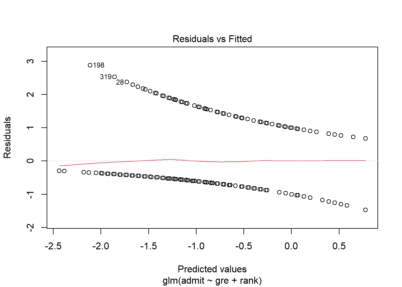
Now, obviously you’re not going to eyeball this plot for linearity or fan shapes. But what you can do is look at that red line across the middle. That line is a moving average of the nearby points. Suppose that red line is near 0 for some predicted value. That means that although we didn’t get any of the students’ outcomes exactly right, we were right on average for students with that predicted value – that is, we guessed the probability of admission correctly for such students.
You can interpret the red line in the context of the problem, too. Here, the average residual seems to be higher for high predicted values and negative for low predicted values. So the students we think have a good chance of admission actually tend to get in even more often than we expected, while the students with a low predicted chance of admission get in less often than we’d expect. This might indicate that there’s some other factor in play that has a synergistic effect but isn’t in our model, or that the log odds of admission aren’t actually linearly related to GRE/rank but have a slight upward curve.
That said, again, this line really isn’t that far off from zero, so I wouldn’t let it prevent you from using the analysis. Just something to think about if you were continuing to explore the question (say, for a data analysis project or something!).
So what you’re really looking for in this plot is for that red line to stay around 0, ish, all the way across. If it has a big bend, or a big trend, that’s cause for concern – it means your estimate of the probability is worse for some fitted values than for others, so there’s something your model isn’t capturing. This one looks fine – there’s a slight increase at higher fitted values, but it’s not that substantial.
You can also scout this plot for anything particularly weird-looking, or, well, more weird-looking. Sometimes you can see outliers, or clusters of points that suggest some kind of subgroup is present.
Okay, back to the list of conditions. The assumption of Normal errors is…well, take a look:
admissions_glm %>% plot(2)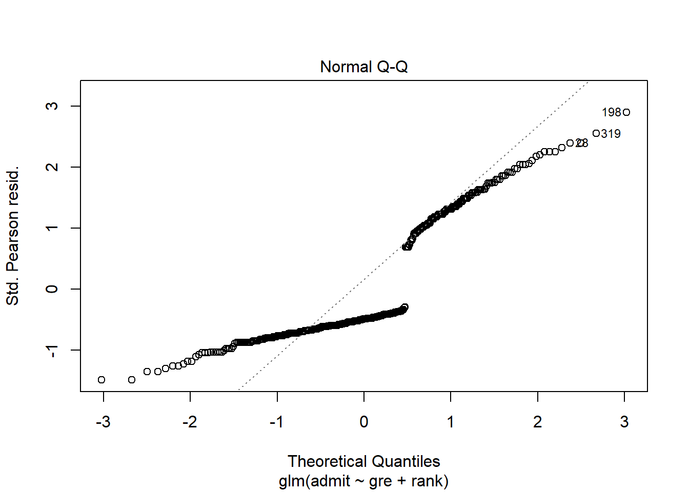
Yeah, no. But this is fine: we don’t assume Normal errors anymore in logistic regression. R will still make the Normal QQ plot, but it really isn’t relevant anymore.
Okay, how about special points? Well, the points in your dataset still have residuals, and they still have leverage, so you can still look at those:
admissions_glm %>% plot(5)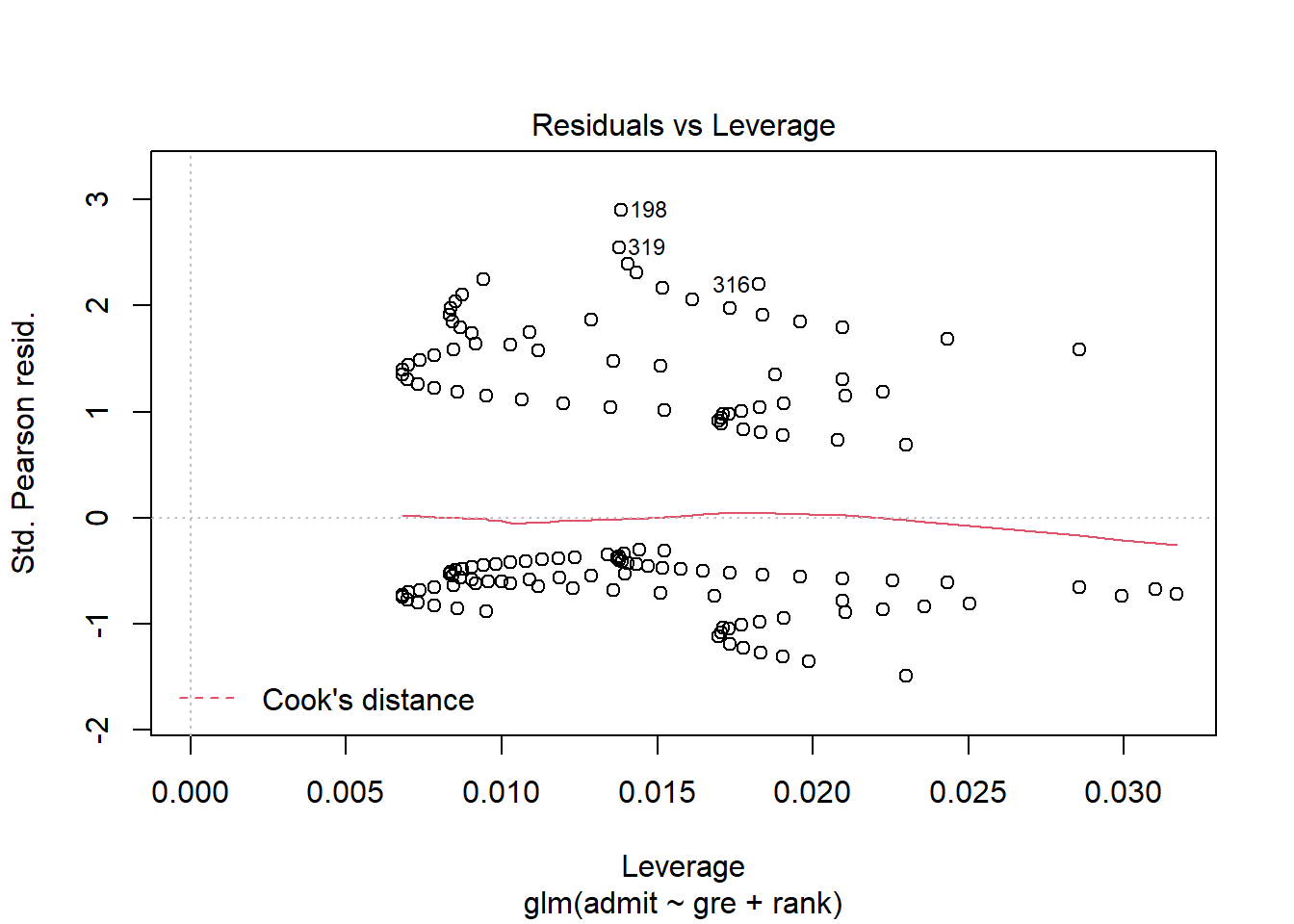
This plot may look kind of funny, but it’s interpreted the same way it was before. Points with the highest leverage are off to the right – say, a student who got the minimum score of 200 on the GRE, because that’s far from the average GRE score. R will also calculate Cook’s distance as a sort of combination of residual and leverage, to help you guess whether a point is influential; as you can see, none of these points seem to come particularly close.
And finally, we can think about multicollinearity. This actually hasn’t changed at all! Although we’ve changed the shape of the relationship between the response and the predictors – by introducing that logistic link function – we can still look at whether the predictors seem to be linearly related to each other, just as we did before.
admissions_dat %>%
  ggpairs()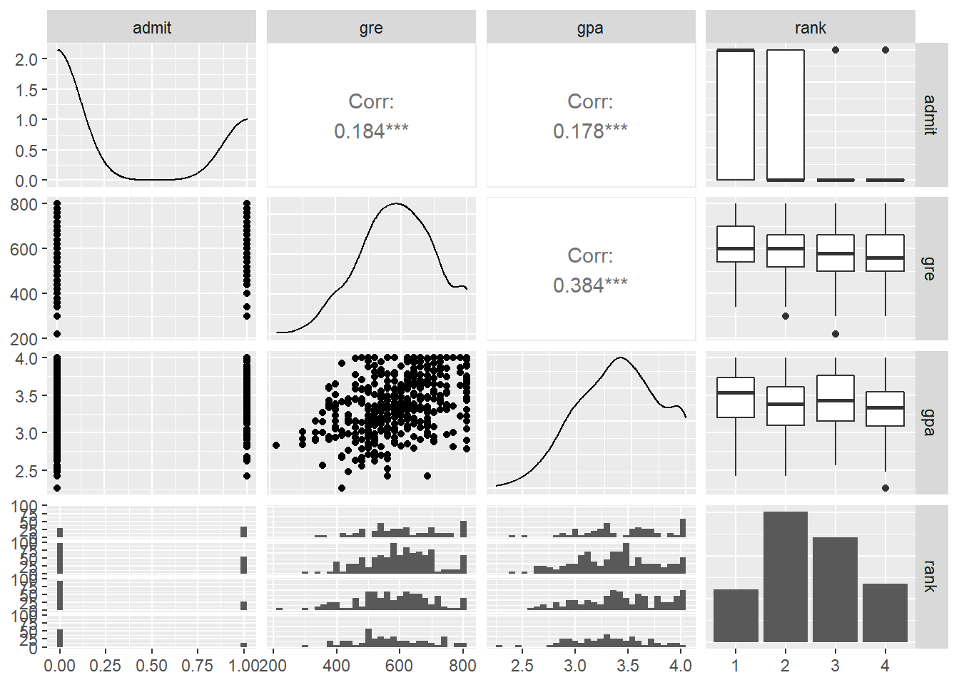
Lots of intriguing information to look at here, of course. One takeaway is that GRE and GPA seem to be somewhat related, so if we had both of them in a model we might start to think about multicollinearity. But the correlation isn’t that strong, and anyway, we only have GRE in this model and not GPA, so no worries there.
What about rank? Well, we can’t talk about the “correlation” between GRE and rank since rank is categorical, but we can ask if there’s a strong association, which might indicate that putting both of them into the model would be redundant. Based on these plots it looks like there’s an association, but it isn’t super duper strong, so I think both class rank and GRE could be useful even if you already know the other one.
Response moment: It’s a little weird to think about “outliers” in the context of logistic regression – it’s not just “a point with a really big \(y\) value,” because all the \(y\) values are either 0 or 1. What would it mean, in this context, for a point to be an outlier? When would it be an influential point?