4.11 Confidence and prediction intervals, one predictor
Okay, so we’re rolling along with a nice regression. We got a fitted model, and we checked whether the coefficients were statistically zero. Now we would like to get some actual predictions out of this model! But also, being responsible statisticians, we’d like to incorporate our uncertainty about those predictions.
Let’s back up and just think about one variable for a moment.
4.11.1 CIs and PIs for means
When we estimate a mean, we make a confidence interval for that mean. It has the same structure as all CIs: \[estimate \pm CV_{\alpha/2}*SE(estimate)\]
For a mean, the estimate is \(\bar{y}\), and the standard deviation would be \(\sigma/\sqrt{n}\) if we knew \(\sigma\). Since we don’t, we use \(s/\sqrt{n}\). In which case the distribution we need is no longer the normal, but the \(t\), with \(n-1\) degrees of freedom:
\[\bar{y} \pm t^*_{n-1,\alpha/2}~~\frac{s}{\sqrt{n}}\]
Okay, great! We’re pretty confident that this range captures the true mean. But now, suppose we are interested in individuals. We don’t just want to be confident that our interval captures the mean; we want to be confident that it captures some randomly selected individual. The problem is: individuals are harder to predict than average behavior.
If you don’t feel like doing this thought experiment with height, think of another variable! Sports can be handy for this since, if you’re an ongoing fan, you probably have an intuitive sense of how the relevant variables behave. For example, in baseball, scoring 12 runs in a single game is pretty unusual, but certainly not unheard of (looking at you, Colorado). But if you told me that some team scored an average of 12 runs per game over, say, 30 games? That would be suuuuper weird.
(In fact, I – and you, and the baseball commissioner – would probably conclude that the team was cheating! We’ve just done an intuitive hypothesis test. If this sample of 30 games came from the same population as baseball games in general, what we observed would be super strange. So we don’t think that these games come from the population of typical games: instead, we suspect that they come from a different population – like the population of games where a team is cheating.)
Here’s a thought experiment for your intuition: what’s the chance that the next person to walk through the front door of your building is, say, between 5’ 4" and 6’ 0" tall? Pretty good, but not a guarantee; you could get an unusually tall or short person walking in. But what’s the chance that the average height of the next 100 people through that door is between 5-4 and six feet? Extremely high! Unless you are hosting a basketball or gymnastics conference I don’t know about, you’re not going to see an average height outside that range. So the average is better behaved – more predictable – than individual values.
So how can we get a range that captures individuals, with a certain level of confidence? Well, if we knew the average height \(\mu\) we’d be fine. Assuming the data are normally distributed \(N(\mu,\sigma)\), we could just build our interval by stretching out \(\pm z^*_{\alpha/2} \sigma\) around \(\mu\). It’s your old buddy the 68-95-99.7 rule! For example, if we wanted to be 95% confident that the interval captured any given individual, we’d need it to capture 95% of individuals, so we’d start at \(\mu\) and go out 1.96 standard deviations to either side.
But we don’t know \(\mu\); we just have a range where we think it probably is. Well, fine. Let’s use this range and go out 1.96 standard deviations from either end.
But wait! We still don’t know \(\sigma\) either, so we can’t use the standard normal critical values like 1.96; we have to use \(t\) critical values instead. So, we take the CI for \(\mu\), and then add \(t^*_{n-1,\alpha/2}s\) to the top and subtract \(t^*_{n-1,\alpha/2}s\) from the bottom. This creates a \(100(1-\alpha)\%\) prediction interval for individuals.
Notice the process here: start with the interval for the average, but then expand it on both sides to account for the fact that individuals vary around the average.
4.11.2 Prediction in regression
Now let’s think about two variables again. For our example, we’ll use a regression of systolic blood pressure with age as the predictor, drawing a sample of people from the NHANES public health study.
set.seed(12) # sample responsibly
bp_dat = NHANES %>%
  filter(!is.na(BPSysAve)) %>%
  slice_sample(n = 50)
bp_dat %>%
ggplot() +
geom_point(aes(x = Age, y = BPSysAve))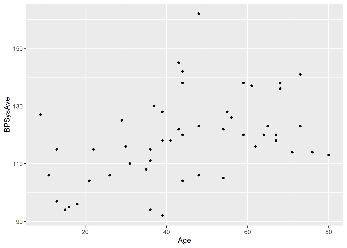
We fit a regression line to this dataset:
bp_lm = lm(BPSysAve ~ Age, data = bp_dat)
bp_lm$coefficients
## (Intercept) Age
## 103.8526796 0.3324511Suppose we have some new data point and we’re interested in predicting the response for this data point. We’ll call this point’s value of \(x\) “\(x_{\nu}\).” That v-looking thing is the Greek letter “nu” (equivalent to “n”), which stands for “new,” har har. We can plug that value into the fitted regression equation to get our prediction for this point’s \(y\) value, \(\hat{y}_{\nu}\).
\[\hat{y}_{\nu} = b_0 + b_1 x_{\nu}\] or, with the variable names:
\[\widehat{BP}_{\nu} = b_0 + b_1 Age_{\nu}\]
This is what we call a point estimate, because it’s just one number. We’re providing a single value that is our best guess for \(y_{\nu}\).
Let’s say \(x_{\nu} = 30\). What do we predict for the blood pressure of a 30-year-old?
bp_lm$coefficients[1] + bp_lm$coefficients[2]*30## (Intercept)
## 113.8262We don’t know the truth, of course, but based on our sample, our best guess is 113.
But we want more! We want an interval – a range where we’re reasonably confident the truth is actually going to be. In order to get that, we need to ask how much this estimated value varies – how different it tends to be from one sample to another.
And this is where things get interesting. Because, as we mentioned before, the variance we need to worry about depends on whether we’re trying to capture the average, or an individual.
4.11.3 Confidence interval for average value
Let’s start with the average, that’s better behaved. So what do I mean by an “average” here? I mean, the true average \(y\) value for allll points in the population with the predictor value equal to \(x_{\nu}\): the average blood pressure of all people of this age. Just to avoid ambiguity, let’s call this value \(\mu_{\nu}\): \(\mu\) because it’s an average, and \({\nu}\) because it’s the average response corresponding to this particular \(x_{\nu}\).
Well, that’s just asking where the line is! \(\mu_{\nu}\) is the \(y\)-value of the true line when \(x = x_{\nu}\).
So what is that? I don’t know. All we have is the fitted, estimated line from our sample, which gives us an estimated value that we could call \(\widehat{\mu}_{\nu}\). But we do know how the fitted line varies from sample to sample – how the coefficients \(b_0\) and \(b_1\) vary. We can use that to determine how much \(\widehat{\mu}_{\nu}\) varies from sample to sample.
There’s some very cute math that happens here, but at the end of it, here’s what you get:
\[SE(\widehat{\mu}_{\nu}) = \sqrt{SE^2(b_1)*(x_{\nu} - \overline{x})^2 + \frac{s_e^2}{n}}\]
This is not something you will have to calculate by hand. But notice the pieces:
- The standard error of \(b_1\). If the slope isn’t very variable, then you have a more reliable estimate of this value as well.
- The difference \((x_{\nu} - \overline{x})^2\). It is harder to predict the response for extreme values of \(x\).
- The standard error of the residuals, \(s_e\). If the relationship is weak and the points have a wide vertical spread around the line, our estimates are less precise.
- The sample size \(n\), in the denominator. As before: the more data we have, the better idea we have of what’s going on!
Now, we just throw that into the general confidence-interval formula, \[estimate \pm CV * SE(estimate)\]
or more specifically:
\[\widehat{\mu}_{\nu} \pm t^*_{\alpha/2, n-2} * SE(\widehat{\mu}_{\nu})\]
R has a helpful function for this. Using an \(\alpha\) of 0.05, we get:
predict(bp_lm, newdata = data.frame("Age" = 30),
        interval = "confidence",
        level = 0.95)
## fit lwr upr
## 1 113.8262 108.9623 118.6902So (108.9, 118.7) is our confidence interval for the average response for this value of \(x\). We’re 95% confident that the true average blood pressure of all 30-year-olds is between 108.9 and 118.7.
4.11.4 Prediction interval for individual value
This is cool and all, but you may want something more. If you meet a 30-year-old with a blood pressure of 120, do they have high blood pressure for their age? Who knows? You’re pretty confident that 120 is above the average blood pressure for 30-year-olds, but hey, in a Normal distribution, half the people are above average. You don’t know if this person is really unusual.
For these purposes, we want a prediction interval: an interval that we’re 95% confident covers a random individual 30-year-old’s blood pressure, \(\widehat{y}_{\nu}\). Or, in other words, an interval that covers 95% of 30-year-olds.
We use the same principle as we did back with one variable. We start at the average, and go out to either side from there. But, again, we have to combine our uncertainty about the average with the fact that individuals vary around the average – which makes us sort of “double uncertain” about individuals.
Here’s what it looks like:
\[SE(\widehat{y}_{\nu}) = \sqrt{SE^2(b_1)*(x_{\nu} - \overline{x})^2 + \frac{s_e^2}{n} + s_e^2}\]
This is exactly the same formula as \(SE(\widehat{\mu}_{\nu})\) …except it has that extra \(s_e^2\) in there. That’s the standard error of the residuals again, showing up to account for the way individual values vary around the line.
In R, we can change an argument in the predict function to specify that we want a prediction interval for an individual, rather than a confidence interval for the average:
predict(bp_lm, newdata = data.frame("Age" = 30),
        interval = "prediction",
        level = 0.95)
## fit lwr upr
## 1 113.8262 86.07975 141.5727We’re 95% confident that the interval (86.1, 141.6) captures the blood pressure of a randomly selected 30-year-old.
Again, notice the contrast with the confidence interval for the mean:
predict(bp_lm, newdata = data.frame("Age" = 30),
        interval = "confidence",
        level = 0.95)
## fit lwr upr
## 1 113.8262 108.9623 118.6902The prediction interval is wider! Trying to catch 95% of individuals is harder than catching the mean with 95% confidence.
4.11.5 Looking at many \(x\) values
Here’s an additional picture that may help demonstrate the contrast. Suppose we got a confidence interval for the average response, and a prediction interval for an individual response, for every possible \(x\) value.
You don’t need to worry too much about the code here unless it interests you – focus on the pictures!
Let’s start with the confidence intervals for the average blood pressure for people of each age:
bp_newpoints = data.frame("Age" = seq(8, 80, by = 0.1))
bp_preds = bp_newpoints %>%
  mutate("Pred" = predict(bp_lm, newdata = bp_newpoints,
                          se.fit = TRUE, interval = "prediction")$fit[,1],
         "CILower" = predict(bp_lm, new = bp_newpoints,
                          se.fit = TRUE, interval = "confidence")$fit[,2],
         "CIUpper" = predict(bp_lm, new = bp_newpoints,
                          se.fit = TRUE, interval = "confidence")$fit[,3],
         "PredLower" = predict(bp_lm, new = bp_newpoints,
                          se.fit = TRUE, interval = "prediction")$fit[,2],
         "PredUpper" = predict(bp_lm, new = bp_newpoints,
                          se.fit = TRUE, interval = "prediction")$fit[,3])

bp_dat %>%
ggplot(aes(x = Age, y = BPSysAve)) +
  geom_point() +
  geom_smooth(method = 'lm') +
  geom_line(data = bp_preds,
            aes(x = Age, y = CILower), color = "red") +
  geom_line(data = bp_preds,
            aes(x = Age, y = CIUpper), color = "red")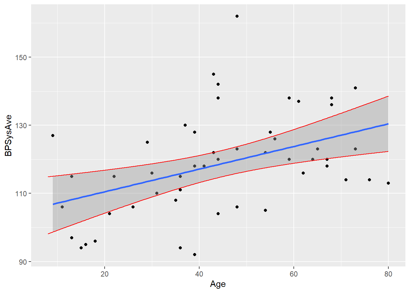
You can see how the intervals get wider as we start looking at very young or very old people – that’s that \((x_{\nu} - \overline{x})^2\) term cropping up in the standard error!
Now, let’s add the prediction intervals for individuals at every age:
bp_dat %>%
ggplot(aes(x = Age, y = BPSysAve)) +
  geom_point() +
  geom_smooth(method = 'lm') +
  geom_line(data = bp_preds,
            aes(x = Age, y = CILower), color = "red") +
  geom_line(data = bp_preds,
            aes(x = Age, y = CIUpper), color = "red") +
  # now adding the limits for individuals
  geom_line(data = bp_preds,
            aes(x = Age, y = PredLower), color = "blue") +
  geom_line(data = bp_preds,
            aes(x = Age, y = PredUpper), color = "blue")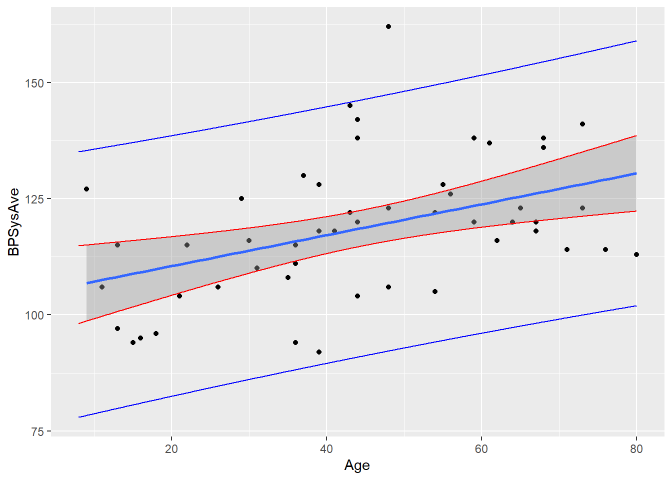
Waaaay wider! That’s the power of adding that \(s_e^2\) term in the standard error. In this case, \(s_e\) is quite large, so there’s a really noticeable difference. We’re much more uncertain about individuals than we are about the average.
These intervals do also get wider as we look at much older or younger people – the \((x_{\nu} - \overline{x})^2\) term is still there. It’s just not that big a deal in comparison to \(s_e^2\)!
Response moment: In your own words, try to explain why the confidence/prediction intervals are wider when \(x_{\nu}\) is far from \(\overline{x}\). Don’t just cite the formula – try to give some intuition about it!