6.3 Poisson Regression
6.3.1 The problem
So far, we’ve seen multiple kinds of regression. We used linear regression when we had a quantitative response variable, like a car’s quarter-mile time, or a person’s blood pressure.
Then we said: okay, what if the response variable is binary, like whether we have a mechanical failure, or whether a student gets into grad school? Then we could do logistic regression to predict the probability of that happening.
Today we’ll look at a third situation: what if the response variable is a count? Like, how many children someone has, or how many servings of vegetables someone eats in a day?
I mean, I guess you could have “negative children” in the sense of “children with a pessimistic outlook on life.” But mathematically speaking, that’s still a positive count.
Counts are kind of funny. They’re quantitative, sort of. But they don’t necessarily behave like regular old quantitative variables. For one thing, counts can’t be less than 0. You can’t have negative children.
So just as in logistic regression, it doesn’t necessarily make sense to just draw a linear relationship between the response and the predictor. We don’t ever want to predict a value for the response that’s negative, because that wouldn’t make sense.
As you might suspect, we’ll approach this the same way we did in logistic regression: by introducing a transformation or link function between the predictors and the response.
6.3.2 Example: squirrels!
As an example, let’s look at a dataset about squirrels. Red squirrels live in the forest, and they go around eating the seeds out of pine cones. We have a dataset of a bunch of different plots of land from a forest in Scotland; each plot of land is a case. For each plot, we have some information about the local forest, like how many trees there are, the average tree height, and so on. And for our response variable, we have a count of the number of pine cones stripped by squirrels.
data("nuts")## Warning in data("nuts"): data set 'nuts' not foundsquirrel_dat = nutsLet’s look at a plot with cones, our response, on the \(y\) axis, using the average height of the trees on the \(x\) axis:
squirrel_dat %>%
  ggplot() +
  geom_point(aes(x = height, y = cones))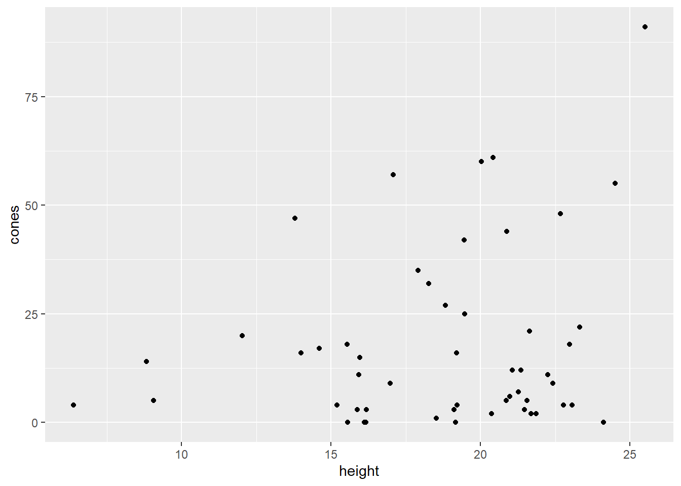
Ooohkay. Well, we can see from this plot that there does appear to be a positive relationship of some sort between these variables, but I’m not comfortable doing a linear regression. Look at that unequal spread, what a mess. And of course, all of the \(y\) values are greater than or equal to zero.
6.3.3 Predictions and distributions
Let’s take a step back for a moment and think more generally about modeling. Any time we build a model, we use it to get a predicted response, like \(\widehat{y}\), based on the values of the predictors. Of course, that prediction isn’t actually accurate for any individual case. The actual response values, \(y\), are sort of distributed around the prediction \(\widehat{y}\).
In linear regression, what we predict is the mean – the average response value for all points with these values of the predictors. We call this predicted mean \(\widehat{y}\), and the actual response values are distributed Normally around \(\widehat{y}\). If we were to make a histogram of a bunch of cases with all the same \(x\) values, we’d get something like this:
data.frame(x = c(-4, 4)) %>%
  ggplot(aes(x)) +
  stat_function(fun = dnorm, n=202, args = list(mean = 0, sd = 1)) +
  xlab(label = "y values") +
  ylab(label = "") +
  scale_x_continuous(breaks = 0, labels = "yHat")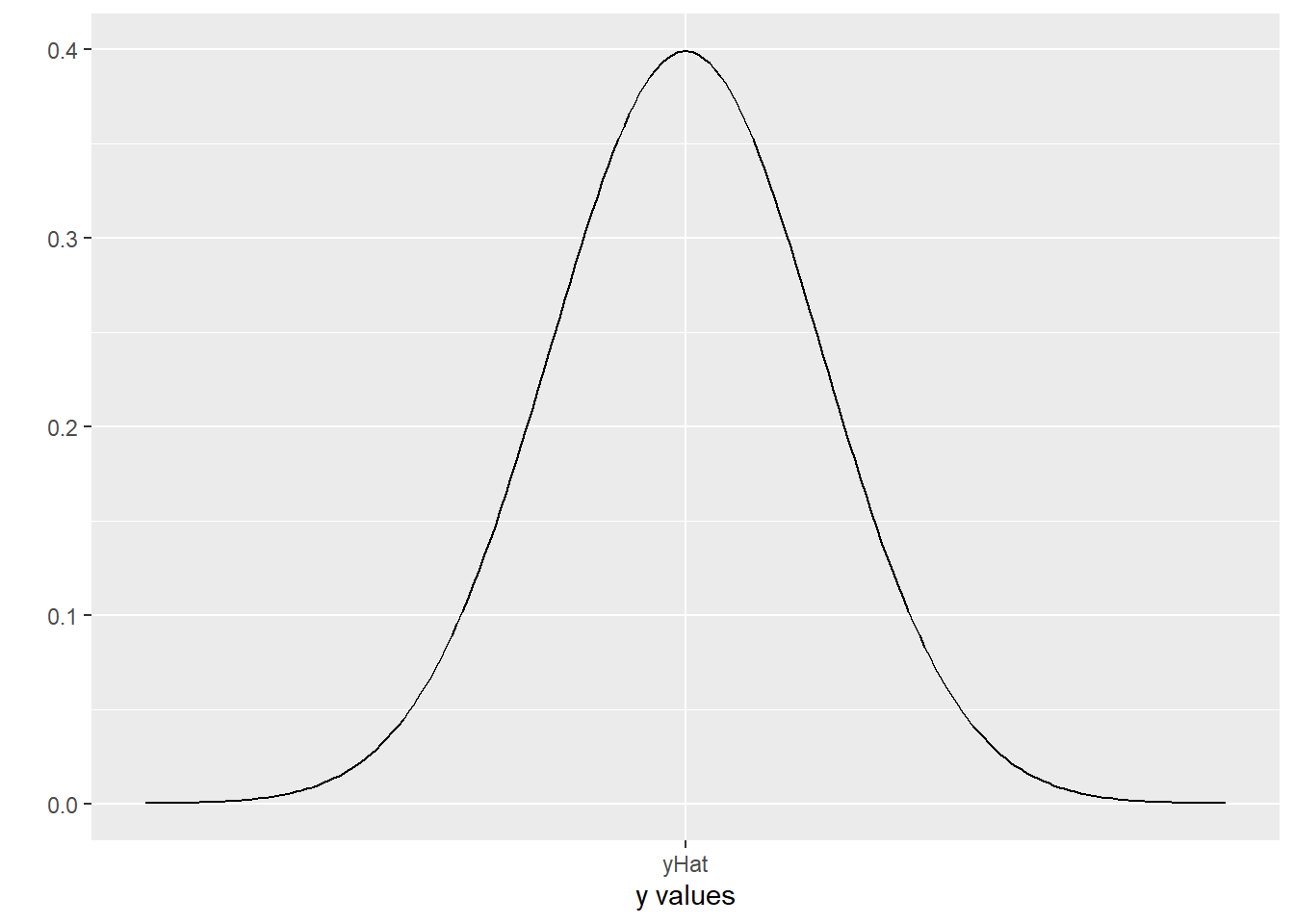
The actual \(y\) values have a Normal distribution, centered at yHat. This is our assumption of Normal errors!
Now, in logistic regression, things are a little different. We predict the probability of an event occurring given certain values of the predictor variables. We call it \(\widehat{p}\). The actual responses for each case, of course, are all either 0 or 1 – either the event happens or it doesn’t. So if we took a bunch of cases with the same \(x\) values and plotted them, we’d get something like this:
data.frame(x = c(0,1), y = c(0.4, 0.6)) %>%
  ggplot(aes(x=x, y=y)) +
  geom_bar(stat = 'identity', width=.1) +
  xlab(label = "y values") +
  ylab(label = "") +
  scale_x_continuous(breaks = c(0,.6,1), labels = c("0", "pHat = 0.6", "1"))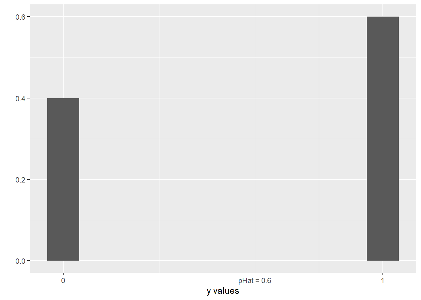
This is more like a bar graph, really. All the \(y\) values are either 0 or 1, but how many of them are 0 or 1 depends on the probability, represented by \(\widehat{p}\). In this picture, \(\widehat{p}\) is 0.6, so more of the responses are 1 than 0.
Reminder that Poisson was a dude’s name; it is also French for “fish.” It’s pronounced with a soft “s,” not a “z.” Poison distribution is a subject for Murder, She Wrote.
So now our new thing: responses that are counts. In this case, what we are trying to predict is the mean count for all cases with the given \(x\) values – that part is a lot like linear regression. What’s different is how we think the actual \(y\) values relate to our prediction. We no longer assume that they’re Normally distributed around that predicted mean; that doesn’t make sense anymore, because the Normal distribution goes off to infinity in both directions, and we know that none of the \(y\) values are going to be less than 0. Instead, we say that the \(y\) values have a different shape of distribution, which we have briefly encountered before: the Poisson distribution. It looks like this:
transform(data.frame(x=c(0:10)), y=dpois(x, 2.5)) %>%
  ggplot(aes(x=x, y=y)) +
  geom_bar(stat = 'identity', width=.1) +
  xlab(label = "y values") +
  ylab(label = "") +
  annotate(geom = 'text', x = 2.5, y = -.0, label = "lambdaHat = 2.5") +
  scale_x_continuous(breaks = c(0:10), labels = 0:10)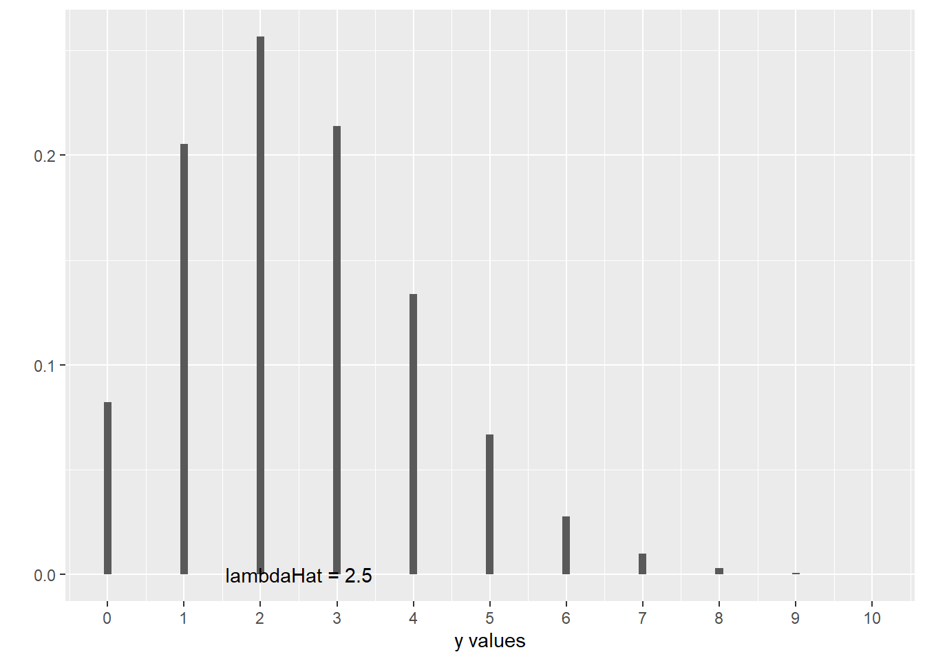
This is a picture of what happens when the mean count is equal to 2.5. Of course, none of the actual \(y\) values are equal to 2.5; they’re distributed around 2.5, in this kind of skewed way that cuts off at 0.
If you’ve done Box-Cox transformations before, you may recall that that parameter is also called \(\lambda\). There’s a reason for that:
- In both cases, \(\lambda\) is related to statistical likelihood, hence using the Greek for “L”
- “Lambda” is fun to say [citation needed]
You may notice that there’s a different name for that predicted mean now. We call the mean of a Poisson distribution \(\lambda\), so our estimated mean is \(\widehat{\lambda}\).
6.3.4 Poisson regression models
When we fit a Poisson regression model, what we’re ultimately interested in, in context, is this \(\lambda\): the average count (i.e., average response value) for all cases with these \(x\) values. In our squirrel example, we had number of pine cones as the response and tree height as the predictor: so, given a tree height, we’re trying to predict the average number of pine cones in forest plots with trees that tall.
I feel like there’s a good log/trees joke here, but I haven’t found it yet. Let me know if you have suggestions.
But just as in logistic regression, we run into this problem: that average count \(\lambda\) can’t possibly be negative, but \(b_0 + b_1TreeHeight\) can totally be negative. And just as in logistic regression, we solve this problem using a transformation. Instead of trying to model the average count directly, we’ll build a model for…its log:
\[\log{\left(\widehat{\lambda}\right)} = b_0 + b_1TreeHeight\]
This log can have a nice, linear relationship with the predictor \(TreeHeight\). If we want to translate back into actual counts later, we can invert the log transformation with exponentiation, \(e^{whatever}\).
6.3.5 R and interpretation
So what does this look like in R? Well, as in logistic regression, R does some exciting and complicated stuff to fit the model and find the best coefficients, and presents you with this:
squirrel_glm = glm(cones ~ height, data = squirrel_dat,
                   family = poisson()) # new "family"!
squirrel_glm %>% summary()
##
## Call:
## glm(formula = cones ~ height, family = poisson(), data = squirrel_dat)
##
## Deviance Residuals:
## Min 1Q Median 3Q Max
## -7.047 -4.229 -1.636 1.690 9.597
##
## Coefficients:
## Estimate Std. Error z value Pr(>|z|)
## (Intercept) 1.607554 0.184242 8.725 < 2e-16 ***
## height 0.066526 0.009214 7.220 5.21e-13 ***
## ---
## Signif. codes: 0 '***' 0.001 '**' 0.01 '*' 0.05 '.' 0.1 ' ' 1
##
## (Dispersion parameter for poisson family taken to be 1)
##
## Null deviance: 1037.76 on 51 degrees of freedom
## Residual deviance: 981.02 on 50 degrees of freedom
## AIC: 1186.9
##
## Number of Fisher Scoring iterations: 5See that coefficient for height, 0.067? That’s the slope relating height to the predicted log of number of pine cones. To put this into interpretable terms, we have to work backwards.
For example, suppose we have some plot with a predicted cone count of, I don’t know, some value \(c\). And then we have a new plot where the trees are 1 unit higher – so how many more cones do we predict?
Well, the original plot’s predicted cone count was \(c\), so its predicted log cone count was \(\log(c)\).
Our new plot has a predicted log cone count of \(\log(c) + 0.067\). So what’s its actual predicted cone count, \(\widehat{\lambda}\)? Well, to undo the log, we have to exponentiate:
\[\widehat{\lambda} = e^{\log(c) + 0.067} = e^{\log(c)} * e^{0.067} = c*1.069\]
So the predicted cone count for our new plot is 1.069 times the predicted cone count for the original plot. This is similar to what happens with the odds in logistic regression! An increase in the predictor actually has a multiplicative effect on the response.
Now, as a quick note: you may be saying, “But wait! I’ve been doing log transformations on \(y\) this whole time. How is this new?”
There’s also a pragmatic issue: you can have 0 counts, and you can’t take the log of 0. (Well, you can, but you get negative infinity and R doesn’t like it.) So just log-transforming your original \(y\) values wouldn’t work. Instead we take advantage of the fact that a Poisson distribution can yield 0 values even when the mean of the distribution, \(\lambda\), is greater than 0.
To which I say: yes, indeed you have. What’s different here is mostly the way we’re thinking about it. And also the math, although you don’t have to dig into that for the purposes of this course. This approach tends to make more sense especially when you’re thinking about small counts.
The key is to remember this extra re-transformation step, which allows you to “translate” back to the original count units when you’re trying to interpret the coefficients.
Response moment: Suppose you’ve got a nice Poisson regression model like this one. What do you think the residuals look like?