1.4 MLR Conditions and Diagnostics
Like almost all the statistical tools we use in this course, there are some assumptions that have to hold if our results are going to be valid and tell us what we want to know. The good news is, a lot of those conditions are the same as for simple linear regression!
For this tour, we’ll look at the blood characteristics of elite Australian athletes. The response is the athlete’s red blood cell count, and for our predictors, we’ll use their white blood cell count, their height, and their chosen sport. We’ll also include an interaction between sport and white blood cell count: we think that the slope of rcc vs. wcc could be different for athletes in different sports.
athlete_cells_dat = ais %>%
  filter(sport %in% c("T_400m", "T_Sprnt", "Tennis"))
athlete_cells_lm3 = lm(rcc ~ wcc + sport + wcc:sport + ht, data = athlete_cells_dat)
athlete_cells_lm3$coefficients
## (Intercept) wcc sportT_Sprnt sportTennis ht
## -0.26132855 0.09163149 0.65838791 -0.40793408 0.02484787
## wcc:sportT_Sprnt wcc:sportTennis
## -0.03383458 0.080207611.4.1 Some old friends
The first thing to think about is independence of observations (or, more technically, of errors). As in SLR, this is especially important for inference. The sample has to be unbiased and representative of the population, with no connections or relationship between the individual cases. You can’t necessarily spot violations of this assumption using a plot – you have to think about how the data were collected.
Another one is linearity. You don’t want there to be a bend or curve in the relationship between a predictor and the response. Now, in the old days you could just check a scatterplot and see if it looked more or less straight, but that’s trickier now, because we have many \(x\) variables to think about. You can, however, still look at a plot of the residuals vs. the fitted values and check for any bends there.
athlete_cells_lm3 %>% plot(which = 1)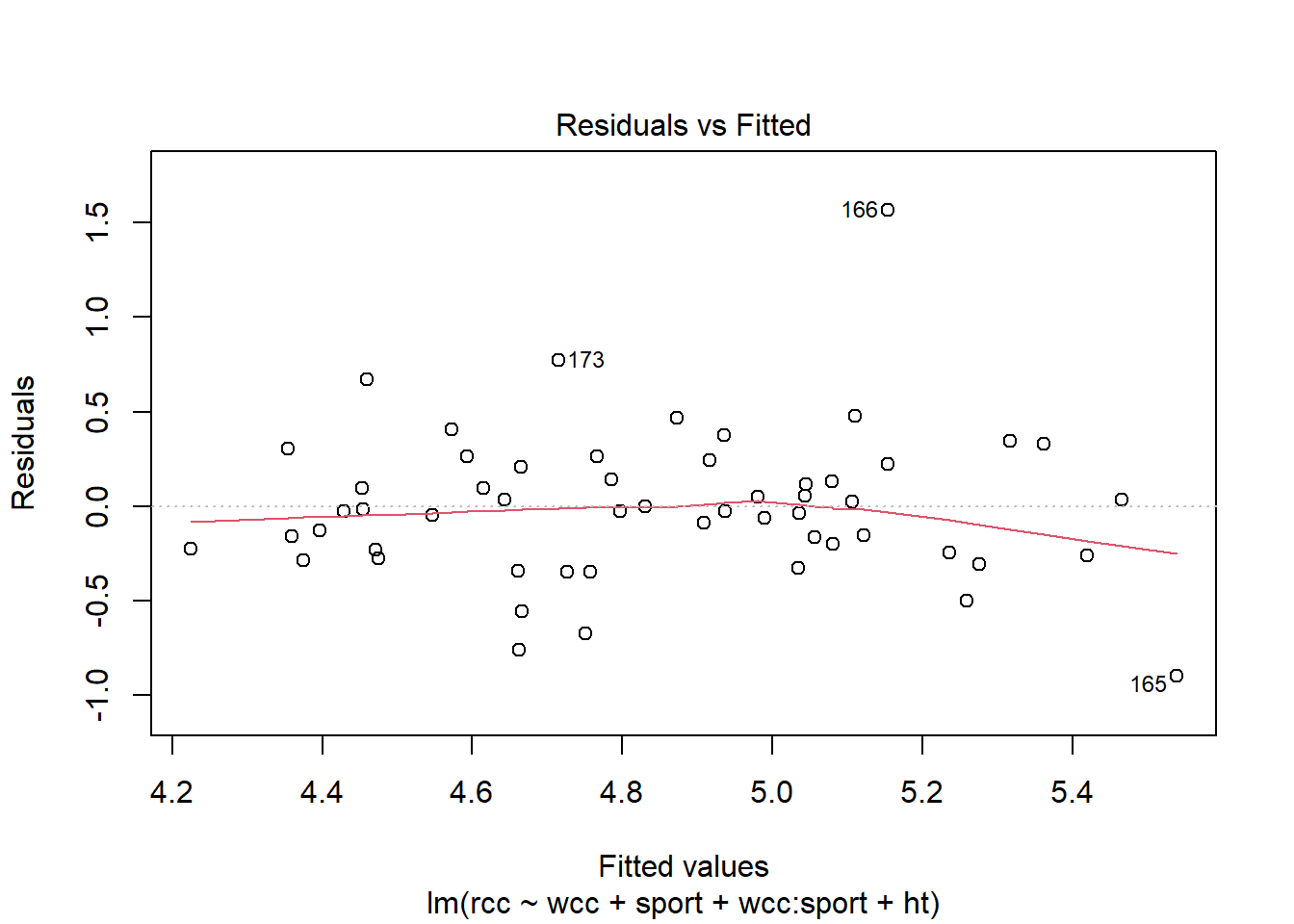
This looks okay. We can also check another condition using this plot, which we’ve also seen previously: equal variance of the residuals. The vertical spread of the residuals seems about the same all the way across, so that looks good.
We can use another familiar plot, the Normal QQ plot of the residuals, to check another familiar condition: Normality of the residuals.
athlete_cells_lm3 %>% plot(which = 2)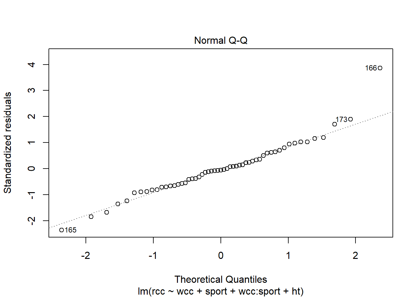
The points are more or less along the line, so this seems good too.
But what you may have noticed in both of these plots is the outlier – athlete number 166. We still need to be concerned about outliers and high-leverage points in multiple regression. And leverage is a little tricker than before. A point has high leverage if it has an unusual predictor value…but now we have lots of predictors whose value might be unusual.
The good news is, R can still calculate the leverage for each point, and plot them for you:
athlete_cells_lm3 %>% plot(which = 5)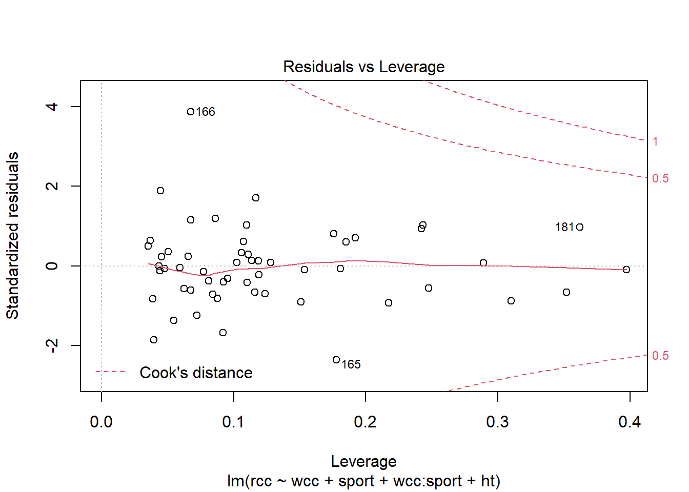
You can see that point 166 does have a very high residual, but it doesn’t have much leverage, so it probably isn’t that influential on the slope. Point 165, meanwhile, has a smaller residual than point 166 but more leverage…so possibly its residual is small because it’s dragging the fitted line toward itself. Still, going by Cook’s distance – which is the particular method of combining leverage and residual that’s shown on this plot – I’m not hugely concerned about either point.
1.4.2 Added-variable plots
This brings us to a new kind of plot: the added-variable plot. These are really helpful in checking conditions for multiple regression, and digging in to find what’s going on if something looks weird.
You make a separate added-variable plot, or AV plot, for each predictor in your regression model. They are scatterplots, of a sort: each case in the dataset corresponds to one point on the plot. The y-coordinate of the point is its residual in your model: here, it’s the residual when we use rcc as the response and all the other stuff as the predictors. The x-coordinate is weird. Let’s take the AV plot for the predictor “height”:
avPlot(athlete_cells_lm3, variable = "ht")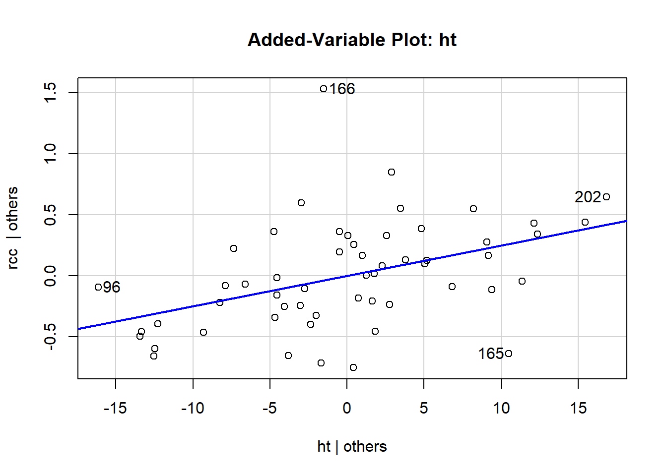
The x-coordinate of each point here is that point’s residual from a different regression model: specifically, if we used height as the response and all the other predictors – wcc, sport, and their interaction – as the predictors. That is, we fit the model:
\[\widehat{height} = b_0 + b_1*wcc + \mbox{(all the other stuff)}\]
and find each athlete’s residual, and that’s what we use for the x-coordinate for their point.
If this feels weird and mind-blowing, that’s fine. You get used to it eventually. And you won’t actually have to go around calculating this stuff by hand, of course. The important takeaway is that an AV plot shows the relationship between the response and the plot’s chosen predictor (so height, in this one) after accounting for everything else in the model. This shows the “leftover” relationship between height and red cell count, after accounting for white cell count and sport.
What that means is that you can use these plots to pick out weird behaviors or violations of the assumptions that are specific to a particular predictor. For example, in this one, you can see that athletes 202 and 96 have the most leverage in terms of height – although neither of them is really all that extreme. These points have the potential to influence the slope of height, specifically.
You can also get R to print out all the AV plots at the same time:
avPlots(athlete_cells_lm3)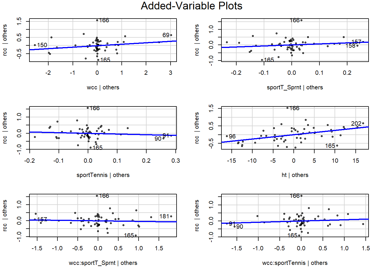
Again, use these as a way to look at relationships between the response and a specific predictor after accounting for everything else. You can check these plots for bends, changing variance, outliers, and so on. In this example, they all look pretty good, I’d say. We can still see good old point 166 standing out in the \(y\) direction – this person’s red cell count is much higher than expected – but they are not really unusual in terms of any of the predictors. While in practice I would want to find out what the deal is with this person (maybe they were doing some sort of high-altitude training?), I don’t think they’re having too much of an impact on my conclusions.
1.4.3 Multicollinearity
There’s one actual new thing that we have to think about in multiple regression, called multicollinearity. Multicollinearity is a problem that occurs when two or more of the predictors are linearly correlated with each other.
Multicollinearity is a problem because, if two predictors are really strongly correlated, it’s hard to tell which one of them is actually related to the response. For example, consider the reading speed of elementary-school children. There’s a positive relationship between reading speed and height. Because it’s easier to reach the bookshelf? No, because children’s reading speed increases with age. But if you built a model with both predictors, like:
\[\widehat{readspeed} = b_0 + b_1*height + b_2*age\]
you could get into trouble. R doesn’t know that “age” makes more sense as a predictor than “height.” Because the older kids are also, in general, the taller kids, it could be really hard to tell objectively that reading speed is related to age, not height.
In general, multicollinearity has this effect of making it hard to tell which predictors are actually related to the response, and how strongly. Your coefficient estimates tend to become unstable – a slight change in the data can give you really different results. This is not a great situation to be in, and so it’s important to try to check whether your predictors are correlated with each other. You can do this by actually calculating the correlation – for example:
cor(athlete_cells_dat$wcc, athlete_cells_dat$ht)## [1] -0.01849315…or, better yet, checking a plot:
athlete_cells_dat %>%
  ggplot() +
  geom_point(aes(x = wcc, y = ht))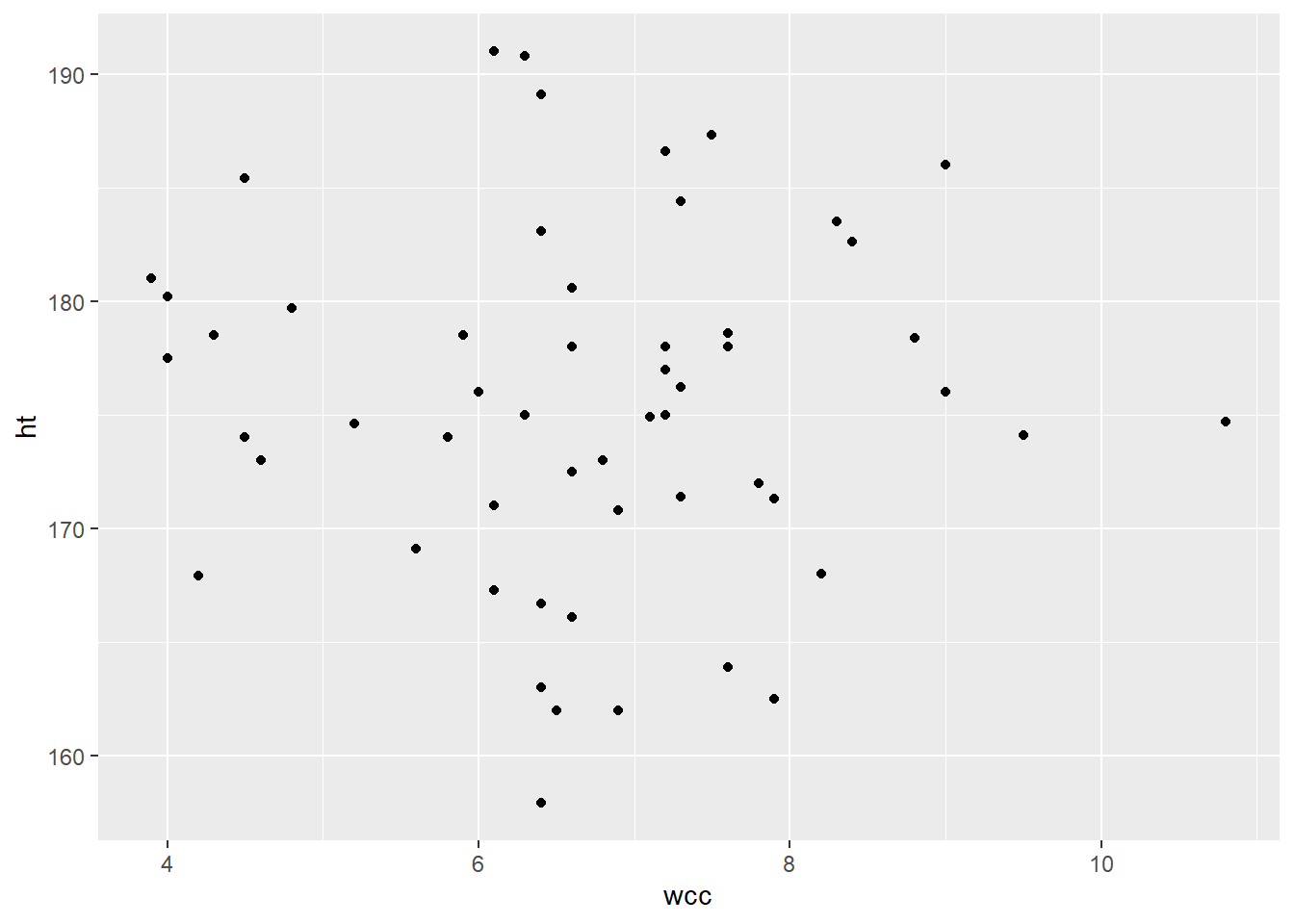
Looks like these two predictors are not linearly related, or indeed associated in any way. Hooray!
There’s actually a function in the R library GGally (or “gee golly”), called ggpairs, that automatically creates a plot of every variable in your dataset vs. every other variable. It’s super useful!
athlete_cells_dat %>%
  dplyr::select(rcc, wcc, ht, sport) %>%
  ggpairs()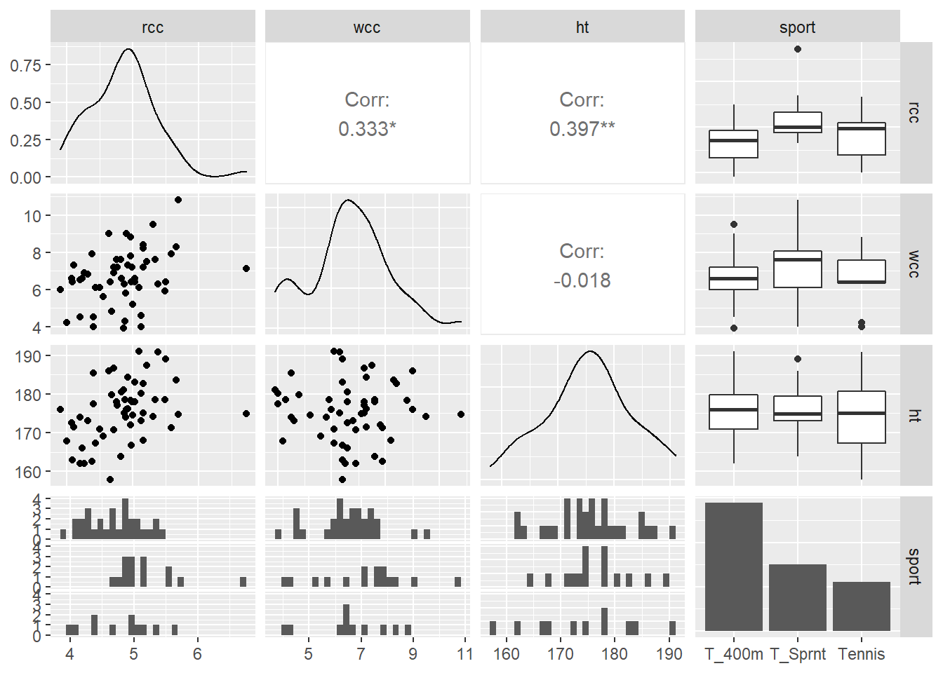
In this grid, the plot in the ht row and the wcc column is the scatterplot of white cell count vs. height. In the wcc row and the ht column, instead of giving us the same thing again, R prints out the value of the correlation between wcc and height. So helpful!
It doesn’t look like any of our predictors are really associated with each other, so that’s nice.
An important point to keep in mind is the difference between multicollinearity and interactions. Two predictors are collinear if their values are correlated – this is just about the values of the predictors for each point. Collinearity is not a good thing. But two predictors have an interaction if their relationships with \(y\) depend on each other. This is neither a good nor a bad thing; you just have to account for it in your model.
Response moment: A little visualization review: In the ggpairs grid, we talked about what’s in the ht row and wcc column, and the wcc row and ht column. Briefly discuss what’s being shown in the other plots in the grid. What kind of plots are they and what variables do they depict?