7 Visualize: Why and how?
Given some data, we usually want to clean and analyze it, understand and interpret it, and then draw and communicate our conclusions. Thus, whereas data transformation (and statistics) can be thought of means for data analysis, comprehension and communication of data are essential goals of data science. A key aspect of both comprehension and communication consists in creating transparent visualizations. As data is mostly conceptualized as numeric information, R is often viewed as a programming language for statistical computing. R is really good at that, of course, but there are many tools for doing statistics. An alternative motivation for using R relies on its immense graphical powers — not just for visualizations of data, but also for defining colors, illustrating mathematical constructs, designing charts and diagrams, and even creating computational art.
Starting our own journey into data science by creating visualizations is a bit unusual. However, working with graphics is a great way of of introducing basic representational constructs (e.g., by defining colors or geometric shapes) and elementary programming concepts (e.g., by incrementally creating a visualization). As we can try out and play with different versions of a script and always see the effects of our commands, visualizing data provides us with immediate feedback and a great sense of achievement. And although creating effective visualizations is challenging, it can also be very enjoyable.
Preparation
Recommended background readings for this chapter include:
Chapter 1: Look at data of Data Visualization: A practical introduction (Healy, 2018)
Chapter 2: Data visualization of Modern Data Science with R (Baumer et al., 2021)
Introductory chapters of Fundamentals of Data Visualization (Wilke, 2019)
After reading this chapter, Chapter 2: Visualizing data of the ds4psy textbook (Neth, 2023a) provides an introduction to the ggplot2 package.
Preflections

Before you read on, please take some time to reflect upon the following questions:
Where do you usually encounter visualizations? Who created them?
Which types of visualizations do you know?
What are the goals, benefits and dangers of visualizations?
What distinguishes a good from a bad visualization?
7.1 Introduction
Above all else show the data.
Edward R. Tufte (2001)
Some key questions that are addressed in this chapter are:
Why visualize data?
What are the key elements of a visualization?
What characterizes good or bad visualizations?
How can we create visualizations in base R?
Many smart people have provided long and elaborate answers to the first three questions. Unfortunately, none of them are simple or fully satisfying. Sure, visualizations can enable insight by rendering numbers, concepts and relations more transparent. But just like words or numbers, they can also hide, distort and obscure facts. Thus, the questions why, when and how we should visualize data are really important ones, even if we may not find conclusive answers.
In the first part of this chapter, we will review some suggestions and recommendations by experts and study some examples of visualizations to consider their benefits and pitfalls. This will illustrate that visualizations can be good and bad at conveying some message, depending on their design and purpose — an insight that holds true for representations in general (see Section 1.2).
The rest of this chapter turns practical by introducing particular tools and technologies for creating visualizations (in base R). Having criticized the graphs of others, trying to create some relatively simple graphs will serve as a lesson in humility: As it turns out, it is rather difficult to create a good visualization. While R supports our creative endeavors, many key elements of graphs (e.g., regarding variable mappings, colors, and labels) require conscientious and intelligent decisions. Thus, our initial insight that any representation can be good or bad at serving particular purposes is an important point to keep in mind throughout this chapter and book.
7.2 Reflections
Before getting our hands dirty — with code, rather than with paint — we briefly reflect on some ways of justifying, classifying, and evaluating visualizations. To provide us with a tentative answer to our initial question (“Why visualize data?”, see Section 7.1), the following section motivate our efforts with a notorious example.
7.2.1 Why visualize?
An urge for visualizing data is not a new phenomenon. Although our ability for generating visualizations has greatly increased with the ubiquity of computers, people have always drawn sketches and diagrams for understanding natural and statistical phenomena (Friendly, 2008).
But why should we visualize data? Most people intuitively assume that visualizations help our understanding of data by illustrating or emphasizing certain aspects, facilitating comparisons, or clarifying patterns that would otherwise remain hidden. Precisely justifying why visualizations may have these benefits is much harder (see Streeb et al., 2019, for a comprehensive analysis). And it would be naive to assume that visualizations are always helpful or appropriate. Instead, we can easily think of potential problems caused by visualizations and claim that they frequently distract from important aspects, facilitate misleading comparisons, or obscure and hide patterns in data. Thus, visualizations are representations that can be good or bad on many levels. Creating effective visualizations requires a mix of knowledge and skills that include aspects of human perception, psychology, design, and technology.
An example
Whenever theoretical justifications are hard, we can use an example that proves the existence of cases in which visualizations help. The following code snippets define four R objects:
# Get 4 sets of data:
a_1 <- ds4psy::get_set(1)
a_2 <- ds4psy::get_set(2)
a_3 <- ds4psy::get_set(3)
a_4 <- ds4psy::get_set(4)
Each of these four objects provides a small data frame (containing 11 rows and 2 columns named x and y). The following functions allow us to examine object a_1:
# Inspect a_1:
a_1         # print object (data frame)
#>      x     y
#> p01 10  8.04
#> p02  8  6.95
#> p03 13  7.58
#> p04  9  8.81
#> p05 11  8.33
#> p06 14  9.96
#> p07  6  7.24
#> p08  4  4.26
#> p09 12 10.84
#> p10  7  4.82
#> p11  5  5.68
dim(a_1)    # a table with 11 cases (rows) and 2 variables (columns)
#> [1] 11  2
str(a_1)    # see table structure
#> 'data.frame':    11 obs. of  2 variables:
#>  $ x: num  10 8 13 9 11 14 6 4 12 7 ...
#>  $ y: num  8.04 6.95 7.58 8.81 8.33 ...
names(a_1)  # names of the 2 column (variables)
#> [1] "x" "y"
With some training in statistics, we might be tempted to summarize the values of both variables x and y (by computing their means or standard deviations), or assess their relationship to each other (as a correlation or linear regression).
For the first set a_1, the corresponding values are as follows:
# Analyzing a_1:
mean(a_1$x)  # mean of x
#> [1] 9
mean(a_1$y)  # mean of y
#> [1] 7.500909

sd(a_1$x)    # SD of x
#> [1] 3.316625
sd(a_1$y)    # SD of y
#> [1] 2.031568

cor(x = a_1$x, y = a_2$y)  # correlation between x and y
#> [1] 0.8162365
lm(y ~ x, a_1)             # linear model/regression: y by x
#>
#> Call:
#> lm(formula = y ~ x, data = a_1)
#>
#> Coefficients:
#> (Intercept)            x
#>      3.0001       0.5001
Rather than doing this only for a_1, we could examine all four sets in this way.
Table 7.1 provides an overview of the corresponding summary statistics:
| nr | n | mn_x | mn_y | sd_x | sd_y | r_xy | intercept | slope |
|---|---|---|---|---|---|---|---|---|
| 1 | 11 | 9 | 7.5 | 3.32 | 2.03 | 0.82 | 3 | 0.5 |
| 2 | 11 | 9 | 7.5 | 3.32 | 2.03 | 0.82 | 3 | 0.5 |
| 3 | 11 | 9 | 7.5 | 3.32 | 2.03 | 0.82 | 3 | 0.5 |
| 4 | 11 | 9 | 7.5 | 3.32 | 2.03 | 0.82 | 3 | 0.5 |
What would we conclude from Table 7.1? Given that the means, standard deviations, correlations, and best fitting lines of a linear regression are identical, it seems plausible that the underlying datasets are very similar — perhaps even identical. For instance, could all four sets describe the same instances, but are just presented in different orders?
As this is an example deliberately constructed to make a point, the intuitive hypotheses turns out to be wrong.
In fact, the datasets are not identical, but were designed to appear similar when being summarized.
Importantly, the true nature of the data and how they can appear so similar becomes “obvious” when visualizing the raw data points.
Figure 7.1 shows four scatterplots that show the x-y coordinates of each subset as points:
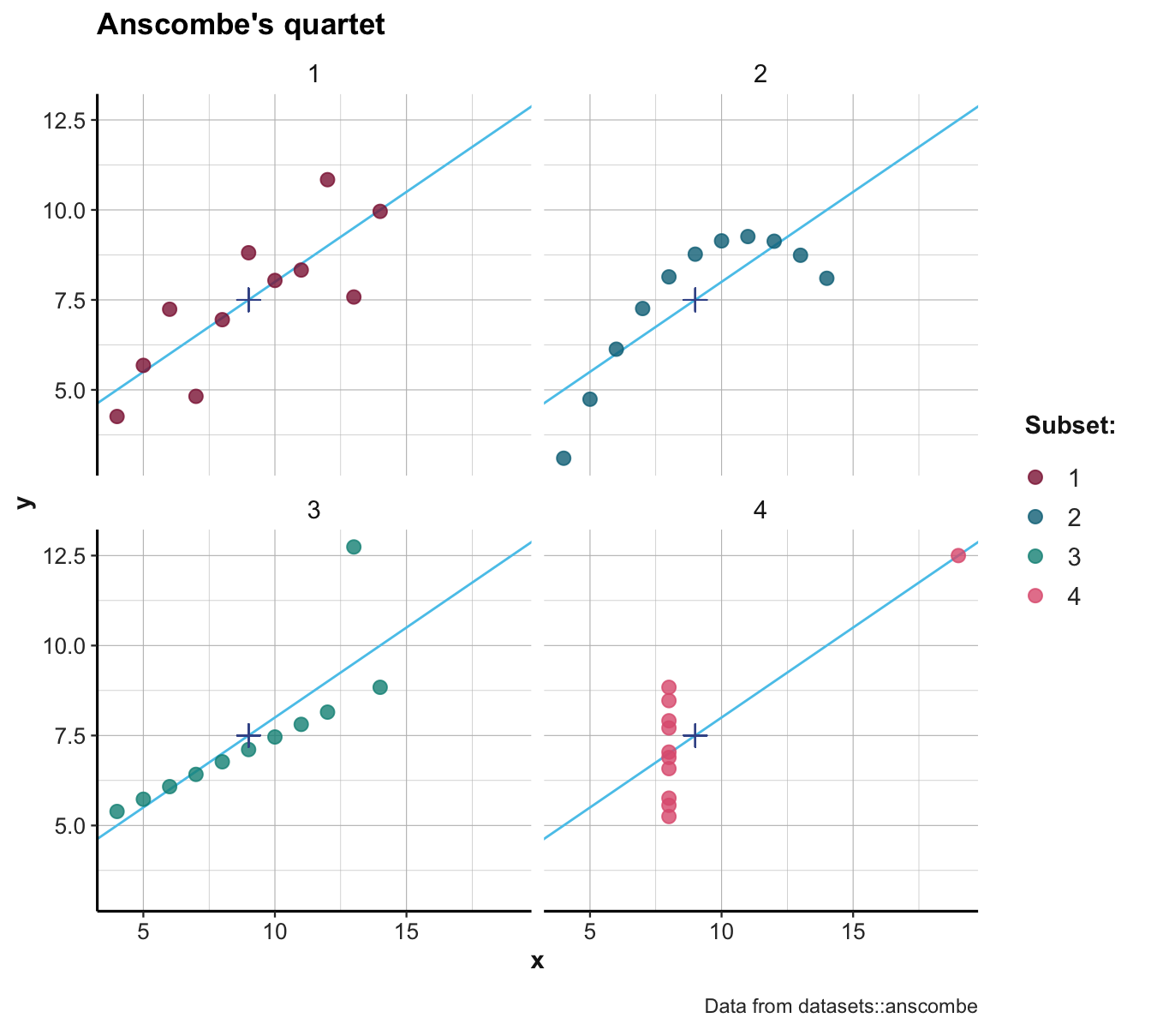
Figure 7.1: Scatterplots of the four subsets. (The \(+\)-symbol marks the mean of each set; blue lines indicate the best fitting linear regression line.)
Inspecting the scatterplots of Figure 7.1 allows us to see what is going on here:
The four sets differ in many aspects, but are constructed in a way that their summary statistics are identical.
The data used in this particular example is known as Anscombe’s quartet (Anscombe, 1973) and is included in R as anscombe in the datasets package (R Core Team, 2023). (The get_set() function of ds4psy only extracts each subset as a data frame.)
More generally, Figure 7.1 illustrates that detecting and seeing similarities or differences crucially depends on the kinds of measures or visualization used: Whereas some ways of describing the data reveal similarities (e.g., means, or linear regression curves), others reveal differences (e.g., the distribution of raw data points).14
7.2.2 Key elements of visualizations
Visualizations should be simple to understand, but this does not imply that creating them is trivial. Instead, successful visualizations typically require a match between the data, the representational objects, and the task that a user is to perform. This goal of achieving ecological rationality (see Section 1.2.6) already implies that visualizations are not primitive. Instead, they involve multiple elements and succeed or fail by the degree to which these parts fit together. We can identify the key elements of a visualization by always asking and answering three questions:
- What data does this visualization show or require?
- Which goals or tasks is the visualization designed to enable or support?
- What abstract measures are mapped to which geometric object or aesthetic feature?
These questions and some of their terms may seem a bit technical at first, but will become clearer as we gain experience in analyzing and creating visualizations. As a basic example, imagine the following situation:
- Product A costs $1.20
- Product B costs $2.00
This situation is about as primitive as it can be. Ordinarily, understanding the difference between two prices hardly requires a visualization.
To visualize or not to visualize?
In fact, before beginning to create a visualization, a good preliminary question (that is not asked often enough) is:
- Does this situation really need to be visualized?
We have seen above (in Section (ref?)(visualize:why)), visualizing data can help us to see regularities and relationships that would otherwise remain hidden. A corresponding rule of thumb for motivating a visualization consists in checking whether it would communicate or reveal something that a verbal statement of the same information would not communicate or reveal. If we really just wanted to state the prices of two products, we would not need a visualization.
What data?
Although we can agree that not every number needs its own graph, our goal in this section is to identify key parts of visualizations. Hence, it makes sense to proceed and ask our first question:
- What data does this visualization involve or require?
Answering this question is not as straightforward as it may seem. Most people would probably say: We are given two prices ($1.20 and $2.00). The typical way of representing this in R would create a 2-element vector:
price <- c(1.20, 2.00)Doing so already involves an element of abstraction: By creating a numeric vector, we lost the information that the prices were given in Dollar units, rather than Euros, Renminbi, or some other currency. We could have preserved this information by defining alternative vectors:
but price_2 would be difficult to work with (as we need numbers for computing with values) and price_in_dollars is cumbersome to type.
Also note that we could alternatively have opted for a representation that uses not just one vector, but two 1-element vectors (or scalars):
A <- 1.20
B <- 2.00
The advantage of using a single price vector is that we can later operate with one data object, rather than two separate ones.
However, this comes at the price that our price vector no longer contains the information which numeric value corresponds to which product (A or B). To preserve this information, we could be tempted to use a more complex data structure (e.g., a data frame containing two variables A and B). However, a simpler and better solution would consist in naming the elements of our price vector:
Thus, the data of this example could be represented as a named vector:
price
#>   A   B
#> 1.2 2.0
Practice: Data type and shape
- What are the data type, the data shape, and the data structure of
price? - Which R functions would allow us verify this?
Which goals or tasks?
The second question to ask when creating a visualization is:
- Which goals or tasks is the visualization designed to enable or support?
Asking which goals or tasks are supported by a visualization hints at a psychological aspect of representations and requires that we regard our data from the user’s — or viewer’s — mind: Which cognitive operation is s/he to perform?
In our basic example, a task could be to perceive and perhaps remember two prices (i.e., their numeric values). A slightly more complex goal and task would consist in comparing two amounts. Additional tasks for more complex data could consist in judging distributions or summaries of values, detecting trends, or evaluating relations between variables. These tasks are not mutually exclusive, of course, but we will see that we could identify additional goals. Importantly, not all goals and tasks are equally supported by all visualizations.
Which mappings, geometric objects, and aesthetic features?
The third and most complex question for designing a visualization is:
- What abstract measures are mapped to which geometric object or aesthetic feature?
Answering this question requires some terminology that describes the links between the data and its representation. A mapping describes the correspondence or relationship between a data variable (e.g., amount or magnitude) and some element of a visualization. The phrase “element of a visualization” is an abstract description of something quite familiar. Such elements can further be distinguished into geometric objects (e.g., shapes like points, lines, circles, polygons, or rectangles) and their aesthetic features (like position, line type and width, or the color and size of an object). Whereas geometric objects are “things to see”, aesthetic features determine how they appear. As we will see, data variables can be mapped to (some dimension of) geometric objects, to aesthetic features, or to both.
To make these terms more concrete, Figure 7.2 provides three possible visualizations of our simple price vector:
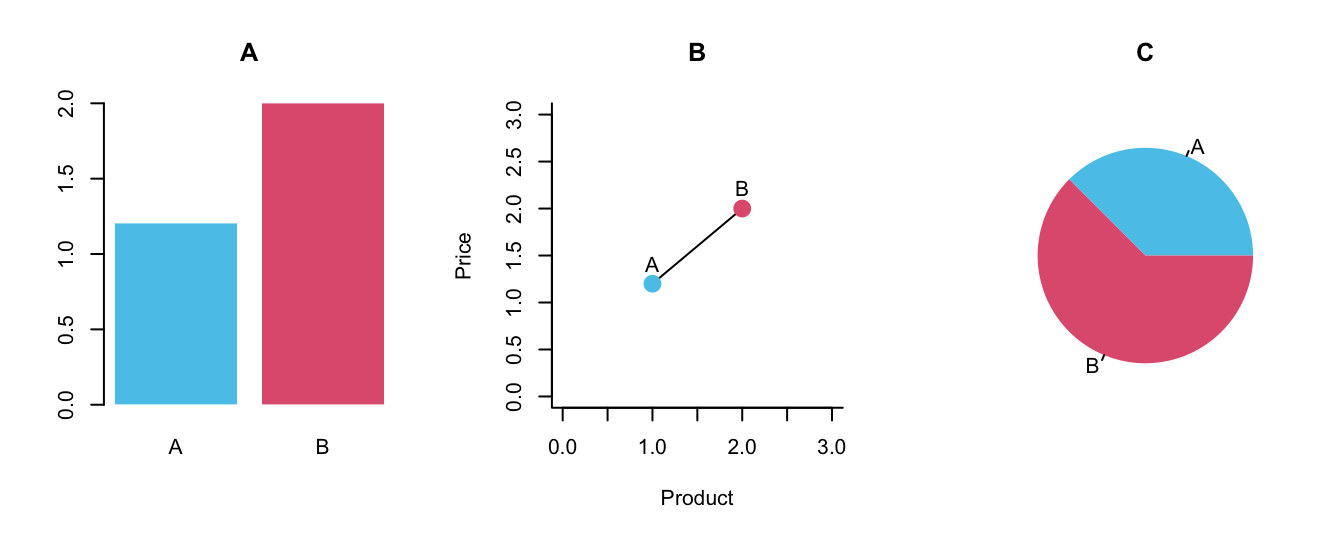
Figure 7.2: Three alternative ways of visualizing the price vector.
Before reading on, take a moment to study the three variants: What are their differences and similarities? Which one(s) are supporting which tasks? What are their geometric objects and aesthetic features?
Let’s consider the three panels of Figure 7.2 in turn:
Panel A shows a bar plot. Given the two data points of
price, using two bars is probably the most straightforward way to represent twopricevalues. But note that even interpreting this simple graph requires variable mappings: Here, product identity (A vs. B) is a categorical variable that is mapped to the x-axis position, whereas each product’s price is a metric variable mapped to a y-axis value. Given two separate bars with category labels, the color coding is optional. Beyond reading off the price of each product, the main task supported by the bar plot consists in comparing the values. The geometric object are rectangles, but note that only their height matters for the interpretation (as the price value is mapped to the height of bars). Panel A additionally uses the aesthetic feature of color to distinguish between both bars, but this mapping of product identity is optional (i.e., the graph would preserve its message when both bars had the same color). Overall, interpreting a bar plot requires knowing which bar represents which price and which dimension matters. Here, the height of the bars is relevant, but their width is arbitrary and must not be interpreted.Panel B shows the two product prices as points that are connected by a line. Whereas the y-axis represents the price (and is labeled, which the axes of Panel A were not), the metric nature of the x-axis is confusing. If the points were not labeled with the letters A and B, the identity of the products would not be clear. Similarly, the function of the line between both points is questionable. A line suggests some continuity or trend, but here it is drawn between two distinct products. Perhaps the line wants to support the mental comparison between both prices, but we could see this without drawing the line. Overall, Panel B is not incomprehensible, but an ill-motivated and misleading representation.
Panel C shows the two product prices as a pie chart. The circle of the whole pie represents the sum of both prices, but we do not see that this sum adds up to a value of $3.20. Thus, this type of visualization supports viewing and comparing the relative proportions of both prices, but simultaneously obscures their actual values. In contrast to Panels A and B, the colors in Panel C are necessary (as the pie slices are not drawn with any borders). This raises the question whether its two areas are still distinguishable if the graph was shown in black-and-white or viewed by someone with non-normal color vision. Overall, Panel C does not show the price values and is not a good representation of our data, unless we explicitly aimed to express the relation between both prices (which could also be deduced from Panels A or B).
Overall, the three panels of Figure 7.2 differ substantially in their means and message. If we really needed a visualization for depicting two prices, Panel A would be the most suitable one.
Organizational elements and non-visual features
Beyond geometric objects and aesthetic features, most visualizations contain two more types of elements and properties:
Organizational elements provide additional information on a visualization and its data: Axes, axes labels and legends explicate the mappings of variables to spatial dimensions or aesthetic properties. Captions, titles and text annotations provide crucial information on content and context.
Non-visual features do not appear in the visualization, but are crucial for managing, storing and transferring them. Examples are file names and formats (e.g., bitmaps vs. vectorized formats, resolution, and various compression rates), but also meta-information (e.g., authors, dates, or semantic tags). Although these properties are somewhat mundane and technical, they matter when publishing, printing or searching for visualizations. For instance, vectorized file formats (like PNG or PDF) typically use less storage space and scale better to different display sizes than bitmap formats (like JPG or TIFF). Visualizations to appear in print usually require much higher resolution rates than images to be shown on computer displays.
Practice: Classifying graphical elements
Classify the following elements or properties of visualizations into four categories:
- A. aesthetic feature
- B. geometric object
- C. organizational element
- D. non-visual feature
Elements to classify:
- axis
- color
- point
- axis label
- rectangle (e.g., of a bar chart)
- size of letters (e.g., of axis label)
- file format (e.g., JPG, PDF, PNG)
- plot title
- semi-transparent line
- copyright information
- font family (e.g., Arial vs. Times)
- legend on color mapping
- dpi (dots per inch) rate
A taxonomy?
Visualizations are often classified by their main geometric objects (e.g., bar plot, point plot, line plot, etc.). However, it is also possible and useful to distinguish visualizations by their contents (e.g,, showing a distribution of or relationship between variables) or by their main functions (i.e., the goals or tasks that they support). Any attempt of creating a taxonomy of visualizations faces the difficulty that one object can represent different aspects or measures. For instance, a point can represent a single data value or an aggregate of an entire sample or population. When using rectangles, only their width or height matters in a (vertical or horizontal) bar plot, but their areas represent proportions in a mosaic plot. This flexibility creates a rich variety of potential visualizations, but makes any classification vulnerable to intersections and exceptions. Thus, rather than opting for a more systematic approach, we recommend always asking the three questions from above:
When designing or interpreting some visualization, specific guiding questions include:
- What data does this visualization show and require?
- Which goals or tasks is the visualization designed to enable or support?
- What abstract measures are mapped to which geometric object or aesthetic feature?
Practice: Systematic collections of visualizations
Study the library of different information visualization types of the The Data Visualisation Catalogue (by Severino Ribecca) or the organization and icons of 5: Directory of visualizations (Wilke, 2019).
Which concepts or elements in these systems refer to data, goals and tasks, or abstract measures?
Identify different types of visualizations that contain rectangular shapes. What measure do they represent and which dimension of a rectangle matters in each type?
The icons are shown in shades of a single color. What information could be added to the visualizations when allowing for multiple colors?
7.2.3 Evaluating visualizations
Having accepted that visualizations are useful and can be analyzed in terms of their data, their goals or tasks, and their mappings of variables to geometric objects or aesthetic features, we can shift our attention from justifying to judging visualizations. This raises an new issue:
- What characterizes good visualizations?
We noted above that visualizations should strive towards the ideal of achieving ecological rationality (see Section 1.2.6): A match between data, the user’s goal or task, and the visualization’s geometric objects and aesthetic features. But explicating a goal and ideal does not yet tell us how we can reach it. And while it is relatively simple to spot flaws or misleading elements in many visualizations, providing general principles for good visualizations is challenging. When lamenting this lack of theory, Antony Unwin emphasizes the need for first-hand experience:
The lack of formal theory bedevils good graphics. The only way to make progress is through training in principles and through experience in practice.
We agree that a good way for learning about visualizations is trying to create many alternative ones. But rather than doing so in a trial-and-error fashion, we will approach visualizations by always asking which data is to be visualized and which goals or tasks the visualization is intended to support. Only after having answered the first two questions from above, addressing the third question (regarding the mapping of variables to geometric objects and aesthetic properties) will decide which type of visualization we create. Unwin (2008) continues by stating:
Paying attention to content, context and construction should ensure that sound and reliable graphics are produced. Adding design flair afterwards can add to the effect, so long as it is consistent with the aims of the graphic.
Disentangling this statement provides no fail-proof recipe, but solid recommendations for creating visualizations: Attending to “content, context and construction” essentially implies asking our three questions (on data, goals or tasks, and mappings). Finding satisfying answers to these questions ensures that a “sound and reliable” visualization is constructed. Only when the basic elements are in place, we add annotations (e.g., labels), organizational elements (like legends or titles), and aesthetic decorations (e.g., adjusting colors or size parameters). Thus, the most salient (or “obvious”) features of visualizations are typically added at the end.
The notion of “design flair” points to an important, but also controversial issue: When creating visualizations with powerful tools — like R or ggplot2 — it is tempting to add all kinds of visual fluff. An important term in this context is the concept of chartjunk which characterizes visual embellishments that are non-essential for describing the data (see Wikipedia). This term was coined by Edward Tufte in his landmark book The Visual Display of Quantitative Information (2001). Tufte wrote:
The interior decoration of graphics generates a lot of ink that does not tell the viewer anything new. The purpose of decoration varies – to make the graphic appear more scientific and precise,
to enliven the display, to give the designer an opportunity to exercise artistic skills.
Regardless of its cause, it is all non-data-ink or redundant data-ink, and it is often chartjunk.Edward R. Tufte (1983)
The concept of chartjunk is similar to Adolf Loos’s claim that — in architecture — ornament is a crime (see Wikipedia) and the design principle that form follows function (see Wikipedia). The common element of all these notions is that all elements should serve a purpose, rather than just provide additional decoration or embellishment.
Research on visualizations has yielded mixed results. While some types of graphs (notably 3-D bar or pie charts, or plots with truncated axes) are clearly misleading, there is also evidence that highly minimalist visualizations are less memorable than abstract depictions (e.g., Bateman et al., 2010). A key obstacle against general recommendations is that different people have different needs for understanding a visualization. For instance, people less experienced in viewing graphs or with disabilities may benefit from more concrete and iconic images (e.g., Wu et al., 2021). Thus, there appears a healthy middle-ground between needless decoration and a purist stance.
In practice, data analysts usually start with a clear mapping of data to geometric objects and then add and tweak aesthetic elements to underline the message of the visualization for its intended audience. When designing an entire series of visualizations (e.g., as part of an article, book, or journal) it makes sense to define a color scheme and graphical template that can be used consistently throughout the entire publication (e.g., as supported by the R package unikn, Neth & Gradwohl, 2023).
Importantly, we should not be tempted to think that visualizations are more real or truthful than any other form or representation. As there are many degrees of freedom in its creation, a visualization can distort or reveal aspects of the data. Thus, just like verbal descriptions or numbers can both uncover or hide facts, visualizations can both enlighten or manipulate the viewer’s mind. Thus, when evaluating visualizations, we should always ask:
- Selection: What is being shown?
- Design: How is it being shown?
Taking a step back from the selection of data and aesthetic features, we also need to consider the context and functional aspects of a visualization (i.e., the goals of authors and audience, and the tasks to be solved by its viewers):
- Authors and audience: Who created and who will view this visualization?
- Message: What is the (intended vs. interpreted) message of this visualization?
As we have pointed out above, achieving ecological rationality for a visualization requires a match between data, design, and its audience of viewers (see Section 1.2.6). Given this match, the interpreted meaning is likely to correspond to the intended message.
As visualizations are not only encountered and found in the environment, but artificial objects that we want to create, we can turn our guidelines for judging and evaluating visualizations into general guideslines for design. When designing visualizations (i.e., being their author and in control of the process of selection and design), it makes sense to partially reverse our evaluation questions:
- Message: What is the (intended vs. interpreted) message of this visualization?
- Audience: Who will view this visualization?
- Selection: What is to be shown?
- Design: How is it to be shown?
Note that the three questions asked above (regarding the data, goals and tasks, and variable mappings) provide more specific guidance for designing or interpreting visualizations.
+++ here now +++
A data analyst starts by selecting some type of visualization and then adds and tweaks features until a satisfying result is obtained.
Questions for evaluating visualizations
Being an artificial object that is designed to serve particular purposes, good questions for evaluating a given visualization include:
- What is the message and the audience for which this visualization was designed?
- How does it convey its message? Which aesthetic features does it use? Which perceptual or cognitive operations does it require or enable?
- How successful is it? Are there ways in which its functionality could be improved?
Thus, evaluating a visualization does not only depend on the visualization itself, but on its relation to the data, its message, and its audience.
A matter of ER: Match of a visualization to a particular task (message) and person (audience, viewer). Again, multiple levers for effecting change (e.g., design or training).
Chartjunk and other crimes
Reduce non-data ink and chartjunk (see Wikipedia).
The term chartjunk was coined by Edward Tufte in his book The Visual Display of Quantitative Information (2001). Tufte wrote:
The interior decoration of graphics generates a lot of ink that does not tell the viewer anything new.
The purpose of decoration varies – to make the graphic appear more scientific and precise,
to enliven the display, to give the designer an opportunity to exercise artistic skills.
Regardless of its cause, it is all non-data-ink or redundant data-ink, and it is often chartjunk.Edward R. Tufte (1983)
The notion is similar to Adolf Loos’s claim that — in architecture — ornament is a crime (see Wikipedia) and the design principle that form follows function (see Wikipedia).
7.2.4 Types of graphs
There are many different types of visualizations. Many compare or contrast values on one dimensions, other combine multiple variables.
See the elegant icons in 5: Directory of visualizations (Wilke, 2019).
7.3 Conclusion
This chapter discussed some motivations for, elements of, and ways to evaluate visualizations.
7.3.1 Summary
Visualizations can be good, bad, or anything in between. Rather than promoting general principles (like “show the data” or “avoid chartjunk”), we emphasized that visualizations are communications that must navigate a complex interplay of data, intended message, and the viewer’s capacities, goals, and constraints. Thus, the success of any particular visualization depends on its ecological rationality: The chosen type of visualization, its variable mappings, and its aesthetic features need to fit to the data that is being shown and to the goal or task to be performed by the viewer. For both creating and evaluating visualizations, we must consider the message to be conveyed and the audience that is to view and interpret them.
General questions for creating or evaluating visualizations include:
- Message: What is the (intended vs. interpreted) message of this visualization?
- Audience: Who will view this visualization?
- Selection: What is being shown?
- Design: How is it being shown?
More specific questions for designing or interpreting visualizations are:
- What data does this visualization show and require?
- Which goals or tasks is the visualization designed to enable or support?
- What abstract measures are mapped to which geometric object or aesthetic feature?
Conclusion
Creating good visualizations is both an art and a craft. R provides abundant tools, but using them in a successful fashion is mostly a matter of experience.
The insight that any representation can be good or bad at serving particular purposes is an important caveat to keep in mind when creating visualizations and beyond.
7.3.2 Resources

Here are some links to general resources on visualization, not just in R.
Background information and inspiration
Books or scripts on data visualization include the landmark publications by Jacques Bertin (e.g., Bertin, 2011) and Edward R. Tufte (Tufte et al., 1990; Tufte, 2001, 2006) combine sound advice with many inspiring examples. Friendly (2008) provides a historical perspective with many beautiful examples.
More recent publications that are geared to the needs of aspiring data scientists include:
Data Visualization. A practical introduction (Healy, 2018) is beautiful, informative, and elegant.
Fundamentals of Data Visualization (Wilke, 2019) provides many instructive examples and helps distinguishing good from bad and ugly graphs.
R Graphics Cookbook (Chang, 2012) provides hands-on advice on using ggplot2 and many useful recipes for data transformation.
Data Visualization with R (Kabacoff, 2018) relies heavily on the ggplot2 package, but also covers other approaches.
More specific resources on the principles of data visualization (with many beautiful or bizarre examples) include:
Various books (e.g., Cairo, 2012, 2016) and The functional art weblog (by Alberto Cairo)
Various books (e.g., Yau, 2011, 2013) and the Flowing data site (by Nathan Yau)
The principle of proportional ink and the Calling bullshit weblog (by Carl T. Bergstrom and Jevin West)
Data visualization principles (by Rafael A. Irizarry)
Data visualization: Basic principles (by Peter Aldhous)
Online resources
Inspiration and tools for additional types of visualizations can be found at (from specific to general):
ggplot2 Extensions expand the range and scope of ggplot2 even further
From Data to Viz: A decision tree for selecting graphical representations
7.3.3 Preview
Having thought about the purposes, elements, and evaluation of visualizations prepared us for creating them. The next Chapter 8 will introduce the plotting functions of base R and the following Chapter 9 will introduce the functionality of the ggplot2 package. To finish this book part on Visualizing data, Chapter 10 will introduce the topic of color representation and show us how to find and manipulate color palettes.
7.4 Exercises

7.4.1 The good, the bad and the ugly
It often is easier to detect outstanding exemplars or spot mistakes than to provide a set of principles that reliably lead to high-quality visualizations.
Find and collect two really good visualizations. What makes them good?
Find and collect two really bad visualizations. What makes them bad?
Could the bad visualizations be turned into good ones? (If so, how? If not, why not?)
-
Distinguish various ways of being good or bad by relating your evaluations to the guiding questions of this chapter:
Which of our general questions (regarding the message, audience, selection, and design) are involved in your answer?
Which of our specific questions (regarding the data, goals or tasks, and variable mappings) are involved in your answer?
Find and collect a good vs. a bad example of a plot (e.g., in brochures, newspapers, media reports, scientific articles, etc.).
- What makes the good one good?
- How could the bad one be improved?
Hint: Visualizations can be found in brochures, newspapers, media reports, scientific articles, etc. For instance, a great source for inspiration is r/dataisbeautiful at reddit.com.
7.4.2 Creating bad and good visualizations
Bonus:15 Create a misleading and a transparent visualization for the same data.
- On which features or aesthetic dimensions do the two visualizations differ?
- Which task does the good version support better than the bad?
Hint: As we have not learned how to create visualizations in R yet, you can use paper and pencil or other software for creating your examples.
A deeper point made by this example is that assessments of similarity are always relative to some dimension or standard: The sets are similar or even identical with respect to their summary statistics, but different with respect to their x-y-coordinates. Whenever the dimension or standard of comparison is unknown, a statement of similarity is ill-defined.↩︎
Exercises marked as Bonus are optional (i.e., instructive, but can be ignored for passing this course).↩︎