2.2 The structure of ggplot2
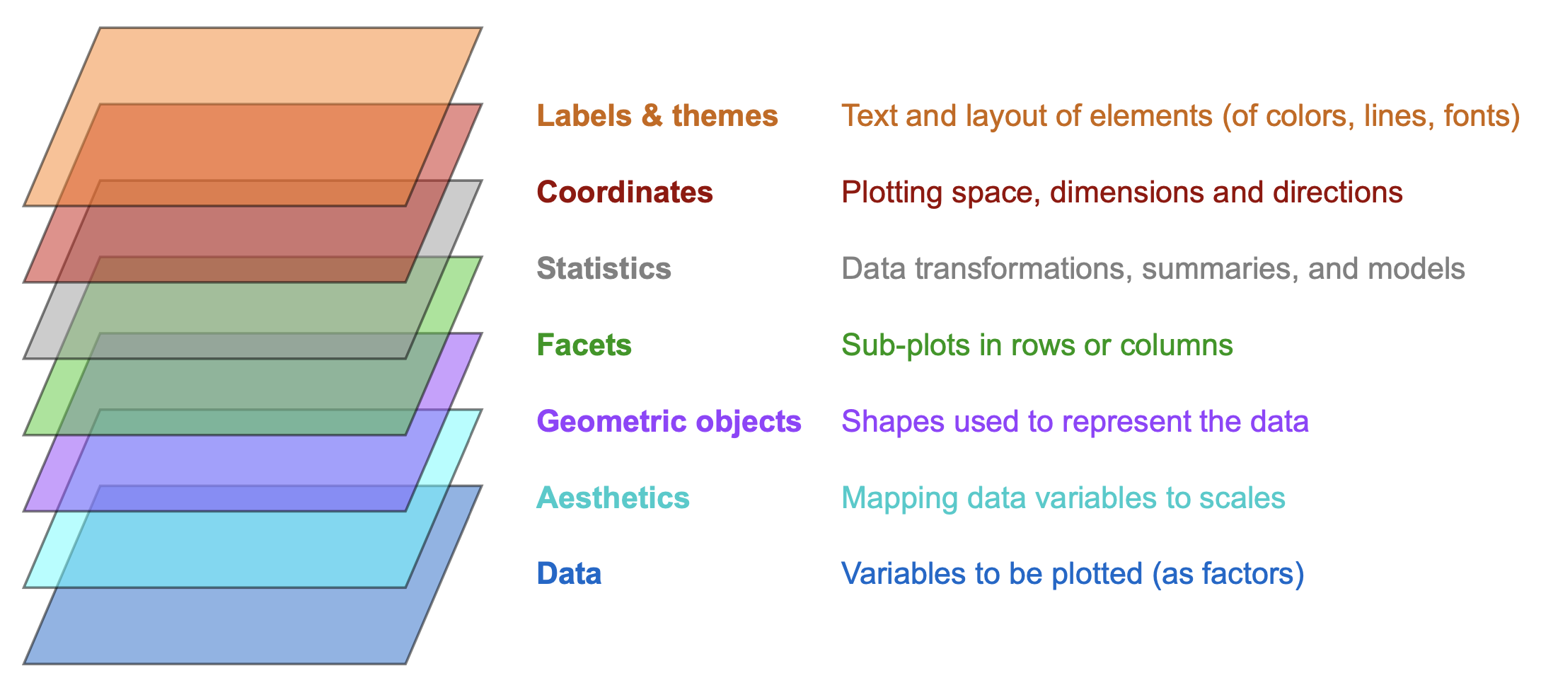
As the ggplot2 package essentially provides a language for creating scientific visualizations, it requires both a grammar and vocabulary. The grammar of ggplot2 is quite abstract, but can be illustrated as a stack of layers that merge into a visualization. Figure 2.3 illustrates the layered structure of plots created by ggplot2:

Figure 2.3: The layered structure of plots in ggplot2 (adapted from the Introduction to ggplot2).
Many terms of Figure 2.3 will initially seem a bit strange and technical. At this point, we only need to realize that every visualization (e.g., a bar chart) is based on data, which is transformed in some way (e.g., summarized) and represented by geometric objects (e.g., shapes) with aesthetic features (colors or sizes) and explained by additional text elements (e.g., labels and titles).
In ggplot2, we can think of a visualization as the combination of multiple layers.
As each layer identifies a key ingredient of visualizations, the rules for their combination provides a general language for creating visualizations.
To create a particular plot, we must learn to specify the details — or rely on the default values — of each layer.
Using ggplot2 typically means evaluating its main ggplot() function.
As calls to the ggplot() function are often quite long and take many different arguments, it is helpful to understand the function’s generic structure before studying concrete examples.
A generic template for creating a graph with the ggplot() function has the following structure:
# Generic ggplot template:
ggplot(data = <DATA>) +                              # 1. specify data set to use
  <GEOM_fun>(mapping = aes(<MAPPING>),               # 2. specify geom + mappings
             <arg_1 = val_1, ..., arg_n = val_n>) +  # - optional arguments to geom
  ...                                                # - additional geoms + mappings
  <FACET_fun> +                                      # - optional facet function
  <LOOK_GOOD_fun>                                    # - optional themes, colors, labels, etc.
The generic template includes the following parts:
<DATA>is a data frame or tibble that contains the data that is to be plotted.<GEOM_fun>is a function that maps data to a geometric object (“geom”) according to an aesthetic mapping that is specified inaes(<MAPPING>). (A mapping specifies a relation between two entities. Here, the mapping specifies the correspondence of variables to graphical elements, i.e., what goes where.)A geom’s visual appearance (e.g., colors, shapes, sizes, …) can be customized
- in the aesthetic mapping (when varying visual features according to data properties), or
- by setting its arguments to specific values in
<arg_1 = val_1, ..., arg_n = val_n>(when remaining constant).
An optional
<FACET_fun>uses one or more variable(s) to split a complex plot into multiple subplots.A sequence of optional
<LOOK_GOOD_fun>adjust the visual features of plots (e.g., by adding titles and text labels, color scales, plot themes, or setting coordinate systems).
Actually, a lot of the generic template is not necessary for using ggplot() for generating a graph.
A minimal template of a ggplot() command can be reduced to the following structure:
# Minimal ggplot template:
ggplot(<DATA>) +             # 1. specify data set to use
  <GEOM_fun>(aes(<MAPPING>)  # 2. specify geom + mappings
A comparison of the generic and the minimal templates shows that large parts of a typical ggplot() command are optional.
In fact, the bare essentials only include some <DATA>, at least one <GEOM_fun>, and its required mappings in aes(<MAPPING>).
This creates the basic visualization specified by the geom and its variable mappings.
All other arguments (e.g., adding aesthetic elements, facetting, titles and labels) provide additional functionality and fluff.
Thus, when creating a new visualization, it always makes sense to start with a minimal working recipe of a ggplot() command and then add more elements and fluff. And as looks can have a major impact — for human beings and other animals — we must not underestimate the effects of visual fluff on communication.