16 Correlations between quantitative variables
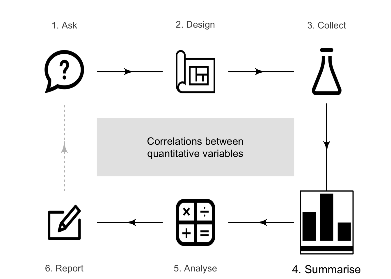
So far, you have learnt to ask an RQ, design a study, collect the data, describe the data, and summarise data.
In this chapter, you will learn to:
- describe the relationships between two quantitative variables.
- compute and interpret correlation coefficients and \(R^2\).
16.1 Introduction
Correlational RQs ask about the relationship between two quantitative variables. Scatterplots are useful for this purpose, and the relationship is usually described numerically using a correlation coefficient or \(R^2\).
16.2 Graphs for the relationship

Scatterplots display the relationship between two quantitative variables. Conventionally, and when appropriate, the response variable (denoted \(y\)) is shown on the vertical axis, and the explanatory variable (denoted \(x\)) is shown on the horizontal axis. Two quantitative variables are measured on each individual, and a point is placed on the scatterplot for each individual (unit of analysis) to indicate the values of the two variables. In some cases, which variable is denoted \(x\) and which is \(y\) is not important (e.g., see Exercise 33.15.)
As with any graph, describing the message in the graph is important, because the purpose of a graph is to display the information in the clearest, simplest possible way.
Example 16.1 (Red-deer data) Holgate (1965) examined the relationship between the age of \(n = 78\) male red deer and the weight of their molars. The data (below) comprises two quantitative variables, and both measurements are made on the same individuals (i.e., male red deer).
The scatterplot (Fig. 16.2) shows one dot for each deer (individual). The response variable is the molar weight, which is on the vertical axis and denoted \(y\). The explanatory variable is the deer age, which is on the horizontal axis and denoted \(x\).
For instance, one deer is just over \(4\) years of age (so \(x\) has a value a bit larger than \(4\)), and has a molar weight of \(2.42\,\text{g}\) (so that \(y = 2.42\)). This is the first deer listed in the data above.
FIGURE 16.1: The male red-deer data.
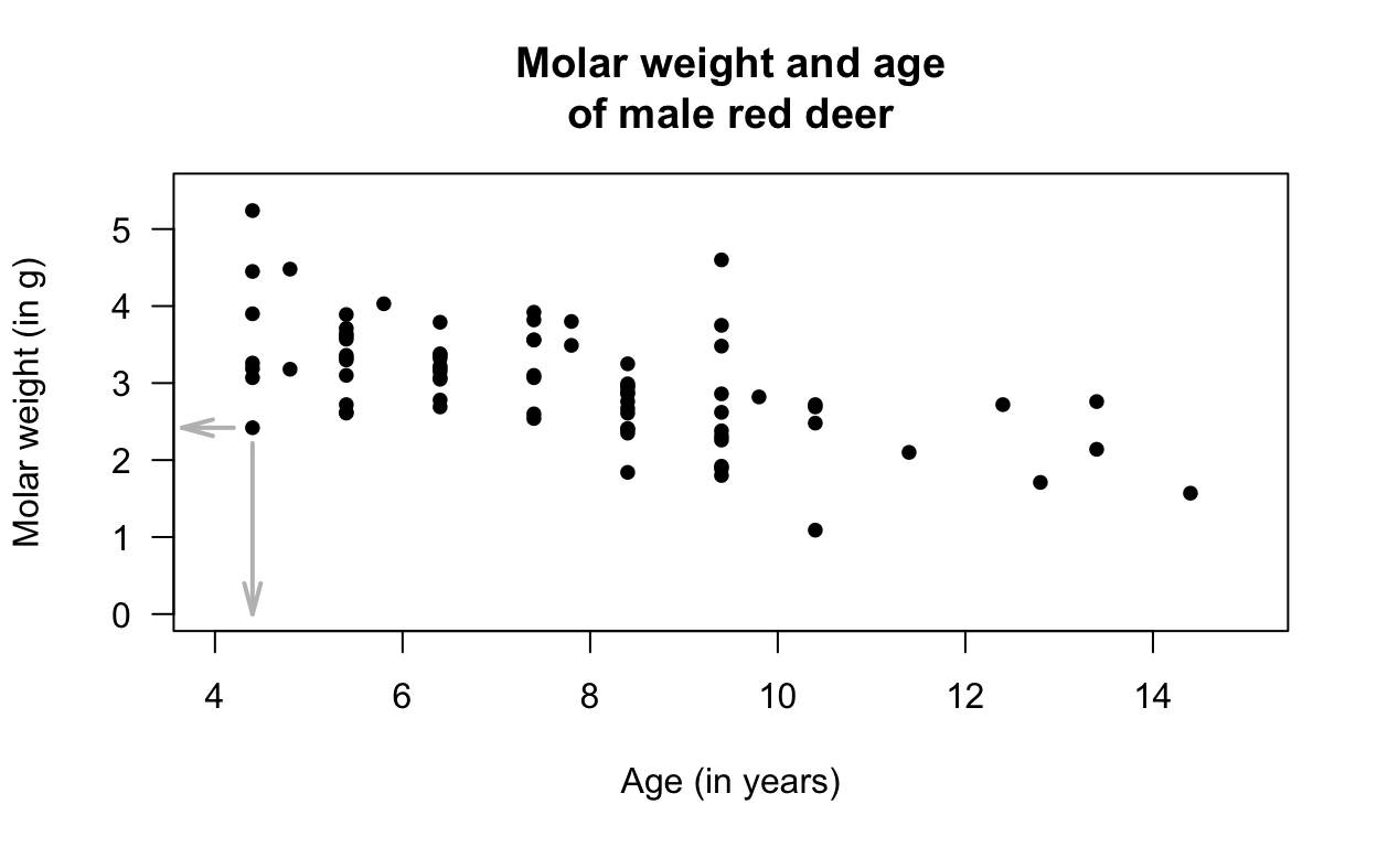
FIGURE 16.2: A plot of the red-deer data. The indicated point is the first observation in Fig. 16.1, where \(x = 4.4\) and \(y = 2.42\).
16.3 Describing scatterplots
The purpose of a graph is to facilitate understanding of the data. For a scatterplot, the form, direction, and variation in the relationship (or the strength of the relationship) are described.
- Form: the overall form or structure of the relationship (e.g., linear; curved upwards; etc.).
-
Direction:
the direction of the relationship (sometimes not relevant if the relationship is non-linear):
- a positive association exists if high values of one variable accompany high values of the other variable, in general.
- a negative association exists if high values of one variable accompany low values of the other variable, in general.
- Variation: the amount of variation in the relationship. A small amount of variation in the response variable for given values of the explanatory variable means the relationship is strong; a lot of variation in the response variable for given values of the explanatory variable means the relationship is weak. Describing the variation can be difficult; an objective, numerical way to do so is explained in Sect. 16.4.
Anything unusual or noteworthy should also be discussed. These features explain the type of relationship (form; direction), and the strength of that relationship (variation). Examples are shown in the carousel below (click to move through the scatterplots).
The axes do not need to start from zero, since the distance of the dots from the axes visually do not imply any quantity of interest.
Example 16.2 (Scatterplots) For the red-deer data (Fig. 16.2), the relationship is approximately linear (form) with a negative direction (older deer generally have lighter teeth); the variation is, perhaps, moderate.
Example 16.3 (Describing scatterplots) Tager et al. (1979) (cited by Kahn (2005)) measured the lung capacity of children in Boston (using forced expiratory volume, FEV, in litres). The scatterplot (Fig. 16.3) is curved (form), where older children have larger FEVs, in general (direction). The variation in FEV gets larger for taller youth.
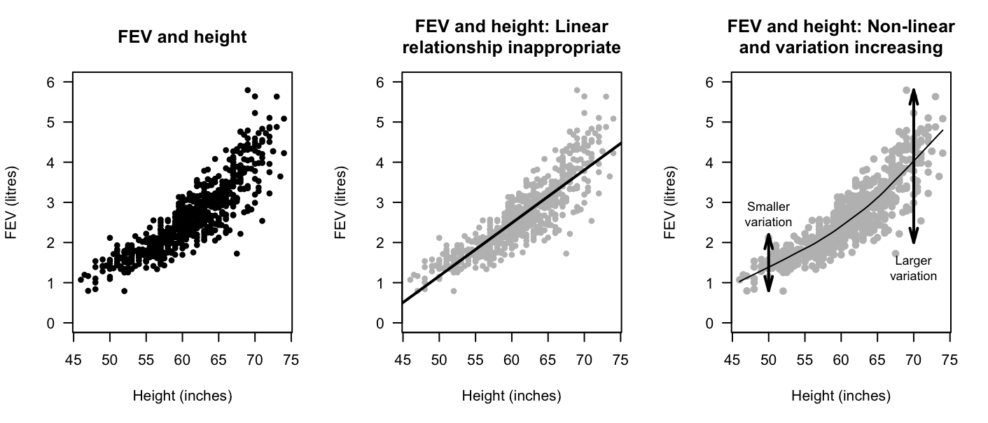
FIGURE 16.3: FEV plotted against height for children in Boston.
16.4 Numerical summary: correlation coefficient and \(R^2\)
16.4.1 Correlation coefficients
In general, summarising the relationship between two quantitative variables is difficult, because the possible relationships vary greatly (consider the variety in the scatterplots shown in the carousel above). However, if we focus only on approximately linear relationships, the best way to numerically summarise the relationship between the variables is to use a correlation coefficient. Both quantitative variables can also be numerically summarised individually.
Definition 16.1 (Correlation coefficient) The Pearson correlation coefficient measures the strength and direction of the linear relationship between two quantitative variables. Its value is always between \(-1\) and \(+1\).
Pearson correlation coefficients only apply if both of these are true:
- the form is approximately linear.
- the variation in the values of \(y\) is reasonably constant for all values of \(x\).
Hence, checking the scatterplot first is important.
Only the Pearson correlation coefficient is discussed in this book (and usually referred to as the 'correlation coefficient'), but other correlation coefficients also exist (such as the Spearman or Kendall correlation coefficients), which may be used for increasing-only or decreasing-only non-linear relationships).
The Pearson correlation coefficient only makes sense if the relationship is approximately linear.
In the population, the unknown value of the correlation coefficient is denoted \(\rho\) ('rho'); in the sample, the value of the correlation coefficient is denoted \(r\). As usual, \(r\) (the statistic) is an estimate of \(\rho\) (the parameter), and the value of \(r\) is likely to be different in every sample (that is, sampling variation exists).
The symbol \(\rho\) is the Greek letter 'rho', pronounced 'row', as in 'row your boat'.
The values of \(\rho\) and \(r\) are always between \(-1\) and \(+1\). The sign indicates whether the relationship has a positive or negative linear association, and the value of the correlation coefficient describes the strength of the relationship, as follows.
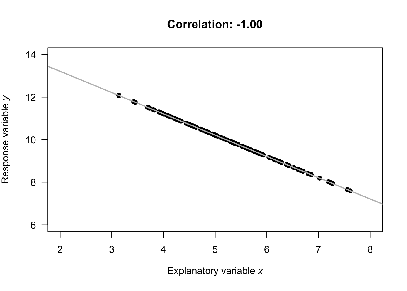
- \(r = -1\) indicates a perfect, negative relationship. By 'perfect', we mean that each value of \(x\) always produces the same value of \(y\); the negative value means larger values of \(y\) are associated with smaller values of \(x\).
- values of \(r\) between \(-1\) and \(0\) indicates a negative relationship. Each value of \(x\) produces a range of values of \(y\), and larger values of \(y\) are associated with smaller values of \(x\) (in general).
- \(r = 0\) indicates no linear relationship between the variables: knowing how the value of \(x\) changes tells us nothing about how the corresponding value of \(y\) changes. The best prediction of \(y\) for any value of \(x\) would be the mean of \(y\); i.e., the value of \(\bar{y}\).
- values of \(r\) between \(0\) and \(+1\) indicates a positive relationship. Each value of \(x\) produces a range of values of \(y\), and larger values of \(y\) are associated with larger values of \(x\) (in general).
- \(r = +1\) indicates a perfect, positive relationship. By 'perfect', we mean that each value of \(x\) always produces the same value of \(y\); the positive value means larger values of \(y\) are associated with larger values of \(x\).
Almost all values of \(r\) seen in practice are between the extremes of \(r = -1\) and \(r = +1\). Guessing the values of the correlation coefficient from a scatterplot is very difficult. The animation below demonstrates how the values of the correlation coefficient work.
Example 16.4 (Correlation coefficients) Numerous example scatterplots were shown in Sect. 16.3. A correlation coefficient is not relevant for Plots C, D, E or H, as those relationships are not linear. For the others:
- Plot A: the correlation coefficient is positive, and reasonably close to one.
- Plot B: the correlation coefficient is negative, but not near \(-1\).
- Plot F: the correlation coefficient is close to zero.
Example 16.5 (Correlation coefficients) Leuchtenberger et al. (2022) and Nishizaki et al. (2022) explored the relationship between water temperature and fertilisation rates for sand dollars (Fig. 16.4). The correlation coefficient is \(r = -0.71\) (left panel), which might suggest that higher temperatures result in lower fertilisation rates. However, a curved relationship is apparent (right panel), and so the relationship is more complex: the fertilisation rate increases up to about \(18\)oC, and then starts falling again.
A Pearson correlation coefficient is not suitable for describing the relationship.
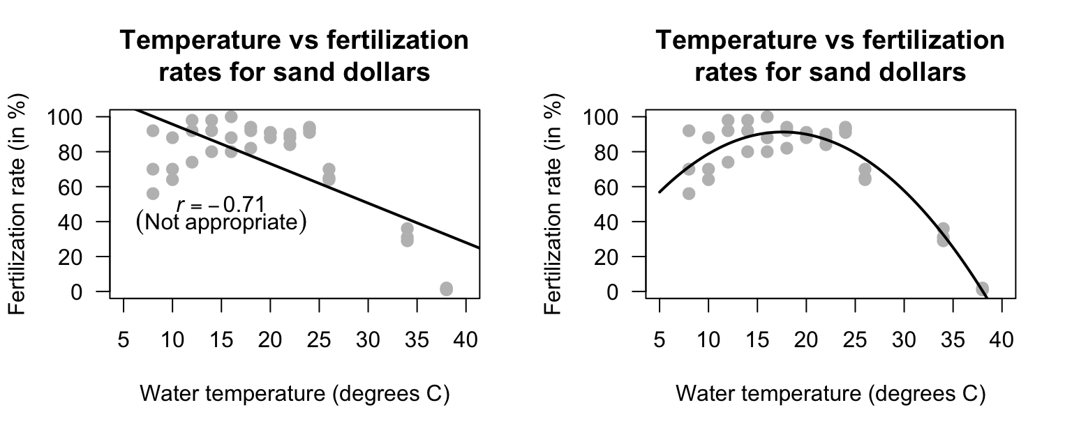
FIGURE 16.4: Water temperature vs fertilisation rates for sand dollars. Left: an inappropriate linear relationship. Right: the appropriate curved relationship.
Formulas exist to compute the value of \(r\), but are tedious to use manually. We will use software output to obtain values of \(r\).
Example 16.6 (Correlation coefficients) For the red-deer data (Fig. 16.2), the relationship is approximately linear, and the software output (Fig. 16.5) shows that \(r = -0.584\). The value of \(r\) is negative because, in general, older deer (\(x\)) are associated with smaller weight molars (\(y\)). The relationship may be described as 'moderately strong' perhaps.
Example 16.7 (Correlation coefficients) Tager et al. (1979) studied the lung capacity (forced expiratory volume; FEV) of children in Boston (Kahn 2005). The scatterplot in Fig. 16.3 is not linear, so a correlation coefficient is inappropriate.
The web page http://guessthecorrelation.com makes a game out of trying to guess the correlation coefficient from a scatterplot. It's very difficult!
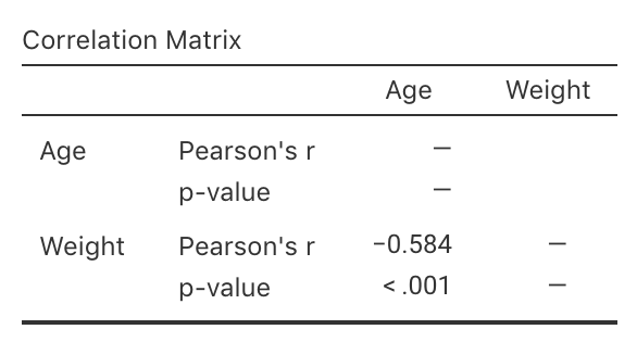
FIGURE 16.5: Software output for correlation for the red-deer data.
16.4.2 R-squared (\(R^2\))
While \(r\) describes the strength and direction of the linear relationship, knowing exactly what the value means is tricky. Interpretation is easier using \(R^2\): the square of the value of \(r\). The animation below shows some values of \(R^2\).
Definition 16.2 (R-squared) The value of \(R^2\) is how much the unexplained variation in the values of \(y\) is reduced (usually expressed as a percentage) due to using the extra information in the values of \(x\).
\(R^2\) is pronounced '\(r\)-squared'.
The value of \(R^2\) is never negative, and is usually multiplied by \(100\) and expressed as a percentage.
The value of \(R^2\) is never negative!
However, you need to be careful using your calculator.
On most calculators, entering -0.5^2 returns an answer of -0.25.
The calculator interprets your input as meaning -(0.5^2).
Use brackets; (-0.5)^2 gives the correct answer of 0.25 (or \(25\)%).
Example 16.8 (Values of R-squared) For the red-deer data (Fig. 16.2), the value of \(R^2\) is \(R^2 = (-0.584)^2 = 0.341\), usually written as a percentage: \(34.1\)%. The value of \(R^2\) is positive, even though the value of \(r\) is negative.
This means a reduction of about \(34.1\)% in the unexplained variation of the molar weights, due to using the information in the age of the deer (see Example 16.9). The rest of the variation in molar weights is due to chance, and to extraneous variables such as weight, diet, amount of exercise, genetics, etc.
\(R^2\) measures the reduction in the unexplained variation in values of \(y\) because the value of \(x\) is known. If the values of \(x\) were unknown, the best summary of the \(y\)-values is the mean of the \(y\)-values (i.e., \(\bar{y}\)). However, if a relationship exists between the values of \(x\) and \(y\) then better estimates of the value of \(y\) could be made by knowing the value of \(x\). That means that less variation should be left unexplained.
When expressed as a percentage, \(R^2\) measures how much the unexplained variation reduces due to our knowledge of the linear relationship. If \(R\)-squared is zero, then the amount of unexplained variation has not reduced at all, and exploring the relationship between \(x\) and \(y\) has no value.
Example 16.9 (Unknown variation in y) For the red-deer data, the unexplained variation in the values of \(y\) (molar weight), without knowing anything about the age of the deer, is the variation in the distances from the mean to each observation (Fig. 16.6, left panels). Effectively, the unexplained variation is the standard deviation of the molar weights (\(s = 0.7263\)).
If the age of the deer (\(x\)) is used, the unexplained variation in the values of \(y\) is now the variation in the distances from the line explaining the relationship to each observation (Fig. 16.6, right panels). The distances are shorter, in general, showing a decrease in the unexplained variation. Effectively, the unexplained variation is the standard deviation of the distances from the line to the observations (\(s = 0.5895\)).
Hence, the reduction in the square of the standard deviations is \((0.7263^2 - 0.5895^2)/0.7263^2 = 0.341\), or \(34.1\)%. This is the value of \(R^2\).
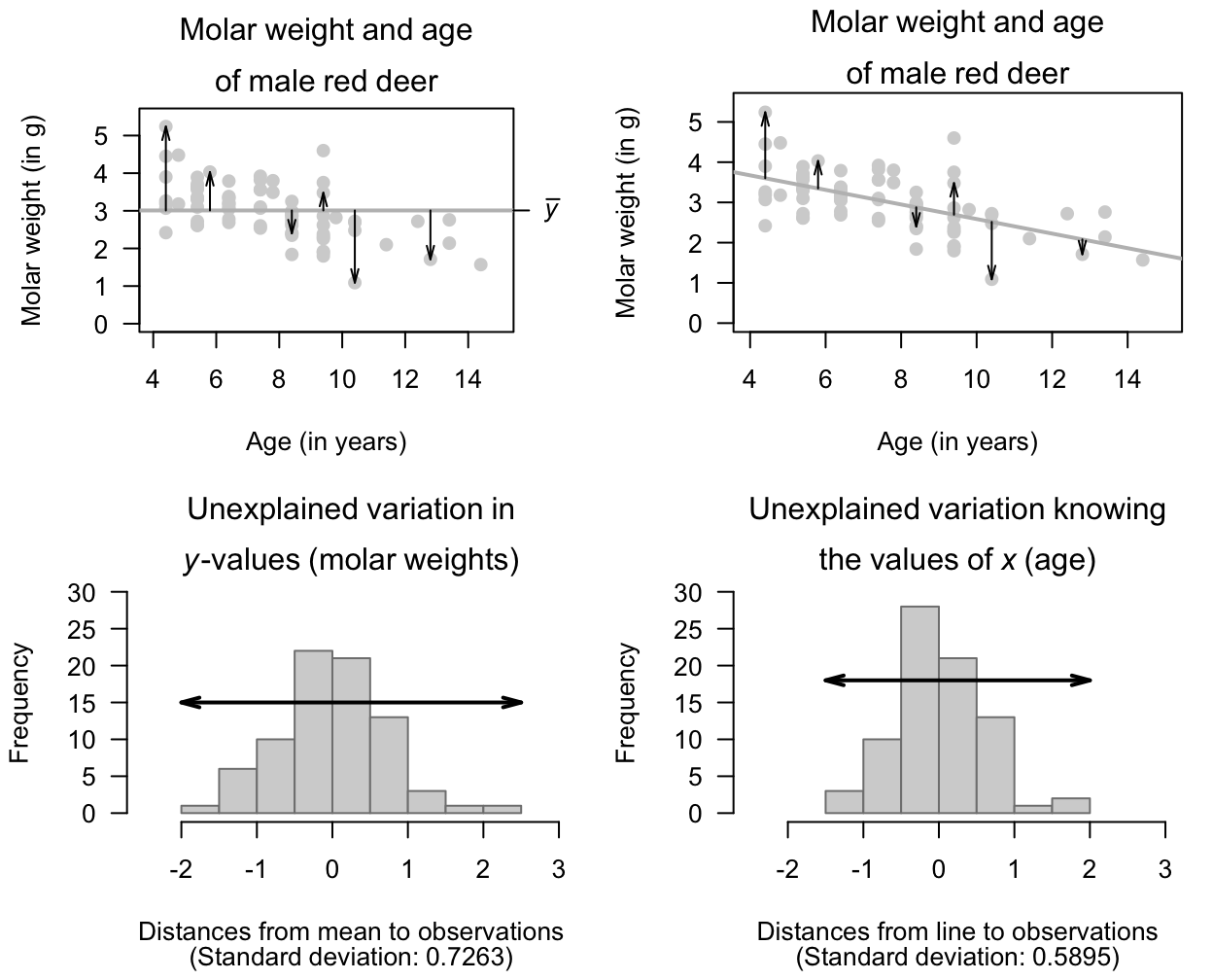
FIGURE 16.6: The unexplained variation for the red-deer data. Left panels: when no information about the age of the deer is used, the mean (the horizontal grey regression line in the top panel) is the best summary of the molar weight. Right panels: when information about the age of the deer is used (as shown by the grey line in the top panel), the distances are shorter in general. \(R^2\) is a measure of how much smaller.
16.5 Numerical summary tables
In general, numerically summarising the relationship between two quantitative variables is difficult because of the many types of possible relationships (Sect. 16.3). However, for linear relationships, both quantitative variables can be summarised, and the correlation coefficient can be given (Table 16.1).
| Mean | Standard deviation | Sample size | Correlation | |
|---|---|---|---|---|
| Age (in years) | \(\phantom{0}7.7\) | \(\phantom{0}2.34\) | \(\phantom{0}78\) | \(\phantom{0}\llap{\)-{}\(}0.584\) |
| Molar weight (in g) | \(\phantom{0}3.0\) | \(\phantom{0}0.73\) | \(\phantom{0}78\) |
16.6 Example: removal efficiency

In wastewater treatment facilities, air from biofiltration is passed through a membrane and dissolved in water, and is transformed into harmless by-products. The removal efficiency \(y\) (in %) may depend on the inlet temperature (in oC; \(x\)). Chitwood and Devinny (2001) asked:
In treating biofiltation wastewater, is the removal efficiency linearly associated with the inlet temperature?
A scatterplot of \(n = 32\) observations (Devore and Berk 2007) suggests an approximately linear relationship (Fig. 16.7, left panel). The direction is positive: larger inlet temperatures are associated with a larger removal efficiency, in general. The variation is always hard to describe in words, but is perhaps 'reasonably small'.
A more precise way to measure the strength of the linear association is to use the correlation coefficient. Using software output (Fig. 16.7, right panel), \(r = 0.891\), and so \(R^2 = (0.891)^2 = 79.4\)%. This means that about \(79.4\)% of the variation in removal efficiency can be explained by knowing the inlet temperature.
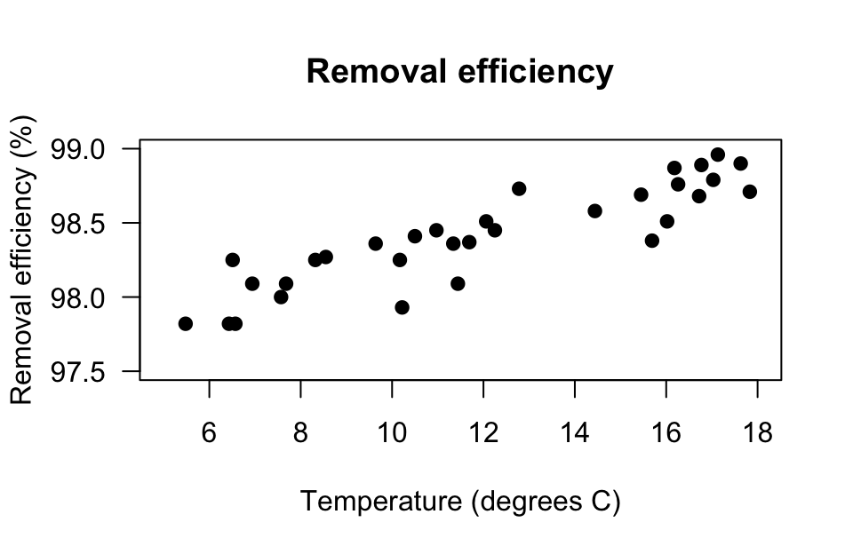

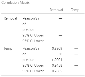
FIGURE 16.7: The relationship between removal efficiency and inlet temperature. Left: scatterplot. Right: software output.
16.7 Chapter summary
A scatterplot displays the relationship between two quantitative variables (the response denoted \(y\); the explanatory denoted \(x\)). The relationship is described by the form (linear, or otherwise), the direction of the relationship (sometimes not relevant if the graph is not linear), and the variation in the relationship (or the strength of the relationship).
Linear relationships are measured numerically using the correlation coefficient and \(R^2\). Correlation coefficients (denoted \(r\) in the sample; \(\rho\) in the population) are always between \(-1\) and \(+1\). Positive values denote positive relationships between the two variables: as the values of one variable get larger, the values of the other tend to get larger too. Negative values denote negative relationships between the two variables: as the values of one variable get larger, the values of the other tend to get smaller. Values close to \(-1\) or \(+1\) are very strong relationships; values near zero shows very little linear relationship between the values of the two variables.
Sometimes, \(R^2\) is used to describe the relationship: it measures how much the unexplained variation in the values of \(y\) is reduced due to using the extra information in the values of \(x\).
16.8 Quick review questions
A study of onion growth (Mead 1970) produced the scatterplot shown in Fig. 16.8.
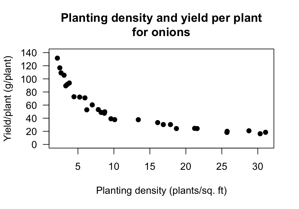
FIGURE 16.8: Onion yield plotted against planting density.
Are the following statements true or false?
- The \(x\)-variable is 'planting density'.
- The best description for the form of the relationship is 'curved'.
- The best description for the direction of the relationship is 'negative'.
- The best description for the variation in the relationship is 'small'.
16.9 Exercises
Answers to odd-numbered exercises are given at the end of the book.
Exercise 16.1 Draw a scatterplot with:
- a negative correlation coefficient, with \(r\) very close to (but not equal to) \(-1\).
- a positive correlation coefficient, with \(r\) very close to (but not equal to) \(+1\).
- a correlation coefficient very close to \(0\).
Exercise 16.2 Estimate the correlation coefficients from scatterplots in Fig. 16.9, when appropriate. (You can only give very rough estimates!)
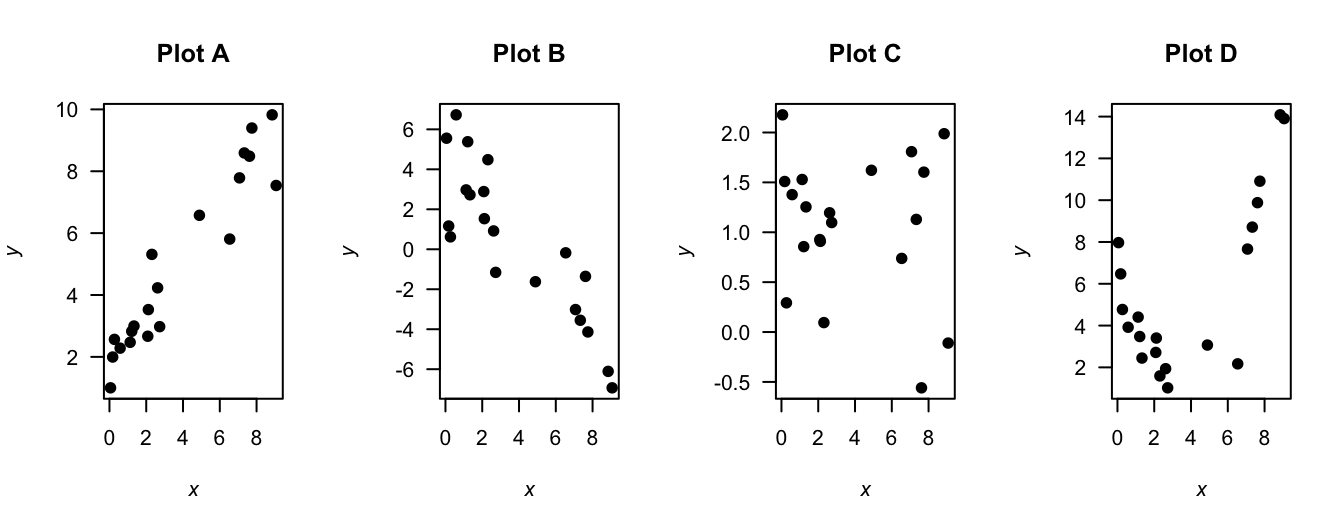
FIGURE 16.9: Four plots: estimate the correlation coefficients.
Exercise 16.3 [Dataset: Peas]
Hacisalihoglu, Beisel, and Settles (2021) studied the nutritional content of peas (Pisum sativum), and measured the quantities of various minerals.
In these plots, it does not matter which of the pair of variables is used on the horizontal axis and which is used on the vertical axis.
From Fig. 16.10 (left panel), estimate the value of \(r\).
Exercise 16.4 [Dataset: Peas]
Hacisalihoglu, Beisel, and Settles (2021) studied of the nutritional content of peas (Pisum sativum), and measured the quantities of various minerals.
In these plots, it does not matter which of the pair of variables is used on the horizontal axis and which is used on the vertical axis.
From Fig. 16.10 (right panel), estimate the value of \(r\).
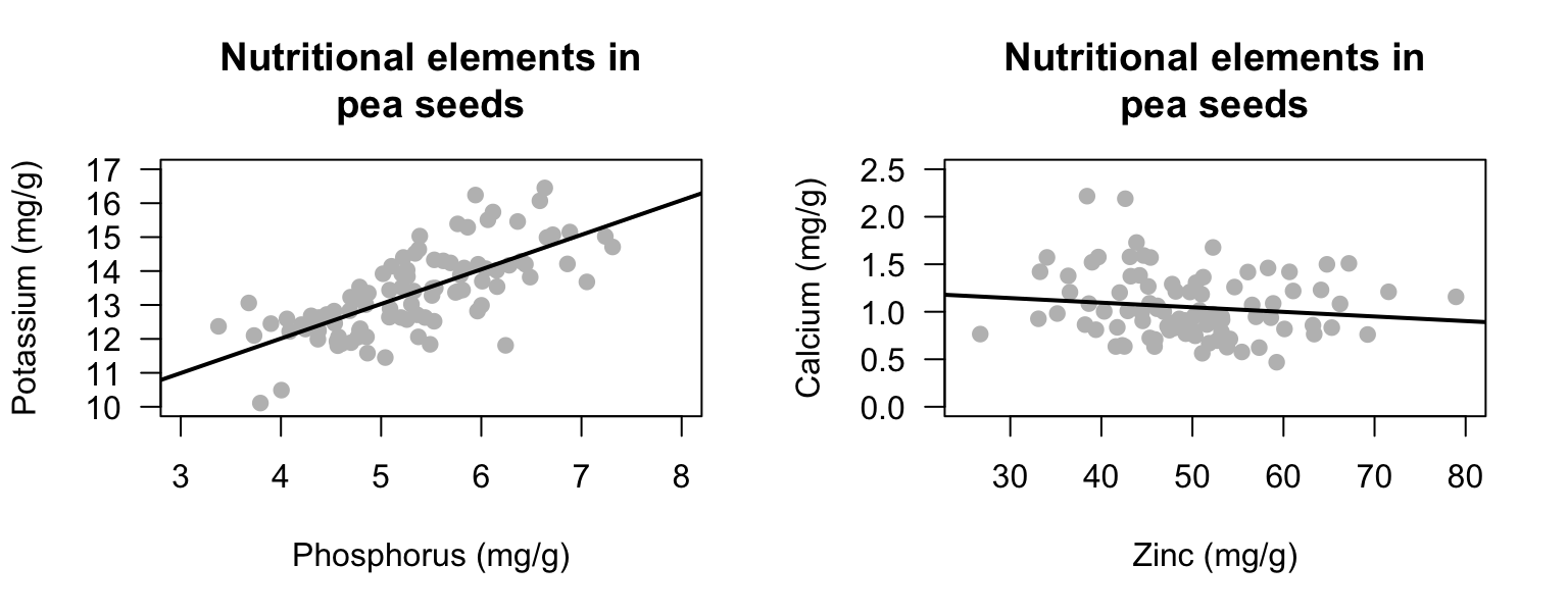
FIGURE 16.10: The relationship between some minerals in pea seeds.
Exercise 16.5 [Dataset: Lime]
Schepaschenko et al. (2017a) measured the diameter and the age of \(385\) small-leaved lime trees (Fig. 16.11).
- What does each point on the scatterplot represent?
- Describe the scatterplot.
- Would a correlation coefficient be appropriate? Explain.
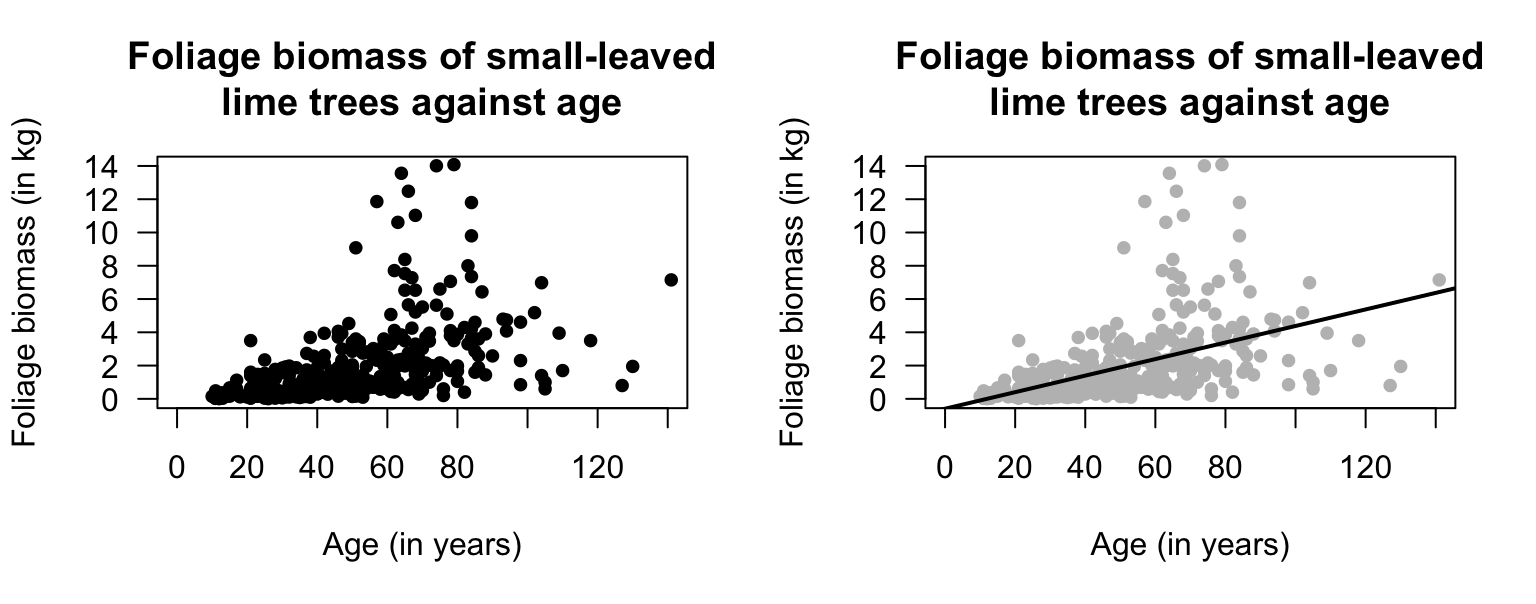
FIGURE 16.11: The age and foliage biomass of small-leaved lime trees grown in Russia (\(n = 385\)). The solid line on the right panel displays the linear relationship.
Exercise 16.6 [Dataset: BoneQuality]
K. Y. Kim and Kim (2022) measured numerous data from \(969\) South Korean subjects, including \(517\) females.
A scatterplot of the height and age for females is shown in Fig. 16.12.
- What does each point on the scatterplot represent?
- Describe the relationship.
- Would a correlation coefficient be appropriate? Explain.
- Does the scatterplot suggest that people become less tall, on average, as they age? Explain.
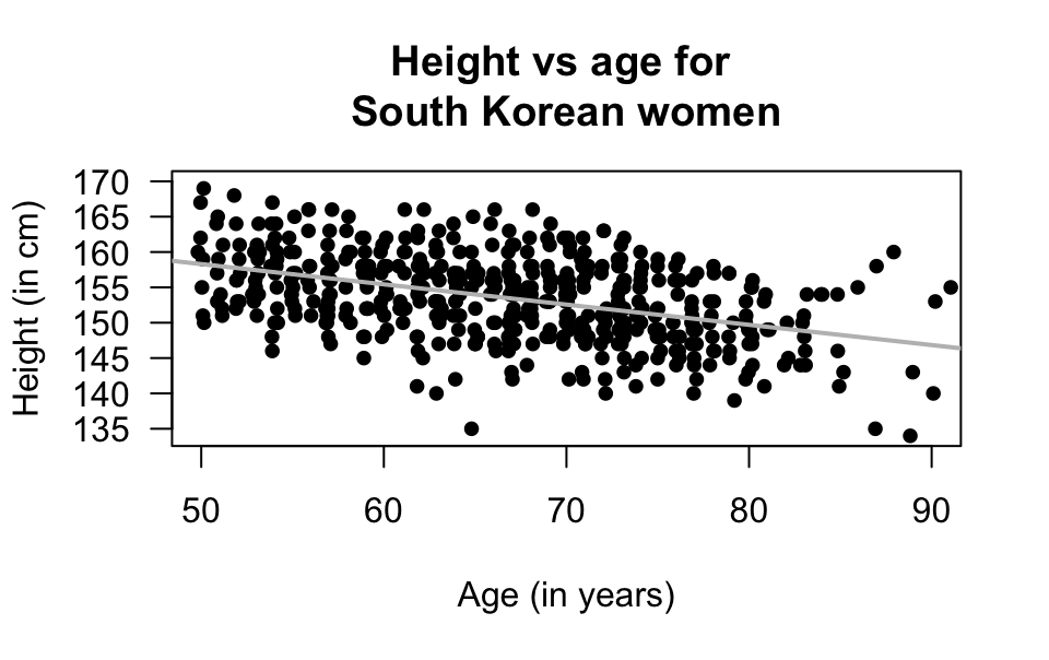
FIGURE 16.12: The age and height of South Korean females (\(n = 517\)). The solid line shows the linear relationship.
Exercise 16.7 [Dataset: SDrink]
Montgomery and Peck (1992) examined the time taken to deliver soft drinks to vending machines.
- Describe the relationship (Fig. 16.13, left panel).
- What does each point represent?
- Would a correlation coefficient be appropriate? Explain.
Exercise 16.8 [Dataset: Mandible]
Royston and Altman (1994) examined the mandible length and gestational age for \(167\) foetuses from the \(12\)th week of gestation onward.
Describe the relationship (Fig. 16.13, right panel).
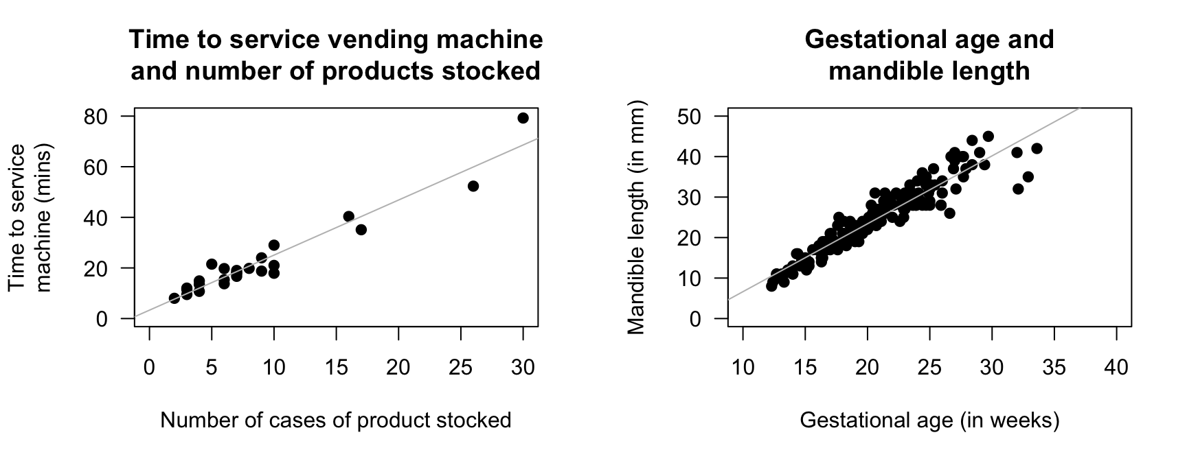
FIGURE 16.13: Two scatterplots. Left: the time taken to deliver soft drinks to vending machines. Right: the relationship between gestational age and mandible length. In both plots, the solid grey line displays the linear relationship.
Exercise 16.9 [Dataset: Gorillas]
Wright et al. (2021) recorded the chest-beating rate of \(25\) gorillas, and the gorillas' size (measured by the breadth of the gorillas' backs).
Describe the relationship (Fig. 16.14, left panel).
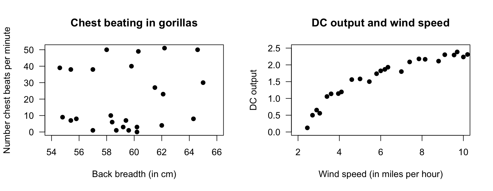
FIGURE 16.14: Two scatterplots. Left: chest beating in gorillas. Right: the relationship between DC output and wind speed.
Exercise 16.10 [Dataset: Windmill]
Joglekar, Scheunemyer, and LaRiccia (1989) examined the relationship between direct current (DC) generated by a windmill and wind speed (Hand et al. 1996).
Describe the relationship (Fig. 16.14, right panel).
Exercise 16.11 [Dataset: SoilCN]
Lambie, Mudge, and Stevenson (2021) recorded the percentage carbon (C) and the percentage nitrogen (N) in \(28\) irrigated farming plots (Fig. 16.15, left panel).
- Describe the relationship.
- Does it matter which variable is \(x\) and which is \(y\)? Explain.
- What does each point represent?
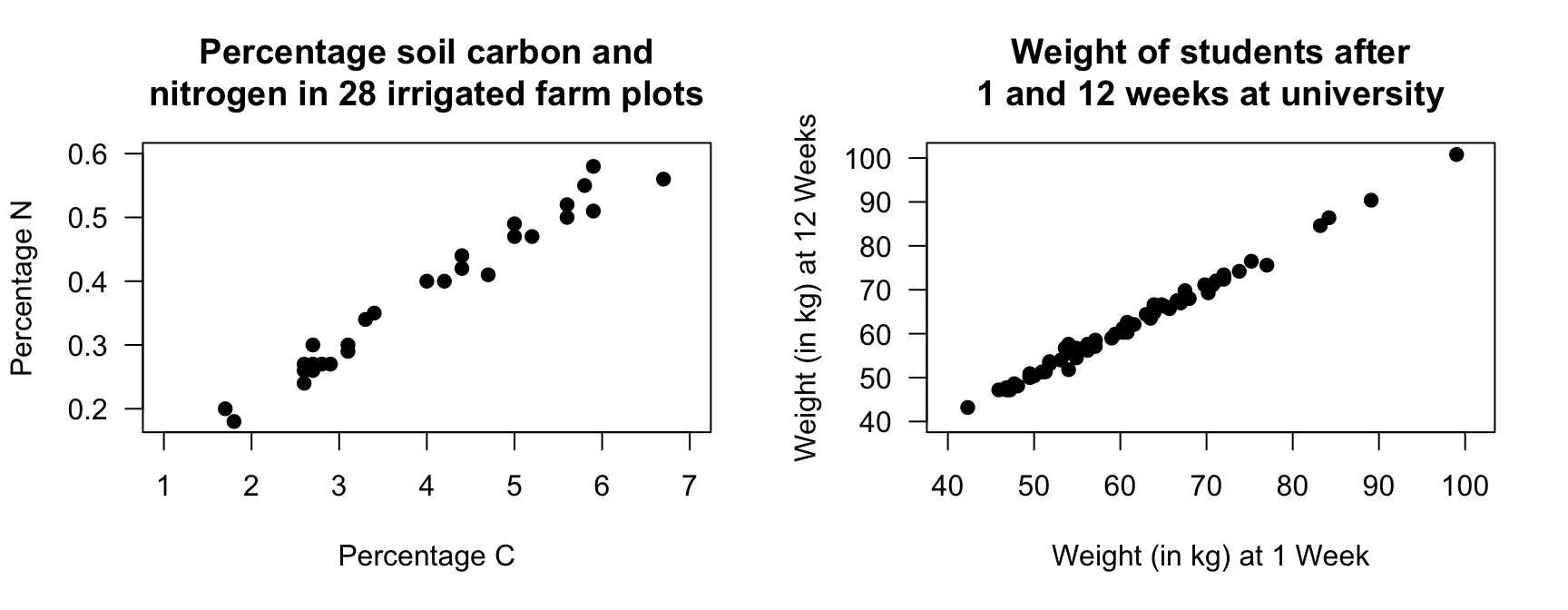
FIGURE 16.15: Left: the percentage N and percentage C in irrigated plots. Right: the weight of students in Week 1 and Week 12 of the university semester.
Exercise 16.12 [Dataset: StudentWt]
The weights of students starting at university (Week 1) and in Week 12 are shown in Fig 16.15 (right panel).
- Describe the relationship.
- What does each point represent?
Exercise 16.13 [Dataset: Cyclones]
The relationship (P. K. Dunn and Smyth 2018) between the number of cyclones \(y\) in the Australian region each year from 1969 to 2005, and a climatological index called the Ocean Niño Index (ONI, \(x\)), is shown in Fig. 16.16.
From software, \(r = -0.682\). What is the value of \(R^2\)? What does it mean?
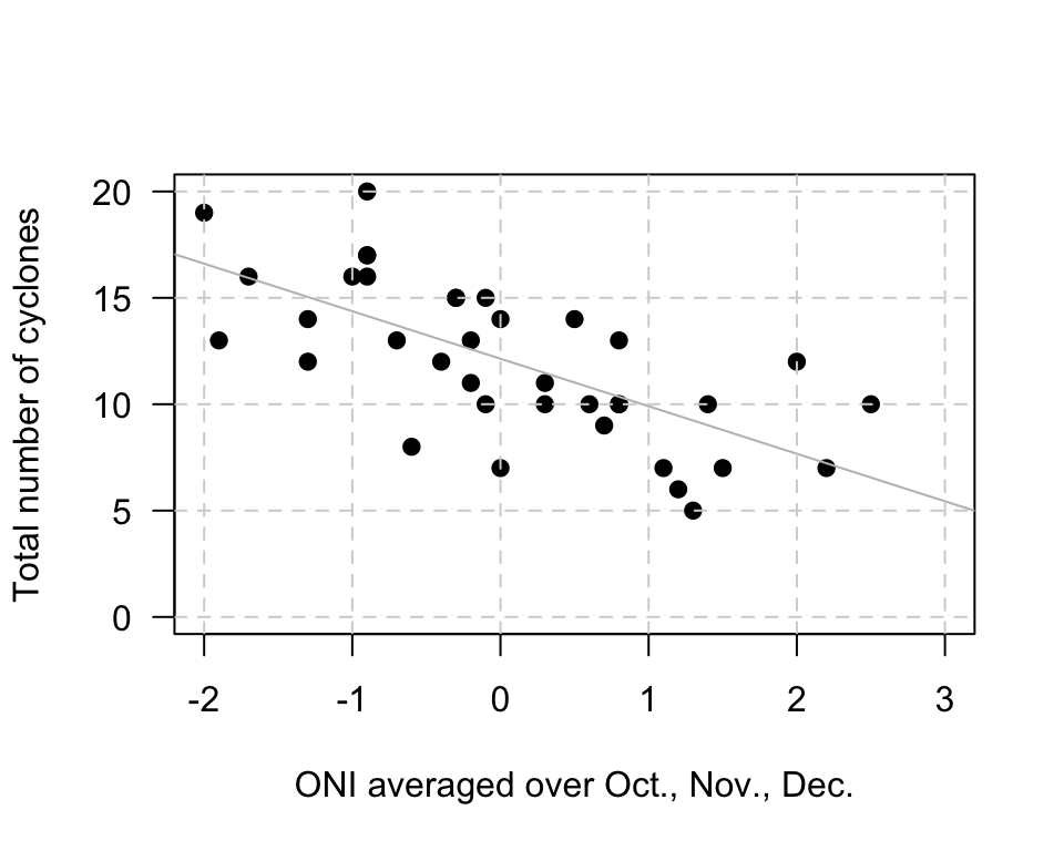
FIGURE 16.16: The number of cyclones in the Australian region each year from 1969 to 2005, and the ONI for October, November, December.