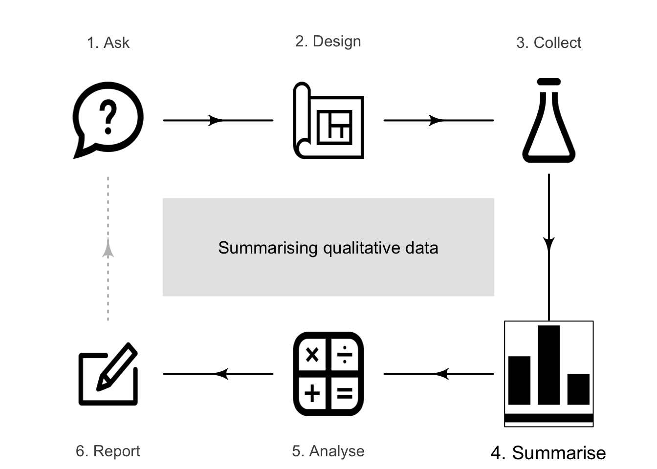
12 Summarising qualitative data
So far, you have learnt to ask an RQ, design a study, collect the data, classify the data, and summarise quantitative data In this chapter, you will learn to:
- summarise qualitative data using the appropriate graphs.
- summarise qualitative data using, for example, medians, proportions and odds.
12.1 Introduction
Many quantitative research studies involve qualitative variables. Except for very small amounts of data, understanding the data is difficult without a summary. As with quantitative data, qualitative data can be understood by knowing how often values of the variables appear. This is called the distribution of the data (Def. 11.1).
The distribution can be displayed using a frequency table (Sect. 12.2) or a graph (Sect. 12.3). Qualitative data can be summarised by finding modes or, for ordinal qualitative data, using medians (Sect. 12.6). The distribution of qualitative data can be summarised numerically by computing proportions, percentages (Sect. 12.4) or odds (Sect. 12.5).
12.2 Frequency tables for qualitative data
Qualitative data are typically collated in a frequency table. The rows (or the columns) should list the levels of the variable, and these should be exhaustive (cover all levels) and mutually exclusive (observations belong to only one level). The number of observations or the percentage of observations (or both) are then given for each level.
For nominal data, the levels of the variables can be displayed in alphabetical order, in order of size, in order of personal preference, or in any other order: use the order most likely to be useful to readers. For ordinal data, the natural order of the levels should almost always be used.
Example 12.1 (Opinions of AV vehicles) Pyrialakou et al. (2020) surveyed \(400\) residents of Phoenix (Arizona) about their opinions of autonomous vehicles (AVs). Demographic information (Table 12.1) and respondents' opinions of sharing roads with AVs (Table 12.2) were recorded.
The gender of the respondent is nominal (two levels), while the age group is ordinal (six levels). The levels are shown in the rows. The three questions about safety (Table 12.2) all yield ordinal responses (five levels, in columns).
| Number | Percentage | |
|---|---|---|
| Gender | ||
| Female | \(204\) | \(51\) |
| Male | \(196\) | \(49\) |
| Age group | ||
| \(18\) to \(24\) | \(\phantom{0}52\) | \(13\) |
| \(25\) to \(34\) | \(\phantom{0}76\) | \(19\) |
| \(35\) to \(44\) | \(\phantom{0}76\) | \(19\) |
| \(45\) to \(54\) | \(\phantom{0}72\) | \(18\) |
| \(55\) to \(64\) | \(\phantom{0}56\) | \(14\) |
| \(65+\) | \(\phantom{0}68\) | \(17\) |
| \(n\) | % | \(n\) | % | \(n\) | % | \(n\) | % | \(n\) | % | |
|---|---|---|---|---|---|---|---|---|---|---|
| Driving near an AV | \(58\) | \(14\) | \(\phantom{0}79\) | \(20\) | \(\phantom{0}96\) | \(24\) | \(97\) | \(24\) | \(70\) | \(18\) |
| Cycling near an AV | \(77\) | \(19\) | \(104\) | \(26\) | \(\phantom{0}87\) | \(22\) | \(76\) | \(19\) | \(56\) | \(14\) |
| Walking near an AV | \(63\) | \(16\) | \(\phantom{0}86\) | \(22\) | \(103\) | \(26\) | \(82\) | \(20\) | \(66\) | \(16\) |
12.3 Graphs for qualitative data
Three options for graphing qualitative data include:
- dot charts (Sect. 12.3.1), which are usually a good choice.
- bar charts (Sect, 12.3.2), which are usually a good choice.
- pie charts (Sect. 12.3.3), which are only useful in special circumstances, and can be hard to interpret.
Sometimes these graphs are used for discrete quantitative data with a small number of possible options.
The purpose of a graph is to display the information in the clearest, simplest possible way, to facilitate understanding the message(s) in the data.
12.3.1 Dot charts (qualitative data)
Dot charts indicate the counts (or corresponding percentages) in each level using dots (or some other symbol). The levels can be on the horizontal or vertical axis, and the counts or percentages on the other. Placing the levels on the vertical axis often makes for easier reading, and space for long labels.
Example 12.2 (Dot plots) For the AV study in Example 12.1, a dot chart of the age group of respondents is shown in Fig. 12.1 (top left panel).
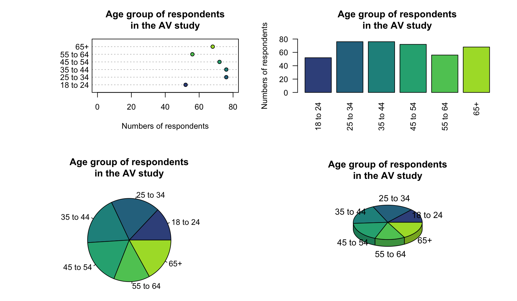
FIGURE 12.1: The age group of respondents in the AV study. All graphs present the same data.
For dot charts:
- place the qualitative variable on the horizontal or vertical axis (and label with the levels of the variable).
- use counts or percentages on the other axis.
- for nominal data, think about the most helpful order for the levels.
The axis displaying the counts (or percentages) should start from zero, since the distance of the dots from the axis visually implies the frequency of those observations (see Example 17.3).
12.3.2 Bar charts
Bar charts use bars to represent the number (or percentage) of observations in each level. As with dot charts, the levels can be on the horizontal or vertical axis, but placing the level names on the vertical axis often makes for easier reading, and room for long labels.
Example 12.3 (Bar plots) For the AV study in Example 12.1, a bar chart of the age group of respondents is shown in Fig. 12.1 (top right panel).
For bar charts:
- place the qualitative variable on the horizontal or vertical axis (and label with the levels of the variable).
- use counts or percentages on the other axis.
- for nominal data, levels can be ordered any way: think about the most helpful order.
- bars have gaps between bars, as the bars represent distinct categories.
In contrast to bar charts, bars in histograms are butted together (except when an interval has a zero count), as the variable-axis usually represents a continuous numerical scale.
The axis displaying the counts (or percentages) should start from zero, since the height of the bars visually implies the frequency of those observations (see Example 17.3).
12.3.3 Pie charts
In pie charts, a circle is divided into segments proportional to the number in each level of the qualitative variable.
Example 12.4 (Pie charts) For the AV study in Example 12.1, a pie chart of the age group of respondents is shown in Fig. 12.1 (bottom left panel).
Using pie charts may present challenges (see Sect. 17.2.4):
- pie charts only work when graphing parts of a whole.
- pie charts only work when all options are present ('exhaustive').
- pie charts are difficult to use with levels having zero or small counts (see Example 17.3).
- pie charts are difficult to interpret when many categories are present.
- pie charts are hard to read, as humans compare lengths (bar and dot charts) better than angles (pie charts) (Friel, Curcio, and Bright 2001).
Example 12.5 (Pie chart unsuitable) Consider studying the percentage of people who use Firefox, Chrome, and Safari as web browsers. A pie chart is not suitable for displaying the data, as people can use more than one of these browsers (i.e., the options are not mutually exclusive) nor exhaustive (i.e., other options exist).
12.3.4 Comparing dot, bar and pie charts
In the pie chart (Fig. 12.1, bottom left panel), determining which age groups have the fewest and most respondents is hard. The equivalent bar chart or dot chart makes the comparison easy. The tilted pie chart makes this comparison even harder (Fig. 12.1, bottom right panel).
Recall that the purpose of a graph is to display the information in the clearest, simplest possible way, to facilitate understanding the message(s) in the data. A pie chart often makes the message hard to see (Siegrist 1996).
12.4 Numerical summary: proportions and percentages
Qualitative data can be summarised numerically by using the proportion or percentage of individuals in each level. These can be given instead of, or with, the counts (Tables 12.1 and 12.2).
Definition 12.1 (Proportion) A proportion is a fraction out of a total, and is a number between \(0\) and \(1\).
Definition 12.2 (Percentages) A percentage is a proportion, multiplied by \(100\). In this context, percentages are numbers between \(0\)% and \(100\)%.
Population proportions are almost always unknown. Instead, the population proportion (the parameter), denoted \(p\), is estimated by a sample proportion (a statistic), denoted by \(\hat{p}\).
The symbol \(\hat{p}\) is pronounced 'pee-hat', and refers to a sample proportion. The caret above the \(p\) is called a 'hat'.
As always, only one possible sample is studied. Statistics are estimates of parameters, and the value of the statistic is not the same for every possible sample.
Example 12.6 (Proportions and percentages) Consider the AV data in Table 12.1, summarising results from a sample of \(n = 400\) respondents. The sample proportion of respondents aged \(25\) to \(34\) is \(76\div 400\), or \(0.19\). The sample percentage of respondents aged \(25\) to \(34\) is \(0.19 \times 100\), or \(19\)%, as in the table.
12.5 Numerical summary: odds
For the AV data in Table 12.1, the number of females is slightly larger than the number of males. Specifically, the ratio of females to males is \(204\div 196 = 1.04\); that is, there are \(1.04\) times as many females as males. This value of \(1.04\) is the odds that a respondent is female in the sample. An alternative interpretation is that there are \(1.04\times 100 = 104\) females for every \(100\) males in the sample.
While proportions and percentages are computed as the number of results of interest divided by the total number, the odds are computed as the number of results of interest divided by the remaining number (Fig. 12.2).
Definition 12.3 (Odds) The odds are the number (or proportion, or percentage) of results of interest, divided by the remaining number (or proportion, or percentage) of results: \[ \text{Odds} = \frac{\text{Number of results of interest}}{\text{Remaining number of results}} \] or (equivalently) \[ \text{Odds} = \frac{\text{Proportion of results of interest}} {\text{Remaining proportion of results}} = \frac{\text{Percentage of results of interest}} {\text{Remaining percentage of results}}. \] The odds are how many times the result of interest occurs compared to the number of times the results of interest does not occur.
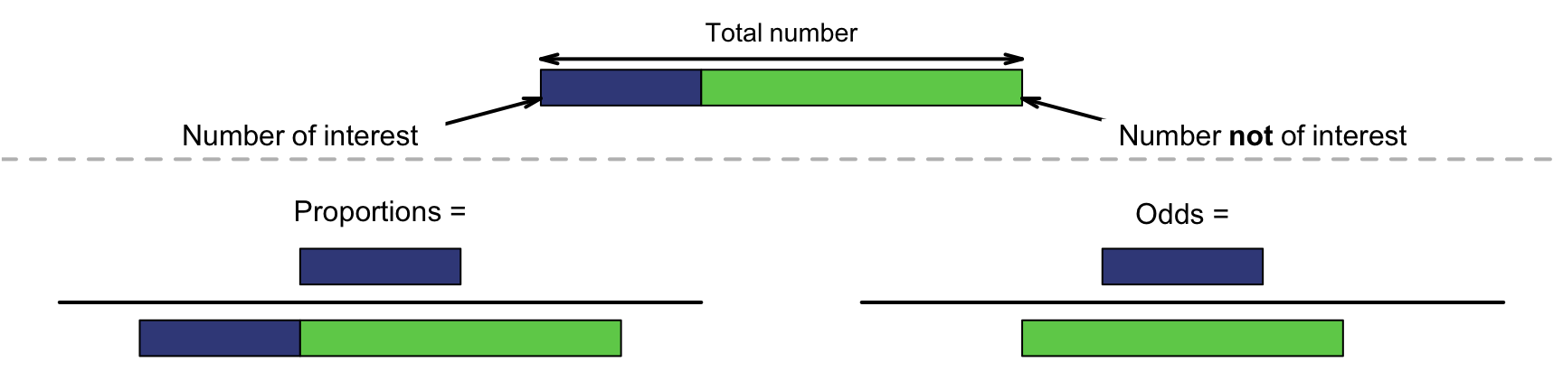
FIGURE 12.2: Proportions (left) are the number of interest divided by the total number. Odds (right) are the number of interest divided by the rest.
Example 12.7 (Interpreting odds) The AV data (Table 12.1) includes \(204\) females and \(196\) males. The odds that a respondent is female is \(1.04\). The odds are greater than one, as there are more females than males. Alternatively, there are \(104\) females for every \(100\) males.
The odds that a respondent is male is \(196/204 = 0.96\); there are \(0.96\) times the number of males as females. The odds are less than one, as there are fewer males than females. Alternatively, there are \(96\) males for every \(100\) females.
When interpreting odds:
- odds greater than \(1\) mean the result of interest is more likely to happen than not.
- odds equal to \(1\) mean the result of interest is equally likely to happen as not.
- odds less than \(1\) mean the result of interest is less likely to happen than not.
Example 12.8 (Odds and percentages) Consider the AV data in Table 12.1, summarising results from a sample of \(n = 400\) respondents.
The percentage of respondents aged \(18\) to \(24\) is \(52/400\times 400 = 13\)%. The odds that a respondent is aged \(18\) to \(24\) is \(52/(400 - 52) = 0.15\). This means the number of respondents aged \(18\) to \(24\) is \(0.15\) times (i.e., less then) the number of respondents aged over \(24\).
The odds that a respondent is aged \(18\) to \(54\) is \((52 + 76 + 76 + 72)/(56 + 68) = 2.23\). This means the number of respondents aged \(18\) to \(54\) is \(2.23\) times (i.e., greater than) the number of respondents aged \(55\) or over.
The population odds (the parameter) are almost always unknown, and are estimated by the sample odds (the statistic). No symbol is commonly used to denote odds.
Take care: proportions and odds are similar, but are different ways of numerically summarising quantitative data (Fig. 12.2).
12.6 Describing the distribution: modes and medians
Graphs are constructed to help readers understand the data, so any important features in the graph should be described. One simple way is to identify the level (or levels) with the most observations. This is called the mode.
Definition 12.4 (Mode) A mode is the level (or levels) of a qualitative variable with the most observations.
Example 12.9 (Modes) Consider the data in Tables 12.1 and 12.2:
- the mode for gender is 'Female' (with \(204\) respondents, or \(51\)%).
- the mode age groups are \(25\) to \(34\) and \(35\) to \(44\) (each with \(19\) respondents, or \(4.8\)%).
- the modal response to the question about driving near AVs is 'Somewhat safe'.
- the modal response to the question about cycling near AVs is 'Somewhat unsafe'.
- the modal response to the question about walking near AVs is 'Neutral'.
Medians can be found for ordinal data (but not nominal data), since ordinal data have levels with a natural order. The median is the level in which the middle response is located, when the levels from all individuals are placed in order. The sample median estimates the unknown population median.
Medians can be used to summarise quantitative data and ordinal data, but never nominal data.
Example 12.10 (Medians) Consider the data in Tables 12.1 and 12.2. 'Gender' is nominal qualitative, so medians are not appropriate. However, the other variables are ordinal, so medians could be used to describe each variable. Since \(n = 400\), the median response will be halfway between the location of the \(200\)th and \(201\)st response when ordered:
- the median age group is \(35\) to \(44\).
- the median response to the driving-near-AVs question is 'Neutral'.
- the median response to the cycling-near-AVs question is 'Neutral'.
- the median response to the walking-near-AVs question is 'Neutral'.
For each variable, ordered observations \(200\) and \(201\) both fall into the indicated level.
Importantly, all these numerical quantities are computed from a sample (i.e., are statistics; Def. 11.3), even though the whole population is of interest (i.e., the parameter; Def. 11.2).
Means (Sect. 11.6.1) are generally not suitable for numerically summarising qualitative data. However, ordinal data may be numerically summarised like quantitative data in rare and very special circumstances. Means may be appropriate if both of these are true:
- the levels are considered equally spaced.
- assigning a number to each level is appropriate (for example, using a mid-point for numerical age groups).
We will not consider means for ordinal data further.
12.7 Numerical summary tables
Qualitative variables should be summarised in a table. The table should include, as a minimum, numbers and/or percentages for each level. While useful in other contexts (see Chap. 15), odds are usually not given in the summary table. Examples are shown in Tables 12.1 and 12.2, and in the next section.
12.8 Example: water access
López-Serrano et al. (2022) recorded data about access to water for three rural communities in Cameroon (see Sect. 11.10). Numerous qualitative variables are recorded; some are displayed in Fig. 12.3, and summarised in Table 12.3. Notice that the levels of the two ordinal variables are displayed in their natural order.
The distance to the nearest water source is usually less than \(1\,\text{km}\), and the wait is often over \(15\,\text{mins}\). The most common water source (i,e., the mode) is a bore (\(68.6\)%). The median (and mode) distance to the water source was \(100\,\text{m}\) to \(1000\,\text{m}\); the median wait time was \(5\) to \(15\,\text{mins}\) (the mode wait time was under \(5\,\text{mins}\)).
| Number | % | Odds | |
|---|---|---|---|
| Distance to water source | |||
| Under \(100\,\text{m}\) | \(55\) | \(45.5\) | \(0.83\) |
| \(100\,\text{m}\) to \(1000\,\text{m}\) | \(57\) | \(47.1\) | \(0.89\) |
| Over \(1000\,\text{m}\) | \(\phantom{0}9\) | \(\phantom{0}7.4\) | \(0.08\) |
| Wait time at water source | |||
| Under \(5\,\text{mins}\) | \(50\) | \(41.7\) | \(0.71\) |
| \(5\) to \(15\,\text{mins}\) | \(28\) | \(23.3\) | \(0.30\) |
| Over \(15\,\text{mins}\) | \(42\) | \(35.0\) | \(0.54\) |
| Water source | |||
| Tap | \(\phantom{0}7\) | \(\phantom{0}5.8\) | \(0.06\) |
| Bore | \(83\) | \(68.6\) | \(2.18\) |
| Well | \(16\) | \(13.2\) | \(0.15\) |
| River | \(15\) | \(12.4\) | \(0.14\) |
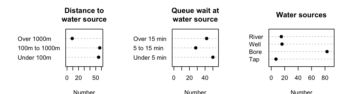
FIGURE 12.3: The distance to the water source (left), the wait time at the water source (centre), and the water sources (right) for the water-access study.
12.9 Chapter summary
Qualitative data can be graphed with a dot chart, bar chart or (in special circumstances) pie chart. Qualitative data can be described using the mode or (for ordinal data only) a median. Qualitative data can be numerically summarised using proportions, percentages or odds.
12.10 Quick review questions
Are the following statements true or false?
- Nominal data can be summarised using a median.
- Ordinal data can be summarised using a mode.
- Odds are the ratio of how often a result of interest occurs, to how often it does not occur.
- Proportions and percentages are the same.
12.11 Exercises
Answers to odd-numbered exercises are given at the end of the book.
Exercise 12.1 A study of spider monkeys (C. A. Chapman 1990) examined the types of social groups present (Table 12.4).
- Construct a suitable plot, and explain what the data reveal.
- Determine, if appropriate, the median and mode social group.
| Social group | Number |
|---|---|
| Solitary | \(\phantom{0}8\) |
| All males | \(\phantom{0}3\) |
| Female + no young | \(\phantom{0}2\) |
| Mixed young | \(15\) |
| Mixed + no young | \(\phantom{0}1\) |
| One female + offspring | \(23\) |
| Many females + offspring | \(48\) |
Exercise 12.2 Czarniecka-Skubina et al. (2021) studied how Poles prepared and consumed coffee using a sample of \(1\,500\) Poles. Some data are shown in Table 12.5.
- Classify the variables as quantitative, nominal or ordinal.
- Sketch appropriate graphs for the three variables.
- Summarise the three variables.
- Where appropriate, compute the median and mode for each variable.
| Where consumed | |
| Home | 1432 |
| Canteen | 687 |
| Cafe | 922 |
| Others' homes | 994 |
| Work | 1196 |
| Brewing temperature | |
| 748 | |
| 269 | |
| 453 | |
| Unknown | 30 |
| Brewing time | |
| Under \(3\) mins | 226 |
| About \(3\) mins | 267 |
| About \(4\) mins | 114 |
| About \(5\) mins | 82 |
| About \(6\) mins | 30 |
| Unknown | 781 |
Exercise 12.3 Henderson and Velleman (1981) recorded the number of cylinders in many models of cars: eleven cars had four cylinders, seven cars had six cylinders, and fourteen cars had eight cylinders. The number of cylinders is quantitative discrete, but with so few different values, the data could be plotted with a graph used for qualitative data. For these data:
- Produce a dot chart.
- Produce a histogram.
- Produce a bar chart.
- Produce a pie chart.
What graph do you think is best? Why?
Exercise 12.4 A survey of voice assistants (such as Amazon Echo; Google Home; etc.) conducted by Nielsen asked respondents to indicate how they used their voice assistant. The options were:
- listening to music;
- listen to news;
- use alarms, timer;
- search for real-time information (e.g., traffic; weather);
- search for factual information (e.g., trivia; history);
- chat with voice assistant for fun.
Respondents could select all options that applied. What would be the best graph for displaying respondents answers? Would a pie chart be suitable? Explain your answer.
Exercise 12.5 Gębski et al. (2019) studied the taste of bread with varying salt and fibre content. Information was recorded from \(300\) subjects, including the subjects' responses to the statement 'Rolls with lower salt content taste worse than regular ones', on a five-point ordinal scale from 'Strongly Agree' to 'Strongly Disagree'; see Table 12.6.
- Identify the variables, then classify them as nominal or ordinal.
- For which variables is a mode an appropriate summary (if any)?
- For which variables is a median an appropriate summary (if any)?
- Compute the above statistics where appropriate.
- Compute and interpret the odds of a respondent coming from a city background.
- Compute and interpret the odds of a respondent agreeing or strongly agreeing with the statement.
- Compute and interpret the odds of a respondent being male.
| Number | Percentage | |
|---|---|---|
| Gender | ||
| Female | \(150\) | \(50\) |
| Male | \(150\) | \(50\) |
| Place of residence | ||
| Rural | \(49\) | \(16\) |
| City up to \(20\, 000\) residents | \(38\) | \(13\) |
| City \(20\, 000\) to \(100\, 000\) residents | \(83\) | \(28\) |
| City more than \(100\, 000\) residents | \(130\) | \(43\) |
| Response to statement | ||
| Strongly agree | \(30\) | \(10\) |
| Agree | \(84\) | \(28\) |
| Neutral | \(78\) | \(26\) |
| Disagree | \(66\) | \(22\) |
| Strongly disagree | \(42\) | \(14\) |
Exercise 12.6 López-Serrano et al. (2022) asked \(231\) farmers what they considered to be the advantages and disadvantages of using reclaimed water on the farm. The responses are shown in Table 12.7 (not all farmers responded).
- Produce two bar charts to display the data.
- Produce two dot charts to display the data.
- Produce two pie charts to display the data.
- Determine the mode for both the advantages and disadvantages.
- Compute the percentages for both the advantages and disadvantages.
- Compute the odds of a farmer stating 'high price' as a disadvantage, among all farmers.
- Compute the odds of a farmer stating 'high price' as a disadvantage, among farmers who listed a disadvantage.
- What is the difference in the meaning of the last two statements?
|
|
Exercise 12.7 Henning, Ferreira Schubert, and Ceccatto Maciel (2020) studied \(284\) university students in Joinville, Brazil, tabulating how students got to campus (Table 12.8; each student could select one option only).
- What is the mode type of active transport? What about motorised transport?
- What is the mode type of transport overall?
- Are medians appropriate? If so, compute the median for active transport types, and motorised transport types.
- Compute the proportions for each option, out of the total sample.
- Compute the odds that a randomly-chosen student uses motorised transport to get to campus. Explain what this means.
- Compute the odds that a student walks to campus. Explain what this means.
- Construct appropriate plots to display the data.
| Number | |
|---|---|
| Active | |
| Bicycle | \(\phantom{0}29\) |
| Walking | \(\phantom{0}35\) |
| Motorised | |
| Car | \(\phantom{0}70\) |
| Bus | \(117\) |
| Other | \(\phantom{0}33\) |
Exercise 12.8 [Dataset: BabyBoom]
Figure 11.2
shows the gender of \(44\) babies born in a hospital on one day (P. K. Dunn 1999; Steele 1997).
The data are given in the order in which the births occurred.
- What is the mode sex?
- If appropriate, compute the median sex.
- Compute the percentages for each sex.
- Compute the odds that a randomly-chosen baby from the sample is female. Explain what this means.
- Construct appropriate plots to display sex of the baby.
Exercise 12.9 [Dataset: LungCap]
Tager et al. (1979) studied the lung volume of \(654\) children in East Boston in the 1970s (Table 12.9).
- Construct suitable plots for all variables.
- For each qualitative variable, determine the mode.
- For each qualitative variable, compute the percentage and odds of one of the levels occurring in the data.
- Compute appropriate statistics for each quantitative variable.
| Age | FEV | Height | Gender | Smoking |
|---|---|---|---|---|
| \(3\) | \(1.072\) | \(46\) | F | No |
| \(4\) | \(0.839\) | \(48\) | F | No |
| \(4\) | \(1.102\) | \(48\) | F | No |
| \(4\) | \(1.389\) | \(48\) | F | No |
| \(4\) | \(1.577\) | \(49\) | F | No |
| \(4\) | \(1.418\) | \(49\) | F | No |
Exercise 12.10 Swinnen et al. (2018) studied the influence of using ankle-foot orthoses in children with cerebral palsy. The data in Table 10.3 give the data for the \(15\) subjects. (Gmfcs is the Gross Motor Function Classification System) used to describe the impact of cerebral palsy on their motor function; where lower levels mean better functionality.)
- Construct suitable plots for all variables.
- For each qualitative variable, determine the mode.
- For each qualitative variable, compute the percentage and odds of one of the levels occurring in the data.
- Compute appropriate statistics for each quantitative variable.