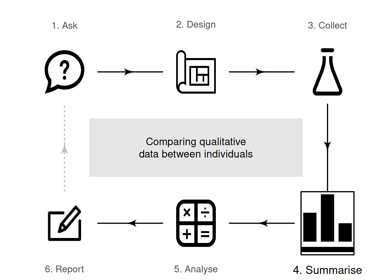
15 Comparing qualitative data between individuals
So far, you have learnt to ask an RQ, design a study, collect the data, describe the data and summarise the data. In this chapter, you will learn to:
- compare qualitative data between groups of individuals using the appropriate graphs.
- compare qualitative data between groups of individuals using the difference in proportions, odds ratios and summary tables.
15.1 Introduction
Relational RQs compare groups. This chapter considers how to compare qualitative variables in different groups. Graphs are useful for this purpose, and a table including odds, odds ratios and proportions is usually produced also.
15.2 Two-way tables
When more than one qualitative variable is recorded for each individual, the data can be collated into a table. When two qualitative variables are cross-tabulated, the resulting table is called a two-way table. The categories for each variable should be exhaustive (cover all levels) and mutually exclusive (observations belong to one and only one level). Usually, the levels of the explanatory variable are in the rows of the table.
Example 15.1 (Two-way tables) To compare two treatments for kidney stones, Charig et al. (1986) collected data from \(700\) UK patients on two qualitative variables:
- the treatment method ('A' or 'B'), the explanatory variable.
- the result of the procedure ('success' or 'failure'), the response variable.
Both variables are qualitative with two levels, and each treatment was used on \(350\) patients. Treatment A was used from 1972--1980, and Treatment B from 1980--1985; that is, treatments were not randomly allocated, and so confounding may be present. For this reason, the researchers also recorded the size of the kidney stone ('small' or 'large') as one possible confounding variable. Firstly, consider just the small stones (Julious and Mullee 1994), displayed in the two-way table in Table 15.1.
| Success | Failure | Total | |
|---|---|---|---|
| Method A | \(\phantom{0}81\) | \(\phantom{0}6\) | \(\phantom{0}87\) |
| Method B | \(234\) | \(36\) | \(270\) |
| Total | \(315\) | \(42\) | \(357\) |
15.3 Summary tables by rows and columns
Each variable in a two-way table can be analysed separately, using percentages or proportions (Sect. 12.4) or odds (Sect. 12.5). For example, the two variables in Table 15.1 (Method; Result) can be analysed separately. For overall results:
- the proportion of procedures that were successful is \(315/357 = 0.882\) (or \(88.2\)%).
- the odds that a procedure was successful is \(315/42 = 7.5\); that is, there were \(7.5\) times as many successful procedures as unsuccessful procedures.
However, to compare Methods A and B, the proportions (or percentages) and odds of successful results need to be computed for each row separately.
Example 15.2 (Small kidney stones) The data in Table 15.1 can be summarised by computing proportions or percentages by row. Each row refers to a different method, so row percentages will compute success percentages for the two methods.
For the small kidney stones (Table 15.1), the row percentages (Table 15.2 give the percentage of successes for each Method, since the rows represent the counts for Methods A and B. Row proportions (or percentages) allow the proportions (or percentages) within the rows (i.e., for each Method) to be compared:
- with Method A, \(81 \div 87 = 0.931\) (or \(93.1\)%) of operations in the sample were successful.
- with Method B, \(234\div 270 = 0.867\) (or \(86.7\)%) of operations in the sample were successful.
For small kidney stones, Method A is slightly more successful (\(93.1\)%) than Method B (\(86.7\)%) in the sample. These percentages are collated in Table 15.2.
Odds can also be computed:
- with Method A, the odds of success is \(81\div6 = 13.5\); there are \(13.5\) times as many successful procedures than failures for Method A.
- with Method B, the odds of success is \(234\div36 = 6.5\); there are \(6.5\) times as many successful procedures than failures for Method B.
The odds of a success is far greater for Method A than Method B in the sample.
| Success | Failure | Total | |
|---|---|---|---|
| Method A | \(93.1\) | \(6.9\) | \(100.0\) |
| Method B | \(86.7\) | \(13.3\) | \(100.0\) |
| Success | Failure | |
|---|---|---|
| Method A | \(25.7\) | \(14.3\) |
| Method B | \(74.3\) | \(85.7\) |
| Total | \(100.0\) | \(100.0\) |
Rather than comparing methods (in the rows), the procedure results can be compared (i.e., the columns).
Example 15.3 (Comparing by column) For the small kidney stones (Table 15.1), the column percentages (Table 15.3 give the percentage of successes within each column (i.e., for successes and for failures), since the columns contain the procedure results. Column percentages (or proportions) allow the percentages (or proportions) within columns to be compared:
- the proportion of the successful procedures from Method A is \(81 \div 315 = 0.257\) (or \(25.7\)%).
- the proportion of the failed procedures from Method A is \(234\div 315 = 0.143\) (or \(14.3\)%).
Odds can also be computed:
- the odds of a success coming from Method A is \(81/234 = 0.346\); there are \(0.346\) times as many Method A procedures than Method B procedures among the successes.
- the odds of failure coming from Method A is \(6/36 = 0.167\); there are \(0.167\) times as many Method A procedures than Method B procedures among the failures.
The odds of a success being a Method A procedure is quite different from the odds of a success being a Method B procedure.
Comparing rows (i.e., using row percentages and row odds) seems more intuitive than column proportions here: they compare the success percentages and odds for each method.
15.4 Graphs for the comparison
When a qualitative variable is compared across different groups (i.e., comparing between individuals), options for plotting include:
- stacked bar charts (Sect. 15.4.1).
- side-by-side bar charts (Sect. 15.4.2).
- dot charts (Sect. 15.4.3).
15.4.1 Stacked bar charts
The data can be graphed by using a bar for each level of one variable, and stacking the bars for the levels of the second variable. Bars indicate the counts (or percentages) in each category. The levels can be on the horizontal or vertical axis, but placing the level names on the vertical axis often makes for easier reading, and room for long labels.
The axis displaying the counts (or percentages) should start from zero, since the height of the bars visually implies the frequency of those observations (see Example 17.3).
Example 15.4 (Stacked bar charts) For the small kidney-stone data in Example 15.1, a stacked bar chart can be created by producing a bar for each method, and stacking the successes and failures for each method (Fig. 15.1, top left panel).
Rather than using numbers, the percentages separately within each group can be used too (Fig. 15.1, bottom left panel). This makes comparing the relative proportions easier.
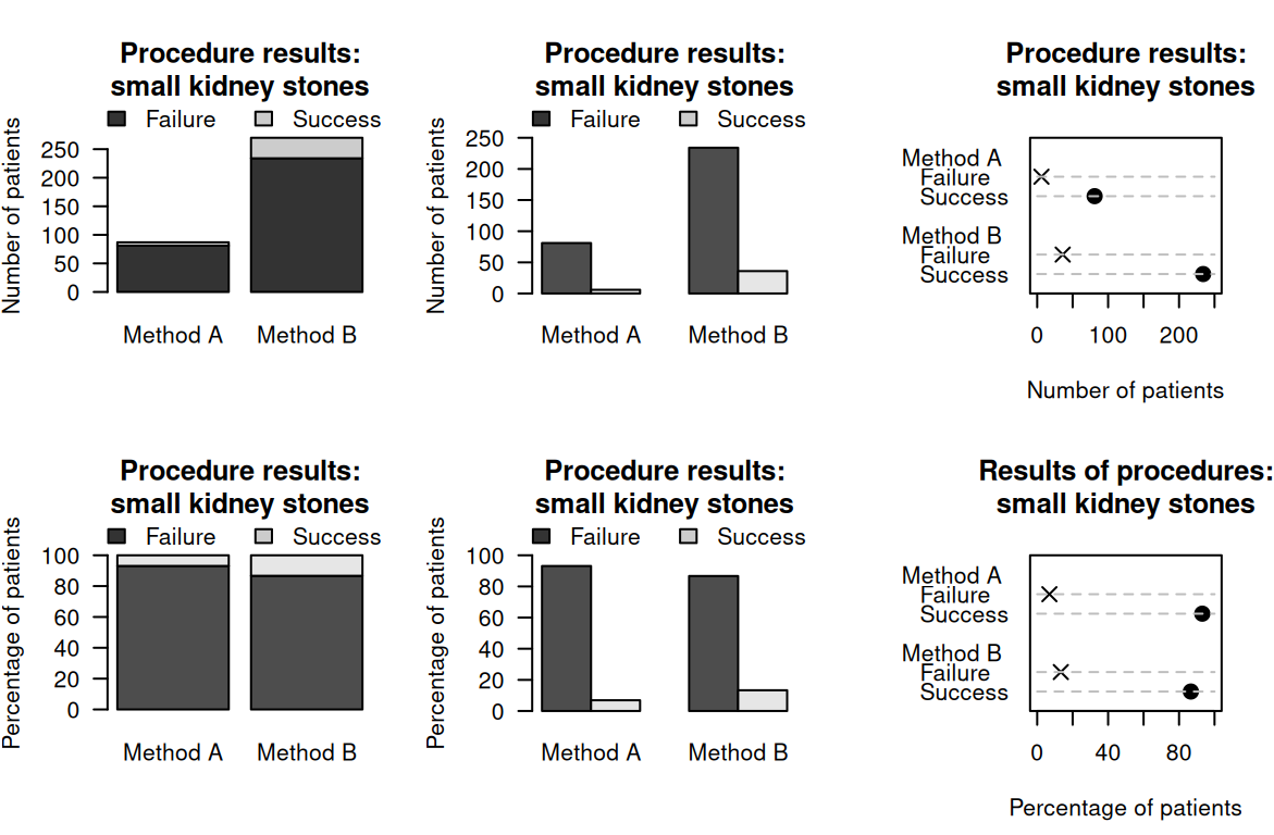
FIGURE 15.1: Six plots for the small kidney-stone data. Top plots: displaying the numbers for each method. Bottom plots: displaying the percentages for each method. Left: stacked bar chart. Centre: side-by-side bar charts. Right: dot charts.
15.4.2 Side-by-side bar charts
Instead of stacking the success and failures bars on top of each other, these bars can be placed side-by-side for each method. Bars indicate the counts (or percentages) in each category. The levels can be on the horizontal or vertical axis, but placing the level names on the vertical axis often makes for easier reading, and room for long labels.
The axis displaying the counts (or percentages) should start from zero, since the height of the bars visually implies the frequency of those observations (see Example 17.3).
Example 15.5 (Side-by-side bar charts) For the small kidney-stone data in Example 15.1, a side-by-side bar chart can be created by producing two bars for each method (one for failures; one for successes), and placing these side-by-side (Fig. 15.1, centre panels). Again, numbers or percentages within each method can be graphed.
15.4.3 Dot charts
Instead of bars, dots (or other symbols) can be used in place of the bars in a side-by-side bar chart to create a dot chart.
The axis displaying the counts (or percentages) should start from zero, since the distance of the dots from the axis visually implies the frequency of those observations (see Example 17.3).
15.4.4 Other variations
Many variations of these charts are possible, by making different choices:
- using a stacked bar chart, side-by-side bar chart, or dot chart.
- using percentages or counts on one axis. (The percentages can be percentages of the total, or within the total for each level of the variable, as in the bottom plots in Fig. 15.1.)
- using the counts (or percentage) on either the horizontal or vertical axis.
- deciding which variable can be used as the first division of the data.
The guiding principle remains: the purpose of a graph is to display the information in the clearest, simplest possible way, to facilitate understanding the message(s) in the data.
Using a computer to create graphs is recommended, and using a computer makes it easy to try different variations to find the graph that best displays the message in the data.
15.5 Numerical summary: difference between proportions
The difference between the success-rates of the two methods for the small kidney-stone data (Table 15.1) can be summarised using the difference between the respective proportions:
- for Method A, the sample proportion of successful procedures is \(\hat{p}_A = 0.931\).
- for Method B, the sample proportion of successful procedures is \(\hat{p}_B = 0.867\).
The difference between these proportions is \(\hat{p}_A - \hat{p}_B = 0.064\) (i.e., the success rate is higher for Method A). The difference between the proportions is a statistic, and the (unknown) difference between the population proportions (i.e., \(p_A - p_B\)) is a parameter.
15.6 Numerical summary: odds ratios
The small kidney-stone data (Table 15.1) also can be summarised using the odds of success for each method:
- for Method A, the odds of success are \(13.5\) (\(13.5\) times as many successes as failures).
- for Method B, the odds of success are \(6.5\) (\(6.5\) times as many successes as failures).
The odds of success for Method A and Method B are very different. In the sample, the odds of success for Method A is many times greater than for Method B. In fact, in the sample, the odds of success for Method A is \(13.5\div 6.5 = 2.08\) times the odds of a success for Method B. This value is the odds ratio (OR). The sample OR is a statistic, and the (unknown) population OR is a parameter. There is no commonly-used symbol for odds ratios.

Definition 15.1 (Odds Ratio (OR)) The odds ratio (often written OR) is the ratio of the odds of a result of interest in one group, compared to the odds of the same result in a different group: \[ \text{Odds ratio (OR)} = \frac{\text{Odds of a result in Group A}} {\text{Odds of the same result in Group B}}. \]
Example 15.7 (Odds ratios) For the small kidney-stone data, the odds of a success for Method A is \(81\div6 = 13.5\). The odds of a success for Method B is \(234\div 36 = 6.5\). The OR is then computed as \(13.5\div 6.5 = 2.08\). The odds have been computed with the rows.
This means that the odds of a success for Method A is about \(2.08\) times the odds of a success for Method B.
Most software computes the OR from a two-way table by using the values in the first row and first column on the top of the fractions when computing the odds and the odds ratio. In Example 15.7, for instance, the odds for both methods were computed with the Column 1 values on the top of the fraction (\(81\) and \(234\)), and the OR comparing the rows was computed with the Row 1 odds (\(13.5\)) on top of the fraction.
However, the OR could also be computed using the odds within the columns (i.e., comparing the columns), rather than within the rows.
The OR can be interpreted in either of these ways (i.e., both are correct):
- the odds in each column compares Row 1 counts (top) to Row 2 counts (bottom). The OR then compares the Column 1 odds (top) to the Column 2 odds (bottom).
- the odds in each row compares Column 1 counts to Column 2 counts. The OR then compares the Row 1 odds to the Row 2 odds.
Odds and ORs are computed with the first row and first column values on the top of the fraction. While both are correct, the levels of the explanatory variable are usually the rows of the table (as in Table 15.1), so usually the second interpretation makes more sense (as in Example 15.7).
The OR compares the odds of the same result (e.g., success) in two groups (e.g., Method A and Method B). This means a \(2\times 2\) table can be summarised with one number: the OR.
When interpreting ORs:
- ORs greater than \(1\) mean the odds of the result is larger for the group on top of the fraction compared to the group on the bottom.
- ORs equal to \(1\) mean the odds of the result is the same for both groups (on the top and the bottom of the fraction).
- ORs less than \(1\) mean the odds of the result is smaller for the group on the top of the fraction compared to the group on the bottom.
The following short video may help explain some of these concepts:
The numerical summary information for comparing qualitative variables can be collated in a table. The data should be summarised by one of the qualitative variables, producing proportions (or percentages) and odds for the other. The summary table also requires the differences between the proportions (or percentages) and the odds ratio.
Example 15.8 (Numerical summary table) For the small kidney-stone data, the summary of the data can be tabulated as in Table 15.4, using percentages and odds.
| Percentage success | Odds of success | Sample size | |
|---|---|---|---|
| Method A | \(93.1\) | \(13.500\) | \(\phantom{0}87\) |
| Method B | \(86.7\) | \(\phantom{0}6.500\) | \(270\) |
| Difference: \(\phantom{0}6.4\) | OR: \(\phantom{0}2.08\) |
15.7 Example: large kidney stones

The data in Table 15.1 are for procedures on small kidney stones. Data were also recorded for the large kidney stones (Table 15.5). As for small kidney stones, the success proportions can be computed for both methods:
- for Method A, the success proportion for large kidney stones: \(192/263 = 0.730\).
- for Method B, the success proportion for large kidney stones: \(55/80 = 0.688\).
For large kidney stones, then, Method A has a higher success proportion than Method B, just as with the small kidney stones.
| Success | Failure | Total | |
|---|---|---|---|
| Method A | \(192\) | \(71\) | \(263\) |
| Method B | \(\phantom{0}55\) | \(25\) | \(\phantom{0}80\) |
So, could the data for small (Table 15.1) and large kidney stones (Table 15.5) be combined, to produce a single two-way table of just Method and Result (Table 15.6)? From this table of small and large stones combined:
- for Method A, the success proportion for all kidney stones: \(273/350 = 0.780\).
- for Method B, the success proportion for all kidney stones: \(289/350 = 0.826\).
| Success | Failure | Total | |
|---|---|---|---|
| Method A | \(273\) | \(77\) | \(350\) |
| Method B | \(289\) | \(61\) | \(350\) |
When all kidney stones are combined, Method A has a lower success proportion than Method B. To summarise:
- Method A is more successful for small stones (\(0.931\) vs \(0.867\)).
- Method A is more successful for large stones (\(0.730\) vs \(0.688\)).
- Method B is more successful for all stones combined (\(0.780\) vs \(0.826\)).
That seems strange: Method A performs better for small and for large kidney stones, but Method B performs better when combining all kidney stones. The explanation is that the size of the stone is a confounding variable (Fig. 15.2). Size is associated with both the method (small stones are treated more often with Method B) and with the result (small stones have a higher success proportion for both methods). Method B was used more often on smaller kidney stones, for which a success is more likely (due to their smaller size).
This confounding could have been avoided by randomly allocating a treatment method to patients. However, random allocation was not possible in this observational study, so the researchers used a different method to manage confounding: recording the size of the kidney stones to use in the analysis (see Sect. 7.2).
In this example, incorporating information about a potential confounder (the size of the kidney stone) is important, otherwise the wrong (opposite) conclusion is reached: Method B would be incorrectly considered better if the size of the stones was ignored, when the better method really is Method A.
This is called Simpson's paradox. If the size of the kidney stone had not been recorded, size would be a lurking variable, and the incorrect conclusion would have been reached.
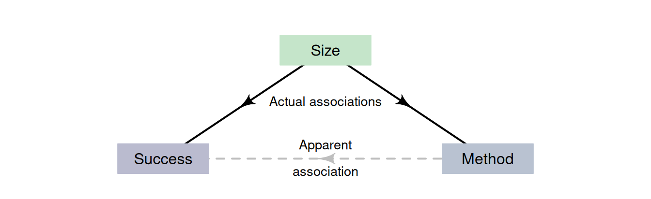
FIGURE 15.2: The size of the stones is associated with the success percentage and method.
15.8 Example: water access
López-Serrano et al. (2022) recorded data about access to water for three rural communities in Cameroon (see Sects. 11.10 and 12.8). The study could be used to determine associations to the incidence of diarrhoea in young children (\(85\) households had children under \(5\)). A cross-tabulation (Table 15.7) shows the relationship with keeping livestock; the numerical summary table (Table 15.8) may suggest a difference in the percentage of children with diarrhoea in households that do and do not keep livestock. The comparison in Fig. 15.3 includes some categories with small sample sizes, so the percentages shown may not be precise estimates of the population values.
As usual, the data come from one of countless possible samples, but the RQ is about the population, so making a definitive decision about the population is difficult.
| No diarrhoea | Diarrhoea | |
|---|---|---|
| Household does not have livestock | \(17\) | \(\phantom{0}3\) |
| Household has livestock | \(42\) | \(23\) |
| Percentage children | Odds children | Sample size | |
|---|---|---|---|
| Household does not have livestock | \(\phantom{0}15.0\) | \(0.176\) | \(20\) |
| Household has livestock | \(\phantom{0}35.4\) | \(0.548\) | \(65\) |
| Difference: \(-20.4\) | OR: \(0.322\) |
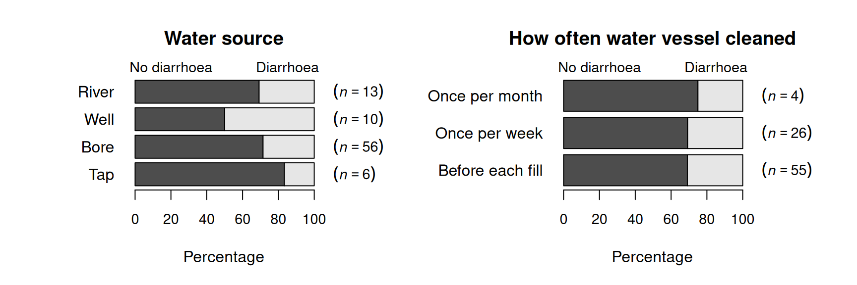
FIGURE 15.3: Percentage of children with and without diarrhoea in the last two weeks, by water source (left) and how often the water vessel was cleaned (right).
15.9 Chapter summary
Qualitative data can be compared between different groups (between-individuals comparisons) using a stacked bar chart, side-by-side bar chart or a dot chart. The data can be displayed in a two-way table, then summarised numerically by comparing proportions (or percentages) and odds. The odds ratio (OR) and the difference between the proportions (or percentages) can be used to compare the two different groups.
15.10 Quick review questions
Alley et al. (2017) examined social media use (Table 15.9), using a representative sample of Queenslanders at least \(18\) years of age (from the \(2013\) Queensland Social Survey).
Are the following statements true or false?
- The sample proportion of urban residents who use social media is \(416/984 = 0.423\).
- The sample proportion of rural residents who use social media is \(89/167 = 0.533\).
- The sample odds of urban residents who use social media is \(416/568 = 0.732\).
- The sample odds of rural residents who use social media is \(78/89 = 0.876\).
- The sample OR of using social media, comparing urban to rural residents is \(1.365/1.141 = 1.196\).
- The sample difference between the proportions using social media, comparing urban to rural residents, is \(0.577 - 0.533 = 0.044\).
| Doesn't use SM | Uses SM | Total | |
|---|---|---|---|
| Urban residents | \(568\) | \(416\) | \(984\) |
| Rural | \(\phantom{0}89\) | \(\phantom{0}78\) | \(167\) |
15.11 Exercises
Answers to odd-numbered exercises are given at the end of the book.
Exercise 15.1 Suppose the sample OR has a value of one. What will be value of the difference between the sample proportions? Explain.
Exercise 15.2 Suppose the sample OR (Row 1 divided by Row 2) has a value smaller than one. Will the difference between the sample proportions (Row 1 minus Row 2) be a positive or a negative value? Explain carefully.
Exercise 15.3 Köchling et al. (2019) studied hangovers and recorded, among other information, when people vomited after consuming alcohol. Table 15.10 shows how many people vomited after consuming beer followed by wine, and how many people vomited after consuming only wine.
- Compute the row proportions. What do these mean?
- Compute the column percentages. What do these mean?
- Compute the overall percentage of drinkers who vomited.
- Compute the sample odds that a wine-only drinker vomited.
- Compute the sample odds that a beer-then-wine drinker vomited.
- Compute the sample OR, comparing the odds of vomiting for wine-only drinkers to beer-then-wine drinkers.
- Compute the sample OR, comparing the odds of vomiting for beer-then-wine drinkers to wine-only drinkers.
- Compute the difference between the sample proportions of people vomiting, comparing beer-then-wine drinkers to wine-only drinkers.
- What do the data suggest about the relationship?
| Beer then wine | Wine only | |
|---|---|---|
| Vomited | \(\phantom{0}6\) | \(\phantom{0}6\) |
| Didn't vomit | \(62\) | \(22\) |
Exercise 15.4 Stirrat (2008) recorded the sex of adult and young wallabies at the East Point Reserve, Darwin. In December 1993, \(91\) males and \(188\) female adult wallabies were recorded, and \(13\) male and \(22\) female young wallabies were recorded.
- Create the two-way table of counts.
- For adult wallabies, what proportion of adult wallabies were males?
- For adult wallabies, what are the odds that a female was observed?
- For young wallabies, what percentage of wallabies were males?
- For young wallabies, what are the odds that a female was observed?
- What is the OR of observing an adult wallaby, comparing females to males?
- What is the difference between the sample proportions of females wallabies, comparing adults to young?
- Create a summary table.
- Sketch a graph to display the data.
- What do the data suggest about the relationship?
Exercise 15.5 [Dataset: EmeraldAug]
The Southern Oscillation Index (SOI) is a standardised measure of the air pressure difference between Tahiti and Darwin, shown to be related to rainfall in some parts of the world (Stone, Hammer, and Marcussen 1996), and especially Queensland, Australia (Stone and Auliciems 1992; P. K. Dunn 2001).
The rainfall at Emerald (Queensland) was recorded for Augusts between 1889 and 2002 inclusive (P. K. Dunn and Smyth 2018), for months when the monthly average SOI was positive and non-positive (zero or negative); see Table 15.11.
- Compute the percentage of Augusts with no rainfall.
- Compute the percentage of Augusts with no rainfall, in Augusts with a non-positive SOI.
- Compute the percentage of Augusts with no rainfall, in Augusts with a positive SOI.
- Compute the odds of no August rainfall.
- Compute the odds of no August rainfall, in Augusts with a non-positive SOI.
- Compute the odds of no August rainfall, in Augusts with a positive SOI.
- Compute the OR of no August rainfall, comparing Augusts with non-positive SOI to Augusts with a positive SOI.
- Interpret this OR.
- Create a summary table.
- Sketch a graph to display the data.
| Non-positive SOI | Positive SOI | |
|---|---|---|
| No rainfall recorded | \(14\) | \(\phantom{0}7\) |
| Rainfall recorded | \(40\) | \(53\) |
Exercise 15.6 Haselgrove et al. (2008) asked boys and girls in Western Australia about back pain from carrying school bags (Table 15.12).
- Compute the percentage of boys reporting back pain from carrying school bags.
- Compute the percentage of girls reporting back pain from carrying school bags.
- Among the boys, compute the odds of reporting back pain from carrying school bags.
- Among the girls, compute the odds of reporting back pain from carrying school bags.
- Compute the odds of a child reporting back pain.
- Compute the OR of reporting back pain, comparing boys to girls.
- Interpret this OR.
- Create a summary table.
- Sketch a graph to display the data.
| Males | Females | |
|---|---|---|
| No back pain | \(330\) | \(226\) |
| Back pain | \(280\) | \(359\) |
Exercise 15.7 Using the information in Table 12.2, create a stacked bar chart to compare the responses to the three questions.
Exercise 15.8 T. C. Russell, Herbert, and Kohen (2009) studied road-kill possums in the northern suburbs of Sydney (Table 15.13).
- Identify the two variables, and classify them as nominal or ordinal.
- Sketch some graphs to display the data.
- What is the main message in the data? What graph shows this best?
| Unknown sex | Male | Female | |
|---|---|---|---|
| Autumn | \(75\) | \(25\) | \(21\) |
| Winter | \(74\) | \(27\) | \(22\) |
| Spring | \(71\) | \(10\) | \(18\) |
| Summer | \(58\) | \(10\) | \(12\) |
Exercise 15.9 The data in Table 15.14 come from a study of Iranian children aged \(6\)--\(18\) years old (Kelishadi et al. 2017).
- Compute the proportion of females who skipped breakfast.
- Compute the proportion of males who skipped breakfast.
- Compute the odds of a female skipping breakfast.
- Compute the odds of a male skipping breakfast.
- Compute the OR comparing the odds of skipping breakfast, comparing females to males.
- Interpret this OR.
- Construct a summary table.
| Skips breakfast | Doesn't skip breakfast | Total | |
|---|---|---|---|
| Females | \(2383\) | \(4257\) | \(6640\) |
| Males | \(1944\) | \(4902\) | \(6846\) |
Exercise 15.10 Yonekura et al. (2020) studied Japanese women and their coffee drinking habits (Table 15.15).
- Compute the proportion of coffee drinkers who are smokers.
- Compute the proportion of non-coffee drinkers who are smokers.
- Compute the odds of a coffee drinker being a smoker.
- Compute the odds of a non-coffee drinker being a smoker.
- Compute the OR comparing the odds of being a smoker, comparing coffee drinkers to non-coffee drinkers.
- Interpret this OR.
- Construct a summary table.
| Smokers | Non-smokers | |
|---|---|---|
| Coffee drinkers | \(10\) | \(66\) |
| Non-coffee drinkers | \(\phantom{0}2\) | \(84\) |
Exercise 15.11 Oostema, Chassee, and Reeves (2018) studied how well emergency dispatchers recognised signs of stroke (Table 15.16).
- Sketch a side-by-side or stacked bar chart to display the data.
- Of the female patients, what percentage had stroke symptoms suspected by the dispatcher?
- Of the male patients, what percentage had stroke symptoms suspected by the dispatcher?
- For female patients, what are the odds they had stroke symptoms suspected by the dispatcher?
- For male patients, what are the odds they had stroke symptoms suspected by the dispatcher?
- What is the OR that a patient had stroke symptoms suspected by the dispatcher, comparing females to males?
- What is the OR that a patient had stroke symptoms suspected by the dispatcher, comparing males to females?
- Construct a numerical summary table.
| Suspected stroke | Missed stroke | |
|---|---|---|
| Female patient | \(97\) | \(67\) |
| Male patient | \(39\) | \(43\) |
Exercise 15.12 Soccer is a unique in that one aspect is 'the purposeful use of the unprotected head for controlling and advancing the ball' (Kirkendall, Jordan, and Garrett 2001). Some researchers suspect that repeatedly 'heading' the ball may impair brain function. Kirkendall, Jordan, and Garrett (2001) studied (p. 157)
...whether long-term or chronic neuropsychological dysfunction (i.e., concussion) was present in collegiate soccer players
Data were collected from \(240\) college students for two variables:
- the student type, where each student was classified as a 'soccer player' (\(63\) students), a 'non-soccer athlete' (\(96\) students), or a 'non-athlete' (\(81\) students).
- the number of head concussions, where each student was asked about the number of head concussions they had experienced; 'zero' (\(158\) students), 'one' (\(45\) students), or 'two or more' (\(37\) students) concussions.
Use the study data (Table 15.17) to answer the following questions.
| 0 | 1 | 2 or more | Total | |
|---|---|---|---|---|
| Soccer players | 45 | 5 | 13 | 63 |
| Non-soccer athletes | 68 | 25 | 3 | 96 |
| Non-athletes | 45 | 15 | 21 | 81 |
| Total | 158 | 45 | 37 | 240 |
- Classify the two variables as nominal or ordinal.
- Compute the percentage of college students in the sample who have received exactly one concussion.
- Among the non-athletes, compute the odds of receiving two or more concussions. Interpret what this means.
- Among the soccer players, compute the odds of receiving two or more concussions. Interpret what this means.
- Compute the OR comparing the odds of a non-athlete player receiving two or more concussions to the odds of a soccer player receiving two or more concussions.
- Create a table of column percentages. What do these tell you?
- Create a table of row percentages. What do these tell you?
- Which one of these tables is probably more sensible, and why?
Exercise 15.13 [Dataset: PremierL]
In the 2019/2020 Premier League season, Chelsea had \(4\) wins from \(10\) games at home, and \(7\) wins from \(11\) wins away from home.
What is the OR of a win (comparing home games and away games)?