Chapter 6 Scatterplots and Correlation
6.1 Univariate Statistics vs Bivariate Statistics
Data Set: Variable \(X\) is ACT composite score; the \(X\) variable will be referred to as the explanatory variable, predictor variable, or independent variable
Variable \(Y\) is the freshman college GPA; the \(Y\) variable will be referred to as the response variable or dependent variable
In statistic, we often want to know if two variables \(X\) and \(Y\) are mathematically related to each other, and eventually if we can form a mathematical model to explain or predict variable \(Y\) based on variable \(X\)
This is a sample of \(n=10\) college students. I have computed the means and standard deviations of both variables. You can do this with a TI calculator: type \(X\) into L1 and \(Y\) into L2 and then go to STAT -> CALC -> 2-VarStats.
| \(X\) | \(Y\) |
|---|---|
| 32 | 4.0 |
| 28 | 3.5 |
| 26 | 1.2 |
| 24 | 3.3 |
| 22 | 3.0 |
| 21 | 2.8 |
| 20 | 2.6 |
| 20 | 2.1 |
| 19 | 3.5 |
| 18 | 2.4 |
## [1] "Variable X (ACT Score)"## mean sd
## 23 4.472136## [1] "Variable Y (GPA)"## mean sd
## 2.84 0.81267736.2 Scatterplots
We will construct a scatterplot with the explanatory variable on the horizontal \(x\)-axis and the response variable on the vertical \(y\)-axis. I will draw by hand on the board, with the TI calculator, and below with my software.
What sort of mathematical model could we use to try to explain the student’s freshman GPA, using their ACT score?
Are there any points that seem to be “outliers”?
6.3 Correlation
A statistic that is commonly used to quantify the strength of a linear relationship between two variables is the correlation coefficient. There are many such coefficients; the most common one, which we will use in this course, is sometimes called Pearson’s correlation coefficient.
If our bivariate data represent an entire population, we use the Greek letter “rho”, \(\rho\), to represent the population correlation as a parameter.
More commonly, our data is a sample and we compute the sample statistic \(r\) as our estimate of the population correlation \(\rho\), similarly to using \(\bar{x}\) to estimate \(\mu\) or \(s^2\) to estimate \(\sigma^2\).
The correlation coefficient has the property that it will always take on a numerical value between \(-1\) and \(+1\). \[-1 \leq r \leq +1\]
\(\pagebreak\)
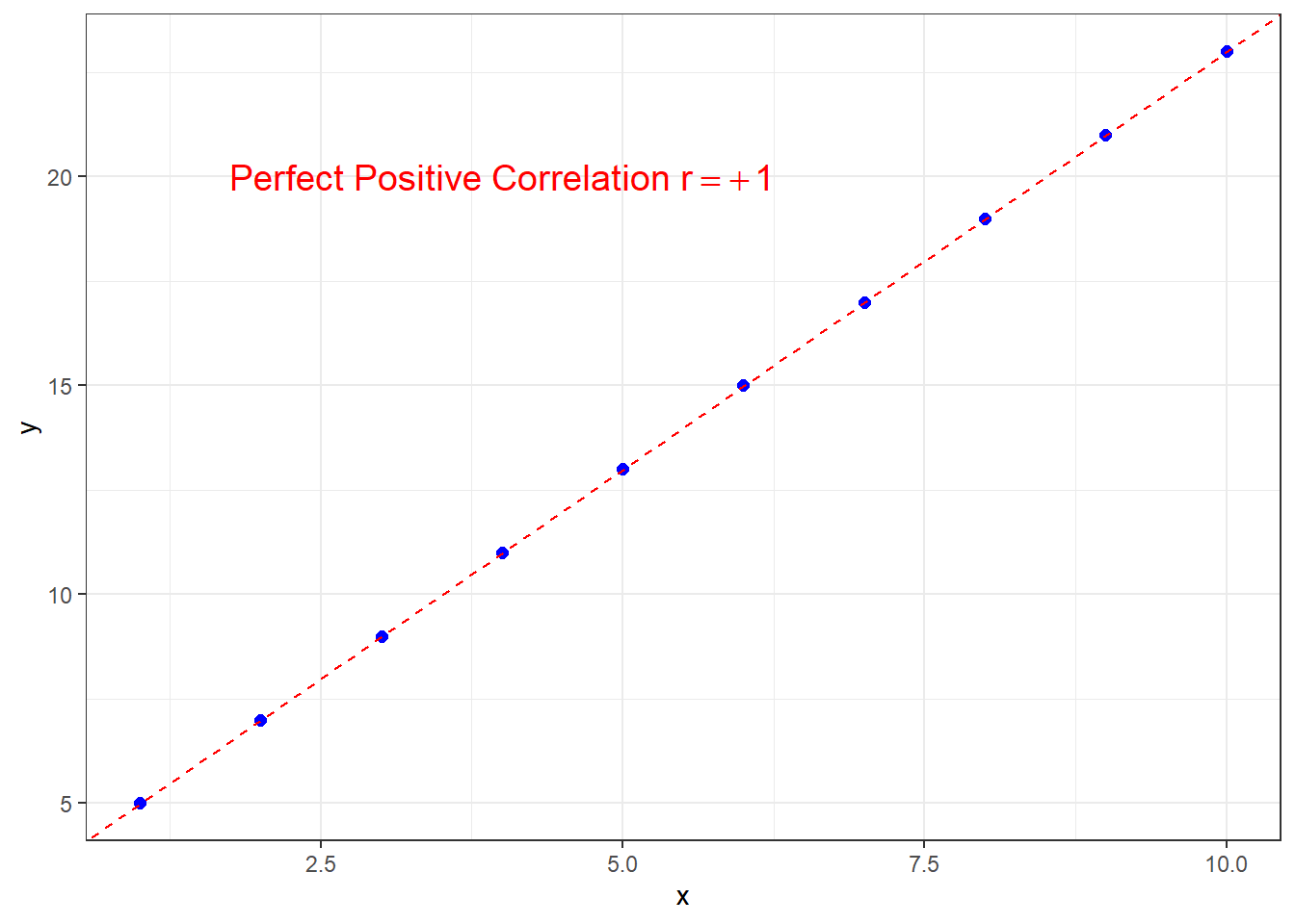
If the correlation is \(r=+1\), this is perfect positive correlation and all points lie exactly on a straight line with positive slope.
\(\pagebreak\)
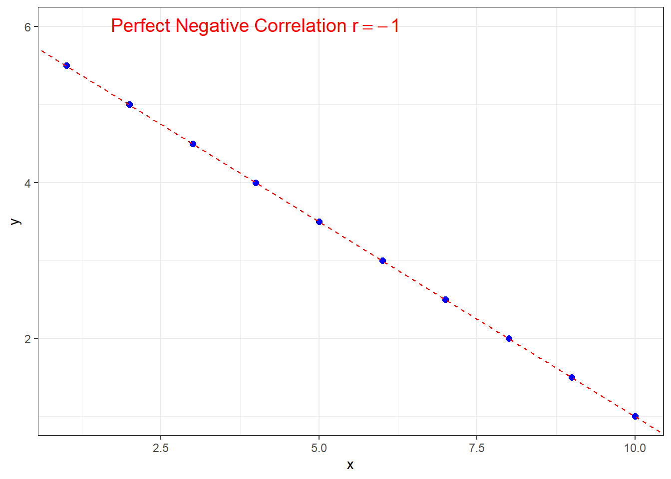
Similarly for \(r=-1\), except the line will have negative slope in order to have perfect negative correlation.
\(\pagebreak\)
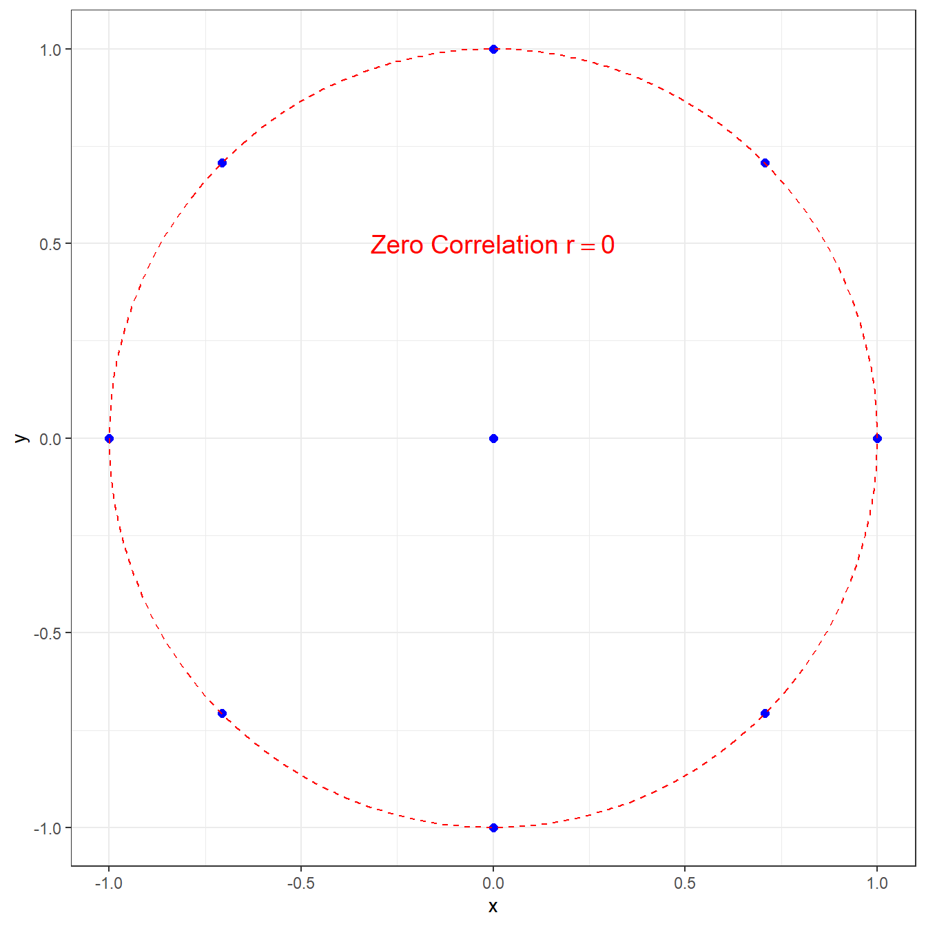
For the correlation to be exactly zero, there must be no linear relationship between the two variables. On the plot, you wouldn’t even be able to tell if the “line of best fit” would have a positive or negative slope.
Note that this does not preclude that there is some nonlinear relationship, such as in this graph with \(r=0\).
Most data sets of interest will have a correlation that is not exactly \(\pm 1\) or \(0\). Generally, we are interested in the magnitude and the direction of a correlation. I will demonstrate some examples from some data sets built into my statistical software package \(R\).
The data set faithful has data from Old Faithful Geyser in Yellowstone National Park. The park rangers use a linear regression model to predict the waiting time until the next eruption, using the length of the previous eruption. The scatterplot below is for \(n=272\) eruptions of this geyser.
If you would like to see a livestream of the geyser (along with a prediction of the next eruption), go to https://www.nps.gov/yell/learn/photosmultimedia/webcams.htm .
\(\pagebreak\)
The correlation is strong and positive, \(r=+0.901\).
##     eruptions waiting
## 1       3.600      79
## 26      3.600      83
## 227     4.083      78
## 231     4.083      70
## 238     4.283      77
## [1] "Length of Eruption (minutes)"## mean sd n
## 3.487783 1.141371 272## [1] "Waiting Time until next eruprtion (minutes)"## mean sd n
## 70.89706 13.59497 272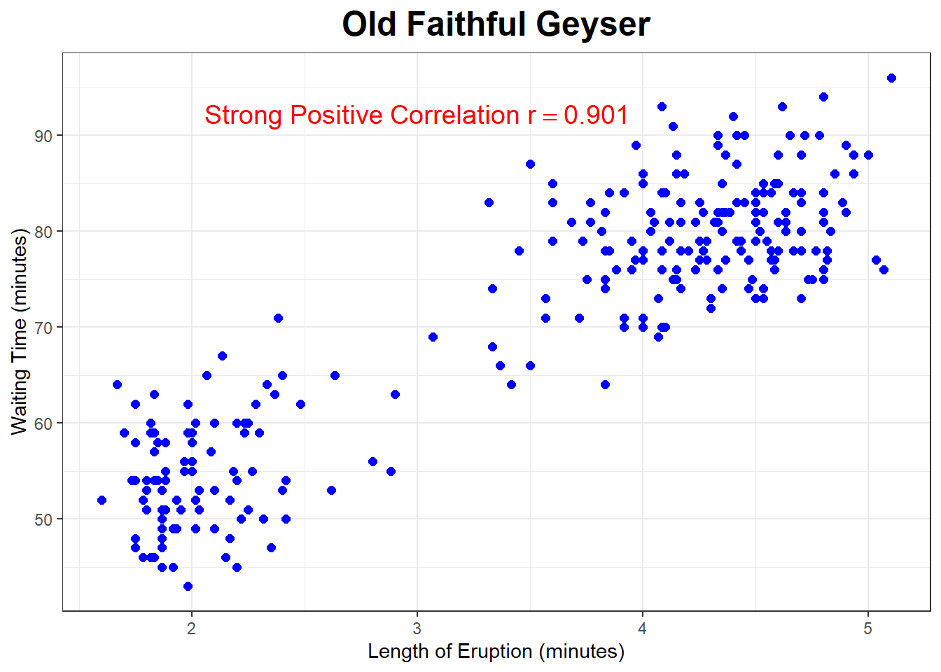
Using data from Motor Trend magazine, below is the scatterplot looking at the relationship between the weight of the vehicle (measured in thousands of pounds) and the gas mileage (measured in miles per gallon) for a sample of \(n=32\) cars.
What sort of correlation do you expect?
\(\pagebreak\)
##                 mpg cyl  disp  hp drat    wt qsec vs am gear carb
## Merc 230       22.8   4 140.8  95 3.92 3.150 22.9  1  0    4    2
## Toyota Corolla 33.9   4  71.1  65 4.22 1.835 19.9  1  1    4    1
## Ford Pantera L 15.8   8 351.0 264 4.22 3.170 14.5  0  1    5    4
## Maserati Bora  15.0   8 301.0 335 3.54 3.570 14.6  0  1    5    8
## Volvo 142E     21.4   4 121.0 109 4.11 2.780 18.6  1  1    4    2
## [1] "Weight of Vehicle (thousands of pounds"## mean sd n
## 3.21725 0.9784574 32## [1] "Gas Mileage (miles per gallon)"## mean sd n
## 20.09062 6.026948 32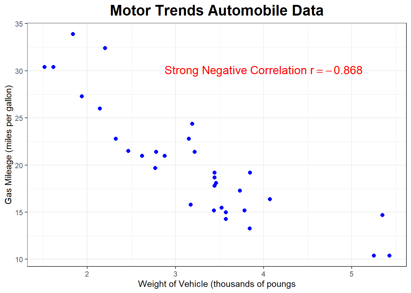
The correlation is negative and strong, with \(r=-0.868\).
The scatterplot below shows the relationship between wind speed (miles per hour) and ozone level in the air (parts per billion) in New York City.
What sort of correlation do you expect? (probably harder to answer without looking at the graph unless you know a lot about the science of ozone levels)
\(\pagebreak\)
##     Ozone Solar.R Wind Temp Month Day
## 22     11     320 16.6   73     5  22
## 26     NA     266 14.9   58     5  26
## 76      7      48 14.3   80     7  15
## 103    NA     137 11.5   86     8  11
## 115    NA     255 12.6   75     8  23
## [1] "Wind Speed (miles per hour)"## mean sd n
## 9.93964 3.557713 111## [1] "Ozone Level (parts per billion)"## mean sd n
## 42.0991 33.27597 111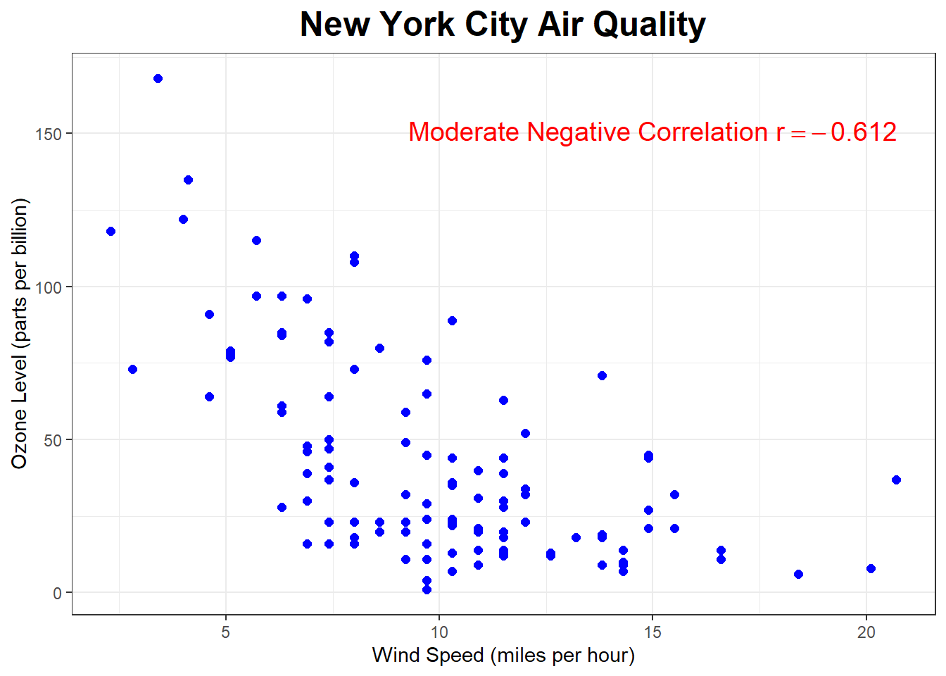
What about the correlation between Ozone and Temperature?
\(\pagebreak\)
## [1] "Temperature (degrees Fahrenheit)"## mean sd n
## 77.79279 9.529969 111## [1] "Ozone Level (parts per billion)"## mean sd n
## 42.0991 33.27597 111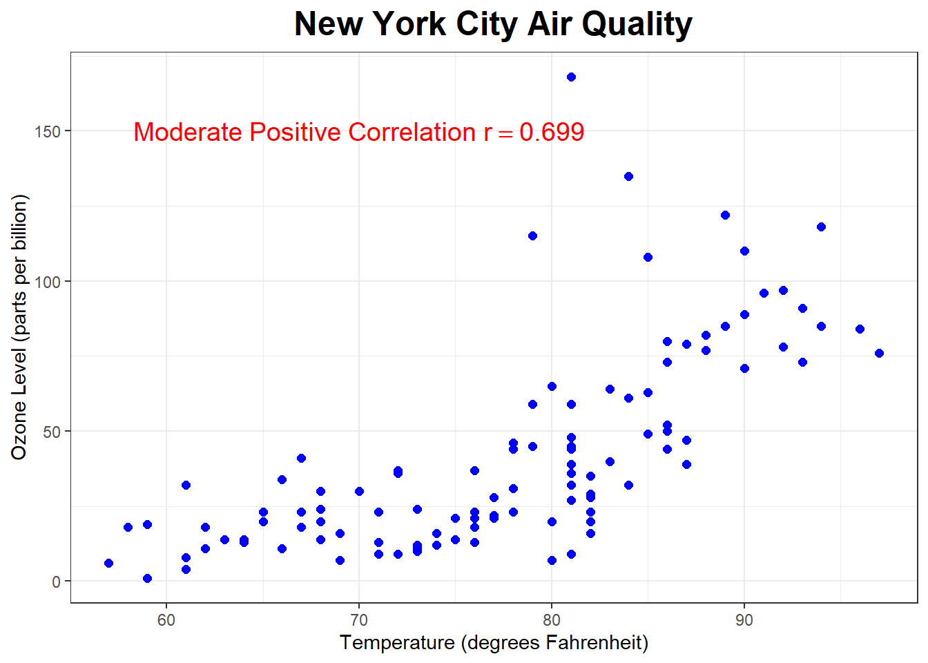
What about the relationship between the weight of a college student’s backpack to their bodyweight ?
\(\pagebreak\)
##    BackpackWeight BodyWeight     Ratio BackProblems     Major Year    Sex
## 4               6        155 0.0387097            0       CSC    6   Male
## 59              9        140 0.0642857            0      Kine    3 Female
## 62             10        150 0.0666667            0 Nutrition    4 Female
## 69              2        125 0.0160000            0        IT    5   Male
## 99              9        140 0.0642857            0      AERO    3   Male
## [1] "Weight of Backpack (pounds)"## mean sd n
## 11.66 5.765134 100## [1] "Body Weight (pounds)"## mean sd n
## 153.05 29.39744 100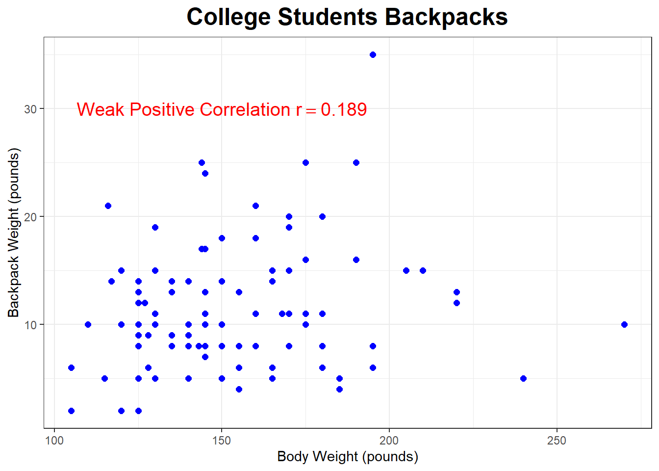
Using my class data, do you think there is a strong, moderate, or weak correlation between Texts and Height? Try to guess the correlation.
\(\pagebreak\)
##    Gender  Color Texts Chocolate HSAlgebra Pizza Sushi Tacos Temp Height
## 8       M   blue     8         7         5     2     3     1   87     68
## 14      F   pink     0        10         3     3     1     2   80     66
## 16      F  green     0         1         2     1     3     2   88     66
## 25      F   blue    48         8         3     1     3     2   95     63
## 26      M  black     2        10         3     1     2     3   86     74
## 27      F   blue    31         8         6     1     3     2   80     65
## 28      F yellow    21         7         8     3     1     2   80     66
## 31      F   blue     3         8         3     1     3     2   89     64
## 36      F  green     4        10         5     1     2     3   90     62
## 39      F   blue   100         5         6     1     2     3   86     65
## [1] "Number of Text Messages"## mean sd n
## 12.59091 18.51878 44## [1] "Height (inches)"## mean sd n
## 67.22727 4.192261 44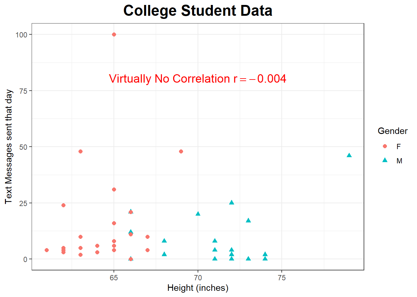
\(\pagebreak\)
6.4 Correlation does not imply causation
There are many situations where there is a moderate or strong correlation between two variables \(X\) and \(Y\) but there is NOT a cause-and-effect relationship between the two. Often a third variable (called a lurking or confounding ) variable is the actual explanation for the relationship between the two variables.
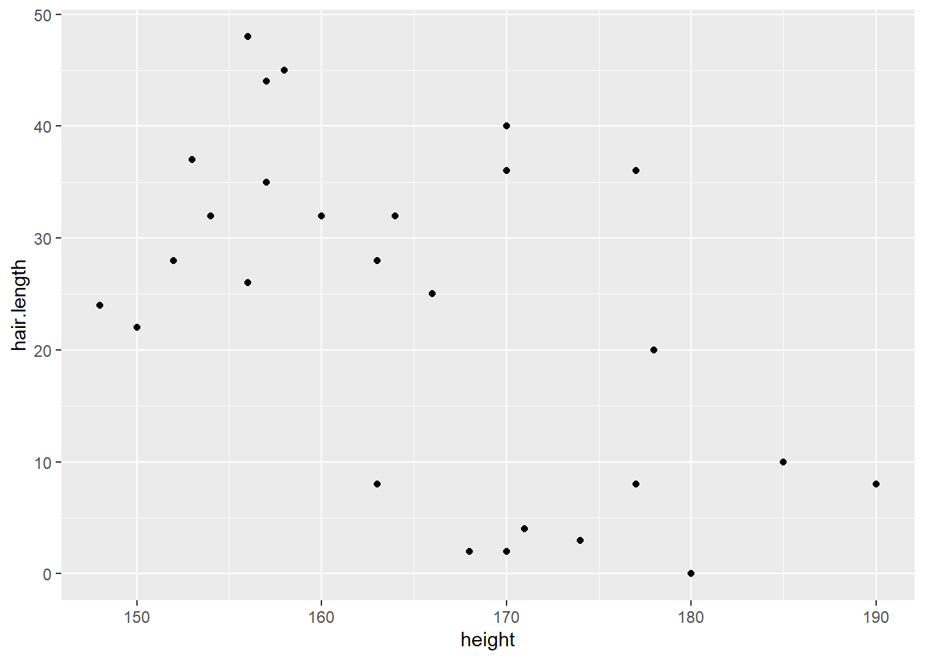
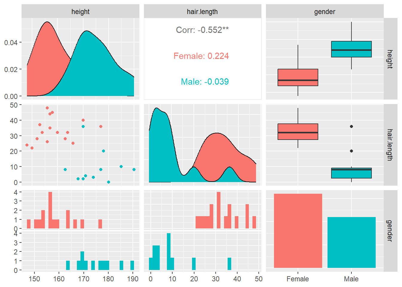
For example, if we let \(X\) be the height of an adult and \(Y\) represent the length of their hair, we would observe a moderate to strong negative correlation between the two variables. Does this mean that grower taller makes our hair shorter, or maybe it means growing our hair longer will cause us to shrink? Of course not; the reason here is that most people that identify as male tend to keep their hair cut short (I’m not a good example), and it is more common to see people that identify as female with longer hair styles.
The overall correlation between height and hair length of the \(n=27\) people, disregarding their gender, is \(r=-0.552\), a moderate negative correlation. When their gender is taken into account, the correlation for the \(n=16\) females is \(r=0.224\) (weak positive) and the \(n=11\) males is \(r=-0.039\) (very weak negative). The correlation is explained by social customs rather than any biological reason (although maybe the guy with hair length 0 shaved his head because he was going bald?).
What are the confounding variables in the examples below? In each example, there is a moderate to strong positive correlation.
Shark attacks vs ice cream sales
Number of churches vs number of liquor stores
Coffee consumption vs heart attacks
6.5 Calculations
\[\Large{r=\frac{1}{n-1} \sum_{i=1}^n [\frac{(x_i-\bar{x})}{s_x}] [\frac{(y_i-\bar{y})}{s_y}]}\] This estimates the population correlation coefficient \(\rho\) (the Greek letter “rho”). A different, but algebraically equivalent version of this formula is in your book. In reality, you would use software or a statistical calculator to compute \(r\).
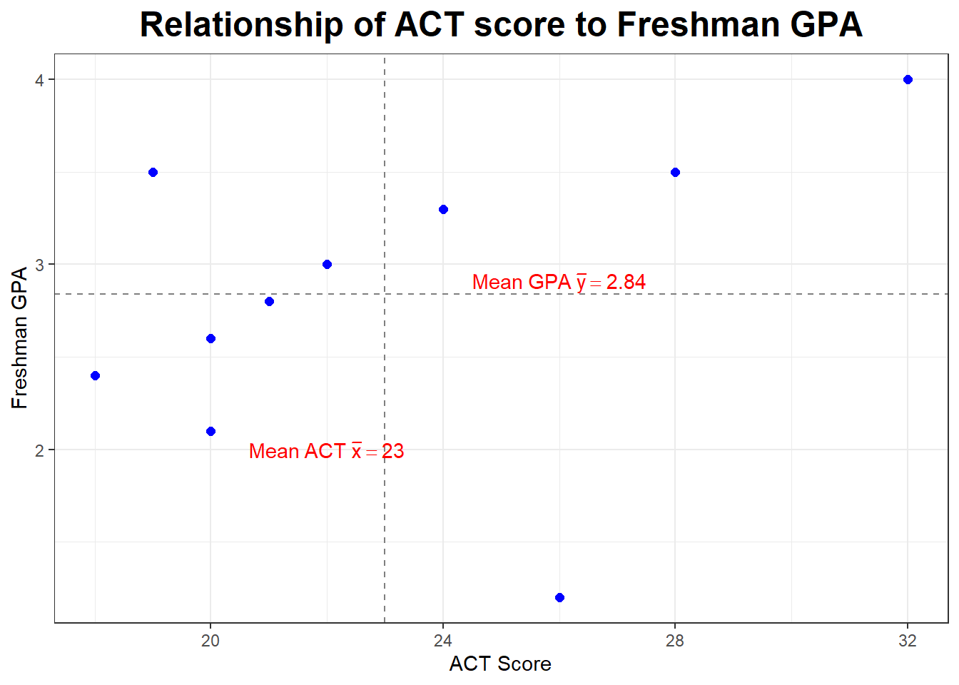
Let’s go back to our sample of \(n=10\).
| \(X\) | \(Y\) |
|---|---|
| 32 | 4.0 |
| 28 | 3.5 |
| 26 | 1.2 |
| 24 | 3.3 |
| 22 | 3.0 |
| 21 | 2.8 |
| 20 | 2.6 |
| 20 | 2.1 |
| 19 | 3.5 |
| 18 | 2.4 |
We computed: \[\Large{\bar{x}=23, s_x=4.472136, \bar{y}=2.84, s_y=0.8126773}\]
Our formula could be written:
\[\Large{r=\frac{1}{n-1} \sum_{i=1}^n Z_X \times Z_Y}\]
If you were working this by hand, you would find the following (a spreadsheet would be nice here). On the calculator, I am going to form L3 with \(Z_X\), L4 with \(Z_Y\), and L5 with \(Z_X \times Z_Y\).
\[\Large{Z_X = \frac{x_i-\bar{x}}{s_x}}\]
\[\Large{Z_Y = \frac{y_i-\bar{y}}{s_y}}\]
\(\pagebreak\)
##        X   Y    Z_X    Z_Y Z_X.Z_Y
##  [1,] 32 4.0  2.012  1.427   2.873
##  [2,] 28 3.5  1.118  0.812   0.908
##  [3,] 26 1.2  0.671 -2.018  -1.354
##  [4,] 24 3.3  0.224  0.566   0.127
##  [5,] 22 3.0 -0.224  0.197  -0.044
##  [6,] 21 2.8 -0.447 -0.049   0.022
##  [7,] 20 2.6 -0.671 -0.295   0.198
##  [8,] 20 2.1 -0.671 -0.911   0.611
##  [9,] 19 3.5 -0.894  0.812  -0.726
## [10,] 18 2.4 -1.118 -0.541   0.605
The summation part of the formula is the sum of List L5.
\[\Large{r=\frac{1}{10-1}(3.218)=+0.358}\]
We have a moderate to weak positive correlation between ACT score and freshman GPA.
There’s an easier way to get correlation with the TI calculator, as I’ll demonstrate in class. You will need to (once) go to the Catalog and switch to DiagnosticOn, then go to STAT, then CALC and pick 8:LinReg(a+bx). You’ll get the regression equation (to be explained in a few days), along with the correlation \(r\) (which is what we want right now) and \(r^2\) (again, to be explained in a few days).
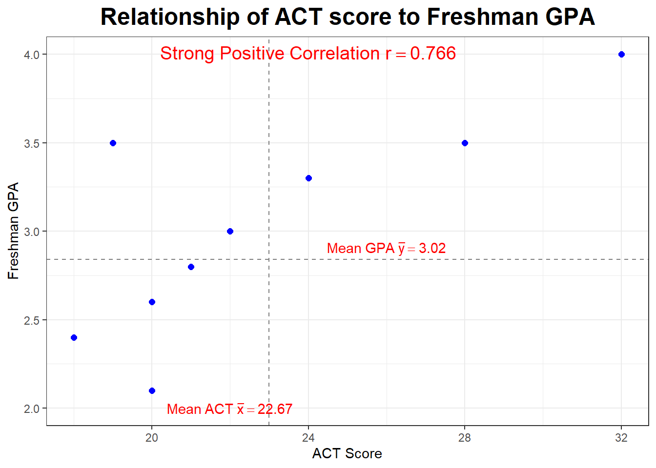
Let’s look at our plot again. Notice the dashed lines are drawn at \(\bar{x}=23\) and \(\bar{y=2.84}\) and serve to divide our graph into four “quadrants”. What is true about the points (the students) in the upper right hand quadrant?
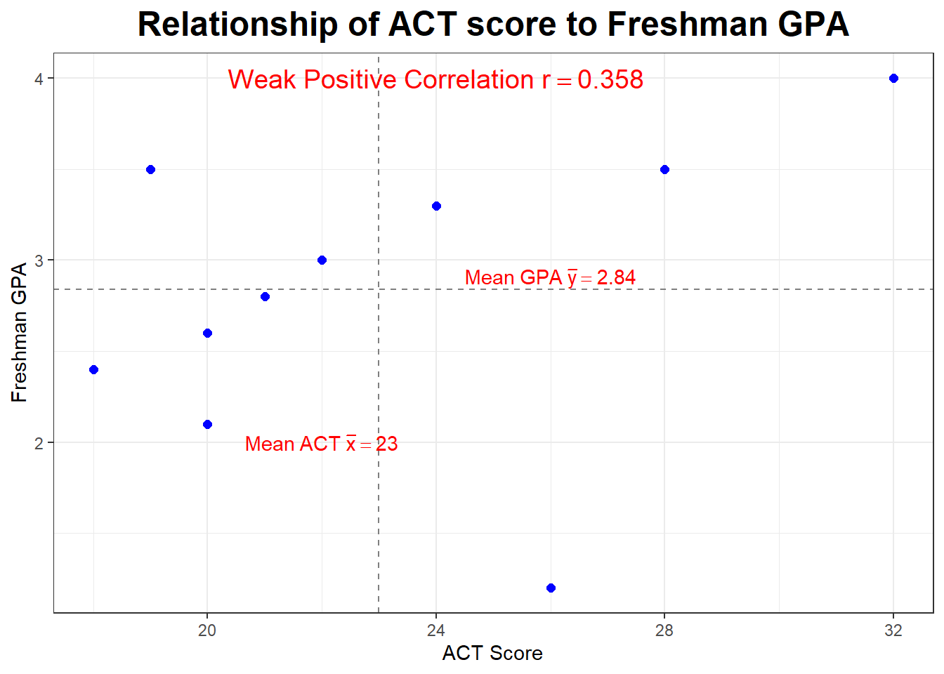
What if we deleted the outlier or influential point (the student with the ususually low GPA)? What would happen to the correlation?
\(\pagebreak\)