Chapter 8 Regression Wisdom
8.1 Dangers of Extrapolation
Indiscriminate use of regression can yield predictions that are ridiculous.
The graph and regression line below show the relationship between the mean height (in cm) and age (in months) of young children in Kalama, Egypt.
## # A tibble: 12 × 2
##      age height
##    <int>  <dbl>
##  1    18   76.1
##  2    19   77
##  3    20   78.1
##  4    21   78.2
##  5    22   78.8
##  6    23   79.7
##  7    24   79.9
##  8    25   81.1
##  9    26   81.2
## 10    27   81.8
## 11    28   82.8
## 12    29   83.5
##
## Call:
## lm(formula = height ~ age, data = Kalama)
##
## Coefficients:
## (Intercept) age
## 64.928 0.635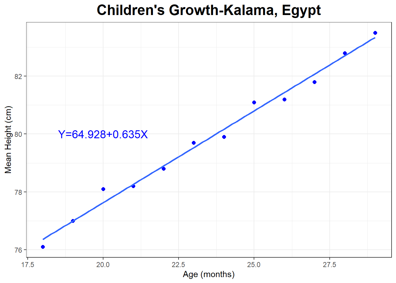
Let’s predict the height of a 50 year old man.
\[X=50 \times 12 = 600\]
\[\hat{Y}=64.928 + 0.635 \times 600 \approx 446\]
The man is predicted to be about 446 cm, or 4.46 m tall. Divide cm by 2.54, the predicted height is about 176 inches tall, or about 14 feet 8 inches tall.
This is obviously a terrible prediction, even though \(r^2=.989\) for the model . Think about how humans tend to grow and what the linear regression model is assuming about how we grow.
8.2 Lurking Variable
Look at the following scatterplot. What do you think is true about the magnitude and the direction of the relationship between \(X\) and \(Y\)?
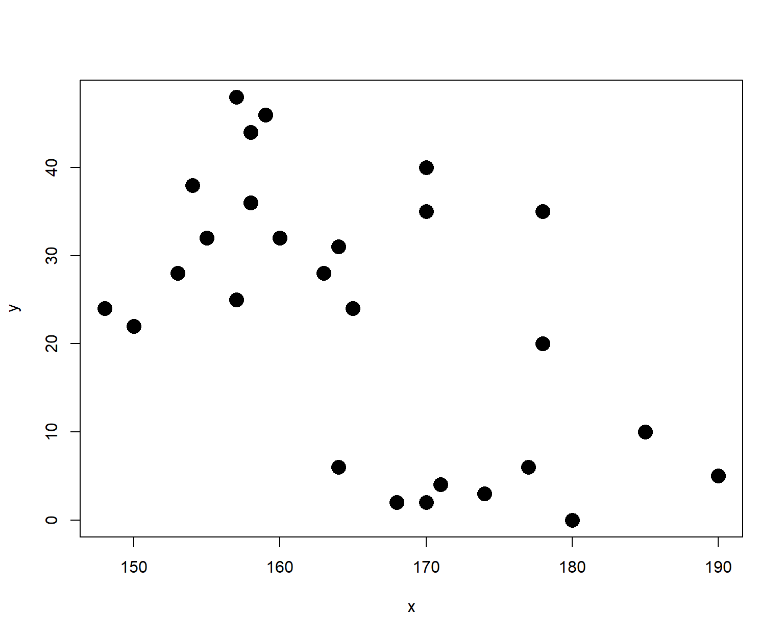
The plot looked like there was a moderate negative relationship.
Correlation: \(r=\) -0.561
Regression Equation: \(\hat{y}=\) 156.472 \(+\) -0.807 \(X\)
But what is \(X\) and \(Y\)? It’s impossible to determine if there is a cause-and-effect relationship between the variables unless you are provided some context.
It turns out that \(X\) is height and \(Y\) is hair length, both measured in centimeters, for a sample of \(n=28\) people, both male and female. What do you think is the actual reason for the correlation between \(X\) and \(Y\)?
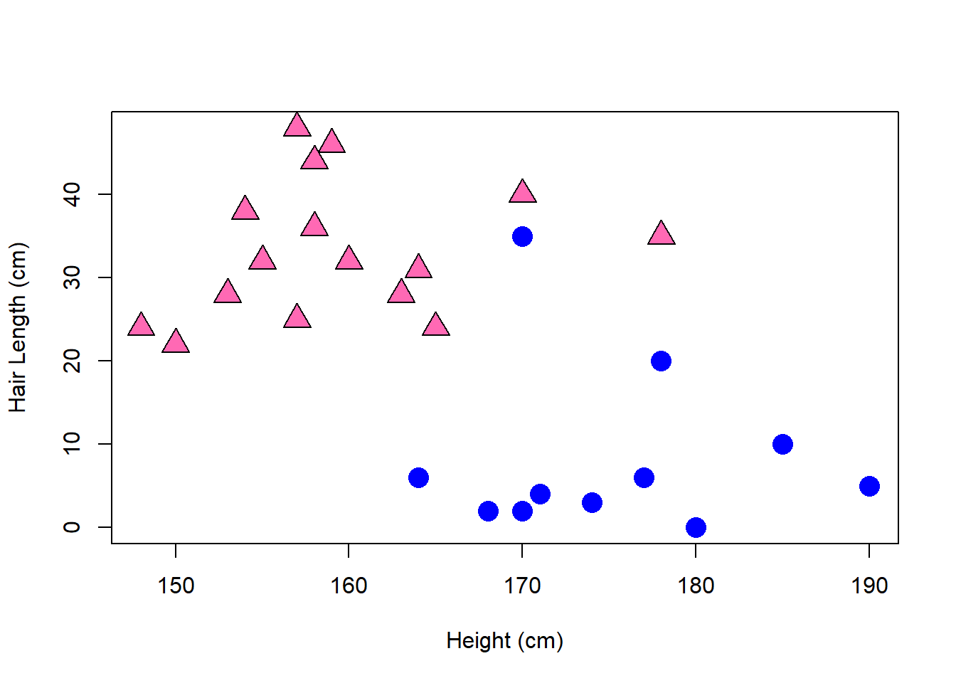
Considering women and men separately, the correlations are much weaker.
Correlation (Women Only): \(r=\) 0.225
Correlation (Men Only): \(r=\) -0.045
Summary statistics
##   sex min     Q1 median     Q3 max     mean       sd  n missing
## 1   F 148 154.75  158.0 163.25 178 159.3125 7.516371 16       0
## 2   M 164 170.00  172.5 178.50 190 174.8333 7.481290 12       0
## sex min Q1 median Q3 max mean sd n missing
## 1 F 22 27.25 32.0 38.5 48 33.312500 8.178987 16 0
## 2 M 0 2.75 4.5 7.0 35 8.083333 9.940352 12 0The multiple linear regression equation predicting hair length based on both height and sex (0=female, 1=male) is:
\[\hat{Hair Length} = 14.736 + 0.117 Height - 27.039 Sex\]
The equation has \(r^2=0.679\) and only the \(Sex\) predictor is statistically significant.
8.3 Residual Plots
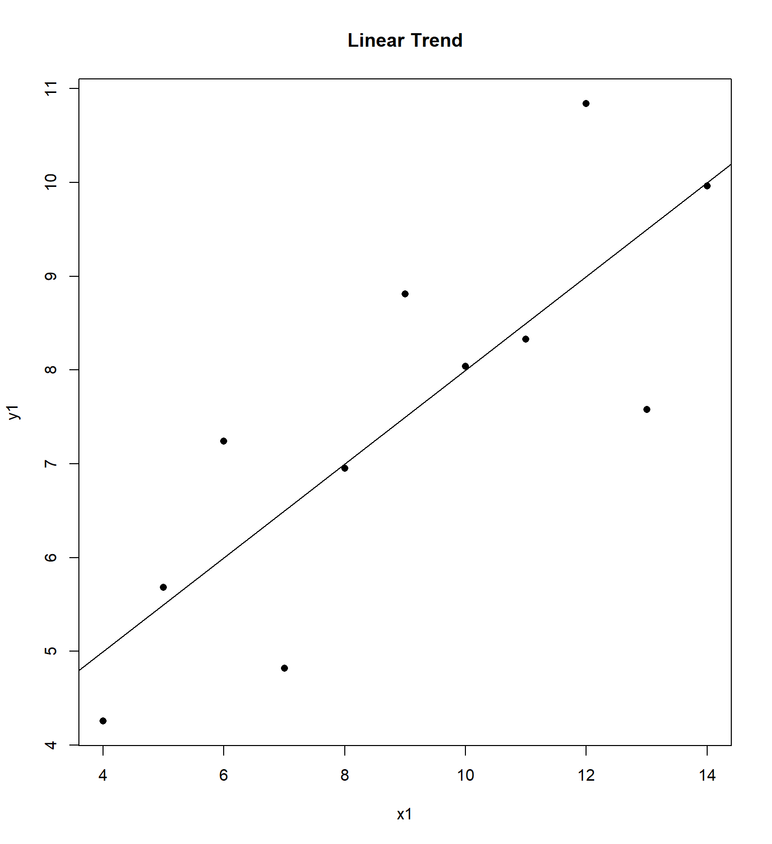
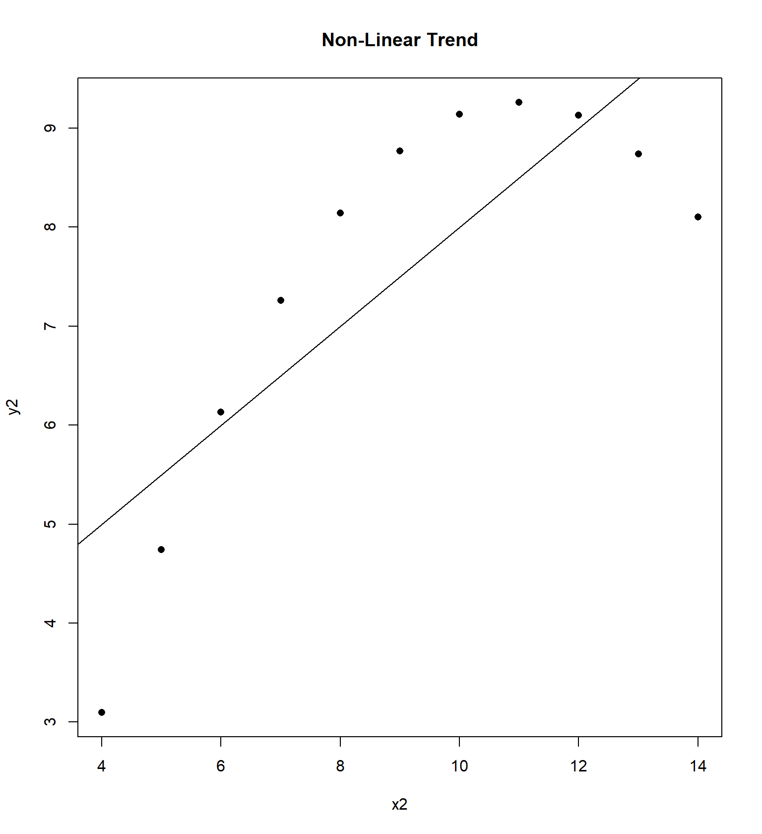
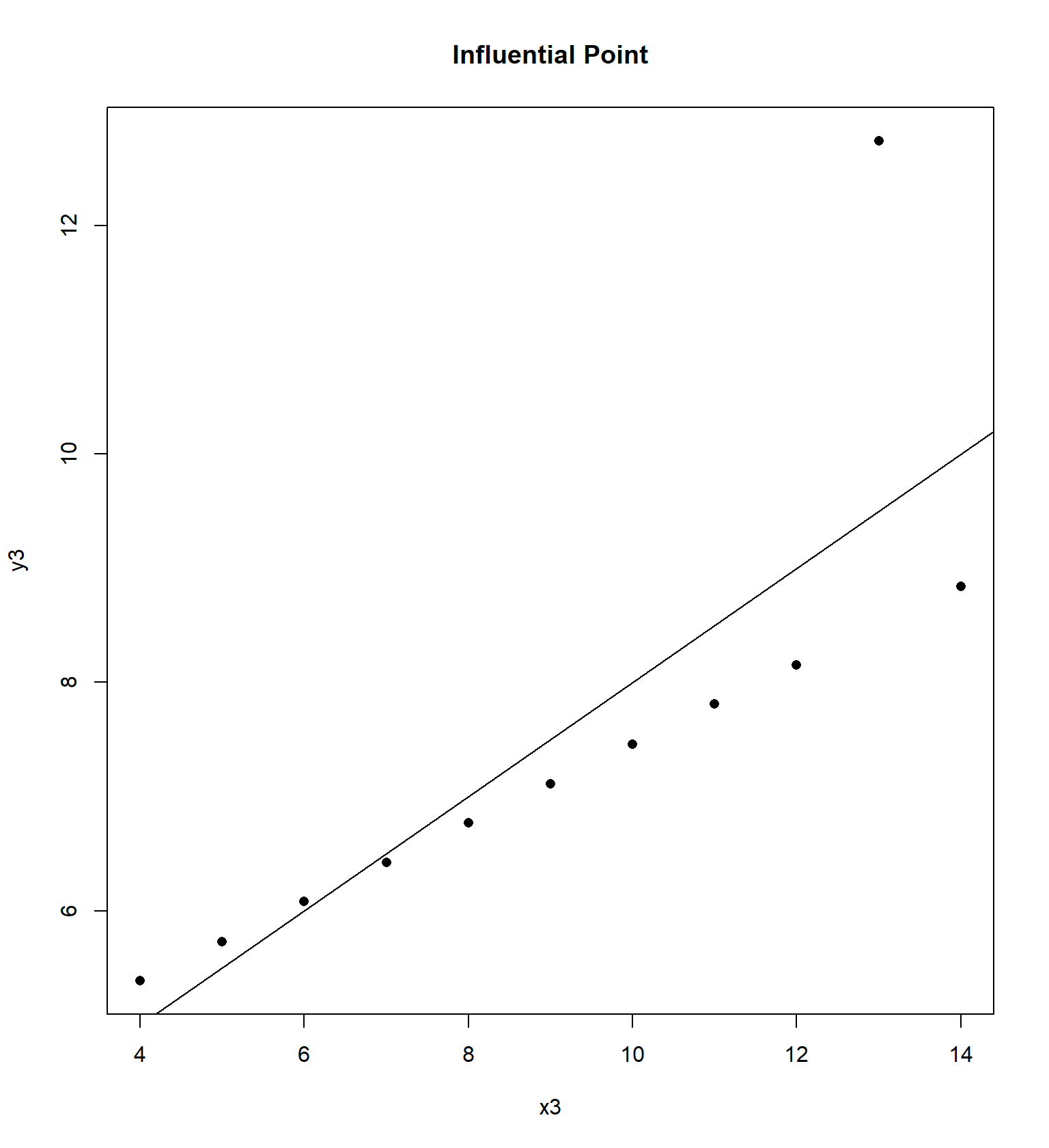
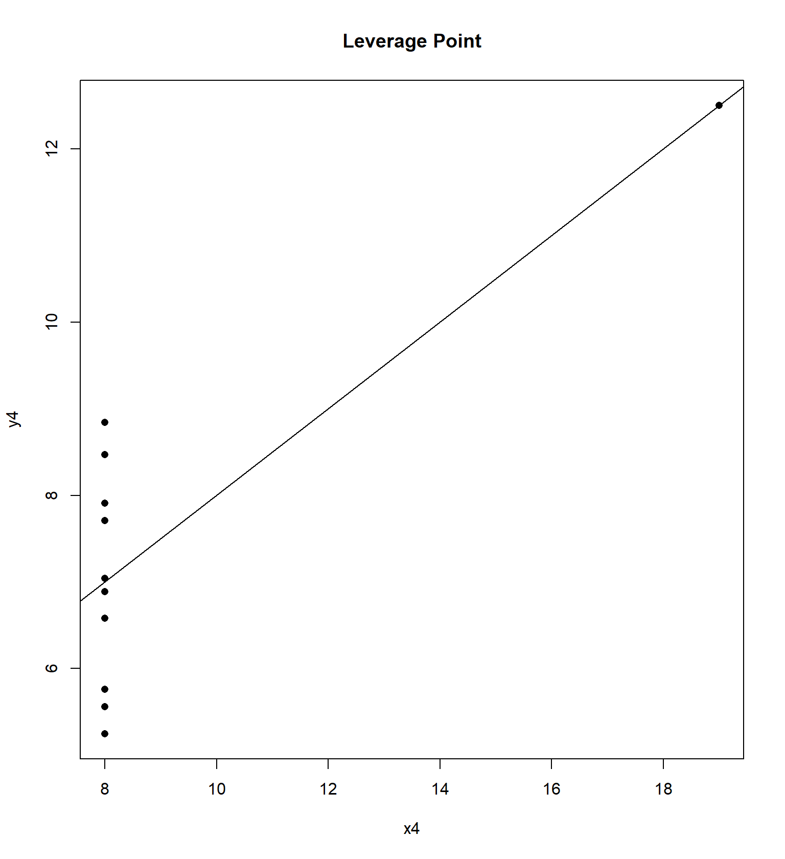
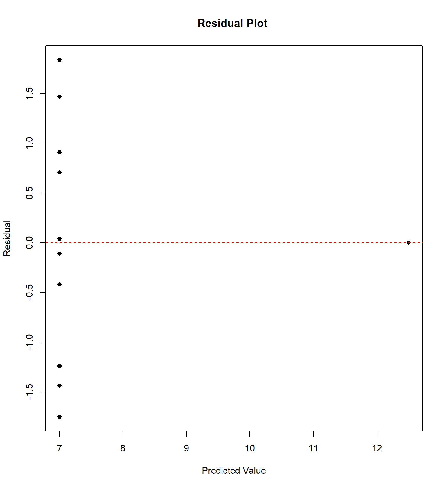
Calculate the correlation coefficient \(r\) and the equation of the least squares regression model \(\hat{Y}=b_0 + b_1 X\) for each of the four data sets. Notice that the \(X\) variable for the first 3 data sets are the same.
## x1 x2 x3 x4 y1 y2 y3 y4
## 1 10 10 10 8 8.04 9.14 7.46 6.58
## 2 8 8 8 8 6.95 8.14 6.77 5.76
## 3 13 13 13 8 7.58 8.74 12.74 7.71
## 4 9 9 9 8 8.81 8.77 7.11 8.84
## 5 11 11 11 8 8.33 9.26 7.81 8.47
## 6 14 14 14 8 9.96 8.10 8.84 7.04
## 7 6 6 6 8 7.24 6.13 6.08 5.25
## 8 4 4 4 19 4.26 3.10 5.39 12.50
## 9 12 12 12 8 10.84 9.13 8.15 5.56
## 10 7 7 7 8 4.82 7.26 6.42 7.91
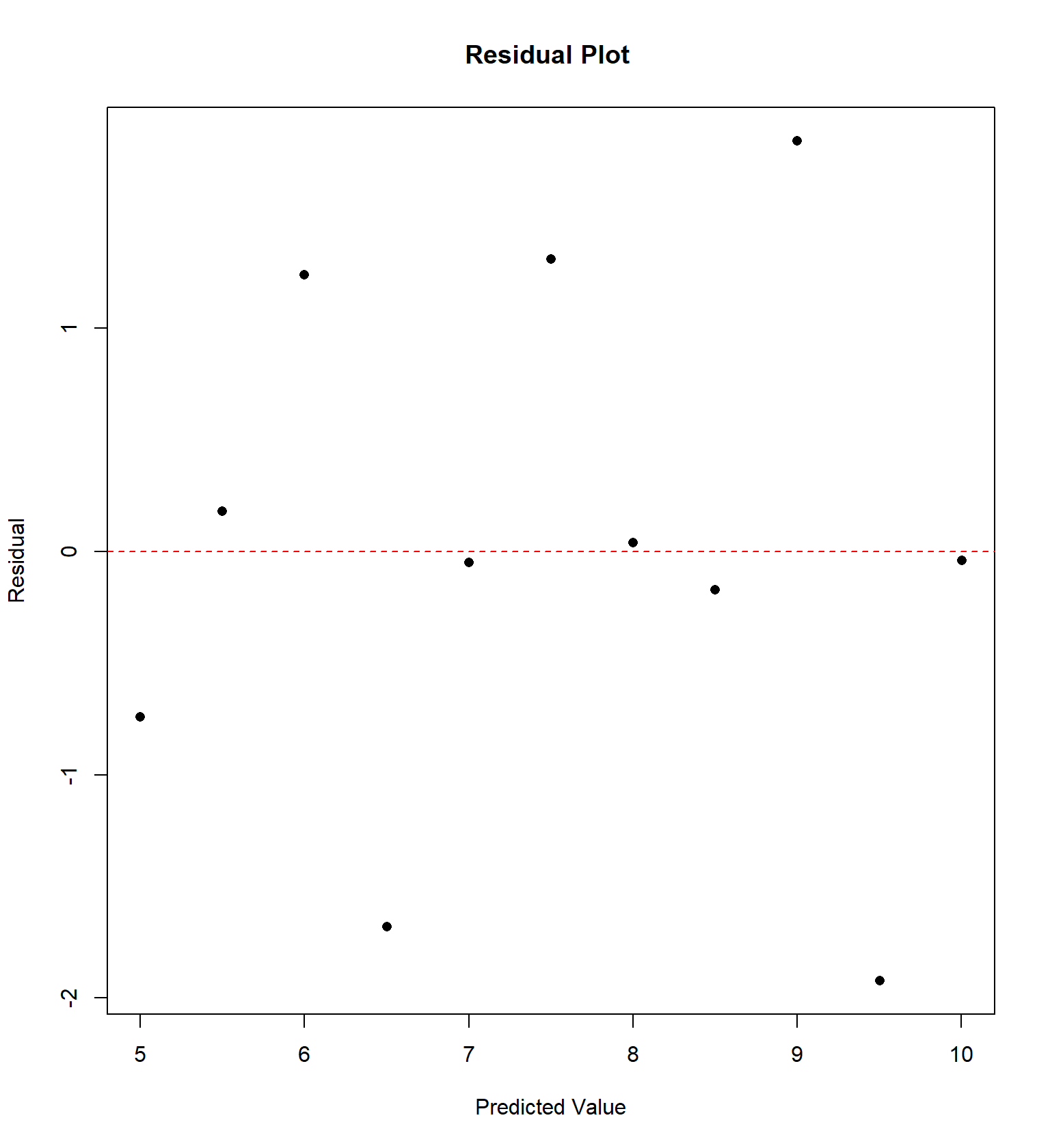
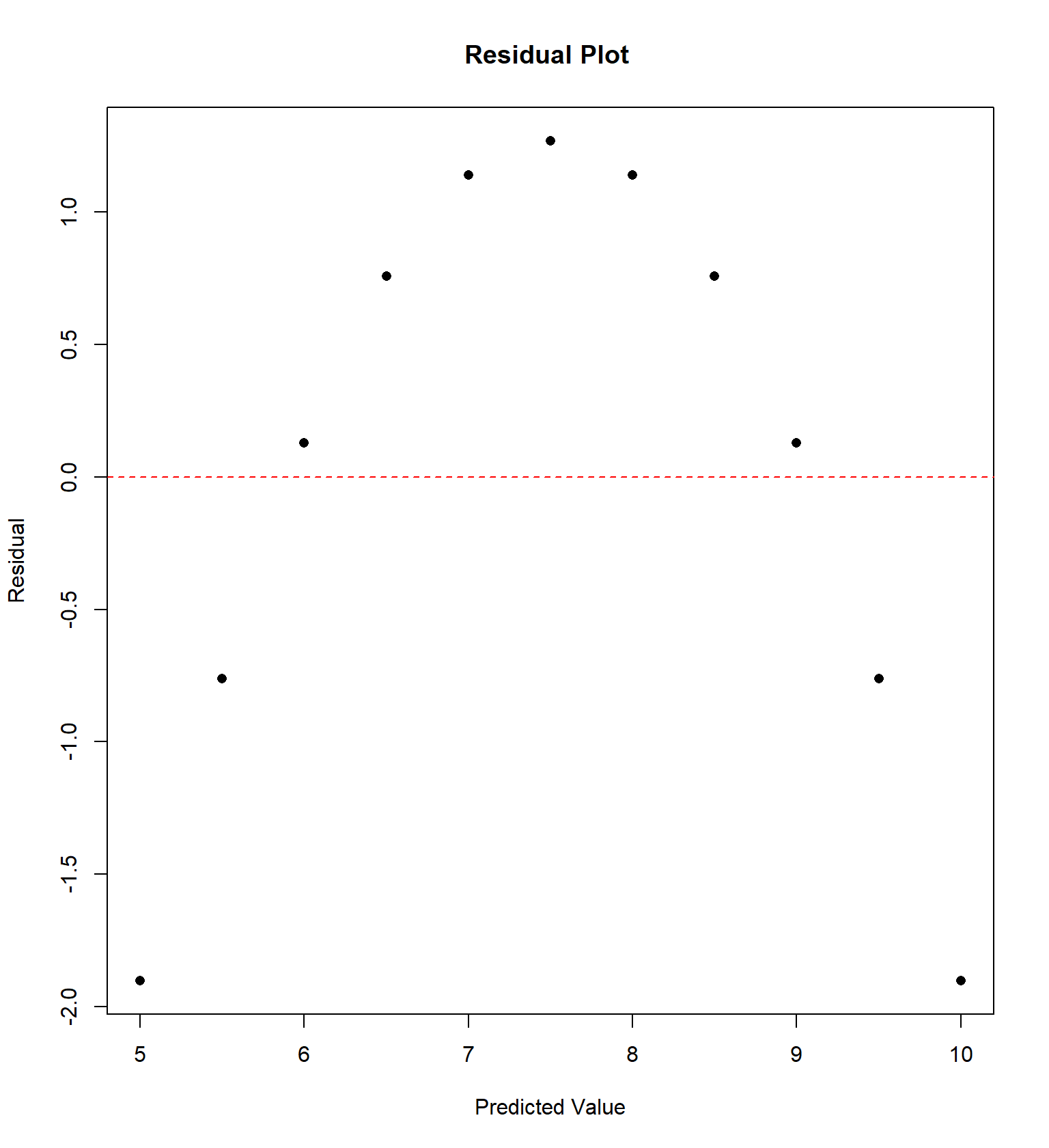
## 11 5 5 5 8 5.68 4.74 5.73 6.89We will examine the “Anscombe” quartet of four data sets with the same correlation and regression equation, but four very different trends, originally presented by Frank Anscombe in 1973. For each data set, I have constructed a residual plot, plotting \(\hat{Y}\) versus \(e\) (predicted value vs residual) for each data set. This plot will ideally be “random”, without any sort of trend or correlation.
Sometimes the residual plot will plot \(X\) vs \(e\) (the actual value of explanatory variable vs residual) instead. This is commonly done if the explanatory variable is time and we wish to determine if there is a temporal trend in the data.
Here’s a more recent entertaining example, called the Datasaurus example that Alberto Cairo came up with. It’s similar to the Anscombe quartet in that data sets with virtually the same correlation and regression equation have wildly different patterns.
## # A tibble: 13 × 8
##    dataset    mean_x mean_y std_dev_x std_dev_y corr_x_y   slope y.intercept
##    <chr>       <dbl>  <dbl>     <dbl>     <dbl>    <dbl>   <dbl>       <dbl>
##  1 away         54.3   47.8      16.8      26.9  -0.0641 -0.103         53.4
##  2 bullseye     54.3   47.8      16.8      26.9  -0.0686 -0.110         53.8
##  3 circle       54.3   47.8      16.8      26.9  -0.0683 -0.110         53.8
##  4 dino         54.3   47.8      16.8      26.9  -0.0645 -0.104         53.5
##  5 dots         54.3   47.8      16.8      26.9  -0.0603 -0.0969        53.1
##  6 h_lines      54.3   47.8      16.8      26.9  -0.0617 -0.0992        53.2
##  7 high_lines   54.3   47.8      16.8      26.9  -0.0685 -0.110         53.8
##  8 slant_down   54.3   47.8      16.8      26.9  -0.0690 -0.111         53.8
##  9 slant_up     54.3   47.8      16.8      26.9  -0.0686 -0.110         53.8
## 10 star         54.3   47.8      16.8      26.9  -0.0630 -0.101         53.3
## 11 v_lines      54.3   47.8      16.8      26.9  -0.0694 -0.112         53.9
## 12 wide_lines   54.3   47.8      16.8      26.9  -0.0666 -0.107         53.6
## 13 x_shape      54.3   47.8      16.8      26.9  -0.0656 -0.105         53.6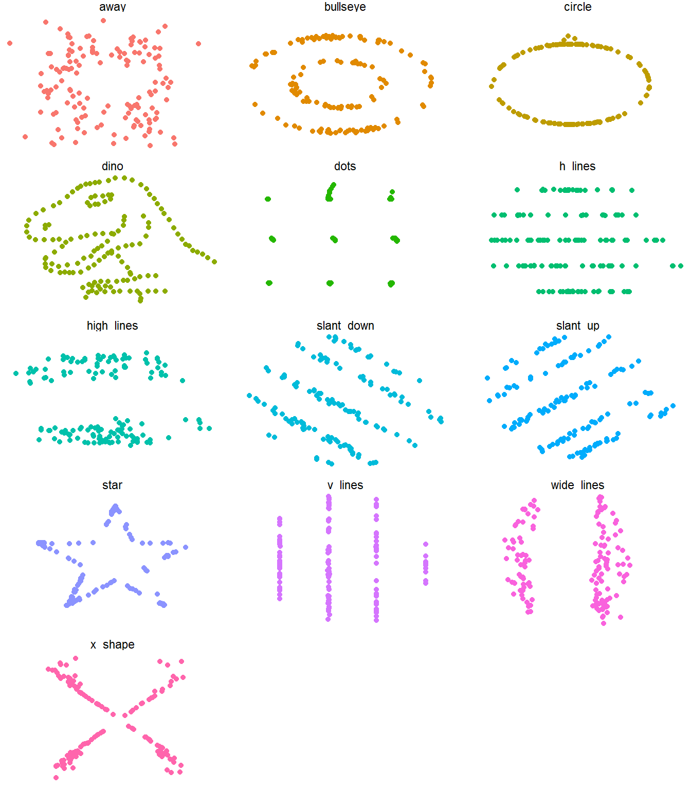
8.4 Quadratic Regression
In this problem, we are trying to model the age (in years) of a tree based on the diameter (in inches) of the trunk. This will be useful for predicting the age of a tree without having to cut the tree down and count the growth rings. I’d suggest entering diameter (\(X\)) in List L1 and the age (\(Y\)) in list L2.
##       diameter age
##  [1,]      1.8   4
##  [2,]      1.8   5
##  [3,]      2.2   8
##  [4,]      4.4   8
##  [5,]      6.6   8
##  [6,]      4.4  10
##  [7,]      7.7  10
##  [8,]     10.8  12
##  [9,]      7.7  13
## [10,]      5.5  14
## [11,]      9.9  16
## [12,]     10.1  18
## [13,]     12.1  20
## [14,]     12.8  22
## [15,]     10.3  23
## [16,]     14.3  25
## [17,]     13.2  28
## [18,]      9.9  29
## [19,]     13.2  30
## [20,]     15.4  30
## [21,]     17.6  33
## [22,]     14.3  34
## [23,]     15.4  35
## [24,]     11.0  38
## [25,]     15.4  38
## [26,]     16.5  40
## [27,]     16.5  42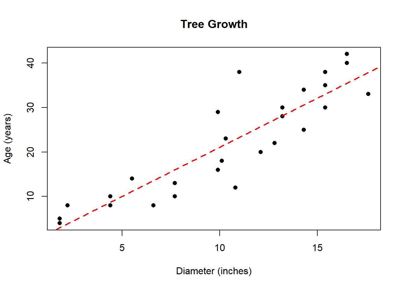
Summary Statistics:
Means: \(\bar{x}=\) 10.4; \(\bar{y}=\) 21.963; Standard Deviations: \(s_x=\) 4.793; \(s_y=\) 11.902; Correlation: \(r=\) 0.888; \(r^2=\) 0.789
Regression Equation: \(\hat{y}=\) -0.974 \(+\) 2.206 \(X\)
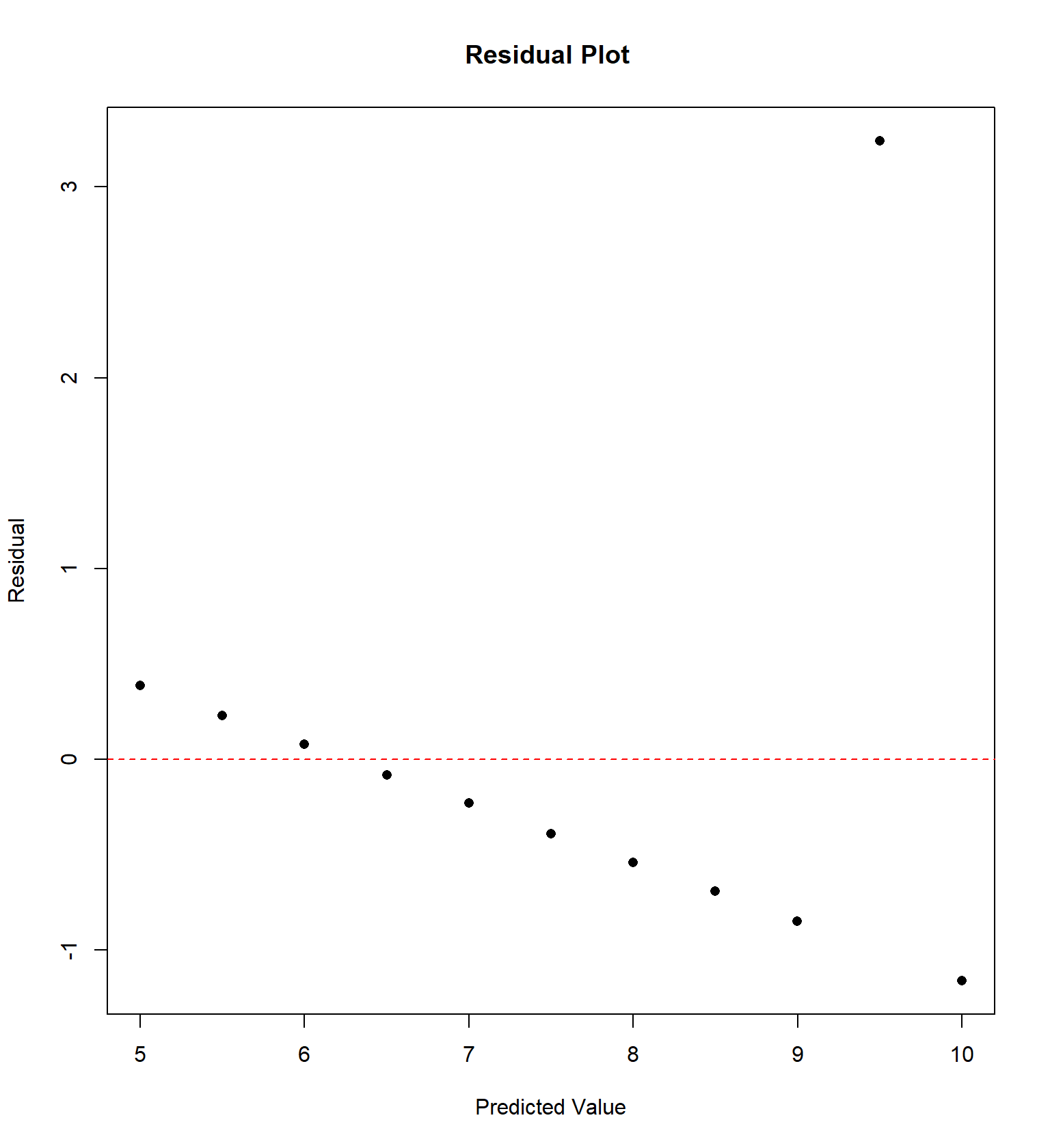
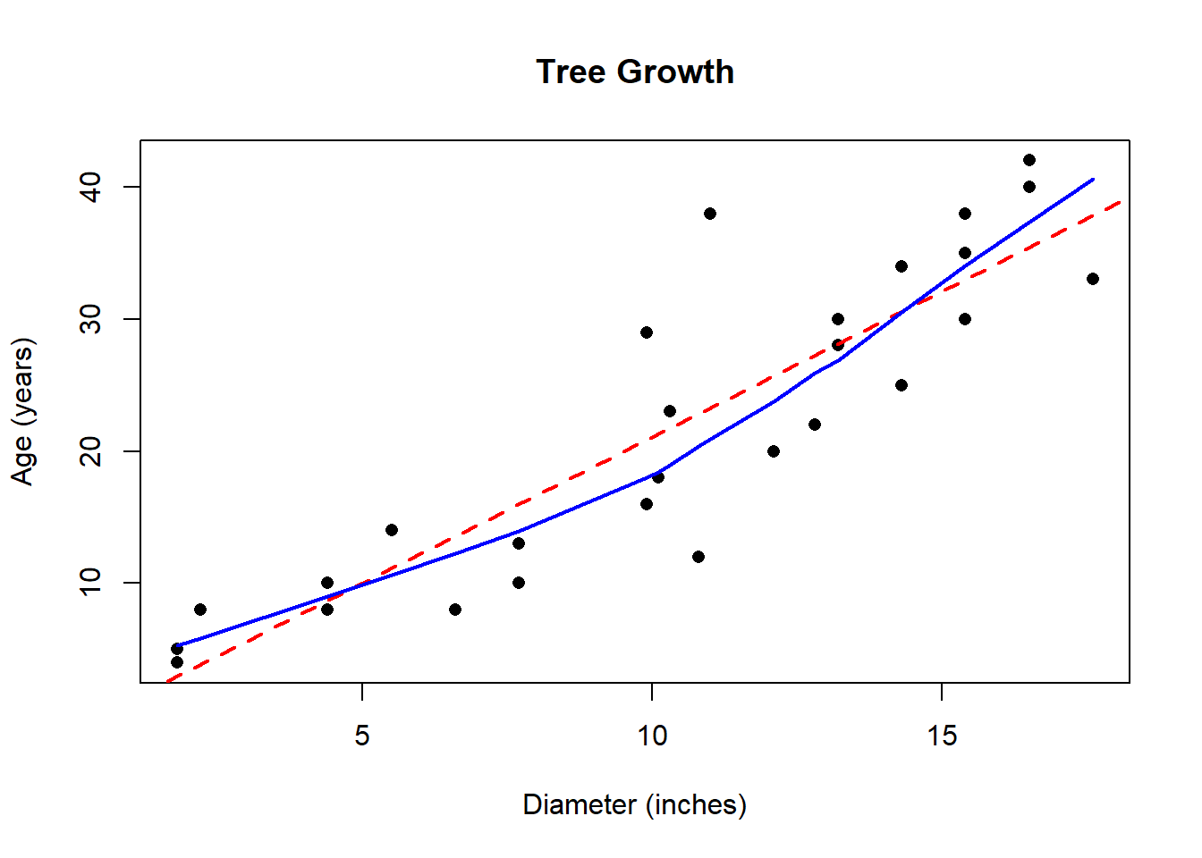
While the correlation coefficient is close to 1, careful examination of the plot shows the trend is somewhat nonlinear. In the following graph, I have superimposed a curve that estimates the true relationship between tree diameter and age.
A plot called a residual plot can help us detect non-linearity, and other violations of regression assumptions. In order to construct it, we must compute the predicted values \(\hat{y}\) and the residuals \(e\) for each data point. We can do this on the TI calculator. Let List L3 hold your predicted values: L3=-0.974+2.206*L1. Let List L4 hold your residuals: L4=L2-L3.
I did this with my software as well. Then construct a scatterplot with the predicted values on the \(x\)-axis and the residuals on the \(y\)-axis.
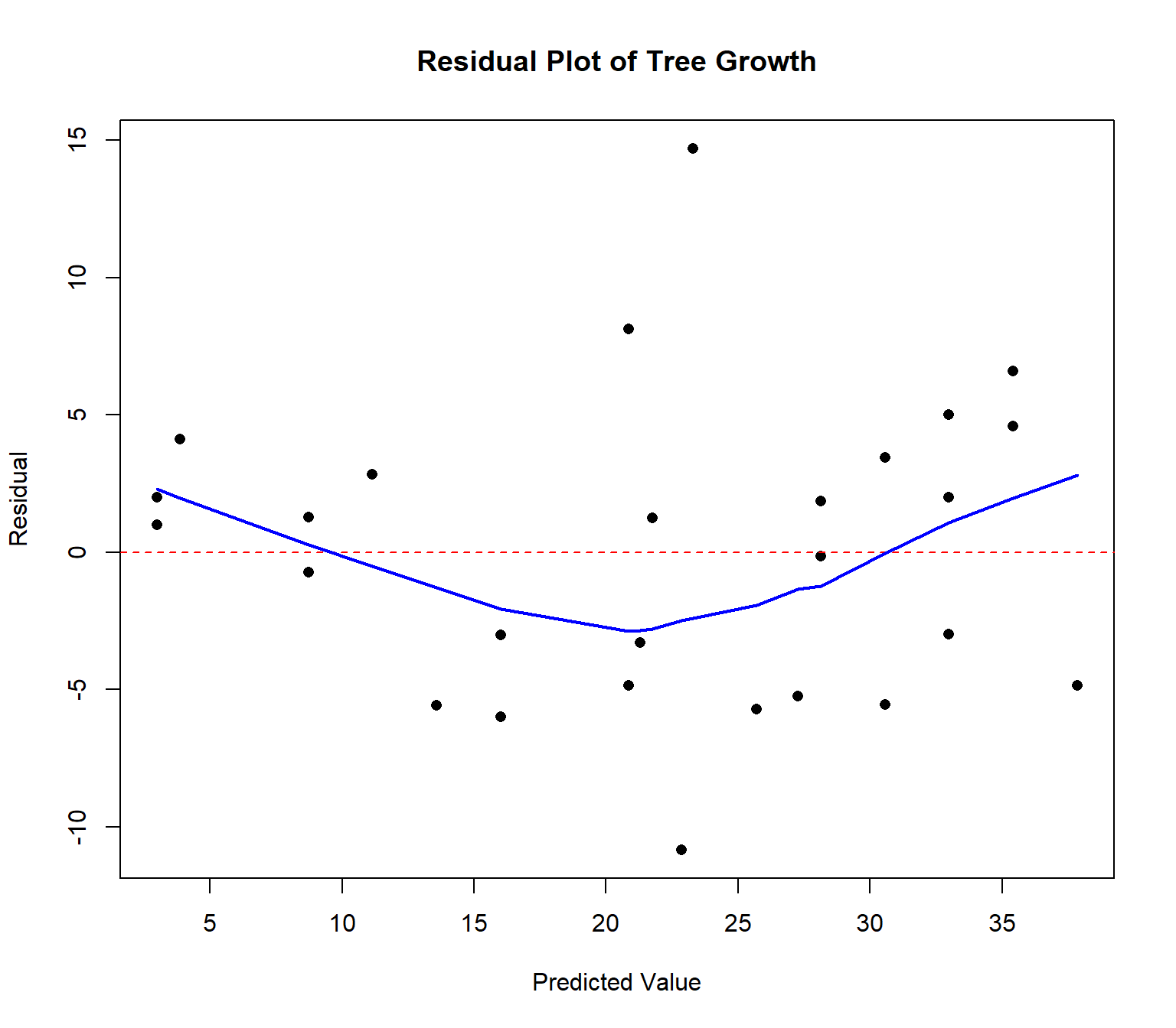
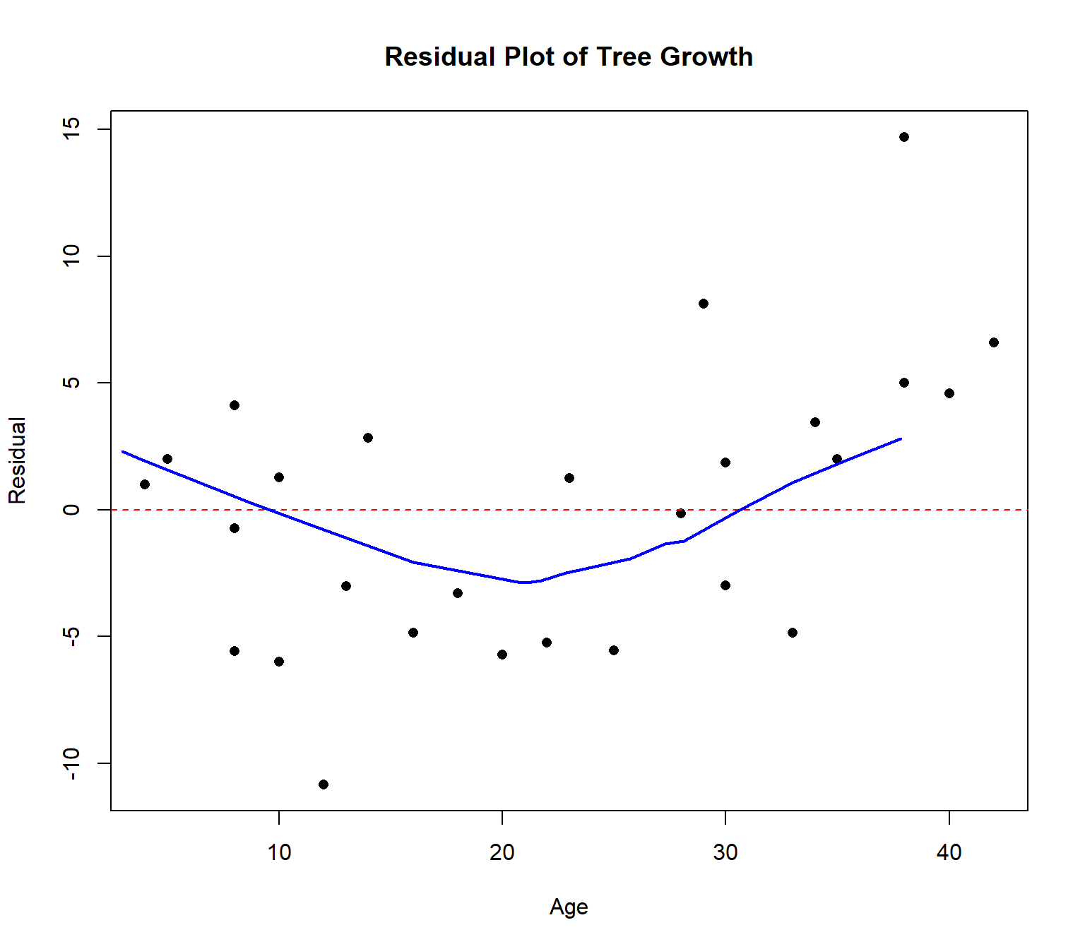
Ideally, the points in the residual plot are uncorrelated and fall in a random pattern. In this case, there is a curved pattern in the data. Notice the most of the largest & oldest trees have their age underestimated (i.e. the residual \(e\) is positive). Our model is biased and will predict larger, older trees to be younger than they really are.
Maybe the cross-sectional area of the tree trunk, rather than the diameter, might be a better predictor of age. We could re-express the diameter in this case by squaring it, using both \(X\) and \(X^2\), the squared diameter, to predict age.
Then we fit a quadratic regression equation of the form \[\hat{y}=b_0 + b_1 X + b_2 X^2\] to the data. The QuadReg option on the TI calculator will fit this model. I’ll fit this model and graph the equation. It’s a better fit! One might also use this for the second data set from the Anscombe data.
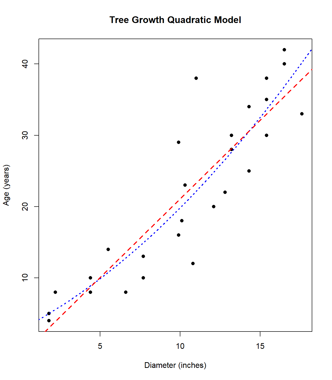
Regression Equation: \(\hat{y}=\) 2.72 \(+\) 1.161 \(X +\) 0.055 \(X^2\)
\(r^2=0.799\)
8.5 Log Transformation
Another very common re-expression is to take the logarithm of one or both regression variables. For example, if the response variable \(Y\) is increasing at an exponential, rather than a linear, rate, taking the log of \(Y\) will “straighten” out the scatterplot.
Here’s a simplified example, with \(X\)=hours and \(Y\)=number of bacteria in an experiment.
##   hours bacteria
## 1     1       20
## 2     2       40
## 3     3       75
## 4     4      150
## 5     5      297
## 6     6      750
## (Intercept) hours
## 0.972 0.308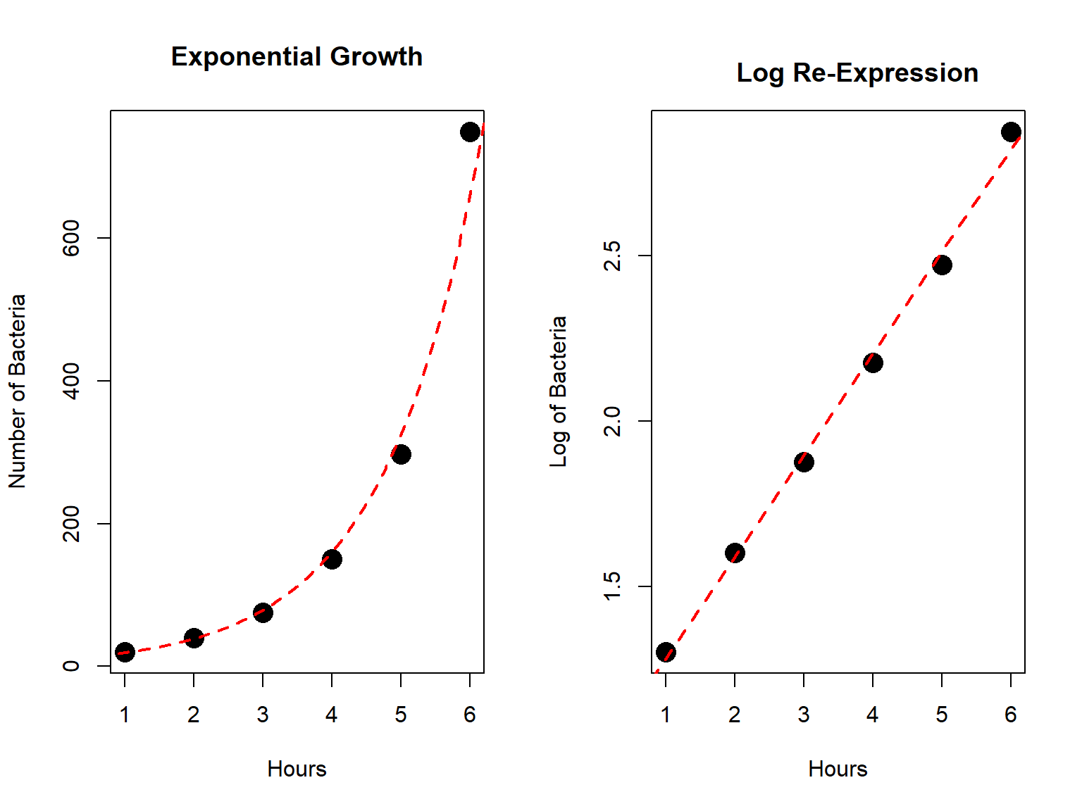
I doubt it would take a residual plot for you to be convinced that fitting a linear model would be a poor choice in this situation.
We can “straighten” an exponential growth trend by taking the logarithm of the \(Y\) variable. We can use either the base-10 log or the natural log. I’ll use the base-10 log in this example and do with my calculator.
The equation has \(r^2=0.996\) is: \[\log(\hat{Y})=0.972+0.308X\]
If I want to predict the number of bacteria in the petri dish after \(X=2.5\) hours, I use the equation.
\(\log(\hat{Y})=0.972+0.308(2.5)=\) 1.742
This answer is in log-bacteria, not number of bacteria. Since the log is less than two, the actual number of bacteria will be less than \(10^2=100\). We “undo” the re-expression by taking the antilog.
\(\hat{Y}=10^{1.742}=\) 55.233 bacteria.