Chapter 2 Displaying and Describing Data
2.1 Summarizing and Displaying a Categorical Variables
Descriptive statistics is the branch of statistics that involves ‘describing a situation’. Most of the methods used in descriptive statistics are relatively simple, such as finding averages or constructing a graph.
A distribution consists of the values that a random variable takes on and how often it takes those values. We will use three techniques to describe a distribution:
- Table
- Graph
- Function (i.e. mathematical formula) ## Tabular and Graphical Presentation of Data
We will look at a number of ways to display data in a table or graph.
- Frequency Table
- Bar Chart & Pie Chart
- Histogram
- Stemplot
- Scatterplot
2.2 Frequency Table
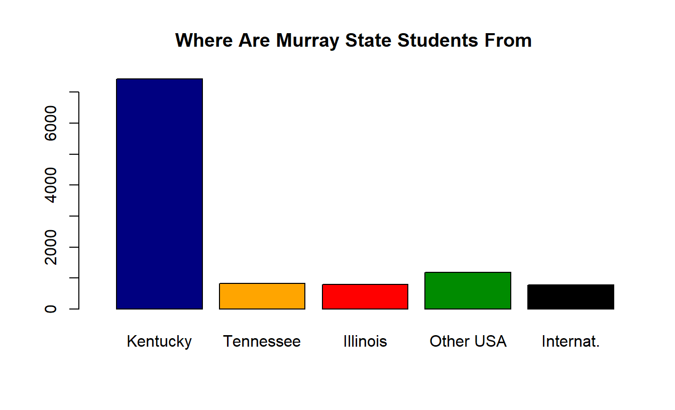
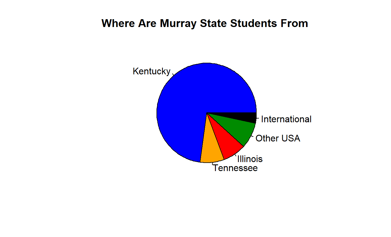
A one-way frequency table shows the tabulated results for each value of a variable. It is often used for data at the nominal level. The table below shows the home state of Murray State students (from the 2015-2016 Murray State Fact Book, page 55 https://www.murraystate.edu/Libraries/Institutional_Research/factbook2015.pdf ).
| State | Frequency | Relative Frequency |
|---|---|---|
| Kentucky | 7430 | 67.6% |
| Tennessee | 824 | 7.5% |
| Illinois | 791 | 7.2% |
| Other U.S. | 1179 | 10.7% |
| International | 775 | 7.0% |
| Total | 10998 | 100.0% |
Other examples, from your data, at http://campus.murraystate.edu/academic/faculty/cmecklin/ClassDataFall2018.txt or https://docs.google.com/spreadsheets/d/1wENYLP0p4dmapA7kT7WaqCOR2YDzuR6AwV3q6NX5YVM/edit?usp=sharing
Part of the data table is presented. Each row represents a student, and each column is a variable (one of the questions you were asked).
##   Class    Sex  Color Texts Chocolate Height Temperature Applebee Jasmine
## 1  9:30   Male  Green    10         3     70          86       NA      NA
## 2  9:30 Female Purple     2         3     67          76        1       3
## 3  9:30 Female  Green     2        10     67          90        3       1
## 4  9:30 Female   Blue     4         7     66          85        3       2
## 5  9:30   Male Purple    30         6     67          90        3       1
## 6  9:30 Female    Red     4         7     67          83        3       2
##   LosPortales
## 1          NA
## 2           2
## 3           2
## 4           1
## 5           2
## 6           1
## [1] "Class Time"##
## 10:30 9:30
## 33 38## [1] "Favorite Color"##
## BabyBlue Black Blue Gray Green Maroon Orange
## 1 2 24 1 8 1 2
## Periwinkle Pink Purple Red Teal Yellow
## 1 4 13 6 1 7## [1] "Chocolate"##
## 2 3 5 6 7 8 9 10
## 2 5 5 13 12 12 7 15## [1] "Applebee's"##
## 1 2 3
## 8 18 33## [1] "Jasmine"##
## 1 2 3
## 24 13 22## [1] "Los Portales"##
## 1 2 3
## 27 28 4Los Portales seems to be your favorite restaurant, and very few ranked it as your least favorite of the three choices. I used the value NA to represent missing data values; there was one temperature I could not read, and several people misinterpreted the restauarant question and told me their 3 favorite (like Cracker Barrel, Mister B’s, Cookout). Height is given in inches and temperature in degrees Fahrenheit; I converted if you gave me an answer in a different unit.
How might the results have been different if I had asked you to rank the three restaurants on a 1-to-10 scale, like I did with chocolate ?
2.3 Bar Chart and Pie Chart
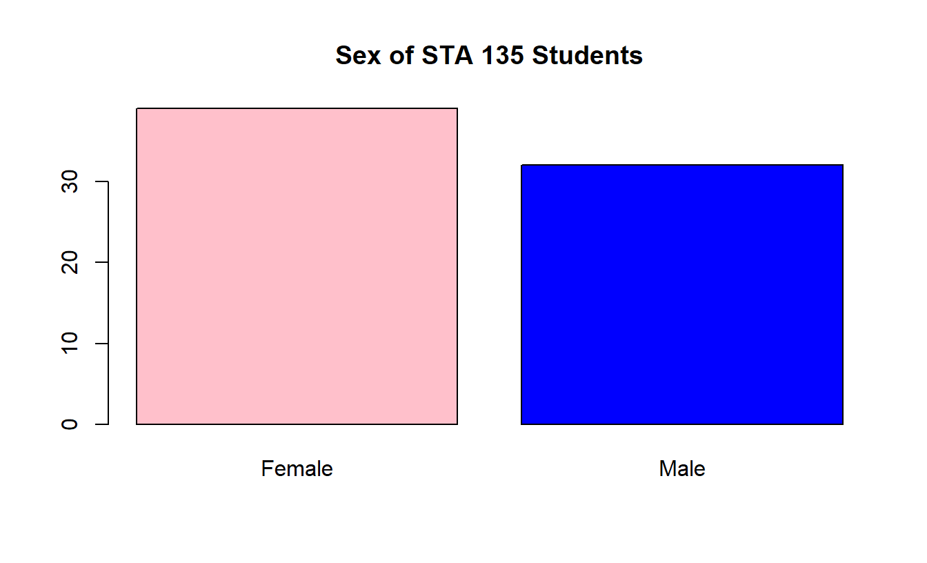
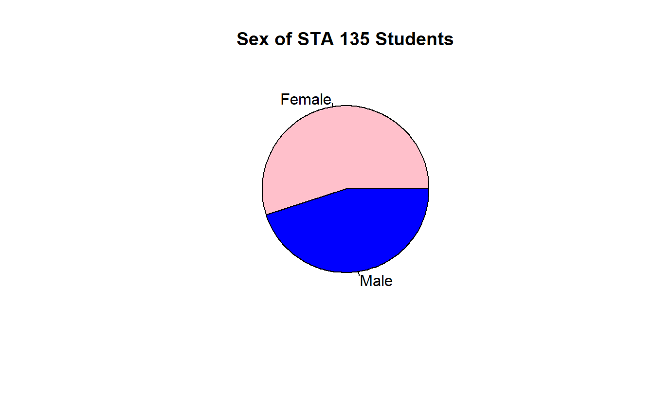
The data from the frequency table in the previous slide can be displayed graphically with either a bar chart or a pie chart.
These graphs end up being harder to create then they should be. We can’t directly create them using the STAT Plot menu on a TI-83 or TI-84. Sorry.
You can “hand-draw” them on an assignment. By the way, experts in statistical graphics hate pie charts!
2.4 Histogram
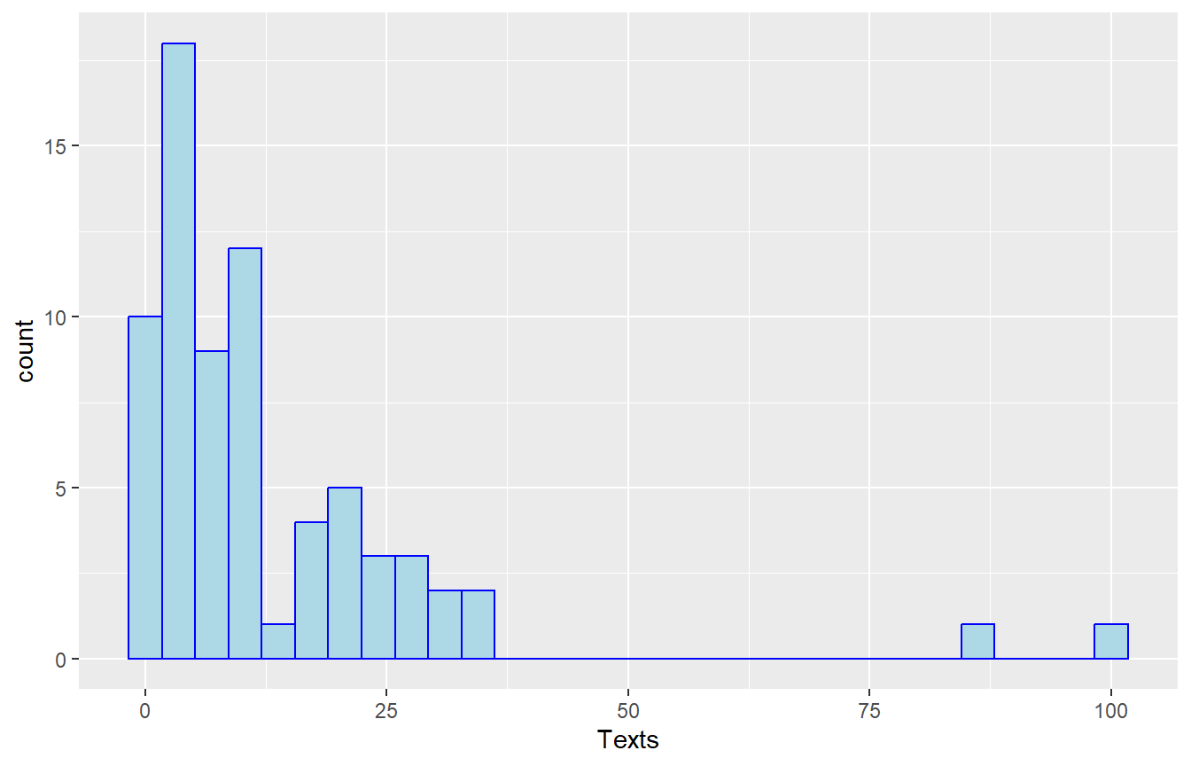
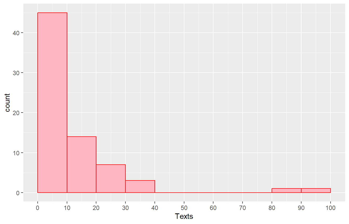
Suppose I want to draw a graph based on how many text messages students sent. The usual way to do this is a variation of a bar chart called a histogram, where the bin width or interval is chosen, usually with the binwidth being equal and yielding 5 to 10 categories/bars. Below are a few examples, with different choices for the binwidth or number of bars.
The first histogram was one allowing my software to choose. It choose to use 30 intervals, so each interval is \(100/30=3.33\) texts wide, which is inconvenient.
The second histogram is one where I specified the binwidth to be 10, probably a better choice.
2.5 Stemplot
A common way to display a quantitative data set is with a stem-and-leaf plot, also known as a stemplot. Each data value is divided into two pieces. The leaf consists of the final significant digit, and the stem the remaining digits.
If we were going to do a stemplot of ages and we had a 42 year-old man, the stem would be the ‘4’ and the leaf the ‘2’. If we had a 9 year-old girl, the stem would be ‘0’ and the leaf the ‘9’.
Here is a stemplot for the number of text messages you sent.
## 1 | 2: represents 12
##  leaf unit: 1
##             n: 71
##   (41)    0 | 00000011112222223344444555556667788889999
##    30     1 | 0000122236777
##    17     2 | 00000333788
##     6     3 | 0234
##           4 |
##           5 |
##           6 |
##           7 |
##     2     8 | 7
##           9 |
##     1    10 | 0
## ________________________________________________________________
## 1 | 2: represents 12, leaf unit: 1
## Texts[Sex == "Male"] Texts[Sex == "Female"]
## ________________________________________________________________
## (20) 98765554332221100000| 0 |011222444455667888999 (21)
## 12 21000| 1 |02236777 18
## 7 7300| 2 |0003388 10
## 3 0| 3 |234 3
## | 4 |
## | 5 |
## | 6 |
## | 7 |
## 2 7| 8 |
## | 9 |
## 1 0| 10 |
## ________________________________________________________________
## n: 32 39
## ________________________________________________________________2.6 Shape
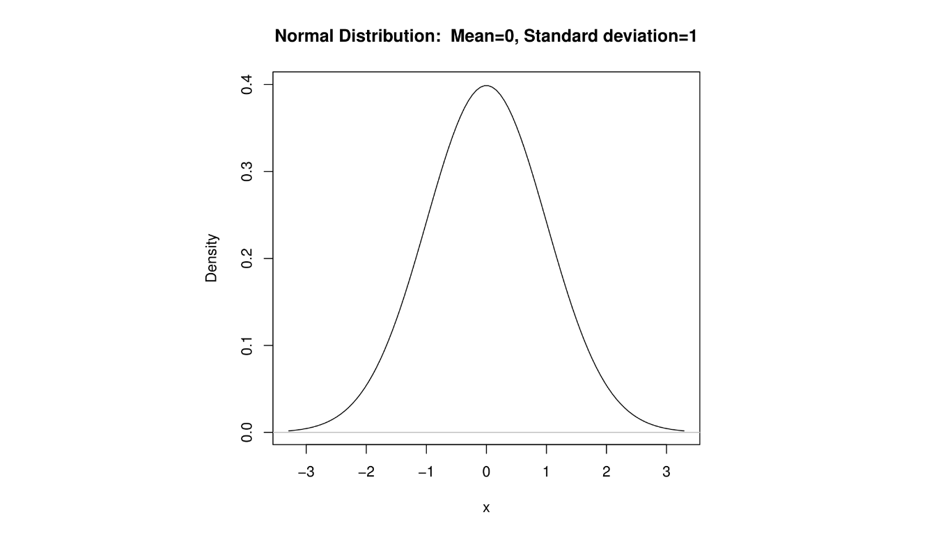
In addition to the center and variability of a distribution, we are interested in shape. A distribution that has the property that the part of the distribution below the median matches the part above the median is said to be symmetric.
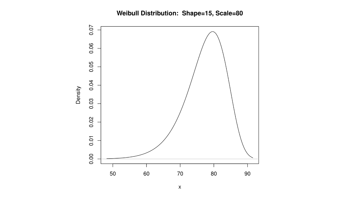
The mean will equal the median when the distribution is symmeteric. The well-known distribution is symmetric.
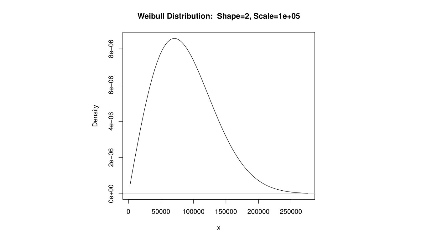
2.7 Right-Skewed Distribution
A distibution that is not symmetric, but has the property that the mean is greater than the median and has a ‘tail’ of low probability to the right is said to be right-skewed, or positively skewed.
The income of a sample of Americans would probably be right-skewed, as a small percentage of people make very large salaries.
2.8 Left-Skewed Distribution
A distibution that is not symmetric, but has the property that the mean is less than the median and has a ‘tail’ of low probability to the left is said to be left-skewed, or negatively skewed.
The ages of patients suffering from Alzheimer’s disease would be left-skewed, as a small percentage of younger people have an early onset of the disorder.
2.9 Measures of Central Tendency
We often are interested in the central value, or ‘average’, of a distribution. Common statistics used to measure the center of a distribution include:
- mean
- median
- mode
2.10 Sample Mean
The mean (or arithmetic mean) of a dataset is just the average, computed as you would expect (i.e. add up the values and divide by sample size).
The mean of a sample is referred to as a statistic (a characteristic of a sample) and is computed as \[\bar{x}=\frac{\sum x}{n}\]
2.11 Population Mean
The mean of a population is referred to as a parameter (a characteristic of a population) and is computed as \[\mu=\frac{\sum x}{n}\]
Notice we are using Greek letters for population parameters. This is the usual convention (although exceptions do exist).
2.12 Median and Mode
The median is the middle value in an ordered data set. The median is often used if outliers (i.e. unusually small or large values) exist in the dataset. Outliers will affect the mean more than the median. We say the median is more resistant, or robust, to the effect of outliers.
The median is computed by taking the \(\frac{n+1}{2}\)th ordered data value, averaging the two middle values if \(\frac{n+1}{2}\) is not an integer.
The mode is the most frequent value in the data set. A data set may have mulitple modes, and the mode may not necessarily be found in the center of the distribution.
2.13 Computing Mean, Median, Mode
Here, instead of using data I collected from the class, the data below are hypothetical exam scores that a class with \(n=35\) students might have earned. I’ll use this data set in class to demonstrate the use of the TI-83/84 calculator.
## 1 | 2: represents 12
##  leaf unit: 1
##             n: 35
##    1     2 | 9
##          3 |
##    4     4 | 579
##    5     5 | 3
##   11     6 | 233578
##   (8)    7 | 11124578
##   16     8 | 011236677789
##    4     9 | 367
##    1    10 | 0
Mean: \(\bar{x}=\frac{2603}{35}=74.4\)
Median: \(M=77\) (the \(\frac{35+1}{2}=18\)th ordered value)
Mode: 71 and 87 (both occur three times)
2.14 Measures of Variability
In addition to central tendency, we are also interested in the amount of spread, or variability, in the data. Are the data clustered close to the mean or is there a wide range?
Statistics for measuring variability include:
- Range
- Five-Number Summary and IQR
- Variance and Standard Deviation
2.15 Range and Five-Number Summary
The five-number summary is a set of five statistics that gives information about the center, spread, and shape of a distribution. It consists of the following values:
Minimum (\(Min\))
First Quartile (\(Q_1\))
Median (\(M\))
Third Quartile (\(Q_3\))
Maximum (\(Max\))
We will use the simplest way to compute the quartiles, that corresponds to how a TI-83 or TI-84 calculator computes them. Some software will compute the quartiles with a more complex method and get slightly different answers; we won’t worry about those details in this class.
2.16 Five-Number Summary
We already know how to compute the median, and the minimum and maximum are just the smallest and largest values in the data set.
The first quartile, \(Q_1\), is the 25th percentile of the data set. We will compute it by taking the median of the lower half of the data set. For example, the exam scores data set has \(n=35\) data values. The median, \(M=77\), was the 18th data value. So \(Q_1\) will be the median of the 17 values below 77.
Similarly, the third quartile, \(Q_3\), is the 75th percentile of the data set. It is the median of the data values greater than the median.
2.17 Range and Five-Number Summary
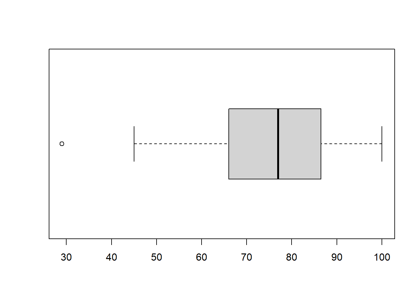
The five-number summary of the exam scores data set.
1.\(Min=29\) (the 1st or minimum value)
\(Q_1=65\) (the 9th value)
\(M=77\) (the 18th or middle value)
\(Q_3=87\) (the 27th value)
\(Max=100\) (the 35th or largest value)
The range is a simple measure of variability that is \(Range=Max-Min\). The interquartile range is \(IQR=Q_3-Q_1\), which measures the variability of the middle 50% of the distribution. Here, the range=71 and \(IQR=22\).
2.18 Outliers
The famous statistician John Tukey has a simple rule for determining if a point in a data set is small/large enough to be an outlier.
First, compute the Step, where \(Step=1.5*IQR\). In the exam scores example, Step=33.
Next, subtract the step from the first quartile. \(Q_1-Step=65-33=32\). Any exam scores below 32 are outliers. In our problem, the score of 29 is an outlier on the low end.
Finally, add the step to the third quartile. \(Q_3+Step=87+33=120\). Any exam scores above 120 are outliers. In our problem, no points qualify as outliers on the high end. These values 32 and 120 are sometimes called fences; outliers are ‘outside’ the fences.
2.19 Tukey’s Boxplot
The boxplot is a graph that displays information from the five-number summary, along with outliers. The vertical, or y-axis, has the range of data values. Horizontal lines are drawn at the first quartile, median, and third quartile, and are connected with vertical lines to form a ‘box’. Sometimes the boxplot is oriented such that the x-axis is used to display the range of values rather than the y-axis.
‘Whiskers’ are vertical lines that are drawn from the quartiles to the smallest/largest values that are NOT outliers.
Points that are outliers are displayed with a symbol such as an asterisk or circle to clearly identify their outlier status.
The student who got a very low score of 29, is indicated as an outlier.
2.20 Variance and Standard Deviation
A weakness of the range is that it only uses the two most extreme values in the data set. The IQR is better, but it would be preferable to have a statistic that uses all values in the data set in an effort to measure the `average deviation’ or distance from the mean.
The deviation is defined as \(x-\bar{x}\). For example, if Dr. X is 42 and the average college professor is 48, the deviation is 42-48=-6, or Dr. X is six years younger than average.
Unfortunately, the sum of deviations, \(\sum (x-\bar{x})\) will equal zero for all data sets. Therefore, we cannot just compute the `average deviation’.
Occasionally we take the absolute value of the deviations, but the standard method for computing variability is based on squared deviations.
If we have a sample of data (i.e. a portion of a larger population), the variance is computed as: \[s^2=\frac{\sum (x-\bar{x})^2}{n-1}\]
Less commonly, if our data represents an entire population, the variance is: \[\sigma^2=\frac{\sum (x-\mu)^2}{n}\]
The standard deviation (either \(s\) or \(\sigma\)) is the square root of variance.
An example of computing the variance for a sample of \(n=5\) ages, where \(\bar{x}=44.2\) years.
| \(x\) | \(x-\bar{x}\) | \((x-\bar{x})^2\) |
|---|---|---|
| 29 | -15.2 | 231.04 |
| 35 | -9.2 | 84.64 |
| 42 | -2.2 | 4.84 |
| 50 | 5.8 | 33.64 |
| 65 | 20.8 | 432.64 |
| \(\sum\): 221 | 0 | 786.80 |
So the variance is \[s^2=\frac{786.8}{5-1}=196.7\] where the unit is years squared.
It is usually more convenient to take the square root. The standard deviation is \(s=\sqrt{196.7}=14.02\) years.
Obviously we want to use technology for large data sets.