2.4 Example: Particulate Matter Concentrations
For this chapter, we will use as a running sample some air pollution data from the U.S. Environmental Protection Agency. This dataset consists of particulate matter less than or equal to 2.5 \(\mu\)g/m\(^3\) in aerodynamic diameter for 2017 and 2018.
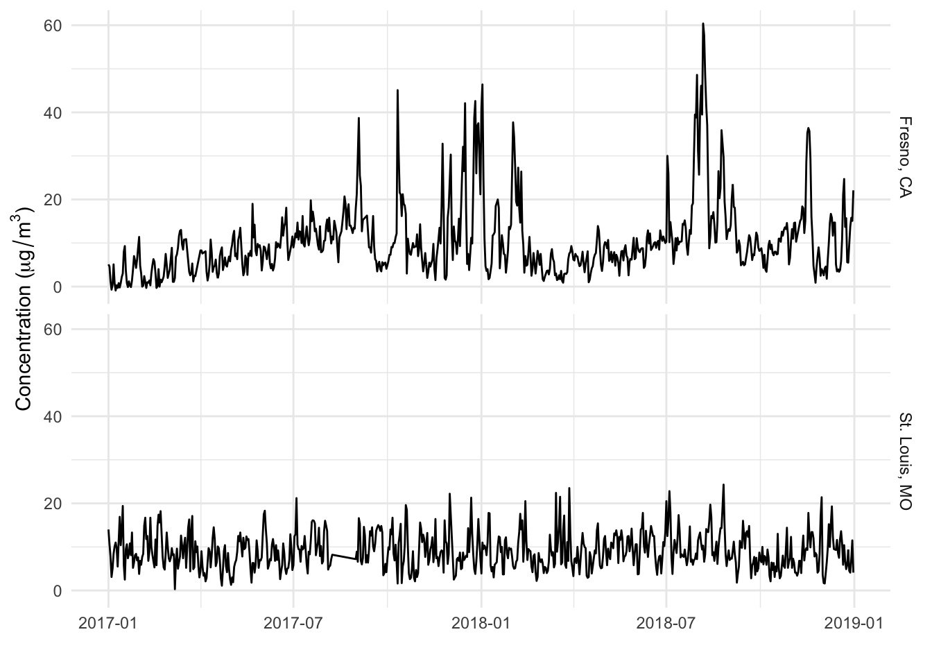
We will focus in particular on data from two specific monitors, one in Fresno, California, and one in St. Louis, Missouri.
Here is what the data look like when plotted over time.
First, try to describe these time series, given what (little) we know about them:
They are daily time series of air pollution levels in two U.S. cities for 2017–2018.
The overall average for the Fresno, CA series seems higher than the the St. Louis, MO series.
The Fresno series seems a bit “spikier” than the St. Louis series.
In Fresno, there seems to be a seasonal trend; a steady increase in levels from January through July, after which there is larger variation and a decrease; in generall it is higher in the summer and lower in the winter.
The St. Louis series seems very steady in terms of its level throughout the year; there aren’t any strong trends up or down and there doesn’t appear to demonstrate strong seasonality
Of course, we have the data, so we can attempt to verify some of these claims.
The overall mean and variance values for each city.
# A tibble: 2 x 3
  city           mean variance
  <chr>         <dbl>    <dbl>
1 Fresno, CA    10.6      74.5
2 St. Louis, MO  9.07     17.0
We can check for seasonal trends, using quarterly averages.
# A tibble: 8 x 4
# Groups:   city [2]
  city          season  mean    sd
  <chr>          <int> <dbl> <dbl>
1 Fresno, CA         1  6.81  7.69
2 Fresno, CA         2  7.73  3.09
3 Fresno, CA         3 15.1  10.1
4 Fresno, CA         4 12.5   9.06
5 St. Louis, MO      1  9.16  4.25
6 St. Louis, MO      2  8.47  3.56
7 St. Louis, MO      3 10.3   4.19
8 St. Louis, MO      4  8.52  4.26
From here we can see that Fresno’s mean increase until the third quarter and then decreases a little. St. Louis’s mean actually decreases a little in the second quarter and then goes back up in the third quarter. Note that the sd column shows the standard deviation of the data, not the standard deviation of the mean.
Another (arguably better) way that we can represent the above table is as an overal mean and deviation.
# A tibble: 8 x 4
# Groups:   city [2]
  city          season overall     dev
  <chr>          <int>   <dbl>   <dbl>
1 Fresno, CA         1   10.6  -3.76
2 Fresno, CA         2   10.6  -2.84
3 Fresno, CA         3   10.6   4.53
4 Fresno, CA         4   10.6   1.94
5 St. Louis, MO      1    9.07  0.0912
6 St. Louis, MO      2    9.07 -0.599
7 St. Louis, MO      3    9.07  1.18
8 St. Louis, MO      4    9.07 -0.546
Here it is clear which seasons are “below average” and which ones are above average.
So far we have characterized the data above in terms of
Linear trends (increasing and decreasing) over time
Seasonality, yearly periods over time
Overall level (mean) across time
Variability (spikiness) across time
These four characteristics may seem straightforward and basic but they are critical components to understanding the structure of many kinds of time series.