11.1 K-Means
The k-means clustering algorithm randomly assigns all observations to one of \(k\) clusters. K-means then iteratively calculates the cluster centroids and reassigns the observations to their nearest centroid. The centroid is the mean of the points in the cluster (Hence the name “k-means”). The iterations continue until either the centroids stabilize or the iterations reach a set maximum, iter.max (typically 50). The result is k clusters with the minimum total intra-cluster variation.
The centroid of cluster \(c_i \in C\) is the mean of the cluster observations \(S_i\): \(c_i = \frac{1}{|S_i|} \sum_{x_i \in S_i}{x_i}\). The nearest centroid is the minimum squared euclidean distance, \(\underset{c_i \in C}{\operatorname{arg min}} dist(c_i, x)^2\). A more robust version of k-means is partitioning around medoids (pam), which minimizes the sum of dissimilarities instead of a sum of squared euclidean distances. That’s what I’ll use.
The algorithm will converge to a result, but the result may only be a local optimum. Other random starting centroids may yield a different local optimum. Common practice is to run the k-means algorithm nstart times and select the lowest within-cluster sum of squared distances among the cluster members. A typical number of runs is nstart = 20.
Choosing K
What is the best number of clusters? You may have a preference in advance, but more likely you will use a scree plot or use the silhouette method. The scree plot is a plot of the total within-cluster sum of squared distances as a function of k. The sum of squares always decreases as k increases, but at a declining rate. The optimal k is at the “elbow” in the curve - the point at which the curve flattens. kmeans() returns an object of class kmeans, a list in which one of the components is the model sum of squares tot.withinss. In the scree plot below, the elbow may be k = 5.
wss <- map_dbl(2:10, ~ kmeans(dat_2_gwr, centers = .x)$tot.withinss)
wss_tbl <- tibble(k = 2:10, wss)
ggplot(wss_tbl, aes(x = k, y = wss)) +
  geom_point(size = 2) +
  geom_line() +
  scale_x_continuous(breaks = 2:10) +
  labs(title = "Scree Plot")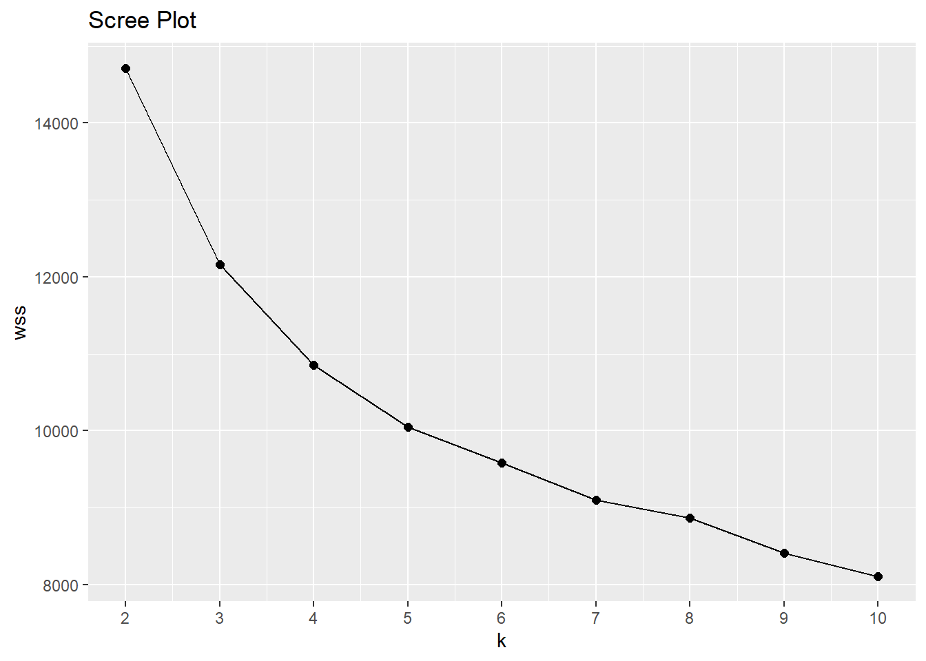
The silhouette method calculates the within-cluster distance \(C(i)\) for each observation, and its distance to the nearest cluster \(N(i)\). The silhouette width is \(S = 1 - C(i) / N(i)\) for \(C(i) < N(i)\) and \(S = N(i) / C(i) - 1\) for \(C(i) > N(i)\). A value close to 1 means the observation is well-matched to its current cluster; A value near 0 means the observation is on the border between the two clusters; and a value near -1 means the observation is better-matched to the other cluster. The optimal number of clusters is the number that maximizes the total silhouette width. cluster::pam() returns a list in which one of the components is the average width silinfo$avg.width. In the silhouette plot below, the maximum width is at k = 6.
sil <- map_dbl(2:10, ~ pam(dat_2_gwr, k = .x)$silinfo$avg.width)
sil_tbl <- tibble(k = 2:10, sil)
ggplot(sil_tbl, aes(x = k, y = sil)) +
  geom_point(size = 2) +
  geom_line() +
  scale_x_continuous(breaks = 2:10) +
  labs(title = "Silhouette Plot")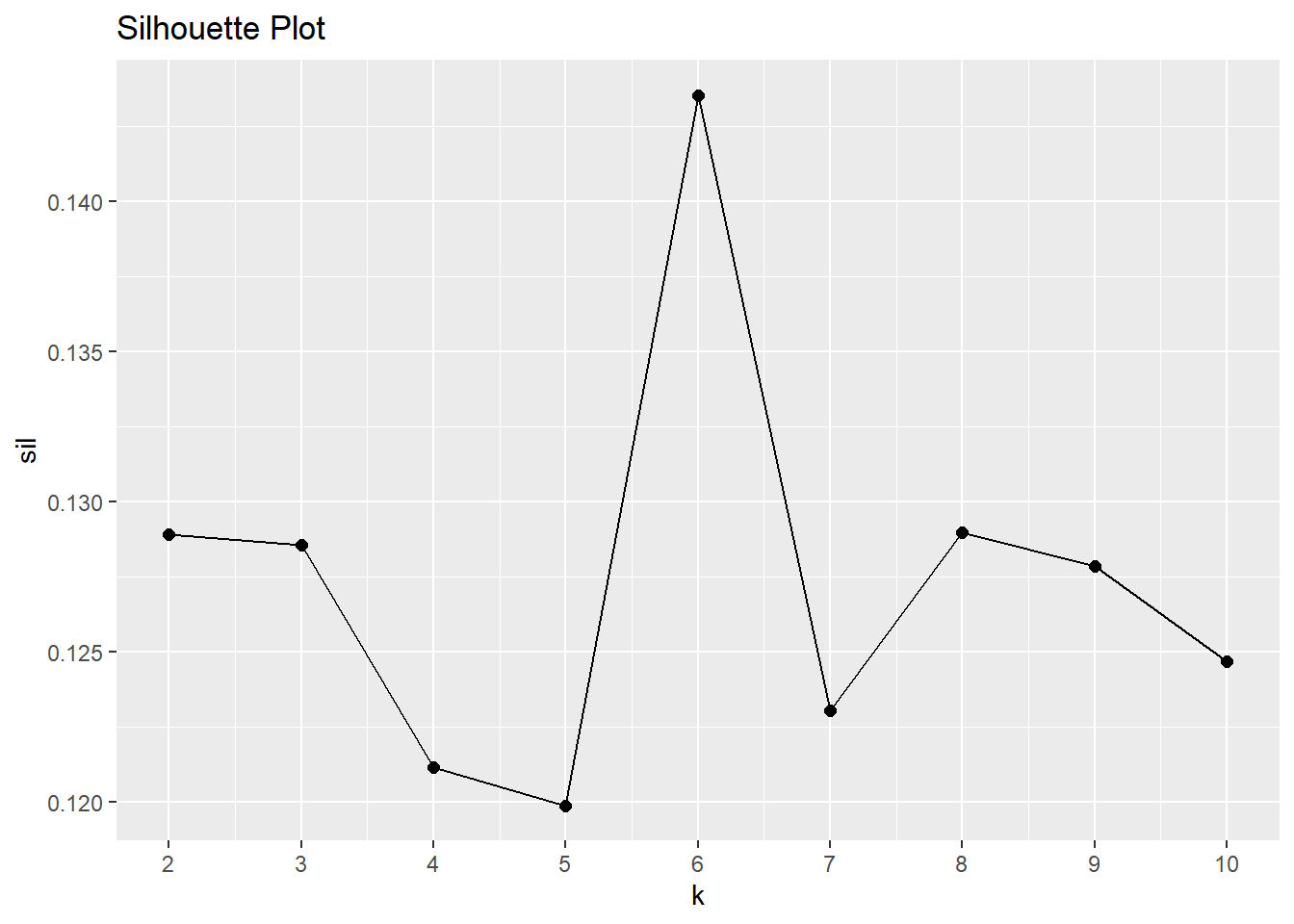
Summarize Results
Run pam() again and attach the results to the original table for visualization and summary statistics.
Here are the six medoids from our data set.
dat_2[mdl$medoids, ] %>%
  t() %>% as.data.frame() %>% rownames_to_column() %>%
  flextable::flextable() %>% flextable::autofit()
rowname | V1 | V2 | V3 | V4 | V5 | V6 |
EmployeeNumber | 1171 | 35 | 65 | 221 | 747 | 1408 |
Attrition | No | No | Yes | No | No | No |
OverTime | No | No | Yes | No | No | No |
JobLevel | 2 | 2 | 1 | 1 | 2 | 4 |
MonthlyIncome | 5155 | 6825 | 3441 | 2713 | 5304 | 16799 |
YearsAtCompany | 6 | 9 | 2 | 5 | 8 | 20 |
StockOptionLevel | 0 | 1 | 0 | 1 | 1 | 1 |
YearsWithCurrManager | 5 | 2 | 2 | 2 | 7 | 9 |
TotalWorkingYears | 9 | 10 | 2 | 5 | 10 | 21 |
MaritalStatus | Single | Married | Single | Married | Divorced | Married |
Age | 42 | 42 | 28 | 28 | 30 | 42 |
YearsInCurrentRole | 4 | 7 | 2 | 2 | 7 | 7 |
JobRole | Sales Executive | Sales Executive | Laboratory Technician | Research Scientist | Sales Executive | Manager |
EnvironmentSatisfaction | 2 | 3 | 3 | 3 | 3 | 3 |
JobInvolvement | 3 | 3 | 3 | 3 | 3 | 3 |
BusinessTravel | Travel_Rarely | Travel_Rarely | Travel_Rarely | Travel_Rarely | Travel_Rarely | Travel_Rarely |
We’re most concerned about attrition. Do high-attrition employees fall into a particular cluster? Yes! 79.7% of cluster 3 left the company - that’s 59.5% of all turnover in the company.
dat_3_smry <- dat_3 %>%
  count(cluster, Attrition) %>%
  group_by(cluster) %>%
  mutate(cluster_n = sum(n),
         turnover_rate = scales::percent(n / sum(n), accuracy = 0.1)) %>%
  ungroup() %>%
  filter(Attrition == "Yes") %>%
  mutate(pct_of_turnover = scales::percent(n / sum(n), accuracy = 0.1)) %>%
  select(cluster, cluster_n, turnover_n = n, turnover_rate, pct_of_turnover)
dat_3_smry %>% flextable::flextable() %>% flextable::autofit()
cluster | cluster_n | turnover_n | turnover_rate | pct_of_turnover |
1 | 268 | 23 | 8.6% | 9.7% |
2 | 280 | 24 | 8.6% | 10.1% |
3 | 177 | 141 | 79.7% | 59.5% |
4 | 364 | 29 | 8.0% | 12.2% |
5 | 202 | 8 | 4.0% | 3.4% |
6 | 179 | 12 | 6.7% | 5.1% |
You can get some sense of the quality of clustering by constructing the Barnes-Hut t-Distributed Stochastic Neighbor Embedding (t-SNE).
dat_4 <- dat_3 %>%
left_join(dat_3_smry, by = "cluster") %>%
rename(Cluster = cluster) %>%
mutate(
MonthlyIncome = MonthlyIncome %>% scales::dollar(),
description = str_glue("Turnover = {Attrition}
MaritalDesc = {MaritalStatus}
Age = {Age}
Job Role = {JobRole}
Job Level {JobLevel}
Overtime = {OverTime}
Current Role Tenure = {YearsInCurrentRole}
Professional Tenure = {TotalWorkingYears}
Monthly Income = {MonthlyIncome}
Cluster: {Cluster}
Cluster Size: {cluster_n}
Cluster Turnover Rate: {turnover_rate}
Cluster Turnover Count: {turnover_n}
"))
tsne_obj <- Rtsne(dat_2_gwr, is_distance = TRUE)
tsne_tbl <- tsne_obj$Y %>%
as_tibble() %>%
setNames(c("X", "Y")) %>%
bind_cols(dat_4) %>%
mutate(Cluster = as_factor(Cluster))
g <- tsne_tbl %>%
ggplot(aes(x = X, y = Y, colour = Cluster, text = description)) +
geom_point()
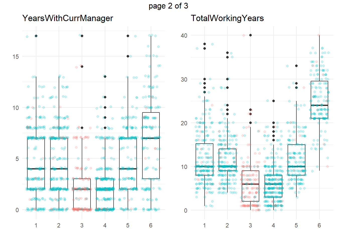
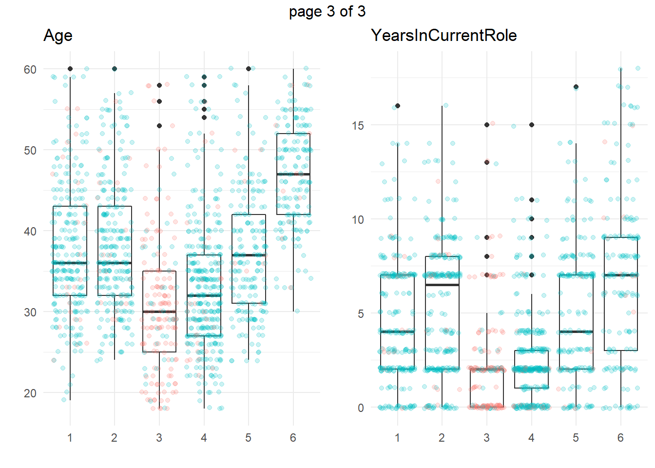
ggplotly(g)Another common approach is to take summary statistics and draw your own conclusions. You might start by asking which attributes differ among the clusters. The box plots below show the distribution of the numeric variables. All of the numeric variable distributions appear to vary among the clusters.
my_boxplot <- function(y_var){
  dat_3 %>%
    ggplot(aes(x = cluster, y = !!sym(y_var))) +
    geom_boxplot() +
    geom_jitter(aes(color = Attrition), alpha = 0.2, height = 0.10) +
    theme_minimal() +
    theme(legend.position = "none") +
    labs(x = "", y = "", title = y_var)
}
vars_numeric <- dat_3 %>% select(-EmployeeNumber) %>% select_if(is.numeric) %>% colnames()
g <- map(vars_numeric, my_boxplot)
gridExtra::marrangeGrob(g, nrow=1, ncol = 2)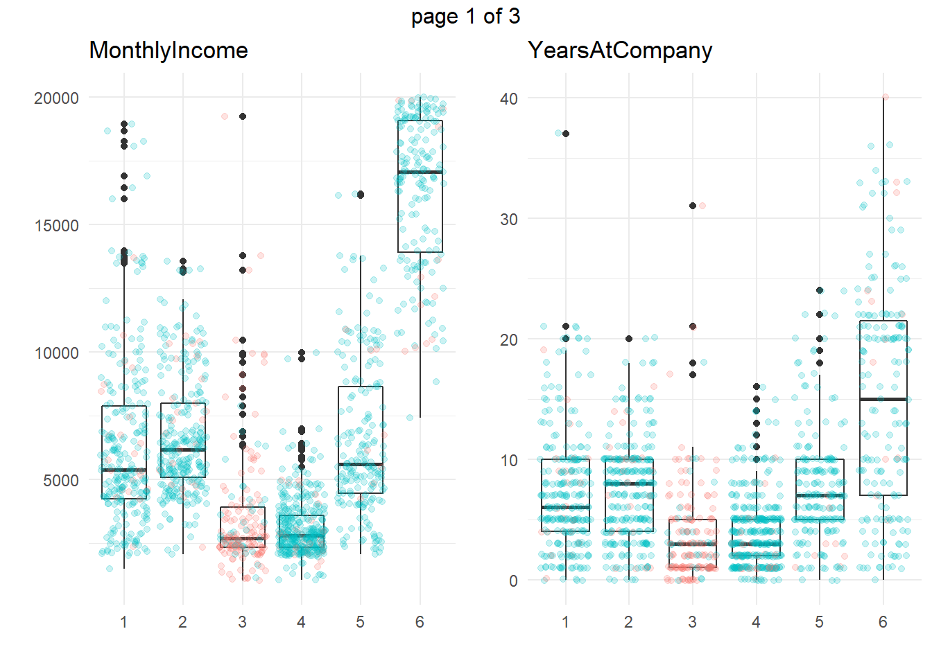
You can perform an analysis of variance to confirm. The table below collects the ANOVA results for each of the numeric variables. The results indicate that there are significant differences among clusters at the .01 level for all of the numeric variables.
km_aov <- vars_numeric %>%
  map(~ aov(rlang::eval_tidy(expr(!!sym(.x) ~ cluster)), data = dat_3))
km_aov %>%
  map(anova) %>%
  map(~ data.frame(F = .x$`F value`[[1]], p = .x$`Pr(>F)`[[1]])) %>%
  bind_rows() %>%
  bind_cols(Attribute = vars_numeric) %>%
  select(Attribute, everything()) %>%
  flextable::flextable() %>%
  flextable::autofit() %>%
  flextable::colformat_num(j = 2, digits = 2) %>%
  flextable::colformat_num(j = 3, digits = 4)
Attribute | F | p |
MonthlyIncome | 718.88 | 0.0000 |
YearsAtCompany | 134.58 | 0.0000 |
YearsWithCurrManager | 65.53 | 0.0000 |
TotalWorkingYears | 342.88 | 0.0000 |
Age | 98.76 | 0.0000 |
YearsInCurrentRole | 69.53 | 0.0000 |
We’re particularly interested in cluster 3, the high attrition cluster, and what sets it apart from the others. Right away, we can see that clusters 3 and 4 similar in almost all of theses attributes. They tend to have the smaller incomes, company and job tenure, years with their current manager, total working experience, and age. I.e., they tend to be lower on the career ladder.
To drill into cluster differences to determine which clusters differ from others, use the Tukey HSD post hoc test with Bonferroni method applied to control the experiment-wise error rate. That is, only reject the null hypothesis of equal means among clusters if the p-value is less than \(\alpha / p\), or \(.05 / 6 = 0.0083\). The significantly different cluster combinations are shown in bold. Clusters 3 and 4 differ from the others on all six measures. However, there are no significant differences between c3 and c4 (highlighted green) for the numeric variables.
km_hsd <- map(km_aov, TukeyHSD)

map(km_hsd, ~ .x$cluster %>%
      data.frame() %>%
      rownames_to_column() %>%
      filter(str_detect(rowname, "-"))) %>%
  map2(vars_numeric, bind_cols) %>%
  bind_rows() %>%
  select(predictor = `...6`, everything()) %>%
  mutate(cluster_a = str_sub(rowname, start = 1, end = 1),
         cluster = paste0("c", str_sub(rowname, start = 3, end = 3))) %>%
  pivot_wider(c(predictor, cluster_a, cluster, p.adj),
              names_from = cluster_a, values_from = p.adj,
              names_prefix = "c") %>%
  flextable::flextable() %>%
  flextable::colformat_num(j = c(3:7), digits = 4) %>%
  flextable::bold(i = ~ c2 < .05 / length(vars_numeric), j = ~ c2, bold = TRUE) %>%
  flextable::bold(i = ~ c3 < .05 / length(vars_numeric), j = ~ c3, bold = TRUE) %>%
  flextable::bold(i = ~ c4 < .05 / length(vars_numeric), j = ~ c4, bold = TRUE) %>%
  flextable::bold(i = ~ c5 < .05 / length(vars_numeric), j = ~ c5, bold = TRUE) %>%
  flextable::bold(i = ~ c6 < .05 / length(vars_numeric), j = ~ c6, bold = TRUE) %>%
  flextable::bg(i = ~ cluster == "c3", j = ~ c4, bg = "#B6E2D3") %>%
  flextable::autofit()
predictor | cluster | c2 | c3 | c4 | c5 | c6 |
MonthlyIncome | c1 | 0.6587 | 0.0000 | 0.0000 | 0.9720 | 0.0000 |
MonthlyIncome | c2 | 0.0000 | 0.0000 | 0.9899 | 0.0000 | |
MonthlyIncome | c3 | 0.3975 | 0.0000 | 0.0000 | ||
MonthlyIncome | c4 | 0.0000 | 0.0000 | |||
MonthlyIncome | c5 | 0.0000 | ||||
YearsAtCompany | c1 | 0.9999 | 0.0000 | 0.0000 | 0.9922 | 0.0000 |
YearsAtCompany | c2 | 0.0000 | 0.0000 | 0.9989 | 0.0000 | |
YearsAtCompany | c3 | 0.9935 | 0.0000 | 0.0000 | ||
YearsAtCompany | c4 | 0.0000 | 0.0000 | |||
YearsAtCompany | c5 | 0.0000 | ||||
YearsWithCurrManager | c1 | 1.0000 | 0.0000 | 0.0000 | 0.9763 | 0.0000 |
YearsWithCurrManager | c2 | 0.0000 | 0.0000 | 0.9595 | 0.0000 | |
YearsWithCurrManager | c3 | 0.9965 | 0.0000 | 0.0000 | ||
YearsWithCurrManager | c4 | 0.0000 | 0.0000 | |||
YearsWithCurrManager | c5 | 0.0000 | ||||
TotalWorkingYears | c1 | 0.9840 | 0.0000 | 0.0000 | 0.9980 | 0.0000 |
TotalWorkingYears | c2 | 0.0000 | 0.0000 | 0.8934 | 0.0000 | |
TotalWorkingYears | c3 | 0.9998 | 0.0000 | 0.0000 | ||
TotalWorkingYears | c4 | 0.0000 | 0.0000 | |||
TotalWorkingYears | c5 | 0.0000 | ||||
Age | c1 | 0.9980 | 0.0000 | 0.0000 | 0.9989 | 0.0000 |
Age | c2 | 0.0000 | 0.0000 | 0.9691 | 0.0000 | |
Age | c3 | 0.0532 | 0.0000 | 0.0000 | ||
Age | c4 | 0.0000 | 0.0000 | |||
Age | c5 | 0.0000 | ||||
YearsInCurrentRole | c1 | 0.1013 | 0.0000 | 0.0000 | 0.6471 | 0.0000 |
YearsInCurrentRole | c2 | 0.0000 | 0.0000 | 0.9573 | 0.0000 | |
YearsInCurrentRole | c3 | 0.9854 | 0.0000 | 0.0000 | ||
YearsInCurrentRole | c4 | 0.0000 | 0.0000 | |||
YearsInCurrentRole | c5 | 0.0000 |
So at this point we have kind of an incomplete picture. We know the high-attrition employees are low on the career ladder, but cluster 4 is also low on the career ladder and they are not high-attrition.
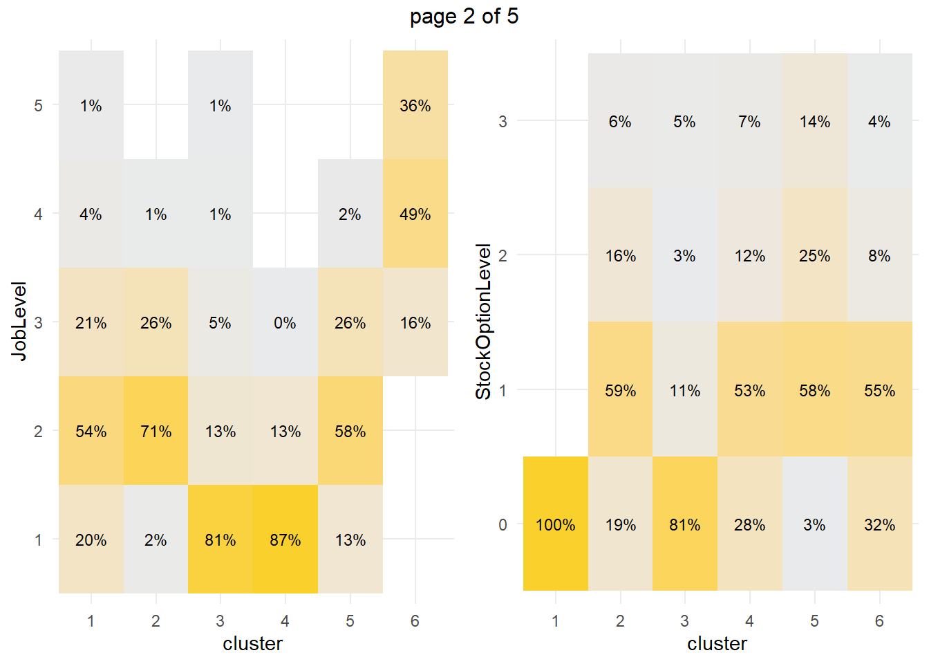
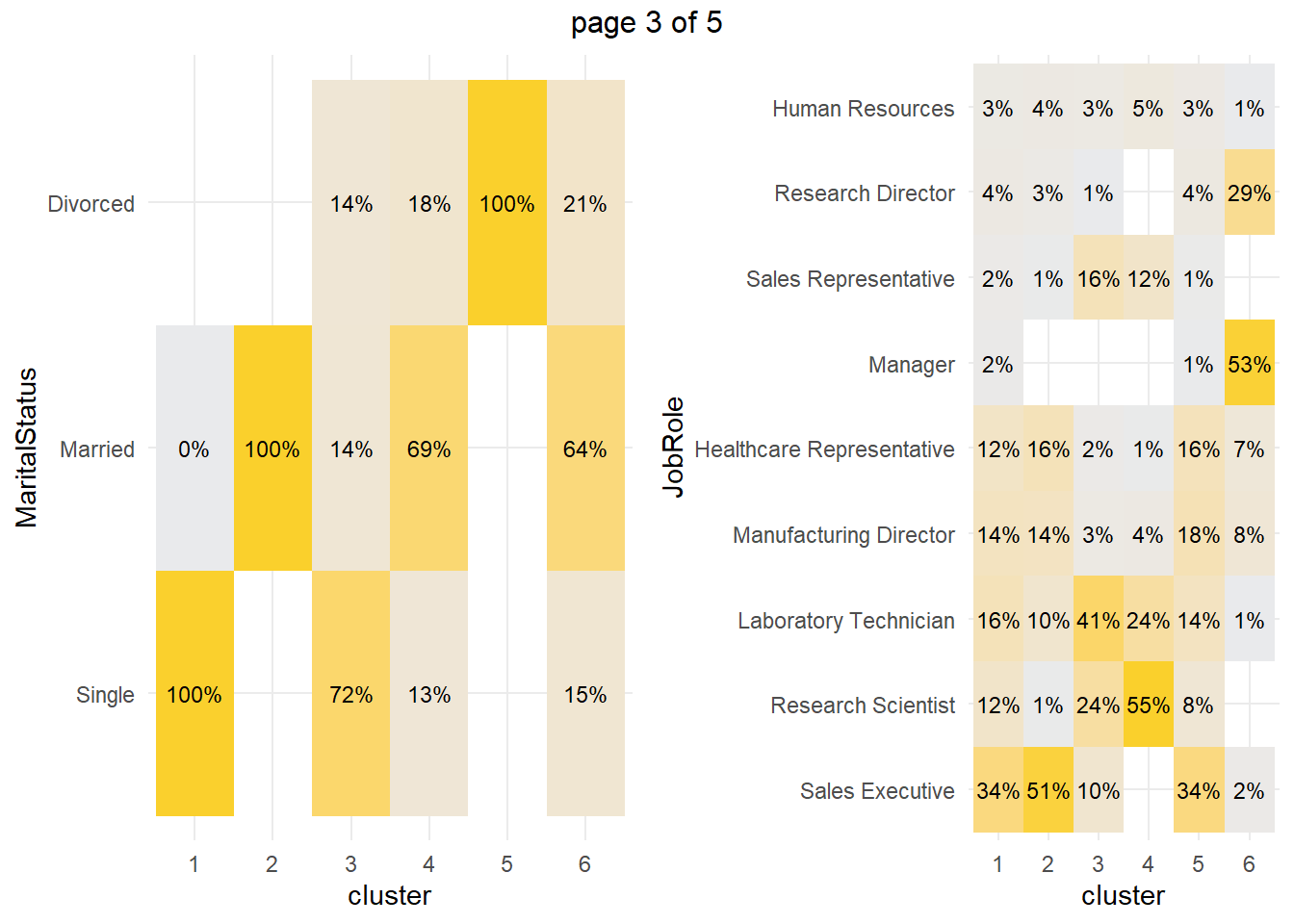
How about the factor variables? The tile plots below show that clusters 3 and 4 are lab technicians and research scientists. They are both at the lowest job level. But three factors distinguish these clusters from each other: cluster 3 is far more likely to work overtime, have no stock options, and be single.
my_tileplot <- function(y_var){
  dat_3 %>%
    count(cluster, !!sym(y_var)) %>%
    ungroup() %>%
    group_by(cluster) %>%
    mutate(pct = n / sum(n)) %>%
    ggplot(aes(y = !!sym(y_var), x = cluster, fill = pct)) +
    geom_tile() +
    scale_fill_gradient(low = "#E9EAEC", high = "#FAD02C") +
    geom_text(aes(label = scales::percent(pct, accuracy = 1.0)), size = 3) +
    theme_minimal() +
    theme(legend.position = "none")
}
vars_factor <- dat_3 %>% select(-cluster) %>% select_if(is.factor) %>% colnames()

g <- map(vars_factor, my_tileplot)
gridExtra::marrangeGrob(g, nrow=1, ncol = 2) 
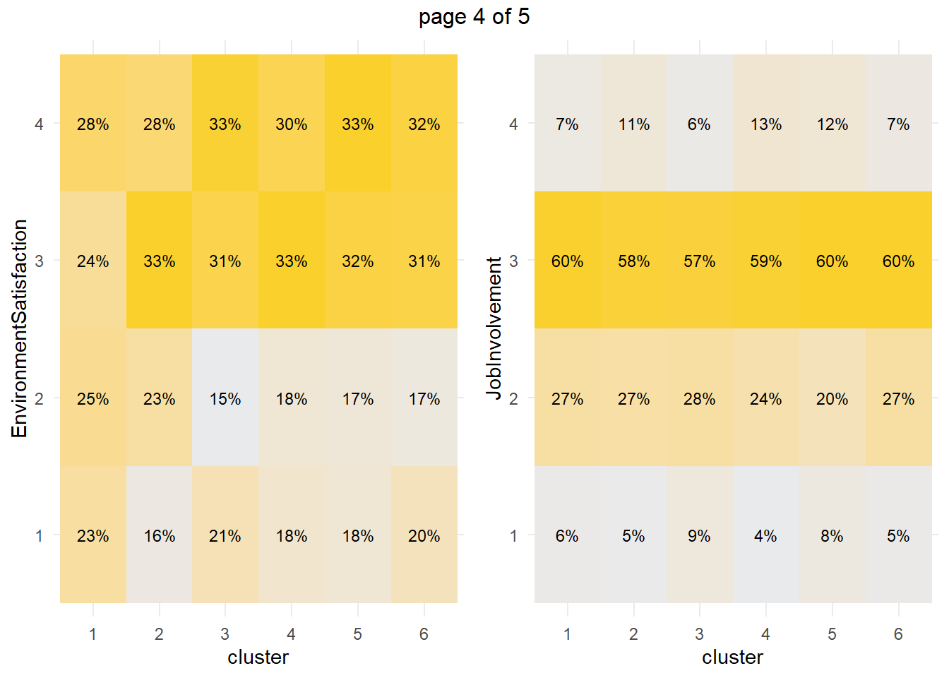
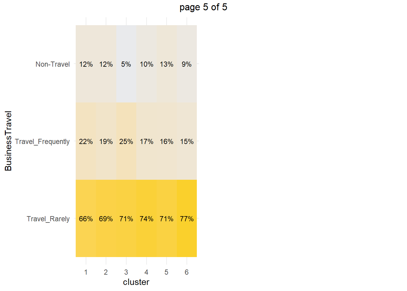
You can perform a chi-squared independence test to confirm. The table below collects the Chis-Sq test results for each of the factor variables. The results indicate that there are significant differences among clusters at the .05 level for all of the factor variables except EnvironmentSatisfaction and JobInvolvement.
km_chisq <- vars_factor %>%
  map(~ janitor::tabyl(dat_3, cluster, !!sym(.x))) %>%
  map(janitor::chisq.test)

km_chisq %>%
  map(~ data.frame(ChiSq = .x$statistic[[1]], df = .x$parameter[[1]], p = .x$p.value[[1]])) %>%
  bind_rows() %>%
  bind_cols(Attribute = vars_factor) %>%
  select(Attribute, everything()) %>%
  flextable::flextable() %>%
  flextable::autofit() %>%
  flextable::colformat_num(j = ~ ChiSq, digits = 1) %>%
  flextable::colformat_num(j = ~ p, digits = 4)
Attribute | ChiSq | df | p |
Attrition | 603.2 | 5 | 0.0000 |
OverTime | 199.9 | 5 | 0.0000 |
JobLevel | 1,855.6 | 20 | 0.0000 |
StockOptionLevel | 731.2 | 15 | 0.0000 |
MaritalStatus | 1,853.4 | 10 | 0.0000 |
JobRole | 1,754.0 | 40 | 0.0000 |
EnvironmentSatisfaction | 20.0 | 15 | 0.1712 |
JobInvolvement | 22.6 | 15 | 0.0938 |
BusinessTravel | 19.7 | 10 | 0.0324 |
We’re particularly interested in cluster 3, the high attrition cluster, and what sets it apart from the others, and cluster 4 in particular. We think it is that cluster 3 is far more likely to work overtime, have no stock options, and be single, but let’s perform a residuals analysis on the the chi-sq test to check. The residuals with absolute value >2 are driving the differences among the clusters.
km_chisq %>%
  map(~ data.frame(.x$residuals)) %>%
  map(data.frame) %>%
  map(t) %>%
  map(data.frame) %>%
  map(rownames_to_column, var = "Predictor") %>%
  map(~ filter(.x, Predictor != "cluster")) %>%
  map(~ select(.x, Predictor, c1 = X1, c2 = X2, c3 = X3, c4 = X4, c5 = X5, c6 = X6)) %>%
  map(~ mutate_at(.x, vars(2:7), as.numeric)) %>%
  map(flextable::flextable) %>%
  map(~ flextable::colformat_num(.x, j = ~ c1 + c2 + c3 + c4 + c5 + c6, digits = 1)) %>%
  map(~ flextable::bold(.x, i = ~ abs(c1) > 2, j = ~ c1, bold = TRUE)) %>%
  map(~ flextable::bold(.x, i = ~ abs(c2) > 2, j = ~ c2, bold = TRUE)) %>%
  map(~ flextable::bold(.x, i = ~ abs(c3) > 2, j = ~ c3, bold = TRUE)) %>%
  map(~ flextable::bold(.x, i = ~ abs(c4) > 2, j = ~ c4, bold = TRUE)) %>%
  map(~ flextable::bold(.x, i = ~ abs(c5) > 2, j = ~ c5, bold = TRUE)) %>%
  map(~ flextable::bold(.x, i = ~ abs(c6) > 2, j = ~ c6, bold = TRUE)) %>%
#  map(~ flextable::bg(i = ~ cluster == "c3", j = ~ c4, bg = "#B6E2D3") %>%
map2(vars_factor, ~ flextable::set_caption(.x, caption = .y))
## [[1]]
## a flextable object.
## col_keys: `Predictor`, `c1`, `c2`, `c3`, `c4`, `c5`, `c6`
## header has 1 row(s)
## body has 2 row(s)
## original dataset sample:
## Predictor c1 c2 c3 c4 c5 c6
## 1 Yes -3.074284 -3.146800 21.052736 -3.875086 -4.304940 -3.138300
## 2 No 1.347835 1.379627 -9.229989 1.698924 1.887382 1.375901
##
## [[2]]
## a flextable object.
## col_keys: `Predictor`, `c1`, `c2`, `c3`, `c4`, `c5`, `c6`
## header has 1 row(s)
## body has 2 row(s)
## original dataset sample:
## Predictor c1 c2 c3 c4 c5 c6
## 1 Yes -4.000828 -0.5884457 10.725697 -3.449431 -0.15403618 0.04836361
## 2 No 2.513485 0.3696858 -6.738324 2.167075 0.09677186 -0.03038401
##
## [[3]]
## a flextable object.
## col_keys: `Predictor`, `c1`, `c2`, `c3`, `c4`, `c5`, `c6`
## header has 1 row(s)
## body has 5 row(s)
## original dataset sample:
## Predictor c1 c2 c3 c4 c5 c6
## 1 X1 -4.622859 -9.678341 9.599235 15.569991 -5.512378 -8.1314460
## 2 X2 4.828776 9.745394 -5.150270 -7.324817 5.208898 -8.0637760
## 3 X3 2.578522 4.729466 -3.561905 -7.211066 4.210211 0.2822892
## 4 X4 -2.121266 -3.825733 -3.012750 -5.123243 -2.768472 20.6230820
## 5 X5 -2.418986 -3.625308 -2.535454 -4.133487 -3.079226 19.1807890
##
## [[4]]
## a flextable object.
## col_keys: `Predictor`, `c1`, `c2`, `c3`, `c4`, `c5`, `c6`
## header has 1 row(s)
## body has 4 row(s)
## original dataset sample:
## Predictor c1 c2 c3 c4 c5 c6
## 1 X0 14.261198 -6.03754600 7.6891380 -4.3398430 -8.667412 -2.1488560
## 2 X1 -10.423939 4.83128800 -6.1104130 3.8210350 3.989103 3.1019730
## 3 X2 -5.367070 2.71691560 -2.9860991 0.4598298 6.071044 -0.9665264
## 4 X3 -3.936572 -0.04733811 -0.6985228 1.0794749 4.775144 -1.0413857
##
## [[5]]
## a flextable object.
## col_keys: `Predictor`, `c1`, `c2`, `c3`, `c4`, `c5`, `c6`
## header has 1 row(s)
## body has 3 row(s)
## original dataset sample:
## Predictor c1 c2 c3 c4 c5 c6
## 1 Single 19.587144 -9.461702 9.492289 -6.338612 -8.036481 -3.9961330
## 2 Married -10.986571 13.408220 -6.224744 6.611745 -9.616666 3.6508300
## 3 Divorced -7.721161 -7.892130 -2.450022 -1.886047 23.430922 -0.4466382
##
## [[6]]
## a flextable object.
## col_keys: `Predictor`, `c1`, `c2`, `c3`, `c4`, `c5`, `c6`
## header has 1 row(s)
## body has 9 row(s)
## original dataset sample:
## Predictor c1 c2 c3 c4 c5
## 1 Sales.Executive 4.224222 10.393935 -3.551837 -8.984643 3.616083
## 2 Research.Scientist -3.047504 -7.055555 1.153688 15.017279 -3.808570
## 3 Laboratory.Technician -0.468456 -3.037306 7.308603 2.730491 -1.272337
## 4 Manufacturing.Director 2.249256 1.975299 -2.742469 -3.822520 3.601185
## 5 Healthcare.Representative 1.865554 4.213539 -2.964428 -4.993130 3.299386
## c6
## 1 -5.6656560
## 2 -5.9629240
## 3 -5.4378120
## 4 -0.8701804
## 5 -0.9894197
##
## [[7]]
## a flextable object.
## col_keys: `Predictor`, `c1`, `c2`, `c3`, `c4`, `c5`, `c6`
## header has 1 row(s)
## body has 4 row(s)
## original dataset sample:
## Predictor c1 c2 c3 c4 c5 c6
## 1 X1 1.4207444 -1.1006522 0.47951650 -0.39635550 -0.4843633 0.2410757
## 2 X2 1.8906688 1.2623375 -1.28554920 -0.71964310 -0.7067058 -0.8369268
## 3 X3 -2.0453569 0.7228204 0.06162142 0.83358388 0.2219346 0.1129351
## 4 X4 -0.5890421 -0.8627985 0.58649848 0.05346915 0.7297500 0.3651772
##
## [[8]]
## a flextable object.
## col_keys: `Predictor`, `c1`, `c2`, `c3`, `c4`, `c5`, `c6`
## header has 1 row(s)
## body has 4 row(s)
## original dataset sample:
## Predictor c1 c2 c3 c4 c5 c6
## 1 X1 -0.03392631 -0.7065995 1.8998844 -1.44533350 1.3604659 -0.3481475
## 2 X2 0.56028040 0.4225771 0.5724950 -0.40027460 -1.6062743 0.4937853
## 3 X3 0.21879629 -0.2592379 -0.3437552 -0.06366268 0.2494020 0.2241808
## 4 X4 -1.41557010 0.4909903 -1.5222857 1.89954330 0.9469245 -1.0829262
##
## [[9]]
## a flextable object.
## col_keys: `Predictor`, `c1`, `c2`, `c3`, `c4`, `c5`, `c6`
## header has 1 row(s)
## body has 3 row(s)
## original dataset sample:
## Predictor c1 c2 c3 c4 c5
## 1 Travel_Rarely -1.0263102 -0.33108864 -0.05226557 0.6056579 -0.02704771
## 2 Travel_Frequently 1.3367306 0.03277861 1.84355843 -0.9165098 -0.82079013
## 3 Non.Travel 0.8897836 0.82850980 -2.36743050 -0.3516054 1.18671160
## c6
## 1 0.8869173
## 2 -1.3309690
## 3 -0.5300458Cluster 3 are significantly more likely to work overtime while cluster 4 (and 1) are significantly less likely. Cluster 3 (and 1) are significantly more likely to have no stock options and be single.