11.1 ggplot2 package
ggplot2 is a powerful package to draw graphics. It implements the grammar of graphics (and hence its name).
install.packages("ggplot2")
library(ggplot2)
Two plotting functions in the package:
- qplot() and
- ggplot().
While qplot() is useful to plot quickly, most of time, one should use ggplot() for systemic plotting
qplot(x, y, dataframe, geom="type")
ggplot(data, aes(x,y))+ geom_type() + options
We illustrate based on the following three data series:
First, we have a vector of intgers from one to 30.
x<-1:30Second, we have another vector of three random integers.
y<-c(5,4,5,3,4,6,7,4,2,1,5,6,2,2,2,
     5,6,7,8,6,2,8,7,8,8,3,3,7,2,1)
Third, we have a vector of categorical variables:
z<-c('A','B','A','A','B','A','B','B','A','A',
     'B','A','A','A','B','A','A','B','A','B',
'B','A','A','A','B','A','A','B','A','B')df<-data.frame(x,y,z)11.1.1 Qplot
Scatter plot is useful to depict relationship between two variables.
qplot(x, y, data=df, geom="point")
Figure 11.1: Scatter plot
Box plot: use when one variable is continuous, another is categorical (discrete). Then box plot is an alternative to scatter plot.
qplot(z,x, data=df, geom="boxplot")
Figure 11.2: Box plot
Line plot is useful to show time trend and how two variables are related. Compared to scatter plot, line plot is most useful if the horizontal variable does not have any duplicated values.
qplot(x, y, data=df, geom="line")
Figure 11.3: Line plot
Histogram is useful if we want to visualize the distribution of single continuous variable.
qplot(y, data=df, geom="histogram",binwidth = 3)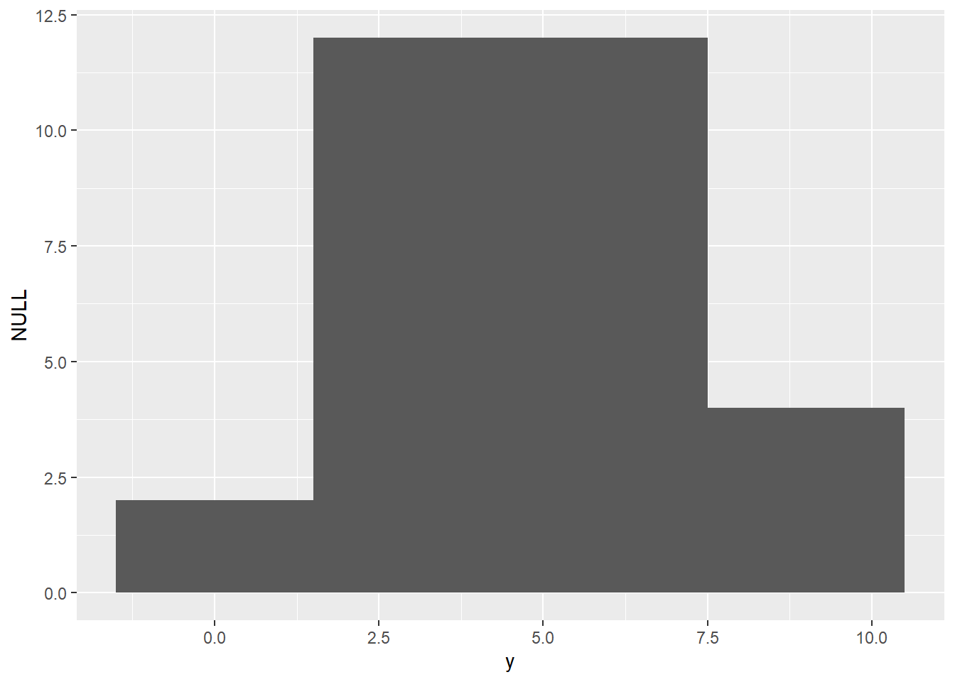
Figure 11.4: Histogram
Density plot is similar to histogram but there is no grouping as in histogram but the function is smoothed.
qplot(y, data=df, geom="density")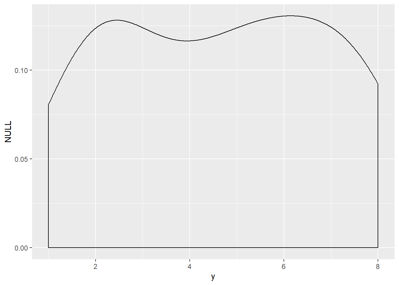
Figure 11.5: Density plot
Bar chart is similar to histogram but it is for discrete data.
qplot(z, data=df, geom="bar")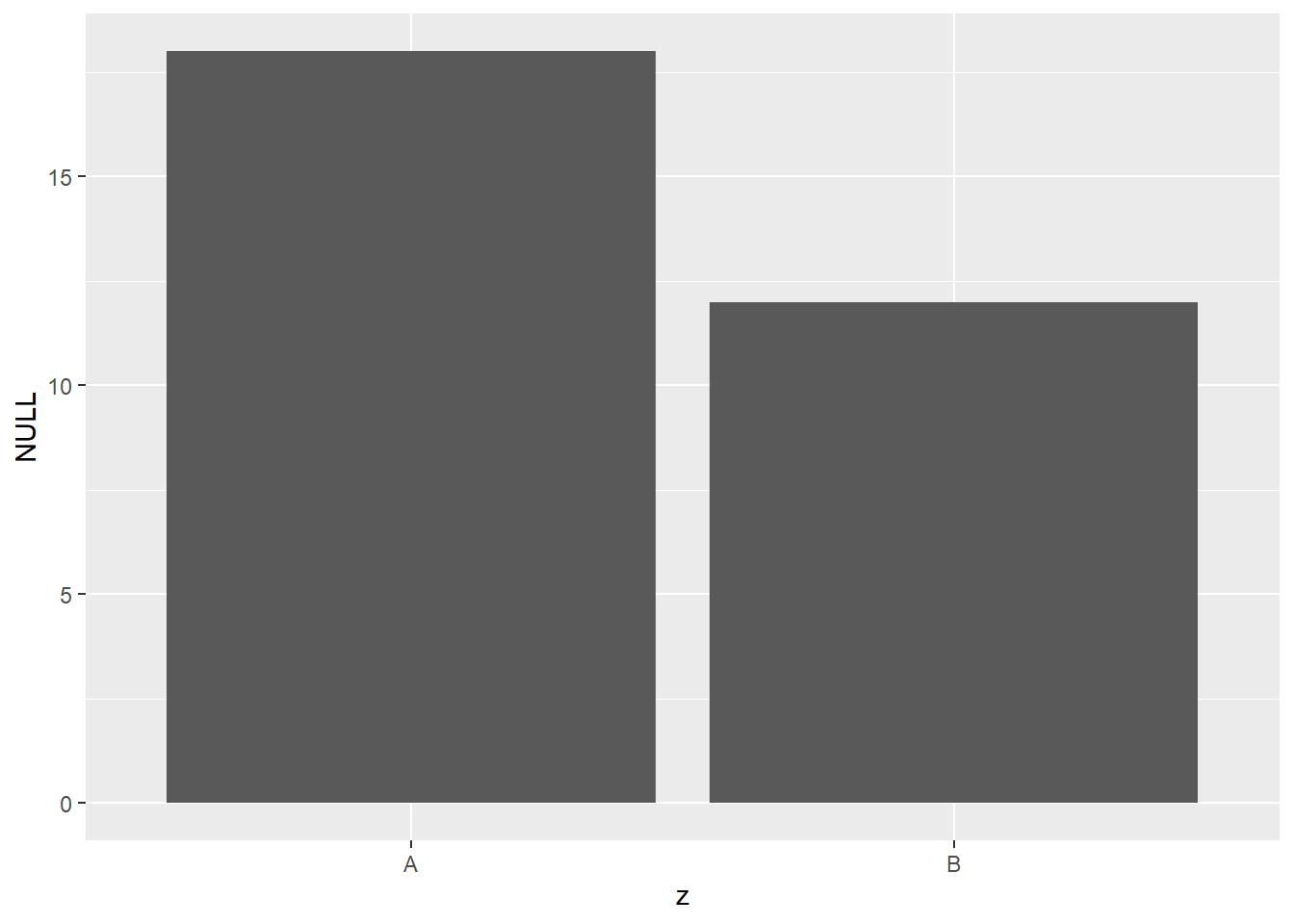
Figure 11.6: Bar chart
11.1.2 ggplot
The syntax for base plots is as follows:
ggplot(data)+aes(x,y)+geom_point()
ggplot(data)+aes(x,y)+geom_boxplot()
ggplot(data)+aes(x,y)+geom_line()
ggplot(data)+aes(x)+geom_histogram()
ggplot(data)+aes(x)+geom_freqpoly()
ggplot(data)+aes(x)+geom_bar()
Scatter plot
ggplot(df)+aes(x,y)+geom_point()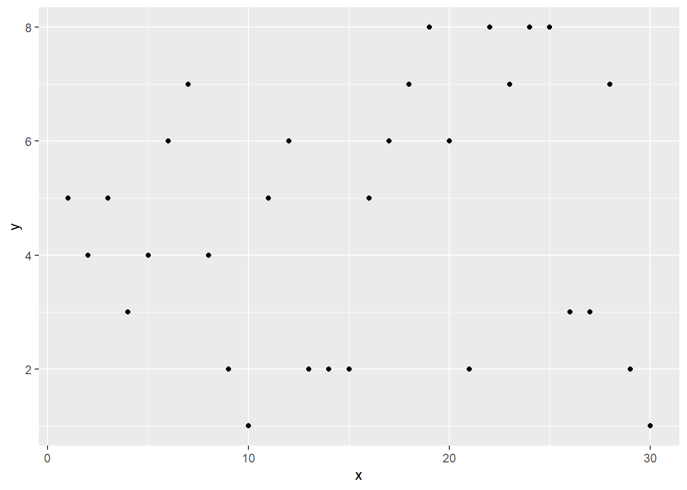
Figure 11.7: Scatter plot
Boxplot
ggplot(df)+aes(z,x)+geom_boxplot()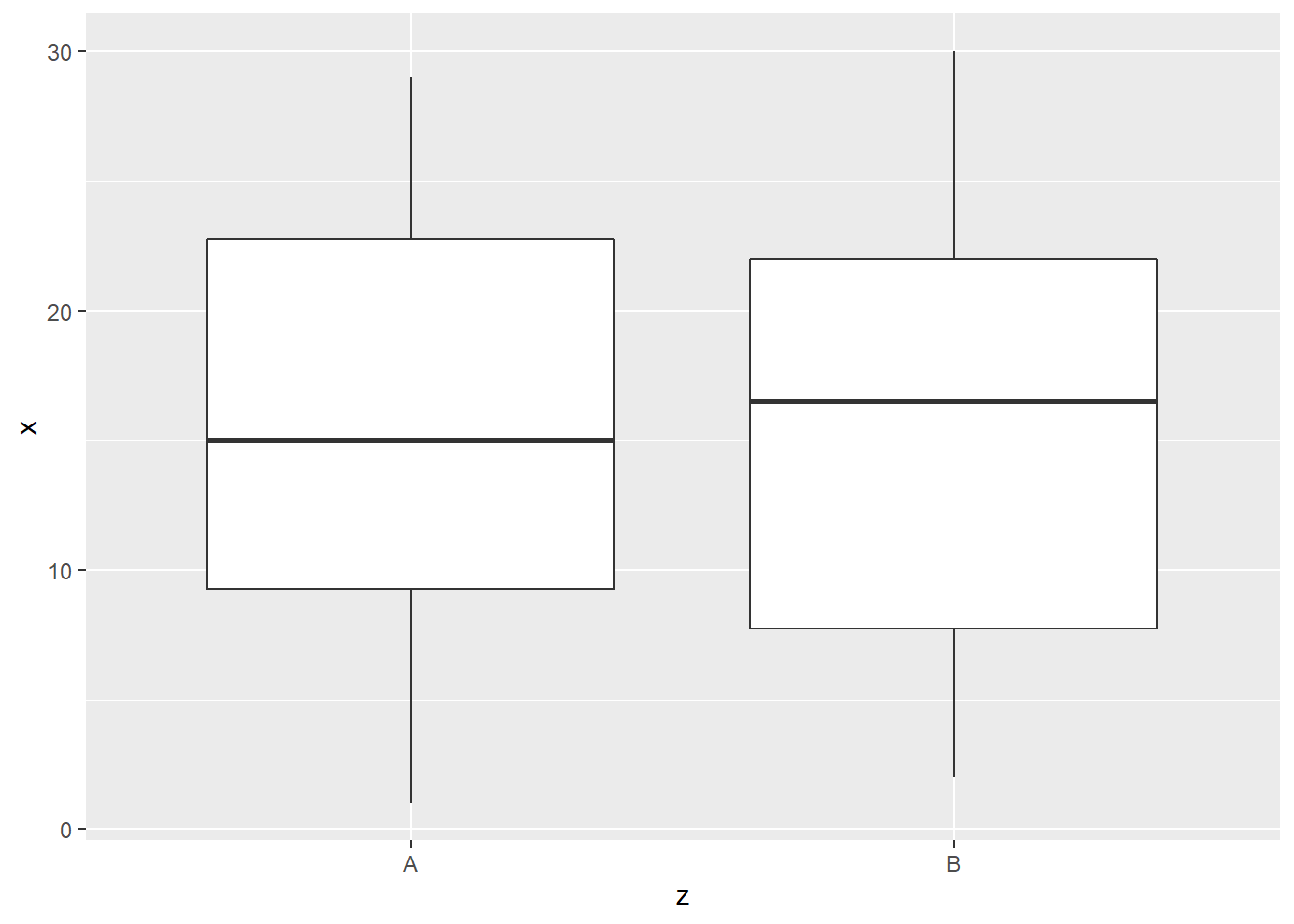
Figure 11.8: Box plot
Lineplot
ggplot(df)+aes(x,y)+geom_line()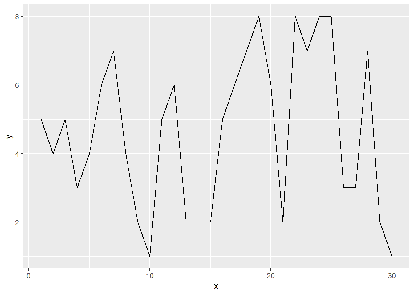
Figure 11.9: Line plot
Histogram
ggplot(df)+aes(y)+geom_histogram(binwidth=1)
Figure 11.10: Histogram
Frequency polygon
ggplot(df)+aes(y)+geom_freqpoly(binwidth=1)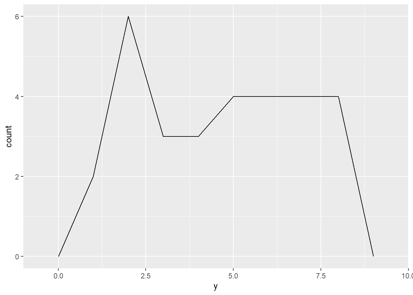
Figure 11.11: Frequency polygon
Bar Chart
ggplot(df)+aes(y)+geom_bar()
Figure 11.12: Bar chart
11.1.3 Aesthetic
To improve the appearance, we can change color, shape (for scatter plot) and size (for scatter plot).
Color: aes(x,y, color=z)
ggplot(df) +aes(x,y, color=z) + geom_point()
shape: aes(x,y, shape=z)
ggplot(df) + aes(x,y, shape=z) + geom_point() 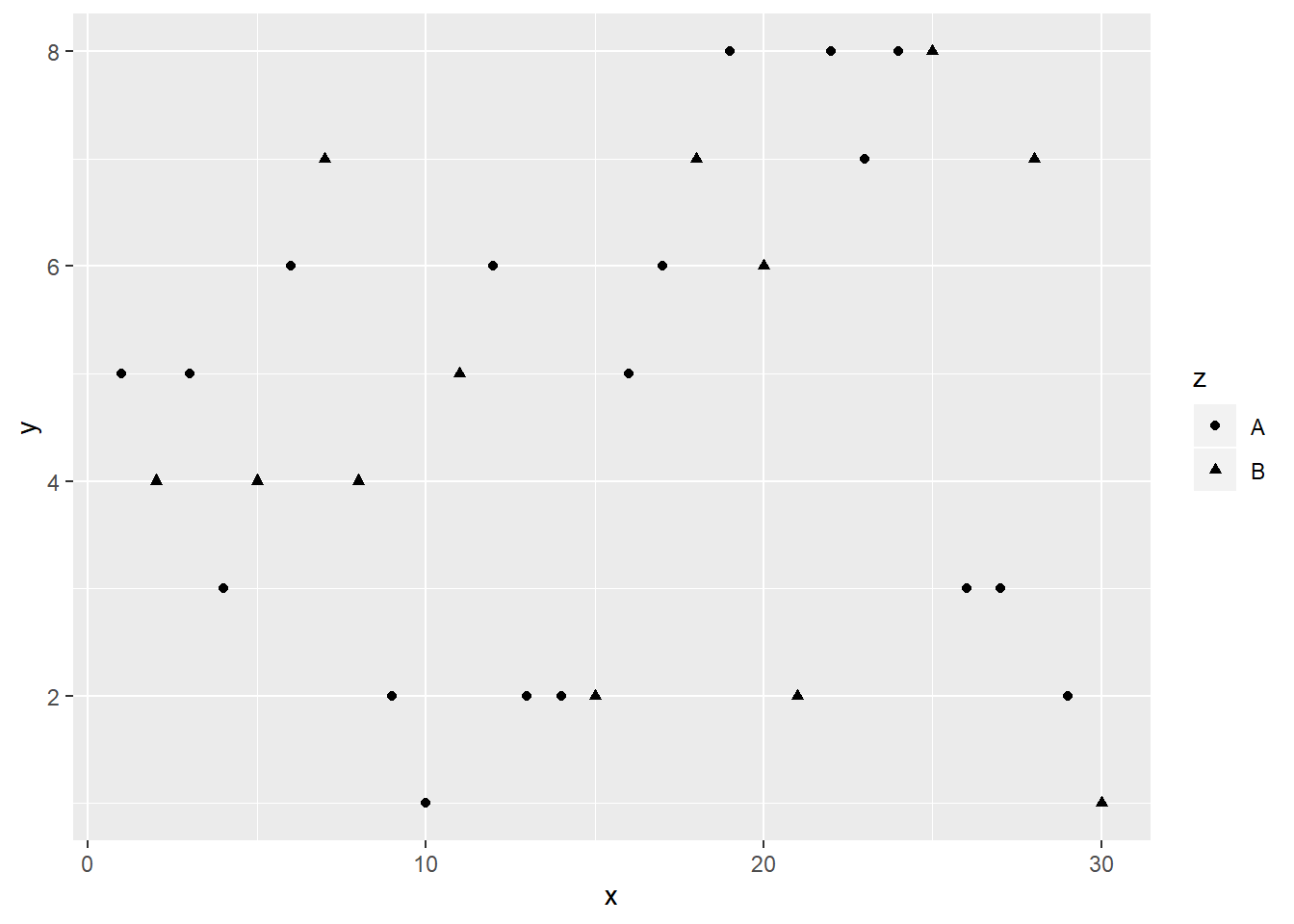
Size: aes(x,y, size = 3)
ggplot(df) + aes(x,y, size = 3) + geom_point() 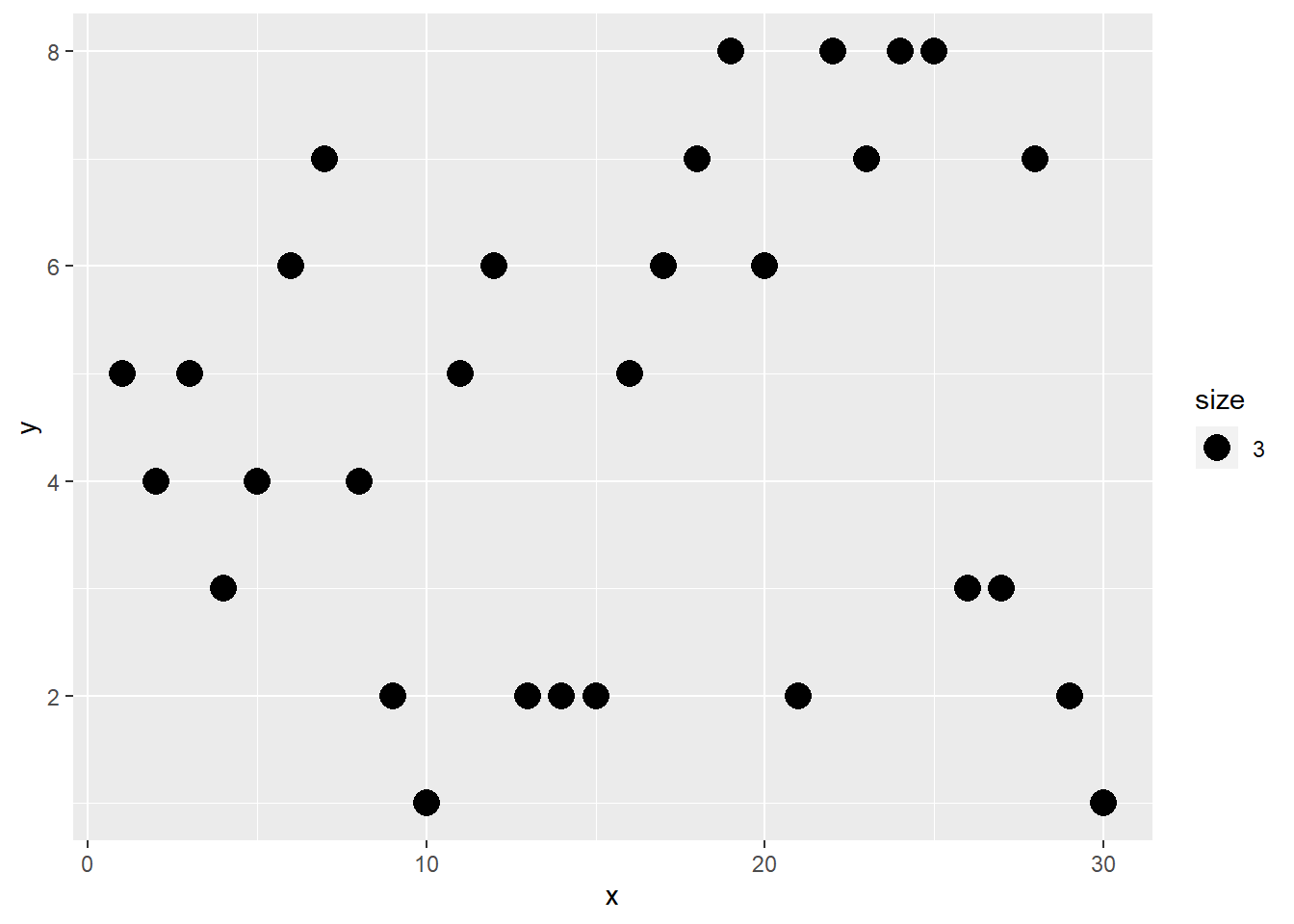
11.1.4 Decoration
To improve the readability of plot, one may add title, label axes, and provide legend.
Add title by using ggtitle()
ggplot(df) + aes(x,y)+ geom_point()+
  ggtitle("title")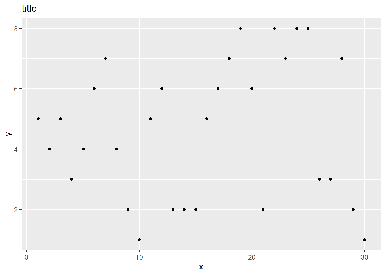
Label Axes using xlab() and ylab().
ggplot(df) + aes(x,y)+ geom_point()+
  xlab("X axis") + ylab("Y axis")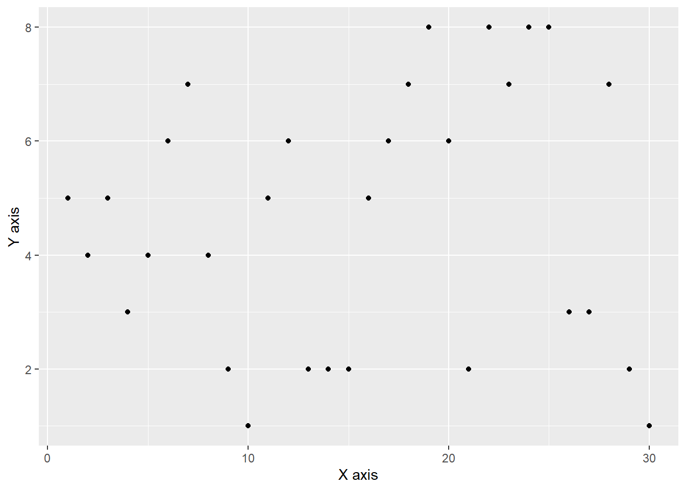
Legend can be added using theme(legend). The position can be top, right, left and bottom.
ggplot(df) + aes(x,y,color=z)+geom_point()+
  theme(legend.position = "bottom")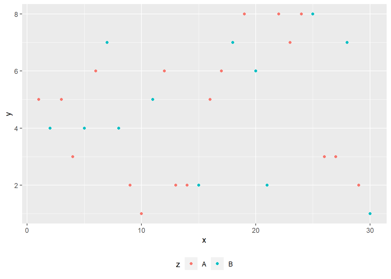
11.1.5 Multiple Plots
It is often that we put plot side by side or even in a grid. We can use facet_wrap() to make multiple graphs.
The following code makes the two plots side by side:
ggplot(data=df)+
  aes(x,y, color=z)+
  geom_point()+
  facet_wrap(~ z, ncol = 2)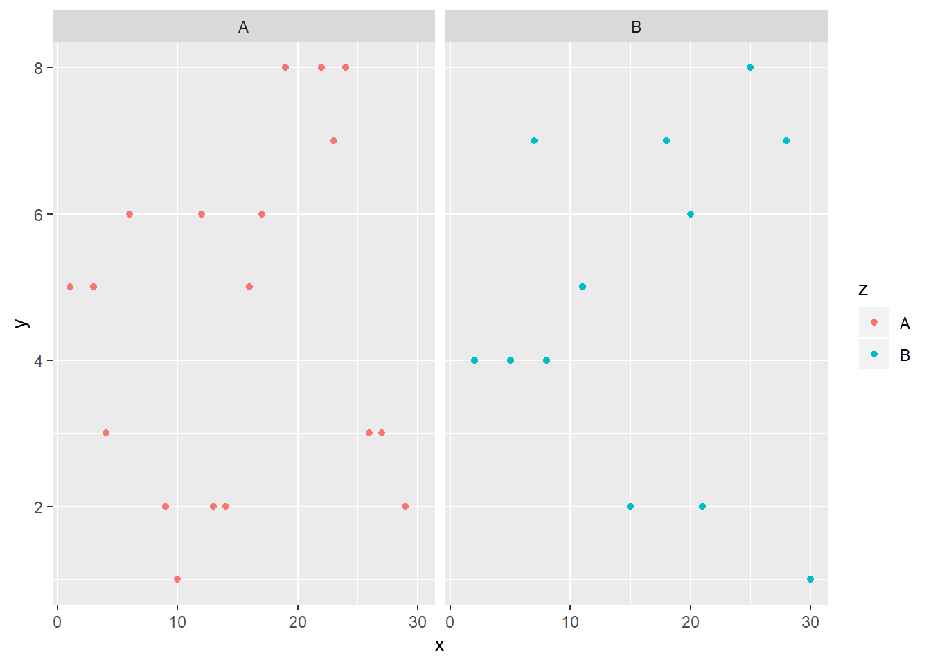
The following code makes the two plots top to bottom:
ggplot(data=df)+
  aes(x,y, color=z)+
  geom_point()+
  facet_wrap(~ z, ncol = 1)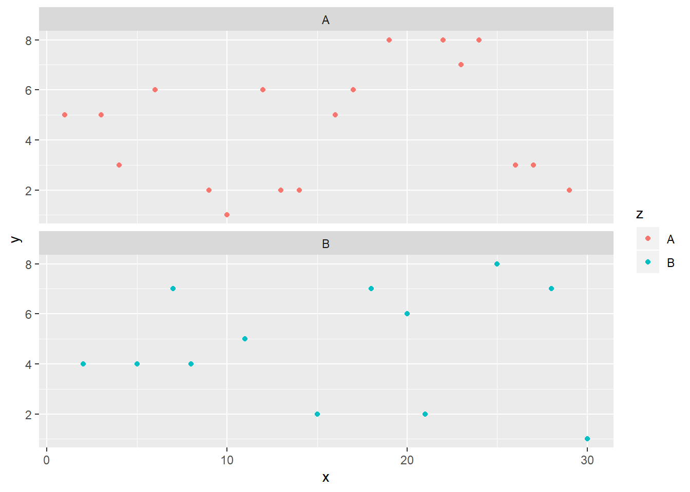
11.1.6 Basic themes
We can also change the theme of the plot. There are four basic themes.
+theme_grey()
+theme_bw()
+theme_minimal()
+theme_classic()
Basic themes: Grey
ggplot(df)+aes(x,y, color=z)+geom_point()+
  theme_grey()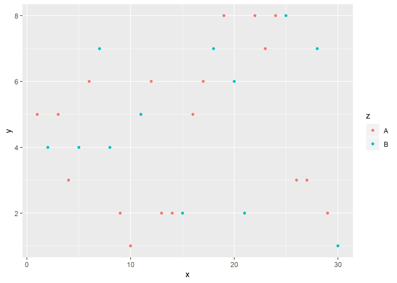
Basic themes: BW
ggplot(df)+aes(x,y, color=z)+geom_point()+
  theme_bw()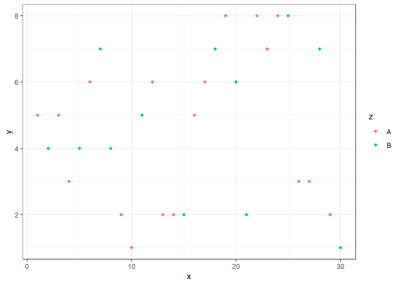
Basic themes: minimal
ggplot(df)+aes(x,y, color=z)+geom_point()+
 theme_minimal()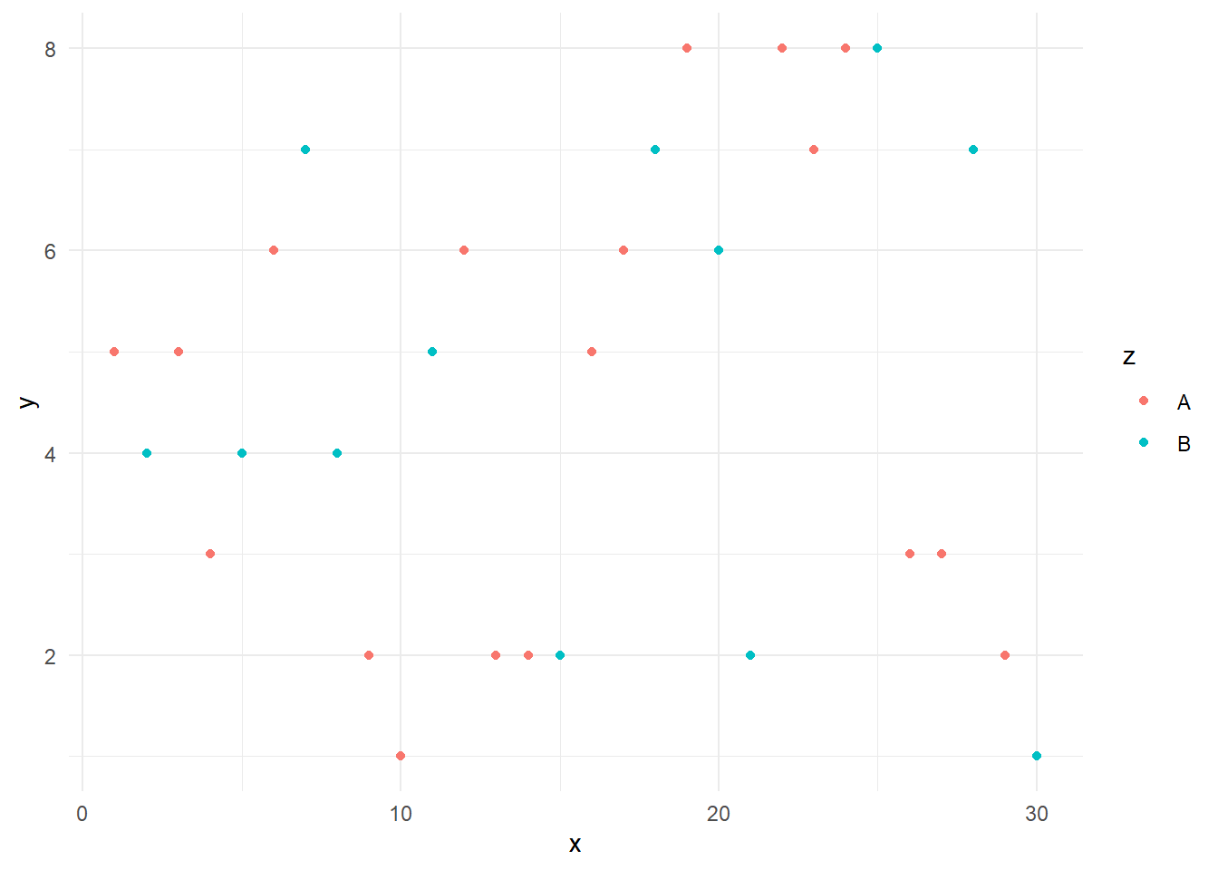
Basic themes: classic
ggplot(df)+aes(x,y, color=z)+geom_point()+
  theme_classic()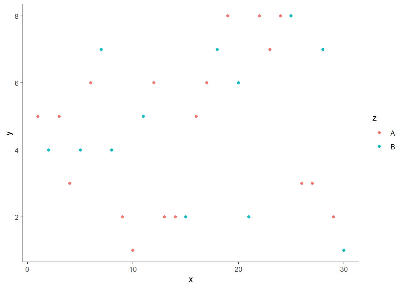
11.1.7 ggthemes package
Finally, we want to introduce a better theme for plotting. Here, we need to install and load the ggthemes package.
install.packages("ggthemes")
library(ggthemes)
There are three interesting themes:
- Stata,
- Excel, and
- Economist.
To get the Stata theme, we use theme_stata() and scale_colour_stata()
ggplot(df) + aes(x,y, color=z)+ geom_point()+
  theme_stata() + scale_colour_stata()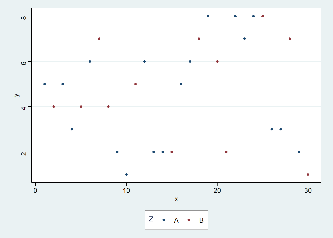
To use the Excel theme, we use theme_excel() + scale_colour_excel(). It is not recommended to use it in practice.
ggplot(df) + aes(x,y, color=z)+ geom_point()+
  theme_excel() + scale_colour_excel()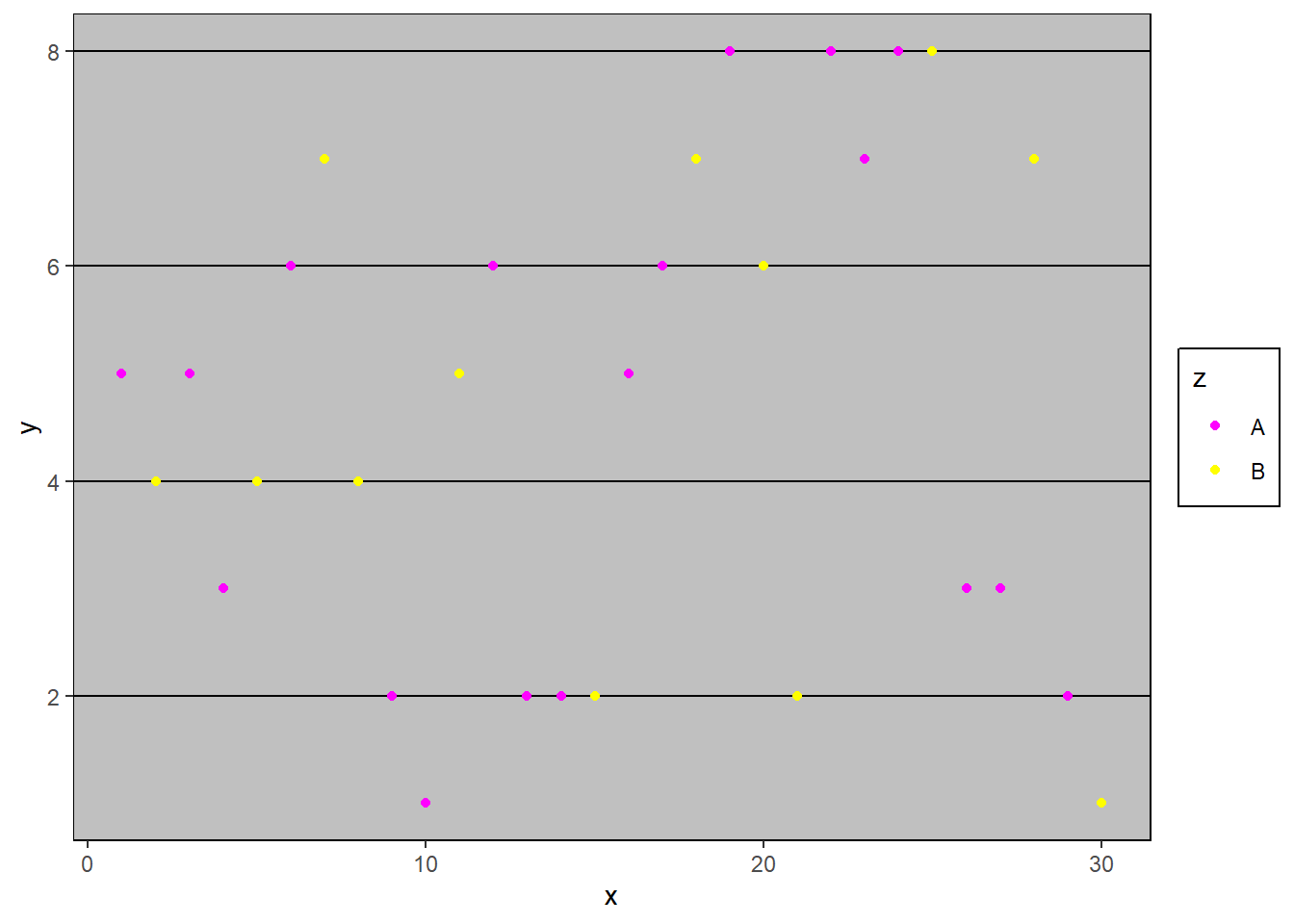
To create the theme like the Economist magazine, we can use theme_economist() and scale_colour_economist().
ggplot(df) + aes(x,y, color=z)+ geom_point() +
theme_economist() + scale_colour_economist() 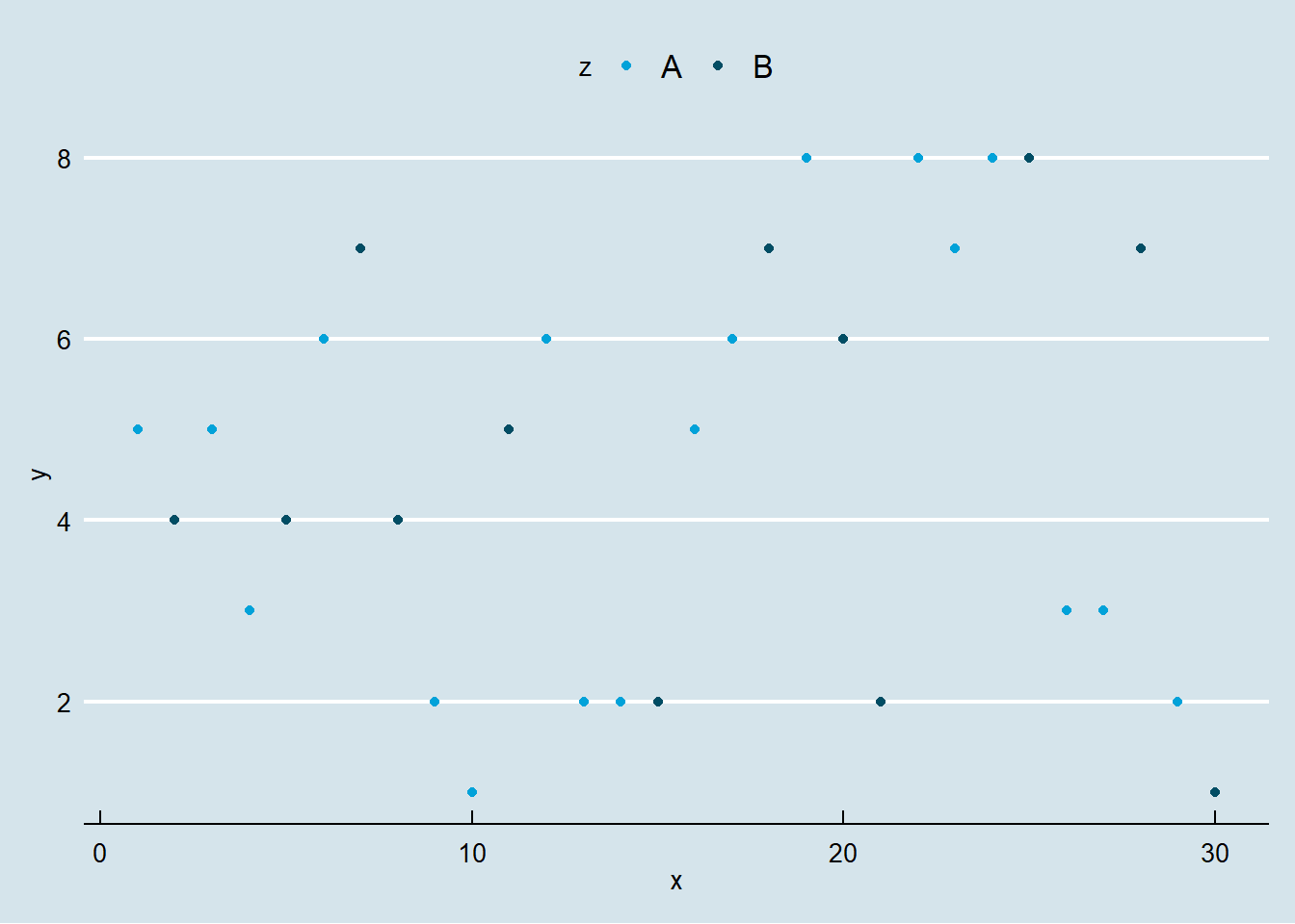
Here is the Economist theme with some further decorations.
ggplot(df) +
  geom_line(aes(x,y, colour = z), size=1.5)+
  theme_economist() + scale_colour_economist()+
  theme(legend.position="bottom",
        axis.title = element_text(size = 12),
        legend.text = element_text(size = 9),
        legend.title=element_text(face = "bold",
                                  size = 9)) +
  ggtitle("Title")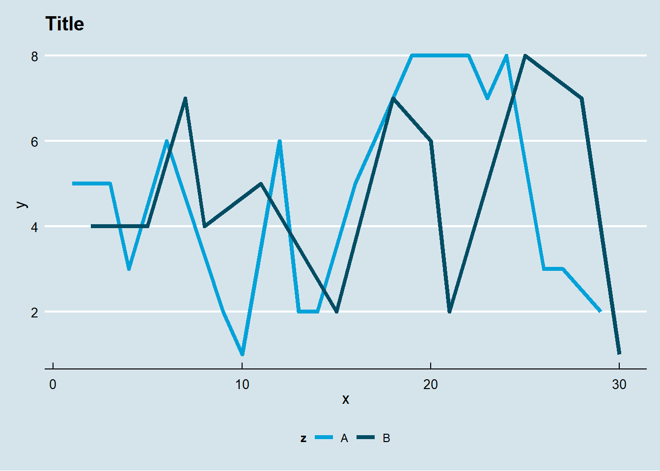
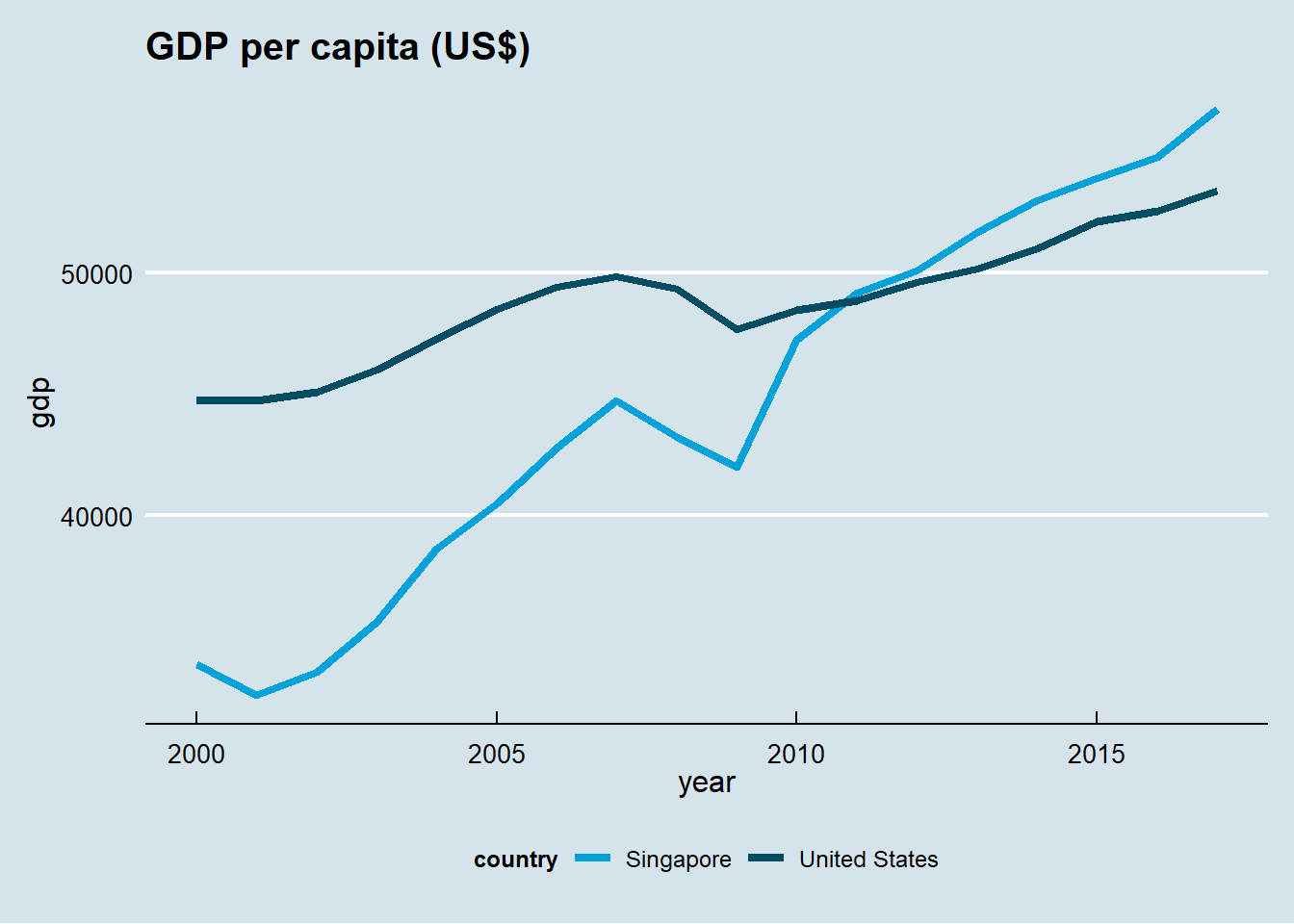
11.1.8 Application: Worldbank
We want to illustrate our plotting function using data from the World Bank. We will use the wbstats package to download data, and reshape package to convert the data into long format.
library(wbstats)
library(dplyr)
library(reshape)
df<- wb(country=c("US", "SG"),
indicator = c("SP.POP.TOTL",
"NY.GDP.PCAP.KD"),
startdate = 2000, enddate = 2017)
df <- dplyr::select(df, date, indicator,
country,value)
temp <- melt(df,
id=c("date","indicator","country"))
charts.data <- cast(temp, country + date~indicator)
colnames(charts.data) <- c("country", "year","gdp", "pop")
charts.data$year <- as.numeric(charts.data$year)Now we are ready to plot the graph.
p1<-ggplot()+
  geom_line(aes(x = year,y = gdp,color = country),
            size=1.5, data = charts.data)+
  theme_economist() + scale_colour_economist() +
  theme(legend.position="bottom",
        axis.title = element_text(size = 12),
        legend.text = element_text(size = 9),
        legend.title=element_text(face = "bold", size = 9)) +
  ggtitle("GDP per capita (US$)")
print(p1)