4.5 Transformations of random variables
A function of a random variable is a random variable: if \(X\) is a random variable and \(g\) is a function then \(Y=g(X)\) is a random variable. In general, the distribution of \(g(X)\) will have a different shape than the distribution of \(X\). The exception is when \(g\) is a linear rescaling.
4.5.1 Linear rescaling
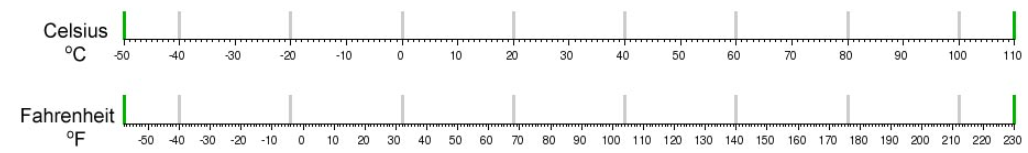
A linear rescaling is a transformation of the form \(g(u) = a +bu\). For example, converting temperature from Celsius to Fahrenheit using \(g(u) = 32 + 1.8u\) is a linear rescaling.
A linear rescaling “preserves relative interval length” in the following sense.
- If interval A and interval B have the same length in the original measurement units, then the rescaled intervals A and B will have the same length in the rescaled units. For example, [0, 10] and [10, 20] Celsius, both length 10 degrees Celsius, correspond to [32, 50] and [50, 68] Fahrenheit, both length 18 degrees Fahrenheit.
- If the ratio of the lengths of interval A and B is \(r\) in the original measurement units, then the ratio of the lengths in the rescaled units is also \(r\). For example, [10, 30] is twice as long as [0, 10] in Celsius; for the corresponding Fahrenheit intervals, [50, 86] is twice as long as [32, 50].
Think of a linear rescaling as just a relabeling of the variable axis.
Suppose that \(U\) has a Uniform(0, 1) distribution and define \(X = 200 + 600 U\). Then \(X\) is a linear rescaling of \(U\), and \(X\) takes values in the interval [200, 800]. We can define and simulate values of \(X\) in Symbulate. Before looking at the results, sketch a plot of the distribution of \(X\) and make an educated guess for its mean and standard deviation.
U = RV(Uniform(0, 1))

X = 200 + 600 * U

(U & X).sim(10)| Index | Result |
|---|---|
| 0 | (0.004739969457516757, 202.84398167451005) |
| 1 | (0.05217375764522092, 231.30425458713256) |
| 2 | (0.43877662352918323, 463.2659741175099) |
| 3 | (0.14334471098478674, 286.00682659087204) |
| 4 | (0.9670314980038219, 780.2188988022932) |
| 5 | (0.8740536439482298, 724.4321863689379) |
| 6 | (0.47133706281716725, 482.80223769030033) |
| 7 | (0.06994134171173771, 241.96480502704264) |
| 8 | (0.15154494548487696, 290.9269672909262) |
| ... | ... |
| 9 | (0.28705125614033267, 372.2307536841996) |
X.sim(10000).plot()
plt.show()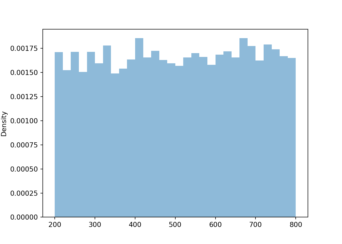
We see that \(X\) has a Uniform(200, 800) distribution. The linear rescaling changes the range of possible values, but the general shape of the distribution is still Uniform. We can see why by inspecting a few intervals on both the original and revised scale.
| Interval of \(U\) values | Probability that \(U\) lies in the interval | Interval of \(X\) values | Probability that \(X\) lies in the interval |
|---|---|---|---|
| (0.0, 0.1) | 0.1 | (200, 260) | \(\frac{60}{600}\) |
| (0.9, 1.0) | 0.1 | (740, 800) | \(\frac{60}{600}\) |
| (0.0, 0.2) | 0.2 | (200, 320) | \(\frac{120}{600}\) |
We have seen previously that the long run average value of \(U\) is 0.5, and of \(X\) is 500. These two values are related through the same formula mapping \(U\) to \(X\) values: \(500 = 200 + 600\times 0.5\).
The standard deviation of \(U\) is about 0.289, and of \(X\) is about 173.
print(U.sim(10000).sd(), X.sim(10000).sd())## 0.2873931511389453 174.0940964804715The standard deviation of \(X\) is 600 times the standard deviation of \(U\). Multiplying the \(U\) values by 600 rescales the distance between the values. Two values of \(U\) that are 0.1 units apart correspond to two values of \(X\) that are 60 units apart. However, adding the constant 200 to all values just shifts the distribution and does affect degree of variability.
In general, if \(U\) has a Uniform(0, 1) distribution then \(X = a + (b-a)U\) has a Uniform(\(a\), \(b\)) distribution. Therefore, we can essentially use the Uniform(0, 1) distribution to simulate values from any Uniform distribution.
Example 4.6 Let \(\textrm{P}\) be the probabilty space corresponding to the Uniform(0, 1) spinner and let \(U\) represent the result of a single spin. Define \(V=1-U\).
- Does \(V\) result from a linear rescaling of \(U\)?
- What are the possible values of \(V\)?
- Is \(V\) the same random variable as \(U\)?
- Find \(\textrm{P}(U \le 0.1)\) and \(\textrm{P}(V \le 0.1)\).
- Sketch a plot of what the histogram of many simulated values of \(V\) would look like.
- Does \(V\) have the same distribution as \(U\)?
Show/hide solution
- Yes, \(V\) result from the linear rescaling \(u\mapsto 1-u\) (intercept of 1 and slope of \(-1\).)
- \(V\) takes values in the interval [0,1]. (Basically, this transformation just changes the direction of the spinner from clockwise to counterclockwise. The axis on the usual spinner has values \(u\) increasing clockwise from 0 to 1. Applying the transformation \(1-u\), the values would decrease clockwise from 1 to 0.)
- No. \(V\) and \(U\) are different random variables. If the spin lands on \(\omega=0.1\), then \(U(\omega)=0.1\) but \(V(\omega)=0.9\). \(V\) and \(U\) return different values for the same outcome; they are measuring different things.
- \(\textrm{P}(U \le 0.1) = 0.1\) and \(\textrm{P}(V \le 0.1)=\textrm{P}(1-U \le 0.1) = \textrm{P}(U\ge 0.9) = 0.1\). Note, however, that these are different events: \(\{U \le 0.1\}=\{0 \le \omega \le 0.1\}\) while \(\{V \le 0.1\}=\{0.9 \le \omega \le 1\}\). But each is an interval of length 0.1 so they have the same probability according to the uniform probability measure.
- Since \(V\) is a linear rescaling of \(U\), the shape of the histogram of simulated values of \(V\) should be the same as that for \(U\). Also, the possible values of \(V\) are the same as those for \(U\). So the histograms should look identical (aside from natural simulation variability).
- Yes, \(V\) has the same distribution as \(U\). While for any single outcome (spin), the values of \(V\) and \(U\) will be different, over many repetitions (spins) the pattern of variation of the \(V\) values, as depicted in a histogram, will be identical to that of \(U\).
P = Uniform(0, 1)
U = RV(P)

V = 1 - U

V.sim(10000).plot()
plt.show()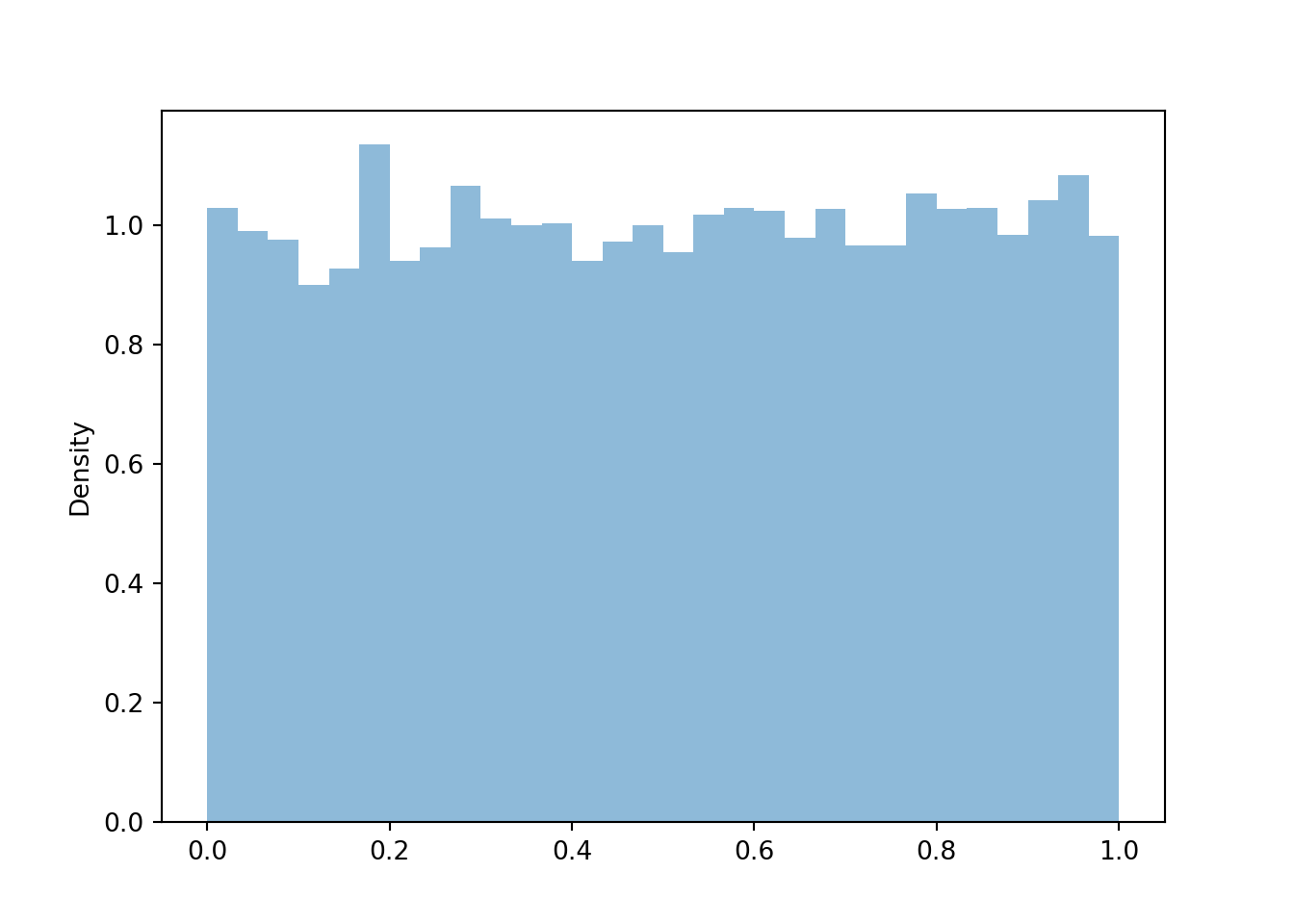
Let’s consider another example. The spinner below represents a Normal distribution with mean 0 and standard deviation 1. Technically, with a Normal distribution any value in the interval \((-\infty, \infty)\) is possible. However, for a Normal(0, 1) distribution, the probability that a value lies outside the interval \((-3, 3)\) is small.
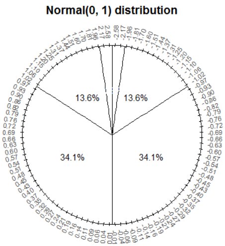
Let \(Z\) be a random variable with the Normal(0, 1) distribution.
Z = RV(Normal(0, 1))

z = Z.sim(10000)

z.plot()
Normal(0, 1).plot() # plot the density
plt.show()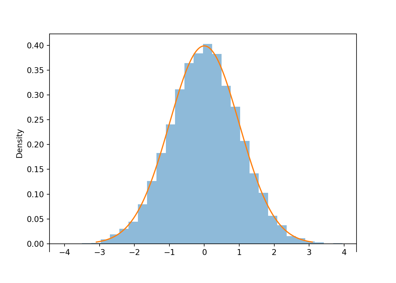
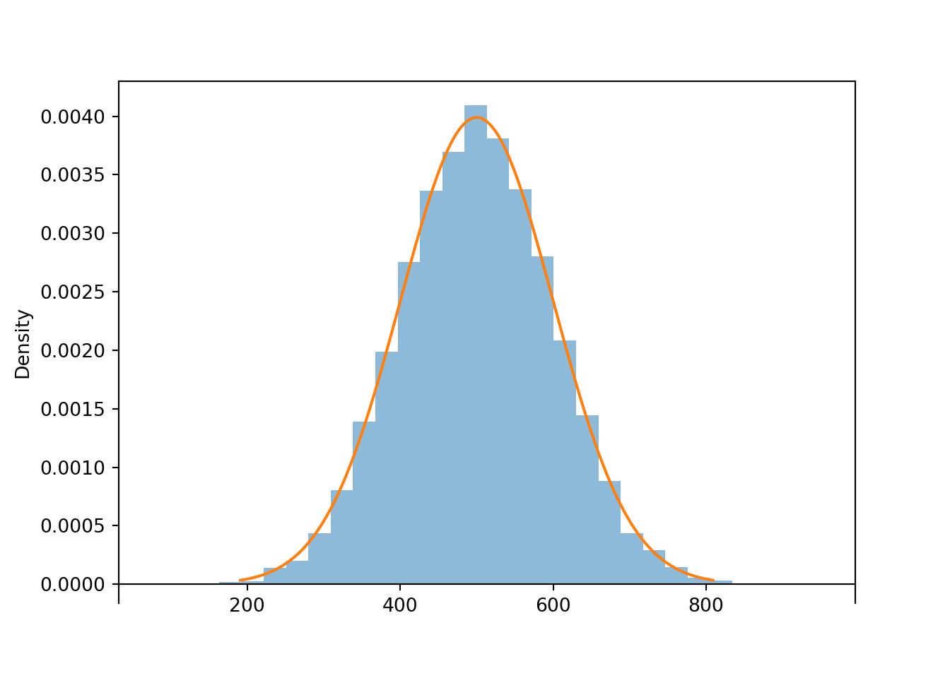
print(z.mean(), z.sd())## 0.01347131983854699 1.0011250645009526Now consider the linear rescaling \(X=500 + 100 Z\). We see that \(X\) has a Normal(500, 100) distribution.
X = 500 + 100 * Z

(Z & X).sim(10)| Index | Result |
|---|---|
| 0 | (0.663145317788866, 566.3145317788866) |
| 1 | (-1.1331199751324472, 386.6880024867553) |
| 2 | (0.6374877661702074, 563.7487766170208) |
| 3 | (1.0645995536155841, 606.4599553615584) |
| 4 | (1.1879348179288152, 618.7934817928815) |
| 5 | (-3.4853822189156936, 151.46177810843062) |
| 6 | (-1.134686148694244, 386.5313851305756) |
| 7 | (0.5663760379457757, 556.6376037945776) |
| 8 | (1.025873212414284, 602.5873212414284) |
| ... | ... |
| 9 | (-1.8894363502791618, 311.0563649720838) |
x = X.sim(10000)

x.plot()
Normal(500, 100).plot() # plot the density
plt.show()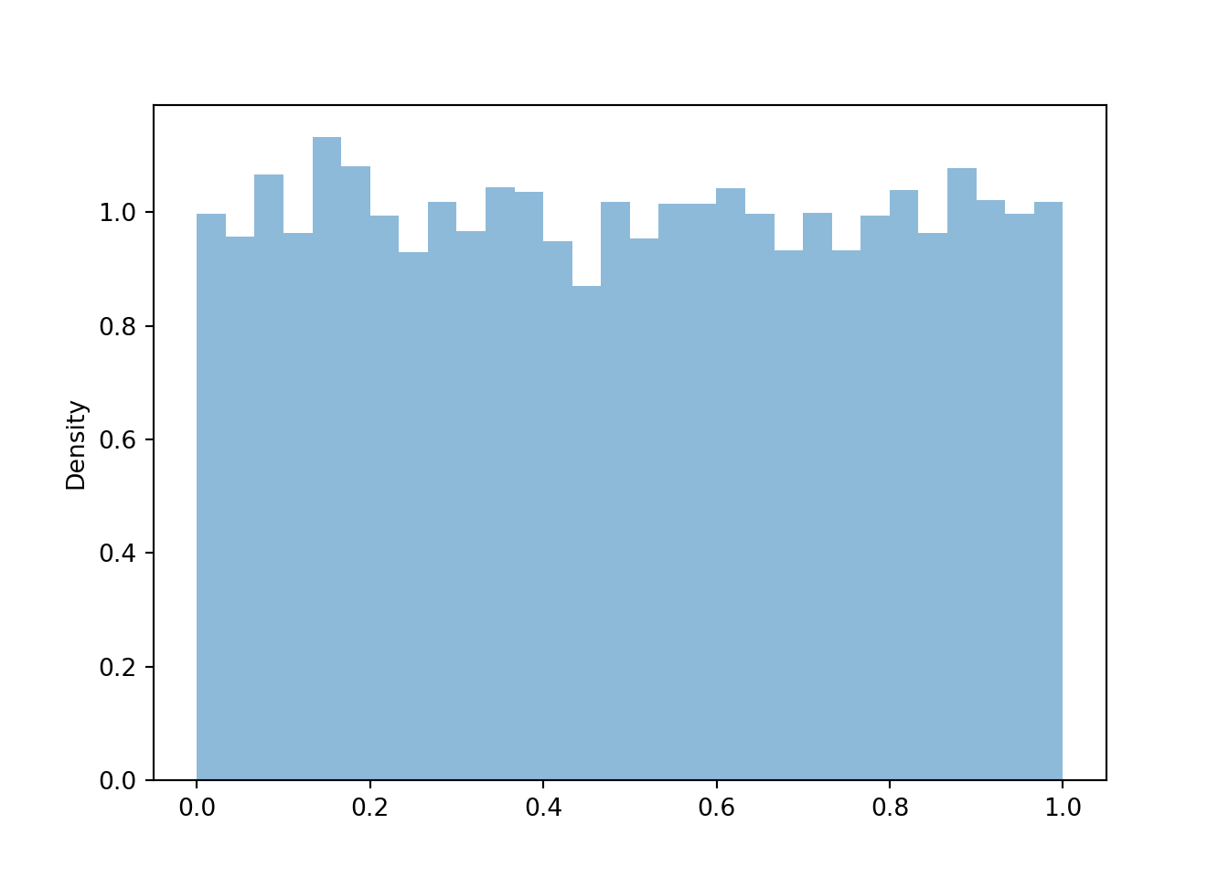
print(x.mean(), x.sd())## 500.09022837195573 99.01353603615111The linear rescaling changes the range of observed values; almost all of the values of \(Z\) lie in the interval \((-3, 3)\) while almost all of the values of \(X\) lie in the interval \((200, 800)\). However, the distribution of \(X\) still has the general Normal shape. The means are related by the conversion formula: \(500 = 500 + 100 \times 0\). Multiplying the values of \(Z\) by 100 rescales the distance between values; two values of \(Z\) that are 1 unit apart correspond to two values of \(X\) that are 100 units apart. However, adding the constant 500 to all the values just shifts the center of the distribution and does not affect variability. Therefore, the standard deviation of \(X\) is 100 times the standard deviation of \(Z\).
In general, if \(Z\) has a Normal(0, 1) distribution then \(X = \mu + \sigma Z\) has a Normal(\(\mu\), \(\sigma\)) distribution. Therefore, we can essentially use the Normal(0, 1) distribution to simulate values from any Normal distribution.
Example 4.7 Suppose that \(X\), the SAT Math score of a randomly selected student, follows a Normal(500, 100) distribution. Randomly select a student and let \(X\) be the student’s SAT Math score. Now have the selected student spin the Normal(0, 1) spinner. Let \(Z\) be the result of the spin and let \(Y=500 + 100 Z\).
- Is \(Y\) the same random variable as \(X\)?
- Does \(Y\) have the same distribution as \(X\)?
Show/hide solution
- No, these two random variables are measuring different things. One is measuring SAT Math score; one is measuring what comes out of a spinner. Taking the SAT and spinning a spinner are not the same thing.
- Yes, they do have the same distribution. Repeating the process of randomly selecting a student and measuring SAT Math score will yield values that follow a Normal(500, 100) distribution. Repeating the process of spinning the Normal(0, 1) spinner to get \(Z\) and then setting \(Y=500+100Z\) will also yield values that follow a Normal(500, 100) distribution. Even though \(X\) and \(Y\) are different random variables they follow the same long run pattern of variability.
Some lessons from this example.
- A linear rescaling is a transformation of the form \(g(u) = a + bu\).
- A linear rescaling of a random variable does not change the basic shape of its distribution, just the range of possible values.
- A linear rescaling transforms the mean in the same way the individual values are transformed.
- Adding a constant to a random variable does not affect its standard deviation.
- Multiplying a random variable by a constant multiples its standard deviation by the same constant.
- If \(U\) has a Uniform(0, 1) distribution then \(X = a + (b-a)U\) has a Uniform(\(a\), \(b\)) distribution.
- If \(Z\) has a Normal(0, 1) distribution then \(X = \mu + \sigma Z\) has a Normal(\(\mu\), \(\sigma\)) distribution.
- Remember, do NOT confuse a random variable with its distribution.
- The RV is the numerical quantity being measured
- The distribution is the long run pattern of variation of many observed values of the RV
4.5.2 Nonlinear transformations
The preceding section illustrated that a linear rescaling does not change the shape of a distribution, only the range of possible values. But what about a nonlinear transformation, like a logarithmic or square root transformation? In contrast to a linear rescaling, a nonlinear rescaling does not preserve relative interval length, so we might expect that a nonlinear rescaling can change the shape of a distribution. We’ll investigate by considering the Uniform(0, 1) spinner and a logarithmic70 transformation.
Let \(\textrm{P}\) be the probabilty space corresponding to the Uniform(0, 1) spinner and let \(U\) represent the result of a single spin. Attempting the transformation \(\log(U)\) leads to two minor technicalities.
- Since \(U\in[0, 1]\), \(\log(U)\le 0\). To obtain positive values we consider \(-\log(U)\), which takes values in \([0,\infty)\).
- Technically, applying \(-\log(u)\) to the values on the axis of the Uniform(0, 1) spinner, the resulting values would decrease from \(\infty\) to 0 clockwise. To make the values start at 0 and increase to \(\infty\) clockwise, we consider \(-\log(1-U)\). (We saw in the previous section the transformation \(u \to 1-u\) basically just changes direction from clockwise to counterclockwise.)
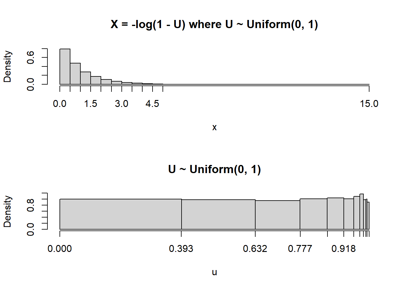
Therefore, it’s a little more convenient to consider the random variable \(X=-\log(1-U)\) which takes values in \([0,\infty)\). Remember: a transformation of a random variable is a random variable. Also, always be sure to identify the possible values that a random variable can take.
Before proceeding, try sketching a plot of the distribution of \(X\). (Just take a guess; you’ll get a chance to make a more educated sketch soon.)
The following code defines \(X\) and plots a few simulated values.
P = Uniform(0, 1)
U = RV(P)

X = -log(1 - U)

x = X.sim(100)

x.plot('rug')
plt.show()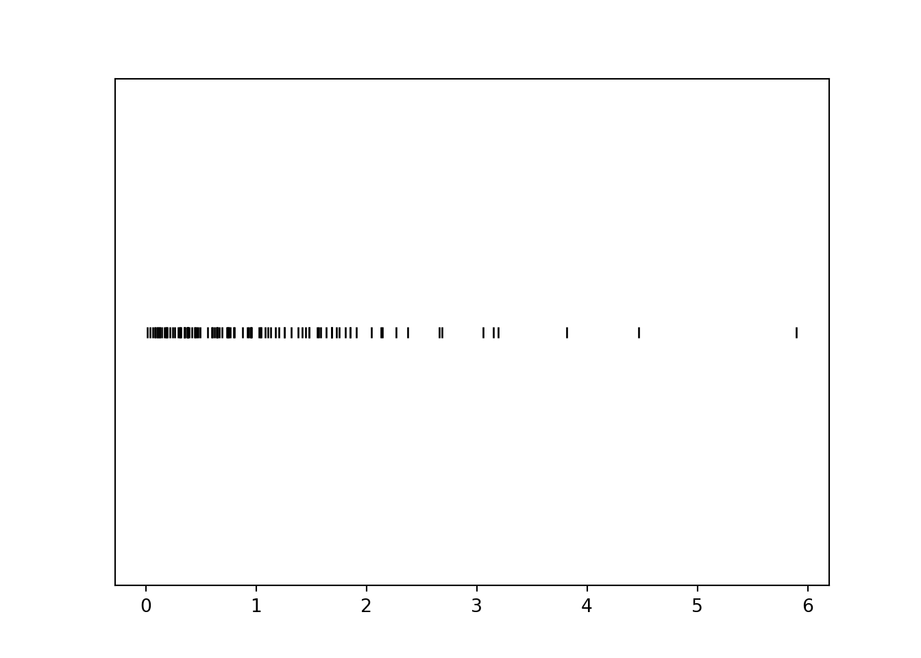
Notice that values near 0 occur with higher frequency than larger values. For example, there are many more simulated values of \(X\) that lie in the interval \([0, 1]\) than in the interval \([3, 4]\), even though these intervals both have length 1. Let’s see why this is happening before simulating many values.
Example 4.8 For each of the intervals in the table below find the probability that \(U\) lies in the interval, and identify the corresponding values of \(X\). (You should at least compute a few by hand to see what’s happening, but you can use software to fill in the rest.)
| Interval of U | Length of U interval | Probability | Interval of X | Length of X interval |
|---|---|---|---|---|
| (0, 0.1) | ||||
| (0.1, 0.2) | ||||
| (0.2, 0.3) | ||||
| (0.3, 0.4) | ||||
| (0.4, 0.5) | ||||
| (0.5, 0.6) | ||||
| (0.6, 0.7) | ||||
| (0.7, 0.8) | ||||
| (0.8, 0.9) | ||||
| (0.9, 1) |
Plug the endpoints into the conversion formula \(u\mapsto -\log(1-u)\) to find the corresponding \(X\) interval. For example, the \(U\) interval \((0.1, 0.2)\) corresponds to the \(X\) interval \((-\log(1-0.1), -\log(1-0.2))\). Since \(U\) has a Uniform(0, 1) distribution the probability is just the length of the \(U\) interval.
| Interval of U | Length of U interval | Probability | Interval of X | Length of X interval |
|---|---|---|---|---|
| (0, 0.1) | 0.1 | 0.1 | (0, 0.105) | 0.105 |
| (0.1, 0.2) | 0.1 | 0.1 | (0.105, 0.223) | 0.118 |
| (0.2, 0.3) | 0.1 | 0.1 | (0.223, 0.357) | 0.134 |
| (0.3, 0.4) | 0.1 | 0.1 | (0.357, 0.511) | 0.154 |
| (0.4, 0.5) | 0.1 | 0.1 | (0.511, 0.693) | 0.182 |
| (0.5, 0.6) | 0.1 | 0.1 | (0.693, 0.916) | 0.223 |
| (0.6, 0.7) | 0.1 | 0.1 | (0.916, 1.204) | 0.288 |
| (0.7, 0.8) | 0.1 | 0.1 | (1.204, 1.609) | 0.405 |
| (0.8, 0.9) | 0.1 | 0.1 | (1.609, 2.303) | 0.693 |
| (0.9, 1) | 0.1 | 0.1 | (2.303, Inf) | Inf |
We see that the logarithmic transformation does not preserve relative interval length. Each of the original intervals of \(U\) values has the same length, but the nonlinear logarithmic transformation “stretches out” these intervals in different ways. The probability that \(U\) lies in each of these intervals is 0.1. As the transformation stretches the intervals, the 0.1 probability gets “spread” over different lengths of values. Since probability/relative frequency is represented by area in a histogram, if two regions of differing length have the same area, then they must have different heights. Thus the shape of the distribution of \(X\) will not be Uniform.
The following example provides a similar illustration, but from the reverse perspective.
Example 4.9 For each of the intervals of \(X\) values in the table below identify the corresponding values of \(U\), and then find the probability that \(X\) lies in the interval. (You should at least compute a few by hand to see what’s happening, but you can use software to fill in the rest.)
| Interval of X | Length of X interval | Probability | Interval of U | Length of U interval |
|---|---|---|---|---|
| (0, 0.5) | ||||
| (0.5, 1) | ||||
| (1, 1.5) | ||||
| (1.5, 2) | ||||
| (2, 2.5) | ||||
| (2.5, 3) | ||||
| (3, 3.5) | ||||
| (3.5, 4) | ||||
| (4, 4.5) | ||||
| (4.5, 5) |
The corresponding \(U\) intervals are obtained by applying the inverse transformation \(v\mapsto 1-e^{-v}\). For example, the \(X\) interval \((0.5, 1)\) corresponds to the \(U\) interval \((1-e^{-0.5}, 1-e^{-1})\).
| Interval of X | Length of X interval | Probability | Interval of U | Length of U interval |
|---|---|---|---|---|
| (0, 0.5) | 0.5 | 0.393 | (0, 0.393) | 0.393 |
| (0.5, 1) | 0.5 | 0.239 | (0.393, 0.632) | 0.239 |
| (1, 1.5) | 0.5 | 0.145 | (0.632, 0.777) | 0.145 |
| (1.5, 2) | 0.5 | 0.088 | (0.777, 0.865) | 0.088 |
| (2, 2.5) | 0.5 | 0.053 | (0.865, 0.918) | 0.053 |
| (2.5, 3) | 0.5 | 0.032 | (0.918, 0.95) | 0.032 |
| (3, 3.5) | 0.5 | 0.020 | (0.95, 0.97) | 0.020 |
| (3.5, 4) | 0.5 | 0.012 | (0.97, 0.982) | 0.012 |
| (4, 4.5) | 0.5 | 0.007 | (0.982, 0.989) | 0.007 |
| (4.5, 5) | 0.5 | 0.004 | (0.989, 0.993) | 0.004 |
Since \(U\) has a Uniform(0, 1) distribution the probability is just the length of the \(U\) interval. Each of the \(X\) intervals has the same length but they correspond to intervals of differing length in the original \(U\) scale, and hence intervals of different probability.
Now we simulate many values of \(X\) and summarize the results in a histogram. But before proceeding, try again to sketch a plot of the distribution of \(X\). (You should be able to make a much more educated sketch now.)
X.sim(10000).plot()
Exponential(1).plot() # overlays the smooth curve
plt.show()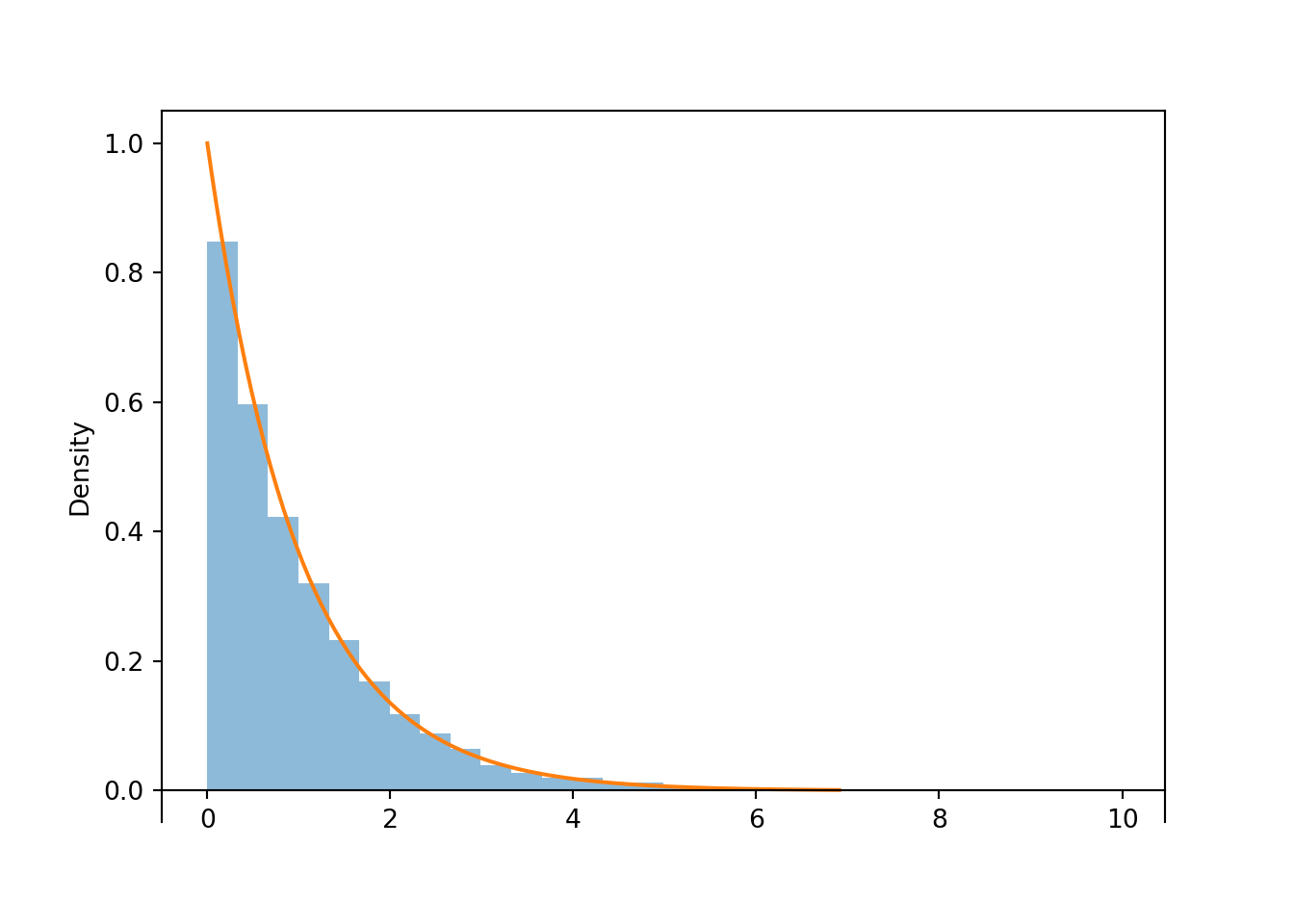
Figure 4.2: Histogram representing the approximate distribution of \(X=-\log(1-U)\), where \(U\) has a Uniform(0, 1) distribution. The smooth solid curve models the theoretical shape of the distribution of \(X\), known as the Exponential(1) distribution.
Notice that the shape of the histogram depicting the simulated values of \(X\) appears that it can be approximated by a smooth curve. This smooth curve is called the Exponential(1) density. We will see more properties of Exponential distributions LATER.
The following plots illustrate the results of Example 4.8 (plot on the left) and Example 4.9 (plot on the right), and give some insight into the shape of the distribution in Figure 4.2.
For a linear rescaling, we could just plug the mean of the original variable into the conversion formula to find the mean of the transformed variable. However, this will not work for linear transformations.
(U & X).sim(10000).mean()## (0.4984837988959223, 0.9966966410778705)We see that the average value of \(U\) is about 0.5, the average value of \(X\) is about 1, and \(-\log(1 - 0.5) \neq 1\). The nonlinear “stretching” of the axis makes some value relatively larger and others relatively smaller than they were on the original scale, which influences the average. Remember, in general: Average of \(g(X)\) \(\neq\) \(g\)(Average of \(X\)).
What about a spinner which generates values according to the distribution in Figure 4.2? The “simulate from the probability space” method for simulating of \(X\) values entailed
- Spinning the Uniform(0, 1) spinner to get a value \(U\)
- Setting \(X=-\log(1-U)\)
These two steps can be combined by relabeling the values on the axis of the spinner according to the transformation \(u\mapsto -\log(1-u)\). For example, replace 0.1 by \(-\log(1-0.1)\approx 0.105\); replace 0.9 by \(-\log(1-0.9)\approx 2.30\). This transformation results in the spinner in Figure 4.3.
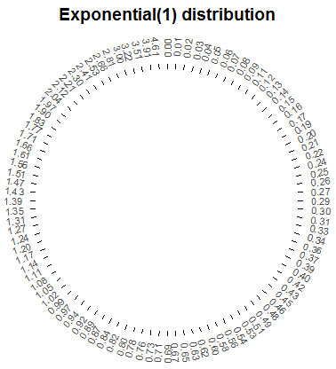
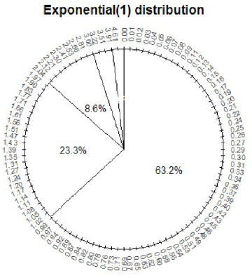
Figure 4.3: A spinner representing the distribution in Figure 4.2 (the “Exponential(1)” distribution.). The spinner is duplicated on the right; the highlighted sectors illustrate the non-linearity of axis values and how this translates to non-uniform probabilities.
Pay special attention to the values on the axis; they do not increase in equal increments. (As with the Uniform(0, 1) spinner, while only certain values are marked on the axis, we consider an idealized model in which any value in the continuous interval \([0, \infty)\) is a possible result of the spin.) The spinner on the right in Figure 4.3 is the same as the one on the left, with the intervals [0, 1], [1, 2], and [2, 3] highlighted with their respective probabilities. Putting a needle on this spinner that is “equally likely” to land anywhere on the axis, the needle will land in the interval [0, 1] with probability 0.632, in the interval [1, 2] with probability 0.233, etc. Therefore, values generated using this spinner, which represents the “Exponential(1)” distribution, will follow the pattern in Figure 4.2. Figure 4.4 illustrations this “simulate from a distribution” method; values of \(X\) are generated directly from an Exponential(1) distribution, rather than first generating \(U\) and then transforming.
X = RV(Exponential(1))

X.sim(10000).plot()
Exponential(1).plot()
plt.show()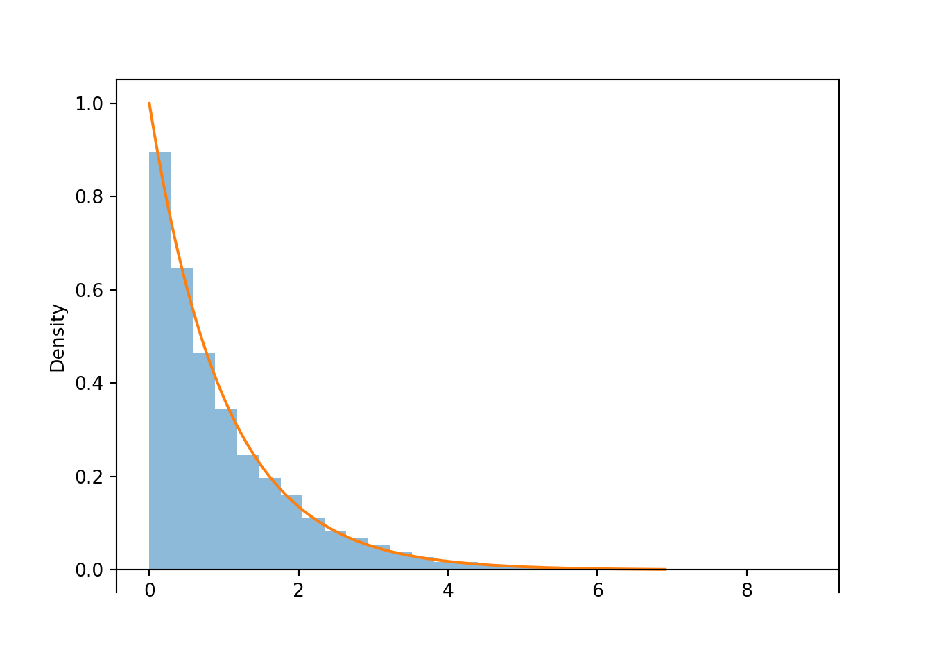
Figure 4.4: Simulated values from an Exponential(1) distribution, correspoding to the results of many spins of the spinner in Figure 4.2.
Some lessons from this example.
- Remember: a transformation of a random variable, both mathematically and in Symbulate.
- Be sure to always specify the possible values a random variable can take.
- A nonlinear transformation of a random variable changes the shape of its distribution.
- The shape of the histogram of simulated continuous values can be approximated by a smooth curve.
- Spinners can be used to generate values from non-uniform distributions by applying nonlinear transformations to values on the spinner axis.
- In general, Average of \(g(X)\) \(\neq\) \(g\)(Average of \(X\))
4.5.3 Transformations of multiple random variables
Earlier in this chapter we studied the joint distribution of the sum and max of two fair-four sided dice rolls. Now we consider a continuous analog. Instead of rolling a die which is equally likely to take the values 1, 2, 3, 4, we spin a Uniform(1, 4) spinner that lands uniformly in the continuous interval \([1, 4]\). Let \(\textrm{P}\) be the probability space corresponding to two spins of the Uniform(1, 4) spinner, and let \(X\) be the sum of the two spins, and \(Y\) the larger spin (or the common value if a tie). We saw that in Section 3.4.9, we could model two rolls of a fair-four sided die using DiscreteUniform(1, 4) ** 2. Similarly, we can model two spins of the Uniform(1, 4) spinner with Uniform(1, 4) ** 2.
We start by looking at the joint distribution of the two spins, \((U_1, U_2)\), which take values in \([1, 4]\times[1, 4]\).
P = Uniform(1, 4) ** 2
U1, U2 = RV(P)

u1u2 = (U1 & U2).sim(100)
u1u2.plot()
plt.show()
We see that the \((U_1, U_2)\) pairs are roughly “evenly spread” throughout \([1, 4]\times [1, 4]\). The scatterplot displays each individual pair. We can summarize the distribution of many pairs with a two-dimensional histogram. To construct the histogram, the space of values \([1, 4]\times[1, 4]\) is chopped into rectangular bins and the relative frequency of pairs which fall within each bin is computed. While for a one-dimensional histogram area represents relative frequency, volume represents relative frequency in a two-dimensional histogram, with the height of each rectangular bin on a “density” scale represented by its color intensity.
(U1 & U2).sim(10000).plot('hist')## Error in py_call_impl(callable, dots$args, dots$keywords): ValueError: invalid literal for int() with base 10: ''
##
## Detailed traceback:
## File "<string>", line 1, in <module>
## File "C:\Users\kjross\AppData\Local\R-MINI~1\envs\R-RETI~1\lib\site-packages\symbulate\results.py", line 578, in plot
## new_labels.append(int(label.get_text()) / len(x))plt.show()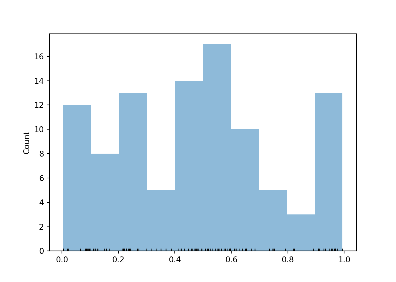
Now we let \(X\) be the sum and \(Y\) the max of the two spins71. First consider the possible values of \((X, Y)\). Marginally, \(X\) takes values in \([2, 8]\) and \(Y\) takes values in \([1, 4]\). However, not every value in \([2, 8]\times [1, 4]\) is possible. Before proceeding, sketch a picture representing the possible values of \((X, Y)\) pairs.
- We must have \(Y \ge 0.5 X\), or equivalently, \(X \le 2Y\). For example, if \(X=4\) then \(Y\) must at least 2, because if the larger of the two spins were less than 2, then both spins must be less than 2, and the sum must be less than 4.
- We must have \(Y \le X - 1\), or equivalently, \(X \ge Y + 1\). For example, if \(Y=3\), then one of the spins is 3 and the other one is at least 1, so the sum must be at least 4.
Therefore, the possible values of \((X, Y)\) lie in the set \[ \{(x, y): 2\le x\le 8, 1 \le y\le 4, 0.5x \le y \le x-1\} \] which can be simplified slightly as \(\{(x, y): 2\le x \le 8, 0.5 x\le y \le \min(4, x-1)\}\). This set is represented by the triangular region in the plots below.
P = Uniform(1, 4) ** 2

U = RV(P)
X = RV(P, sum)
Y = RV(P, max)

(U & X & Y).sim(100)| Index | Result |
|---|---|
| 0 | ((3.846726289679407, 2.498313546796235), 6.345039836475642, 3.846726289679407) |
| 1 | ((1.3895750517602083, 1.168299266940093), 2.5578743187003012, 1.3895750517602083) |
| 2 | ((3.8241187142006323, 2.7875911068109636), 6.611709821011596, 3.8241187142006323) |
| 3 | ((1.9870339362740268, 3.0408615762538793), 5.027895512527906, 3.0408615762538793) |
| 4 | ((3.667187938319683, 2.4480776812612675), 6.115265619580951, 3.667187938319683) |
| 5 | ((3.286426999390726, 1.130326064779707), 4.4167530641704325, 3.286426999390726) |
| 6 | ((2.853523985613615, 3.192990121009546), 6.046514106623161, 3.192990121009546) |
| 7 | ((1.9043933046892207, 1.4805013638143498), 3.384894668503571, 1.9043933046892207) |
| 8 | ((3.4432924882509117, 3.9488619360509687), 7.39215442430188, 3.9488619360509687) |
| ... | ... |
| 99 | ((1.5280562265240811, 1.9791628148134435), 3.5072190413375246, 1.9791628148134435) |
(X & Y).sim(100).plot()
plt.show()
(X & Y).sim(10000).plot('hist')## Error in py_call_impl(callable, dots$args, dots$keywords): ValueError: invalid literal for int() with base 10: ''
##
## Detailed traceback:
## File "<string>", line 1, in <module>
## File "C:\Users\kjross\AppData\Local\R-MINI~1\envs\R-RETI~1\lib\site-packages\symbulate\results.py", line 578, in plot
## new_labels.append(int(label.get_text()) / len(x))plt.show()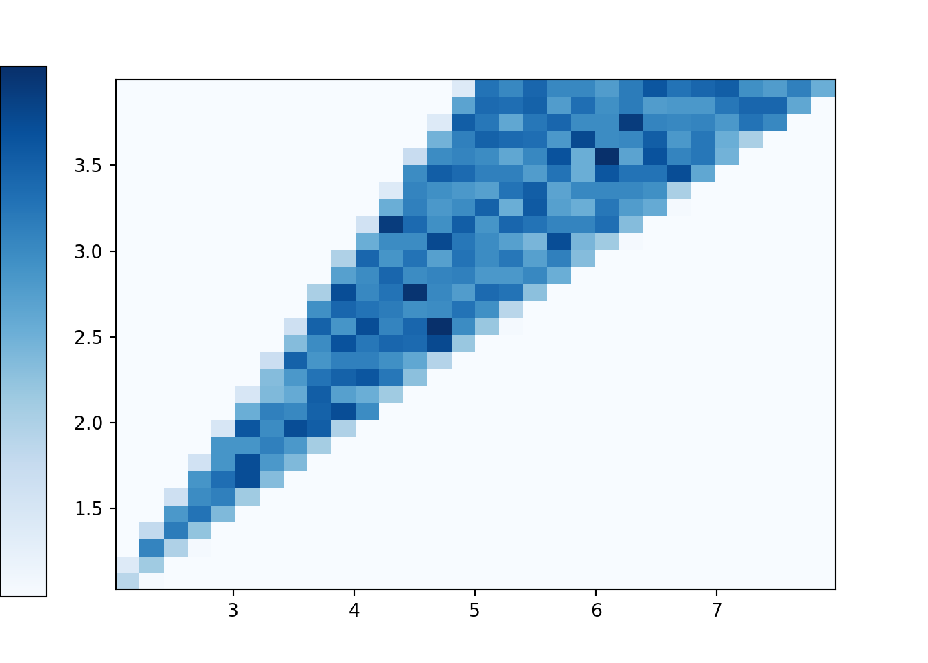
Compare the two-dimensional histogram above to the tile plot in Section 3.2.6. In the dice rolling situation there are basically two cases. Each \((X, Y)\) pair that correspond to a tie — that is each \((X, Y)\) pair with \(X = 2Y\) — has probability 1/16. Each of the other possible \((X, Y)\) pairs has probability 2/16.
Back to the continuous analog, the histogram shows that \((X, Y)\) pairs are roughly uniformly distributed within the triangular region of possible values. Consider a single \((X, Y)\) pair, say (0.8, 0.5). There are two outcomes — that is, pairs of spins — for which \(X=0.8, Y=0.5\), namely (0.5, 0.3) and (0.3, 0.5). Like (0.8, 0.5), most of the possible \((X, Y)\) values correspond to exactly two outcomes. The only ones that do not are the values with \(Y = 0.5X\) that lie along the western border of the triangular region. The pairs \((X, 0.5X)\) only correspond to exactly one outcome. For example, the only outcome corresponding to (6, 3) is the \((U_1, U_2)\) pair (3, 3); that is, the only way to have \(X=6\) and \(Y=3\) is to spin 3 on both spins. In general, the event \(\{Y = 0.5X\}\) is the same as the event that both spins are exactly the same, \(\{U_1=U_2\}\). However, as discussed in Section 2.4.5, the probability that \(U_1=U_2\) exactly is 0. Therefore, we don’t really need to worry about the ties as we did in the discrete case. Excluding ties, roughly, each pair in the triangular region of possible \((X, Y)\) pairs corresponds to exactly two outcomes (pairs of spins), and since the outcomes are uniformly distributed (over \([1, 4]\times[1, 4]\)) then the \((X, Y)\) pairs are also uniformly distributed (over the triangular region of possible values).
The plot below represents the joint distribution of \((X, Y)\). This is really a three-dimensional plot. The base is the triangular region which represents the possible \((X, Y)\) pairs. There is a surface floating above this region which represents the density at each point. For a single variable, the density is a smooth curve approximating the idealized shape of the histogram. Likewise, for two variables, the density is a smooth surface approximating the idealized shape of the two-dimensional histogram. The height of this surface is depicted in the two-dimensional plot via the color intensity. Since the \((X, Y)\) pairs are uniformly distributed over their range of possible values, the height of the surface and hence the color intensity is constant over the range of possible values, and the height is 0 (white) for impossible \((X, Y)\) pairs. Careful: this plot is not the same as the ones in Section 2.4.5. Those plots were just depicting events, and the color was just used to shade the region of interest. The plot below is depicting a joint distribution, and the color represents the height of the density surface at each \((X, Y)\) pair; white areas correspond to a height of 0.
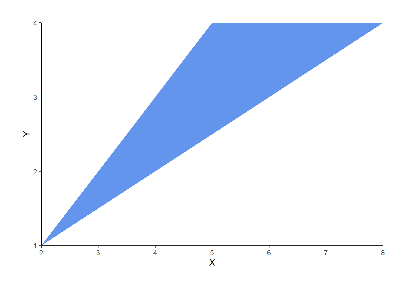
Figure 4.5: Joint distribution of \(X\) (sum) and \(Y\) (max) of two spins of the Uniform(1, 4) spinner. The triangular region represents the possible values of \((X, Y)\) the height of the density surface is constant over this region and 0 outside of the region.
We now consider the marginal distributions of \(X\) and \(Y\). Before proceeding, try to sketch the marginal distributions.
Here is a plot showing the two-dimensional histogram representing the joint distribution of \((X, Y)\), along with histograms representing each of the marginal distributions.
(X & Y).sim(10000).plot(['hist', 'marginal'])## Error in py_call_impl(callable, dots$args, dots$keywords): ValueError: invalid literal for int() with base 10: ''
##
## Detailed traceback:
## File "<string>", line 1, in <module>
## File "C:\Users\kjross\AppData\Local\R-MINI~1\envs\R-RETI~1\lib\site-packages\symbulate\results.py", line 578, in plot
## new_labels.append(int(label.get_text()) / len(x))plt.show()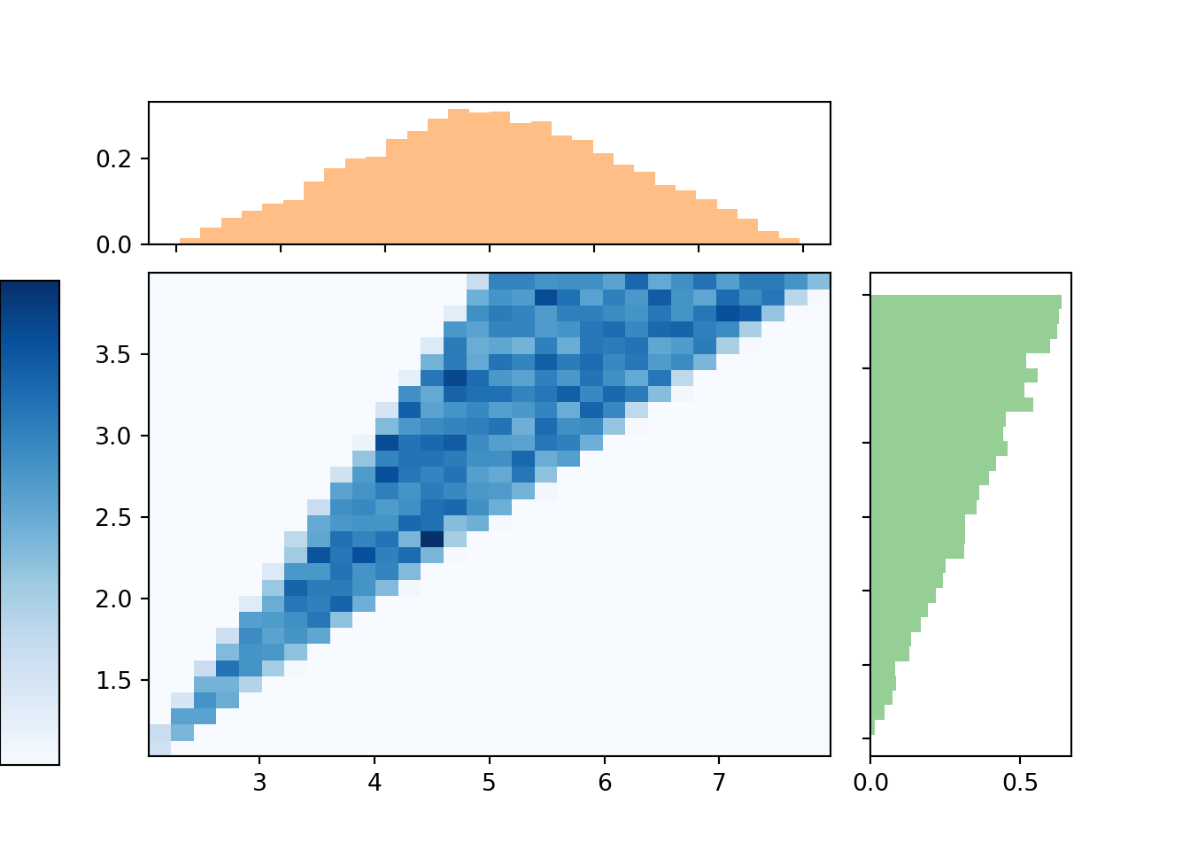
Let’s look a little more closely at the marginal distribution of \(X\).
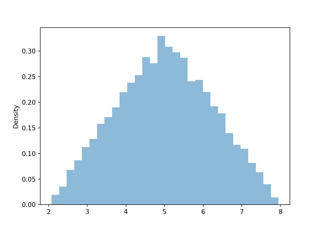
Figure 4.6: Histogram representing the marginal distribution of the sum (\(X\)) of two spins of the Uniform(1, 4) spinner.
The marginal distribution of \(X\) has highest density near 5 and lowest density near 2 and 8. Intuitively, there is only one pair of spins — (1, 1) — for which the sum is 2; similarly for a sum of 8. But there are many pairs for which the sum is 5: (2.5, 2.5), (3, 2), (2, 3), (1.2, 2.8), etc. Recall that for the dice rolls, we could obtain the marginal distribution of \(X\) by summing the joint distribution over all \(Y\) values. Similarly, we can find the marginal density of \(X\) by aggregating over all possible values of \(Y\). For each possible value of \(X\), “collapse” the joint histogram vertically over all possible values of \(Y\). Imagine that within the region of possible \((X, Y)\) pairs, the joint histogram is composed of stacks of blocks, one for each bin, each stack of the same height (because the values are uniformly distributed over the triangular region). To get the marginal density for a particular \(x\), take all the stacks corresponding to that \(x\), for different values of \(y\), and stack them on top of one another. There will be the most stacks for \(x\) values near 5 and the fewest stacks for \(x\) values near 2 or 8. In other words, the aggregated density along “vertical strips” is largest for the vertical strip for \(x=5\).
Similarly reasoning applies to find the marginal distribution of \(Y\). Now we find the marginal density for a particular \(y\) value by collapsing/stacking the histogram horizontally over all possible value of \(X\). We see that the density increases with values of \(y\). Intuitively, there is only one pair of spins, (1, 1), for which \(Y=1\), but many pairs of spins for which \(Y=4\), e.g., (1, 4), (4, 1), (4, 2), (2.5, 4), etc.
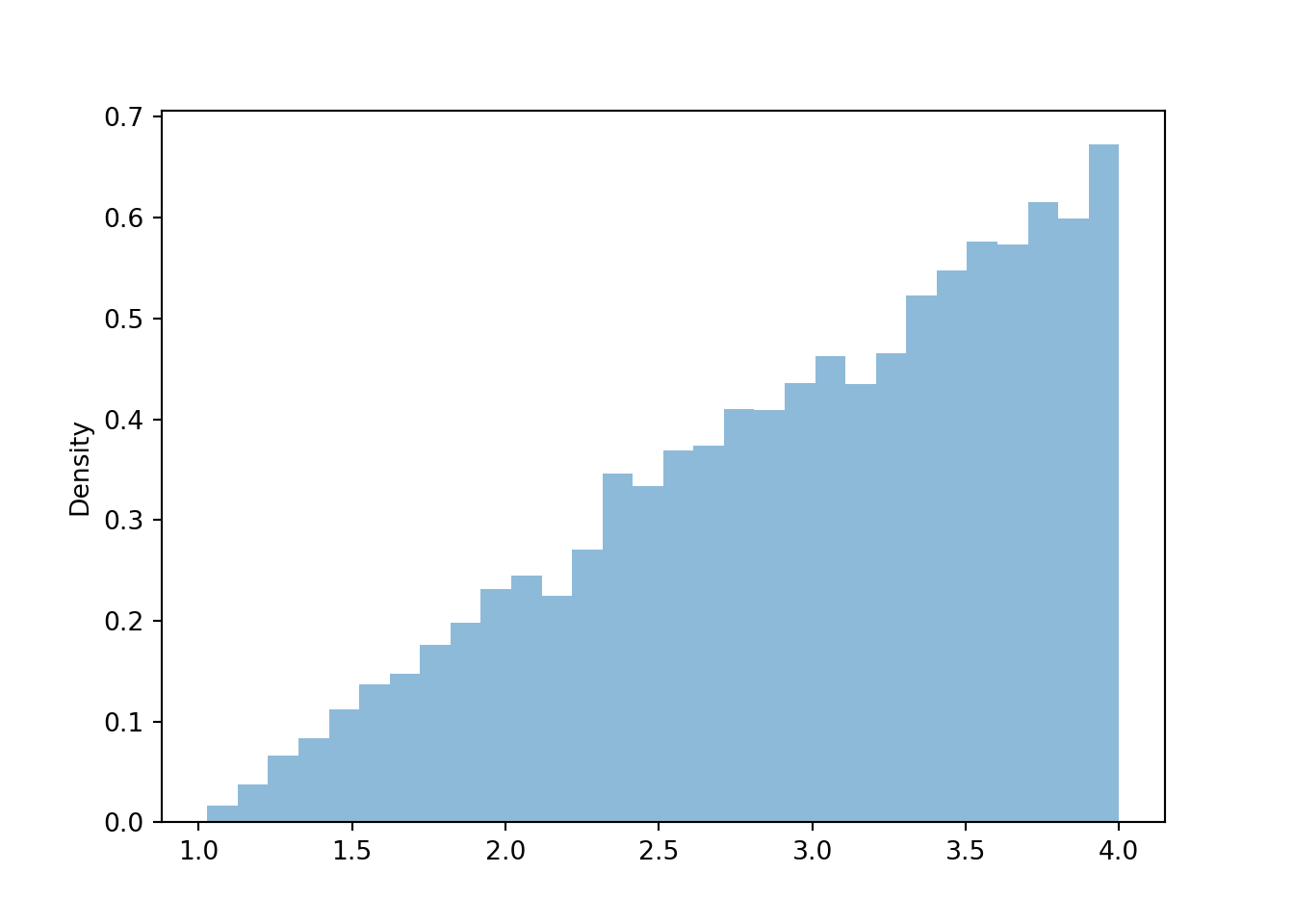
Figure 4.7: Histogram representing the marginal distribution of the larger (\(Y\)) of two spins of the Uniform(1, 4) spinner.
What about the long run averages? The sums of the two spins is \(X= U_1 + U_2\). The long run average of each of \(U_1\) and \(U_2\) is 2.5 (the midpoint of the interval [1, 4]). We can see from its marginal distribution that the long run average of \(X\) is 5. Therefore, the average of the sum is the sum of averages.
X.sim(10000).mean()## 5.00509434786288However, the average of \(Y=\max(U_1, U_2)\) is 3, which is not \(\max(2.5, 2.5)\). Therefore, the average of the maximum is not the maximum of the averages. Remember that in general, Average of \(g(X, Y)\) \(\neq\) \(g\)(Average of \(X\), Average of \(Y\)).
Y.sim(10000).mean()## 2.994076534987546Finally, observe that the plots in this section look like continuous versions of the plots for the dice rolling example earlier in the chapter. However, it took a little more work in this section to think about what the joint or marginal distributions might look like. When studying continuous random variables, it is often helpful to think about how a discrete analog behaves.
Some lessons from this example.
- The joint distribution of values on a continuous scale can be visualized in a two-dimensional histogram.
- Remember to always identify possible values of random variables, including possible pairs in a joint distribution.
- The marginal distribution of a single random variable can be obtained from a joint distribution by aggregating or collapsing or stacking over the values of the other random variables.
- The average of a sum is the sum of the averages.
- In general, Average of \(g(X, Y)\) \(\neq\) \(g\)(Average of \(X\), Average of \(Y\)).
- When studying continuous random variables, it is often helpful to think about how a discrete analog behaves.
4.5.4 Exercises
Exercise 4.1 Spin the Uniform(0, 1) spinner twice and let \(U_1\) and \(U_2\) be the result of the two spins. Each of the following random variables takes values in the interval (-1, 1). (You should verify this.)
- \(V = 2 U_1 - 1\).
- \(W = 2U_1^2 - 1\).
- \(U_1^2\) the square of \(\U_1\).
- \(X = U_1 - U_2\).
- \(Y = 2\max(U_1, U_2) - 1\).
- \(Z = (2 U_1 - 1)^{1/3}\), where the cube root of a negative number is defined to be negative, e.g. \((-1/8)^{1/3} = -1/2\); \((-1)^{1/3} = -1\).
Match each of the random variables above with the feature below that best describes its distribution. Each feature will be used exactly once.
- Density is uniform over \((-1, 1)\).
- Density is highest at -1 and lowest at 1.
- Density is highest at 0 and lowest at -1 and 1.
- Density is highest at 1 and lowest at -1.
- Density is highest at 1 and -1 and lowest at 0.
As in many other contexts and programming languages, in this text any reference to logarithms or \(\log\) refers to natural (base \(e\)) logarithms. In the instances we need to consider another base, we’ll make that explicit.↩︎
Remember that a probability space outcome corresponds to the pair of spins, so we can define random variables on this space as we have done. We could also first define random variables
U1, U2 = RV(P)corresponding to the individual spins, and then define the sum asX = U1 + U2. For technical reasons the syntax formaxis a little different:Y = (U1 & U2).apply(max).↩︎