2.1 Examples and applications
2.1.1 Case study I: PISA scores and GDPp
The Programme for International Student Assessment (PISA) is a study carried out by the Organization for Economic Co-operation and Development (OECD) in 65 countries with the purpose of evaluating the performance of 15-year-old pupils on mathematics, science and reading. A phenomena observed over years is that wealthy countries tend to achieve larger average scores. The purpose of this case study, motivated by the OECD (2012a) inform, is to answer two questions related with the previous statement:
- Q1. Is the educational level of a country influenced by its economic wealth?
- Q2. If so, up to what precise extent?
The pisa.csv file (download) contains 65 rows corresponding to the countries that took part on the PISA study. The data was obtained merging the statlink in OECD (2012b) with The World Bank (2012) data. Each row has the following variables: Country; MathMean, ReadingMean and ScienceMean (the average performance of the students in mathematics, reading and science); MathShareLow and MathShareTop (percentages of students with a low and top performance in mathematics); GDPp and logGDPp (the Gross Domestic Product per capita and its logarithm); HighIncome (whether the country has a GDPp larger than 20000$ or not). The GDPp of a country is a measure of how many economic resources are available per citizen. The logGDPp is the logarithm of the GDPp, taken in order to avoid scale distortions. A small subset of the data is shown in Table 2.1.
| Country | MathMean | ReadingMean | ScienceMean | logGDPp | HighIncome |
|---|---|---|---|---|---|
| Shanghai-China | 613 | 570 | 580 | 8.74267 | FALSE |
| Singapore | 573 | 542 | 551 | 10.90506 | TRUE |
| Hong Kong SAR, China | 561 | 545 | 555 | 10.51074 | TRUE |
| Chinese Taipei | 560 | 523 | 523 | NA | NA |
| Korea | 554 | 536 | 538 | 10.10455 | TRUE |
| Macao SAR, China | 538 | 509 | 521 | 11.25344 | TRUE |
| Japan | 536 | 538 | 547 | 10.75152 | TRUE |
| Liechtenstein | 535 | 516 | 525 | 11.91278 | TRUE |
| Switzerland | 531 | 509 | 515 | 11.32911 | TRUE |
| Netherlands | 523 | 511 | 522 | 10.80922 | TRUE |
We definitely need a way of summarizing this amount of information!
We are going to do the following. First, import the data into R Commander and do a basic manipulation of it. Second, fit a linear model and interpret its output. Finally, visualize the fitted line and the data.
Import the data into R Commander.
Go to
'Data' -> 'Import data' -> 'from text file, clipboard, or URL...'. A window like Figure 2.1 will pop-up. Select the appropiate formatting options of the data file: whether the first row contains the name of the variables, what is the indicator for missing data, what is the field separator and what is the decimal point character. Then click'OK'.Inspecting the data file in a text editor will give you the right formatting choices for importing the data.
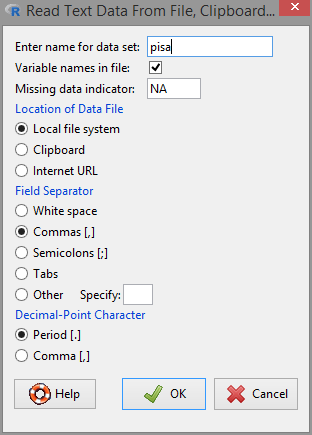
Figure 2.1: Data importation options.
Click on
'View data set'to check that the importation was fine. If the data looks weird, then recheck the structure of the data file and restart from the above point.Since each row corresponds to a different country, we are going to name the rows as the value of the variable
Country. To that end, go to'Data' -> 'Active data set' -> 'Set case names...'and select the variableCountryand click'OK'. The dataset should look like Figure 2.2.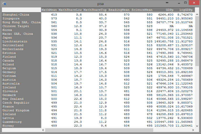
Figure 2.2: Correct importation of the
pisadataset.In UC3M computers, altering the location of a downloaded file may cause errors in its importation to R Commander!
Example:
-
Default download path:
‘C:/Users/g15s4021/Downloads/pisa.csv’. Importation from that path works fine. -
If you move the file another location (e.g. to
‘C:/Users/g15s4021/Desktop/pisa.csv’). Importation generates an error.
-
Default download path:
Fit a simple linear regression.
Go to
'Statistics' -> 'Fit models' -> 'Linear regression...'. A window like Figure 2.3 will pop-up.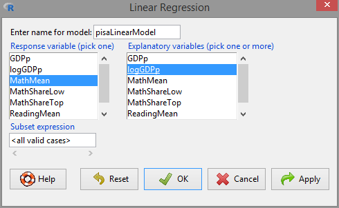
Figure 2.3: Window for performing simple linear regression.
Select the response variable. This is the variable denoted by \(Y\) that we want to predict/explain. Then select the explanatory variable (also known as the predictor). It is denoted by \(X\) and is the variable used to predict/explain \(Y\). Recall the form of the linear model: \[\begin{align*} Y=\beta_0+\beta_1X+\varepsilon \end{align*}\]
In our case \(Y=\)
MathMeanand \(X=\)logGDPp, so select them and click'OK'1.If you want to deselect an option in an R Commander menu, use
‘Control’ + ‘Mouse click’.Four buttons are common in the menus of R Commander:
-
‘OK’: executes the selected action, then closes the window. -
‘Apply’: executes the selected action but leaves the window open. Useful if you are experimenting with different options. -
‘Reset’: resets the fields and boxes of the window to their defaults. -
‘Cancel’: exits the window without performing any action.
-
The window in Figure 2.3 generates this code and output:
pisaLinearModel <- lm(MathMean ~ logGDPp, data = pisa)
summary(pisaLinearModel)
## ## Call: ## lm(formula = MathMean ~ logGDPp, data = pisa) ## ## Residuals: ## Min 1Q Median 3Q Max ## -138.924 -29.109 1.381 20.239 176.166 ## ## Coefficients: ## Estimate Std. Error t value Pr(>|t|) ## (Intercept) 185.16 61.36 3.018 0.00369 ** ## logGDPp 28.79 6.13 4.696 1.51e-05 *** ## --- ## Signif. codes: 0 '***' 0.001 '**' 0.01 '*' 0.05 '.' 0.1 ' ' 1 ## ## Residual standard error: 47.48 on 62 degrees of freedom ## (1 observation deleted due to missingness) ## Multiple R-squared: 0.2624, Adjusted R-squared: 0.2505 ## F-statistic: 22.06 on 1 and 62 DF, p-value: 1.512e-05This is the linear model of
MathMeanregressed onlogGDPp(first line) and its summary (second line). The summary gives the coefficients of the line and the \(R^2\) ('Multiple R-squared'), which – as we will see in Section 2.7 – it can be regarded as an indicator of the strength of the linear relation between the variables. (\(R^2=1\) is a perfect linear fit – all the points lay in a line – and \(R^2=0\) is the poorest fit.)The fitted regression line is
MathMean\(= 185.16 + 28.79\,\times\)logGDPp. The slope coefficient is positive, which indicates that there is a positive correlation between the wealth of a country and its performance in the PISA Mathematics test (this answers Q1). Hence, the evidence that wealthy countries tend to achieve larger average scores is indeed true (at least for the Mathematics test). We can be more precise on the effect of the wealth of a country. According to the fitted linear model, an increase of 1 unit in thelogGDPpof a country is associated with achieving, on average, 28.79 additional points in the test (Q2).
Visualize the fitted regression line.
Go to
'Graphs' -> 'Scatterplot...'. A window with two panels will pop-up (Figures 2.4 and 2.5).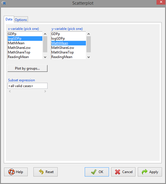
Figure 2.4: Scatterplot window,
'Data'panel.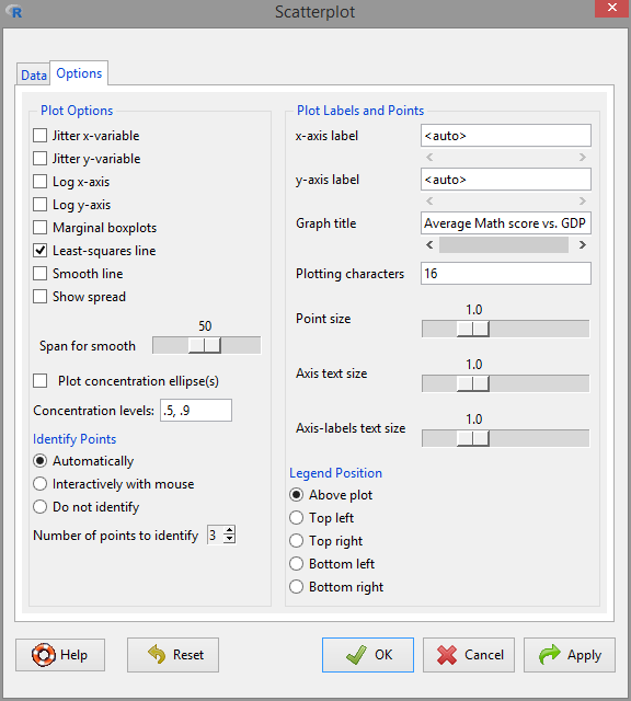
Figure 2.5: Scatterplot window,
'Options'panel. Remember to tick the'Least-squares line'box in order to display the fitted regression line.On the
'Data'panel, select the \(X\) and \(Y\) variables to be displayed in the scatterplot. On the'Options'panel, check the'Least-squares line'box and choose to identify'3'points'Automatically'2. This will identify what are the three3 most different observations of the data.The following R code will be generated. It produces a scatterplot of
MathMeanvslogGDPp, with its corresponding regression line.scatterplot(MathMean ~ logGDPp, reg.line = lm, smooth = FALSE, spread = FALSE, id.method = 'mahal', id.n = 3, boxplots = FALSE, span = 0.5, ellipse = FALSE, levels = c(.5, .9), main = "Average Math score vs. logGDPp", pch = c(16), data = pisa)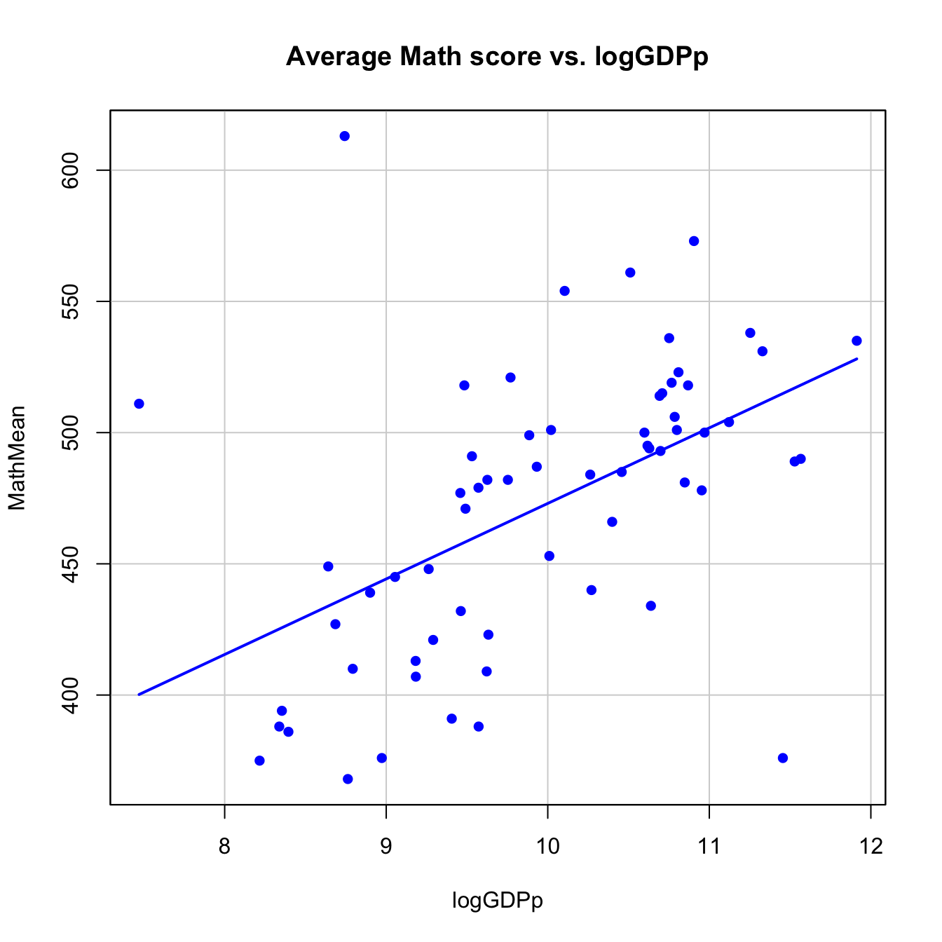
There are three clear outliers4: Vietnam, Shanghai-China and Qatar. The first two are non high-income economies that perform exceptionally well in the test (although Shanghai-China is a cherry-picked region of China). On the other hand, Qatar is a high-income economy that has really poor scores.
We can identify countries that are above and below the linear trend in the plot. This is particularly interesting: we can assess whether a country is performing better or worse with respect to its expected PISA score according to its economic status (this adds more insight into Q2). To do so, we want to display the text labels in the points of the scatterplot. We can take a shortcut: copy and run in the input panel the next piece of code. It is a slightly modified version of the previous code (what are the differences?).
scatterplot(MathMean ~ logGDPp, reg.line = lm, smooth = FALSE, spread = FALSE,
            id.method = 'mahal', id.n = 65, id.cex = 0.75, boxplots = FALSE,
            span = 0.5, ellipse = FALSE, levels = c(.5, .9),
            main = "Average Math score vs. logGDPp", pch = c(16), cex = 0.75,
            data = pisa)
If you understood the previous analysis, then you should be able to perform the next ones on your own.
Repeat the regression analysis (steps 2–3) for:
-
ReadingMeanregressed onlogGDPp. Are the results similar toMathMeanonlogGDPp? -
MathMeanregressed onReadingMean. Compare it withMathMeanonScienceMean. Which pair of variables has the highest linear relation? Is that something expected?
Save the new models with different names to avoid overwriting the previous models!
2.1.2 Case study II: Apportionment in the EU and US
Apportionment is the process by which seats in a legislative body are distributed among administrative divisions entitled to representation.
— Wikipedia article on Apportionment (politics)
The European Parliament and the US House of Representatives are two of the most important macro legislative bodies in the world. The distribution of seats in both cameras is designed to represent the different states that conform the federation (US) or union (EU). Both chambers were created under very different historical and political circumstances, which is reflected in the kinds of apportionment that they present. More specifically:
In the US, the apportionment is neatly fixed by the US Constitution. Each of the 50 states is apportioned a number of seats that corresponds to its share of the total population of the 50 states, according to the most recent decennial census. Every state is guaranteed at least 1 seat. There are 435 seats.
Until now, the apportionment in the EU was set by treaties (Nice, Lisbon), in which negotiations between countries took place. The last accepted composition gives an allocation of seats based on the principle of “degressive proportionality”5 and somehow vague guidelines. It concludes with a commitment to establish a system to “allocate the seats between Member States in an objective, fair, durable and transparent way, translating the principle of degressive proportionality.” The Cambridge Compromise (Grimmett et al. 2011) was a proposal in that direction that was not effectively implemented. Currently, every state is guaranteed a minimum of 6 seats and a maximum of 96 for a grand total of 750 seats.
We know that there exist qualitative dissimilarities between both chambers, but we can not be more specific with the description at hand. The purpose of this case study is to quantify and visualize what are the differences between the apportionments of the two chambers and how the simple linear regression can add insights on what is actually going on with the EU apportionment. The questions we want to answer are:
- Q1. Can we quantify which chamber is more proportional?
- Q2. What are the over-represented and under-represented states in both chambers?
- Q3. How can we quantify the ‘degressive proportionality’ in the EU apportionment system? Was the Cambridge Compromise proposing a fairer representation?
Let’s begin by reading the data:
The
US_apportionment.xlsxfile (download) contains the 50 US states entitled to representation. The variables areState,Population2010(from the last census) andSeats2013–2023. This is an Excel file that we can read using'Data' -> 'Import data' -> 'from Excel file...'. A window will pop-up, asking for the right options. We set them as in Figure 2.6, since we want the variableStateto be the case names. After clicking in'View dataset', the data should look like Figure 2.7.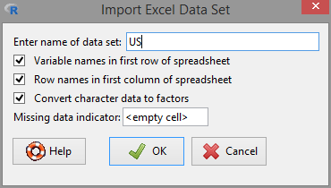
Figure 2.6: Importation of an Excel file.
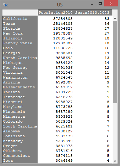
Figure 2.7: Correct importation of the
USdataset.The
EU_apportionment.txtfile (download) contains 28 rows with the member states of the EU (Country), the number of seats assigned under different years (Seats2011,Seats2014), the Cambridge Compromise apportionment (CamCom2011) and the countries population6 (Population2010,Population2013).For this file, you should know how to:
- Inspect the file in a text editor and determine its formatting.
-
Decide the right importation options and load it with the name
EU. -
Set the case names as the variable
Country.
Table 2.2: The EUdataset withCountryset as the case names.Population2010 Seats2011 CamCom2011 Population2013 Seats2014 Germany 81802257 99 96 80523746 96 France 64714074 74 85 65633194 74 United Kingdom 62008048 73 81 63896071 73 Italy 60340328 73 79 59685227 73 Spain 45989016 54 62 46704308 54 Poland 38167329 51 52 38533299 51 Romania 21462186 33 32 20020074 32 Netherlands 16574989 26 26 16779575 26 Greece 11305118 22 19 11161642 21 Belgium 10839905 22 19 11062508 21 Portugal 10637713 22 18 10516125 21 Czech Republic 10506813 22 18 10487289 21 Hungary 10014324 22 18 9908798 21 Sweden 9340682 20 17 9555893 20 Austria 8375290 19 16 8451860 18 Bulgaria 7563710 18 15 7284552 17 Denmark 5534738 13 12 5602628 13 Slovakia 5424925 13 12 5426674 13 Finland 5351427 13 12 5410836 13 Ireland 4467854 12 11 4591087 11 Crotia 4425747 NA NA 4262140 11 Lithuania 3329039 12 10 2971905 11 Latvia 2248374 9 8 2058821 8 Slovenia 2046976 8 8 2023825 8 Estonia 1340127 6 7 1324814 6 Cyprus 803147 6 6 865878 6 Luxembourg 502066 6 6 537039 6 Malta 412970 6 6 421364 6
We start by analyzing the US dataset. If there is indeed a direct proportionality in the apportionment, we would expect a direct, 1:1, relation between the ratios of seats and the population per state. Let’s start by constructing these variables:
Switch the active dataset to
US. An alternative way to do so is by'Data' -> 'Active data set' -> 'Select active data set...'.Go to
'Data' -> 'Manage variables in active dataset...' -> 'Compute new variable...'.Create the variable
RatioSeats2013.2023as shown in Figure 2.8. Be careful to not overwrite the variableSeats2013.2023.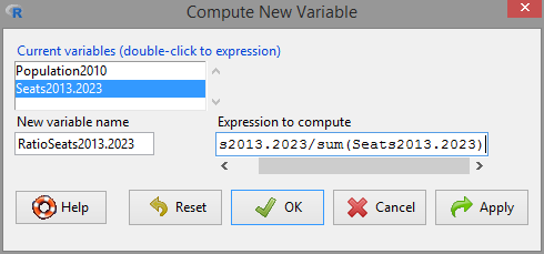
Figure 2.8: Creation of the new variable
RatioSeats2013.2023. The expression to compute isSeats2013.2023/sum(Seats2013.2023).'View dataset'to check that the new variable is available.
Repeat steps 1–3, conveniently adapted, to create the new variable RatioPopulation2010.
Let’s fit a regression line to the US data, with RatioSeats2013.2023 as the response and RatioPopulation2010 as the explanatory variable. If we name the model as appUS, you should get the following code and output:
appUS <- lm(RatioSeats2013.2023 ~ RatioPopulation2010, data = US)
summary(appUS)
##
## Call:
## lm(formula = RatioSeats2013.2023 ~ RatioPopulation2010, data = US)
##
## Residuals:
## Min 1Q Median 3Q Max
## -1.118e-03 -4.955e-04 -3.144e-05 4.087e-04 1.269e-03
##
## Coefficients:
## Estimate Std. Error t value Pr(>|t|)
## (Intercept) -0.0001066 0.0001275 -0.836 0.407
## RatioPopulation2010 1.0053307 0.0042872 234.498 <2e-16 ***
## ---
## Signif. codes: 0 '***' 0.001 '**' 0.01 '*' 0.05 '.' 0.1 ' ' 1
##
## Residual standard error: 0.0006669 on 48 degrees of freedom
## Multiple R-squared: 0.9991, Adjusted R-squared: 0.9991
## F-statistic: 5.499e+04 on 1 and 48 DF, p-value: < 2.2e-16The fitted regression line is RatioSeats2013.2023 \(=0.000+1.005\,\times\)RatioPopulation2010 and has an \(R^2=0.9991\) ('Multiple R-squared'), which means that the data is almost perfectly linearly distributed. Furthermore, the intercept coefficient is not significant for the regression. This is seen in the column 'Pr(>|t|)', which gives the \(p\)-values for the null hypotheses \(H_0:\beta_0=0\) and \(H_0:\beta_1=0\), respectively. The null hypothesis \(H_0:\beta_0=0\) is not rejected (\(p\text{-value}=0.407\); non-significant) whereas \(H_0:\beta_1=0\) is rejected (\(p\text{-value}=0\); significant)7. Hence, we can conclude that the appropriation of seats in the US House of Representatives is indeed directly proportional to the population of each state (partially answers Q1).
If we make the scatterplot for the US dataset, we can see the almost perfect (up to integer rounding) 1:1 relation between the ratios “state seats”/“total seats” and “state population”/“aggregated population.” We can set the scatterplot to automatically label the '25' most different points (select the numeric box with the mouse and type '25' – the arrow buttons are limited to '10') with their case names. As it is seen in Figure 2.9, there is no state clearly over- or under-represented (Q2).
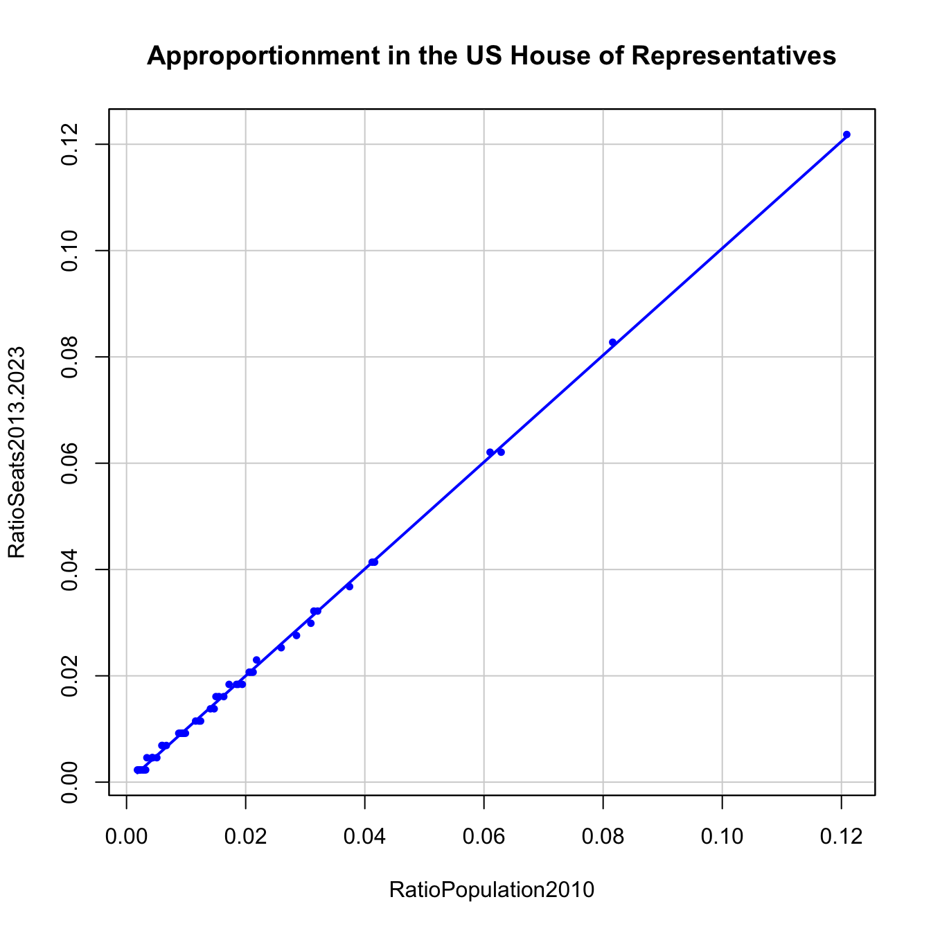
Figure 2.9: The apportionment in the US House of Representatives compared with a linear fit.
Let’s switch to the EU dataset, for which we will focus on the 2011 variables. A quick way of visualizing this dataset and, in general, of visualizing multivariate data (up to a moderate number of dimensions) is to use a matrix scatterplot. Essentially, it displays the scatterplots between all the pairs of variables. To do it, go to 'Graphs' -> 'Scatterplot matrix...' and select the number of variables to be displayed. If you select them as in Figures 2.10 and 2.11, you should get an output like Figure 2.12.
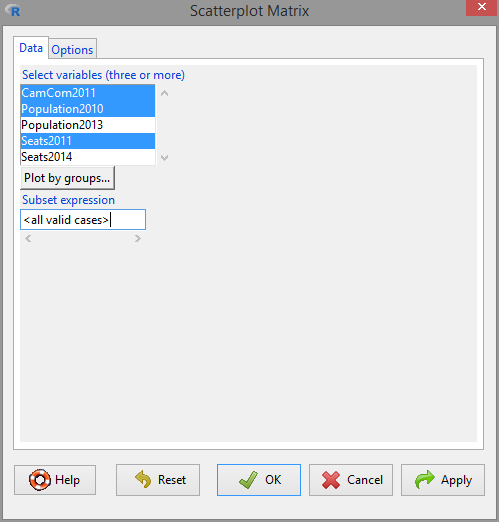
Figure 2.10: Scatterplot matrix window, 'Data' panel.
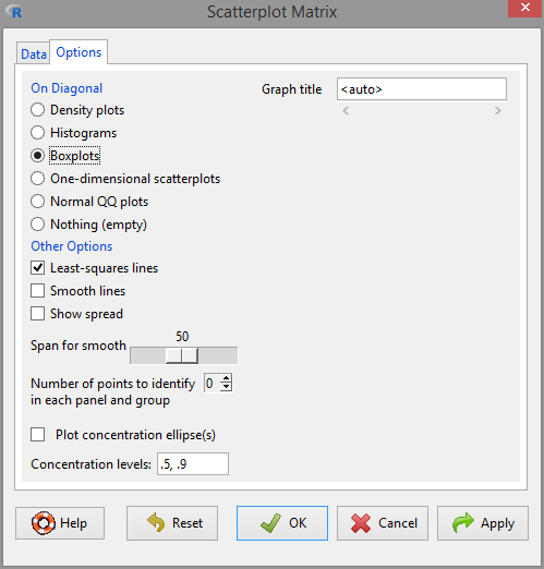
Figure 2.11: Scatterplot matrix window, 'Options' panel. Be sure to tick the 'Least-squares line' box in order to display the fitted regression line.
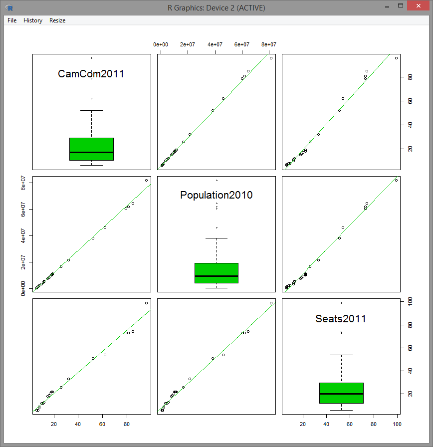
Figure 2.12: Scatterplot matrix for the variables CamCom2011, Population2010 and Seats2011 of EU dataset with boxplots in the central panels.
The scatterplot matrix has a central panel displaying one-variable summary plots: histogram, density estimate, boxplot and QQ-plot. Experiment and understand them.
The most interesting panels in Figure 2.12 for our study are CamCom2011 vs. Population2010 – panel (1,2) – and Seats2011 vs. Population2010 – panel (3,2). At first sight, it seems that the Cambridge Compromise was favoring a fairer allocation of seats than what it was actually being used in the EU parliament in 2011 (recall the step-wise patterns in (3,2)). Let’s explore in depth the scatterplot Seats2011 vs Population2010.
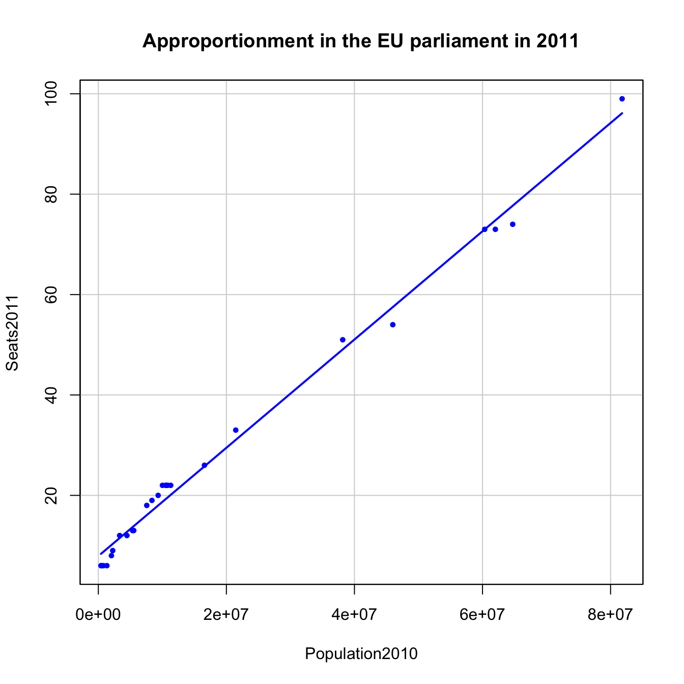
Figure 2.13: Seats2011 vs Population2010 in the EU dataset.
There are some countries clearly detrimented and benefited by this apportionment. For example, France and Spain are under-represented and, on the other hand, Germany, Hungary and Czech Republic are over-represented (Q2).
Let’s compute the regression line of Seats2011 on Population2010, which we save in the model appEU2011.
appEU2011 <- lm(Seats2011 ~ Population2010, data = EU)
summary(appEU2011)
##
## Call:
## lm(formula = Seats2011 ~ Population2010, data = EU)
##
## Residuals:
## Min 1Q Median 3Q Max
## -3.7031 -1.9511 0.0139 1.9799 3.2898
##
## Coefficients:
## Estimate Std. Error t value Pr(>|t|)
## (Intercept) 7.910e+00 5.661e-01 13.97 2.58e-13 ***
## Population2010 1.078e-06 1.915e-08 56.31 < 2e-16 ***
## ---
## Signif. codes: 0 '***' 0.001 '**' 0.01 '*' 0.05 '.' 0.1 ' ' 1
##
## Residual standard error: 2.289 on 25 degrees of freedom
## (1 observation deleted due to missingness)
## Multiple R-squared: 0.9922, Adjusted R-squared: 0.9919
## F-statistic: 3171 on 1 and 25 DF, p-value: < 2.2e-16The fitted line is Seats2011 \(=7.91+1.078\,\times10^{-6}\,\times\)Population2010. The intercept is not zero and, indeed, the fitted intercept is significantly different from zero. Therefore, there is no proportionality in the apportionment. Recall that the fitted slope, despite being very small (why?), is also significantly different from zero. The \(R^2\) is slightly smaller than in the US dataset, but definitely very high. Two conclusions stem from this analysis:
The US House of Representatives is a proportional chamber whereas the EU parliament is definitely not, but is close to perfect linearity (completes Q1).
The principle of digressive proportionality, in practice, means an almost linear allocation of seats with respect to population (Q3). The main point is the presence of a non-zero intercept – that is, a minimum number of seats corresponding to a country – in order to over-represent smaller countries with respect to its corresponding proportional share.
The question that remains to be answered is whether the Cambridge Compromise was favoring a fairer allocation of seats than the 2011 official agreement. In Figure 2.12 we can see that indeed it seems like that, but there is an outlier outside the linear pattern: Germany. There is an explanation for that: the EU commission imposed a cap to the maximum number of seats per country, 96, to the development of the Cambridge Compromise. With this rule, Germany is notably under-represented.
In order to avoid this distortion, we will exclude Germany from our comparison. To do so, we specify in the 'Subset expression' field, of either 'Linear regression...' or 'Scatterplot...', a '-1'. This tells R to exclude the first row of EU dataset, corresponding to Germany. Then, we compare the linear models for the official allocation, appEUNoGer2011 and the Cambridge Compromise, appCamComNoGer2011. The outputs are the following.
appEUNoGer2011 <- lm(Seats2011 ~ Population2010, data = EU, subset = -1)
summary(appEUNoGer2011)
##
## Call:
## lm(formula = Seats2011 ~ Population2010, data = EU, subset = -1)
##
## Residuals:
## Min 1Q Median 3Q Max
## -3.5197 -2.0722 -0.2192 2.0179 3.2865
##
## Coefficients:
## Estimate Std. Error t value Pr(>|t|)
## (Intercept) 8.099e+00 5.638e-01 14.37 2.78e-13 ***
## Population2010 1.060e-06 2.212e-08 47.92 < 2e-16 ***
## ---
## Signif. codes: 0 '***' 0.001 '**' 0.01 '*' 0.05 '.' 0.1 ' ' 1
##
## Residual standard error: 2.227 on 24 degrees of freedom
## (1 observation deleted due to missingness)
## Multiple R-squared: 0.9897, Adjusted R-squared: 0.9892
## F-statistic: 2296 on 1 and 24 DF, p-value: < 2.2e-16appCamComNoGer2011 <- lm(CamCom2011 ~ Population2010, data = EU, subset = -1)
summary(appCamComNoGer2011)##
## Call:
## lm(formula = CamCom2011 ~ Population2010, data = EU, subset = -1)
##
## Residuals:
## Min 1Q Median 3Q Max
## -0.47547 -0.22598 0.01443 0.27471 0.46766
##
## Coefficients:
## Estimate Std. Error t value Pr(>|t|)
## (Intercept) 5.459e+00 7.051e-02 77.42 <2e-16 ***
## Population2010 1.224e-06 2.766e-09 442.41 <2e-16 ***
## ---
## Signif. codes: 0 '***' 0.001 '**' 0.01 '*' 0.05 '.' 0.1 ' ' 1
##
## Residual standard error: 0.2784 on 24 degrees of freedom
## (1 observation deleted due to missingness)
## Multiple R-squared: 0.9999, Adjusted R-squared: 0.9999
## F-statistic: 1.957e+05 on 1 and 24 DF, p-value: < 2.2e-16We see that the Cambridge Compromise has a larger \(R^2\) and a lower intercept than the official allocation of seats. This means that it favors a more proportional allocation, which is fairer in the sense that the deviations from the linear trend are smaller (Q3). We conclude the case study by illustrating both fits.
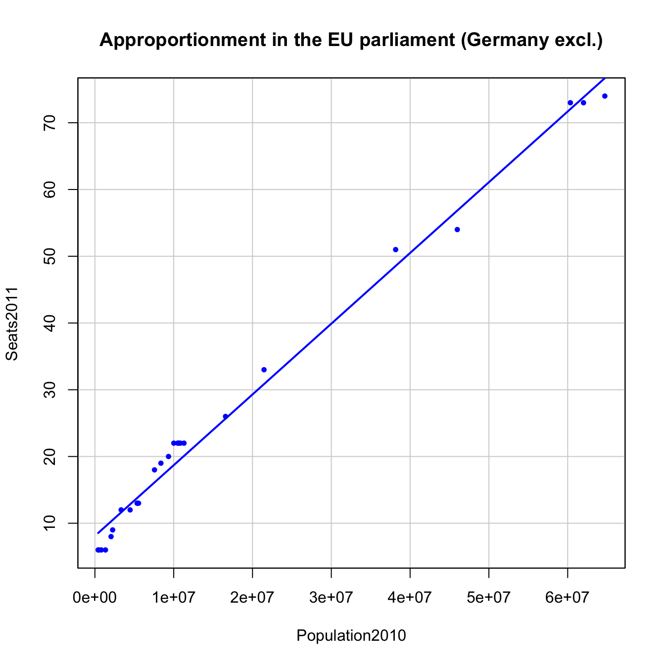
Figure 2.14: Seats2011 vs Population2010 in the EU dataset, Germany excluded.
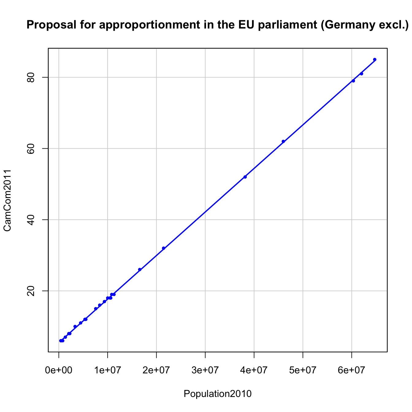
Figure 2.15: CamCom2011 vs Population2010 in the EU dataset, Germany excluded.
In 2014 it was negotiated a new EU apportionment, collected in Seats2014, according to the population of 2013, Population2013 and due to the inclusion of Croatia in the EU. Answer these questions:
- Which countries were the most favored and unfavored by such apportionment?
- Was the apportionment proportional?
- Was the degree of linearity higher or lower than the 2011 apportionment? (Exclude Germany.)
- Was the degree of linearity higher or lower than the Cambridge Compromise for 2011? (Exclude Germany.)
We have performed a decent number of operations in R Commander. If we have to exit the session, we can save the data and models in an .RData file, which contains all the objects we have computed so far (but not the code – this has to be saved differently).
To exit R Commander, save all your progress and reload it later, do:
Save
.RDatafile. Go to'File' -> 'Save R workspace as...'.Save
.Rfile. Go to'File' -> 'Save script as...'.Exit R Commander + R. Go to
'File' -> 'Exit' -> 'From Commander and R'. Choose to not save any file.Start R Commander and load your files:
.RDatafile in'Data' -> 'Load data set...',.Rfile in'File' -> 'Open script file...'.
If you just want to save a dataset, you have two options:
-
‘Data’ -> ‘Active data set’ -> ‘Save active data set…’: it will be saved as an.RDatafile. The easiest way of importing it back to R. -
‘Data’ -> ‘Active data set’ -> ‘Export active data set…’: it will be saved as a text file with the format that you choose. Useful for exporting data to other programs.
References
In principle, you could pick more than one explanatory variables using the
'Control'or'Shift'keys, but that corresponds to the multiple linear regression (covered in Chapter 3).↩︎The decision of which points are the most different from the rest is done automatically by a method known as the Mahalanobis depth.↩︎
The default GUI option is set to identify
'2'points. However, we know after a preliminary plot that there are three very different points in the dataset, hence this particular choice.↩︎The outliers have a considerable impact on the regression line, as we will see later.↩︎
Less populated states are given more weight than its corresponding proportional share.↩︎
According to EuroStat and the population stated in the Cambridge Compromise report.↩︎
We will be able to say more about how these test are performed after Section 2.5.↩︎