6.3 Pareto Charts
A Pareto chart is a bar graph with the bars arranged from the tallest bar to the shortest bar. Because of that, we need first to put the data in descending order.
6.3.1 Sorting Data
- Highlight the cells A1:B6 again.
Copy(CTRL+C) the data, click on cell E1 (or any empty cells of the worksheet), andPaste(CTRL+V) the data.- Highlight the cells E1:F6 (or the cells that contain the copy of the data). Select
Custom Sortin the Sort & Filter ribbon in theHometab in the menu bar. - In the Sort dialog window that appears. Select the following options:
- Sort by ->
Number (in thousands) - Sort on ->
Values - Order ->
Largest to Smallest
- Sort by ->
This will sort both highlighted columns concerning the highest frequencies.
- Check the box to the left on
My list has headers. ClickOK.
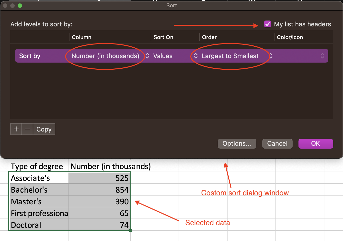
Figure 6.4: Custom sort options..
6.3.2 Building the Pareto Chart
- Select the cells E1:F6 (or the cells containing the copy of the data) that have been sorted.
- Go to
Insert > Column chartand choose the leftmost top type. - Change the title of the graph to Earned Degrees conferred in 2000.
- With the graph selected, go to the
Chart Designtab. - To add axis titles, click
Add Chart Element > Axis Titles > Primary Horizontaland thenAdd Chart Element > Axis Titles > Primary Vertical. - Replace the horizontal axis title with the Type of Degree.
- Replace the vertical axis title with In Thousands.