9.2 Creating a Scatter Plot
- Select the cells in the Columns Eruptions and Waiting.
- Go to the
Inserttab. SelectScatterin theChartsribbon. Select the leftmost chart in the top row by clicking on it (Figure 9.1).
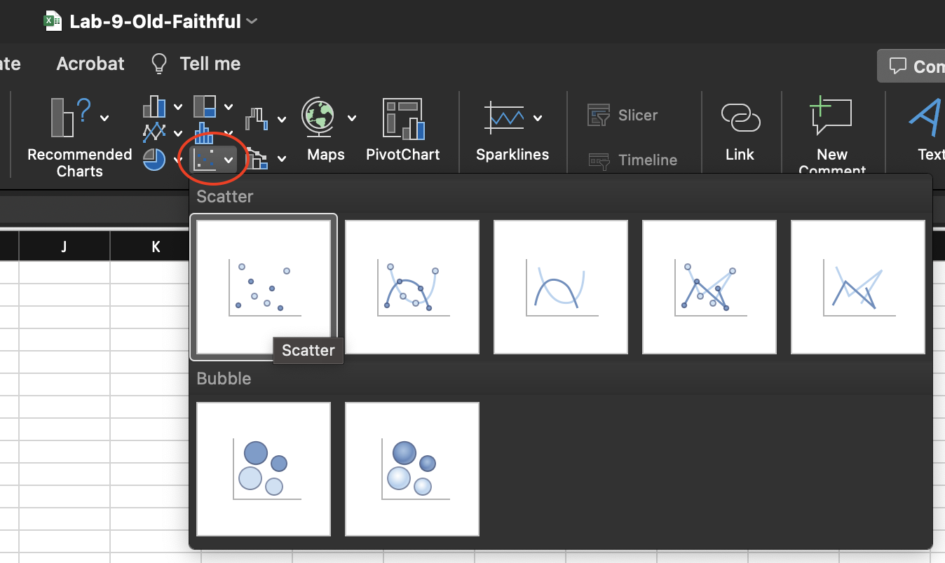
Figure 9.1: Scatter option in the Chart ribbon of the Insert tab.
The resulting plot is shown in Figure 9.2. The Chart Design tab shows that the leftmost diagram style is selected (Style 1).
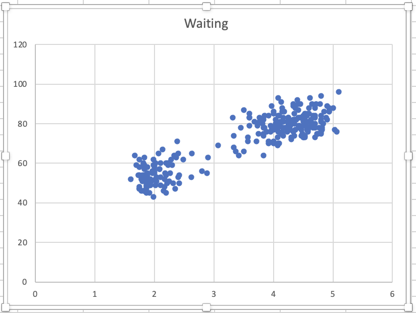
Figure 9.2: Scatter plot created.
- For the title, replace Waiting with Old Faithful Data.
- Click
Add Chart Element > Axis Title > More Axis Title Options. This will add an automatic x-axis title and y-axis title. - Click the x-axis title and replace it with Duration of Eruptions (in Minutes).
- Click the y-axis title and replace it with Time Until the Next Eruption (in Minutes).
RIGHT-clickon the horizontal axis and then selectFormat Axisto change the axis format in the plot. Set the Minimum Bound as 1. Adjusting the axis removesRIGHT-clickon the vertical axis and then selectFormat Axisto change the axis format. Set the Minimum Bound as 30 and Maximum Bound as 100.
The adjusted box plot is shown in Figure 9.3.
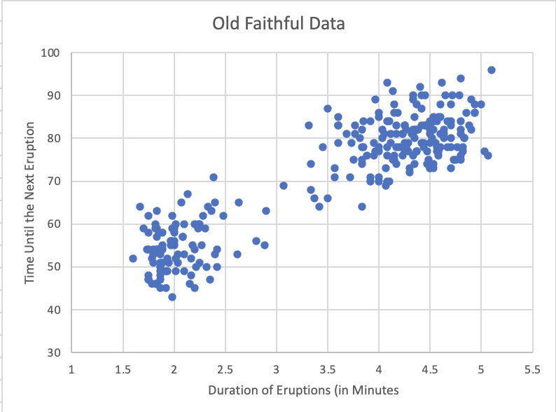
Figure 9.3: Adjusted scatter plot.