3.4 Creating the Histogram
- Select
Data>Data Analysis>Histogramand clickOK.
Note: If Data Analysis does not appear in the Data menu, refer to the instructions in Lab 1 Getting Started with Excel how to make it available.
- In the dialog window, first click in the
Input Rangefield then type in$A$2:$A$33.
Note: Instead of typing, you can select cells that form the Input Range by clicking on A2, holding, and dragging downward until you reach cell A33. Then release.
- Click the
Bin Rangefield in the dialog window first, then type in$D$8:$D$12.
- Click the
Note: You can also select cells containing the upper limits instead of typing‼!
- You have the option to have the graph placed in a specific cell or range of cells (for this option check
Output Rangeas in the picture above, you may select a different cell address) or in a new worksheet (for this check optionNew Worksheet Ply). - In the pop-up window, Check the boxes for
Cumulative PercentageandChart Output. - Then click
OK.
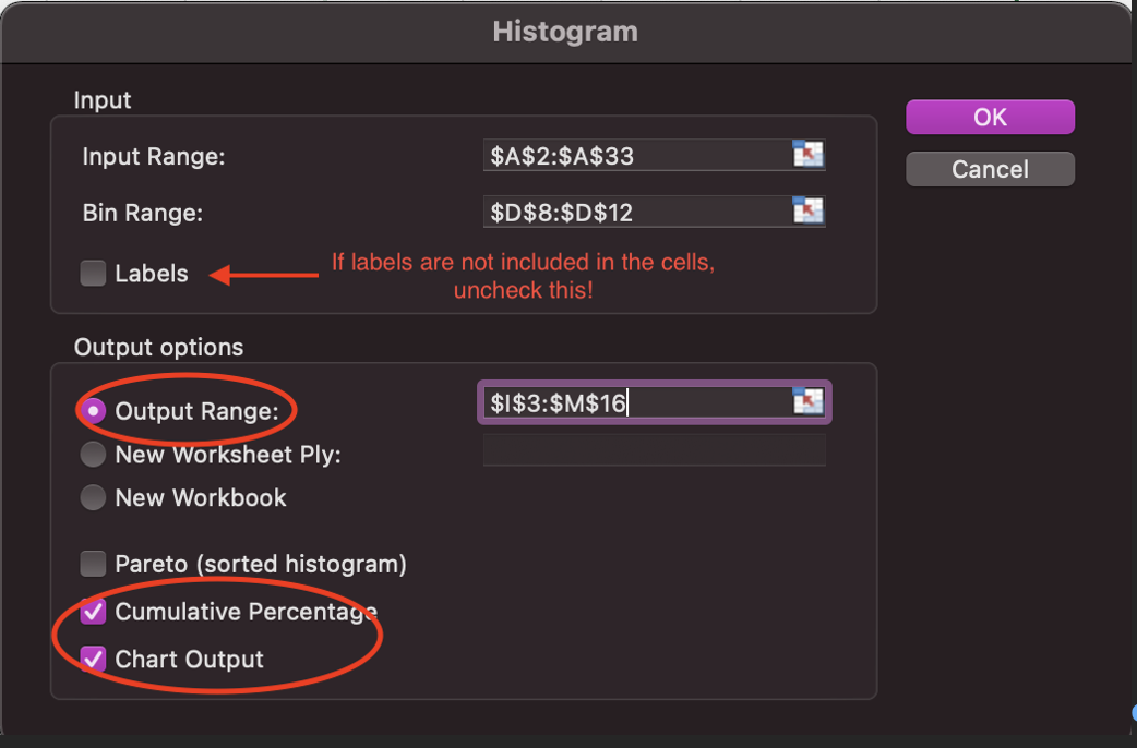
Figure 3.3: Dialog window with the histogram options.
After the steps above, Excel presents a frequency table and the corresponding graph. Excel counts the frequency of each class based on the Bins values you entered in the dialog window for the histogram. Thus, it counts how many values are in the date set (Input Range) up to the upper limits.
The graph is a raw histogram that needs to be adjusted to resemble an actual histogram.
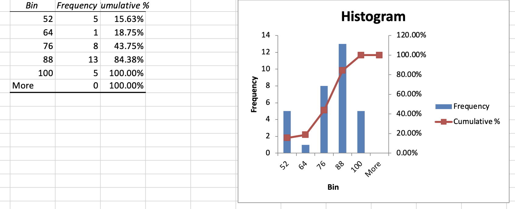
Figure 3.4: Resulting histogram.