8.4 Box Plot
- Select the cells with the temperature values in Column B.
- Go to the Insert tab. Select
Box and Whiskerin theChartsribbon (Figure 8.1).
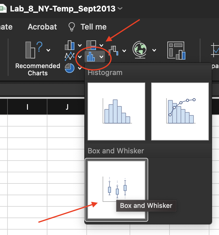
Figure 8.1: Box and Whisker option in the Chart ribbon of the Insert tab.
The resulting plot is shown in Figure 8.2.
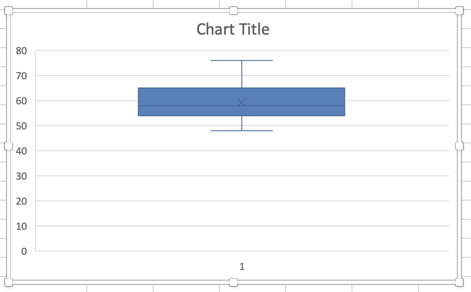
Figure 8.2: Box and Whisker created.
- Replace Chart Title with NY Temperatures in September 2013.
RIGHT-clickon the vertical axis and then selectFormat Axisto change the axis format in the graph. Set the Minimum Bound as 45. Adjusting the axis removes the unnecessary space in the chart.
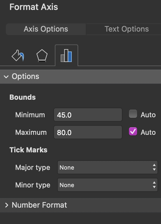
Figure 8.3: Format Axis options.
Use the Chart Design to customize the look of your chart.
- Select the graph, and the tab
Chart Designappears in the menu. Click on theChart Designtab. - Click
Add Chart Element > Data Labels > Right. - Click
Add Chart Element > Axes. Uncheck the optionPrimary Horizontal.
The adjusted box plot is shown in Figure 8.4.
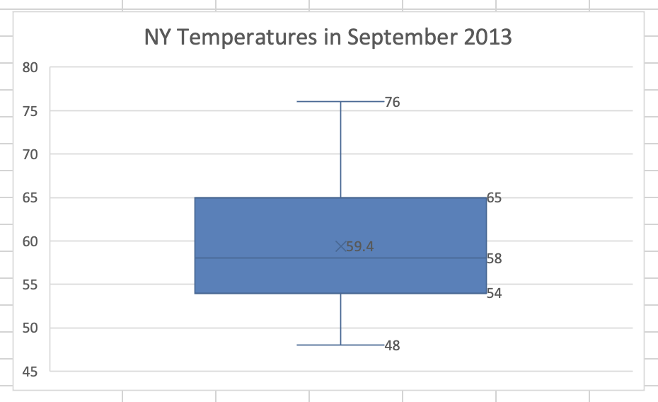
Figure 8.4: Adjusted box plot.