11.3 Graphing the Normal Distribution
The NORM.DIST(x,mean,standard_dev,FALSE) function calculates the normal probability density function that can be used to plot the bell-shaped curve. To graph the normal curve, we need x and y values. The x values correspond to the birthweights. The y values are values of the probability density functions.
First, you will generate the y-values and then use a scatter plot to display the bell-shaped curve.
- Select the cell K1 and type the label Y-Values.
- Below Y-Values, enter the formula
= NORM.DIST(J2,$H$2,$H$4, FALSE). - Select cell K2 and place the mouse pointer in the lower right corner of the selected cell until it becomes a
+sign, and click-drag downward across the range that covers all the values in column K.
The y-values range from \(3.34\) x \(10^{-5}\) to \(1.71\) x \(10^{-4}\).
- Select all cells in the birthweight and Y-Values columns (select the first cells in columns J and K, then press the
Shift+Arrow Downkeys to select the whole range of data). - Click
Insert > Scatter > Scatter with Smooth Lines.
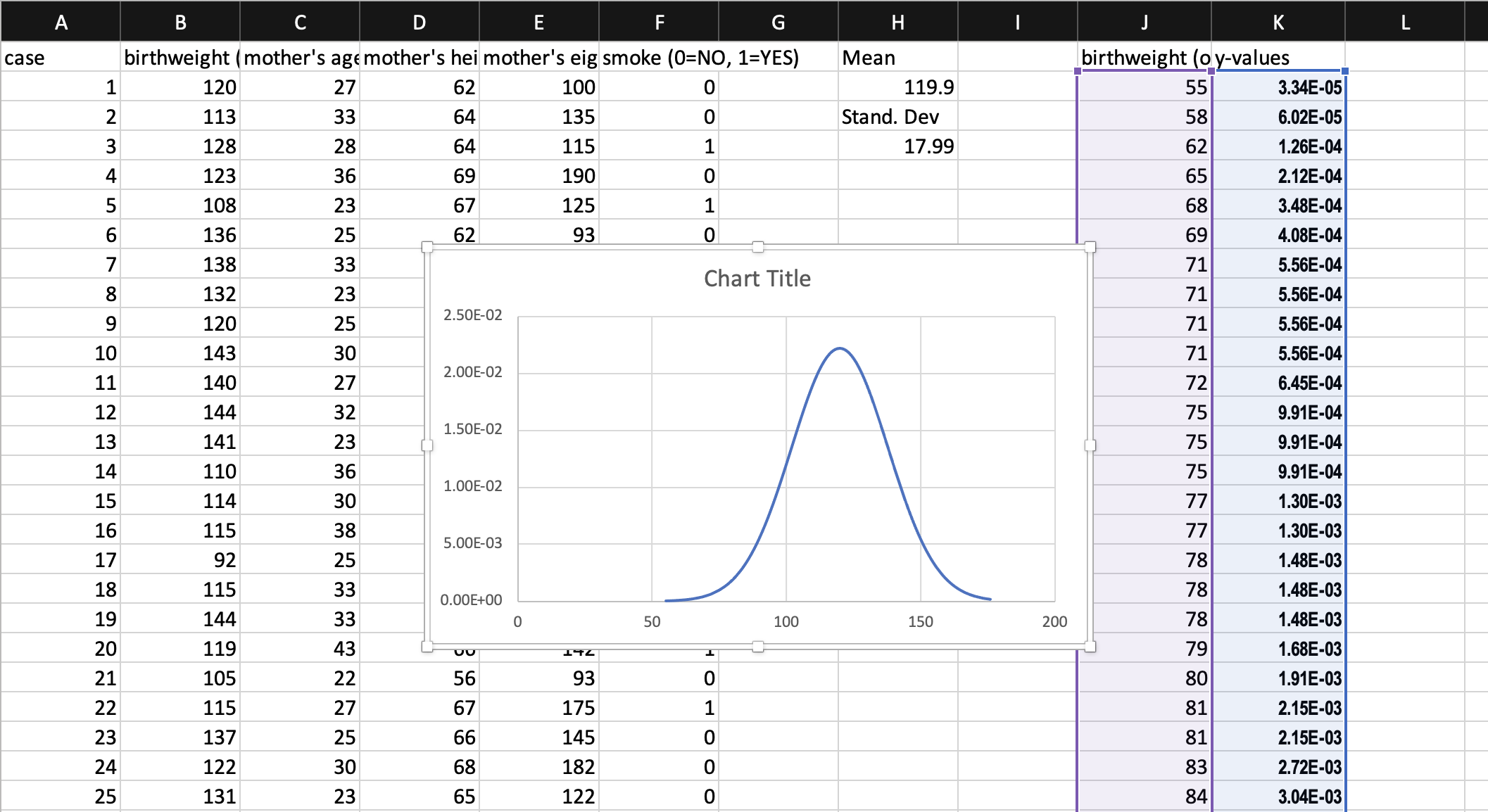
Figure 11.1: The normal curve created.
The resulting graph needed to be adjusted (Figure 11.1 ). Use the instructions in Steps 3-8 in Section 9.2 Creating a Scatter Plot to make the necessary adjustments to the graph. Adjust the title, axis titles, and horizontal axis.