Chapter 6 Joining Datasets
To emphasize that ggplot2 is part of the tidyverse along with dplyr, consider that you could clean some data and plot it in one step. Below we create a new plot that takes a closer look at measles cases in 1963. First we filter our dataset to look at rows for 1963, and then we use geom_bar to view each state.
#Combine data cleaning and plotting in one step
#plot the counts for each state in a bar graph in the year 1963, year vaccine was introduced.
count_1963 <-
  yearly_count_state %>%
  filter(Year == 1963) %>%
  ggplot(aes(x = State, y = TotalCount)) +
  geom_bar(stat = "identity") +
  theme(axis.text.x = element_text(angle = 90))

count_1963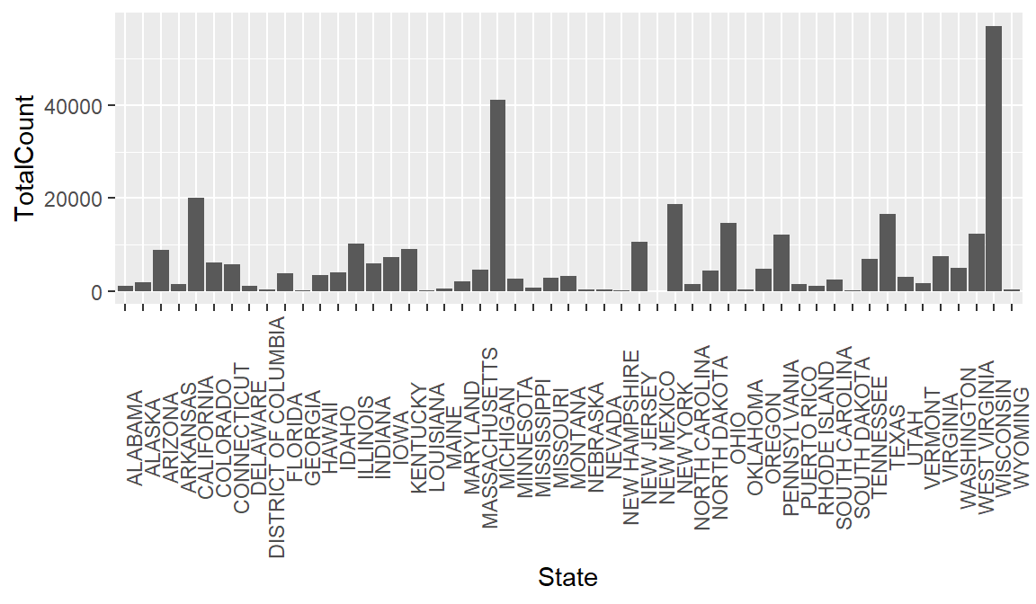
Of course, looking at total counts in each state is not the most helpful metric without taking population into account. To rectify this, let’s try joining some historical population data with our measles data.
First we need to import the population data.
#load csv of populations by state over time, changing some of the datatypes from default
hist_pop_by_state <-
  read_csv(
    "data/Historical_Population_by_State.csv",
    col_types = cols(ALASKA = col_double(), HAWAII = col_double())
)View(hist_pop_by_state)As we saw in our measles data import, the presence of NAs makes it necessary to explicitly state that the Hawaii and Alaska columns contain numerical data.