Chapter 6 Visualizing data in R – An intro to ggplot
Motivating scenarios: Motivating scenarios: you have a fresh new data set and want to check it out. How do you go about looking into it?
Learning goals: By the end of this chapter you should be able to:
- Build a simple ggplot.
- Explain the idea of mapping data onto aesthetics, and the use of different geoms.
- Match common plots to common data type.
- Use geoms in ggplot to generate the common plots (above).
mpg data.
6.1 A quick intro to data visualization.
Recall that as bio-statisticians, we bring data to bear on critical biological questions, and communicate these results to interested folks. A key component of this process is visualizing our data.
6.1.1 Exploratory and explanatory visualizations
![]()
We generally think of two extremes of the goals of data visualization
- In exploratory visualizations we aim to identify any interesting patterns in the data, we also conduct quality control to see if there are patterns indicating mistakes or biases in our data, and to think about appropriate transformations of data. On the whole, our goal in exploratory data analysis is to understand the stories in the data.
![]()
- In explanatory visualizations we aim to communicate our results to a broader audience. Here are goals are communication and persuasion. When developing explanatory plots we consider our audience (scientists? consumers? experts?) and how we are communicating (talk? website? paper?).
The ggplot2 package in R is well suited for both purposes. Today we focus on exploratory visualization in ggplot2 because
- They are the starting point of all statistical analyses.
- You can do them with less
ggplot2knowledge.
- They take less time to make than explanatory plots.
Later in the term we will show how we can use ggplot2 to make high quality explanatory plots.
6.1.2 Centering plots on biology
Whether developing an exploratory or exploratory plot, you should think hard about the biology you hope to convey before jumping into a plot. Ask yourself
- What do you hope to learn from this plot?
- Which is the response variable (we usually place that on the y-axis)?
- Are data numeric or categorical?
- If they are categorical are they ordinal, and if so what order should they be in?
The answers to these questions should guide our data visualization strategy, as this is a key step in our statistical analysis of a dataset. The best plots should evoke an immediate understanding of the (potentially complex) data. Put another way, a plot should highlight both the biological question and its answer.
Before jumping into making a plot in R, it is often useful to take this step back, think about your main biological question, and take a pencil and paper to sketch some ideas and potential outcomes. I do this to prepare my mind to interpret different results, and to ensure that I’m using R to answer my questions, rather than getting sucked in to so much Ring that I forget why I even started. With this in mind, we’re ready to get introduced to ggploting!
My approach to figure-making in #ggplot ALWAYS begins with sketching out what I want the final product to look like. It feels a bit analog but helps me determine which #geom or #theme I need, what arrangement will look best, & what illustrations/images will spice it up. #rstats pic.twitter.com/GUjeEgqZxj
— Shasta E. Webb (@webbshasta) May 22, 2020
Remembering out set up from last chapter
msleep <- msleep %>%
  mutate(log10_brainwt = log10(brainwt),
         log10_bodywt  = log10(bodywt))

msleep_plot1 <- ggplot(data = msleep, aes(x = log10_brainwt)) # save plot

msleep_histogram <- msleep_plot1 +
  geom_histogram(bins =10, color = "white")
6.2 Common types of plots
As we saw in the section, Centering plots on biology, we want our biological questions and the structure of the data to guide our plotting choices. So, before we get started on making plots, we should think about our data.
- What are the variable names?
- What are the types of variables?
- What are our motivating questions and how do the data map onto these questions?
- Etc…
Using the msleep data set below, we briefly work through a rough guide on how the structure of our data can translate into a plot style, and how we translate that into a geom in ggplot. So the first step you should look at the data – either with the view() function, or a quick glimpse() and reflect on your questions before plotting. This also helps us remember the name and data type of each variable.
glimpse(msleep)## Rows: 83
## Columns: 13
## $ name [3m[38;5;246m<chr>[39m[23m "Cheetah", "Owl monkey", "Mountain beaver", "Greater short-tailed shrew", …
## $ genus [3m[38;5;246m<chr>[39m[23m "Acinonyx", "Aotus", "Aplodontia", "Blarina", "Bos", "Bradypus", "Callorhi…
## $ vore [3m[38;5;246m<chr>[39m[23m "carni", "omni", "herbi", "omni", "herbi", "herbi", "carni", NA, "carni", …
## $ order [3m[38;5;246m<chr>[39m[23m "Carnivora", "Primates", "Rodentia", "Soricomorpha", "Artiodactyla", "Pilo…
## $ conservation [3m[38;5;246m<chr>[39m[23m "lc", NA, "nt", "lc", "domesticated", NA, "vu", NA, "domesticated", "lc", …
## $ sleep_total [3m[38;5;246m<dbl>[39m[23m 12.1, 17.0, 14.4, 14.9, 4.0, 14.4, 8.7, 7.0, 10.1, 3.0, 5.3, 9.4, 10.0, 12…
## $ sleep_rem [3m[38;5;246m<dbl>[39m[23m NA, 1.8, 2.4, 2.3, 0.7, 2.2, 1.4, NA, 2.9, NA, 0.6, 0.8, 0.7, 1.5, 2.2, 2.…
## $ sleep_cycle [3m[38;5;246m<dbl>[39m[23m NA, NA, NA, 0.1333333, 0.6666667, 0.7666667, 0.3833333, NA, 0.3333333, NA,…
## $ awake [3m[38;5;246m<dbl>[39m[23m 11.90, 7.00, 9.60, 9.10, 20.00, 9.60, 15.30, 17.00, 13.90, 21.00, 18.70, 1…
## $ brainwt [3m[38;5;246m<dbl>[39m[23m NA, 0.01550, NA, 0.00029, 0.42300, NA, NA, NA, 0.07000, 0.09820, 0.11500, …
## $ bodywt [3m[38;5;246m<dbl>[39m[23m 50.000, 0.480, 1.350, 0.019, 600.000, 3.850, 20.490, 0.045, 14.000, 14.800…
## $ log10_brainwt [3m[38;5;246m<dbl>[39m[23m NA, -1.8096683, NA, -3.5376020, -0.3736596, NA, NA, NA, -1.1549020, -1.007…
## $ log10_bodywt [3m[38;5;246m<dbl>[39m[23m 1.6989700, -0.3187588, 0.1303338, -1.7212464, 2.7781513, 0.5854607, 1.3115…Now we’re nearly ready to get started, but first, some caveats
These are vey preliminary exploratory plots – and you may need more advanced plotting R talents to make plots that better help you see patterns. We will cover these in Chapters YB ADD, where we focus on explanatory plots.
There are not always cookie cutter solutions, with more complex data you may need more complex visualizations.
That said, the simple visualization and R tricks we learn below are the essential building blocks of most data presentation. So, let’s get started!
6.2.1 One variable
With one variable, we use plots to visualize the relative frequency (on the y-axis) of the values it takes (on the x-axis).
gg-plotting one variable We map our one variable of interest onto x aes(x = <x_variable>), where we replace <x_variable> with our x-variable. The mapping of frequency onto the y happens automatically.
One categorical variable
Say we wanted to know how many carnivores, herbivores, insectivores, and omnivores in the msleep data set. From the output of the glimpse() function above, we know that vore is a categorical variable, so we want a simple bar plot, which we make with geom_bar().
ggplot(data = msleep, aes(x = vore)) +
  geom_bar()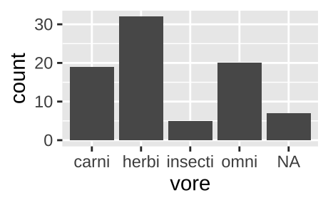
Figure 6.1: Classic barplot
We can also pipe data into ggplot argument after doing stuff to the data. For example, the code below remove NA values from our plot.
msleep                 %>%
  filter(!is.na(vore)) %>%
  ggplot(aes(x = vore)) +
  geom_bar()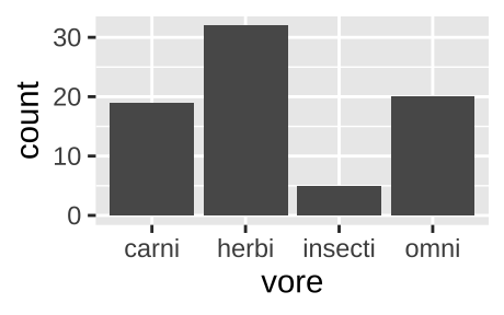
Figure 6.2: A barplot, like the one above, but with NA values removed.
If the same data where presented as one categorical variable for vore (with each vore once) and another, n, for counts.
count(msleep, vore)## [38;5;246m# A tibble: 5 x 2[39m
## vore n
## [3m[38;5;246m<chr>[39m[23m [3m[38;5;246m<int>[39m[23m
## [38;5;250m1[39m carni 19
## [38;5;250m2[39m herbi 32
## [38;5;250m3[39m insecti 5
## [38;5;250m4[39m omni 20
## [38;5;250m5[39m [31mNA[39m 7We could recreate figure 6.1 with geom_col(). again mapping vore to the x-aesthetic, and now mapping count to the y aesthetic, by as follows:
count(msleep, vore) %>%
  ggplot(aes(x = vore, y = n))+
  geom_col()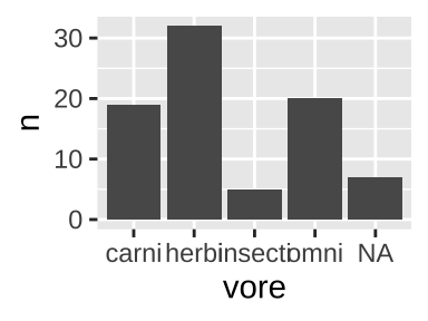
One continuous variable
We are often interested to know how variable our data is, and to think about the shape of this variability. Revisiting our data on mammal sleep patterns, we might be interested to evaluate the variability in how long mammals sleep.
- Do all species sleep roughly the same amount?
- Is the data bimodal (with two humps)?
- Do some species sleep for an extraordinarily long or short amount of time?
We can look into this with a histogram or a density plot.
One continuous variable: A histogram
We use the histogram geom, geom_histogram(), to make a histogram in R.
ggplot(msleep, aes(x = log10_brainwt))+
  geom_histogram(bins = 10, color  = "white") # Bins tells R we want 10 bins, and color = white tells R we want white lines between our bins
## Warning: Removed 27 rows containing non-finite values (stat_bin).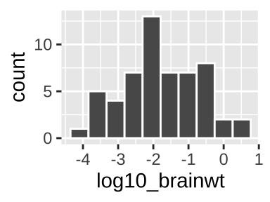
In a histogram, each value on the x represents some interval of values of our categorical variable (in this case, we had 10 bins, but we could have, for example, looked at sleeep in one hour with binwidth = 1), while y-values show how many observations correspond to an interval on the x.
See this excellent write up if you want to learn more about histograms.
When making a histogram it is worth exploring numerous binwidths to ensure you’re not fooling yourself
One continuous variable: A density plot
We use the density geom, geom_density(), to make a histogram in R.
ggplot(msleep, aes(x = log10_brainwt))+
geom_density(fill = "blue") 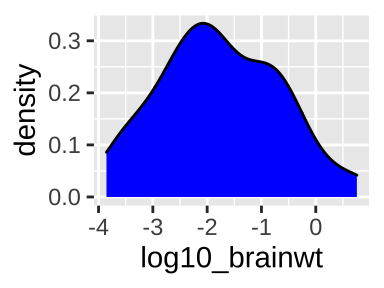
Sometimes we prefer a smooth density plot to a histogram, as this can allow us to not get too distracted by a few bumps (on the other hand, we can also miss important variability, so be careful). We again map total_sleep onto the x aesthetic, but now use geom_density().
6.2.2 Two variables
With two variables, we want to highlight the association between them. In the plots below, we show that how this is presented can influence our biological interpretation and take-home messages.
Two categorical variables
With two categorical variables, we usually add color to a barplot to identify the second group. We can choose to
- Stack bars (stacked barplot, the default behavior of
geom_bar()) [Fig. 6.3],
- Have them next to one another (grouped barplot, add
position = position_dodge(preserve = "single")togeom_bar()) [Fig. 6.4], or
- Standardize them by proportion (add
position = "fill"togeom_bar()) [Fig. 6.5].
First, we process our data, making use of the tricks we learned in
Handling data in R. To do so, we filter() for not NA diets, add_count() to see how many species we have in each order, and filter() for orders with five or more species with diet data.
# Data processing
msleep_data_ordervore <- msleep  %>%
    filter(!is.na(vore))         %>%  # Only cases with data for diet
    add_count(order)             %>%  # Find counts for each order
    filter(n >= 5)                    # Lets only hold on to orders with 5 or more species with data
Two categorical variables: A stacked bar plot
ggplot(data = msleep_data_ordervore, aes(x = order,  fill= vore))+
  geom_bar()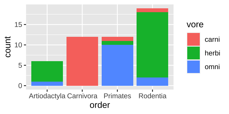
Figure 6.3: A stacked bar chart.
Stacked barplots are best suited for cases when we’re primarily interested in total counts (e.g. how many species do we have data for in each order), and less interested in comparing the categories going into these counts. Rarely is this the best choice, so don’t expect to make too many stacked barplots.
Two categorical variables: A grouped bar plot
ggplot(data = msleep_data_ordervore, aes(x = order,  fill= vore))+
  geom_bar(position = position_dodge(preserve = "single"))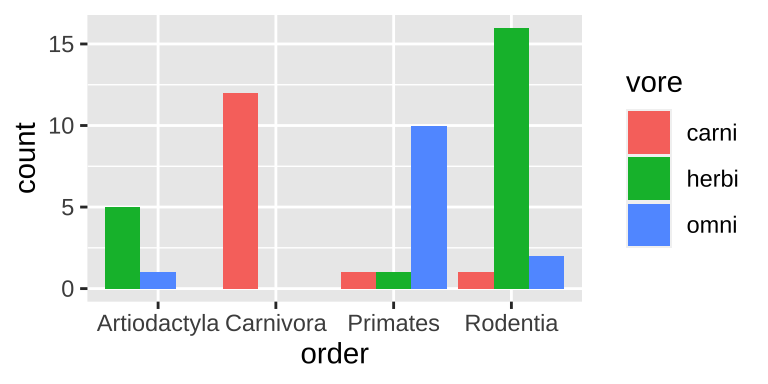
Figure 6.4: A grouped bar chart.
Grouped barplots are best suited for cases when we’re primarily interested in comparing the categories going into these counts. This is often the best choice, as we get to see counts. However the total number in each group is harder to see in a grouped than a stacked barplot (e.g. it’s easy to see that we have the same number of primates and carnivores in Fig. 6.3, while this is harder to see in Fig. 6.4).
Two categorical variables: A filled bar plot
ggplot(data = msleep_data_ordervore, aes(x = order,  fill= vore))+
  geom_bar(position = "fill")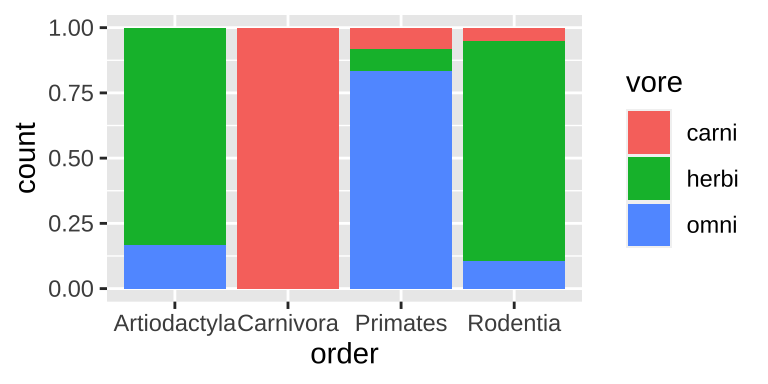
Figure 6.5: A filled bar chart.
Filled barplots are much stacked barplots standardized to the same height. In other words, they are like stacked bar plots without their greatest strength. This is rarely a good idea, except for cases with only two or three options for each of numerous categories.
6.2.2.1 One categorical and one continuous variable.
One categorical and one continuous variable: Multiple histograms
A straightforward way to show the continuous values for different categories is to make a separate histogram for each numerous distributions is to make separate histograms for each category using the geom_histogram() and facet_wrap() functions in ggplot.
msleep_data_ordervore_hist <- ggplot(msleep_data_ordervore, aes(x= log10_bodywt))+
  geom_histogram(bins = 10)

msleep_data_ordervore_hist +
  facet_wrap(~order, ncol = 1)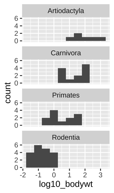
Figure 6.6: Multiple histograms
When doing this, be sure to aid visual comparisons simple by ensuring there’s only one column. Note how Figure 6.6 makes it much easier to compare distributions than does Figure 6.7.
msleep_data_ordervore_hist +
  facet_wrap(~order, nrow = 1)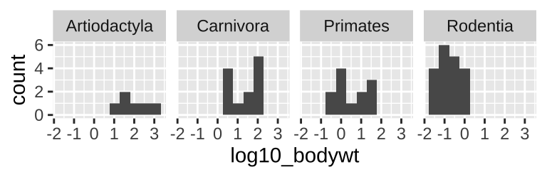
Figure 6.7: Multiple histograms revisited
One categorical and one continuous variable: Density plots
ggplot(msleep_data_ordervore, aes(x= bodywt, fill = order))+
  geom_density(alpha = .3)+
  scale_x_continuous(trans = "log10")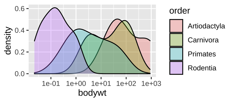
Figure 6.8: A density plot
While many histograms can be nice, they can also take up a lot of space. Sometime we can more succinctly show distributions for each group with numerous density plots (geom_density()). While this can be succinct, it can also get too crammed, so have a look and see which display is best for your data and question.
One categorical and one continuous variable: Boxplots, jitterplots etc..
Histograms and density plots communicate the shapes of distributions, but we often hope to compare means and get a sense of variability.
Boxplots (Figure 6.9A) summarize distributions by showing all quartiles – often showing outliers with points. e.g.
ggplot(aes(x = order, y = bodywt)) +geom_boxplot().Jitterplots (Figure 6.9B) show all data points, spreading them out over the x-axis. e.g.
ggplot(aes(x = order, y = bodywt)) +geom_jitter().
We can combine both to get the best of both worlds (Figure 6.9C). e.g.
ggplot(aes(x = order, y = bodywt)) + geom_boxplot() + geom_jitter().
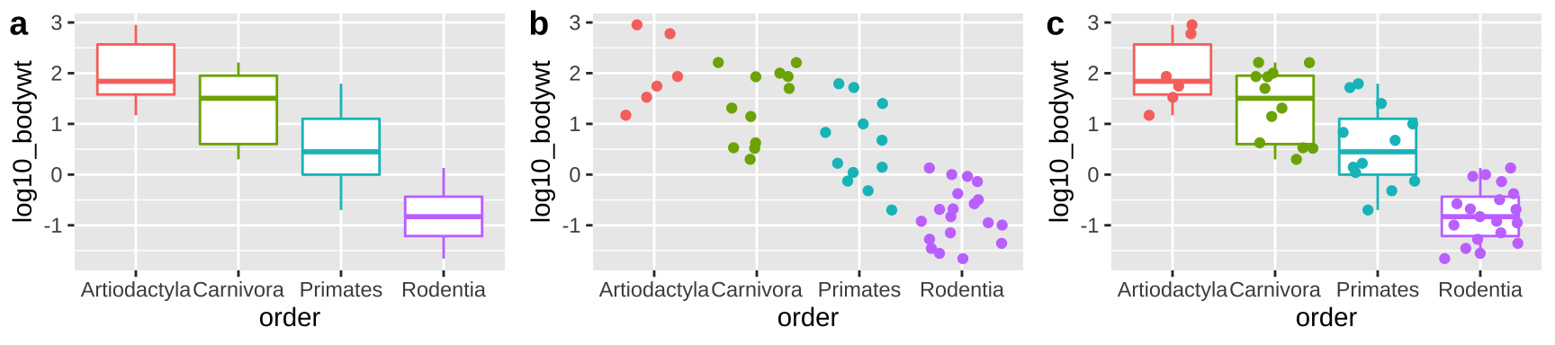
Figure 6.9: Boxplots, jitterplots and a combination
6.2.2.2 Two continuous variables
ggplot(msleep_data_ordervore, aes(x = log10_bodywt, y = log10_brainwt))+
  geom_point()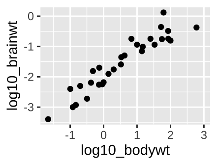
Figure 6.10: A scatterplot.
With two continuous variables, we want a graph that visually display the association between them. A scatterplot displays the explanatory variable n the x-axis, and the response variable on the y-axis. The scatterplot in figure 6.10, shows a clear increase in brain size with body size across mammal species when both are on \(log_{10}\) scales.
6.2.3 More dimensions
ggplot(msleep_data_ordervore,
       aes(x = log10_bodywt, y = log10_brainwt, color = vore, shape = order))+
  geom_point()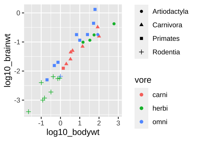
Figure 6.11: Colored scatterplot
What if we wanted to see even more? Like let’s say we wanted to know if we found a similar relationship between brain weight and body weight across orders and/or if this relationship was mediated by diet. We can pack more info into these plots.
⚠️ Beware, sometimes shapes are hard to differentiate.⚠️ Facetting might make these patterns stand out.
ggplot(msleep_data_ordervore, aes(x = log10_bodywt, y = log10_brainwt, color = vore))+
  geom_point()+
  facet_wrap(~order, nrow = 1)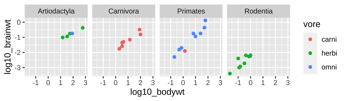
6.2.4 Interactive plots with the plotly package
Often when I get a fresh data set I want to know a bit more about the data points (to e.g. identify outliers or make sense of things). The plotly package is super useful for this, as it makes interactive graphs that we can explore.
# install.packages("plotly") first install plotly, if it's not installed yet
library(plotly) # now tell R you want to use plotly
# Click on the plot below to explore the data!

big_plot <- ggplot(msleep_data_ordervore,
          aes(x = log10_bodywt, y = log10_brainwt,
              color = vore, shape = order, label = name))+
  geom_point()

ggplotly(big_plot)
Decoration vs information
ggplot(msleep_data_ordervore, aes(x = log10_bodywt, y = log10_brainwt))+
  geom_point(color = "firebrick", size = 3, alpha = .5)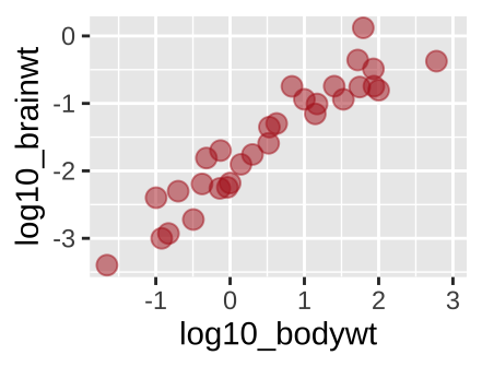
Figure 6.12: A new scatterplot
We have used the aes() argument to provide information. For example, in Figure 5.15 we used color to show a diet by typing aes(…, color = vore). But what if we just want a fun color for data points. We can do this by specifying color outside of the aes argument. Same goes for other attributes, like size etc, or transparency (alpha)…
6.3 ggplot Assignment
Read the chapter
Watch the video about getting started with ggplot
Complete RStudio’s primer on data visualization basics.
Complete the glimpse intro (4.3.1) and the quiz.
Make three plots from the mpg data and describe the patterns they highlight.
Fill out the quiz on canvas, which is very simlar to the one below.
6.3.1 ggplot2 quiz
6.4 ggplot2 review / reference
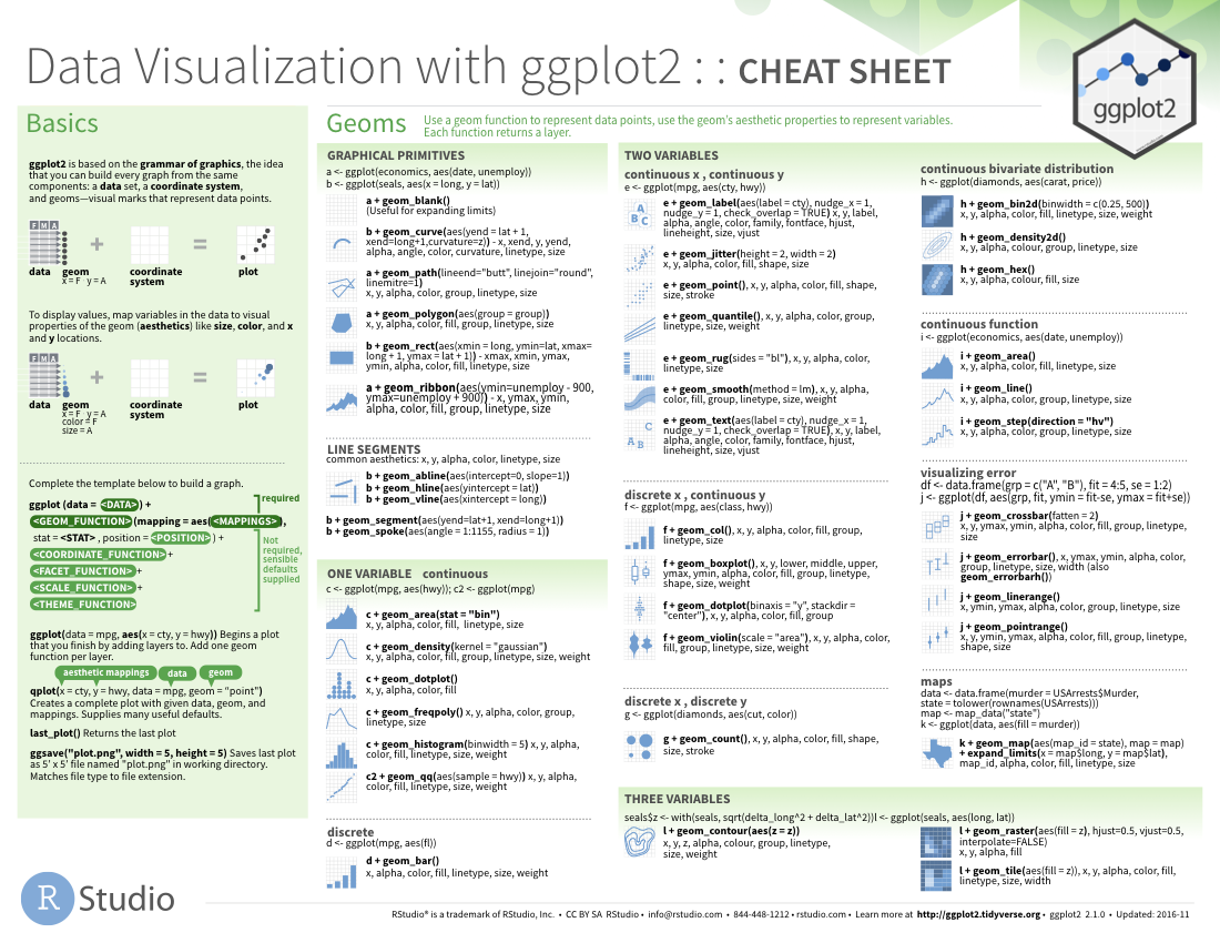
6.4.1 ggplot2: cheat sheet
There is no need to memorize anything, check out this handy cheat sheet!
6.4.1.1 ggplot2: common functions, aesthetics, and geoms
The ggplot() function
- Takes arguments
data =andmapping =.
- We usually leave these implied and type e.g.
ggplot(my.data, aes(...)) rather thanggplot(data = my.data, mapping = aes(...)).
- We can pipe data into the
ggplot()function, so my.data %>% ggplot(aes(…)) does the same thing as ggplot(my.data, aes(…)).
Arguments for aes() function
The aes() function takes many potential arguments each of which specifies the aesthetic we are mapping onto a variable:
x, y, and label:
x: What is shown on the x-axis.
y: What is shown on the y-axis.
label: What is show as text in plot (when using geom_text())
Commonly used geoms
See Section 3.1 of the ggplot2 book for more (Grolemund and Wickham 2018).
geom_histogram(): Makes a histogram.
geom_density(): Makes a density plot.
geom_point(): Makes points - ideal for a scatterplot.
geom_jitter(): Maks jittered points - ideal for showing data when x is catgorical or discrete.
geom_col(): orgeom_bar(): Makes a barplot from count datageom_col(), or from all observationsgeom_bar().
geom_line(): Connect observations with a line.
Faceting
Faceting allows us to use the concept of small multiples (Tufte 1983) to highlight patterns.
For one facetted variable: facet_wrap(~ <var>, nocl = )
facet_grid(<var1>~ <var2>), where one is shown by rows, and is shown by columns.