Chapter 33 Causal Inference
We want to (know what we can) learn about causation from observations: We know “correlation does not necessarily imply causation,” and that experiments are our best way to learn about causes. But we also understand that there is some use in observation, and we want to know how we can evaluate causal claims in observational studies.
Required reading / Viewing:
Calling bullshit Chapter 4. Causality. download here.33.1 What is a cause?
Like so much of statistics, understanding causation requires an healthy dose of our imagination.
Specifically imagine multiple worlds. For example, we can imagine a world in which there was some treatment (e.g. we drank coffee, we got a vaccine, we raised taxes etc) and one in which that treatment was absent (e.g. we didn’t have coffee, we didn’t raise taxes etc), and we then follow some response variable of interest. We say that the treatment is a cause of the outcome if changing it will change the outcome, on average. Note for quantitative treatments, we can imagine a bunch of worlds where the treatments was modified by some quantitative value.
In causal inference, considering the outcome if we had changed a treatment is called counterfactual thinking, and it is critical to our ability to think about causes.
33.2 DAGs, confounds, and experiments
Say we wanted to know if smoking causes cancer.
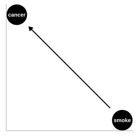
Figure 33.1: We could represent this causal claim with the simplest causal graph we can imagine. This is our first formal introduction to a Directed Acyclic Graph (herefater DAG). This is Directed because WE are pointing a causal arrow from smoking to cancer. It is acyclic because causality in these models only flows in one direction, and its a graph because we are looking at it. These DAGs are the backbone of causal thinking because they allow us to lay our causal models out there for the world to see. Here we will largely use DAGs to consider potential causal paths, but these can be used for mathematical and statistical analyses.
33.2.1 Confounds
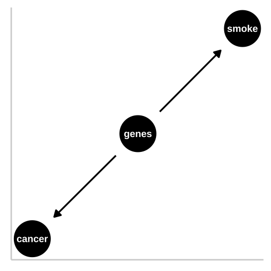
Figure 33.2: R.A. Fisher – a pipe enthusiast, notorious asshole, eugenicist, and the father of modern statistics and population genetics was unhappy with this DAG. He argued that a confound could underlie the strong statistical association between smoking and lung cancer. Specifically, Fisher proposed that the propensity to smoke and to develop lung cancer could be causally unrelated, if both were driven by similar genetic factors. Fisher’s causal model is presented in th DAG to the right – here genes point to cancer and to smoking, but no arrow connects smoking to lung cancer.
In the specifics of this case, Fisher turned out to be quite wrong – genes do influence the probability of smoking and genes do influence the probability of lung cancer, but smoking has a much stronger influence on the probability of getting lung cancer than does genetics.
33.2.2 Randomized Controlled Experiments
This is why, despite their limitations (Ch. 30), randomized control experiments are our best to learn about causation – we randomly place participant in these alternative realities that we imagine and look at the outcome of alternative treatments. That is, we bring our imaginary worlds to life.
So to distinguish between the claim that smoking causes cancer and Fisher’s claim that genetics is a confound and that smoking does not cause cancer, he could randomly assign some people to smoke and some to not. Of course, this is not feasible for both ethical and logistical reasons, so we need some way to work through this. This is our goal today!
33.2.3 DAGs
I’ve introduced two DAGs so far.
Figure 33.1 is a causal model of smoking causing lung cancer. Note this does it mean that nothing else causes lung cancer, or that everyone who smokes will get lung cancer, or that no one who doesn’t smoke will get lung cancer. Rather, it means that if we copied each person, ad had one version of them smoke and the other not, there would be more cases of lung cancer in the smoking clones than the nonsmoking clones.
Figure 33.2 presents Fisher’s argument that smoking does not cause cancer and that rather, both smoking and cancer are influenced by a common cause – genetics.
These are not the only plausible causal models for an association between smoking and cancer. I present three other possibilities in Figure 33.3.
- A pipe is presented in Figure 33.3a. That is – genes cause smoking and smoking causes cancer. Empirically and statistically, this is a hard model to evaluate because changing genes would “cause” cancer in an experiment, and “controlling for genetics” by including it in a linear model would hide the effect of smoking. The right thing to do is to ignore the genetic component – but that feels wrong and how do we justify it? One way to get at this s to “match” on genetics and then compare outcomes for cancer. A 2017 study compared the incidence of lung cancer between monozygotic twins for which one smoked and one did not, and found a higher incidence of cancer in the smoking twin (Hjelmborg et al. 2017).
- A collider is presented in Figure 33.3b, as both genes and smoking cause cancer (they “collide”). Here there are two “paths” between smoking and cancer. 1. The front door causal path – smoking causes cancer, and 2. The back door non causal path in connecting smoking to cancer via the confounding variable, genetics. Here the challenge is to appropriately partition and attribute causes.
- A more complex and realistic model including the effects of the environment on cancer and smoking is presented in 33.3c. Noe that in this model genes do not cause the environment and the environment does not cause genes.
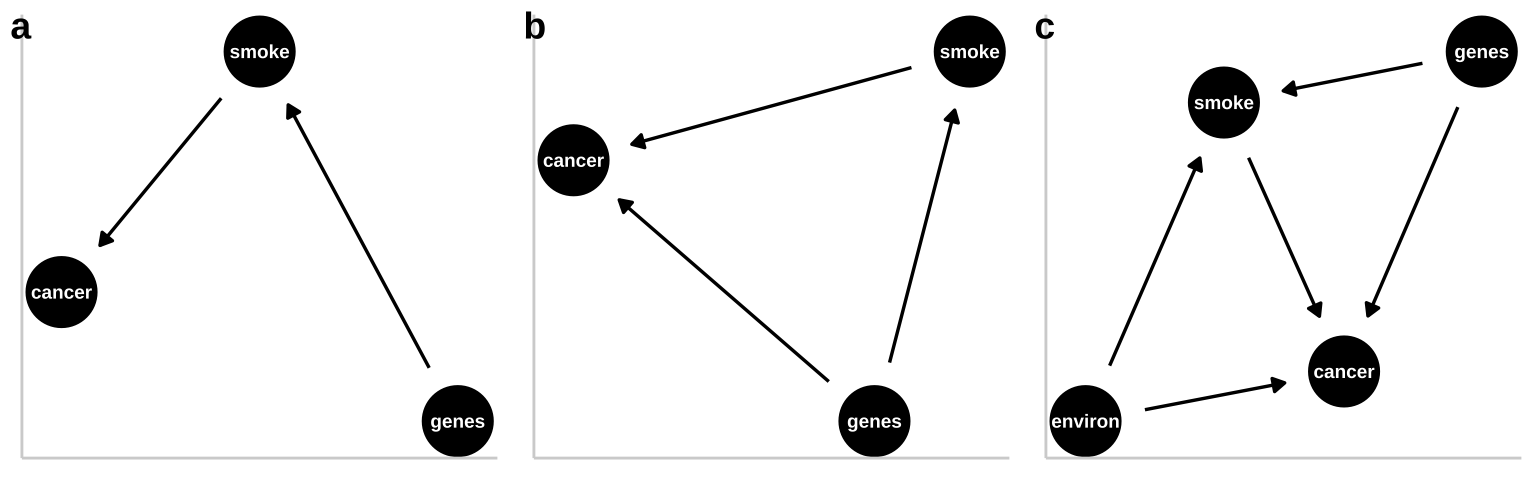
Figure 33.3: Three plausible DAGs concerning the relationship between smoking and cancer. a A pipe – Genes cause smoking, and smoking causes cancer. b A collider – genes cause cancer and smoking, and smoking causes cancer. c Complex reality – Environmental factors cause smoking and cancer, and genetics cause smoking and cancer, while smoking too causes cancer.
33.3 When correlation is (not) good enough
So we are going to think through causation – but we might wonder when we need to know causes.
- We don’t need to understand causation to make predictions under the status quo. If I just want to make good predictions, I can build a good multiple regression model, and make predictions from it, and we will be just fine. If I want to buy good corn – I can go to the farm stand that reliably sells yummy corn, I don’t care if the corn is yummy because of the soil, the light environment, or the farmers playing Taylor Swift every morning to get the corn excited. Similarly, if I was selling insurance, I would just need to reliably predict who would get lung cancer, I wouldn’t need to know why.
- We need to understand causation when we want to intervene (or make causal claims). If I want to grow my own yummy corn, I would want to know what about the farmers practice made the corn yummy. I wouldn’t need to worry about fertilizing my soil if it turned out that pumping some Taylor swift tunes was all I needed to do to make yummy corn. Similarly, if I was giving public health advice I would need to know that smoking caused cancer to credibly suggest that people quit smoking to reduce their chance of developing lung cancer. selling insurance, I would just need to reliably predict who would get lung cancer, I wouldn’t need to know why.
33.4 Multiple regression, and causal inference
So far we have considered how we draw and think about causal models. This is incredibly useful – drawing a causal model makes our assumptions and reasoning clear.
But what can we do with these plots, and how can they help us do statistics? It turns out they can be pretty useful! To work through this I will simulate fake data under different causal models and run different linear regressions on the simulated data to see what happens.
33.4.1 Imaginary scenario
In evolution, fitness is the metric we care about most. While it is nearly impossble to measure and define, we often can measure things related to it, like the number of children that an organism has. For the purposes of this example let’s say that is good enough.
So, say we are studying a fish and want to see if being big (in length) increases fitness (measured as the number of eggs produced). To make things more interesting, let’s say that fish live environements whose quality we can measure. For the purpoes of this example, let’s say that we can reliably and correctly estimate all these values without bias, and that all have normally distributed residuals etc..
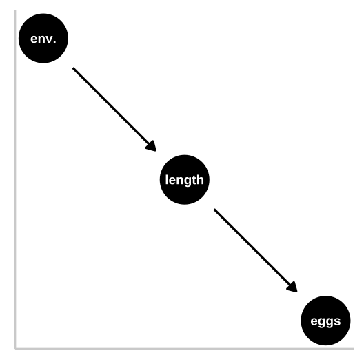
33.4.1.1 Causal model 1: The confound
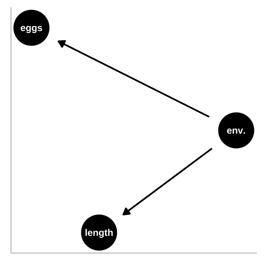
Let’s start with a simple confound – say a good environment makes fish bigger and increases their fitness, but being bigger itself has no impact on fitness. First let’s simulate
n_fish          <- 100
confounded_fish <- tibble(env_quality = rnorm(n = n_fish, mean = 50, sd = 5), #simulating the environment
                          fish_length = rnorm(n = n_fish, mean = env_quality, sd = 2),
                          fish_eggs   = rnorm(n = n_fish, mean = env_quality/2, sd = 6) %>% round()) #
Now we know that fish length does not cause fish to lay more eggs – as we did not models this. Nonetheless, a plot and a statistical test show a strong association between length and eggs if we do not include if we do not include environmental quality in our model.
confound_plot <- ggplot(confounded_fish, aes(x = fish_length, y = fish_eggs)) +
  geom_point()+
  geom_smooth(method = "lm")+
  labs("Confound", subtitle = "# eggs increases with length\nwithout a causal relationship.")

confound_plot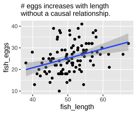
Our statistical analysis will not show cause
We can build a simple linear model predicting the number of fish eggs as a function of fish length. We can see that the prediction is good, and makes sense – egg number reliably increases with fish length. But we know this is not a causal relationship (because we didn’t have this cause in our simulation).
lm(fish_eggs ~ fish_length, confounded_fish) %>% summary()##
## Call:
## lm(formula = fish_eggs ~ fish_length, data = confounded_fish)
##
## Residuals:
## Min 1Q Median 3Q Max
## -14.1181 -4.5182 -0.1195 3.8313 15.6278
##
## Coefficients:
## Estimate Std. Error t value Pr(>|t|)
## (Intercept) 3.2557 5.8634 0.555 0.579982
## fish_length 0.4379 0.1151 3.805 0.000247 ***
## ---
## Signif. codes: 0 '***' 0.001 '**' 0.01 '*' 0.05 '.' 0.1 ' ' 1
##
## Residual standard error: 6.244 on 98 degrees of freedom
## Multiple R-squared: 0.1287, Adjusted R-squared: 0.1198
## F-statistic: 14.48 on 1 and 98 DF, p-value: 0.0002467lm(fish_eggs ~ fish_length, confounded_fish) %>% anova() ## Analysis of Variance Table
##
## Response: fish_eggs
## Df Sum Sq Mean Sq F value Pr(>F)
## fish_length 1 564.4 564.43 14.479 0.0002467 ***
## Residuals 98 3820.2 38.98
## ---
## Signif. codes: 0 '***' 0.001 '**' 0.01 '*' 0.05 '.' 0.1 ' ' 1Adding the confound into our model
So, let’s build a model including the confound environmental quality.
fish_lm_w_confound <- lm(fish_eggs~ env_quality + fish_length, confounded_fish) Looking at the estimates from the model we see that the answers don’t make a ton of sense
fish_lm_w_confound %>% coef() %>% round(digits = 2)## (Intercept) env_quality fish_length
## -6.04 1.22 -0.61In this case, an ANOVA with type one sums of squares give reasonable p-values, while an ANOVA with type II sums of squares shows that neither environment nor length is a significant predictor of egg number. This is weird.
fish_lm_w_confound %>% anova() ## Analysis of Variance Table
##
## Response: fish_eggs
## Df Sum Sq Mean Sq F value Pr(>F)
## env_quality 1 924.5 924.48 27.0705 1.094e-06 ***
## fish_length 1 147.5 147.55 4.3205 0.0403 *
## Residuals 97 3312.6 34.15
## ---
## Signif. codes: 0 '***' 0.001 '**' 0.01 '*' 0.05 '.' 0.1 ' ' 1fish_lm_w_confound %>% Anova(type = "II")## Anova Table (Type II tests)
##
## Response: fish_eggs
## Sum Sq Df F value Pr(>F)
## env_quality 507.6 1 14.8632 0.0002079 ***
## fish_length 147.5 1 4.3205 0.0402963 *
## Residuals 3312.6 97
## ---
## Signif. codes: 0 '***' 0.001 '**' 0.01 '*' 0.05 '.' 0.1 ' ' 1What to do?
First let’s look at all the relationships in our data
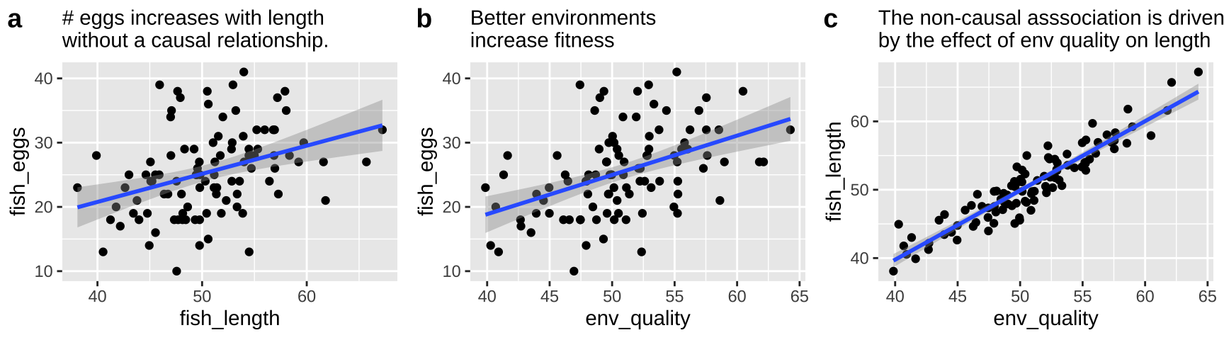
The right thing to do in this case is to just build a model with the environmental quality.
lm(fish_eggs ~ env_quality , confounded_fish) %>% summary()##
## Call:
## lm(formula = fish_eggs ~ env_quality, data = confounded_fish)
##
## Residuals:
## Min 1Q Median 3Q Max
## -13.4176 -4.0742 0.0123 3.3561 15.5949
##
## Coefficients:
## Estimate Std. Error t value Pr(>|t|)
## (Intercept) -5.5802 6.0913 -0.916 0.362
## env_quality 0.6111 0.1194 5.117 1.55e-06 ***
## ---
## Signif. codes: 0 '***' 0.001 '**' 0.01 '*' 0.05 '.' 0.1 ' ' 1
##
## Residual standard error: 5.942 on 98 degrees of freedom
## Multiple R-squared: 0.2108, Adjusted R-squared: 0.2028
## F-statistic: 26.18 on 1 and 98 DF, p-value: 1.546e-06lm(fish_eggs ~ env_quality , confounded_fish) %>% anova()## Analysis of Variance Table
##
## Response: fish_eggs
## Df Sum Sq Mean Sq F value Pr(>F)
## env_quality 1 924.5 924.48 26.183 1.546e-06 ***
## Residuals 98 3460.2 35.31
## ---
## Signif. codes: 0 '***' 0.001 '**' 0.01 '*' 0.05 '.' 0.1 ' ' 133.4.1.2 Causal model 2: The pipe
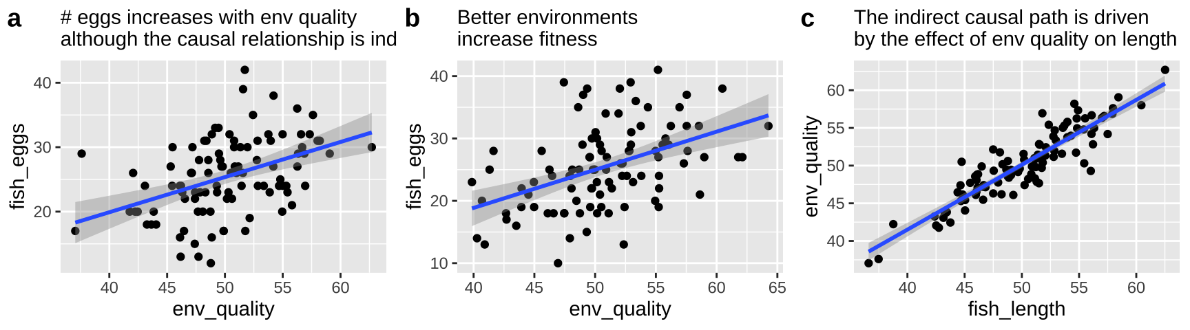
So now let’s look at a pipe in which the environment causes fish length and fish length causes fitness, but environment itself has has no impact on fitness. First let’s simulate
pipe_fish <- tibble(env_quality = rnorm(n = n_fish, mean = 50, sd = 5), #simulating the environment
                          fish_length = rnorm(n = n_fish, mean = env_quality, sd = 2),
                          fish_eggs   = rnorm(n = n_fish, mean = fish_length/2, sd = 5) %>% round()) #
Now we know that environmental quality does not directly cause fish to lay more eggs – as we did not models this. Nonetheless, a plot and a statistical test show a strong association between quality and eggs if we do not include if we do not include fish length in our model.
pipe_plot <- ggplot(pipe_fish, aes(x = env_quality, y = fish_eggs)) +
  geom_point()+
  geom_smooth(method = "lm")+
  labs( subtitle = "# eggs increases with env quality\nalthough the causal relationship is indirect.")

pipe_plot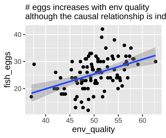
Our statistical analysis will not show cause
We can build a simple linear model predicting the number of fish eggs as a function of environmental quality. We can see that the prediction is good, and makes sense – egg number reliably increases with environmental quality. But we know this is not a causal relationship (because we didn’t have this cause in our simulation).
lm(fish_eggs ~ env_quality, pipe_fish) %>% summary()##
## Call:
## lm(formula = fish_eggs ~ env_quality, data = pipe_fish)
##
## Residuals:
## Min 1Q Median 3Q Max
## -12.6909 -3.6816 -0.1526 3.6523 15.7056
##
## Coefficients:
## Estimate Std. Error t value Pr(>|t|)
## (Intercept) -1.9039 5.8096 -0.328 0.744
## env_quality 0.5452 0.1152 4.732 7.48e-06 ***
## ---
## Signif. codes: 0 '***' 0.001 '**' 0.01 '*' 0.05 '.' 0.1 ' ' 1
##
## Residual standard error: 5.369 on 98 degrees of freedom
## Multiple R-squared: 0.186, Adjusted R-squared: 0.1777
## F-statistic: 22.39 on 1 and 98 DF, p-value: 7.48e-06lm(fish_eggs ~ env_quality, pipe_fish) %>% anova() ## Analysis of Variance Table
##
## Response: fish_eggs
## Df Sum Sq Mean Sq F value Pr(>F)
## env_quality 1 645.57 645.57 22.392 7.48e-06 ***
## Residuals 98 2825.34 28.83
## ---
## Signif. codes: 0 '***' 0.001 '**' 0.01 '*' 0.05 '.' 0.1 ' ' 1Adding the immediate cause into our model
So, let’s build a model including the immediate cause, fish length.
fish_lm_w_cause <- lm(fish_eggs~ fish_length + env_quality, pipe_fish) Looking at the estimates from the model we see that the answers don’t make a ton of sense
fish_lm_w_cause %>% coef() %>% round(digits = 2)## (Intercept) fish_length env_quality
## -4.16 1.03 -0.44The stats here again come out a bit funny. A type
lm(fish_eggs~ fish_length + env_quality, pipe_fish) %>% anova()## Analysis of Variance Table
##
## Response: fish_eggs
## Df Sum Sq Mean Sq F value Pr(>F)
## fish_length 1 1026.39 1026.39 41.9920 3.812e-09 ***
## env_quality 1 73.59 73.59 3.0107 0.08589 .
## Residuals 97 2370.93 24.44
## ---
## Signif. codes: 0 '***' 0.001 '**' 0.01 '*' 0.05 '.' 0.1 ' ' 1lm(fish_eggs~ env_quality + fish_length, pipe_fish) %>% anova()## Analysis of Variance Table
##
## Response: fish_eggs
## Df Sum Sq Mean Sq F value Pr(>F)
## env_quality 1 645.57 645.57 26.412 1.429e-06 ***
## fish_length 1 454.41 454.41 18.591 3.894e-05 ***
## Residuals 97 2370.93 24.44
## ---
## Signif. codes: 0 '***' 0.001 '**' 0.01 '*' 0.05 '.' 0.1 ' ' 1lm(fish_eggs~ fish_length + env_quality, pipe_fish) %>% Anova(type = "II")## Anova Table (Type II tests)
##
## Response: fish_eggs
## Sum Sq Df F value Pr(>F)
## fish_length 454.41 1 18.5909 3.894e-05 ***
## env_quality 73.59 1 3.0107 0.08589 .
## Residuals 2370.93 97
## ---
## Signif. codes: 0 '***' 0.001 '**' 0.01 '*' 0.05 '.' 0.1 ' ' 1What to do?
First let’s look at all the relationships in our data
The right thing to do in this case is to just build a model with the fish length.
lm(fish_eggs ~ fish_length, pipe_fish) %>% summary()##
## Call:
## lm(formula = fish_eggs ~ fish_length, data = pipe_fish)
##
## Residuals:
## Min 1Q Median 3Q Max
## -10.8320 -3.3050 -0.7149 3.2950 13.5107
##
## Coefficients:
## Estimate Std. Error t value Pr(>|t|)
## (Intercept) -7.2409 5.1238 -1.413 0.161
## fish_length 0.6528 0.1018 6.415 5.01e-09 ***
## ---
## Signif. codes: 0 '***' 0.001 '**' 0.01 '*' 0.05 '.' 0.1 ' ' 1
##
## Residual standard error: 4.994 on 98 degrees of freedom
## Multiple R-squared: 0.2957, Adjusted R-squared: 0.2885
## F-statistic: 41.15 on 1 and 98 DF, p-value: 5.009e-09lm(fish_eggs ~ fish_length, pipe_fish) %>% anova()## Analysis of Variance Table
##
## Response: fish_eggs
## Df Sum Sq Mean Sq F value Pr(>F)
## fish_length 1 1026.4 1026.39 41.148 5.009e-09 ***
## Residuals 98 2444.5 24.94
## ---
## Signif. codes: 0 '***' 0.001 '**' 0.01 '*' 0.05 '.' 0.1 ' ' 133.4.1.3 Causal model 3: The collider
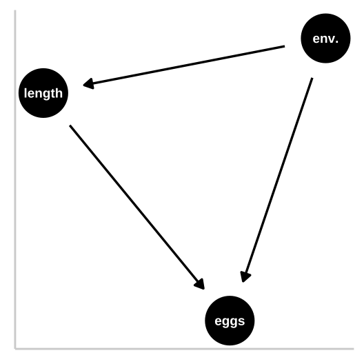
So now let’s look at a collider in which the environment causes fitness and fish length, and fish length causes fitness, but environment itself has has no impact on fitness. First let’s simulate
collide_fish <- tibble(env_quality = rnorm(n = n_fish, mean = 50, sd = 5), #simulating the environment
                  fish_length = rnorm(n = n_fish, mean = env_quality, sd = 2),
                  fish_eggs   = rnorm(n = n_fish, mean = (env_quality/4+ fish_length*3/4)/2, sd = 7) %>% round()) #
Now we know that environmental quality increases fish length and both environmental quality and fish length directly cause fish to lay more eggs.
But our models have a bunch of trouble figuring this out. Again, a type one sums of squares puts most of the “blame” on the first thing in the model.
lm(fish_eggs ~ env_quality + fish_length, collide_fish ) %>% summary()##
## Call:
## lm(formula = fish_eggs ~ env_quality + fish_length, data = collide_fish)
##
## Residuals:
## Min 1Q Median 3Q Max
## -15.7630 -4.9224 -0.0557 4.4401 15.3646
##
## Coefficients:
## Estimate Std. Error t value Pr(>|t|)
## (Intercept) -9.1815 7.2330 -1.269 0.207
## env_quality 0.2040 0.3835 0.532 0.596
## fish_length 0.4763 0.3604 1.322 0.189
##
## Residual standard error: 6.902 on 97 degrees of freedom
## Multiple R-squared: 0.1928, Adjusted R-squared: 0.1761
## F-statistic: 11.58 on 2 and 97 DF, p-value: 3.086e-05lm(fish_eggs ~ env_quality + fish_length, collide_fish ) %>% anova() ## Analysis of Variance Table
##
## Response: fish_eggs
## Df Sum Sq Mean Sq F value Pr(>F)
## env_quality 1 1020.4 1020.40 21.4175 1.144e-05 ***
## fish_length 1 83.2 83.21 1.7466 0.1894
## Residuals 97 4621.4 47.64
## ---
## Signif. codes: 0 '***' 0.001 '**' 0.01 '*' 0.05 '.' 0.1 ' ' 1lm(fish_eggs ~ fish_length + env_quality, collide_fish ) %>% anova() ## Analysis of Variance Table
##
## Response: fish_eggs
## Df Sum Sq Mean Sq F value Pr(>F)
## fish_length 1 1090.1 1090.13 22.8811 6.153e-06 ***
## env_quality 1 13.5 13.48 0.2829 0.596
## Residuals 97 4621.4 47.64
## ---
## Signif. codes: 0 '***' 0.001 '**' 0.01 '*' 0.05 '.' 0.1 ' ' 1lm(fish_eggs ~ env_quality + fish_length, collide_fish ) %>% Anova(type = "II") ## Anova Table (Type II tests)
##
## Response: fish_eggs
## Sum Sq Df F value Pr(>F)
## env_quality 13.5 1 0.2829 0.5960
## fish_length 83.2 1 1.7466 0.1894
## Residuals 4621.4 9733.5 Additional reading
.](images/calling_bs4.jpeg)
Figure 33.4: BE SURE TO READ CHAPTER 4 of CALLING BULLSHIT. link.
33.6 Wrap up
The examples above show the complexity in deciphering causes without experiments. But they also show us the light about how we can infer causation, because causal diagrams can point to testable hypotheses.
If we can’t do experiments, causal diagrams offer us a glimpse into how we can infer causation.
Perhaps the best way to do this is by matching – if we can match subjects that are identical for all causal paths except the one we are testing, we can then test for a statistical association, ad make a causal claim we can believe in.
The field of causal inference is developing rapidly. If you want to hear more, the popular book, The Book of Why (Pearl and Mackenzie 2018) is a good place to start.