Chapter 5 Combining dplyr verbs for handling data in R and a brief intro to ggplot
%>%, we also introduce the group_by() and summarise() functions, and dip our toes into ggploting.
Motivating scenarios: We just got our data, how do we get it into R and explore?
Learning goals: By the end of this chapter you should be better able to get data into R and explore it. Specifically, students will be able to:
- Chain operations with the pipe
%>%.
- Take estimates with
summarise().
- Isolate groups with
group_by().
- Make simple plots with ggplot2
There is no external reading for this chapter, but
- Watch the last two and a half minutes of the veido Stat 545 – about using dplyr from the last course, and one about getting comfortable with ggplot.
- Complete the
learnRtutorial we began last chapter, and a new one on Data Visualization Basics.
- Canvas assignment which goes over the quiz, readings, tutorials and videos.
- Consider dataset for first major assignment.
5.1 Review
In the previous chapter we learned how to do a bunch of things to data. For example, in our toad dataset, below, we
- Use the
mutate()function made a new column forBMIby dividing weight by height.
- Sort the data with the
arrange()function.
We also saw how we could select() columns, and filter() for rows based on logical statements.
We did each of these things one at a time, often reassigning variables a bunch. Now, we see a better way, we combine operations with the pipe %>% operator.
## [38;5;246m# A tibble: 3 x 5[39m
## individual species sound weight height
## [3m[38;5;246m<chr>[39m[23m [3m[38;5;246m<fct>[39m[23m [3m[38;5;246m<chr>[39m[23m [3m[38;5;246m<dbl>[39m[23m [3m[38;5;246m<dbl>[39m[23m
## [38;5;250m1[39m a Bufo spinosus chirp 2 2
## [38;5;250m2[39m b Bufo bufo croak 2.6 3
## [38;5;250m3[39m c Bufo bufo ribbit 3 25.2 The pipe %>% operator
Say you want to string together a few things – like you want make a new tibble, called sorted_bufo_bufo by:
- Only retaining Bufo bufo samples
- Calculating
BMI
- Sorting by BMI, and
- Getting rid of the column with the species name.
The pipe operator, %>%, makes this pretty clean by allowing us to pass results from one operation to another.
%>% basically tells R to take the data and keep going!
sorted_bufo_bufo <- toad_data     %>% # initial data
  filter(species == "Bufo bufo")  %>% # only Bufo bufo
  mutate(BMI = height / weight)   %>% # calculate BMI
  arrange(BMI)                    %>% # sort by BMI
  dplyr::select(-species)             # remove species

sorted_bufo_bufo
## [38;5;246m# A tibble: 2 x 5[39m
## individual sound weight height BMI
## [3m[38;5;246m<chr>[39m[23m [3m[38;5;246m<chr>[39m[23m [3m[38;5;246m<dbl>[39m[23m [3m[38;5;246m<dbl>[39m[23m [3m[38;5;246m<dbl>[39m[23m
## [38;5;250m1[39m c ribbit 3 2 0.667
## [38;5;250m2[39m b croak 2.6 3 1.155.2.1 Why did I introduce piping in a separate class?
My sense is combining skills is a whole different thing that learning them independently.
I’m hoping that by separating the tools from the pipeline we can wrap our heads around both.
Also, as a bonus, we get more practice.
Piping a bunch of things together is super fun – but it also means that each line offers an opportunity to mess up.
To make sure each line works, I type one line at a time, checking the output each time.
Once I finish I then go back to the top to add the variable assignment.Watch the end of the STAT 545 video
Figure 5.1: Watch the laste two and a half minutes of this video from last class, as he introduces the pipe operator.
Complete the final section on pipes in the RStudio primer 2.2
If you didn’t finish last time, do it now
Figure 5.2: Complete the final section of the RStudio Primer on isolating data with dplyr
5.3 group_by()
One of the benefits of tidy data is that it makes it easy to separately do things based one the value of a variable. To do this, we group_by() the variable(s) of interest, being sure to [ungroup()] when we’re done. Check this example to see what I mean…
## [38;5;246m# A tibble: 4 x 4[39m
## last_name first_name exam grade
## [3m[38;5;246m<chr>[39m[23m [3m[38;5;246m<chr>[39m[23m [3m[38;5;246m<dbl>[39m[23m [3m[38;5;246m<dbl>[39m[23m
## [38;5;250m1[39m Horseman BoJack 1 70
## [38;5;250m2[39m Horseman BoJack 2 63
## [38;5;250m3[39m Carolyn Princess 1 97
## [38;5;250m4[39m Carolyn Princess 2 85Say we had student’s grades (above), and we wanted to curve it so the highest score was a hundred, by finding the highest grade on each exam, dividing scores by this grad, and multiplying by 100. We could do this by typing
grades                             %>%
  group_by(exam)                   %>%
  mutate(high_score = max(grade))  %>%
  ungroup()                        %>%
  mutate(curved_grade = 100 * grade / high_score)
## [38;5;246m# A tibble: 4 x 6[39m
## last_name first_name exam grade high_score curved_grade
## [3m[38;5;246m<chr>[39m[23m [3m[38;5;246m<chr>[39m[23m [3m[38;5;246m<dbl>[39m[23m [3m[38;5;246m<dbl>[39m[23m [3m[38;5;246m<dbl>[39m[23m [3m[38;5;246m<dbl>[39m[23m
## [38;5;250m1[39m Horseman BoJack 1 70 97 72.2
## [38;5;250m2[39m Horseman BoJack 2 63 85 74.1
## [38;5;250m3[39m Carolyn Princess 1 97 97 100
## [38;5;250m4[39m Carolyn Princess 2 85 85 1005.4 Summaries in R
The summarise() function in R reduces a data set to summaries that you ask it for. So, we can use tell R to summarize these data as follows.
grades                                %>%
  group_by(exam)                      %>%
  summarise(high_score = max(grade))
## [38;5;246m# A tibble: 2 x 2[39m
## exam high_score
## [3m[38;5;246m<dbl>[39m[23m [3m[38;5;246m<dbl>[39m[23m
## [38;5;250m1[39m 1 97
## [38;5;250m2[39m 2 85Note that we lost all the other information as we summarized, only retaining our groups name(s) and the summarised value(s).
We can use this function with basically any way to take summarize an estimate from a sample.
5.5 The idea of ggplot
Figure 5.3: Watch this video about getting started with ggplot2 (7 min and 17 sec), from STAT 545
ggplot is built on a framework for building plots called the grammar of graphics. A major idea here is that plots are made up of data that we map onto aesthetic attributes.
Lets unpack this sentence, because there’s a lot there. Say we wanted to make a very simple plot e.g. observations for categorical data, or a simple histogram for a single continuous variable. Here we are mapping this variable onto a single aesthetic attribute – the x-axis.
ggplot in one place, check out the ggplot2 book (Wickham 2016) and/or the socviz book (Healy 2018).
5.5.1 Our first ggplot
So, let’s do this with a data set msleep built in to tidyverse, which contains interesting information about a bunch of mammals. One question we might have is - how much variability is there in mammal brain size, and what explains this variation? Let’s look to find out…
Data prep and transformation
Before making these plots, we’ll use the mutate() function
to \(log_{10}\) transform brainwt and bodywt. For this data set, this makes patterns easier to see. Later we’ll see when this is a good or bad idea and how to do this while we are plotting, but let’s hold off on that for now.
msleep <- msleep %>%
  mutate(log10_brainwt = log10(brainwt),
         log10_bodywt  = log10(bodywt))
Mapping aesthetics to variables
So first we need to think of the variables we hope to map onto an aesthetic. Here, the only variable from the data set we are considering is how many hours an organism is awake per day. This is a continuous variable, which we hope to map on to the x-axis. We do so like this:
msleep_plot1 <- ggplot(data = msleep, aes(x = log10_brainwt)) # save plot
plot(msleep_plot1)                                             #
Figure 5.4: Uhh ohhh
So, that didn’t go as expected :( — there just a blank grey background. But look more closely, what do you notice?
We make a more useful plot by adding a geom layer.
Adding geom layers
geoms explain to R what we want to see: points, lines, histograms etc.. In chapter YANIV ADD we will see how to add data summaries and trendlines. As we discuss below, a histogram is a great way to visualize variability, so lets add that as a `geom``.
msleep_histogram <- msleep_plot1 +
  geom_histogram(bins =10, color = "white")

plot(msleep_histogram)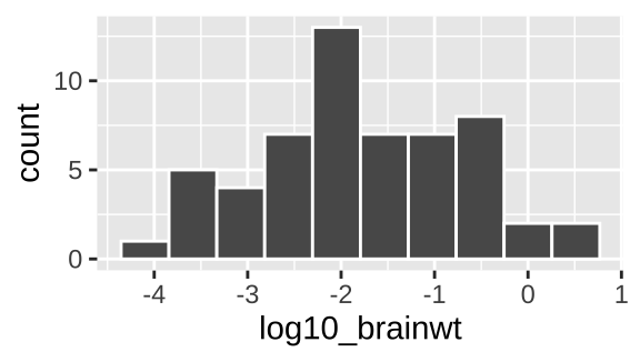
Figure 5.5: Our first ggplot!
Yay! OK - we’re off. Below we explore a bunch more geom and how they relate to the type of variables we’re interested in! But first, one more awesome feature of ggplot – faceting.
5.5.1.1 Adding facets
In the bible of data visualization, the Visual Display of Quantitative Information, Tufte (1983), introduced the idea of “small multiples” as a way to efficiently visualize data in many dimensions, by making many small graphs for different values of categorical variables.
Small multiples are economical: once viewers understand the design of one [chart], they have immediate access to the data in all the other [charts]. […] as the eye moves from one [chart] to the next, the constancy of the design allows the viewer to focus on changes in the data rather than on changes in graphical design.
In ggplot we can build small multiples as facets, with the facet_wrap() and facet_grid() functions.
msleep_histogram +
facet_wrap(~vore, ncol =3) 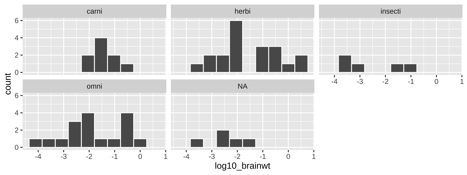
Figure 5.6: Our first ggplot!
5.5.1.2 An aside – saving and adding to plots
Above, we built a ggplot one component at a time, saving each move and visualizing it with the plot function. This isn’t necessary — we can recreate Fig. 5.5 as follows:
ggplot(data = msleep, aes(x = log10_brainwt)) +
  geom_histogram(bins =10, color = "white")                            +
  facet_wrap(~vore, ncol =3)
It is up to you if you want to save intermediate efforts in a plot.
5.5.2 ggplot2 primer
To get more of a sense of how to use ggplot, complete the Primer on Data Visualization Basics primer embedded below. This will get you a solid foundation in R which we will build off in this lecture and in the coming weeks.
Figure 5.7: The RSutdio Primer on Data Visualization Basics primer
5.6 Homework
- Watch the last two and a half minutes of the veido Stat 545 – about using dplyr from the last course, and one about getting comfortable with ggplot.
- Complete the
learnRtutorial we began last chapter, and a new one on Data Visualization Basics.
- Canvas assignment which goes over the quiz, readings, tutorials and videos.
- Consider dataset for first major assignment.
5.6.1 Quiz
5.7 More functions for dealing with data
%>%: Passes your answer down.group_by(): Conduct operatins separaely by values of a column (or columns).summarise(): Reduce a data set to its (group) summaries.